Adding floating labels to form fields in Divi can boost the design and UX of any Divi form in a subtle, yet powerful, way. Any website form (not just Divi) usually includes some kind of input field and a label for that input field. For example, a form may have a text input field for a name where you can enter the text (or name) and a label for that field’s input box (i.e. “Name”). This label may be visible or hidden depending on the form style. In addition to a label, input fields may also contain a placeholder pseudo-element that serves as a kind of temporary label within the input field that remains visible until the user enters an input value. In Divi, the default design hides the label element and shows only the placeholder text. Adding a floating label to a Divi form will allow designers to keep the sleek feel of the “placeholder only” form style and also reveal (or float) the label above the field whenever the user adds a value.
In this tutorial, we are going to show you how to add floating labels to a Divi email option form. To do this, we are going to use the Divi builder to design the email option form. Then we will add some custom CSS and JQuery to float those hidden labels into view when a user focuses on the field.
Let’s get started!
Sneak Peek
Here is a quick look at the design we’ll build in this tutorial.
Download the Layout for FREE
To lay your hands on the designs from this tutorial, you will first need to download it using the button below. To gain access to the download you will need to subscribe to our Divi Daily email list by using the form below. As a new subscriber, you will receive even more Divi goodness and a free Divi Layout pack every Monday! If you’re already on the list, simply enter your email address below and click download. You will not be “resubscribed” or receive extra emails.
@media only screen and ( max-width: 767px ) {.et_bloom .et_bloom_optin_1 .carrot_edge.et_bloom_form_right .et_bloom_form_content:before { border-top-color: #ffffff !important; border-left-color: transparent !important; }.et_bloom .et_bloom_optin_1 .carrot_edge.et_bloom_form_left .et_bloom_form_content:after { border-bottom-color: #ffffff !important; border-left-color: transparent !important; }
}.et_bloom .et_bloom_optin_1 .et_bloom_form_content button { background-color: #f92c8b !important; } .et_bloom .et_bloom_optin_1 .et_bloom_form_content .et_bloom_fields i { color: #f92c8b !important; } .et_bloom .et_bloom_optin_1 .et_bloom_form_content .et_bloom_custom_field_radio i:before { background: #f92c8b !important; } .et_bloom .et_bloom_optin_1 .et_bloom_border_solid { border-color: #f7f9fb !important } .et_bloom .et_bloom_optin_1 .et_bloom_form_content button { background-color: #f92c8b !important; } .et_bloom .et_bloom_optin_1 .et_bloom_form_container h2, .et_bloom .et_bloom_optin_1 .et_bloom_form_container h2 span, .et_bloom .et_bloom_optin_1 .et_bloom_form_container h2 strong { font-family: “Open Sans”, Helvetica, Arial, Lucida, sans-serif; }.et_bloom .et_bloom_optin_1 .et_bloom_form_container p, .et_bloom .et_bloom_optin_1 .et_bloom_form_container p span, .et_bloom .et_bloom_optin_1 .et_bloom_form_container p strong, .et_bloom .et_bloom_optin_1 .et_bloom_form_container form input, .et_bloom .et_bloom_optin_1 .et_bloom_form_container form button span { font-family: “Open Sans”, Helvetica, Arial, Lucida, sans-serif; } p.et_bloom_popup_input { padding-bottom: 0 !important;}

Download For Free
Join the Divi Newsletter and we will email you a copy of the ultimate Divi Landing Page Layout Pack, plus tons of other amazing and free Divi resources, tips and tricks. Follow along and you will be a Divi master in no time. If you are already subscribed simply type in your email address below and click download to access the layout pack.
You have successfully subscribed. Please check your email address to confirm your subscription and get access to free weekly Divi layout packs!
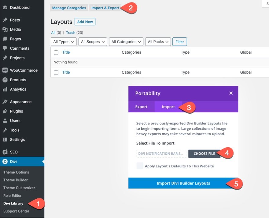
To import the section layout to your Divi Library, navigate to the Divi Library.
Click the Import button.
In the portability popup, select the import tab and choose the download file from your computer.
Then click the import button.

Once done, the section layout will be available in the Divi Builder.
Let’s get to the tutorial, shall we?
What You Need to Get Started

To get started, you will need to do the following:
- If you haven’t yet, install and activate the Divi Theme.
- Create a new page in WordPress and use the Divi Builder to edit the page on the front end (visual builder).
- Choose the option “Build From Scratch”.
After that, you will have a blank canvas to start designing in Divi.
Adding Floating Labels to Form Fields in Divi
Building the Email Optin Form
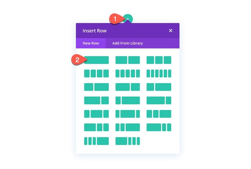
Add a one-column row to the default section in the Divi Builder.
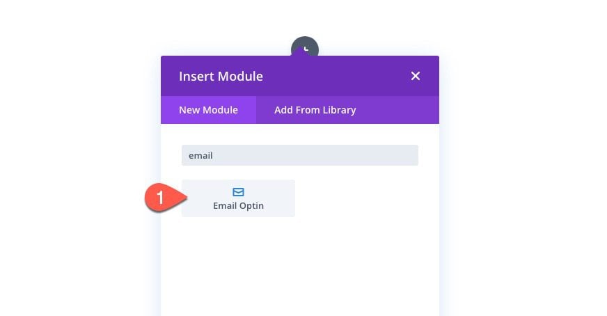
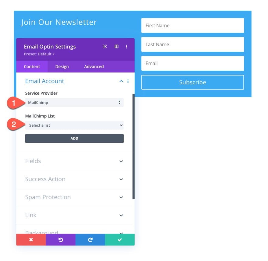
Add an Email Optin form to the column.
Open the Email Optin Settings modal. Under the content tab, update the title text and delete the body text.
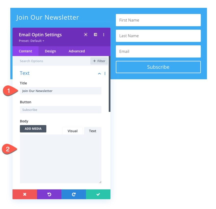
Make sure to link your email account service provider. If not, the email optin will not appear on a live page.
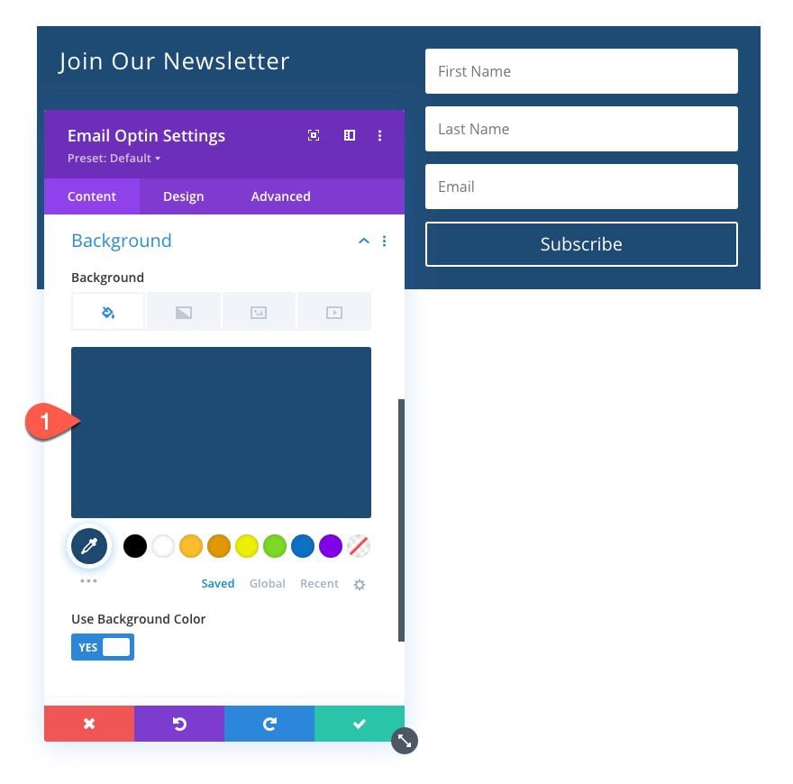
Next, add the following background color to the email optin:
- Background Color: #1f4b74
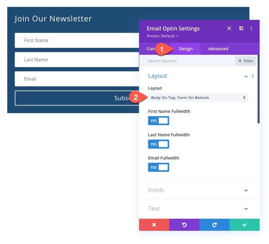
Under the design tab, update the layout of the form:
- Layout: Body On Top, Form On Bottom
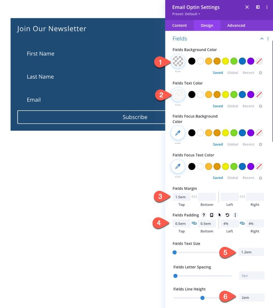
Then update the field styles as follows:
- Fields Background Color: transparent
- Fields Text Color: #ffffff
- Fields Margin: 1.5em top
- Fields Padding: 0.5em top, 0.5em bottom, 1em left, 1em right
- Fields Text Size: 1.2em
- Fields Line Height: 2em
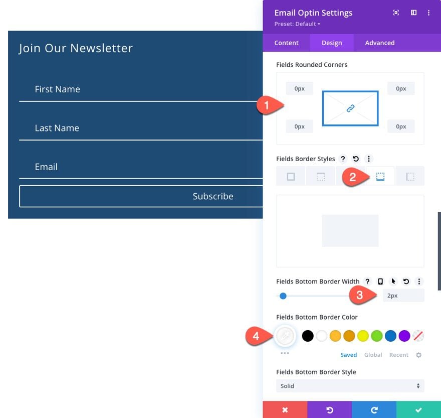
Next, update the field border styles:
- Fields Rounded Corners: 0px
- Fields Bottom Border Width: 2px
- Fields Bottom Border Color: #ffffff
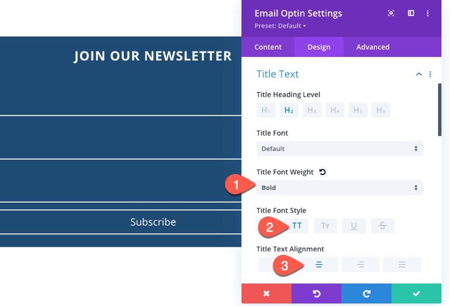
Let’s also update the Title font styles:
- Title Font Weight: Bold
- Title Font Style: TT
- Title Text Alignment: Center
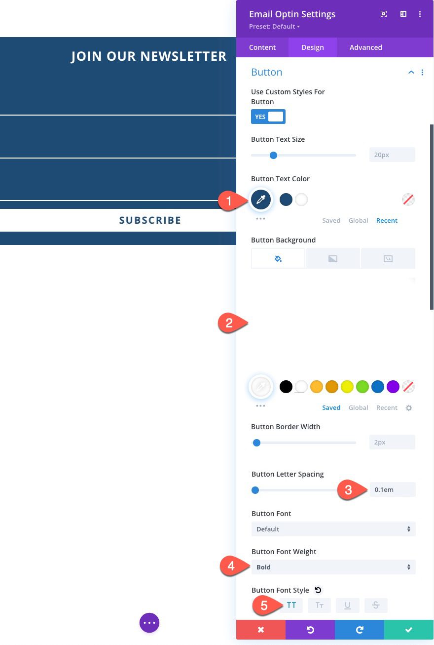
And now let’s go ahead and style the button.
- Use Custom Styles for Button: YES
- Button Text Color: #1f4b74
- Button Background Color: #ffffff
- Button letter spacing: 0.1em
- Button Font Weight: Bold
- Button Font Style: TT
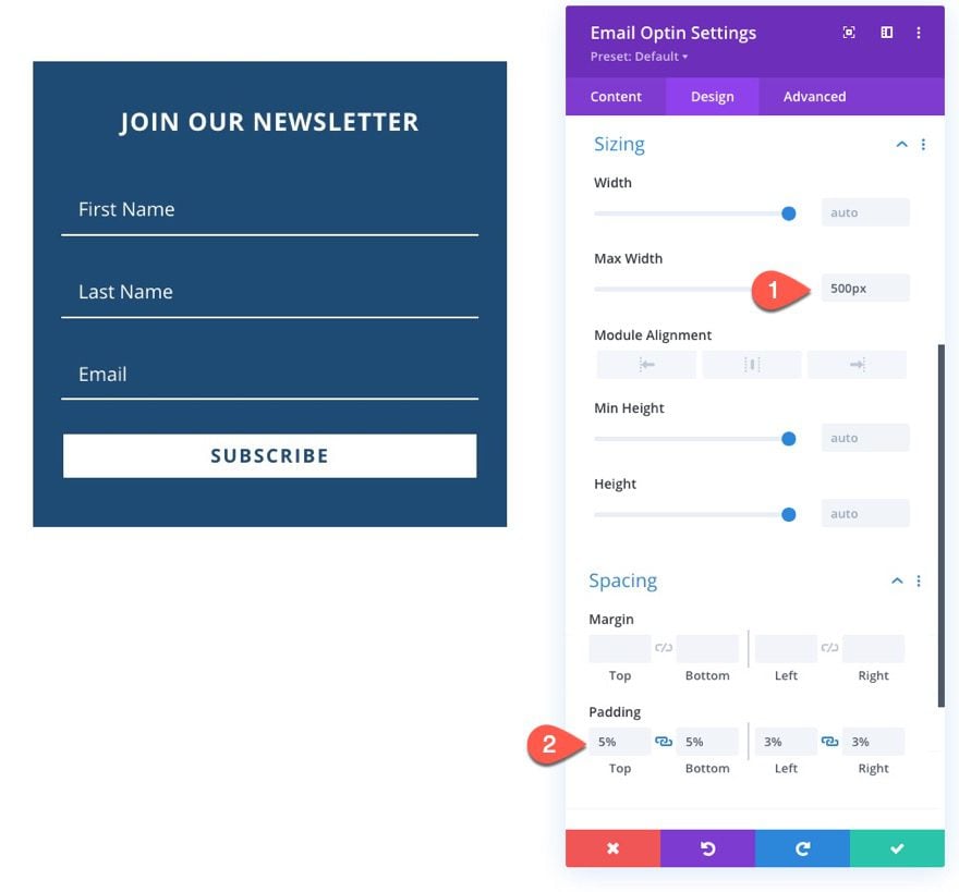
For our last design customization, let’s add a max-width and padding to the form as follows:
- Max Width: 500px
- Padding: 5% top, 5% bottom, 3% left 3% right
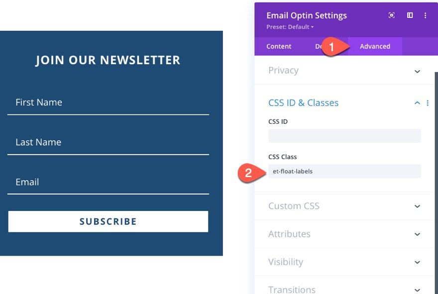
Finally, we need to add a CSS Class to the module so that we can target it with our CSS and JQuery code in the next step.
Adding the Custom Code
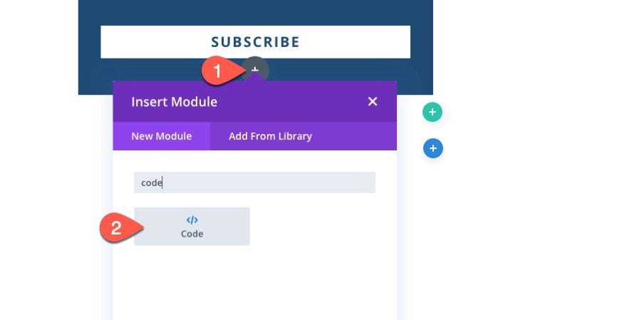
To add the custom CSS and JQuery, add a code module under the email opt-in form module.
The CSS
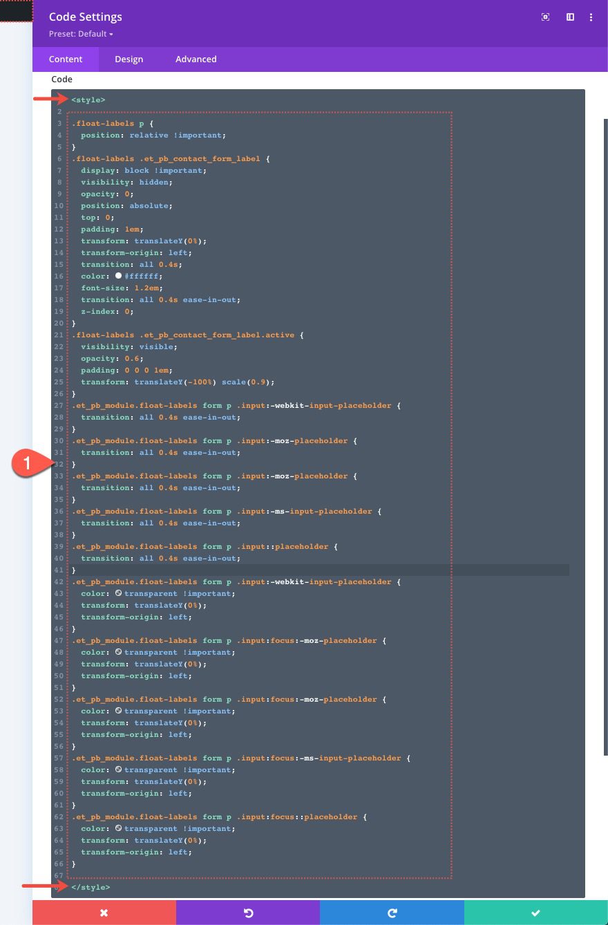
In the code content box, paste the following CSS making sure to wrap the CSS in the necessary style tags:
.et-float-labels p {
  position: relative !important;
}

.et-float-labels .et_pb_contact_form_label {
  display: block !important;
  visibility: hidden;
  opacity: 0;
  position: absolute;
  top: 1em;
  padding: 0 1em;
  transform: translateY(0%);
  transform-origin: left;
  color: #ffffff;
  font-size: 1.2em;
  -webkit-transition: all 0.4s ease-in-out;
  transition: all 0.4s ease-in-out;
  z-index: 0;
}

.et-float-labels .et_pb_contact_form_label.active {
  visibility: visible;
  opacity: 0.6;
  top:0;
  transform: translateY(-100%) scale(0.9);
}

.et_pb_module.et-float-labels form p .input::-webkit-input-placeholder {
  -webkit-transition: all 0.4s;
  transition: all 0.4s;
}
.et_pb_module.et-float-labels form p .input::-moz-placeholder {
  -moz-transition: all 0.4s ease-in-out;
  transition: all 0.4s ease-in-out;
}
.et_pb_module.et-float-labels form p .input:-ms-input-placeholder {
  -ms-transition: all 0.4s ease-in-out;
  transition: all 0.4s ease-in-out;
}
.et_pb_module.et-float-labels form p .input:-moz-placeholder {
  -moz-transition: all 0.4s ease-in-out;
  transition: all 0.4s ease-in-out;
}
.et_pb_module.et-float-labels form p .input::placeholder {
  transition: all 0.4s ease-in-out;
}

.et_pb_module.et-float-labels form p .input:focus::-webkit-input-placeholder {
  color: transparent !important;
}
.et_pb_module.et-float-labels form p .input:focus::-moz-placeholder {
  color: transparent !important;
}
.et_pb_module.et-float-labels form p .input:focus:-moz-placeholder {
  color: transparent !important;
}
.et_pb_module.et-float-labels form p .input:focus:-ms-input-placeholder {
  color: transparent !important;
}
.et_pb_module.et-float-labels form p .input:focus::placeholder {
  color: transparent !important;
}
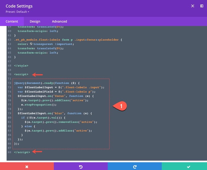
The JQuery
Under the ending style tag, paste the following JQuery and wrap it with the necessary script tags.
jQuery(document).ready(function ($) {
  var $floatLabelInput = $(".et-float-labels .input");
  $floatLabelInput.on("focus", function (e) {
    $(e.target).prev().addClass("active");
    e.stopPropagation();
  });
  $floatLabelInput.on("blur", function (e) {
    if (!$(e.target).val()) {
      $(e.target).prev().removeClass("active");
    } else {
      $(e.target).prev().addClass("active");
    }
  });
});
Breaking Down the Code
About the CSS
First, we target the fields and give them a relative position so that we can give the label element an absolute position within the field (or p element).
.et-float-labels p {
  position: relative !important;
}
Next, we give the label element on the form and absolute position with other styling that places the label text so that it overlaps the placement text. The display:block overrides the default display:hidden property so that the label is ready to be shown. Then we hide it with visibility hidden.
.et-float-labels .et_pb_contact_form_label {
  display: block !important;
  visibility: hidden;
  opacity: 0;
  position: absolute;
  top: 1em;
  padding: 0 1em;
  transform: translateY(0%);
  transform-origin: left;
  color: #ffffff;
  font-size: 1.2em;
  -webkit-transition: all 0.4s ease-in-out;
  transition: all 0.4s ease-in-out;
  z-index: 0;
}
Then we show, scale, and translate(move) the label with an upward slide animation once it receives the “active” class controlled by the JQeury.
.et-float-labels .et_pb_contact_form_label.active {
  visibility: visible;
  opacity: 0.6;
  top:0;
  transform: translateY(-100%) scale(0.9);
}
The rest of the CSS is about hiding the placeholder with a transition. There are a lot of lines to do this because each browser requires different prefixes for targeting the placeholder pseudo-element. But the idea is simple – change the color of the placeholder to transparent.
.et_pb_module.et-float-labels form p .input::-webkit-input-placeholder {
  -webkit-transition: all 0.4s;
  transition: all 0.4s;
}
.et_pb_module.et-float-labels form p .input::-moz-placeholder {
  -moz-transition: all 0.4s ease-in-out;
  transition: all 0.4s ease-in-out;
}
.et_pb_module.et-float-labels form p .input:-ms-input-placeholder {
  -ms-transition: all 0.4s ease-in-out;
  transition: all 0.4s ease-in-out;
}
.et_pb_module.et-float-labels form p .input:-moz-placeholder {
  -moz-transition: all 0.4s ease-in-out;
  transition: all 0.4s ease-in-out;
}
.et_pb_module.et-float-labels form p .input::placeholder {
  transition: all 0.4s ease-in-out;
}

.et_pb_module.et-float-labels form p .input:focus::-webkit-input-placeholder {
  color: transparent !important;
}
.et_pb_module.et-float-labels form p .input:focus::-moz-placeholder {
  color: transparent !important;
}
.et_pb_module.et-float-labels form p .input:focus:-moz-placeholder {
  color: transparent !important;
}
.et_pb_module.et-float-labels form p .input:focus:-ms-input-placeholder {
  color: transparent !important;
}
.et_pb_module.et-float-labels form p .input:focus::placeholder {
  color: transparent !important;
}
About the JQuery
First, we define the variable $floatLabelInput as the input element on each form field.
var $floatLabelInput = $(".et-float-labels .input");
Then we us the focus event handler with a function to add a class (“active”) to the label element (the previous sibling of the input element) whenever the input element is in focus. Once the “active” class is added to the label, the label is shown, scaled, and moved into place above the input with the corresponding CSS.
  $floatLabelInput.on("focus", function (e) {
    $(e.target).prev().addClass("active");
    e.stopPropagation();
  });
Lastly, we us the blur event handler with a function that determines when to keep the “active” class on the label. If the input doesn’t have a value, it will stay active even when the input field is not in focus. If it doesn’t have a value, the class is removed and the default state of the field returns.
  $floatLabelInput.on("blur", function (e) {
    if (!$(e.target).val()) {
      $(e.target).prev().removeClass("active");
    } else {
      $(e.target).prev().addClass("active");
    }
  });
Adding and removing the class using the “focus” and “blur” event handlers (instead of “click”) allows the user to see the effect even when navigating using only a keyboard (i.e. pressing tab to cycle through the fields).
Final Result
Here is the final result of our floating labels on form fields in a Divi email option form.
Final Thoughts
Adding floating labels to a Divi form isn’t that difficult. Designing the email option form (or any Divi form) is surprisingly easy. However, when adding floating labels, remember to customize the size and spacing of the form fields to leave the right amount of space for the floating label. After that, we use custom CSS to effectively hide or show the placeholder when the user focuses on the field. Since each browser requires different prefixes for targeting the placeholder pseudo-element, it is important to get those right. The JQuery we added adds and removes a class on the label element that will float it into view when needed. All in all, it is a solid microinteraction that adds to the user experience.
Feel free to use this same process on other Divi forms (like a login or contact form) as well. Just don’t forget to add the custom class on the form before adding the custom code. After that, you may need to tweak the design settings of the form fields to make sure it has enough room for those floating labels.
I look forward to hearing from you in the comments.
Cheers!
.inline-code{padding: 0px 4px; color: crimson; font-family: Monaco,consolas,bitstream vera sans mono,courier new,Courier,monospace!important} video.with-border {border-radius: 8px;box-shadow: 0 8px 60px 0 rgba(103,151,255,.11), 0 12px 90px 0 rgba(103,151,255,.11);display:block;margin: 0 auto;}
The post How to Add Floating Labels to Form Fields in Divi appeared first on Elegant Themes Blog.