There’s a good chance your next customer is looking at your website right now.
There’s an equally good chance they’re looking at three other websites too.
That’s the part businesses often forget.
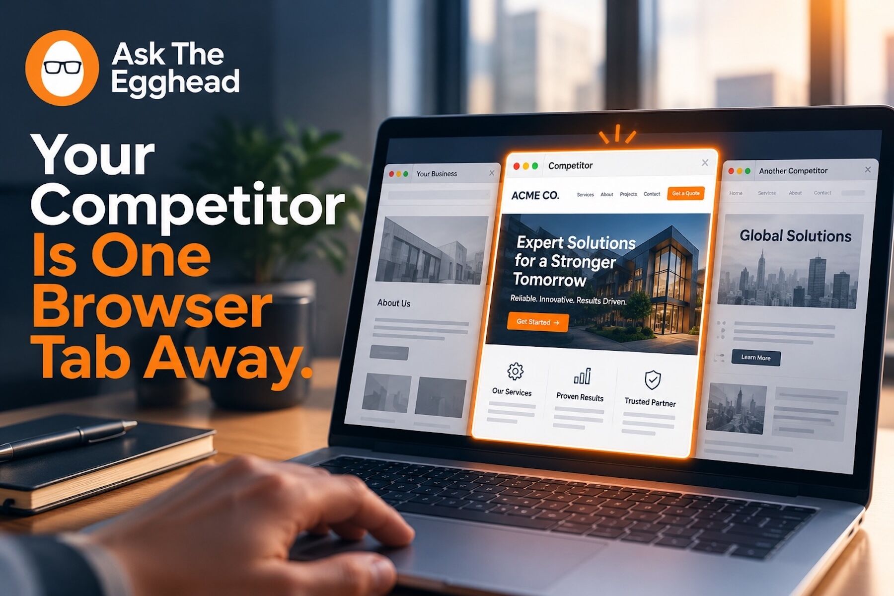
People rarely visit a website in isolation. They search. They open tabs. They compare. They bounce back and forth between companies that all seem capable of solving the same problem.
And while you may think your website is being judged on its own merits, your customer is asking a much simpler question:
Which one feels like the safest choice?
That decision can happen in less time than it takes to read this paragraph.
“Good Enough” Changes When Another Tab Is Better
Your website may be perfectly functional.
The logo is there. The services are listed. The phone number works. The contact form sends an email.
Nothing is technically wrong.
But “nothing is wrong” is not the same as “this makes me want to choose you.”
That distinction matters when a competitor is one click away.
If their website loads faster, explains the service more clearly, feels more current, or makes the next step easier, your customer notices—even if they can’t explain exactly why.
Online, people don’t always choose the best business.
They often choose the business that makes them feel most confident.
Your website plays a major role in creating that confidence.
Every Second of Confusion Costs You Attention
Imagine a customer opens your website and sees a headline like:
“Delivering Innovative Solutions for Tomorrow.”
What does that actually mean?
Now imagine the next tab says exactly what the company does, who it helps, and how to get started.
One site makes the visitor think.
The other makes the visitor understand.
That difference is enormous.
Customers are already trying to make a decision. Your website should reduce their uncertainty, not add to it.
If someone has to dig through your navigation to figure out what you offer, search for basic pricing information, decode industry jargon, or hunt for a way to contact you, the next tab starts looking more attractive.
Not because the competitor is necessarily better.
Because they’re easier to understand.
Slow Feels Like Uncertainty
Speed creates another invisible comparison.
Your page loads.
Then another image.
Then a script.
Then a banner moves.
Then the button finally appears.
Meanwhile, the competitor’s website was ready five seconds ago.
Those few seconds may not seem significant inside your office.
To a customer with multiple tabs open, they can feel like hesitation.
A slow website can unintentionally communicate neglect, complexity, or lack of attention to detail.
A fast, smooth experience feels deliberate.
And when customers don’t know either company personally, those impressions matter.
Trust Is Built From Small Signals
Visitors are constantly collecting clues.
Does the website look current?
Are there recent testimonials?
Is the contact information easy to find?
Does the site work properly on a phone?
Are the photos authentic?
Is the content useful?
Does the company sound like it understands the customer’s problem?
None of these things proves that one company is better than another.
But together, they influence perception.
And perception is often what determines which company gets the call.
Try the Four-Tab Test
Here’s an exercise every business owner should try.
Search for the service you provide.
Open your website and three competitors in separate tabs.
Then compare them as if you knew nothing about any of the companies.
Which one explains itself fastest?
Which one feels easiest to trust?
Which one looks best on your phone?
Which one answers the questions you would have as a customer?
Which one makes taking the next step obvious?
And then ask yourself the question that matters most:
If your website didn’t belong to you, would you keep the tab open?
That answer can be uncomfortable.
It can also be useful.
Your website doesn’t need to be flashy. It doesn’t need to follow every design trend. It doesn’t need to impress other web designers.
It needs to make a potential customer feel that choosing your business is simple, sensible, and safe.
At Ask the Egghead, we help businesses build, manage, host, and improve WordPress websites that compete for attention where it actually matters: in the browser, beside everyone else.
Your next customer may already be comparing you.
Make sure your website gives them a reason to stop clicking through the other tabs. Contact Ask the Egghead and let’s make your site harder to leave.