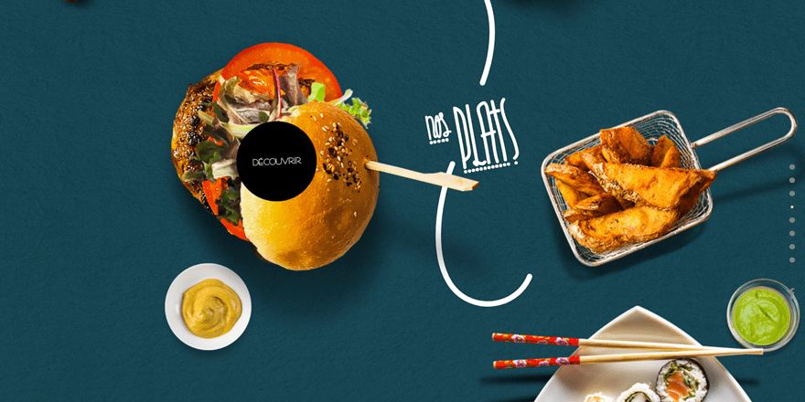
Having a good restaurant menu design on your website is as important as having a good menu on the spot, if not more important. You’d be surprised how many people visit a restaurant’s website before planning on making a reservation. It’s only logical that the menu page on your website will be the most visited page since that’s what a restaurant is all about; the food and the drinks. How you present this page, and how tasty you make your assortment look, will play a crucial role in the success of your website. If you’re planning on creating a website for your restaurant, or for a client’s, this post might help you gain inspiration. We’ll be showing you 12 examples of great existing restaurant menu design on the web. Let’s get to it!
1. Mugs
We’re going to start off with the awesome restaurant menu design of Mugs. The menu on this website is nothing like you’ve ever come across. Besides the awesome visuals, there are also effects on scroll that literally guide you through the assortment. This website shows clearly that you don’t have to stick with what’s expected from a menu. You can make the menu match your restaurant’s brand and attract various audiences. When clicking on a type of food, instead of being redirected to another page, you’ll see a slider popup appear that’ll make it very easy to discover the other food types as well.
2. Ruxbin
Next, we have the Ruxbin restaurant menu design. This menu design of this one-pager is super clean and elegant, something which matches the company’s branding and the rest of the website style. Although this menu looks like a menu you can come across on other websites as well, it simply makes more sense than it does elsewhere because of the overall feeling you get on the website. There’s also this subtle effect on scroll that makes the menu appear when you come across that part of the page. This website is enjoyable to scroll through and the menu provides visitors all the information they need elegantly.
3. Quay
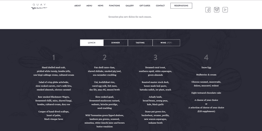
Then, we also have the Quay restaurant. Quay has found a different and intriguing way to approach their menu. Instead of mentioning everything in one big part, they use tabs instead. These tabs are divided into the different types of meals. This definitely makes it easier for people to navigate and see if the menu fits their taste. Once they click on one of the types of meals, they are immediately informed by the different courses they can choose from.
4. Smokey Bones
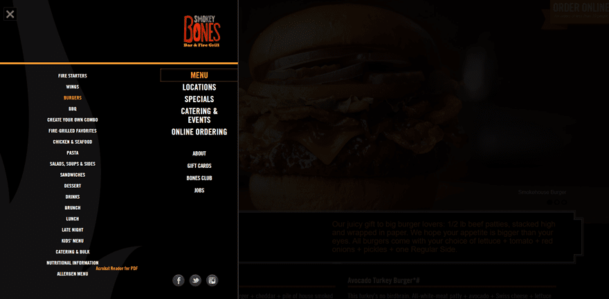
A website with a different approach to their restaurant menu design is Smokey Bones. They’ve chosen an interesting way to share all the different types of food they offer by using them as submenu items and allowing visitors to find what they’re looking for in a few clicks. People can also directly go to the general menu page where the food types are beautifully presented and easy to navigate through.
5. Backyard Burgers
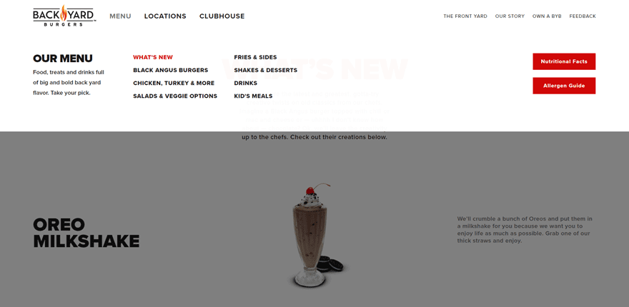
Moving on, let’s take a look at the website of Backyard Burgers restaurant. The menu items in this example are presented in a very clean and way and manage to differentiate themselves from other restaurant menus out there. One of the things that brings a lot of added value is the photography. The high-quality images match the web design perfectly and make the menu not only very informative but also attractive. Other than that, they’ve decided to keep it clean, use very readable fonts and add a short description that’ll speak to your imagination.
6. Colonia Verde
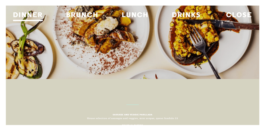
You can find another nice restaurant menu design on the website of Colonia Verde. One of the best things about this menu is the division between the different types of meals. You can choose whether you want to view the menu for dinner, brunch, lunch or drinks. Although it might seem like these are individual pages, the menu is just a slider that’ll allow the visitors to easily navigate through the different menus without having to load a page each time.
7. Benito’s Hat.
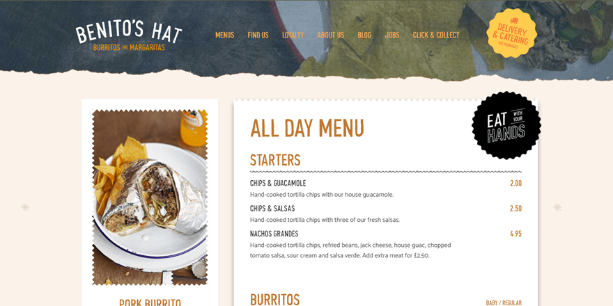
Another original example in our list of restaurant menu design is Benito’s Hat. The menu design they’ve used is very easy to follow and looks just great on their website. If you choose one of the menus, the first thing you’ll notice is the choice they recommend on the left side of the page. This recommendation keeps following you through the page while you are looking through all the options within the menu. They’ve definitely managed to bring a stunning menu with a good user experience into their website.
8. Noodle Bar
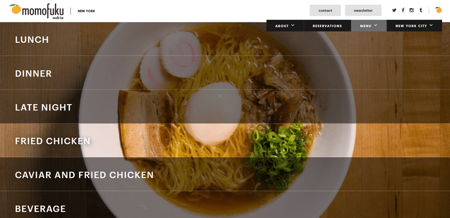
Next, we have the Noodle Bar by Momofuku. Noodle Bar is one of the many places Momofuku owns and if you look through all their websites, you’ll notice that they use the same design through them all. The menu design is highly visual and has an interacting factor as well. When hovering a type of meal, the area will get lightened up.
9. Boston Market
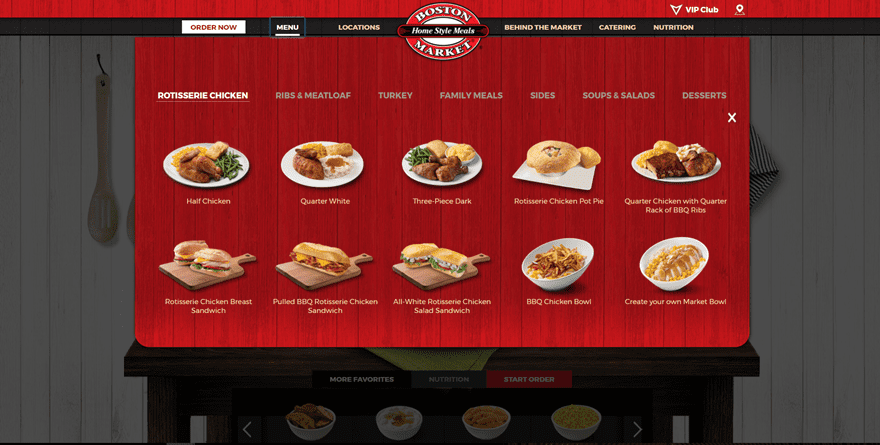
Or what about the Bostom Market menu design? The overall website design is loyal to the branding of the company itself. When clicking on the menu, submenu items appear with different plates per category which helps the visitors navigate easily through the different food types, without having to open multiple pages.
10. Giraffe
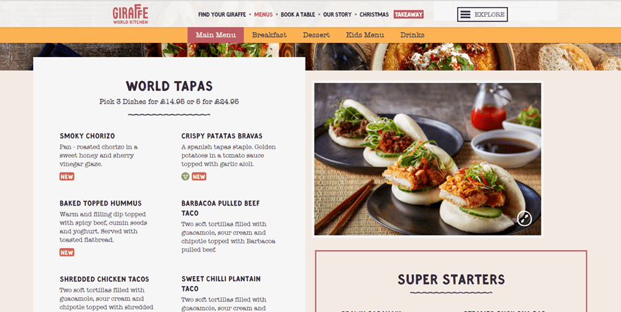
Up next, we have the Giraffe restaurant menu design. You can clearly notice that it is in the same style as the Benito’s Hat menu design we’ve seen earlier in this post. They’ve divided their menu into five categories; main menu, breakfast, dessert, kids menu and drinks. Each one of those maintains the same style in design and allow the visitors to have all the information they need in one place while being presented beautifully.
Made with Divi
11. Tuttas
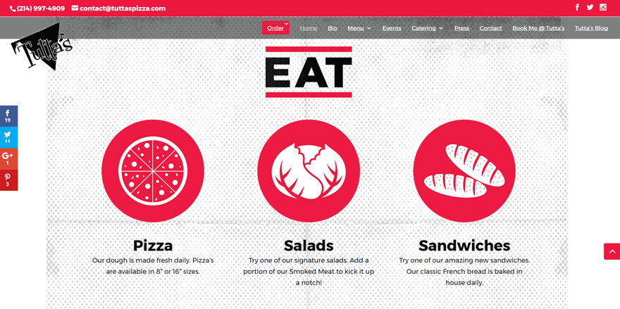
The first awesome restaurant menu design made with Divi is Tuttas. Like many menus we’ve seen up until now in this post, this website makes it easier for its visitors to look through the different types of food by dividing them into different categories. They manage to pull the attention by allowing people to immediately go into one of three types of food they offer; pizza, salads and sandwiches. Once in the menu page, you can easily observe the choices you have within that category. However, you don’t have to go back and click on another food type; all the choices are placed in one place, by clicking on a food type you’ll simply get redirected to that part of the menu page.
12. Ferdinand’s Eetlokaal
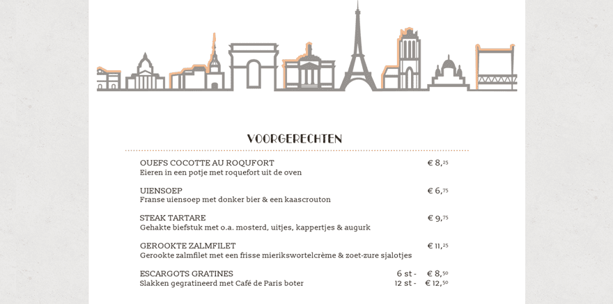
Another great website made with Divi, and the last restaurant menu design in this list, is Ferdinand’s Eetlokaal. Their restaurant menu design is pretty simple yet gives you a personalized feeling. There’s a nice balance between a good color choice, illustrations and matching font families. This type of menu is probably the most standard type of menu in this list, but that doesn’t take away that it looks good and gives enough information to the visitors.
Final Thoughts
In this post, we’ve shown you some great restaurant websites that have beautifully presented their restaurant menu. These examples are a great inspiration for people who are looking to take their own restaurant website to the next level. If you have any questions or suggestions; make sure you leave a comment in the comment section below!
Be sure to subscribe to our email newsletter and YouTube channel so that you never miss a big announcement, useful tip, or Divi freebie!
Featured Image by sergio34 / shutterstock.com
The post 12 Tasty Examples of Restaurant Menu Design on the Web appeared first on Elegant Themes Blog.