
Fullwidth Image Galleries always seem to look great on a website. A fullwidth gallery spans the full width of the browser window. Theis extra space allows the images to keep a larger size which is great for the user experience. And the grid layout provides an aesthetic design that organizes images into columns that will adjust nicely on all browser widths.
In this tutorial, I’m going to show you how to create a Fullwidth Image Gallery with the Divi Gallery Module. You may be surprised just how easy this is to do in Divi. I’ll also mention a couple of ways you can use custom spacing to give you more control over your fullwidth gallery on mobile.
Let’s get started.
The Before and After
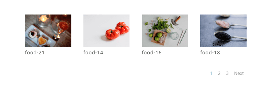
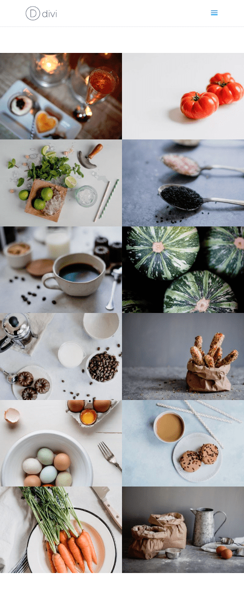
Here is the default Divi Gallery Module with 12 images.
Here is an example fullwidth image gallery you can easily create.

Preparing Your Design Elements
For this tutorial, you will need the Divi theme installed and active. You will also need 12 images added to your media library to be used for the building the image gallery. For a Divi gallery module using a grid layout, the size of your images should be around 1500px by 800px if you plan on your images opening up in lightbox display so that it fills the screen nicely on most desktops.
For this tutorial, I’ll be using images from the Restaurant Gallery Page premade layout which is available for free from within the Divi Builder. You can download all the images at the bottom of this post.
Implementing the Fullwidth Divi Gallery Module
Setting up a New Page
For starters, create a new page, give your page a title, and deploy the Divi Builder. Select the option “Build from Scratch” and then publish your page. Then click to build on the front end.
Creating the Image Gallery
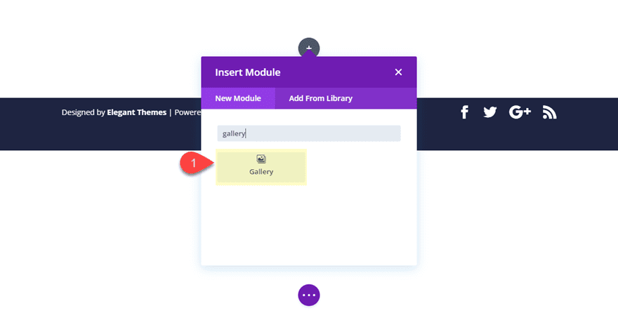
With the Divi Builder deployed, go ahead and create a new regular section with a one-column row and add a Divi Gallery Module to the row.
Divi will populate the gallery module with some images from your media gallery in a grid display like the following:
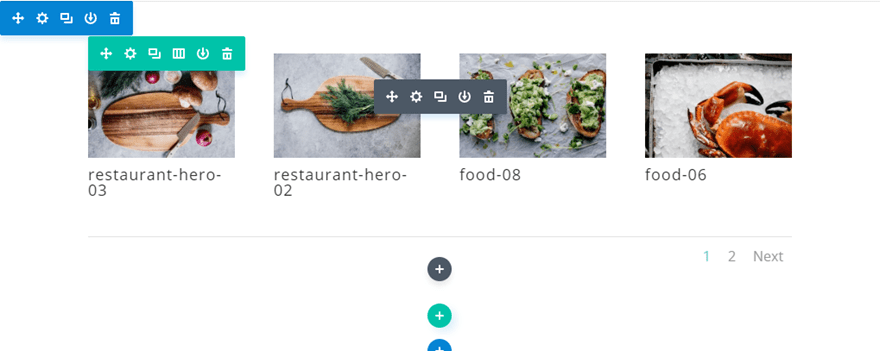
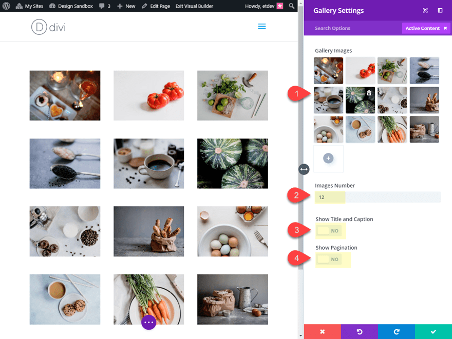
In the Divi gallery module settings, click the gray plus icon to add 12 images to the gallery.
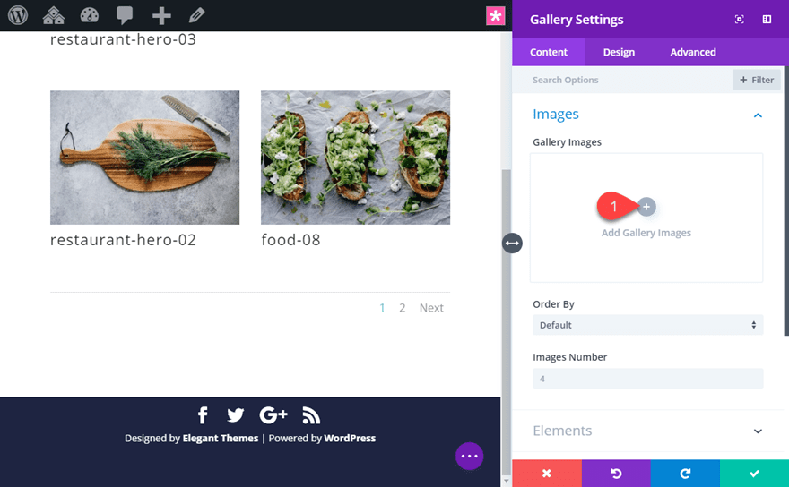
Then update the Divi Gallery Module settings as follows:
Images Number: 12
Show Title and Caption: NO
Show Pagination: NO
Creating a Fullwidth Layout for the Image Gallery
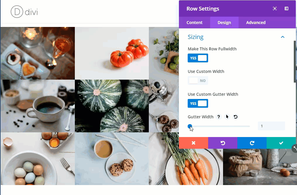
To create the fullwidth layout for the image gallery, let’s save our gallery settings for now and open the row settings. Under the design tab, update the following:
Make This Row Fullwidth: YES
Gutter Width: 1
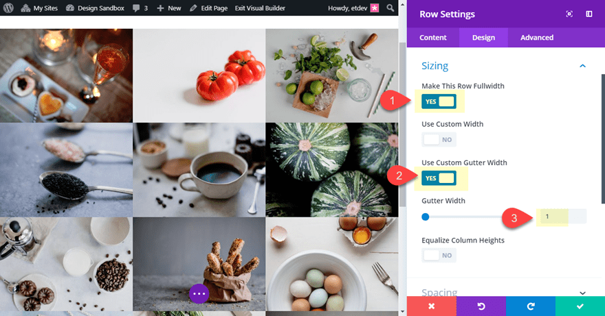
This is the easiest way to get a fullwidth image gallery up and running. Choosing to “Make This Row Fullwidth” in combination with setting the gutter width to “1” will make the gallery span the fullwidth of the section (on all browser sizes) and take out the spacing between the images.
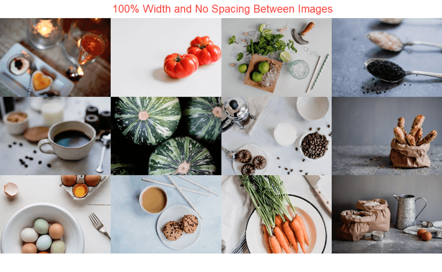
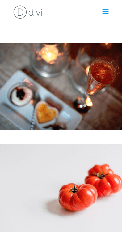
And the gallery will continue to span the fullwidth of the page on mobile as well.
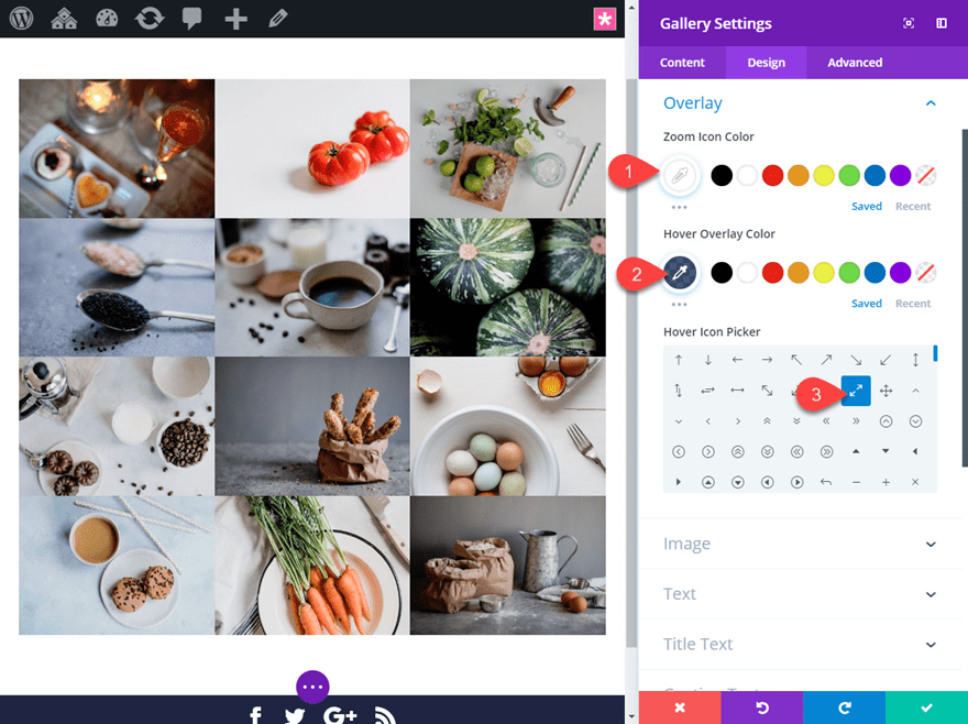
Customizing the Image Hover Overlay Options
To complete the design of your fullwidth image gallery, it helps to customize the image hover overlay options that are built in to the Divi Gallery Module settings. You can change the zoom icon, icon color, and overlay color. To do this, open the Gallery settings and update the following:
Zoom Icon Color: #ffffff
Hover Overlay Color: #333d48
Hover Icon: see screenshot
Now let’s check out the final design.
More Fullwidth Image Gallery Spacing Options
Creating a Fullwidth Layout with Gutter Width Spacing
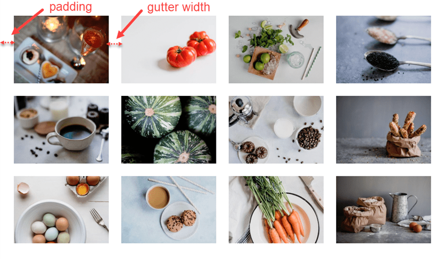
The easiest way to customize the spacing between your images in the Divi Gallery Module is to adjust the gutter width of its parent row. Gutter width refers to the spacing between columns. With any Divi Row element, the optional values for gutter width range from 1 to 4.
1 represents zero margin between columns.
2 represents a 3% right margin between columns.
3 represents a 5.5% right margin between columns.
4 represents a 8% right margin between columns.
Since we are using the Divi Gallery Module, gutter width also refers to the spacing between gallery items. So adding gutter width to the row will adjust the spacing of the gallery items/images in the Gallery Module.
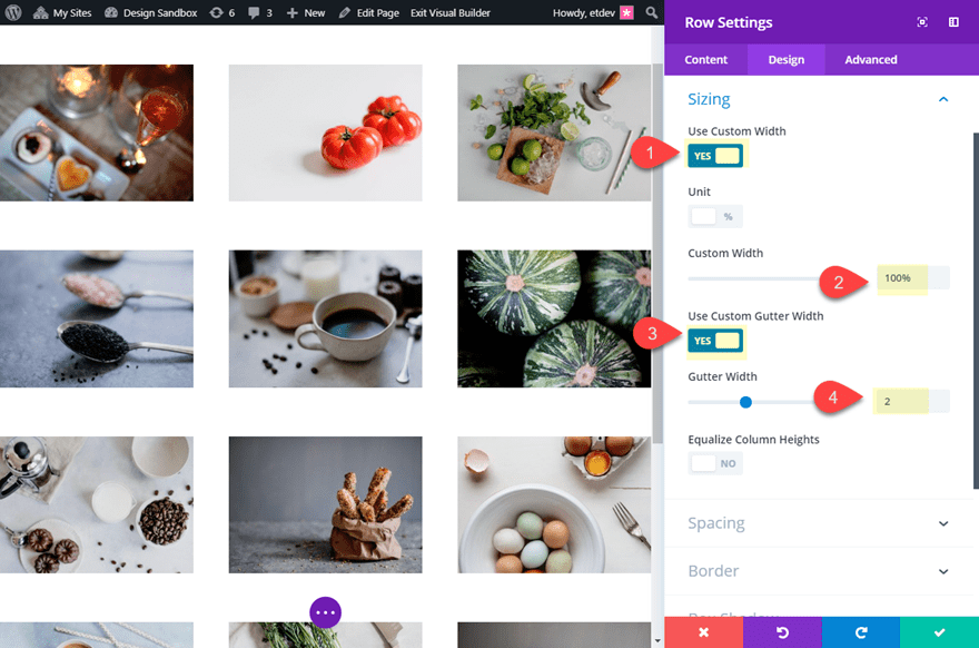
Using Custom Width for More Control Over Spacing on Mobile
If the “Make This Row Fullwidth” option is set to YES and the Gutter width is 2 or more (anything but 1), Divi will automatically adjust the width of the row to provide additional outer spacing. This is necessary because the gutter width only applies to the spacing between the columns/gallery items and not to the row itself. However, this may add more margin spacing than you want on mobile. For example, if you have the “Make This Row Fullwidth” option active with a 2 Gutter Width, the actual width of your row will be 89% on mobile (not 100%). So if you want the row to span to a 100% on mobile, you can use the Custom Width option instead. By giving the row a custom width of 100%, the width of the row will remain 100% regardless of the Gutter Width value. Now you can simply add the outer spacing for the row using row padding. This will give you more control of the outer spacing on desktop, tablet and smartphone.
Here is an example of how this would work. Open the row settings and update the following:
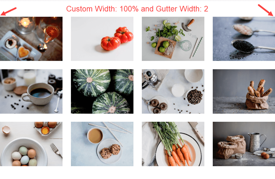
Custom Width: 100%
Gutter Width: 2
Notice how there is no margin on the right or left of the gallery.
Now add the following custom padding to the row:
Custom Padding (desktop): 5% top, 5% bottom, 5% left, 5% right
Custom Padding (smartphone) 5% top, 5% bottom, 0% left, 0% right
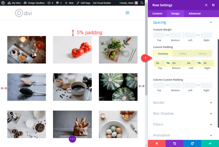
The 5% padding on desktop (and tablet) will provide the outer spacing we need to match the spacing between gallery items.
And by taking out the right and left custom padding for smartphone, the images will span the fullwidth of the browser, giving the images more visibility.
Adding Custom Spacing to Gallery Items without Gutter Width
If you want to gain even more control over the spacing of your Divi Gallery Module, you can actually add your own custom spacing between gallery items instead of using Gutter Width. To do this, you would need to set the gutter width to 1 and then add spacing between your gallery items within the Divi gallery module settings. For more info, check out the full tutorial on Using the Divi Gallery Module to Create an Image Gallery with Custom Spacing
Learn More About the Divi Gallery Module
Check out the following tutorials for more ways to customize your Divi Gallery Module:
- 6 Unique Border Designs for your Divi Gallery Module Images
- Changing the Number of Columns in the Divi Gallery Module at Different Breakpoints
- Using the Divi Gallery Module to Create an Image Gallery with Custom Spacing
- How to Create an Image Gallery that Changes from Black-and-White to Color with Divi’s Gallery Module
Final Thoughts
Hopefully this tutorial will help you understand how to use the Divi Gallery Module to create some beautiful fullwidth image galleries on your next project. And don’t forget to explore all of Divi’s built-in design options and hover effects to make your image galleries stand out even more.
I look forward to hearing from you in the comments below.
Cheers!
The post How to Create a Fullwidth Image Gallery with the Divi Gallery Module appeared first on Elegant Themes Blog.