
The layout of your blog can have a huge impact on its success; you don’t want your site to be too cluttered, too busy, or otherwise unappealing to your site’s visitors. Enter masonry-style templates. They’re not your only option for a clutter-free layout, but the style can offer your site a unique and refreshing look. In addition, there’s enough flexibility to help you create a layout that matches your branding, regardless of your niche.
Fortunately, there are plenty of masonry style blogs across the web to inspire you. In this piece, we’ll highlight twelve examples, covering niches such as art, beauty, food, and more. Let’s take a look at each blog – in no particular order – highlighting their features and outlining their positives and negatives.
1. Curioos
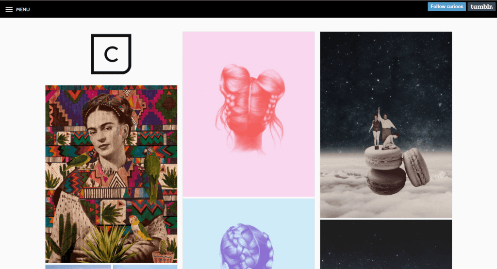
Curioos is an art prints blog, featuring work from the Curioos artist marketplace. With a clean design featuring a solid white background, a black header bar, and crisp text, this masonry-style blog focuses your full attention on each featured print – an important aspect of an image-heavy blog.
In addition to the masonry layout, the site also incorporates features such as a Pinterest button (which enables readers to share their favorite prints with a simple click), and infinite scrolling to help keep visitors wedded to the content.
2. The Blonde Salad
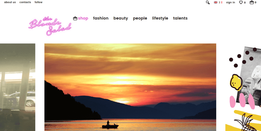
The Blonde Salad is a fashion, beauty, and lifestyle blog that incorporates non-bordered masonry tiles, instead relying on the natural image border width to separate and define content.
As you scroll, the branded header minimizes to reveal a smaller, static version. This calls attention to the scrolling slideshow, as well as the blog post layout underneath. Reaching the bottom of the page, you’re greeted by a more… option, loading more posts for you to peruse.
3. Hooked
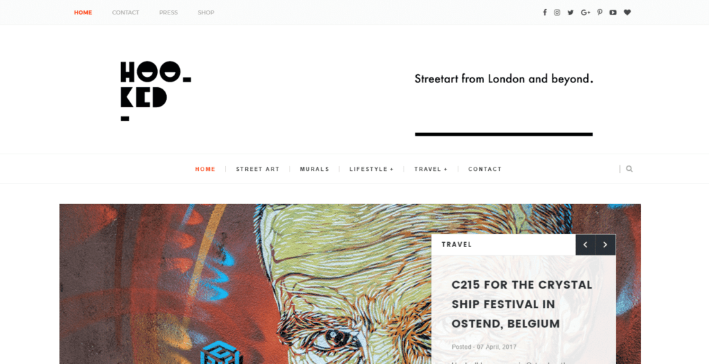
Hooked divides its content using thin, grey borders, cleanly separating each tile without taking focus away from the staggered layout. Opting for a white background with black, bold lettering, Hooked is similar to Curioos in that it depends on its artwork – street art in Hooked’s case – to add texture and depth.
To the right of the masonry blog post display, you’ll also notice a sidebar (not a feature that’s common on masonry style blogs) with the typical About Us, Follow Us, and Popular Posts sections.
4. Green Kitchen Stories
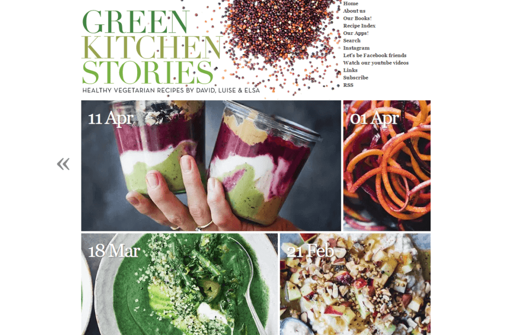
Green Kitchen Stories is – you guessed it! – a food blog, featuring a thin-width display and overlay text that displays on hovering over each image. These design elements enable the featured images to do the talking, and it provides users with a fresh pop of color and an easy-to-navigate site.
The tiles’ border width provides a natural division line, and the slim look contributes significantly to the site’s seamless display. Scrolling down displays a static Previous Posts arrow on the left-hand side, making it a breeze to navigate throughout the site.
5. OMFG. SO GOOD.
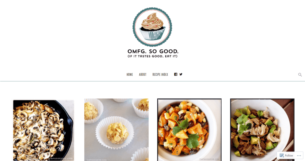
OMFG. SO GOOD. is a comfort food blog based on WordPress.com that leverages the masonry-style layout with a full-width display and infinite scrolling.
Each of the tiles is split into two parts – an image on the top, and text underneath – with distinct and separate outlines. As with the other featured sites here, OMFG. SO GOOD. also incorporates a white background, which helps the website appear clean and uncluttered.
6. Jam & Toast
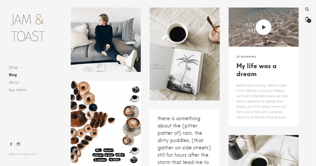
Jam & Toast – a poetry and design blog – utilizes a soft, grey background, static left-hand navigation, and image overlays to create a unique website with a masonry layout that stands out from the crowd.
As you scroll through the site, you’ll also notice a nifty back-to-top button in the lower right corner for ease of navigation. Jam & Toast is a good example of how versatile a masonry layout can be, and uses a mix of text and image tiles on the main page.
7. Polienne
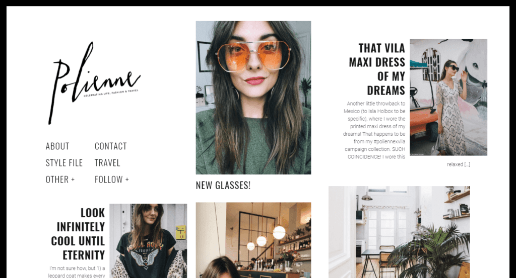
Polienne is a lifestyle, fashion, and travel blog that emulates style and simplicity with its full-width display and full-site black border wraparound. The site keeps things simple by incorporating a logo and menu in the top left corner, which seamlessly melds it into the masonry design.
Hovering over images reveals an information bar that includes the post’s meta information, and the clarity is improved with a greyscale overlay. While Polienne doesn’t use infinite scroll, it does use pagination – both via numbers, as well as Next and Previous arrows at the bottom.
8. Amanda Celeste
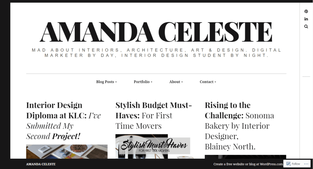
Amanda Celeste is another WordPress.com blog, this time focusing on interior design and style – the crisp and stylish design caught our attention, making it worthy of inclusion.
This full-width masonry style blog uses a bold header and static menu bar, and an unusual three-sided black border wraparound. As for the masonry layout, it’s similar to others featured in the list. Hovering over each image reveals a Read More text overlay, and thick content borders divide the tiles.
9. Vanity Teen
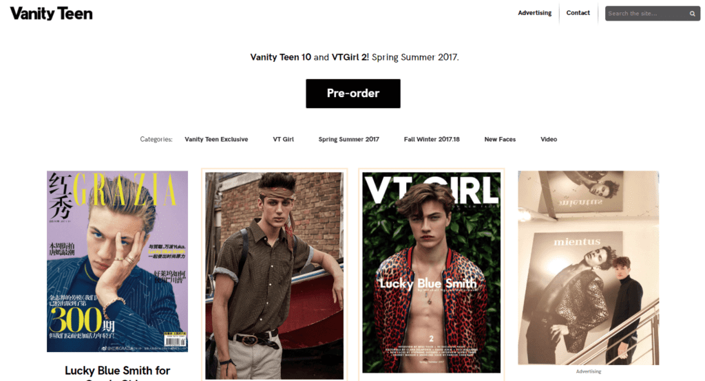
Vanity Teen offers the clean lines you’d expect from a teen style and fashion blog. It features a white background and black text, but also uses salmon pink borders to break up each masonry tile. While there’s no image hover effect or infinite scrolling, the design is an excellent example of the versatility that masonry style blogs offer.
Similar to many other sites, Vanity Teen includes a scrolling header. It also offers a ‘back-to-top’ arrow – just like Jam & Toast – which is an understated feature that’s important for user experience.
10. Alex in Feverland
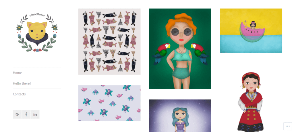
Alex in Feverland is another good example of a WordPress.com blog getting the masonry style right. With a focus on illustrative design, this website cleanly displays the author’s work, separating them with wide border widths and clean lines. The hover animations are smooth and pleasing, and the overlay simply showcases the name of each piece. It’s an excellent showcase of minimalism, as well a masonry layout.
Finally, the site incorporates a static left-hand sidebar that includes a logo, sparse navigation, and three social media buttons. Overall, it’s understated and gorgeous to look at.
11. Jeff Hawe
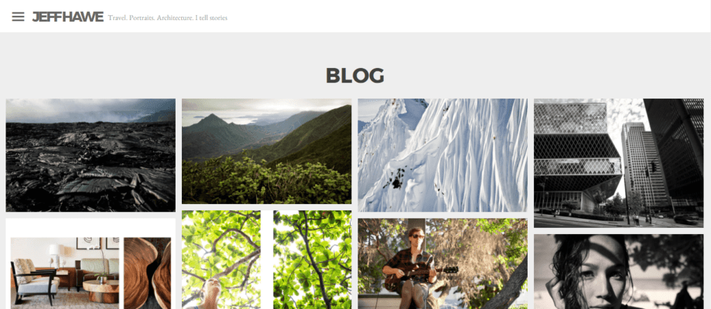
Jeff Hawe is a photographer specializing in travel and architecture. His blog uses bold typography, but not at the expense of his work. It uses tight borders to separate each image, which could make things feel cramped, but instead enables the images to appear as a cohesive whole.
Like a few of the other sites mentioned in this list, infinite scroll is used to help keep the reader on-site – a classic technique for retention.
12. Juule Kay
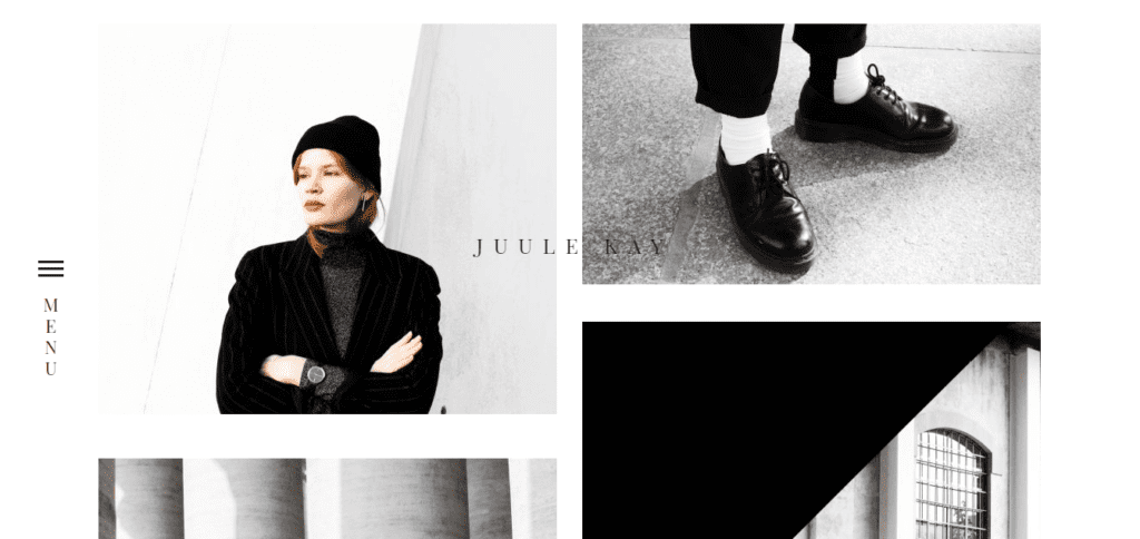
Our final masonry style blog is Juule Kay, a fashion blog that’s arguably the most image-heavy blog on this list. There’s little text on display, and the variable image size and chunky natural borders to help generate space.
The website incorporates a simple left-hand menu bar and features infinite scroll – the animations here are smooth. Hovering over images displays a white box with black text, in keeping with the rest of the design. All in all, this site is a good example of cohesion in design. Even the featured images have similar color schemes, which further showcases the beauty of masonry style layouts.
Conclusion
Regardless of your niche, there are two main elements that every blog needs to incorporate – style and functionality. The former heavily impacts on the user’s experience, and determines how content is delivered and consumed. Functionality also lends itself to a better reading experience and can even boost your blog’s search engine rankings.
As we’ve shown, masonry style blogs deliver content in a cohesive and functional manner. In addition, a masonry layout can offer flexibility, making it an excellent option for bloggers across a variety of niches. No matter what look you’re going for, there’s sure to be a style here that inspires you!
What are some of your favorite elements of the masonry style blogs we’ve featured above? Let us know in the comments below!
Article thumbnail image by tovovan / shutterstock.com.
The post 12 Stunning Examples of Masonry Style Blogs appeared first on Elegant Themes Blog.