
With WordPress, the sky is the limit. There are all kinds of WordPress themes and plugins out there that help us take the first step towards a brand new and surprizing website.
In this post, we’re happy to give you a taste of what is out there. We’re going to share 14 different websites that are made with WordPress as their content management system. Although each website might be a different type, they do have one this in common; they’re all amazing website designs that leave a great impression on you.
1. Crazy

The first website design in the list, Crazy, lives up to its name since they have a crazy good-looking website. The company behind the website is located in Japan and have truly managed to reflect their creativity on their website. In overall, the website is pretty clean and uses the white color to reflect their elegance and simplicity. One of the nice touches that they’ve added is the social media icons on the right side of their website. Another thing they’ve done a great job at is making use of a fullscreen menu that divides itself in two when you open a menu item that contains sub menu items. The last thing worth mentioning is the excellent effects on scroll they’ve included for almost all the elements on their website.
2. Bonne Marque
Moving on, we’ve also put Bonne Marque on the list of amazing website designs. This website isn’t anything like the typical website you often see around. One of the first things you’ll notice when visiting the website is the sound effects that go parallel with the movements and actions you take on the website. Although the homepage consists of many special effects, they’ve kept the content sober. They start their homepage with a hero section that shows what their company and website is about. The next part of the homepage (and the last part as well) showcases the case studies the company has. Instead of telling people what they’re about, they’ve decided to show them without overwhelming them with promising content.
3. Digital Smile Academy
Up next, we have Digital Smile Academy. A website that did a great job at representing their added value through visuals all over the website. The hero section, for example, contains a video that reflects the values and approaches the company has when they’re providing their services. Like the Crazy website, this website decides to subtly showcase the social media icons on the left side of the website. Besides that, the website also uses effects on scroll for most of the elements within the website. The last thing worth mentioning in this short summary is the fullscreen menu that is, unlike most fullscreen menus, horizontally presented. Each menu item is a chapter and when hovering over the item, you’ll see a background image appear that emphasizes the fact that you’re choosing one of the 10 existing menu items (including the submenu items).
4. Ghost Horses
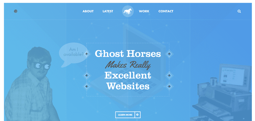
The next website in the list of amazing website designs is Ghost Horses. Ghost horses is a website dedicated to a web design company located in Manchester. Although at first sight this website looks a bit more simple than the other ones, it has a thought-through and elaborated website structure. The different sections on the homepage, for instance, are very nicely divided. You can notice that every section is marked with an icon that immediately gives you a heads up on what the section will be handling. Besides, every section on the homepage has a subtle but value-adding particle background that makes it okay to use simply-designed elements within those sections.
5. Coraline Colasse
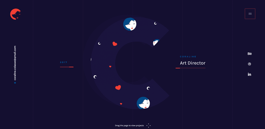
The Coraline Colasse website is one of the most interactive website designs in the list. In order for people to discover all the content on the homepage, they’ll have to participate in another way than just scrolling and clicking. As mentioned at the bottom of the page, you can drag the page to see projects. Since people are not used to this form of navigation, the attention span will be larger on the content provided when dragging. The content they provide on the homepage is focused on their biggest asset; the previous projects. They’ve also made use of a fullscreen, and slightly transparent, menu. Besides including the menu items, they’ve also added some introductory text that helps the visitors navigate through the different pages of the website.
6. Doze Studio
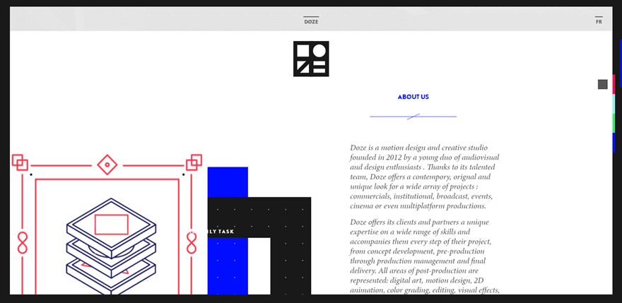
The sixth website in the list, Doze Studio, is probably the most complex-looking website of them all. The website is dedicated to a design and creative studio located in France. The website is a one-pager that contains four anchor links in the navigation leading to an about section, team section, clients section and contact section. All the needed sections provide the visitors with enough information. The website contains complex and intelligent-looking effects that showcase a part of what the company can achieve.
7. Yoke
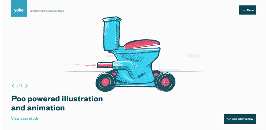
Up next is Yoke. The homepage of Yoke uses very clean colors that make the website and company behind the website look professional. The animations used on the homepage, however, bring up the playful and creative side as well. When we take a look at the hero section, we can notice its structure is not one you come across that often. Instead of making the elements centralized, they rather chose to place the animation in the middle and all the rest of the elements in the corners. Something which makes it easy for the visitors to navigate through the different options they have. When you scroll down further, you’ll notice that they use different sort of boxes to represent the content they’re providing.
8. Creano
Moving on, we’re going to take a look at Creano, a digital craft studio located in France. When opening the website, they immediately request interaction with the website by asking to enter the website through the launcher. Once you enter the actual website, another thing that immediately catches people’s eye is the mutual background between sections. This emphasizes the storytelling process they want to give to their visitors. Besides, they also use a floating effect throughout their website that adds perspective to it. Something that surely does it job at giving people a reason to explore the content. When clicking on the menu item, instead of opening an overlay, a new page with the same layout gets loaded and the menu items are shown there.
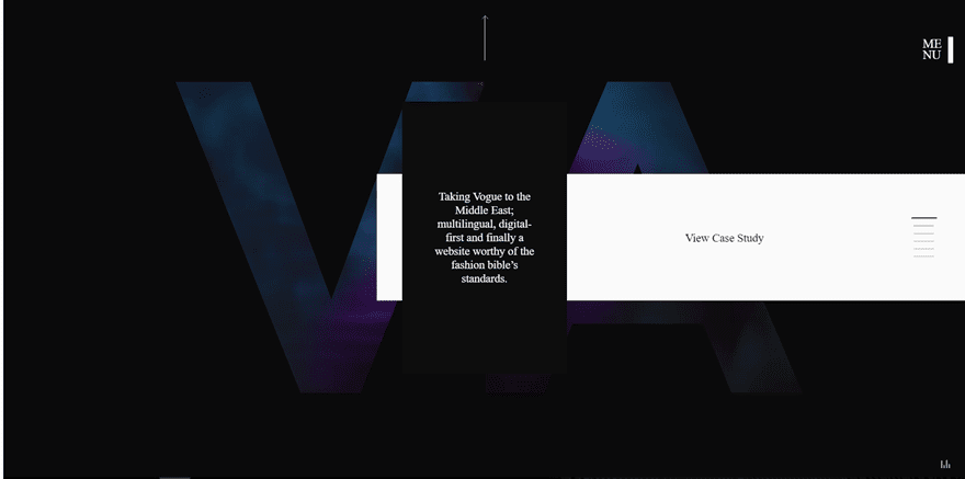
9. Victoria Spicer
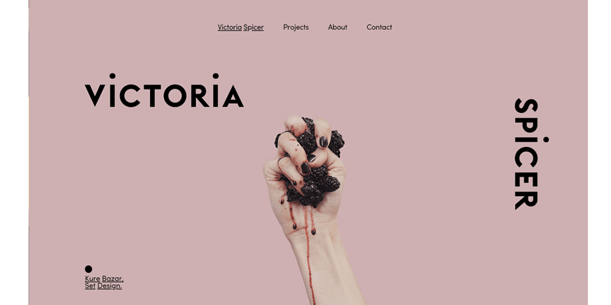
Another website on our list of website designs that left its impression on us is Victoria Spicer, a set designer located in London. The website that she’s made is quite impressive, especially when considering the fact that it’s a website that represents the services and projects of one individual. The website has a nice balance between a sober and clean look and some awesome effects that highlight the content that’s being provided. In the hero section, for instance, Victoria Spicer found a nice way to let people explore the different slides. When hovering over the right side or left side of the hero section, an arrow shows up as a cursor. Besides all this, she also used excellent effects on scroll.
10. Portal Kandydata

Another very nice website in our list of amazing website designs is Portal Kandydata. This website brings storytelling to the next level. By holding your click on the hero section, you’ll get shown around in a story. The end of the story leads you to the homepage eventually. It’s definitely a nice way to interact with the visitors. However, if you want to skip the story, you can immediately go to the thing you’re looking for in the menu. The website is designed by Superskrypt, a polish web design company that we’ll handle further down this post as well.
11. VR Arles Festival
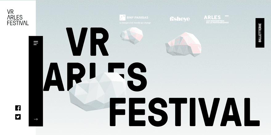
The next one of our chosen website designs is VR Arles Festival. VR Arles Festival is a French website as well (the French are doing a pretty good job, aren’t they). The website is dedicated to a VR festival and the first thing that catches our eye is the use of 3D animation in the hero section. It gives that extra little touch to the website and it’s in line with what the website is about; which is virtual reality. Besides that, they also have a nice slide-in menu that doesn’t cover up the whole height of the website but rather just a part of it.
12. Superskrypt
Then, we also have Superskrypt, a creative agency based in Poland. Two of the services they offer are branding and brand websites. Superskrypt is also the creator of the Portal Kandydata website that we’ve showcased in this post as well. They have a dark-colored website with a very simple hero section. Although, it’s simple, it’s effective as well. They provide their audience with some simple tag lines before moving on to the fancy part of the website. There, they cut to the chase by providing their written content in a to-the-point way and decorating it with nice background effects.
Made With Divi
After showing you some website that are made with WordPress in general, we also want to include two stunning-looking websites that are made with WordPress and Divi at the same time.
13. Popla Bellingen
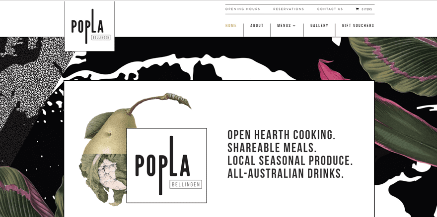
The fourteenth website in the list and first Divi website worth mentioning is the Popla Bellingen website. The hero section of this website immediately catches our attention. It’s a nicely combined section background with a white background used for the row. Besides including a tagline and fitting image, the hero section of this website also contains some basic information that makes it easy for people who are looking for contact details to get in touch right away. Another remarkable thing about this website is the overlapping logo in the primary menu in combination with the menu items. The last thing worth mentioning is the slider at the end of the homepage that contains Instagram images.
14. Family Dynamics Assistance Center
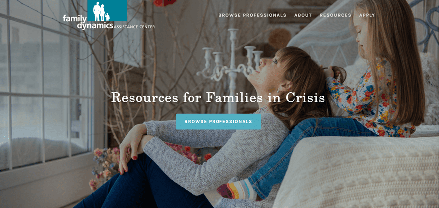
The last one in the list and the second website made with Divi is a website dedicated to the Family Dynamics Assistance Center. This site matches the services they offer perfectly with the look and feel of the website. The website uses soft and serious colors that combine nicely with the different special designs used within the website. Besides that, the different effects on scroll help bring the message and share the serious content in an interactive and structured way.
Final Thoughts
In this post, we’ve shown you some amazing website designs that are out there. All the designs that we showcased were made and empowered by WordPress. These website designs are an excellent way to get inspired for your own website or for a next project you might have. If you have any questions or suggestions; make sure you leave a comment in the comment section below!
Be sure to subscribe to our email newsletter and YouTube channel so that you never miss a big announcement, useful tip, or Divi freebie!
Featured Image by 32 pixels / shutterstock.com
The post 14 Amazing Website Designs Made With WordPress appeared first on Elegant Themes Blog.