
An interesting services page is crucial for doing business online. It shows the visitor what you do, how you do it, what it’s like doing business with you, and helps gives them a realistic expectations. Service pages come in all types of designs. In this article we’ll look at 14 Divi websites with interesting services pages to help inspire you for your next Divi design.
Service pages typically include elements such as pricing tables, blurbs, toggles, images, video, and calls to action. I’ll show an image of the section I like and discuss what I liked about it. The websites are in no particular order. Hang around until the end for a few links to help you level up your own unique contact page.
1. Bristol Roofers
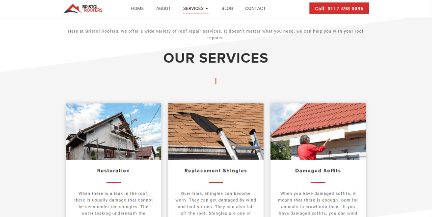
This site displays services within cards that use box shadow effects. They show an image, title, divider, and text. The two-color background divides diagonally behind the title, giving it an interesting design that also doesn’t take away from the foreground. Full-width images are angled to match. The Why Us section uses red titles while using dividers to create quadrants. The Process section is numbered with an alternating layout against a large image that’s styled to match the site.
2. Landcore Consulting
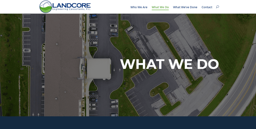
This site uses a large image in parallax behind the title. Services are displayed within boxes that include green borders and icons to match the site’s branding. Each of the services also get their own individual sections with each section divided by an image in parallax and wavy section dividers.
3. Doshii
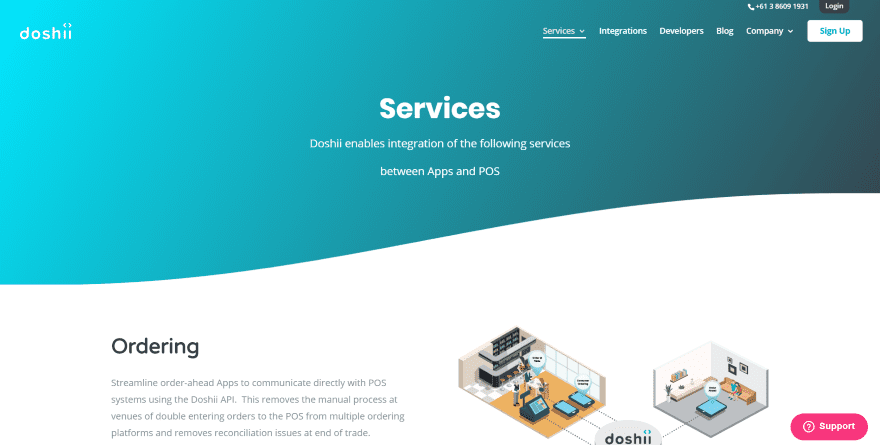
This site uses alternating sections that include a blue gradient or white background – each with a wavy divider. Each section displays a service with text and graphics and their layouts alternate from one side to the other. A final CTA use box shadows and button shadows. The site makes great use of color and shadow effects.
4. First Five Eight
This one displays a two-column diagonally split screen with CTA on one side and icons of services on the other. The next section has a four-block graphic that steps through the process, showing the relationship of each step. A full-width section shows goals with green icons and white text over a black background and buttons with hover effects. Stats and contact sections match this design. Each of the steps get their own section with graphics and blurbs.
5. Ends + Stems
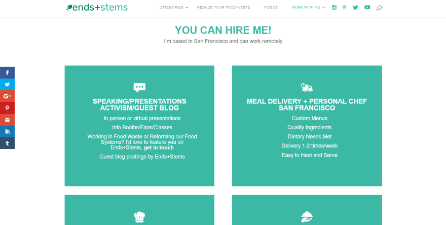
This page starts with full-width sections about the company leaders to help establish credibility. Services are displayed within green boxes with white icons and text. Following this is a styled contact form, social media call to action, Instagram feed with social follow buttons, opt-in, and an About section. This site uses some interesting color branding. I love the button hover effect that brings the button’s background within the buttons’ border on hover.
6. Stuart Johnson
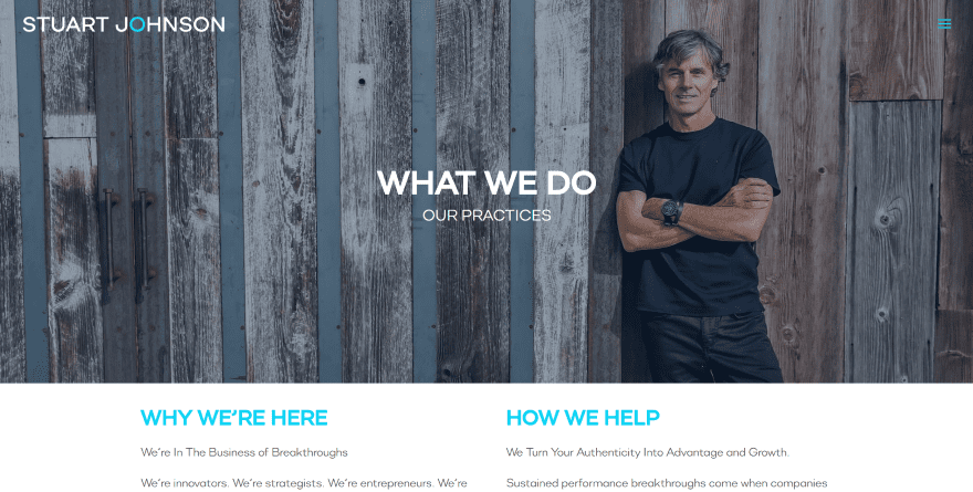
This site uses a full-screen background image in parallax with large title text to introduce the page. Introductory information text is provided in two columns. A 6-circular graphic describes their 6-P approach with a short description of each one. Practice Areas are introduced with a title in a short parallax section. The practice areas themselves are shown within toggles that are styled to match the site’s branding.
7. Web Nexus
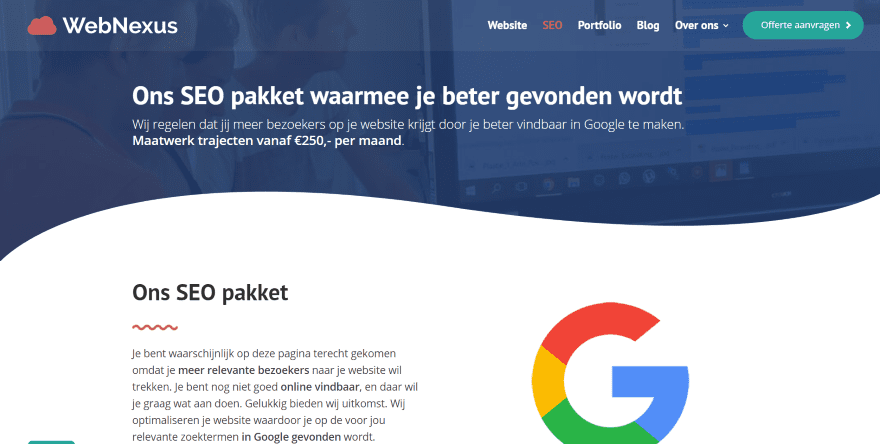
This site introduces the page with a title and tagline over a background with overlay. The next section shows the service for that page, using a wavy separator for the top and bottom of the section. Features for the service are provided in a table followed by a section to describe their method in three blurbs. A short case study includes a link to a detailed page for more information. Social proof is provided with customer logos.
8. Blue Cat Media and Design
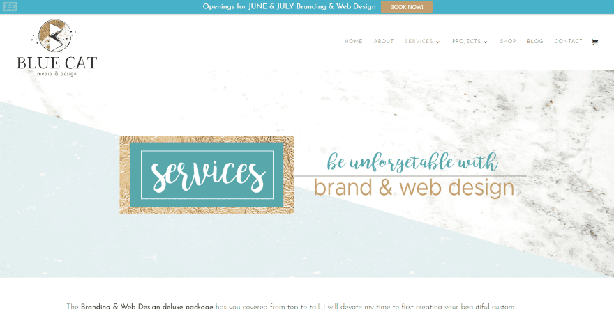
This site introduces the page with an elegant title and text over a patterned background. A section that shows what’s included provides information about the different services with text in the center and images in the outer columns followed by a description of addons with a CTA. A section about the journey steps through each portion of the process, numbering and providing detailed information about each one.
9. Flair-Designs
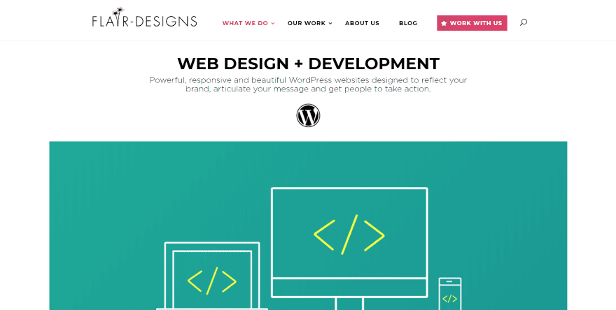
This one uses bold colors and introduces the services with individual blurbs that seem to combine into a single large blurb complete with icons, titles, and text for each one. Following this is a section that lists the services with a styled button to see the portfolio. Another section steps through the process with numbered titles and short descriptions. A bold red CTA includes a styled section divider, elegant text, and a styled button. I like the background patterns and colors in this page.
10. Zomlex
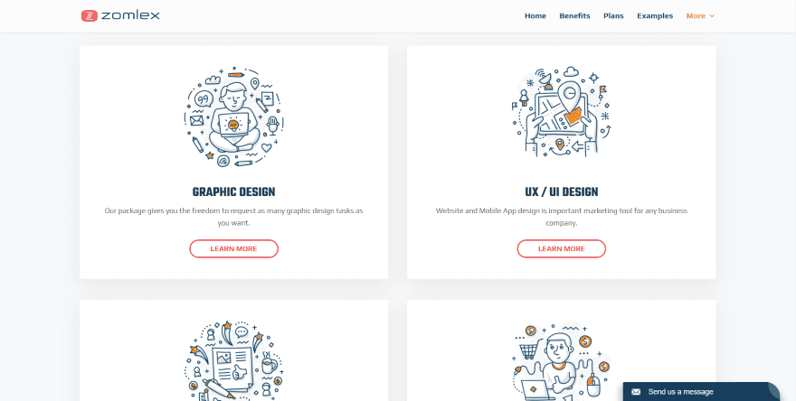
This one uses a clean design with lots of white-space. The page is introduced with a large title and short description. Services are shown within large blurbs using box shadows, hand-drawn graphics, titles, text, and styled buttons to the individual services pages. Following this is a full-width CTA that reverses the blue of white colors to stand out while retaining its elegant look. I especially like the graphics and colors.
11. Adverup
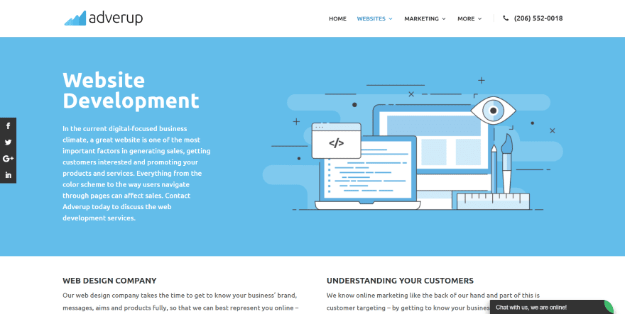
This site’s individual services pages are introduced with a title, description and graphic, followed by a description in two columns. Benefits are shows within a short full-width section with blurbs and hand-drawn graphics. Examples are shown within a full-screen image followed by blurbs that describe the process. CTA’s for quotes include tables to show what’s included. Another section highlights benefits next to a styled contact form.
12. RevolutionParts
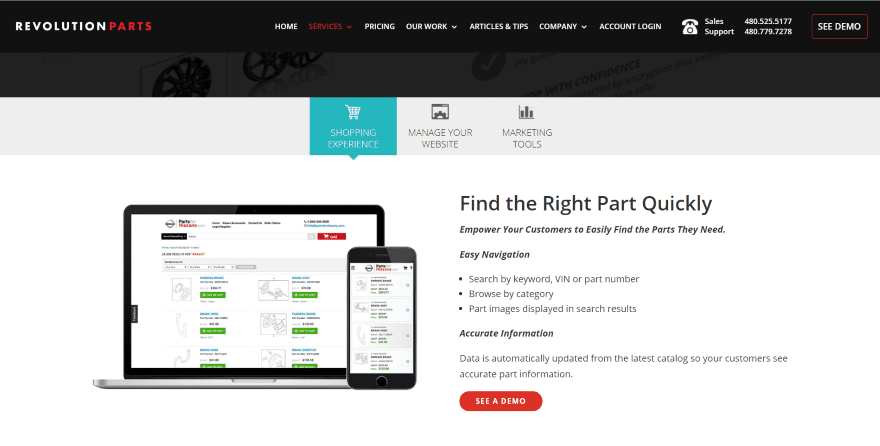
Each of this site’s services pages include a section with icons and a title that highlights difference features when clicked. The features themselves are displayed with images, descriptions, and a button to see a demo. The page ends with a blog section for articles that are related to that service and a final CTA that creates a nice footer. This page makes great use of color and white-space.
13. Panoramic Design
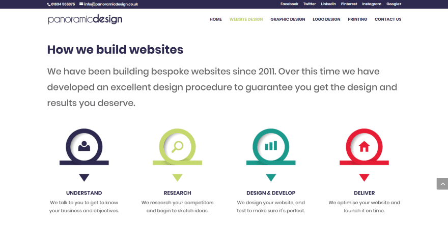
This page starts with a title and clickable phone number followed by a section that describes the benefits of working with the company. Blurbs provide a description of each service and include large icons, a title, a short description, and a nice shadow effect that appears on hover. A section for projects includes a hover effect that displays the name and read more link for each project. A section about how they build websites shows each step of the process with elegant graphics followed by information about payments and a section that includes a phone number and a contact form that’s styled to blend.
14. Elderly Care Law Firm
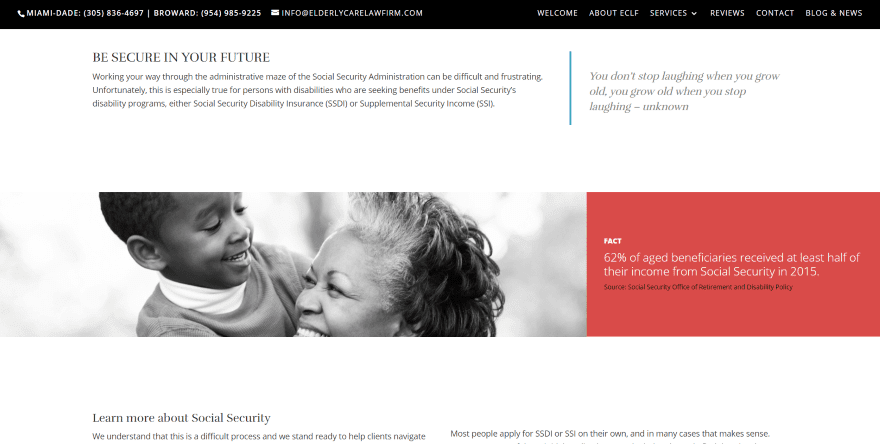
This site’s individual services pages are mostly text, but it presents it in an interesting way. Pages are introduced with a short, full-width, title over a background image. Following this is a section of text in two columns: the first column displays the title and description, and the second column is a quote that’s relevant to the topic. The quote’s vertical line works as a divider between the two columns. Another section displays an image in parallax with a block to the right with information. These blocks use interesting colors that stand out. More information is provided in text followed by a full-width CTA.
Ending Thoughts
That’s our look at 14 Divi websites with interesting services pages to help inspire you for your next Divi design. There are lots of articles here at the ET blog that focus specifically on services pages or elements such as pricing tables, blurbs, toggles, etc.
Here are just a few that discuss design with Divi:
- How to Create a Highly Visual Services Section for Your Next Project with Divi
- How to Style a Beautiful Pricing Table in Divi
- Free Divi Downloads: Creative Pricing Tables Layout Kit
- 5 Pricing Best Practices You Should Be Using with Divi’s Pricing Table Module
- Using Divi’s Fold Animation to Make Blurbs Bloom
- 5 Fun Ways to Style Divi’s Blurb Module
We want to hear from you. Which of these websites with interesting services pages are your favorites? Let us know in the comments.
Featured Image via blocberry / shutterstock.com
The post 14 Divi Sites with Interesting Services Pages appeared first on Elegant Themes Blog.