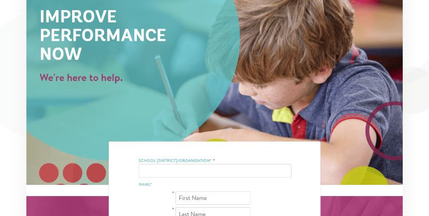
The contact page can be one of the most important pages of a website. It shows the visitor how to reach you, where you’re located, provides them with a way to follow you on social media, and can even be your call to action. Contact pages are not the center of attention, so they don’t always get the design attention they need. In this article we’ll look at 17 Divi websites with unique contact pages to help inspire you for your next Divi design.
Contact pages typically include contact forms, but they just need to provide contact information that meets the needs of the visitor. Many include phone numbers, email addresses, physical addresses, maps, social links, or any combination of these options.
I’ll show an image of the section I like and discuss what I liked about it. The websites are in no particular order. Hang around until the end for a few links to help you level up your own unique contact page.
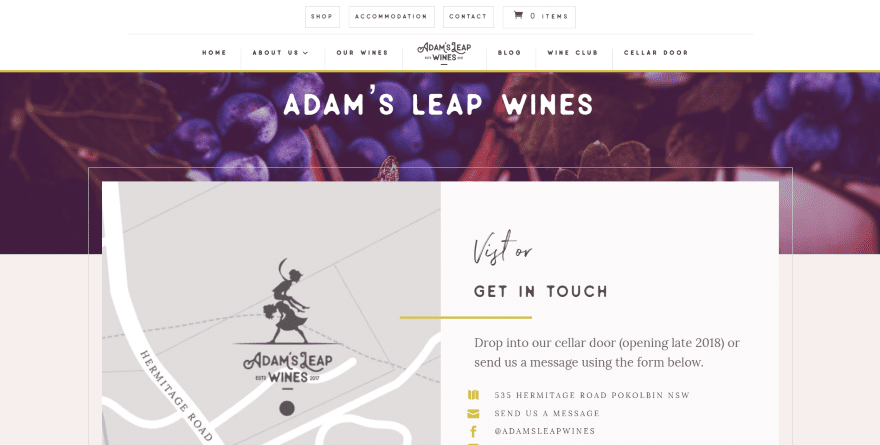
1. Adams Leap Wines
This one uses a background image with overlay to help describe the company. A section that overlaps this shows a styled map on one side with information on the other and includes a clickable address that opens a map, clickable email, social follow links, and a contact form. A styled border encases this row. This is followed by a full-screen image, signup form, and information about the company – all styled to match the site’s branding.
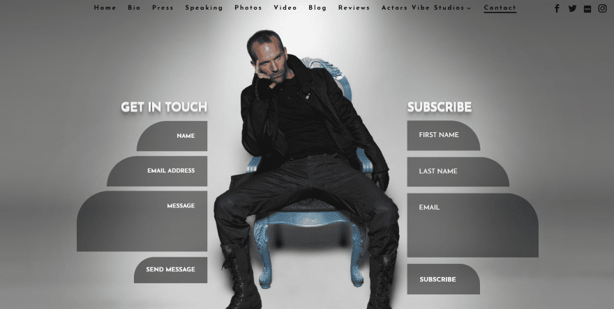
2. Brionne Davis
This is one of the most dramatic contact pages I’ve seen. It displays a full-screen background image of Brionne Davis in parallax. The form fields are styled to create a pattern. A contact form is placed on the left with a subscribe form on the right. The image remains in place on scroll. Scrolling reveals the contact info for the manager on one side and the talent agency on the other.
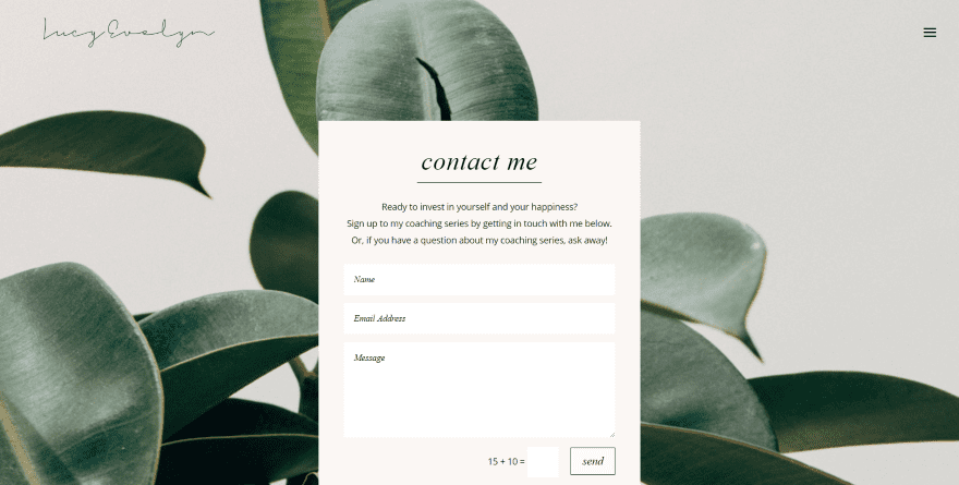
3. Lucy Evelyn
This site uses a simple contact form that’s styled to fit the site’s design. It includes a CTA within the text that invites the reader to ask questions. The form is placed over a full-screen background image that helps bring out the elegance of the site’s design.
Featured Image via artist / shutterstock.com
See Website
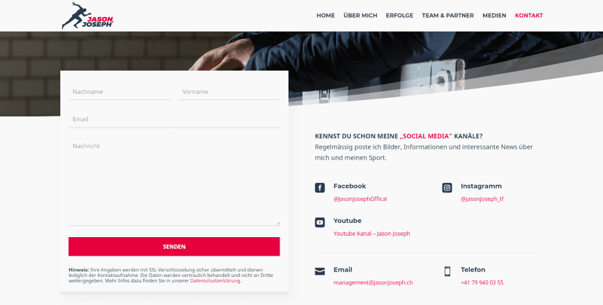
4. Jason Joseph
This one includes some unique styling. A full-screen image displays a title with large text that’s styled to match the website. The image uses an elegant section divider and the contact form overlaps the image. The form itself is simple but matches the site’s styling. Styled social follow links, email, and a phone number are provided next to the form.
5. Fenix Pest Control
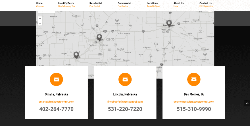
This site includes a large title section with a logo to introduce the contact information and provide information about the service. A styled contact form without a background provides selections with radio buttons and a dropdown box. What I find the most interesting is the styled map that overlaps the previous section and three blurbs that overlap the map. The blurbs provide contact info for three different locations.
6. MBS Accountancy
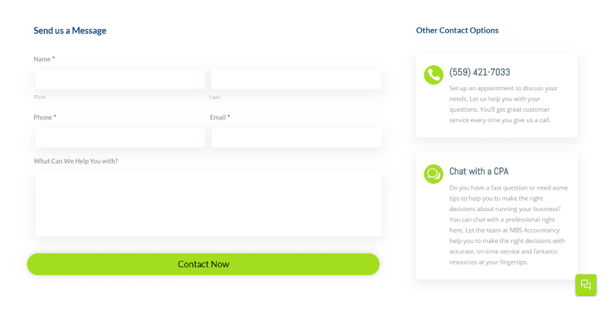
Every element on this site’s contact page, including the individual contact form fields, includes shadow effects. It includes a full-width CTA with graphic and a button. The button’s text displays the phone number. A full-width text section provides information about services. The blurbs next to the contact form include a clickable phone number and information about chatting with them. An annotated image shows parking. An information section overlaps a background image of a map and include social follow icons.
7. Petratec
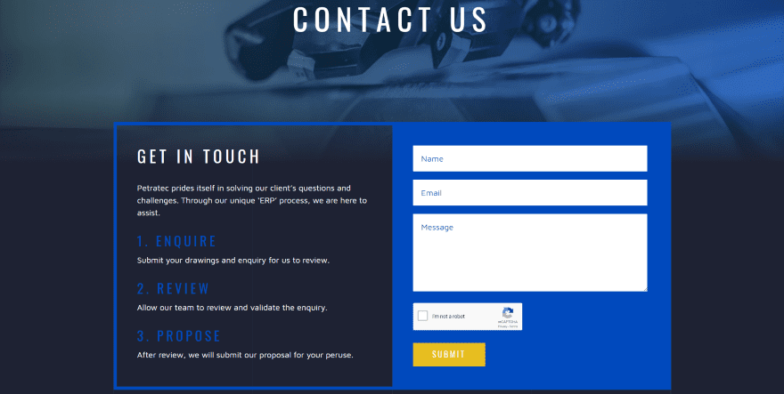
This page keeps the engineering theme of the website with dark blue and industrial background images. The contact form includes a section with a description of their contact information process. Following this is a section that includes a row with text and a map that’s outlined with the same blue border. The text provides the address, phone, and fax numbers. The map is offset and overlaps the row above it.
8. Garden Concept
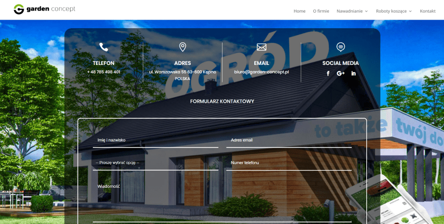
This one displays a full-screen background image with the contact information displaying over it within a row with a black transparent background and rounded corners. The information includes four blurbs to show the phone number, address, email, and social follow links. The form is simple and includes a centered submit button at the bottom that matches the company’s branded colors.
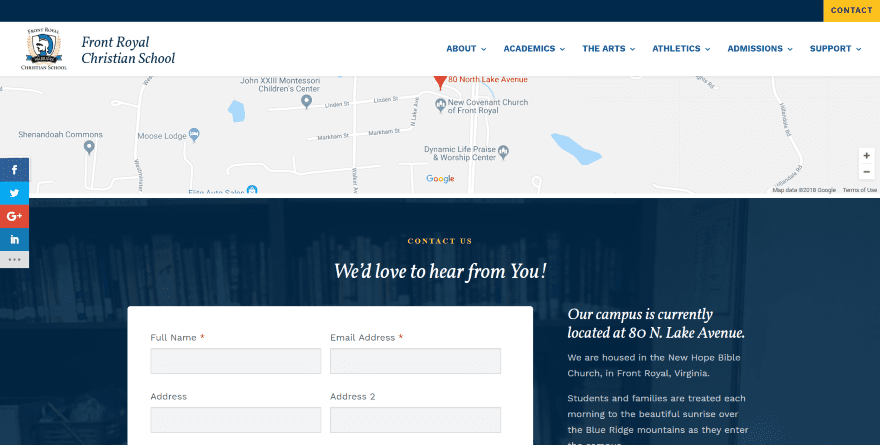
9. Front Royal Christian School
This one uses dark blue with gold and white text to match the site’s branding. The address is displayed on a full-width map that doesn’t zoom on hover. A contact form and the school’s information are placed over an image of the school with a dark blue overlay. The phone number is clickable. I love how well the blue and gold work together.
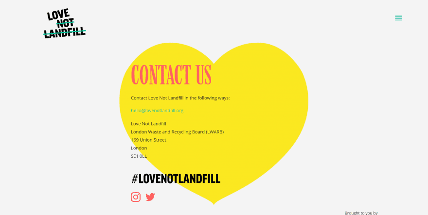
10. Love Not Landfill
Rather than a contact form, this one provides a clickable email link, physical address, and social follow links, all placed over a heart in the background to match the site’s message. It also includes a hashtag to help spread the company’s message.
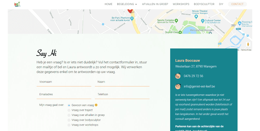
11. Enjoy Eat Live
This site includes a full-width map that doesn’t zoom on hover with an overlapping contact form and a text module with information. Rather than displaying background colors for the fields, the form underlines them with a color that matches the titles in the website. The information uses styled icons with the same colors.
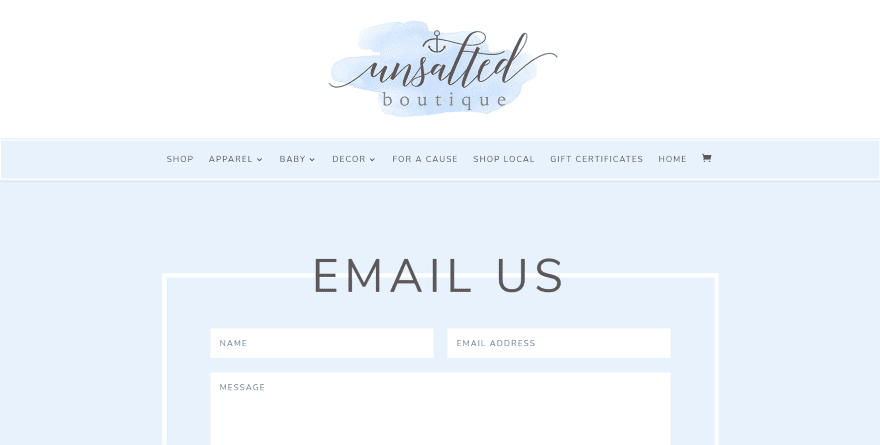
12. Unsalted Boutique
This site displays a simple contact form with minimal but interesting styling. The border is white, just like the field backgrounds, and the background itself is blue to match the section’s background color. The title overlaps the border. Social follow buttons are included in the footer.
13. Dukeries Homes
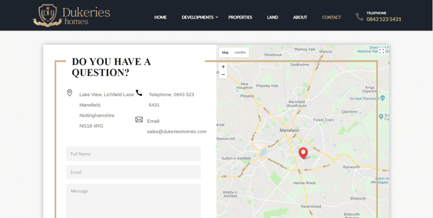
This page displays blurbs with icons that create large blocks with phone number, email, and location contact information. Icons are in gold and the borders use shadows to help separate them. The next section displays a contact form and map together within a row with a background shadow. The title and gold border overlay the row, giving it an elegant design. The contact form portion shows the contact information above the form.
14. Claire Salon
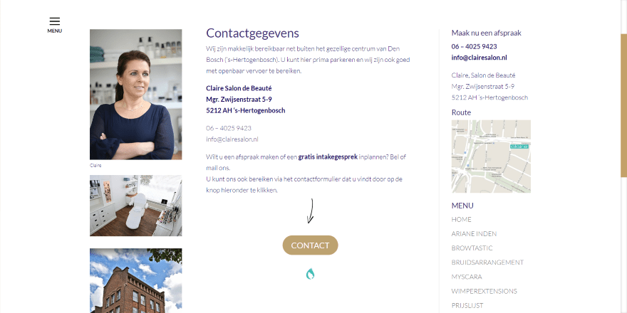
This one doesn’t show the form unless you want to see it. It provides all the contact info including company information, physical address, phone number, email, map, images, and CTA’s. This leads to a button that’s highlighted by an arrow. Clicking the button opens the contact form in a popup. The form itself uses shadow effects over the gold background that’s styled to match the website.
15. Mood Media
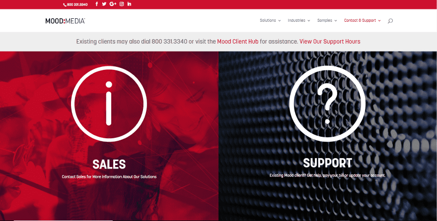
This one helps narrow down the type of contact information you need by providing choices that use large backgrounds with overlays, text, and large icons. Clicking on Sales takes you to a styled contact form over a full-screen background image. Clicking on Support opens a page with this background in full-screen and three icons to help you narrow down further. This helps the website to provide you with the specific information you need and ensures that your information goes to the correct department.
16. NXT Book Media
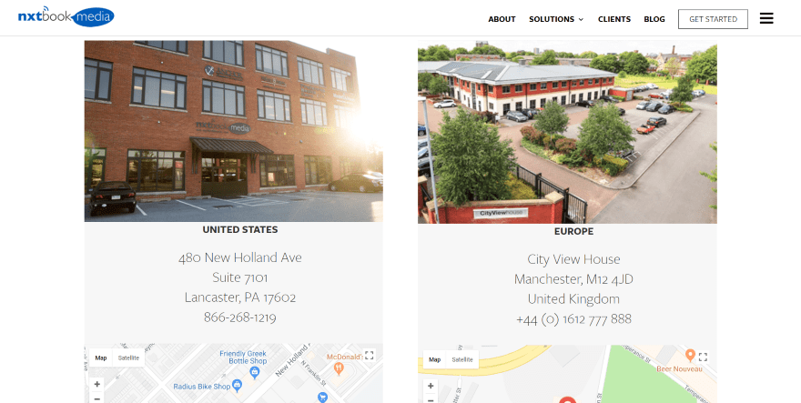
This one handles contact information for multiple locations within two columns. It displays cards that include an image, address with phone number, and map for each location. Following this is a simple contact form that’s styled so the background blends with the section. The page includes a full-width introduction and ends with a CTA to see the team member’s page.
17. Grape Seed US
This site overlaps the contact form with the first section. The form displays over a parallax background with an overlay that matches the site’s branding. Just under the form is an FAQ followed by social icons, a phone number, and a button that takes you back to the top of the screen where you can see the contact form.
Ending Thoughts
That’s our look at 17 Divi websites with unique contact pages to help inspire you for your next Divi design. There are lots of articles here at the ET blog for even more help with your Divi designs. Some include layouts while others discuss specific form plugins. Here are just a few that discuss design with Divi:
- Download The Free Divi Contact Pages Layout Pack
- How to Require a Terms and Conditions Agreement On Your Contact Form
- How to Create a Contact Form on Click with Divi
- How to Create an Inline Contact Form with Divi
- How to Create a Quote Form With Divi’s Contact Form Module
- 5 Unique Ways to Style Divi’s Contact Form Module
We want to hear from you. Which of these websites with unique contact pages are your favorites? Let us know in the comments.
Featured Image via Keep Calm and Vector / shutterstock.com
The post 17 Divi Sites with Unique Contact Pages appeared first on Elegant Themes Blog.

