
The new Divi options offer tons of possibilities. Modules, rows and columns, more than ever, empower one another on the road towards stunning and user-friendly web design. One of the things it can do is create remarkable editorial style sections. And that’s exactly what we’ll be showing you in this post; 5 different editorial style section layouts that you can use within different websites. The best part? The post is made by using the right settings for each module, row and column only.
Let’s take a look at the five examples we’ll show you how to create.
First Example
Desktop
Mobile
Second Example
Desktop
Mobile
Third Example
Desktop
Mobile
Fourth Example
Desktop
Mobile
Fifth Example
Desktop
Mobile
Start Creating First Example
Let’s get started by creating our first editor style layout.
Add New Section
Add a new page, enable the Divi Builder and switch over to Visual Builder. Once you’re in the Visual Builder, add a standard section.
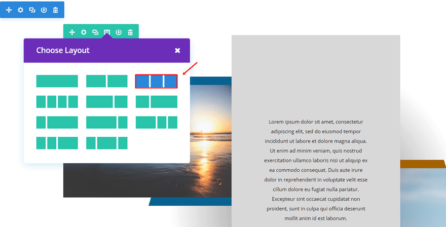
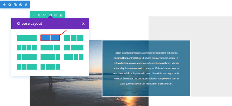
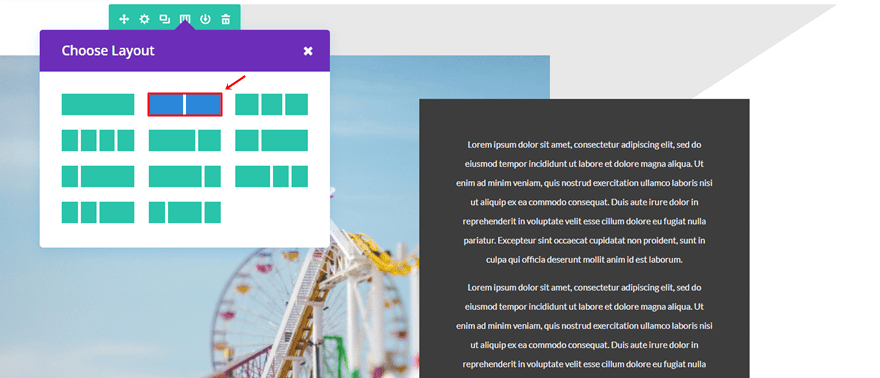
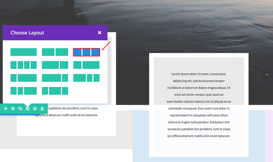
Add Three-Column Row
Within that standard section, we’ll be needing a three-column row.
Gradient Background
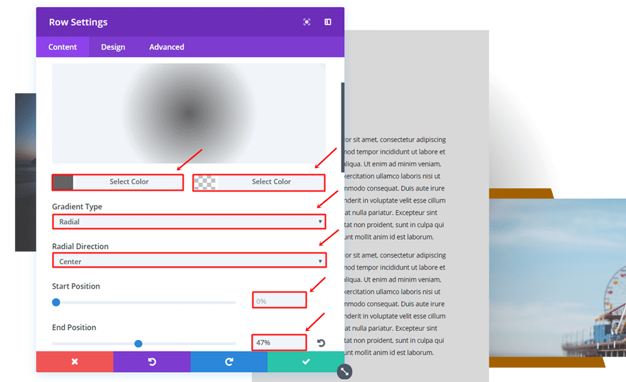
Open the row settings and add the following gradient background to it:
- First Color: #636363
- Second Color: rgba(255,255,255,0)
- Gradient Type: Radial
- Radial Direction: Center
- Start Position: 0%
- End Position: 47%
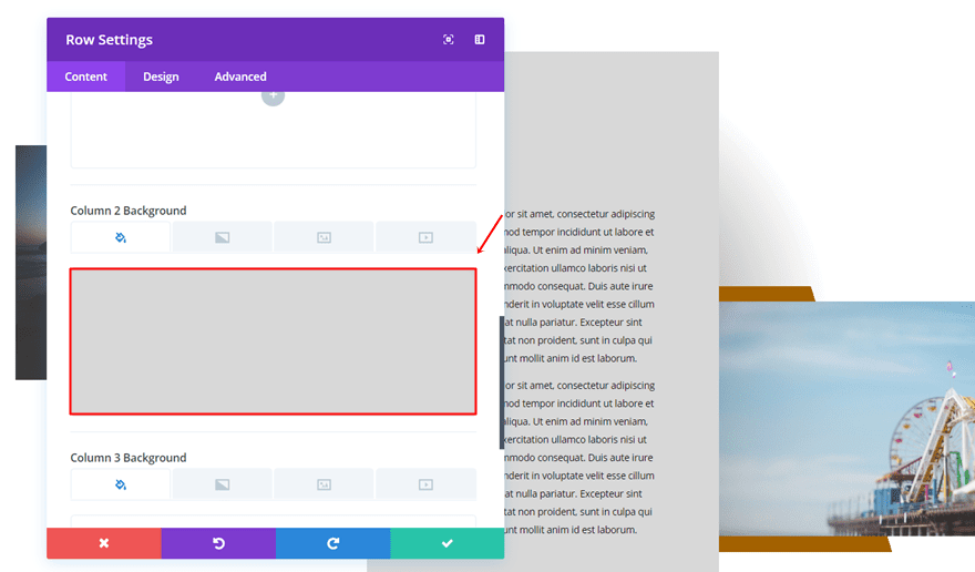
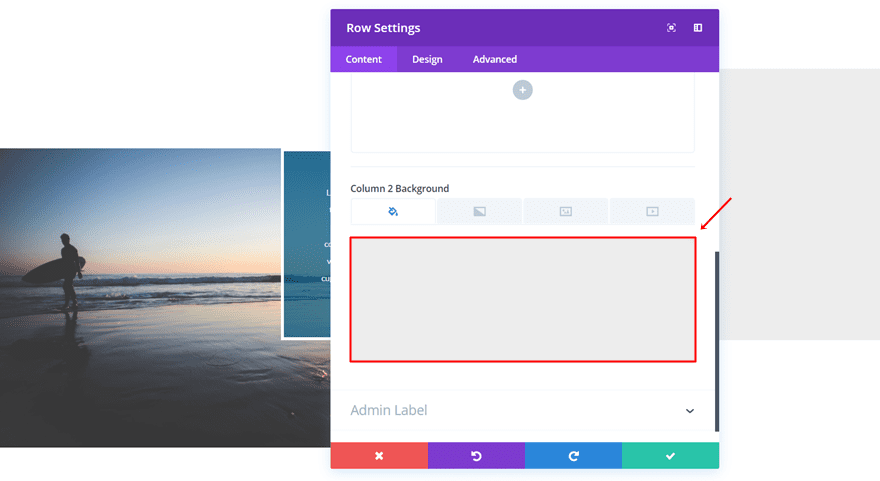
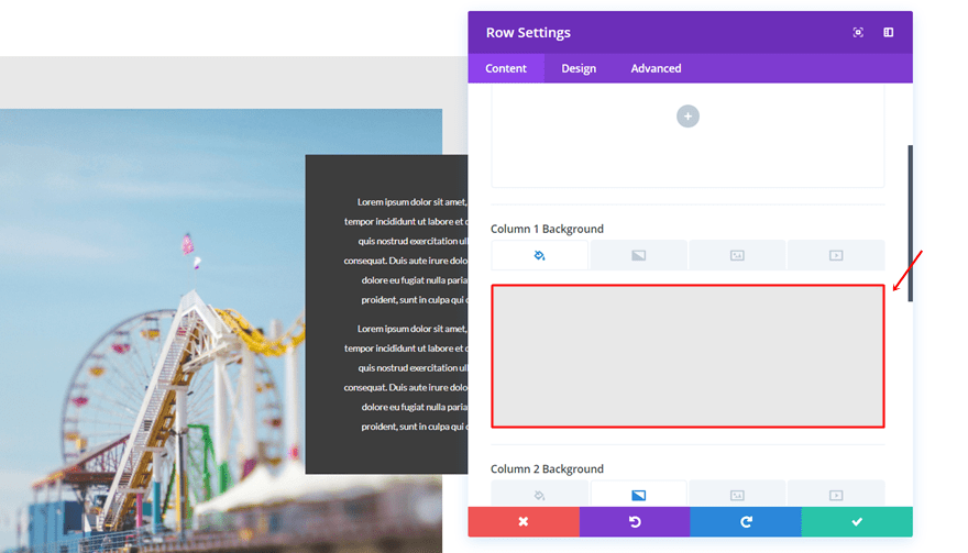
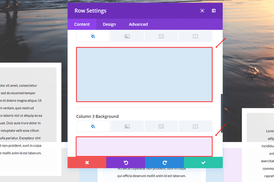
Column 2 Background Color
We’ll also need to set ‘#d8d8d8’ as the Column 2 Background Color.
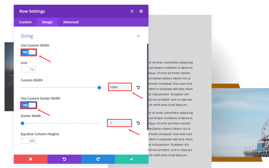
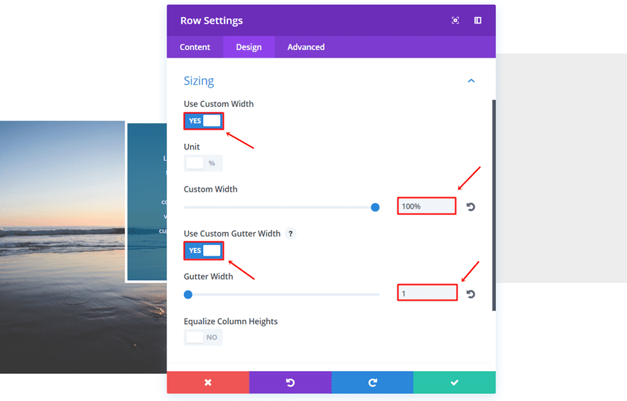
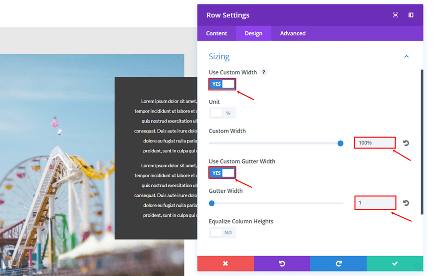
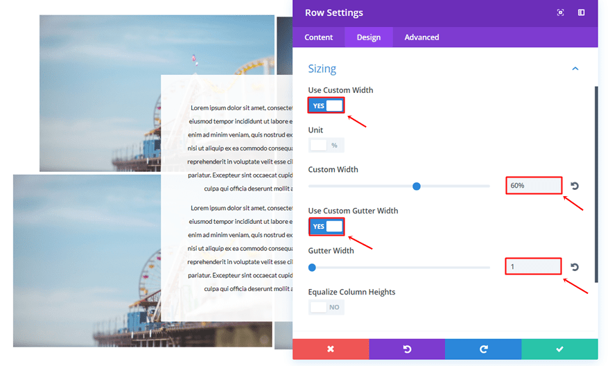
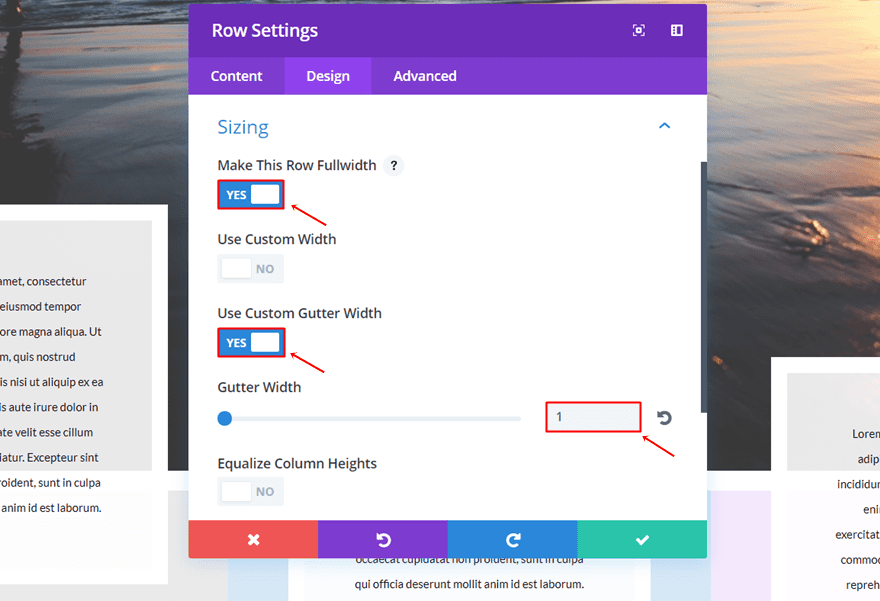
Sizing
Move on to the Design tab and use the following settings for the Sizing subcategory:
- Use Custom Width: Yes
- Custom Width: 100%
- Use Custom Gutter Width: Yes
- Gutter Width: 1
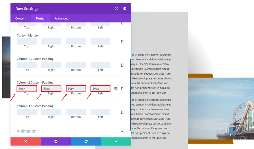
Spacing
Open the Spacing subcategory and add ’50px’ to the top, right, bottom and left padding of the second column.
First Column Image Module
Gradient Background
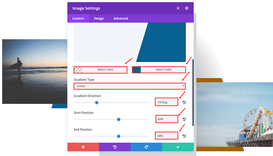
Add an image to the first column of the row and use the following gradient background for it:
- First Color: rgba(255,255,255,0)
- Second Color: #086191
- Gradient Type: Linear
- Gradient Direction: 107deg
- Start Position: 60%
- End Position: 60%
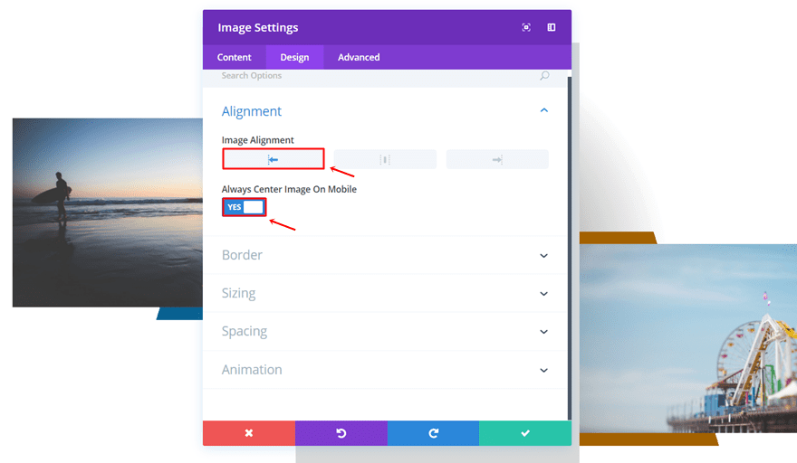
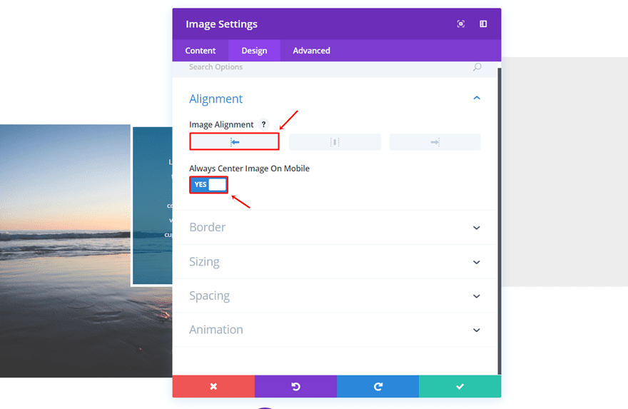
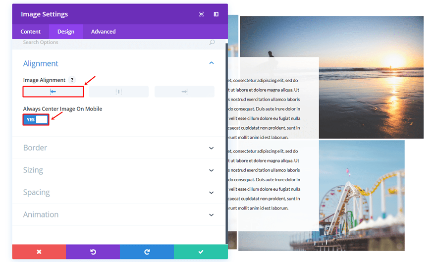
Alignment
Go to the Design tab, use the left Image Alignment and enable the ‘Always Center Image on Mobile’ option.
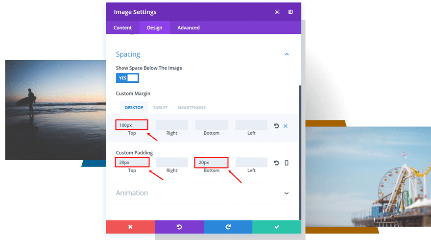
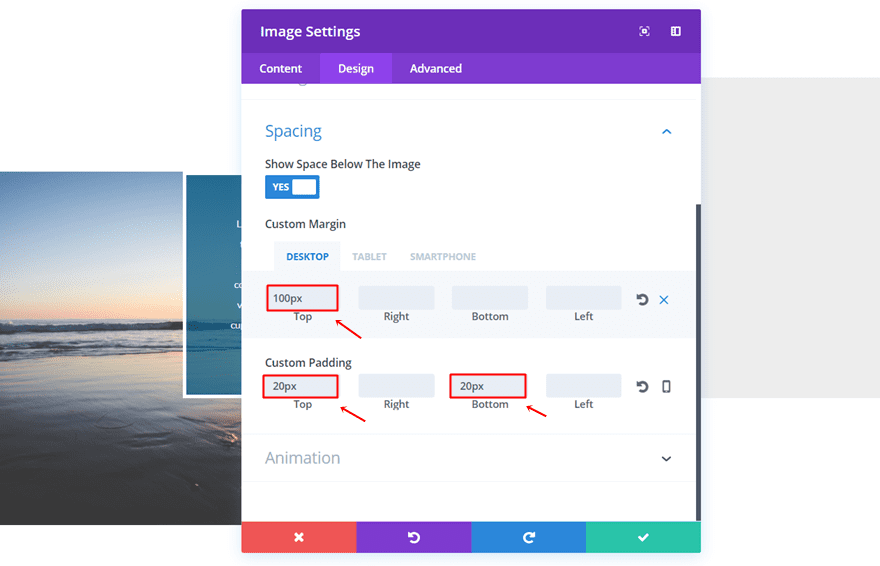
Spacing
Then, open the Spacing subcategory and use the following margin and padding settings:
- Top Margin: 100px (Desktop), 0px (Tablet & Phone)
- Top Padding: 20px
- Bottom Padding: 20px
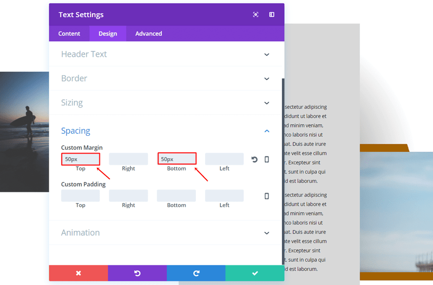
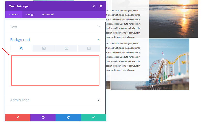
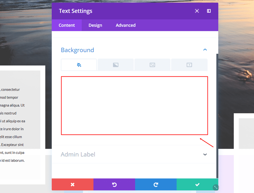
Second Column Text Module
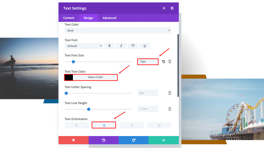
Text Settings
Next, add a Text Module to the second column of the row. Go to the Design tab and use the following settings for the Text subcategory:
- Text Font Size: 12px
- Text Color: #000000
- Text Orientation: Center
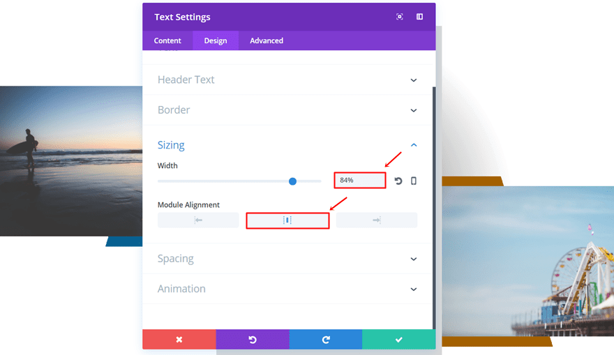
Sizing
Open the Sizing subcategory, use a Width of ‘84%’ and select the center Module Alignment.
Spacing
Lastly, add ’50px’ to the top and bottom margin.
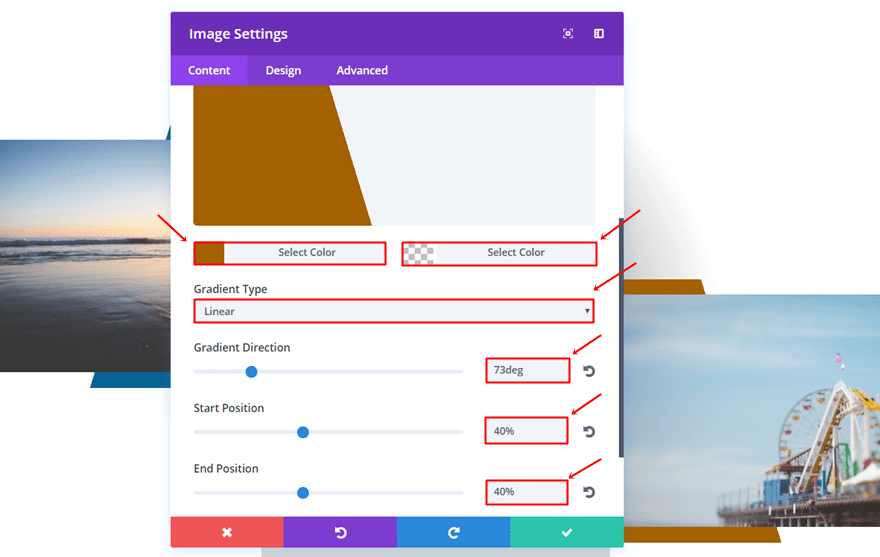
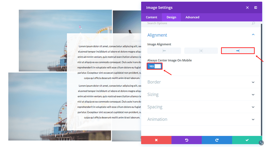
Third Column Image Module
Gradient Background
Add another Image Module to the third column and use the following gradient background:
- First Color: #a36100
- Second Color: rgba(255,255,255,0)
- Gradient Type: Linear
- Gradient Direction: 73deg
- Start Position: 40%
- End Position: 40%
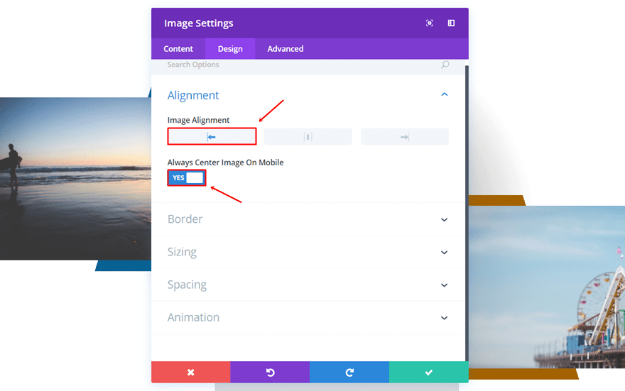
Alignment
Go to the Design tab, select the left Image Alignment and enable the ‘Always Center Image on Mobile’ option.
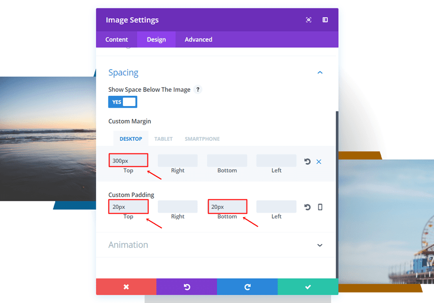
Spacing
Lastly, add the following custom margin and padding:
- Top Margin: 300px (Desktop), 0px (Tablet & Phone)
- Top Padding: 20px
- Bottom Padding: 20px
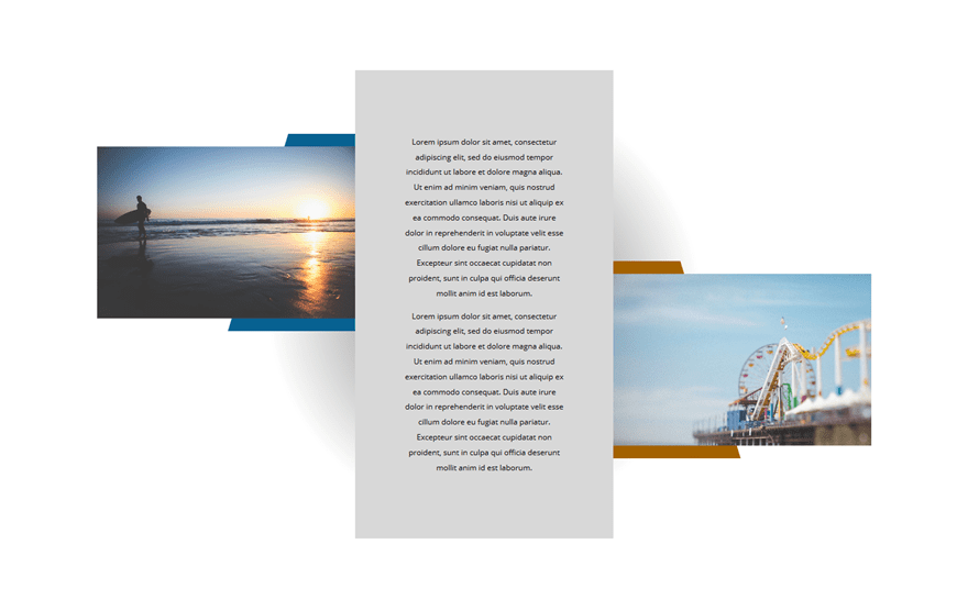
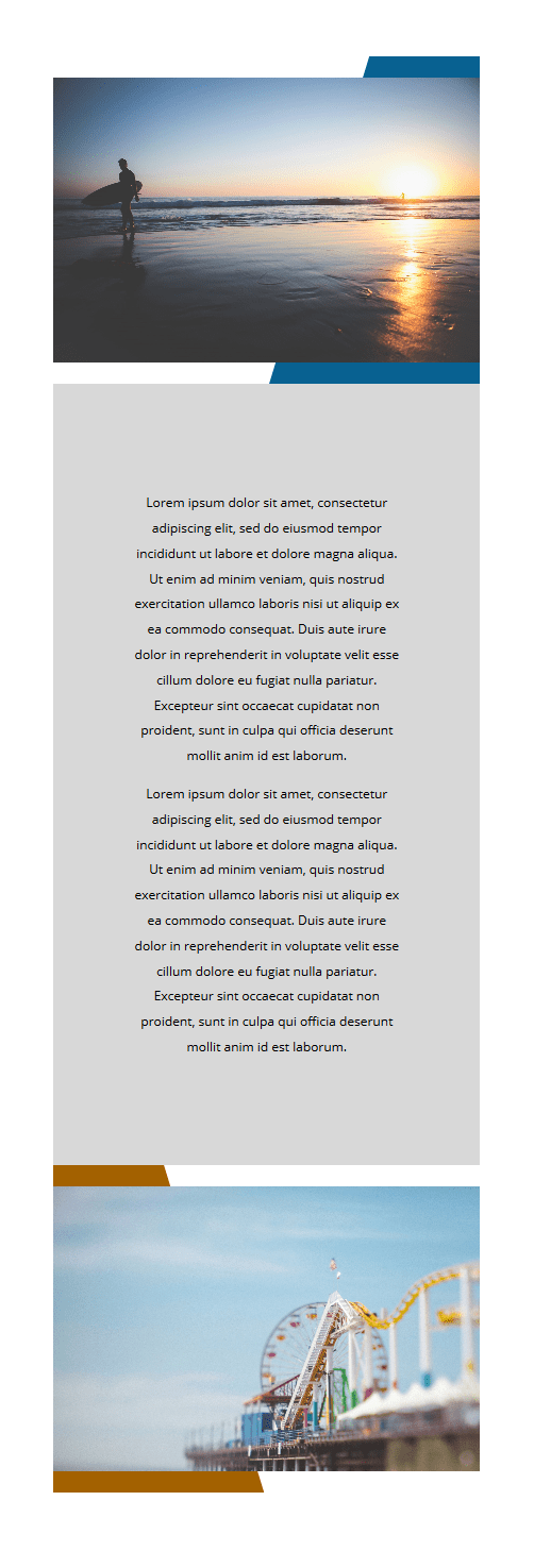
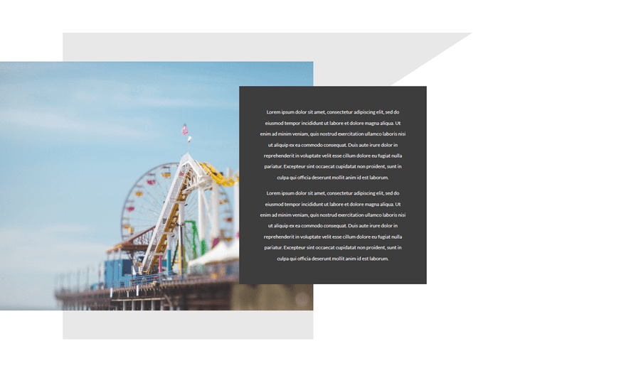
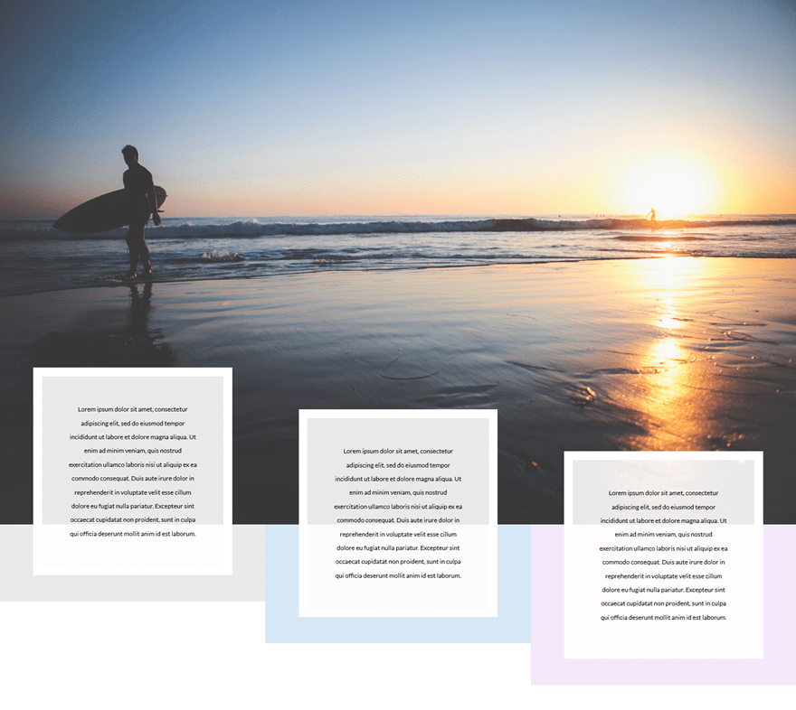
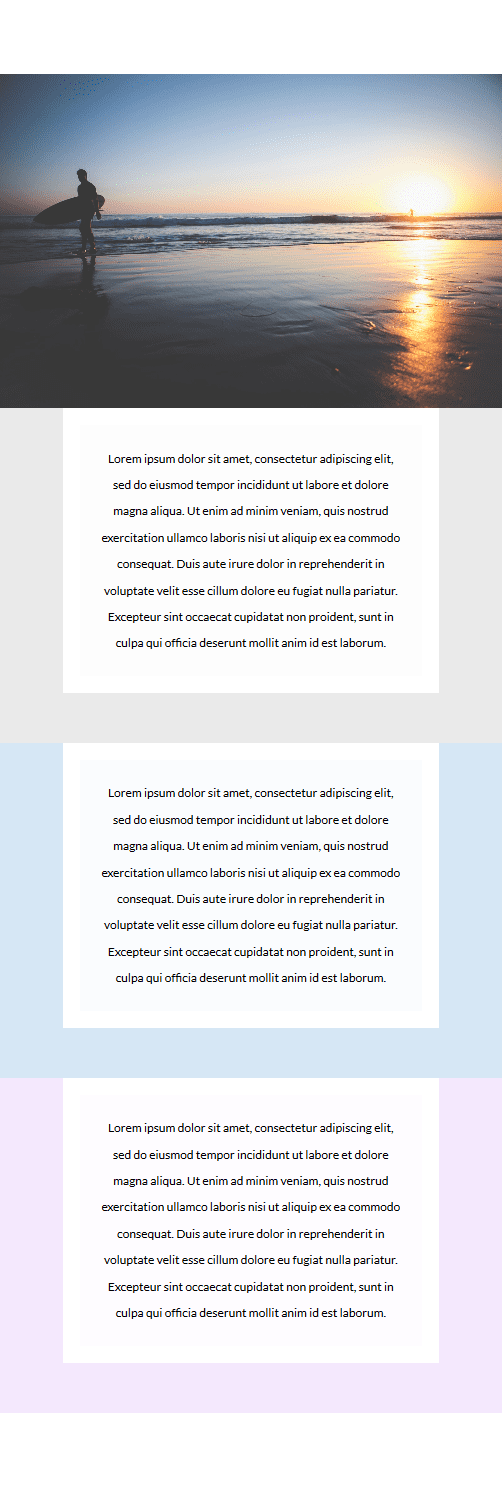
Result
Let’s take another look at the result on desktop:
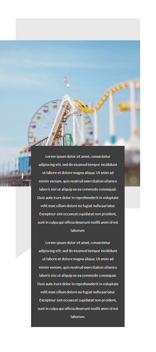
And on mobile:
Start Creating Second Example
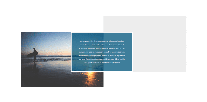
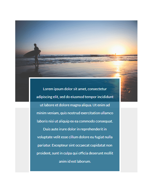
The second example looks like this on desktop:
Add New Section
Firstly, add a new standard section.
Add Two-Column Row
Then, add a two-column row to it.
Column 2 Background Color
Open the row settings and add ‘#ededed’ as the Column 2 Background Color.
Sizing
Go to the Design tab and make the following changes apply to the Sizing subcategory:
- Use Custom Width: Yes
- Custom Width: 100%
- Use Custom Gutter Width: Yes
- Gutter Width: 1
First Column Image Module
Alignment
Add an Image Module to the first column, use the left Image Alignment and enable the ‘Always Center Image on Mobile’ option.
Spacing
Open the Spacing subcategory and use the following settings:
- Top Margin: 100px (Desktop), 0px (Tablet & Phone)
- Top Padding: 0px
- Bottom Padding: 0px
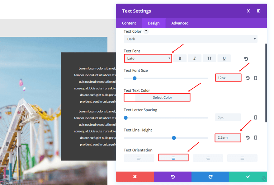
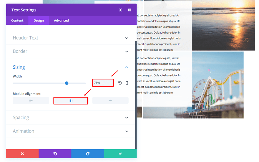
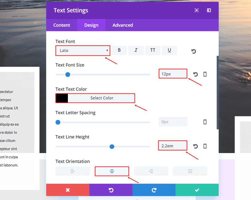
Second Column Text Module
Text Settings
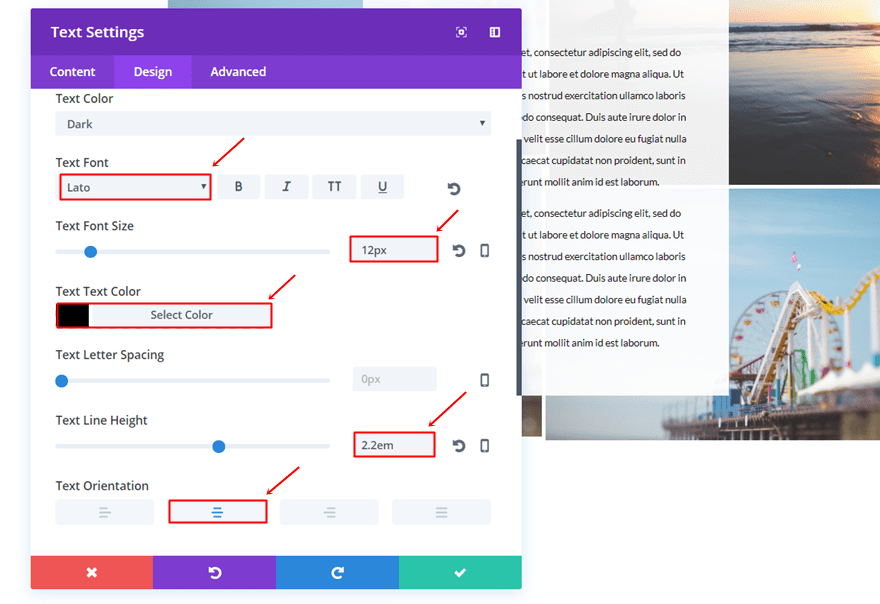
Then, add a Text Module to the second column and apply the following settings to the Text subcategory:
- Text Font: Lato
- Text Font Size: 12px
- Text Color: #000000
- Text Line Height: 2.2em
- Text Orientation: Center
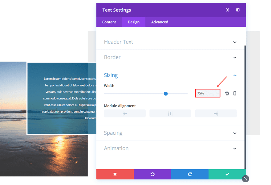
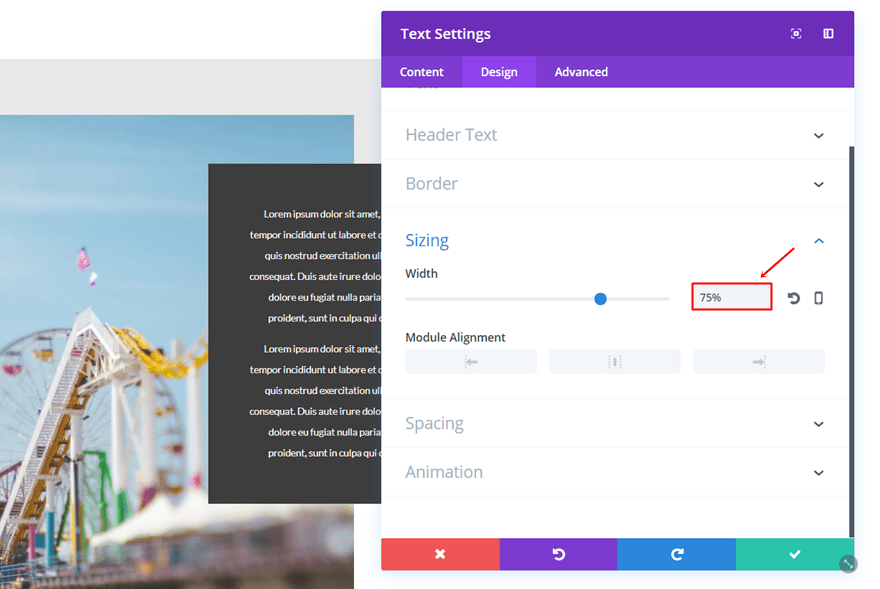
Sizing
Open the Sizing subcategory and apply a Width of ‘75%’.
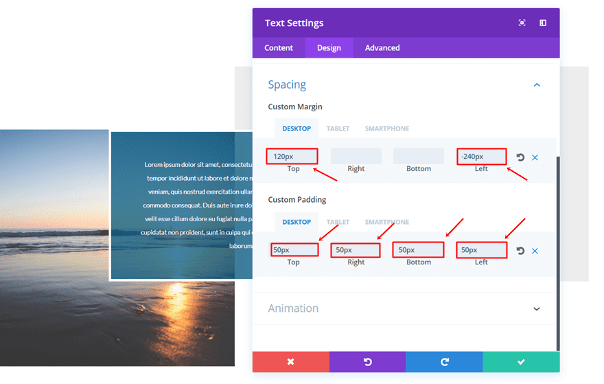
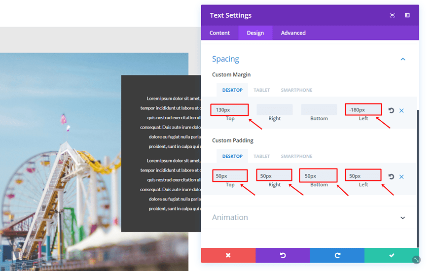
Spacing
Lastly, make sure the following settings apply to the Spacing subcategory:
- Top Margin: 120px (Desktop), -80 (Tablet & Phone)
- Left Margin: -240px (Desktop), 80 (Tablet), 45 (Phone)
- Top, Right, Bottom & Left Padding: 50px (Desktop & Tablet), 20px (Phone)
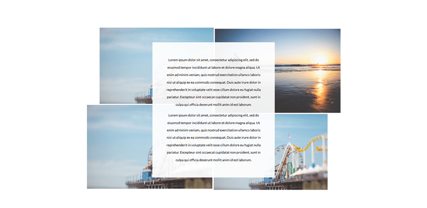
Result
Once done, you’ll notice the following design on desktop:
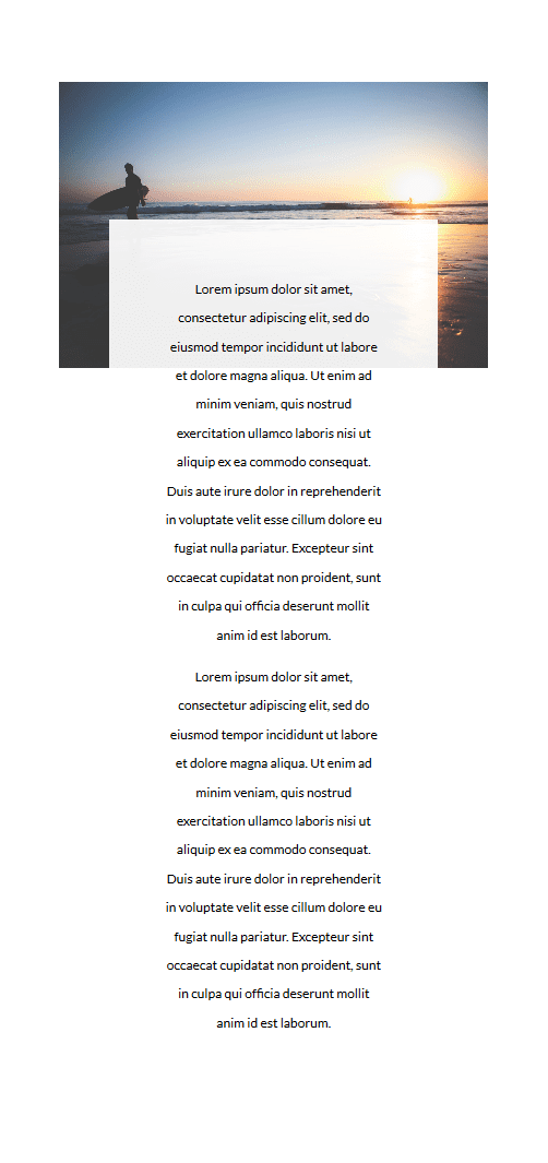
And on mobile:
Start Creating Third Example
Up next, we have the following example which looks like this:
Add New Section
Once again, add a new standard section.
Add Two-Column Row
The column structure we’ll be needing for this row is the following:
Column 1 Background Color
Open the row settings and use ‘#e8e8e8’ as the Column 1 Background Color.
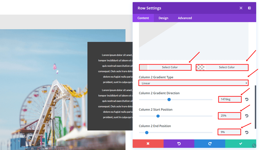
Column 2 Gradient Background
The needed Gradient Background for the second column is the following:
- First Color: #e8e8e8
- Second Color: rgba(255,255,255,0)
- Column 2 Gradient Type: Linear
- Column 2 Gradient Direction: 147deg
- Column 2 Start Position: 25%
- Column 2 End Position: 9%
Sizing
Open the Sizing subcategory and use the following settings:
- Use Custom Width: Yes
- Custom Width: 100%
- Use Custom Gutter Width: Yes
- Gutter Width: 1
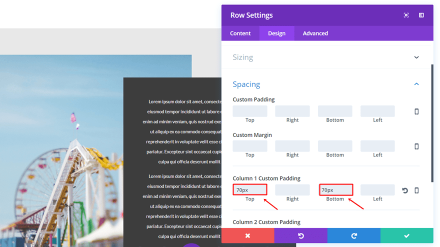
Spacing
Lastly, add ’70px’ to the top and bottom padding of the first column.
First Column Image Module
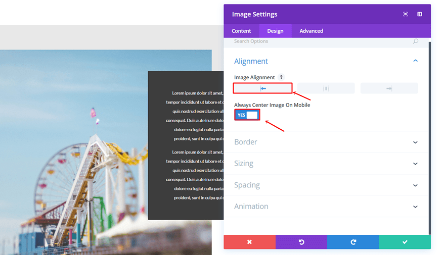
Alignment
Add an Image Module to the first column, use the left Image Alignment and enable the ‘Always Center Image on Mobile’ option.
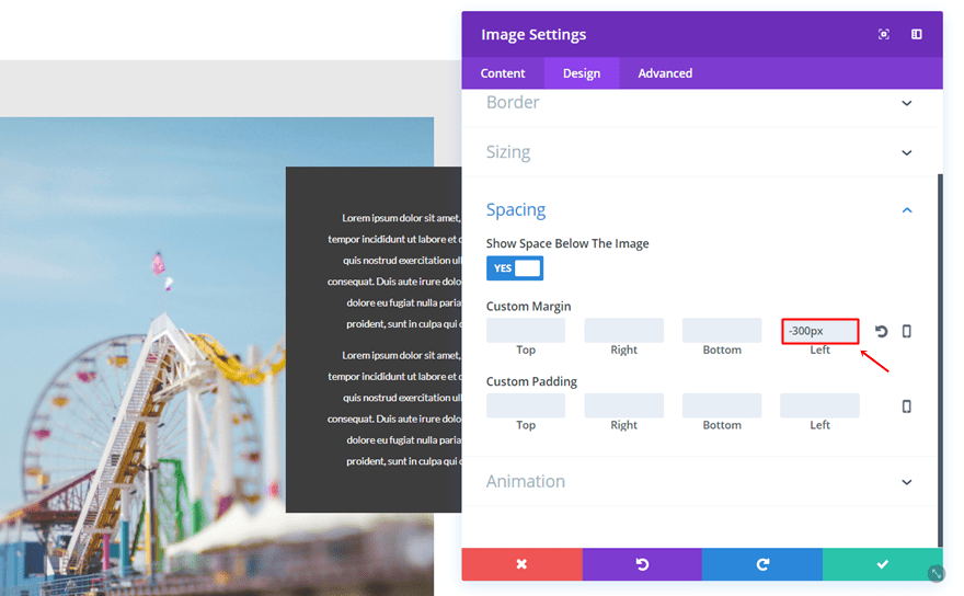
Spacing
Open the Spacing subcategory and add ‘-300px’ to the left margin.
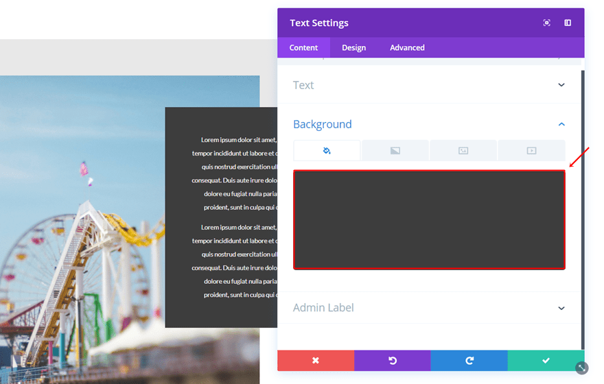
Second Column Text Module
Background Color
Add a Text Module to the second column and use ‘#3d3d3d’ as the background color.
Text Settings
Go to the Design tab and use the following settings for the Text subcategory:
- Text Font: Lato
- Text Font Size: 12px
- Text Color: #FFFFFF
- Text Line Height: 2.2em
- Text Orientation: Center
Sizing
Open the Sizing subcategory and use ‘75%’ for the Width.
Spacing
Lastly, use the following settings for the Spacing subcategory:
- Top Margin: 130px (Desktop), -200 (Tablet & Phone)
- Left Margin: -180px (Desktop), 80 (Tablet), 50 (Phone)
- Top, Right, Bottom & Left Padding: 50px (Desktop & Tablet), 20px (Phone)
Result
Once finished, the result on desktop will look like this:
And like this on mobile:
Start Creating Fourth Example
The fourth example we’ll be creating looks like this:
Add New Section
Start by adding a standard section to the page you’re working on.
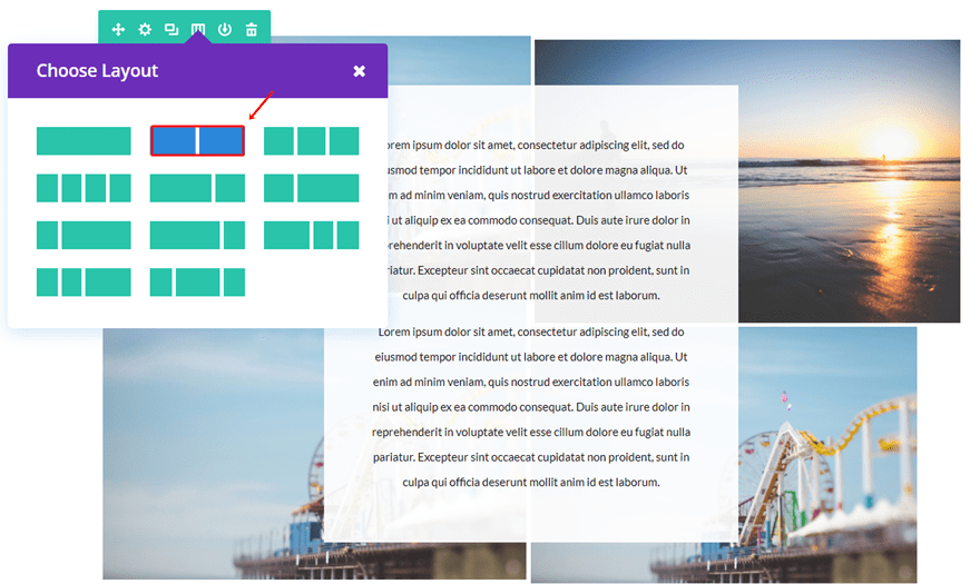
Add Two-Column Row
Then, add a two-column row to it.
Sizing
Open the Sizing subcategory and make the following changes:
- Use Custom Width: Yes
- Custom Width: 60%
- Use Custom Gutter Width: Yes
- Gutter Width: 1
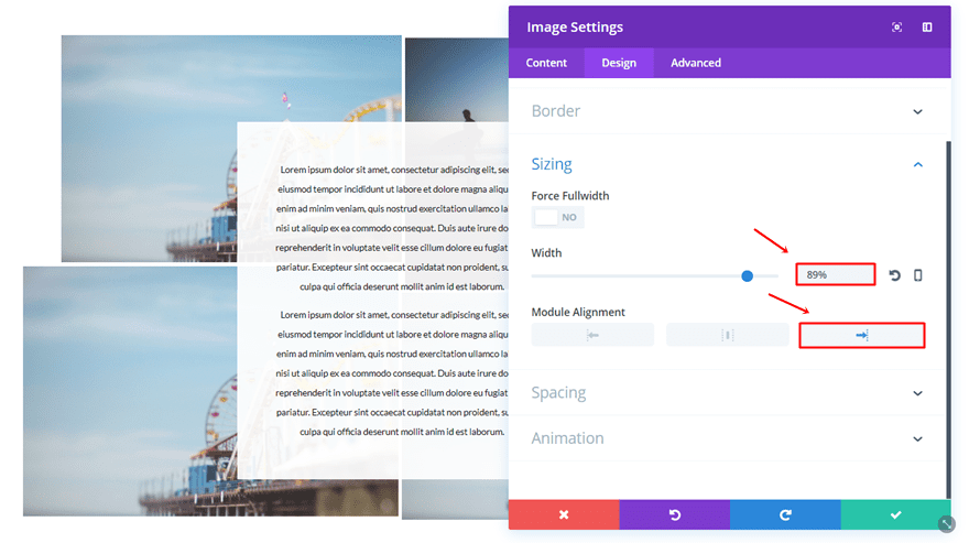
First Column First Image Module
Alignment
Add an Image Module to the first column, use the right Image Alignment and enable the ‘Always Center Image on Mobile’ option.
Sizing
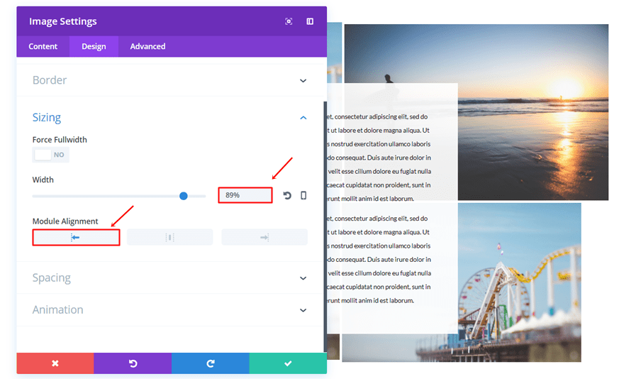
Go to the Sizing subcategory of that Image Module, use a Width of ‘89%’ and select the right Module Alignment.
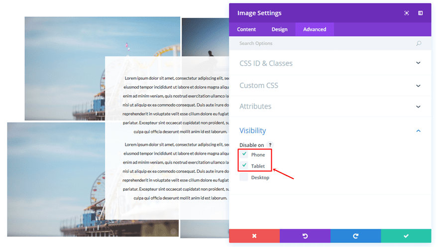
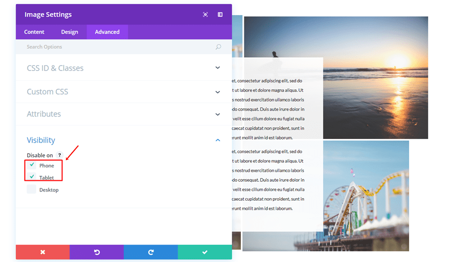
Visibility
Go to the Advanced tab and disable the Image Module on phone and tablet. We’ll be doing this for 3 of the Image Modules that are being used. You can decide for yourself which one you want to appear on tablet and phone, in our case, that’ll be the image in the right top corner.

First Column Second Image Module
Alignment
Add another Image Module, use the right Image Alignment and enable the ‘Always Center Image on Mobile’ option.
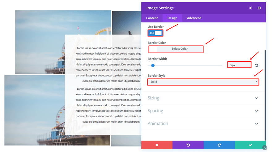
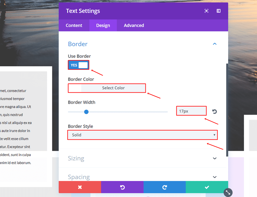
Border
Scroll down and make use of the following border:
- Use Border: Yes
- Border Color: #FFFFFF
- Border Width: 5px
- Border Style: Solid
Visibility
Lastly, go to the Advanced tab and disable the Image Module on phone and tablet.
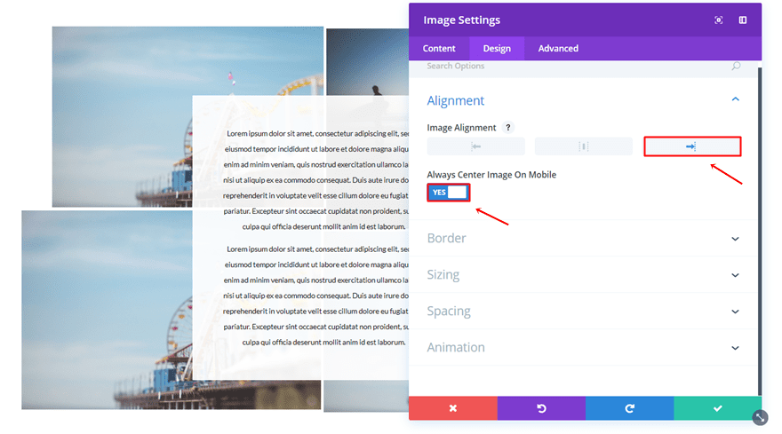
Second Column First Image Module
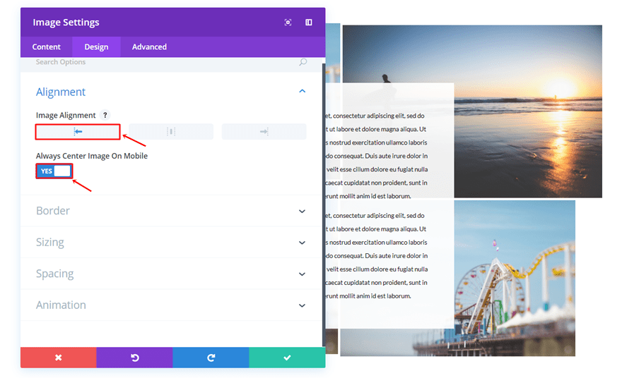
Alignment
Add the next Image Module to the second column, use the left Image Alignment and enable the ‘Always Center Image on Mobile’ option.
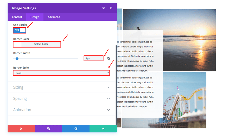
Border
Scroll down, open the Border subcategory and make the following settings apply:
- Use Border: Yes
- Border Color: #FFFFFF
- Border Width: 4px
- Border Style: Solid
Second Column Second Image Module
Alignment
Add the last Image Module to the second column, use the left Image Alignment and enable the ‘Always Center Image on Mobile’ option.
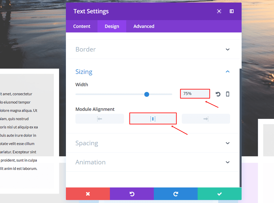
Sizing
Then, open the sizing subcategory, use a Width of ‘89%’ and select the left Module Alignment.
Visibility
Disable this Image Module on phone and tablet as well.
Add One-Column Row
Once you’ve finished the previous row, go ahead and add another one. This time, the row will only need one column.
Sizing
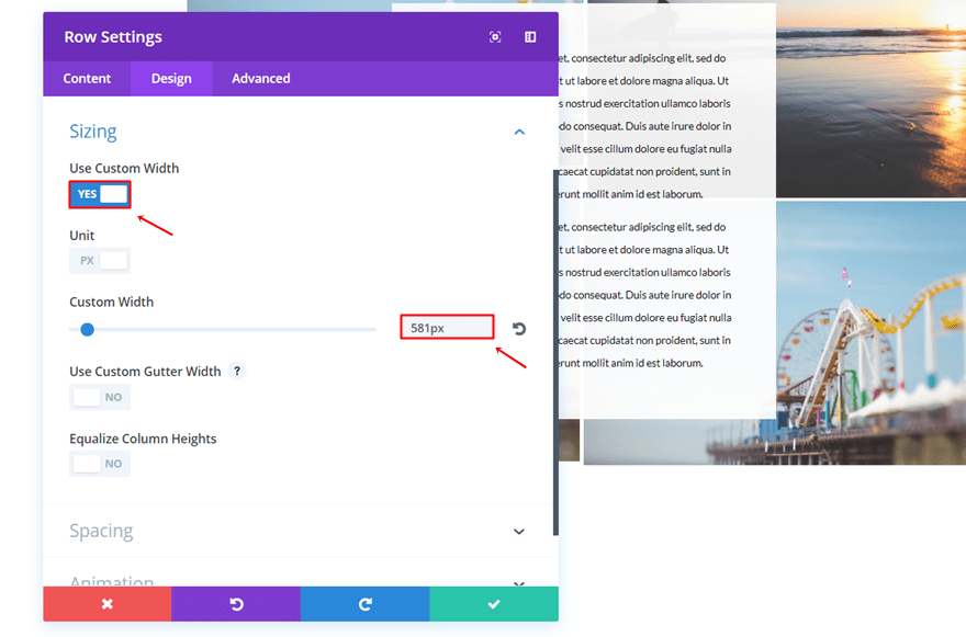
Go to the Design tab of the row settings, enable the ‘Use Custom Width’ option and use ‘581px’ as the Custom Width.
Text Module
Background Color
Add a Text Module to that new row and select ‘rgba(255,255,255,0.92)’ as the background color.
Text Settings
Move on to the Design tab and make the following settings apply to the Text subcategory:
- Text Font: Lato
- Text Font Size: 12px
- Text Color: #000000
- Text Line Height: 2.2em
- Text Orientation: Center

Sizing
Then, open the Sizing subcategory, add ‘75%’ to the Width and select the center Module Alignment.
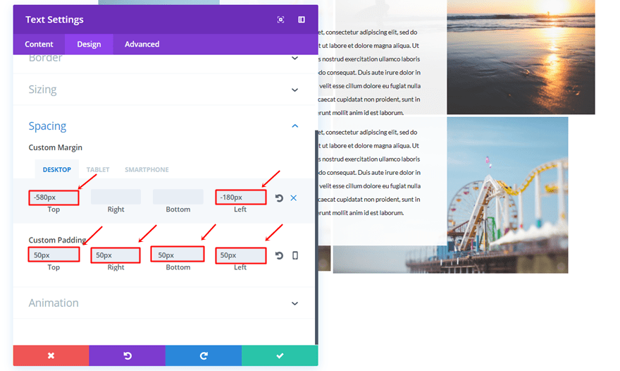
Spacing
Lastly, make the following settings apply to the Spacing subcategory:
- Top Margin: -580px (Desktop), -200 (Tablet & Phone)
- Left Margin: – 180px (Desktop), 80 (Tablet), 50 (Phone)
- Top, Right, Bottom & Left Padding: 50px
Result
Once done, you’ll be able to witness the following result on desktop:
And the following on mobile:
Start Creating Fifth Example
The last example we’ll be showing you how to recreate is the following:
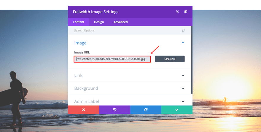
Add Fullwidth Section
Start by adding a fullwidth section to your page.
Fullwidth Image Module
Within that Fullwidth section, add a Fullwidth Image Module.
Add New Section
Right below the previous section, add another section. This time, the section has to be standard instead of fullwidth.
Add Three Column Row
Add a three-column row to that new standard section.
Column 1, 2 & 3 Background Color
Open the row settings and assign the following background colors to the columns:
- Column 1: #eaeaea
- Column 2: rgba(12,113,195,0.17)
- Column 3: rgba(131,0,233,0.09)
Sizing
Go to the Design tab and make the following changes to the Sizing subcategory:
- Make This Row Fullwidth: Yes
- Use Custom Gutter Width: Yes
- Gutter Width: 1
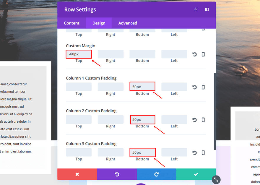
Spacing
Then open the Spacing subcategory, add ‘-60px’ to the top margin and ’50px’ to the bottom padding of each column.
First Column Text Module
Background Color
Continue by adding a Text Module to the First Column and using ‘rgba(255,255,255,0.89)’ as its background color.
Text Settings
Go to the Design tab and make the following settings apply to the Text subcategory:
- Text Font: Lato
- Text Font Size: 12px
- Text Color: #000000
- Text Line Height: 2.2em
- Text Orientation: Center
Border
Open the Border subcategory and make use of the following settings:
- Use Border: Yes
- Border Color: #FFFFFF
- Border Width: 17px
- Border Style: Solid
Sizing
Then, use a Width of ‘75%’ and select the center Module Alignment within the Sizing subcategory.
Spacing
Lastly, open the Spacing subcategory and make the following settings apply:
- Top Margin: -300px (Desktop), 0px (Tablet & Phone)
- Top, Right, Bottom, Left Padding: 50px (Desktop & Tablet), 20px (Phone)

Clone Text Module Twice & Place in Other Two Columns
Go ahead and clone the Text Module twice. Then, place each one of the clones in the two remaining columns.
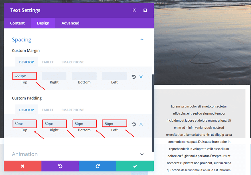
Change Spacing Second Column Text Module
We’ll have to change the Top Margin of the Text Module placed within the second column into ‘-220px’.
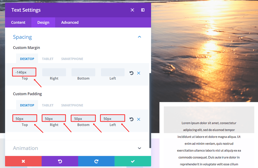
Change Spacing Third Column Text Module
Same counts for the Text Module in the third column but the value is instead ‘-140px’.
Result
And here you have the result on desktop:
And on mobile:
Final Thoughts
In this post, we’ve shown you some beautiful and fun editorial style section layouts that you can use throughout your own website. These examples show how flexible Divi’s options are and how creative you can get. If you have any questions or suggestions; make sure you leave a comment in the comment section below!
Be sure to subscribe to our email newsletter and YouTube channel so that you never miss a big announcement, useful tip, or Divi freebie!
Featured Image by Julia Tim / shutterstock.com
The post 5 Examples of Editorial Style Section Layouts Created with Divi appeared first on Elegant Themes Blog.