
An interesting About page can make your website stand out from the crowd. Too often the About page becomes a place where information about the company and its members is dumped without a lot of design or styling. Fortunately, there are lots of well-designed About pages created with Divi to help inspire you for your next Divi design. In this article we’ll look at 9 Divi websites with interesting About pages.
About pages typically contain team and personal profiles, company information such as history and a mission statement, lists of skills, contact forms, etc. I’m also looking at the layout design, use of images, colors, and fonts. I’ll show an image of the section I like and discuss what I liked about it. The websites are in no particular order. Hang around until the end for a few links to help you design your own interesting About pages.
1. Total Productivity
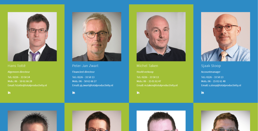
This one displays person modules with alternating blue or green backgrounds and no space between them so they touch on all sides. The rows alternate which colors they begin with, creating a checkerboard-style grid. Most of the images are uniform. I like the LinkedIn icon in the corner. The contact information and signup form use the same colors.
2. Crunch
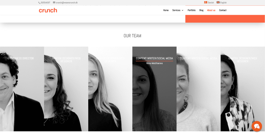
This one has an interesting team member’s area with images in full-with that overlap each other. The images partially slide to the right on hover and displays an animated overlay with the person’s name and divider. The divider slides into place from one direction while the name slides from the other. The About information displays a solid block of color that blends with the site’s branding.
3. Go Crayons
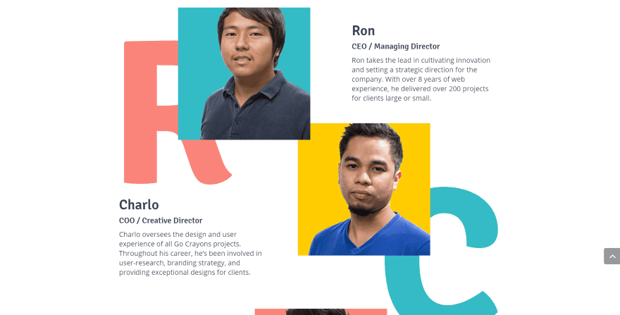
This one divides the About page into sections with a red vertical line and text that changes from one side to the other. Several sections overlap the background and use alternating elements. My favorite section displays team members’ images over styled letters from their first name. The images overlap the letters and the other images. The backgrounds from the images and the letters match the site’s styling.
4. Hozjan
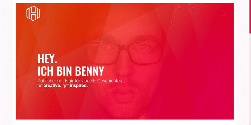
This one uses a gradient overlay with a styled pattern over the image. This same pattern is used without the image as an email call to action at the bottom of the page. The page also displays a short bio and skills within circle counters. One of my favorites is the section with interviews. On the left is the title, divider, text, and social buttons. On the right is two images over a single image to create a multi-column layout. Each image is a PDF download link. I also like the styled navigation slider on the right.
5. SpotX
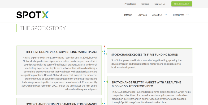
This one shows the company’s development history within a vertical timeline, with boxes on both sides of the line. Each point on the timeline is placed within a box and slides outward on hover. The boxes have an arrow pointing to the nodes on the timeline. Boxes for major milestones span both columns.
6. GCON
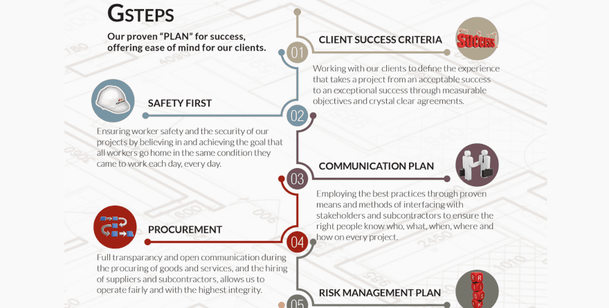
This site displays the company’s mission, vision, and values within an interesting slider that includes a background image with overlay, vertical text, and a styled dot navigation on the right. Their plan for success is displayed as a numbered timeline with large numbers and icons, with each element a different color and placed over an interesting background. The process is also displayed on a timeline, but this one is in the shape of a lightbulb.
7. 8020 Graphics
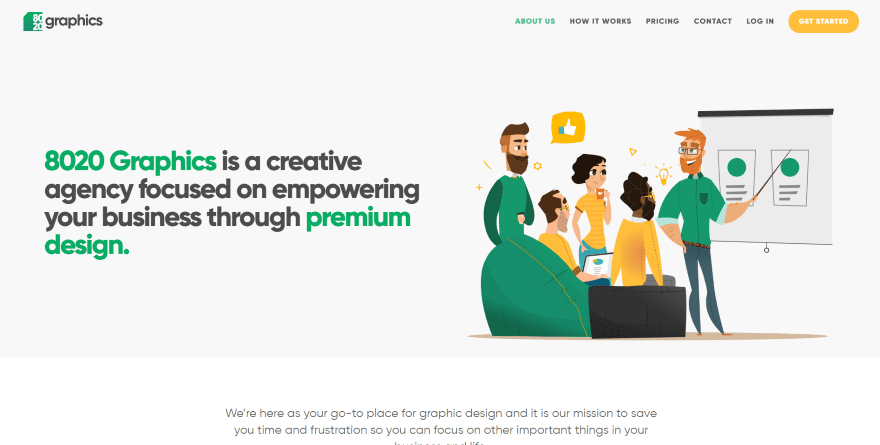
This site uses interesting graphics throughout the About page that matches the branding of the website. The hero area shows the company information with green highlights next to a graphic that utilizes the green and yellow highlights from the website. A section of blurbs showing the process uses similar cartoons that pop out from their circled backgrounds and green text.
8. Loxone
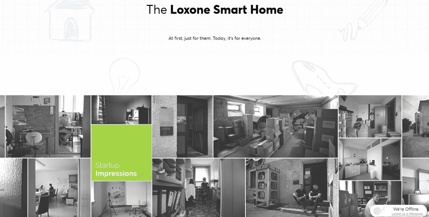
This one uses full-width sections for the hero area, company information, team member images with text and links, mission statement, and a few CTA’s. What stands out to me is the multi-column image montage with a single colored box as a title. I also like the team member image that places a quote within the image.
9. Brionne Davis
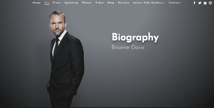
This site has a biography page with a full-screen image, title, and name over the image’s background. The bio is provided in two columns followed by an image gallery of work. I like that this site uses a full-screen image as a header. This is common on homepages, but they’re not as popular for About pages. I love the colors in the image and the shadow effect on the title.
Ending Thoughts
That’s our look at 9 Divi websites with interesting About pages to help inspire you for your next Divi website. For even more help with your Divi designs there are lots of articles here at the ET blog. Many focus on a single element that we normally see on a well-designed About page. Here are just a few:
- How to Create a Compelling About Page for Your Portfolio Website with Divi
- How to Add Star Reviews to Profile Pages with Divi’s Babysitter Layout Pack
- How to Create a Person Module with Bio on Click
- How To Add A Bio Hover Effect To Team Member Photos In Divi
- How to Design a Standout Work Experience section for Your Freelancer Site with Divi
- How to Use Divi’s New Opacity Filter Option to Create a Stunning Team Section
- How to Create a Contact Form on Click with Divi
- How to Create an Inline Contact Form with Divi
- How to Create a Quote Form With Divi’s Contact Form Module
We want to hear from you. Which of these About pages are your favorites? Let us know in the comments.
The post 9 Divi Websites with Interesting About Pages appeared first on Elegant Themes Blog.