
Creating interactive design is something that immediately helps elevate the look and feel of any website. With Divi’s built-in options, you can take many turns and create effects that are truly unique to your website.
In this post, we’re going to show you how to decorate your page with transforming shapes on hover. The result we’ll obtain focuses on the desktop experience but keeps a neat and user-friendly design on smaller screen sizes as well.
Let’s get to it!
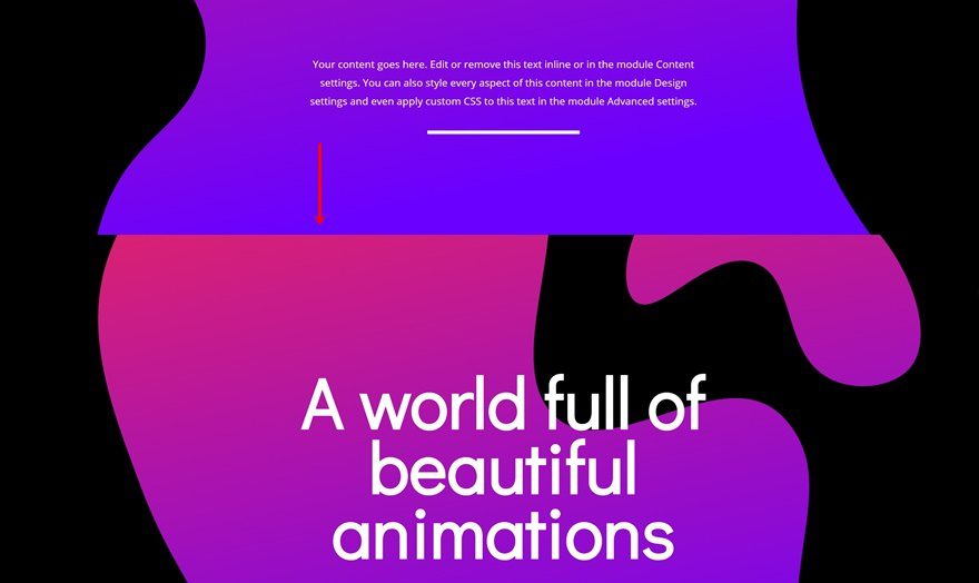
Preview
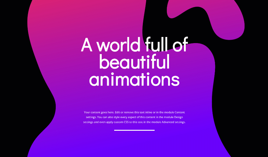
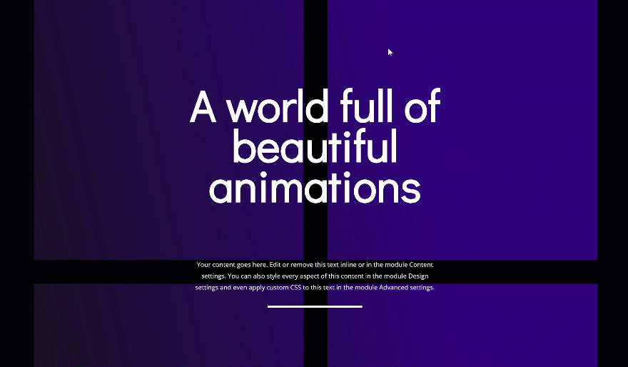
Before we dive into the tutorial, let’s take a quick look at the two examples we’ll recreate from scratch.
Example #1
Example #2
Download the Shaped Image Overlays
To lay your hands on the shaped image overlays that are used throughout this tutorial, you will need to download them using the button below. To gain access to the download you will need to subscribe to our Divi Daily email list by using the form below. As a new subscriber, you will receive even more Divi goodness and a free Divi Layout pack every Monday! If you’re already on the list, simply enter your email address below and click download. You will not be “resubscribed” or receive extra emails.
@media only screen and ( max-width: 767px ) {.et_bloom .et_bloom_optin_1 .carrot_edge.et_bloom_form_right .et_bloom_form_content:before, .et_bloom .et_bloom_optin_1 .carrot_edge.et_bloom_form_left .et_bloom_form_content:before { border-top-color: #ffffff !important; border-left-color: transparent !important; }
}.et_bloom .et_bloom_optin_1 .et_bloom_form_content button { background-color: #f92c8b !important; } .et_bloom .et_bloom_optin_1 .et_bloom_form_content .et_bloom_fields i { color: #f92c8b !important; } .et_bloom .et_bloom_optin_1 .et_bloom_form_content .et_bloom_custom_field_radio i:before { background: #f92c8b !important; } .et_bloom .et_bloom_optin_1 .et_bloom_border_solid { border-color: #f7f9fb !important } .et_bloom .et_bloom_optin_1 .et_bloom_form_content button { background-color: #f92c8b !important; } .et_bloom .et_bloom_optin_1 .et_bloom_form_container h2, .et_bloom .et_bloom_optin_1 .et_bloom_form_container h2 span, .et_bloom .et_bloom_optin_1 .et_bloom_form_container h2 strong { font-family: “Open Sans”, Helvetica, Arial, Lucida, sans-serif; }.et_bloom .et_bloom_optin_1 .et_bloom_form_container p, .et_bloom .et_bloom_optin_1 .et_bloom_form_container p span, .et_bloom .et_bloom_optin_1 .et_bloom_form_container p strong, .et_bloom .et_bloom_optin_1 .et_bloom_form_container form input, .et_bloom .et_bloom_optin_1 .et_bloom_form_container form button span { font-family: “Open Sans”, Helvetica, Arial, Lucida, sans-serif; } p.et_bloom_popup_input { padding-bottom: 0 !important;}

Download For Free
Join the Divi Newlsetter and we will email you a copy of the ultimate Divi Landing Page Layout Pack, plus tons of other amazing and free Divi resources, tips and tricks. Follow along and you will be a Divi master in no time. If you are already subscribed simply type in your email address below and click download to access the layout pack.
You have successfully subscribed. Please check your email address to confirm your subscription and get access to free weekly Divi layout packs!
Let’s Start Creating!
Add New Section
Background Color
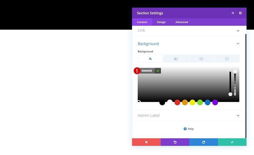
Stary by creating a new page or opening an existing one. Add a regular section to it, open the section settings and add an entirely black background color.
- Background Color: #000000
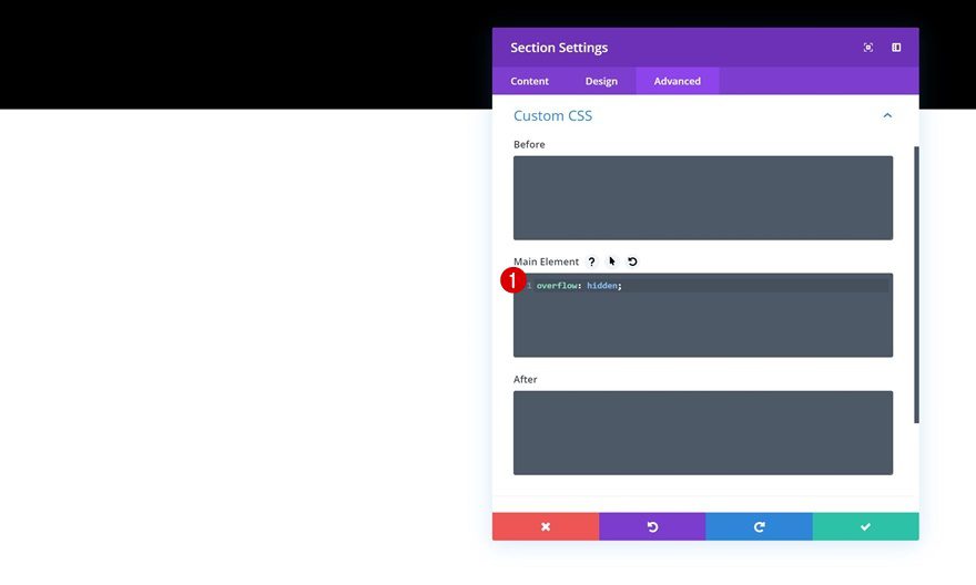
Overflow
To cut off the shaped image overlay later on this tutorial, we’re going to make sure nothing surpasses the section container by adding a single line of CSS code to the main element of the section.
overflow: hidden;
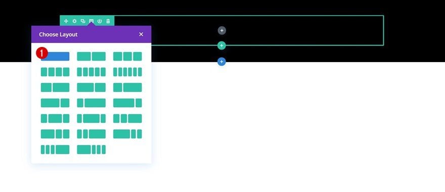
Add New Row
Column Structure
Continue by adding a new row using the following column structure:
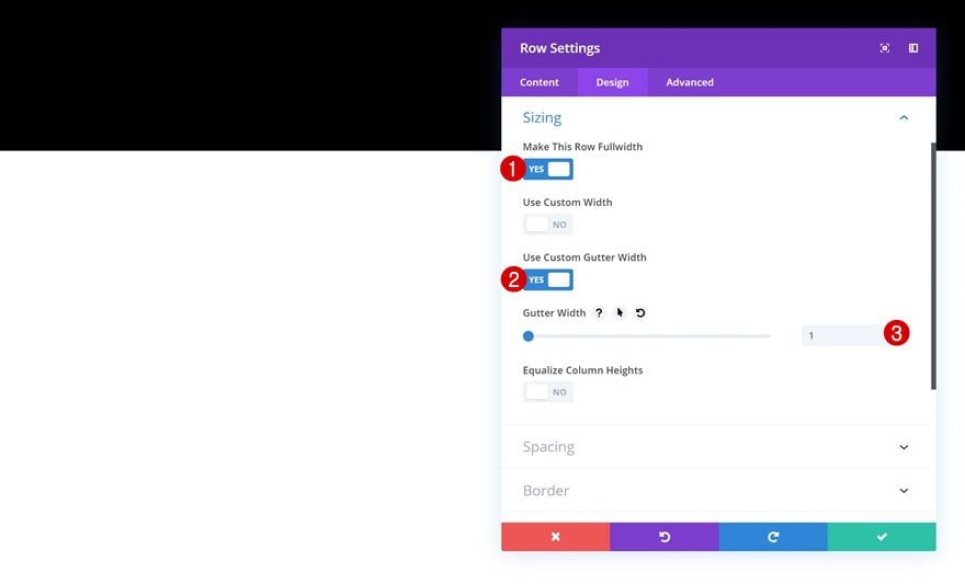
Sizing
Without adding any modules yet, open the row settings and allow the row to take up the entire width of the screen.
- Make This Row Fullwidth: Yes
- Use Custom Gutter Width: Yes
- Gutter Width: 1
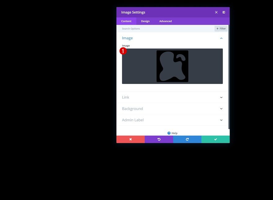
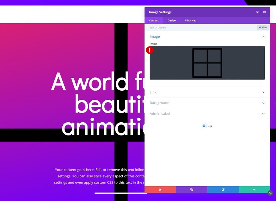
Add Image Module to Row
Upload Shaped Image Overlay
Time to start adding modules! The first module we need is an Image Module. Upload the first shaped image overlay which you can find in the folder you’ve downloaded. You can find more shaped image overlays by going to this post, downloading the files, opening the Illustrator file and customizing them to your needs. If you, however, just want to recreate the examples that were shared in the preview of this post, the folder you’ve downloaded at the beginning of this post will do.
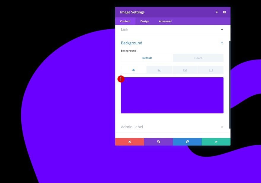
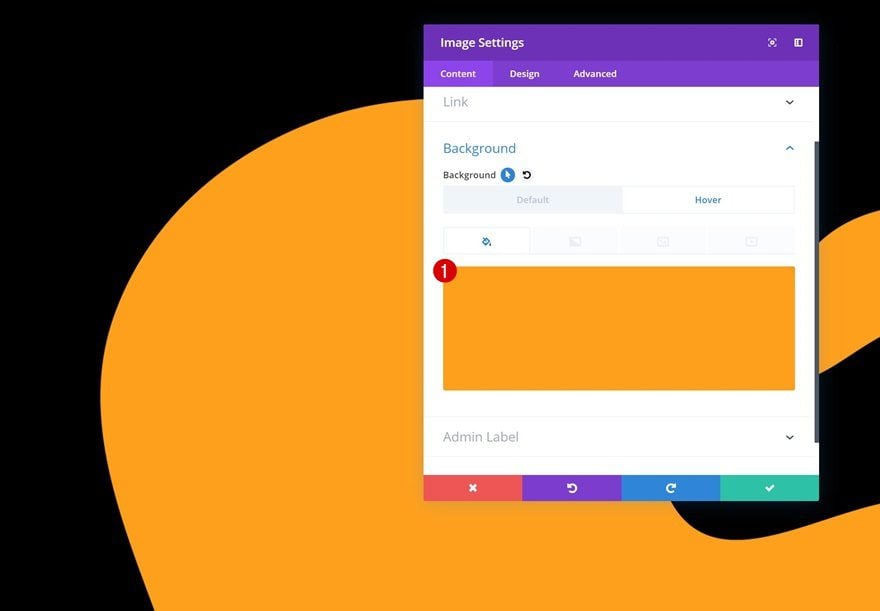
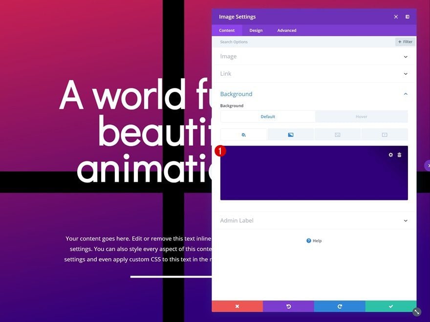
Default Background Color
Go to the background settings of the Image Module and add the following default background color:
- Background Color: #6a00ff
Hover Background Color
Change the background color on hover using the following color code:
- Background Color: #ffa216
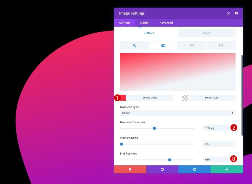
Gradient Background
Continue by adding a gradient background to the Image Module as well.
- Color 1: #ff2841
- Color 2: rgba(255,255,255,0)
- Gradient Direction: 168deg
- End Position: 68%
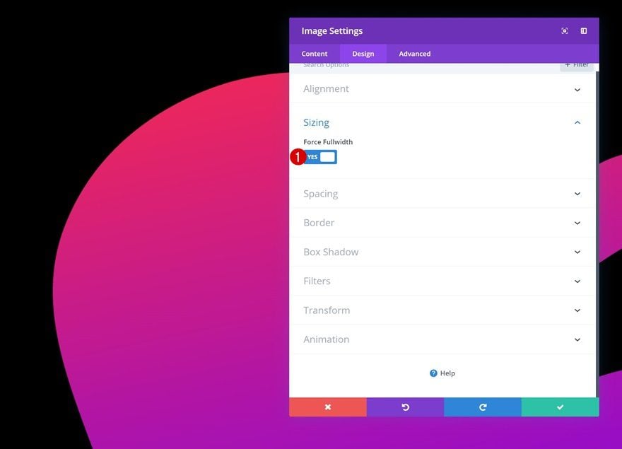
Sizing
Move on to the design tab and enable the ‘Force Fullwidth’ option.
- Force Fullwidth: Yes
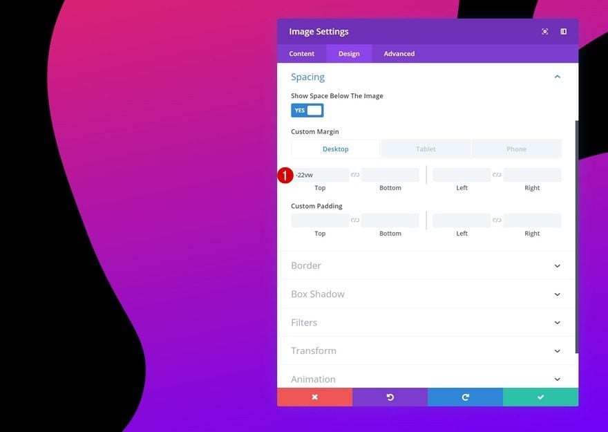
Spacing
We’re also hiding a part of the shaped image overlay by adding some negative top margin to the spacing settings. You’ll notice that the module won’t surpass the section container thanks to that one line of CSS code we’ve added to the section at the beginning of the tutorial.
- Top Margin: -22vw (Desktop & Tablet), 0vw (Phone)
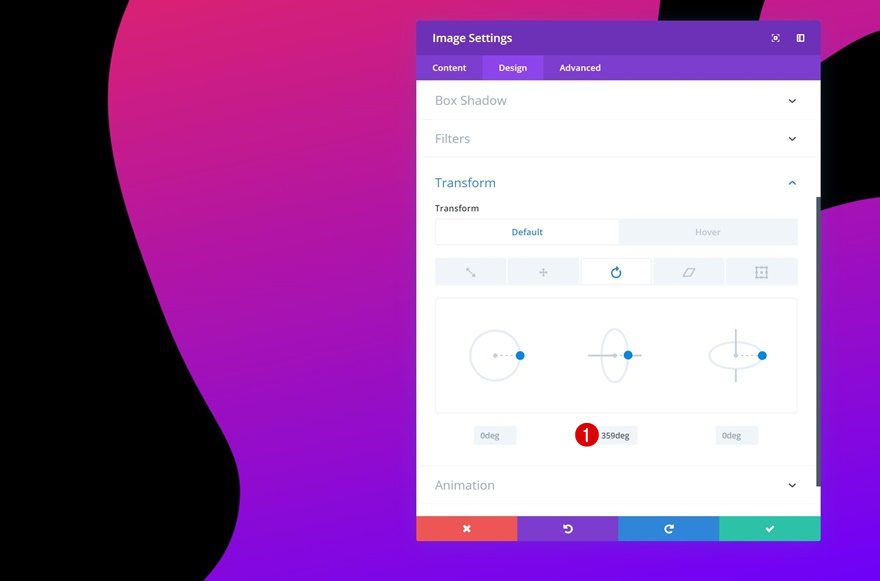
Default Transform Rotate
We can now start transforming the module! Add the following default transform rotate settings to the Image Module:
- Center: 359deg
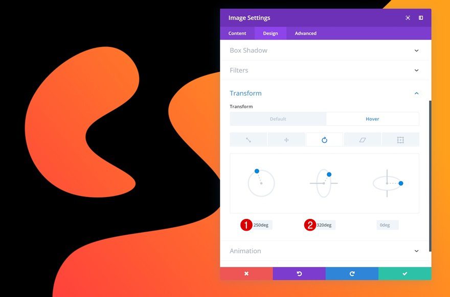
Hover Transform Rotate
And change these values on hover to create a transforming shape.
- Left: 250deg
- Center: 320deg
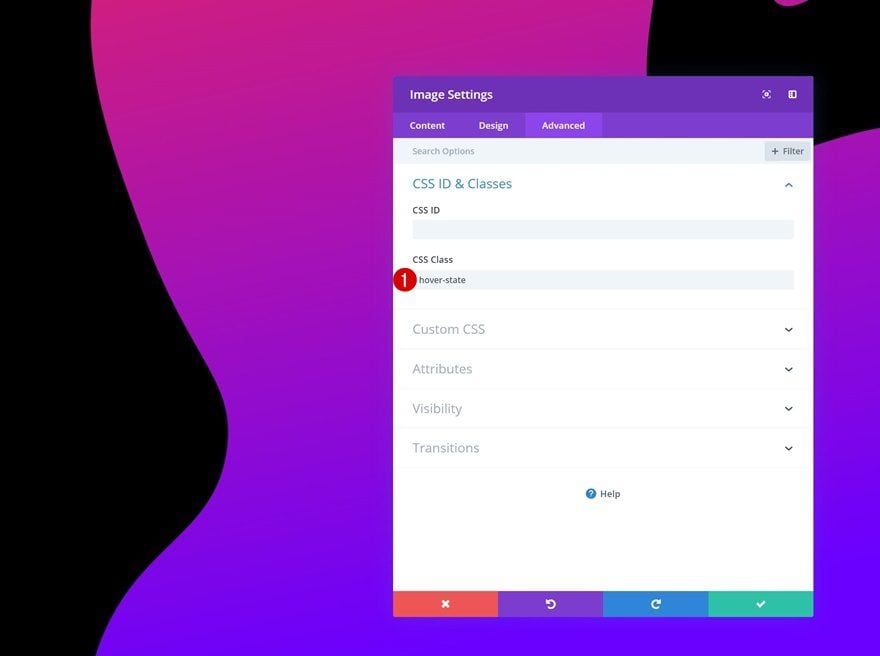
CSS ID
When hovering the Image Module, the shaped image overlay will overlap all other modules that are on top of it. To avoid that, we’ll need to modify the module’s z-index on hover later on the post. To accomplish that, you’ll need to add a custom CSS class to the Image Module.
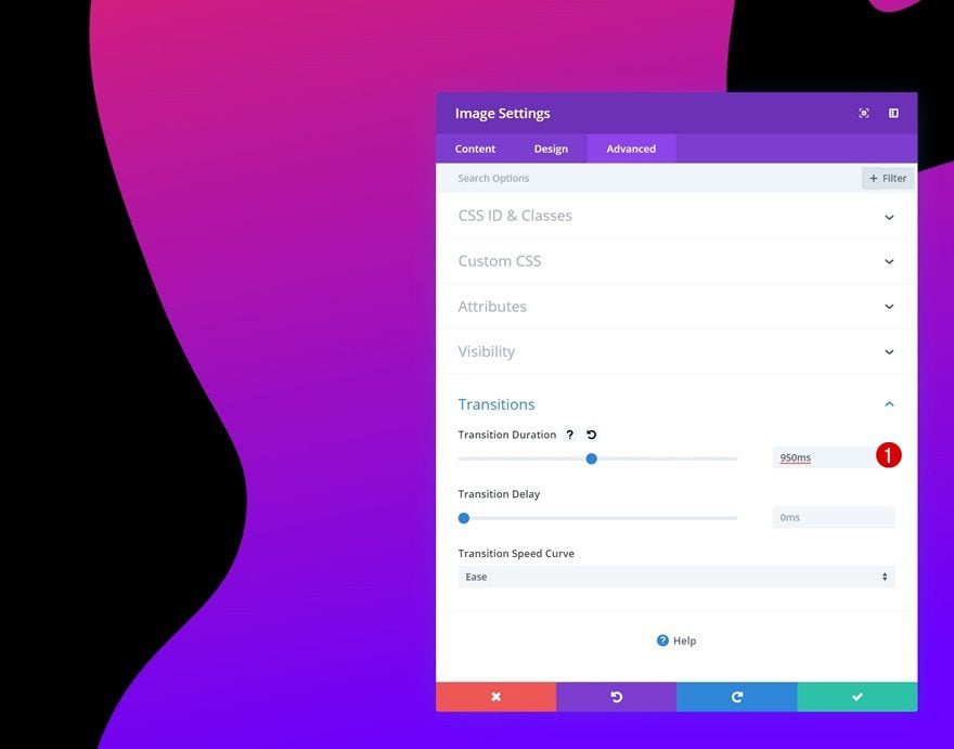
Transitions
Last but not least, we’re creating a smooth transition by increasing the transition duration in the advanced tab.
- Transition Duration: 950ms
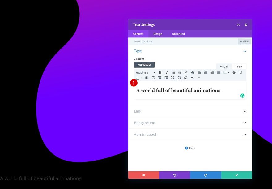
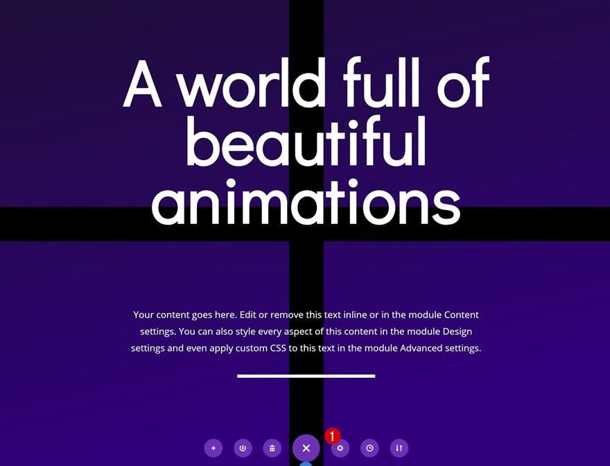
Add Text Module #1 to Row
Add H2 Content
The next module we need is a Text Module. Add some H2 content of your choice.
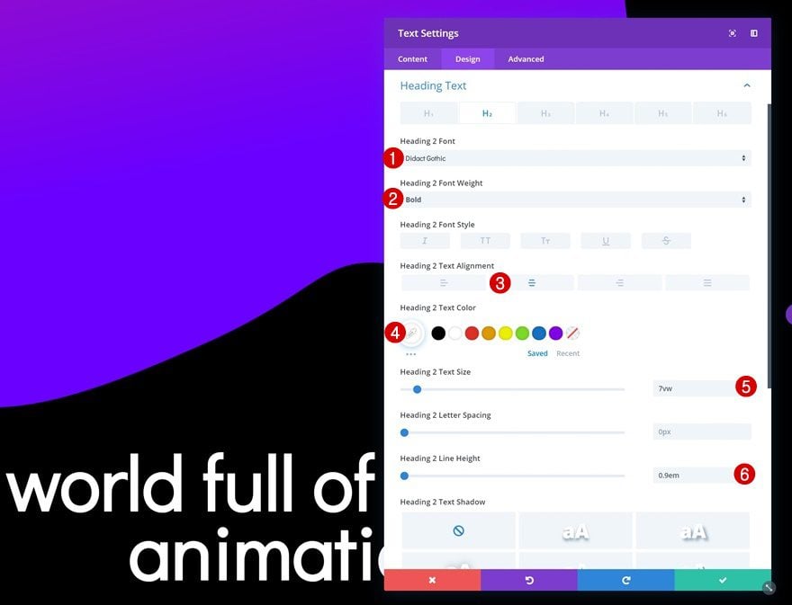
H2 Text Settings
Then, go to the design tab and modify the H2 text settings.
- Heading 2 Font: Didact Gothic
- Heading 2 Font Weight: Bold
- Heading 2 Text Alignment: Center
- Heading 2 Text Color: #ffffff
- Heading 2 Text Size: 7vw
- Heading 2 Line Height: 0.9em
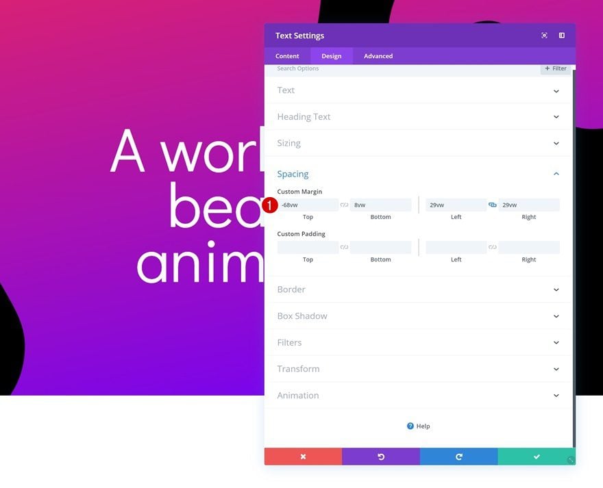
Spacing
Create an overlap between this module and the Image Module using some custom margin values.
- Top Margin: -68vw
- Bottom Margin: 8vw
- Left Margin: 29vw
- Right Margin: 29vw
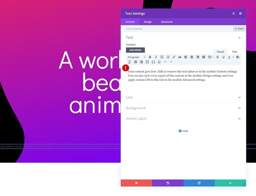
Add Text Module #2 to Row
Add Content
Add another Text Module right below the previous one and enter some paragraph content of your choice.
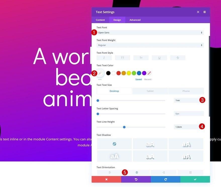
Text Settings
Then, go to the design tab and modify the text settings.
- Text Font: Open Sans
- Text Color: #ffffff
- Text Size: 1vw (Desktop), 2vw (Tablet), 3vw (Phone)
- Text Line Height: 1.8em
- Text Orientation: Center
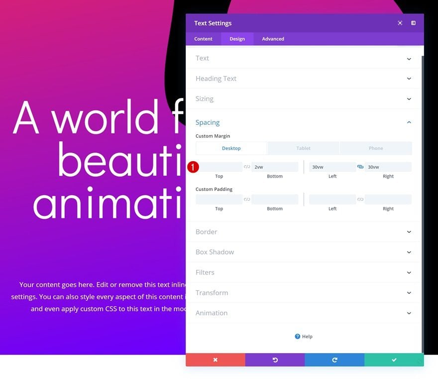
Spacing
Add some custom margin values as well.
- Bottom Margin: 2vw (Desktop), 4vw (Tablet), 6vw (Phone)
- Left Margin: 30vw (Desktop), 10vw (Tablet & Phone)
- Right Margin: 30vw (Desktop), 10vw (Tablet & Phone)
Add Divider Module to Row
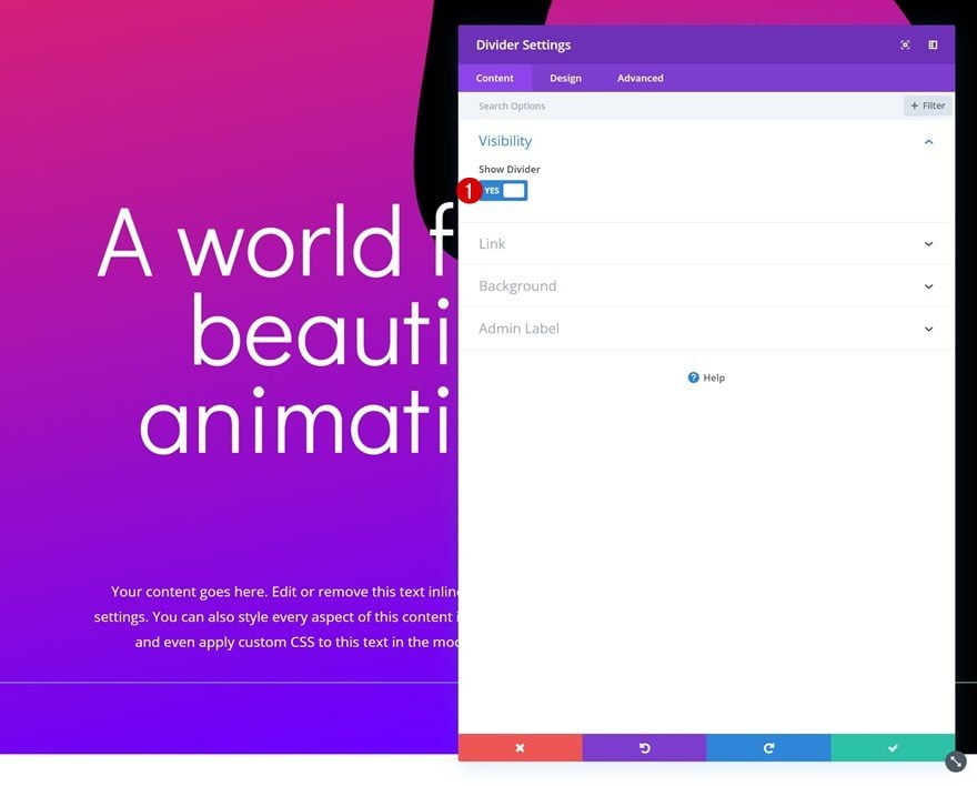
Visibility
The next and last module we need is a Divider Module. Make sure the ‘Show Divider’ option is enabled.
- Show Divider: Yes
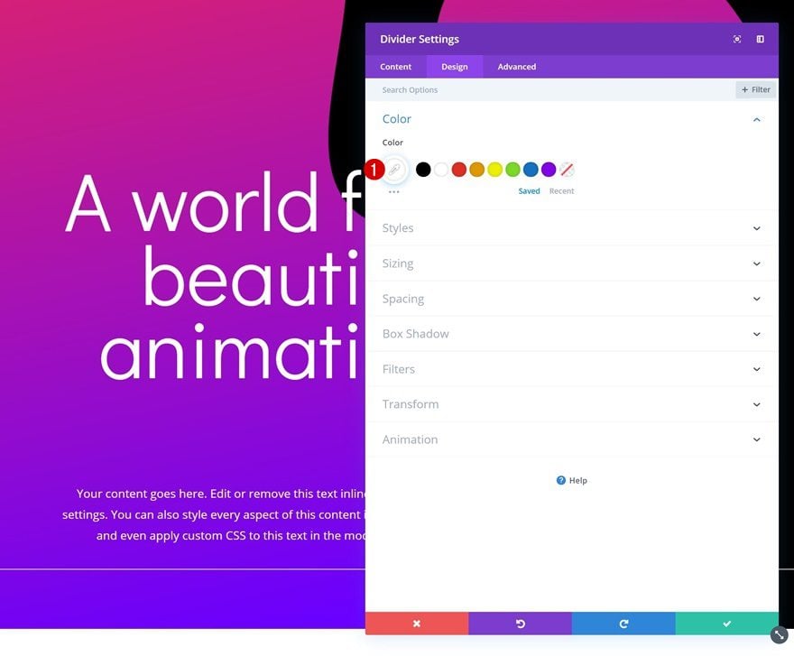
Color
Then, go to the design tab and change the color of the divider.
- Color: #ffffff
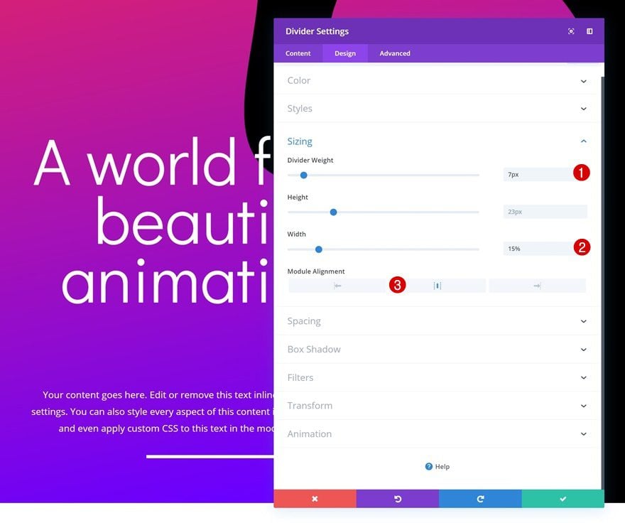
Sizing
Modify the sizing values as well.
- Divider Weight: 7px
- Width: 15%
- Module Alignment: Center
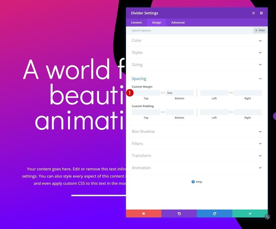
Spacing
And add some custom bottom padding.
- Bottom Margin: 5vw
Clone Entire Section
On to the second example! Clone the section you’ve just completed.
Change Image Module
Upload New Shaped Image Overlay
There are a few changes we need to make, starting with the shaped image overlay. Go ahead and upload the second shaped image overlay which you can find in the folder you’ve downloaded at the beginning of this post.
Change Default Background Color
Then, go to the Image Module’s background settings and change the default background color.
- Background Color: #2d007c
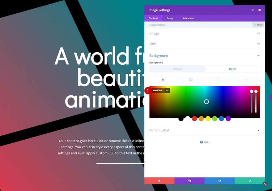
Change Hover Background Color
Change the hover background color as well.
- Background Color: #008089
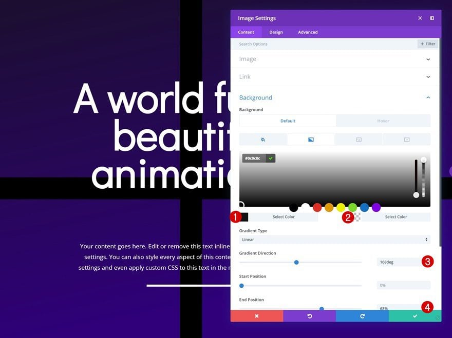
Change Gradient Background
Along with the gradient background.
- Color 1: #0c0c0c
- Color 2: rgba(255,255,255,0)
- Gradient Direction: 168deg
- End Position: 68%
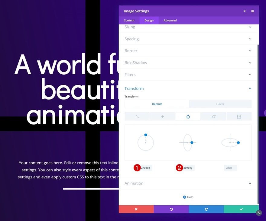
Change Default Transform Rotate Settings
We’re also changing the transform effect. Go to the transform settings and change the default transform rotate values.
- Left: 270deg
- Center: 359deg
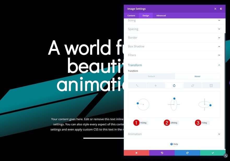
Change Hover Transform Rotate Settings
Modify those same values on hover.
- Left: 192deg
- Center: 280deg
- Right: 15deg
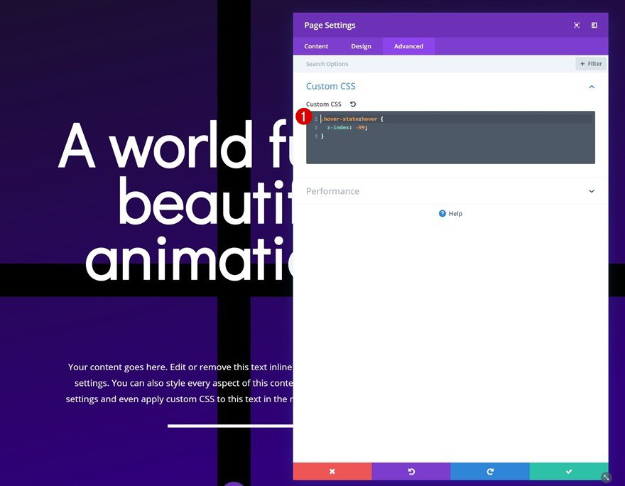
Add Custom Code to Page
Open Page Settings
Now, the last part of this post makes sure that the transforming shape remains below all the other modules when it is being hovered. Open the page settings.
Add CSS Code
Then go to the advanced tab and add the following CSS code.
.hover-state:hover {
z-index: -99; }
We’re using the CSS Class we’ve assigned to the sections throughout the tutorial.
Preview
Now that we’ve gone through all the steps, let’s take a final look at the outcome.
Example #1
Example #2
Final Thoughts
In this post, we’ve shown you how to get creative with Divi’s transform options. More specifically, we’ve used Image Modules with shaped image overlays to create a transforming background shape. If you have any questions or suggestions, make sure you leave a comment in the comment section below!
The post Decorating Your Page with Transforming Shapes on Hover with Divi appeared first on Elegant Themes Blog.