
It’s time again for our monthly Divi Showcase where we take a look at 10 amazing Divi websites made by our community members. Each month we showcase the best Divi websites that were submitted from our community and today we want to share with you the top ten websites for the month of April. Throughout the post I’ll point out some of my favorite design features that draw me to each of the websites.
I hope you like them!
Divi Design Showcase: New Submissions from April 2018
1. Heidi Rose
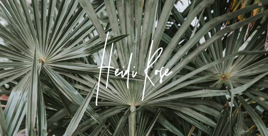
This site was submitted by Heidi Rose. It uses a minimal design with a few sections with background images, a couple of warm tan sections (including one with an overlay), and several sections with white backgrounds with text. Several titles have a hand written font while taglines use all-caps with extra spacing which look amazing over the white backgrounds. I love the use of true parallax in a couple of the sections.
2. Petratec
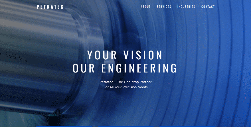
This site was submitted by Arthur. You can tell at a glance, just from the colors and images alone, that this site focuses on engineering. The large blue image fades to a solid blue background as you scroll, transitioning from an introduction to services to a contact form. The other pages follow this same design. I love the services section. It has overlapping blurbs which change from blue to yellow on hover, and cut-out images that overlap the blurbs and remain in place on hover.
3. Noje
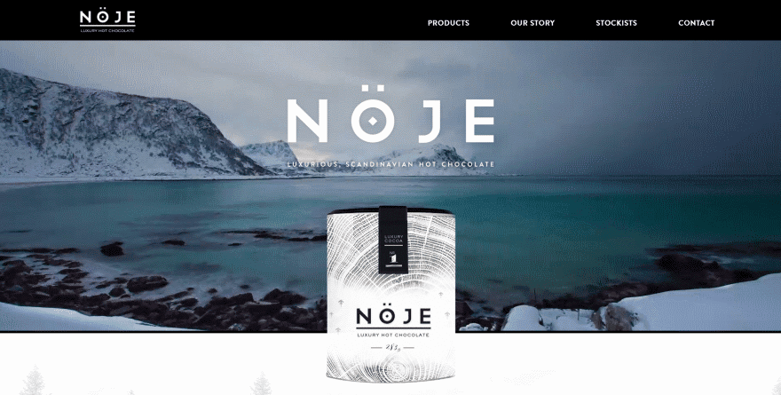
This site was submitted by Chris Peak. The hero section displays a background video in time-lapse behind the overlapping product graphic. I love the use of images in this site. An About section displays two columns with images as links to pages. A non-clickable image gallery displays 9 images in three columns. Images do not use padding, so they’re touching on all sides. I also like the dots that appear above the links in the menu on hover.
4. Shovel
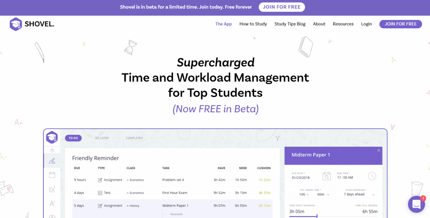
This site was submitted by Kelsey Frizzell. This site makes excellent use of purple highlights and line-art. The art-work is used either in backgrounds or as the graphic to draw attention to a section. Several of the full-width sections with graphics have purple highlights. Alternating numbered lists step you through the process of using the app. I also like the outline for navigation on the How to Study page.
5. Grib
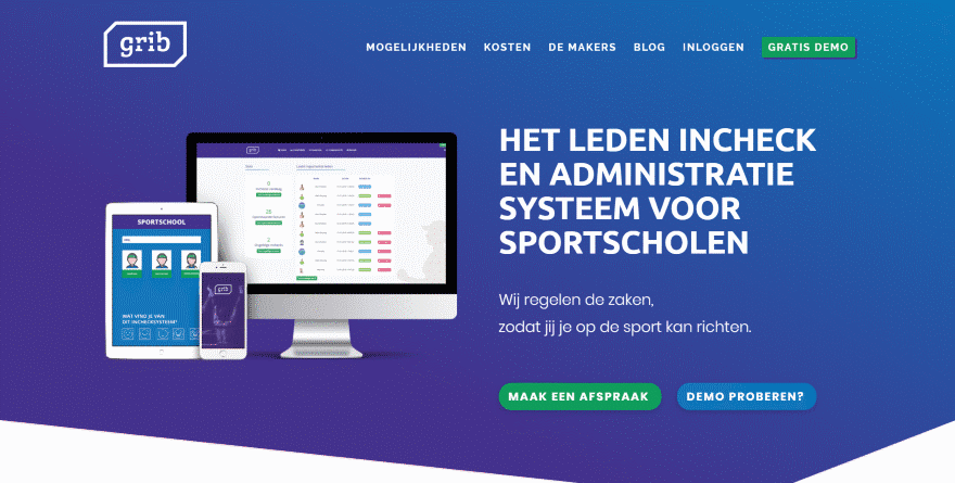
This site was submitted by Camiel Bos. It uses lots of angle section separators to separate the blue and white backgrounds. A three-column section to show the product and benefits shows a 360 degree rotation of the product using a slider control. Blue and green are used together to create highlights and often alternate from one to the other on hover. The site makes great use of color, box shadow, and illustrations in its calls to action.
6. Das Gute Ruft
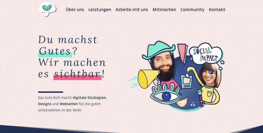
This site was submitted by Philipp Stakenborg. This one alternates tan and blue with two-color section section separators throughout. The tan sections use green highlights as shadows behind the buttons and title text. Several other pages use red highlights in the blue backgrounds. I love the section right in the middle with a background image and a text overlay with its angled section separators that creates an angled section. I also like the footer with its use of dark blue and large icons and the loading animation.
7. Tip Me
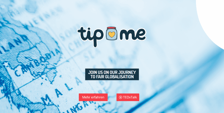
This site was submitted by Philipp Stakenborg. This one uses some interesting section separators. In the hero section you can see a circled cut-out in the right corner. This same curvy design is also used to separate the hero section from the following section, which uses an elegant two-sided button to choose which set of blurbs display. I love the way the blurbs use cartoonish illustrations that stand out and match the site’s branding.
8. Paper Jacket Marketing
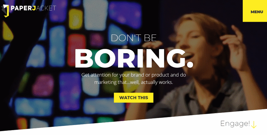
This site was submitted by John Hicks. It uses lots of yellow highlights throughout, including the menu which displays a yellow block with text instead of a hamburger menu and shows a yellow background on open. I love the angled section separator for the hero section with Engage! and a down arrow that invites you to see the rest of the site. I like the way the portfolio images zoom on hover. The site makes excellent use of color, images, and icons.
9. LearnSafe

This site was submitted by Shawn Wright. This site uses various shades of blue and green for title text, buttons, and graphics against shades of off-white for backgrounds to create a clean and elegant design. A services section displays four services in two columns with alternating background colors, large icons, blue titles, and dark blue links. I love the use of graphics for numbering within blurbs and alternating sections.
10. Little Green Thumbs
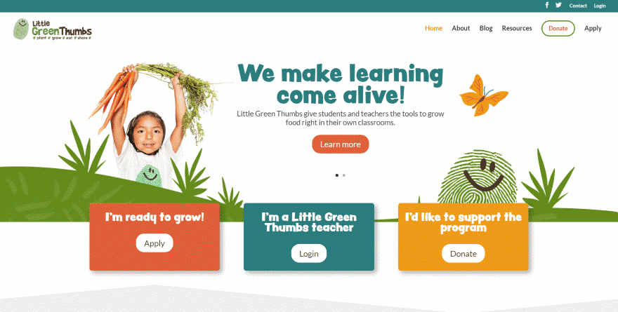
This site was submitted by Molly Seaton-Fast. I love the bold colors and fonts in this site. They work perfectly for the target audience. It uses lots of styled section separators, dividers, true parallax, and overlapping elements. An Instagram slider creates a gallery. The information sections display alternating CTA’s with and without background patterns. The menu displays icons in the submenu and changes color on scroll. Even the blog’s sidebar is styled with a matching background color. I also like the alternating blog layout.
In Closing
That’s our 10 best community Divi website submissions for the month of April. These sites look amazing and as always we want to thank everyone for your submissions!
If you’d like your own design considered please feel free to email our editor at nathan at elegant themes dot com. Be sure to make the subject of the email “DIVI SITE SUBMISSION”.
We’d also like to hear from you in the comments! Tell us what you like about these websites and if there is anything they’ve done you want us to teach on the blog.
Featured Image via StudioADFX / shutterstock.com
The post Divi Design Showcase: New Submissions from April 2018 appeared first on Elegant Themes Blog.