Accordions are basic design elements that provide great ways to provide content in collapsible form. Readers can open and close the content on demand. Divi includes a standard accordion module, but what if you wanted new accordion designs? For that you might be interested in a plugin called Divi Accordion.
Divi Accordion is a third party plugin for SA Solutions that adds a new module to the Divi Builder that includes 10 themes that create new accordion designs. Add backgrounds, overlays, gradients, icons from Font Awesome, and lots more. The themes include basic accordion designs as well as animated cards and icons.
In this article we’ll take a look at all 10 themes and get an idea of what each one can do. It also works with Extra. At the end of this article we’ll take a look at a couple of examples in an Extra blog page. Images for the examples were taken from Unsplash.com.
SA Accordion Installation and Settings
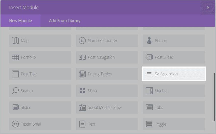
Upload and activate the plugin as normal. You’ll see a new module added to the Divi Builder called SA Accordion.
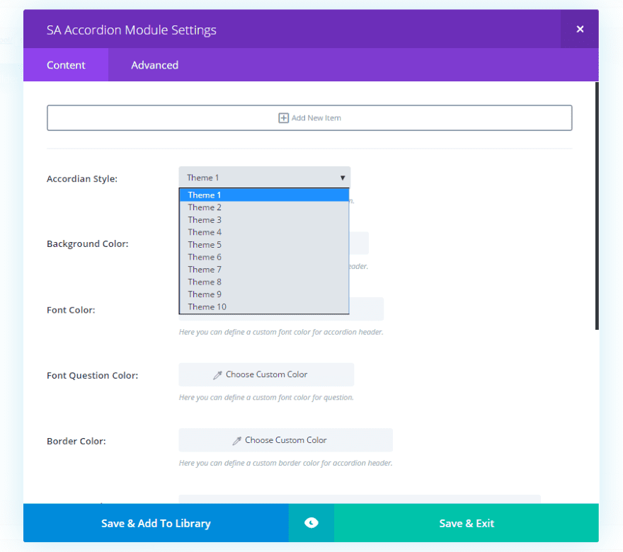
The module includes two tabs: Content and Advanced. In the Content tab you can add a new item, choose a theme, change colors for background, font, font question, and border, and enter Font Awesome icon slugs for open and closed.
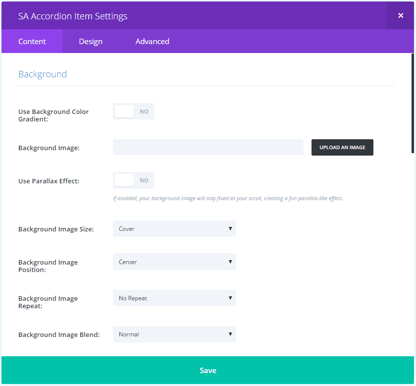
New Item settings add lots of new background customizations. They include gradients, images, parallax, image size, position, repeat, lots of video options, image URL for theme 7, and Font Awesome code for theme 8. It still includes the visual editor.
The features that will be used will depend on the theme you choose. You must provide a title for each item to get them to display.
SA Accordion Examples
Here’s a look at each theme. The first image is the default settings and the second image includes some customizations.
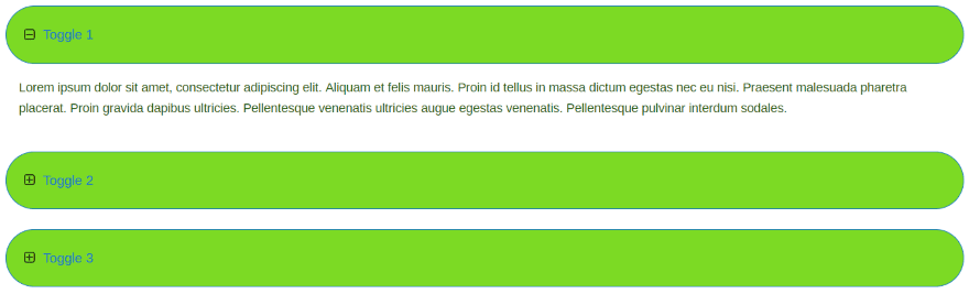
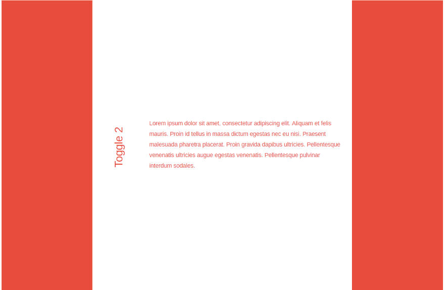
Theme 1
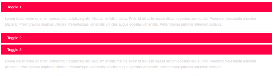
This is the default look for Theme 1. Clicking on the red bar opens and closes the toggle. You can open them all at the same time.
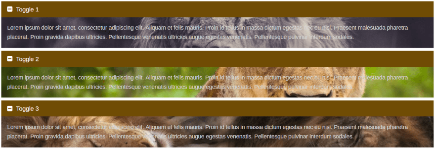
I’ve adjusted the background, font, and font question colors, and added Font Awesome icons. I’ve also placed a background image within each toggle. Background color, gradients, and images are placed behind the text within the open toggle.
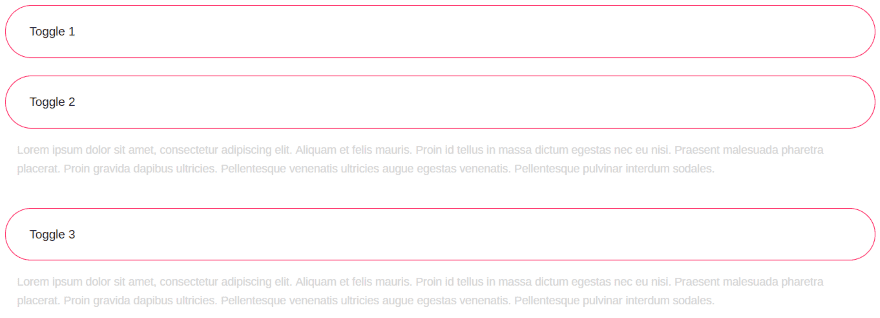
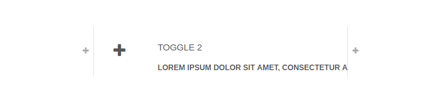
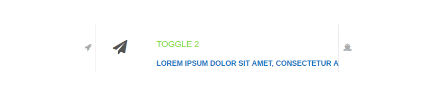
Theme 2
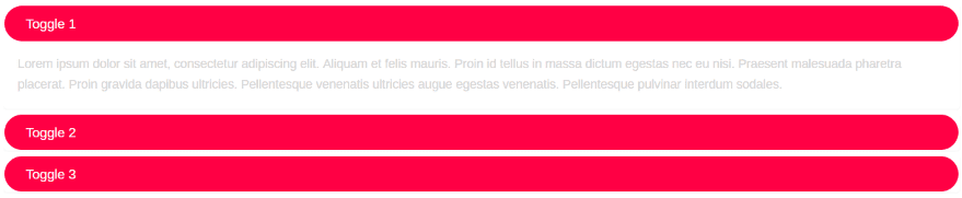
Theme 2 looks like theme 1 but rounds the edges.
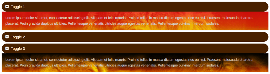
I’ve changed the background and used the same settings as in theme 1, only this time I’ve added a gradient as an overlay for each of the items.
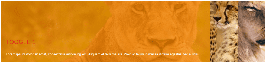
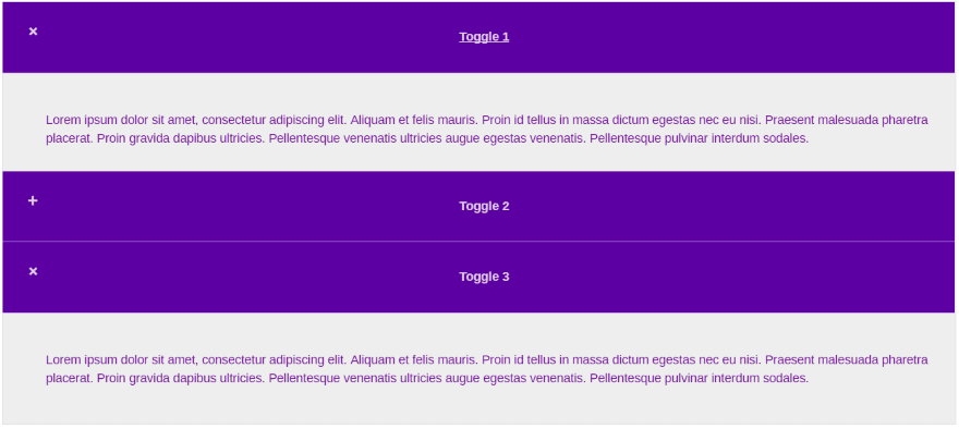
Theme 3
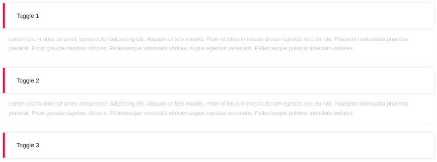
Theme 3 uses a blocked look with the accent color to the left.
This one includes a color adjustment for the border. I’ve added new Font Awesome icons to indicate the toggle’s open/close state and I’ve darkened the background of the text just enough to make it stand out.
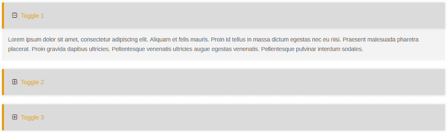
Theme 4
Theme 4 uses a border around the toggle.
I’ve adjusted the fill, border, and font colors, and added Font Awesome icons to indicate open and close.
Theme 5
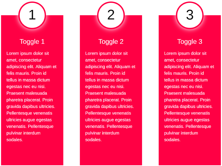
Theme 5 uses a completely different design. Rather than animating or having an open/close state it provides a nice layout to present your information as a numbered list.
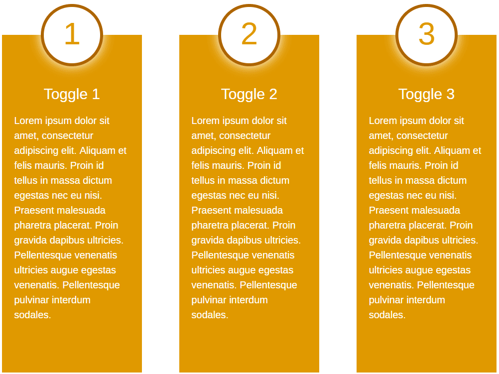
This theme adds a customization for the number color. All of the other colors work the same as the others. The border color adjusts the color around the circle.
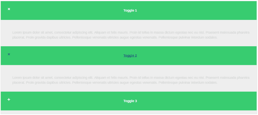
Theme 6
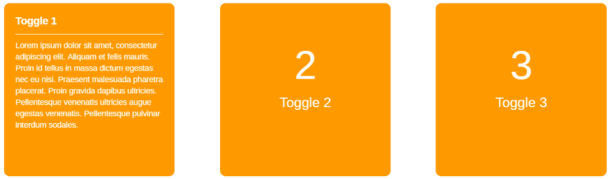
Theme 6 is a set of cards that flip around when you hover over them. This one only allows for one toggle to be activated at a time. The card closes when you move away.
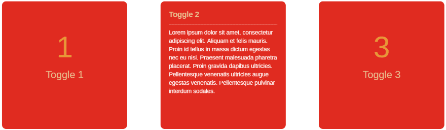
You can adjust the number color just like in theme 5. The font question color appears on both sides of the card.
Theme 7
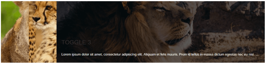
Theme 7 requires a background image in order to display. It shows a cropped version of the image. Hovering over the image opens it (with a nice zoom animation), revealing the title and text in an overlay over the image. This one allows one toggle to be open at a time. The toggle closes as you move away.
This example uses a background overlay with red title font. Theme 7 is one of my favorite themes.
Theme 8
Theme 8 is unique in that it displays the toggles horizontally as icons. Hovering over the icons opens a toggle. The toggle closes as you move away.
You can add icons from Font Awesome and adjust the font and question colors.
Theme 9
Theme 9 places the toggles vertically and includes large blocks. You can open one, which remains open, but it closes when you open the next toggle.
Adjust the background, font, and font question colors.
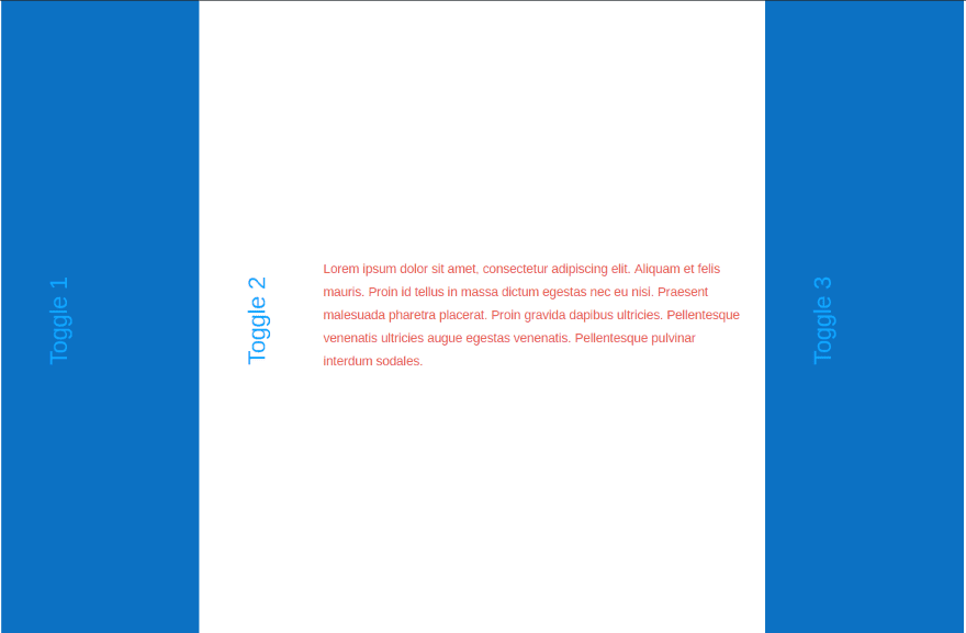
Theme 10
Theme 10 displays the toggles horizontally and is more similar to the traditional look. You can open multiple toggles at once.
Adjust the background, font, and font question colors.
Using Divi Accordion Within a Layout
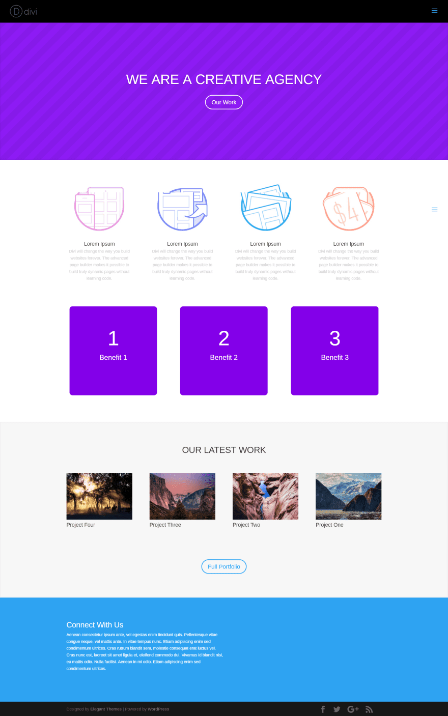
Divi Accordion’s theme 6 looks right at home with the Divi Creative Agency layout.
This layout uses a fullwidth image, Divi Accordion using theme 7 with 5 items, and a blog module in a grid layout with 3 posts. Divi Accordion works well within the design. I can see using this to explain the categories, provide info about locations, and lots more.
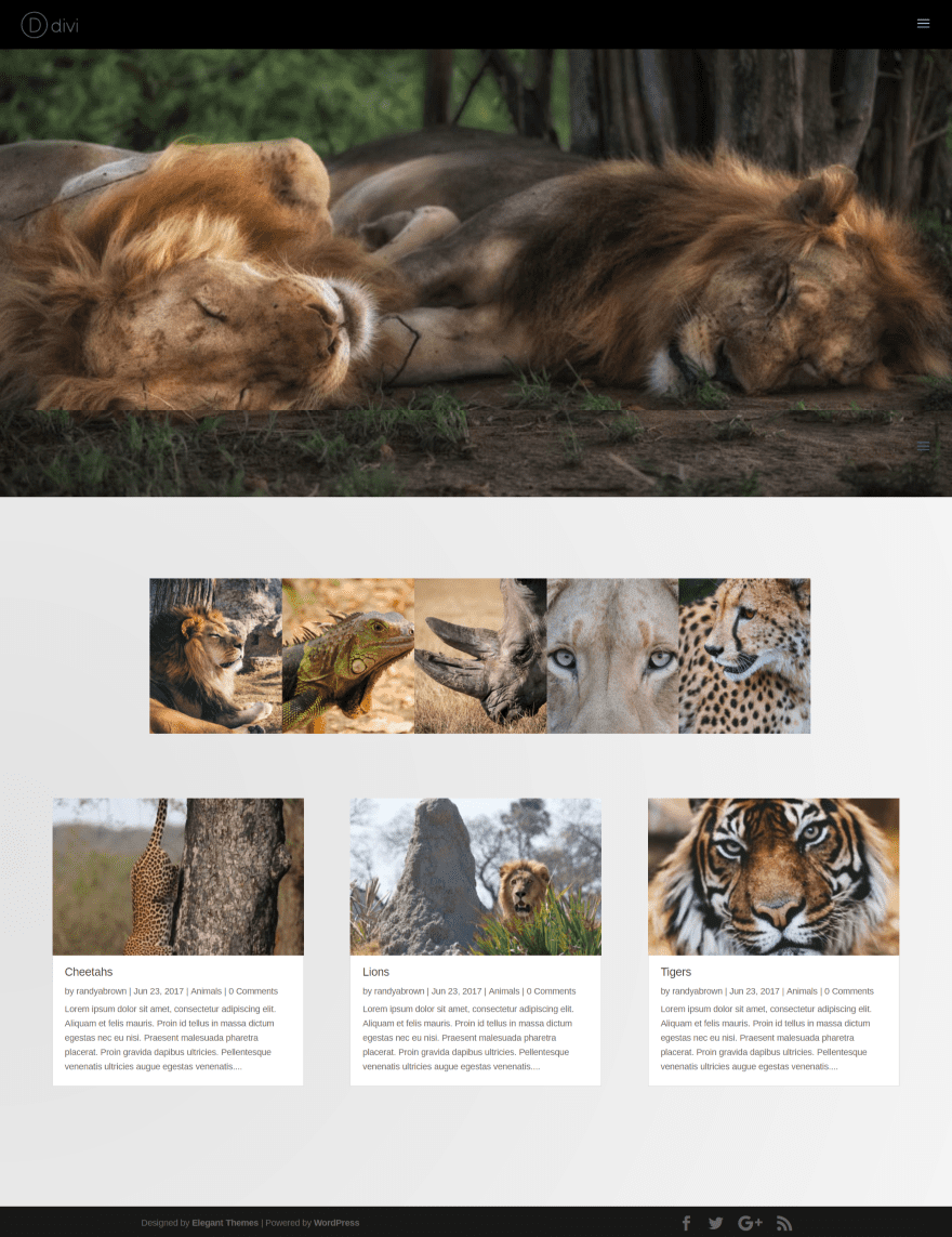
Using Divi Accordion with Extra
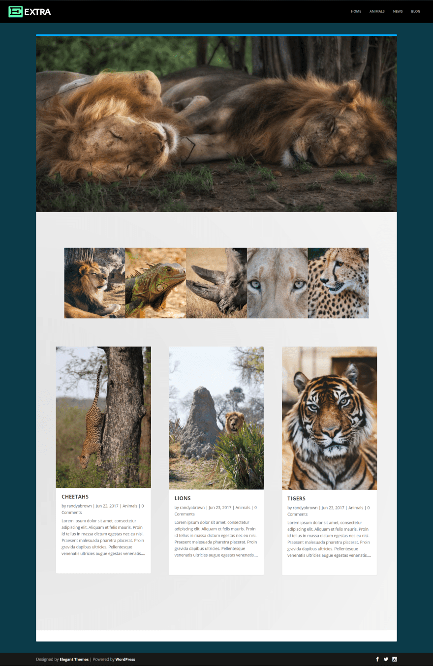
Here’s a look at the blog page using theme 7 in Extra. Divi Accordion works the same with Extra as it does with Divi.
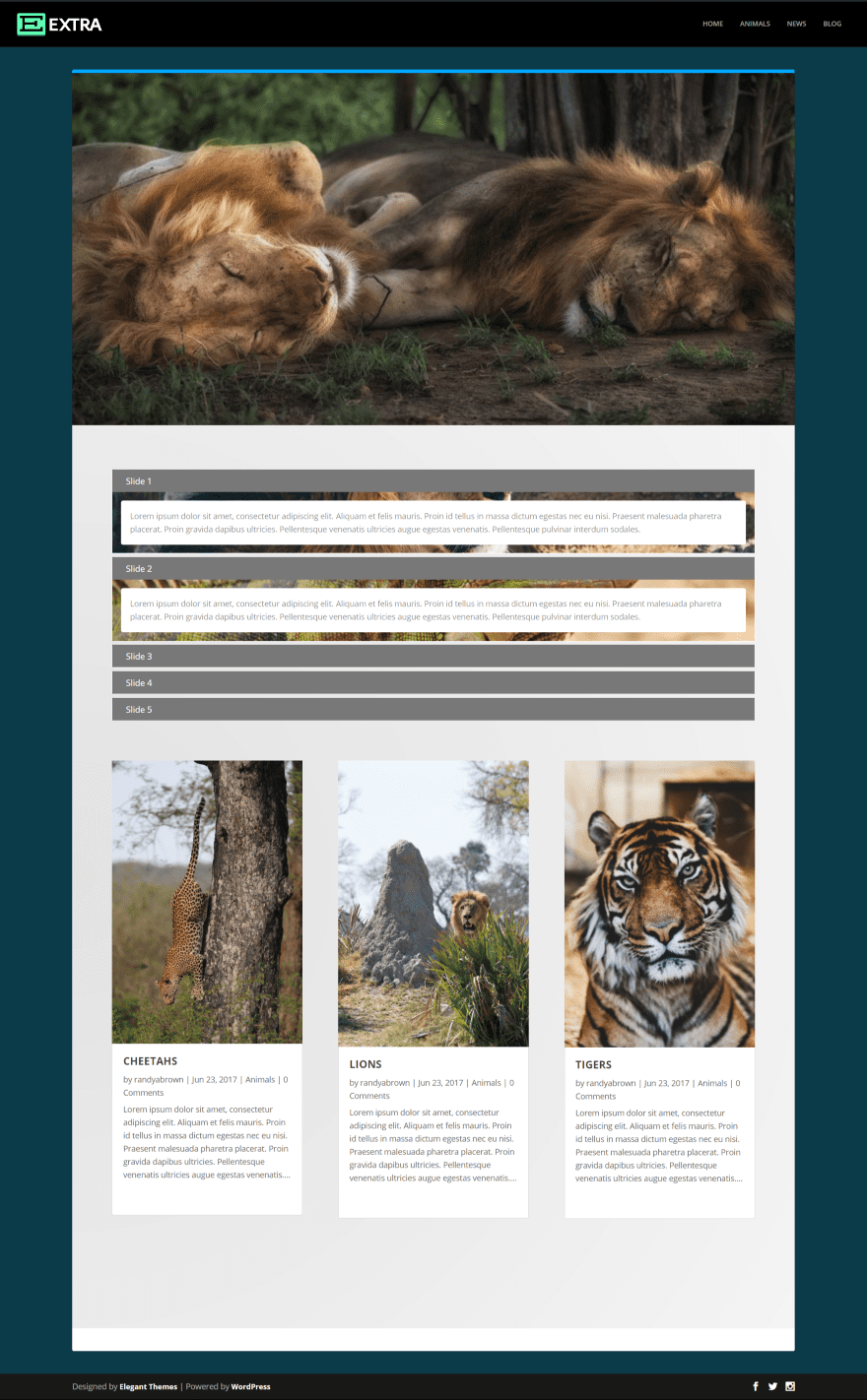
Here’s a look at theme 1 within the same blog layout. This is a great way to add extra elements for information or other media within your content.
License and Support
Divi Accordion can be installed on unlimited sites for you and your clients. It includes 6 months support.
Final Thoughts
Divi Accordion is simple to use but gives you lots of new accordion designs and features to style your accordions to match your pages and posts. The new layouts makes accordions more useful than ever and the ability to add background colors, gradients, and images opens up a lot of design possibilities. If you’re interested in accordion designs that go beyond the standard accordion module, Divi Accordion might be what you’re looking for.
We’d like to hear from you. Have you tried Divi Accordion? Let us know about your experience in the comments.
Featured Image via Cihan Terlan / shutterstock.com
The post Divi Plugin Highlight – Divi Accordion appeared first on Elegant Themes Blog.

