
Whether you’re selling a physical book or an e-book, having an effective landing page for it can do wonders. You can approach this landing page the traditional way, or you can turn it into a book preview landing page. A book preview landing page allows people to read certain parts or chapters of your book in advance. It’s also equipped with anchor links that make navigating through the different parts or chapters seamless. To top it off, you also want to put a CTA in the spotlight that’ll drive traffic to wherever you’re selling your book.
In this tutorial, we’ll recreate a stunning book preview landing page from scratch with Divi. You’ll also be able to download the layout JSON for free if you want to add it to your website right away.
Let’s get to it!
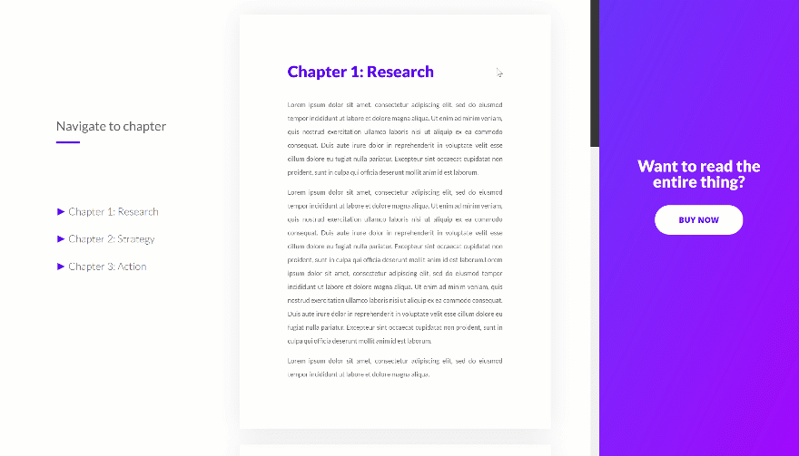
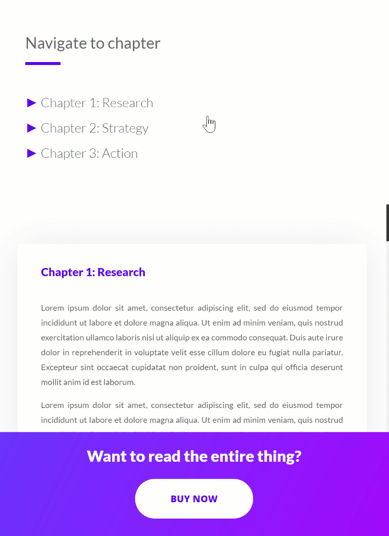
Preview
Before we dive into the tutorial, let’s take a quick look at the outcome across different screen sizes.
Desktop
Mobile
Download the Book Preview Landing Page Layout for FREE
To lay your hands on the free book preview landing page layout, you will first need to download it using the button below. To gain access to the download you will need to subscribe to our Divi Daily email list by using the form below. As a new subscriber, you will receive even more Divi goodness and a free Divi Layout pack every Monday! If you’re already on the list, simply enter your email address below and click download. You will not be “resubscribed” or receive extra emails.
@media only screen and ( max-width: 767px ) {.et_bloom .et_bloom_optin_1 .carrot_edge.et_bloom_form_right .et_bloom_form_content:before, .et_bloom .et_bloom_optin_1 .carrot_edge.et_bloom_form_left .et_bloom_form_content:before { border-top-color: #ffffff !important; border-left-color: transparent !important; }
}.et_bloom .et_bloom_optin_1 .et_bloom_form_content button { background-color: #f92c8b !important; } .et_bloom .et_bloom_optin_1 .et_bloom_form_content .et_bloom_fields i { color: #f92c8b !important; } .et_bloom .et_bloom_optin_1 .et_bloom_form_content .et_bloom_custom_field_radio i:before { background: #f92c8b !important; } .et_bloom .et_bloom_optin_1 .et_bloom_border_solid { border-color: #f7f9fb !important } .et_bloom .et_bloom_optin_1 .et_bloom_form_content button { background-color: #f92c8b !important; } .et_bloom .et_bloom_optin_1 .et_bloom_form_container h2, .et_bloom .et_bloom_optin_1 .et_bloom_form_container h2 span, .et_bloom .et_bloom_optin_1 .et_bloom_form_container h2 strong { font-family: “Open Sans”, Helvetica, Arial, Lucida, sans-serif; }.et_bloom .et_bloom_optin_1 .et_bloom_form_container p, .et_bloom .et_bloom_optin_1 .et_bloom_form_container p span, .et_bloom .et_bloom_optin_1 .et_bloom_form_container p strong, .et_bloom .et_bloom_optin_1 .et_bloom_form_container form input, .et_bloom .et_bloom_optin_1 .et_bloom_form_container form button span { font-family: “Open Sans”, Helvetica, Arial, Lucida, sans-serif; } p.et_bloom_popup_input { padding-bottom: 0 !important;}

Download For Free
Join the Divi Newlsetter and we will email you a copy of the ultimate Divi Landing Page Layout Pack, plus tons of other amazing and free Divi resources, tips and tricks. Follow along and you will be a Divi master in no time. If you are already subscribed simply type in your email address below and click download to access the layout pack.
You have successfully subscribed. Please check your email address to confirm your subscription and get access to free weekly Divi layout packs!
Let’s Start Recreating!
Add New Regular Section
Spacing
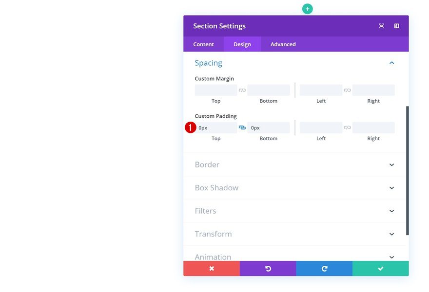
Start by creating a new page and add a regular section to it. Open the section settings and remove all custom top and bottom padding.
- Top Padding: 0px
- Bottom Padding: 0px
Add Row
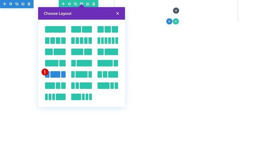
Column Structure
Continue by adding a new row to the section using the following column structure:
Background Color
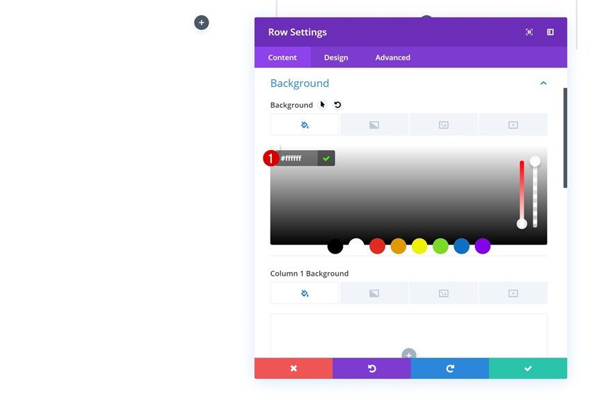
Without adding any modules yet, open the row settings and add a white background color.
- Background Color: #ffffff
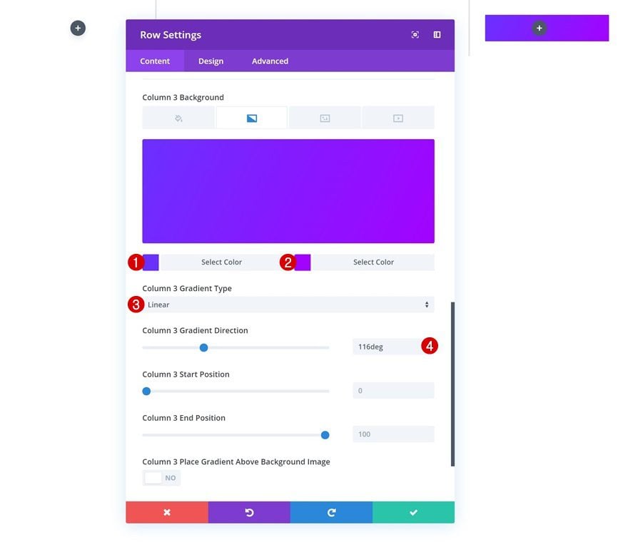
Column 3 Gradient Background
Add a gradient background to the third column as well.
- Color 1: #6a30ff
- Color 2: #a202ff
- Column 3 Gradient Type: Linear
- Column 3 Gradient Direction: 166deg
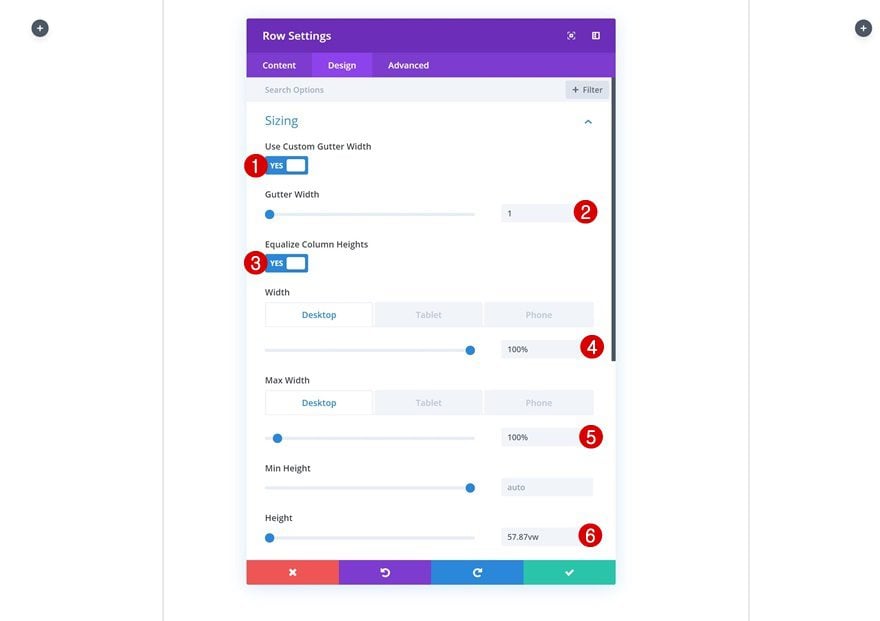
Sizing
Then, go to the sizing settings and allow the row to take up the entire width of the screen by adding the following sizing settings:
- Use Custom Gutter Width: Yes
- Gutter Width: 1
- Equalize Column Heights: Yes
- Width: 100%
- Max Width: 100%
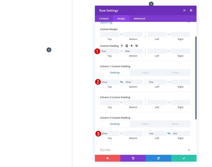
Spacing
Move on to the spacing settings and remove the custom top and bottom padding of the row. Add some padding values to the first and third column as well.
- Top Padding: 0vw
- Bottom Padding: 0vw
- Column 1 Top Padding: 15vw (Desktop), 10vw (Tablet & Phone)
- Column 2 Bottom Padding: 15vw (Desktop), 10vw (Tablet & Phone)
- Column 1 Left Padding: 7vw
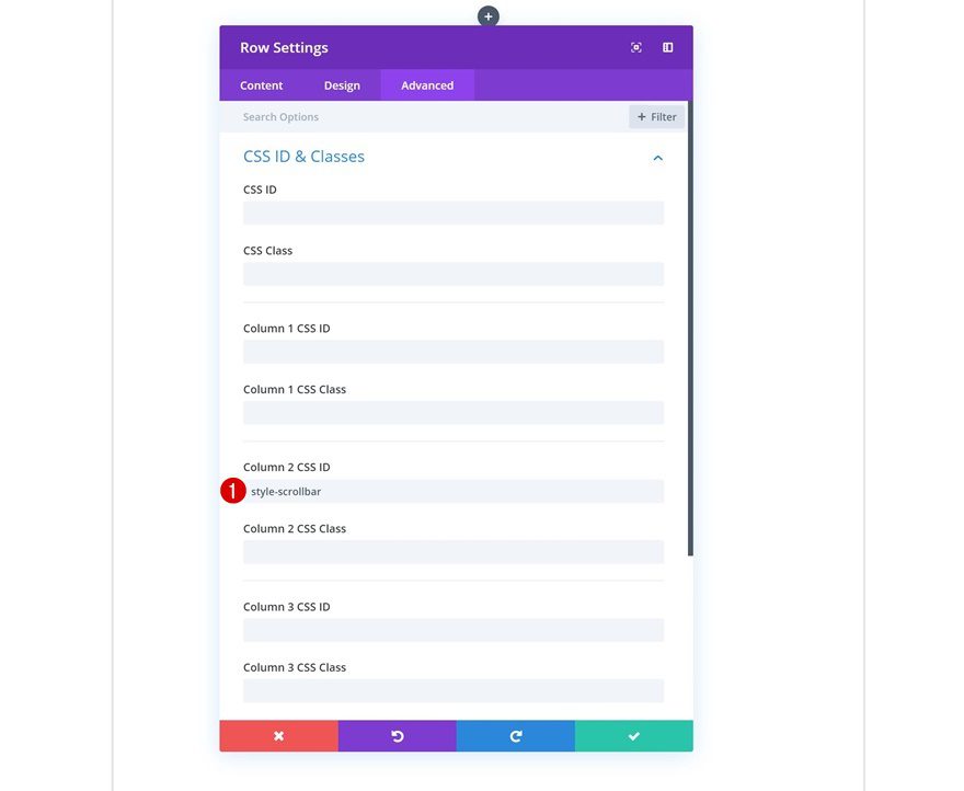
Column 2 CSS ID
As you can notice in the preview of this post, there’s a scroll bar attached to the second column. If you want to style this scrollbar later on the post, go ahead and add a CSS ID to the second column.
- Column 2 CSS ID: style-scrollbar
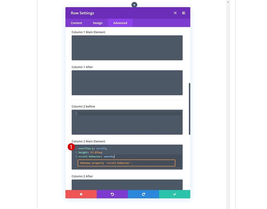
Column 2 Main Element
The next thing we’re going to do is allow the column to be scrollable by adding the following lines of CSS code to the column 2 main element:
overflow-y: scroll;
height: 57.87vw;
scroll-behavior: smooth;
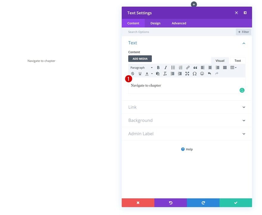
Add Text Module #1 to Column 1
Add Content
Now that we’ve modified all row settings, we can start adding the modules! Start with a Text Module in column 1 and add some content of your choice.
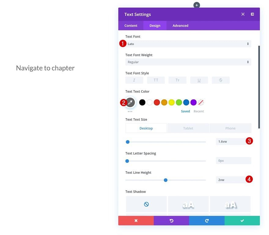
Text Settings
Go to the text settings of the module and make some changes.
- Text Font: Lato
- Color: #666666
- Text Size: 1.6vw (Desktop), 3vw (Tablet), 4vw (Phone)
- Text Line Height: 2vw
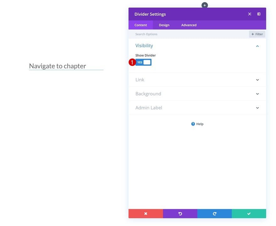
Add Divider Module to Column 1
Visibility
The next module we’ll add is a Divider Module. Make sure the ‘Show Divider’ option is enabled.
- Show Divider: Yes
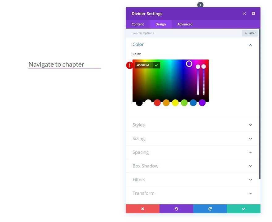
Color
Then, go to the design tab and change the color.
- Color: #5802ed
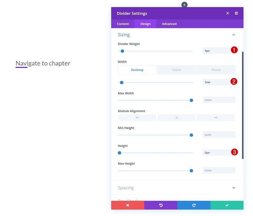
Sizing
Play around with the sizing values as well.
- Divider Weight: 4px
- Width: 3vw (Desktop), 6vw (Tablet), 9vw (Phone)
- Height: 0px
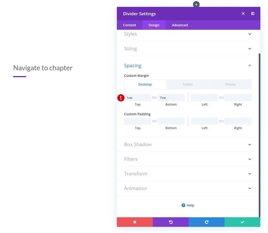
Spacing
And add some custom top and bottom padding to create space.
- Top Margin: 1vw (Desktop), 3vw (Tablet), 4vw (Phone)
- Bottom Margin: 7vw
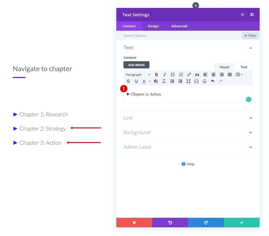
Add Text Module #2 to Column 1
Add Content
On to the third module, which is another Text Module. Here, we’ve added a symbol (►) followed by the first chapter title to the content box.
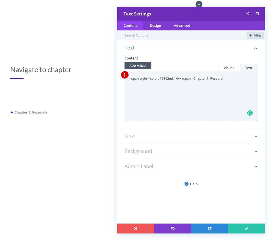
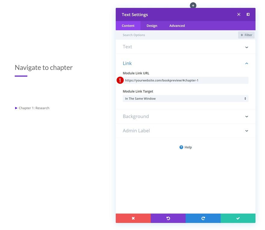
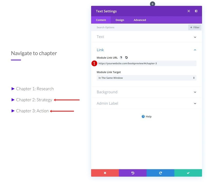
Add Link
We’re linking this entire module to an anchor ID which we’ll add later on this post.
- Module Link URL: https://yourwebsite.com/pagetitle/#chapter-1
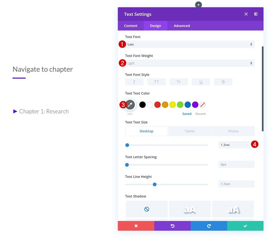
Text Settings
Continue by going to the text settings and style the content exactly the way you want to.
- Text Font: Lato
- Text Font Weight: Light
- Text Color: #666666
- Text Size: 1.3vw (Desktop), 2vw (Tablet), 3.3vw (Phone)
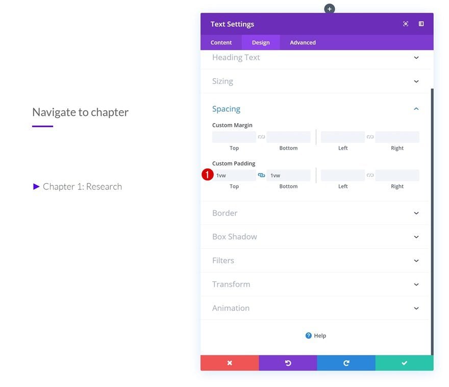
Spacing
Add some custom top and bottom padding as well.
- Top Padding: 1vw
- Bottom Padding: 1vw
Clone Text Module #2 Twice
Once you’re done modifying the Text Module, clone it twice (or up to as many chapters as you want to share).
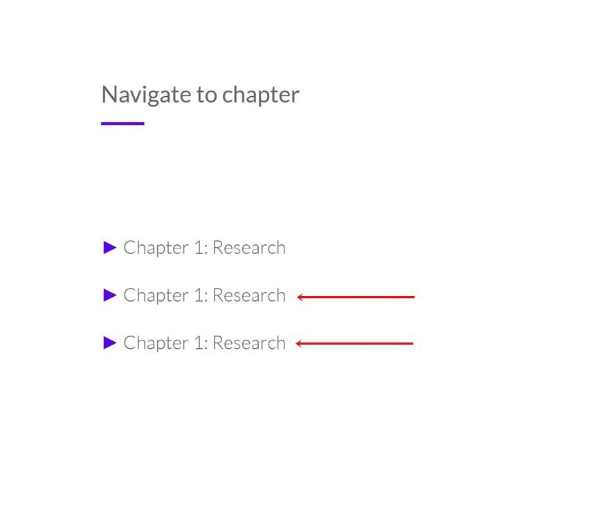
Change Content
Modify the content of each one of the duplicates.
Change Links
Along with the anchor ID at the end of the module link URL. In this case, that means adding ‘#chapter-2’ to the first duplicate and ‘#chapter-3’ to the second one.
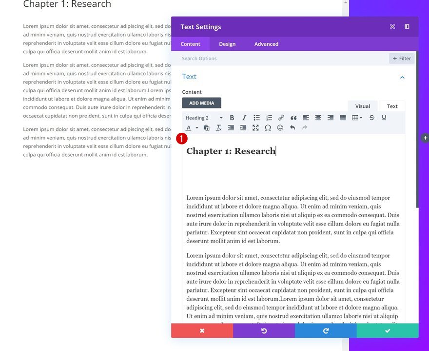
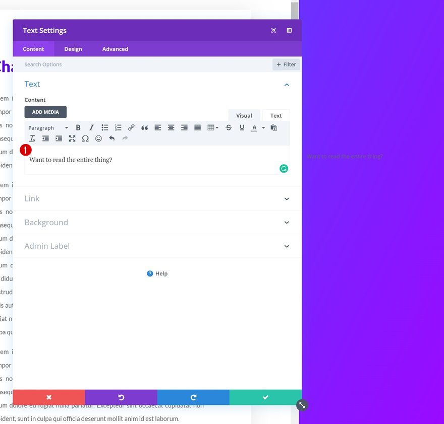
Add Text Module to Column 2
Add Content
On to the next column, which is a scrollable one. Here, we’re going to use Text Modules to add different pages of the book preview. Start by adding the first Text Module with some content of your choice.
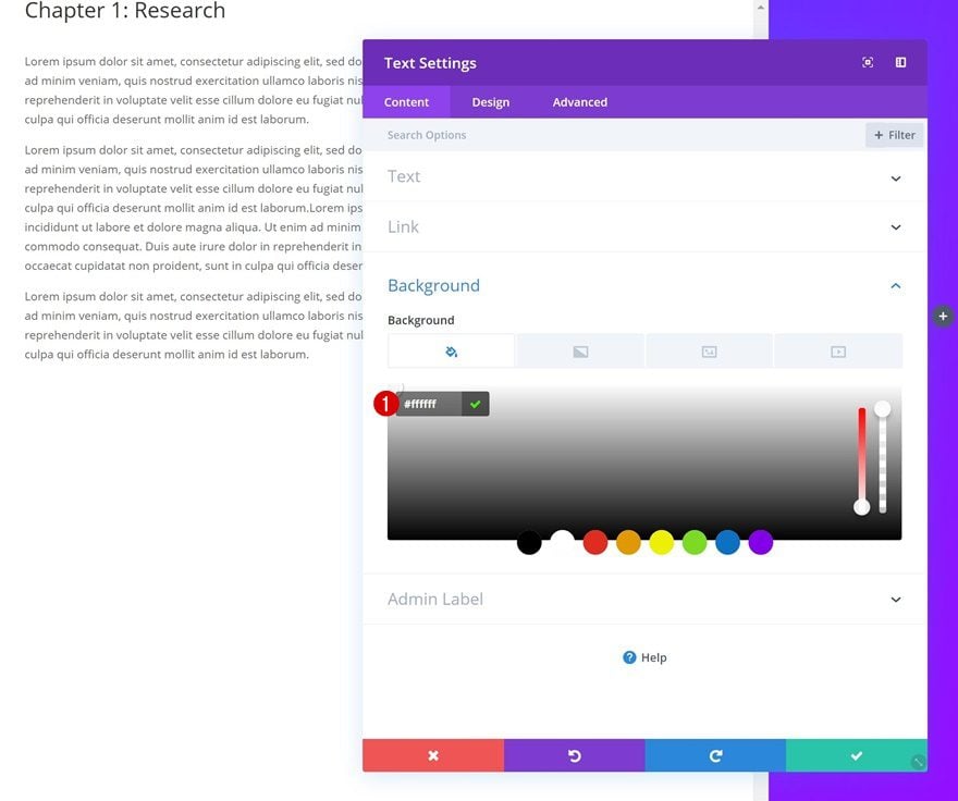
Background Color
Then, go to the background settings and add a white background color.
- Background Color: #ffffff
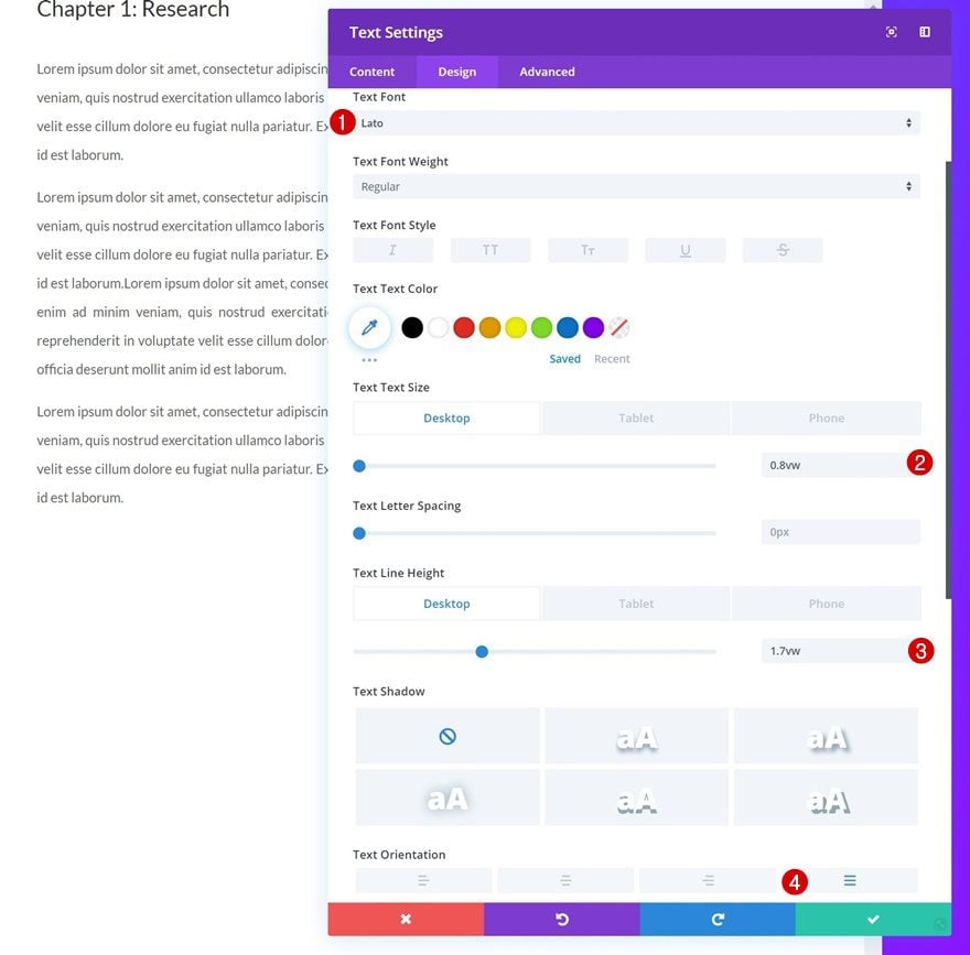
Text Settings
Modify the text settings as well.
- Text Font: Lato
- Text Size: 0.8vw (Desktop), 1.6vw (Tablet), 2.1vw (Phone)
- Text Line Height: 1.7vw (Desktop), 3.3vw (Tablet), 3.8vw (Phone)
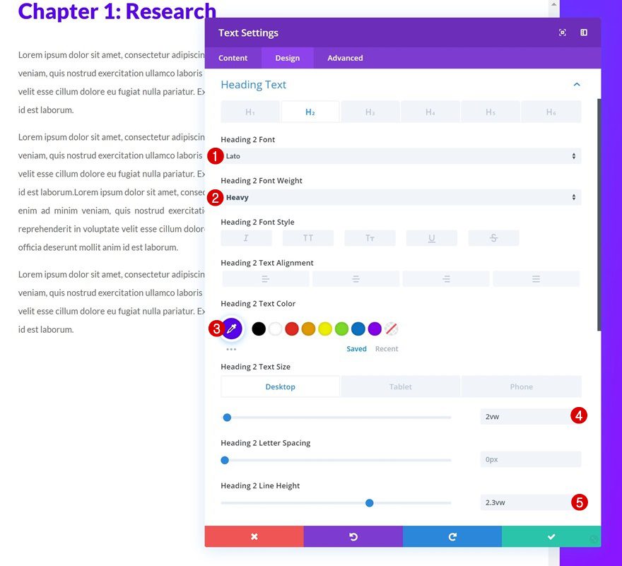
H2 Text Settings
Play around with the H2 text settings too.
- Heading 2 Font: Lato
- Heading 2 Font Weight: Heavy
- Heading 2 Text Color: #5802ed
- Heading 2 Text Size: 2vw (Desktop), 2.5vw (Tablet), 2.9vw (Phone)
- Heading 2 Line Height: 2.3vw
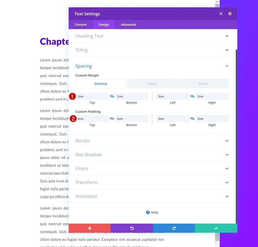
Spacing
Continue by going to the spacing settings and adding the following custom margin and padding values:
- Top Margin: 2vw (Desktop), 7vw (Tablet), 10vw (Phone)
- Bottom Margin: 2vw (Desktop), 7vw (Tablet), 10vw (Phone)
- Left Margin: 5vw
- Right Margin: 5vw
- Top Padding: 6vw
- Bottom Padding: 6vw
- Left Padding: 6vw
- Right Padding: 6vw
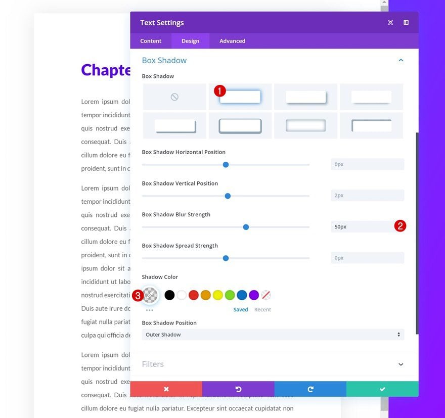
Box Shadow
Shape the Text Module by adding a subtle box shadow.
- Box Shadow Blur Strength: 50px
- Shadow Color: rgba(0,0,0,0.09)
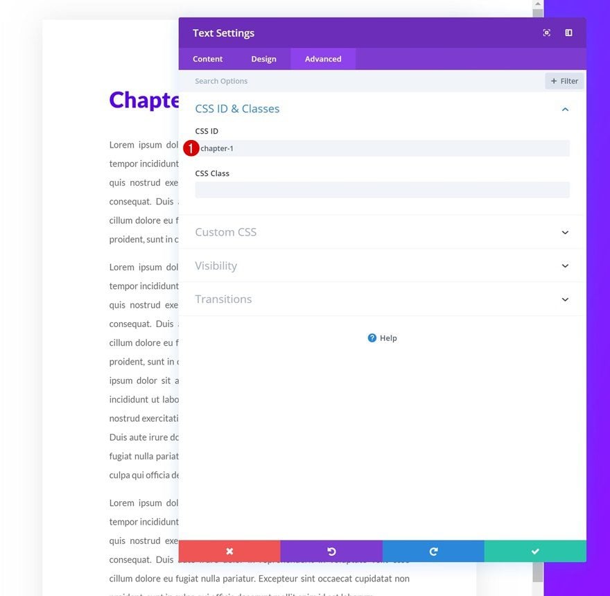
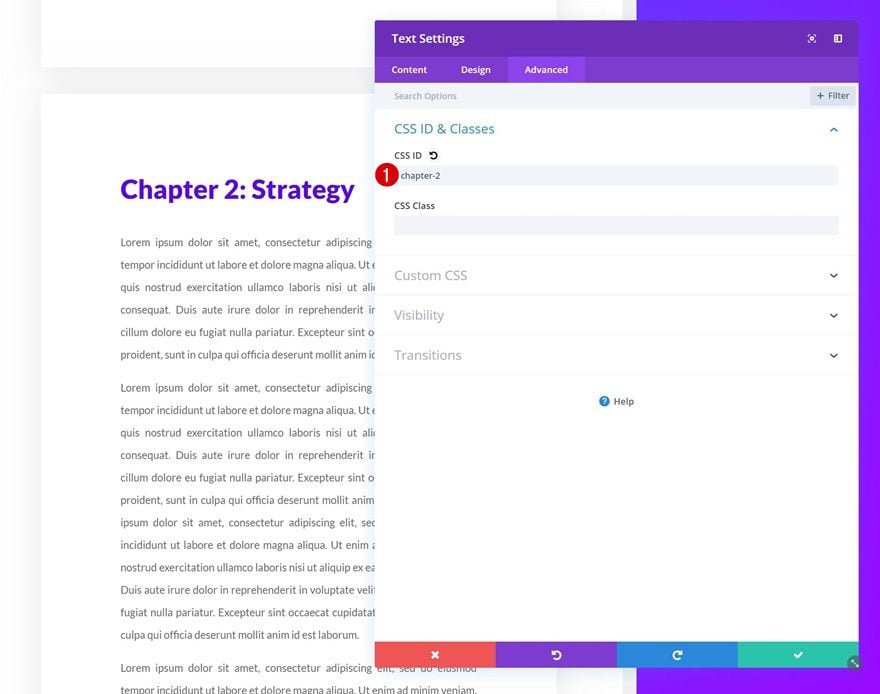
CSS ID
Continue by adding a CSS ID to the Text Module. Make sure you’re using the same CSS ID as the one you were linking to in the first column of the row.
- CSS ID: chapter-1
Clone Text Module Twice
Once you’ve styled the Text Module, clone it up to as many times as you want.
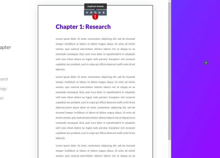
Change Content
Change the content of each Text Module duplicate.
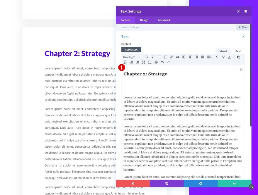
Change CSS IDs
Along with the CSS IDs.
- CSS ID: chapter-2
- CSS ID: chapter-3
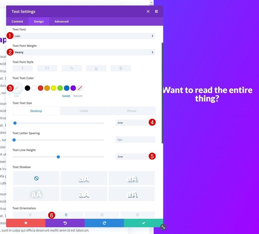
Add Text Module to Column 3
Add Content
On to the next and last column! Add a Text Module with some content of your choice.
Text Settings
Then, go to the design tab and change the text settings.
- Text Font: Lato
- Text Font Weight: Heavy
- Text Color: #ffffff
- Text Size: 2vw (Desktop), 3vw (Tablet), 4vw (Phone)
- Text Line Height: 2vw
- Text Orientation: Center
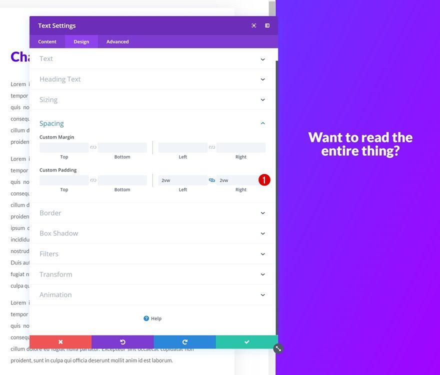
Spacing
Add some custom left and right padding next.
- Left: 2vw
- Right: 2vw
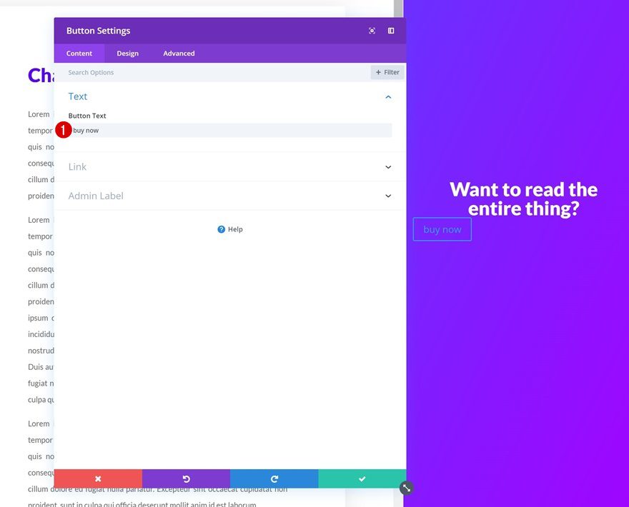
Add Button Module to Column 3
Add Copy
Continue by adding a Button Module to the third column with some copy of your choice.
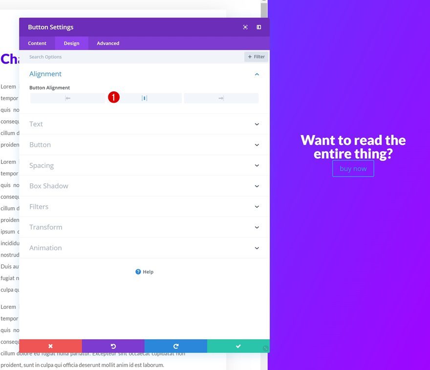
Alignment
Change the button alignment next.
- Button Alignment: Center
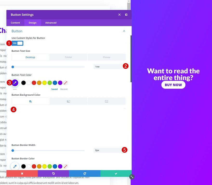
Button Settings
Modify the button settings as well.
- Use Custom Styles for Button: Yes
- Button Text Size: 1vw (Desktop), 1.5vw (Tablet), 2.4vw (Phone)
- Button Text Color: #5802ed
- Button Background Color: #ffffff
- Button Border Width: 0px
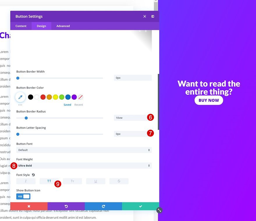
- Button Border Radius: 10vw
- Button Letter Spacing: 0px
- Font Weight: Ultra Bold
- Font Style: Uppercase
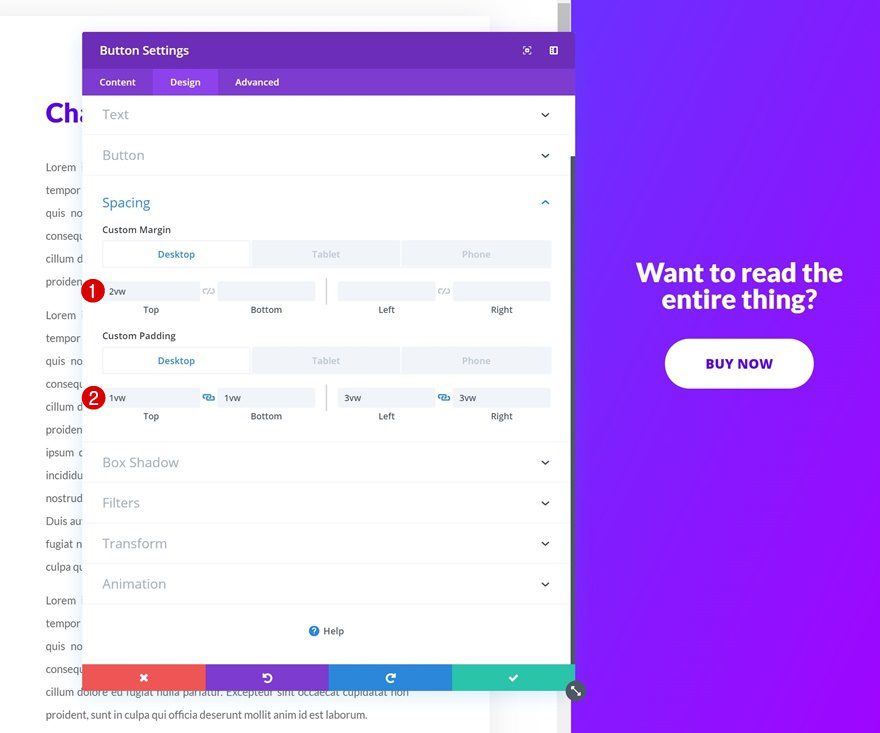
Spacing
And add some custom margin and padding values to style and position the module.
- Top Margin: 2vw (Desktop), 4vw (Tablet), 5vw (Phone)
- Top Padding: 1vw (Desktop), 2vw (Tablet), 3vw (Phone)
- Bottom Padding: 1vw (Desktop), 2vw (Tablet), 3vw (Phone)
- Left Padding: 3vw (Desktop), 7vw (Tablet), 9vw (Phone)
- Right Padding: 3vw (Desktop), 7vw (Tablet), 9vw (Phone)
Style Scrollbar
Open Page Settings
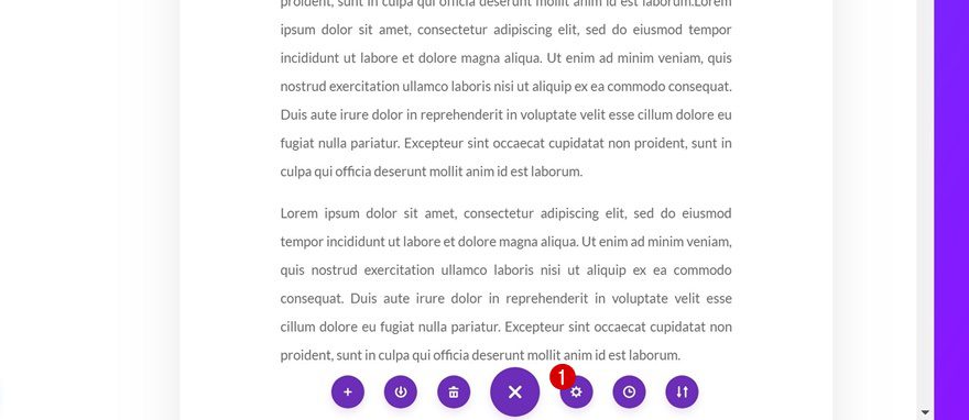
The last part of this tutorial is dedicated to styling the scrollbar of the second column. Whether you style the column scrollbar or not is entirely up to you. Not styling it doesn’t change anything about the functionality. If you decide to style the scrollbar, open the page settings.
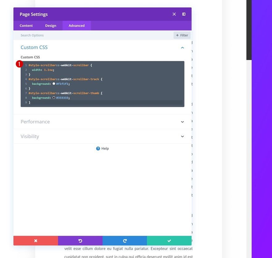
Add CSS Code
Then, go to the advanced tab and add some custom CSS to the Custom CSS box and you’re done!
#style-scrollbar::-webkit-scrollbar {
width: 1.1vw;
}
#style-scrollbar::-webkit-scrollbar-track {
background: #f1f1f1;
}
#style-scrollbar::-webkit-scrollbar-thumb {
background: #333333;
} 
Preview
Now that we’ve gone through all the steps, let’s take a final look at the outcome across different screen sizes.
Desktop
Mobile
Final Thoughts
In this post, we’ve shown you how to create a stunning and effective book preview landing page with anchor links to different parts or chapters of your book and a CTA that stands out. We’ve also shared the layout JSON for free so you can start adding it to any website you’re creating right away! If you have any questions or suggestions, make sure you leave a comment in the comment section below.
If you’re eager to learn more about Divi and get more Divi freebies, make sure you subscribe to our email newsletter and YouTube channel so you’ll always be one of the first people to know and get benefits from this free content.
The post Download a FREE Book Preview Divi Landing Page Layout Including Anchor Links & CTAs appeared first on Elegant Themes Blog.