
Creating a responsive navigation menu that looks great on all screen sizes can be difficult. I wish it wasn’t that important, but since the navigation is normally at the top of every page of your site, it is the thing that is visible first on every page. So it is important to get it right. Thankfully, Divi’s theme customizer allows you to customize the primary menu with some pretty cool header options. But for the default menu style with the logo on the left and the menu links to the right, things can easily get shuffled around on smaller screen sizes, especially when you have too many links crowding the header. I know it happens a lot for me. I get the menu looking just right for desktop and then you check it on a tablet (especially an iPad Pro) and the logo is overlapping the menu and some of the links have jumped down one line.
Today, I’m going to give you some helpful solutions for those crowded navigation menus so that they look great even on those not so common screen sizes. After all, at least for some users, the credibility of your site depends on it.
Let’s get started.
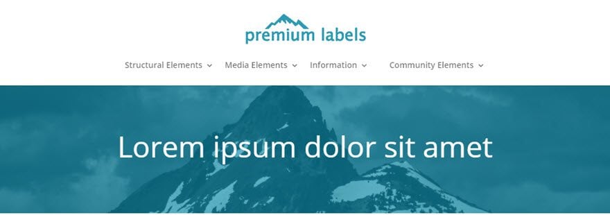
Fixing Your Responsive Navigation Menu in Divi
Subscribe To Our Youtube Channel
Four Solutions for a Crowded Navigation Menu
One of the great things about Divi is that it is built on a fluid grid layout that uses media queries (compartmentalized CSS) to adjust the style of your site for different screen sizes. The point at which these adjustments are made is what we call breakpoints. If you are committed to perfecting your main navigation menu on ALL screen sizes, chances are you will need to use customize your menu using media queries and adjust certain breakpoints.
The Problem
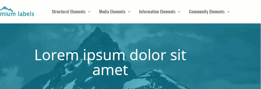
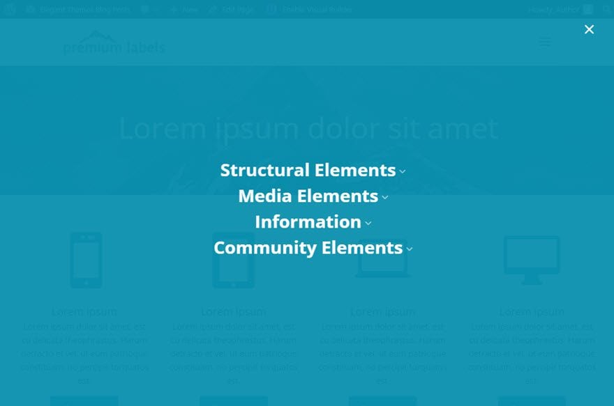
The most common problem I run into when using Divi’s default navigation menu is when a client wants a lot of top level menu items. Having more more than 5 menu items (or having menu items with a large font size) on the main navigation menu will often create a line break and enlarged logo when the screen size reaches a width between 980-1100 pixels (the size of small laptops and large tablets). I’m confident you have had this problem before, even if you never noticed it. It looks something like this:
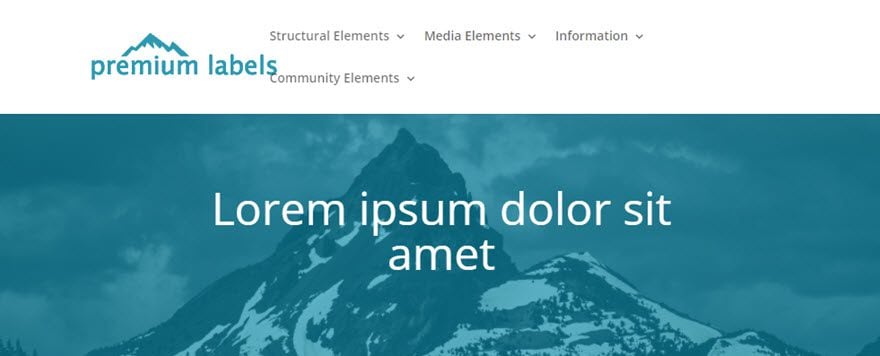
Not ideal. So let’s look at four solutions to this problem.
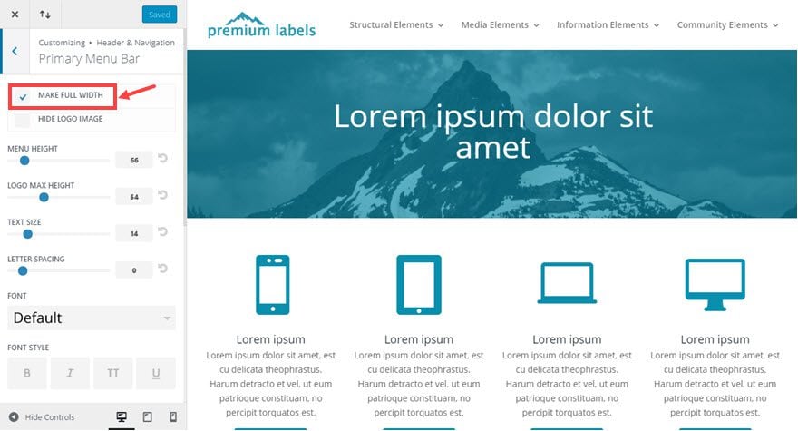
Solution #1: Make the Menu Bar Fullwidth
Normally I wouldn’t suggest making your navigation menu fullwidth unless I was making the rest of my site fullwidth as well. I think the consistency in design is important. But sometimes it’s a good compromise to make if it means your navigation menu looks great on all devices. And it is a simple fix as well.
Go to Theme Customizer > Header & Navigation > Primary Menu Bar and select Make Full Width.
Solution #2: Adjust the Logo and Font settings.
Another simple solution to your problem is to use the theme customizer settings to adjust the default Logo Max Height, Text Size, or Font options.
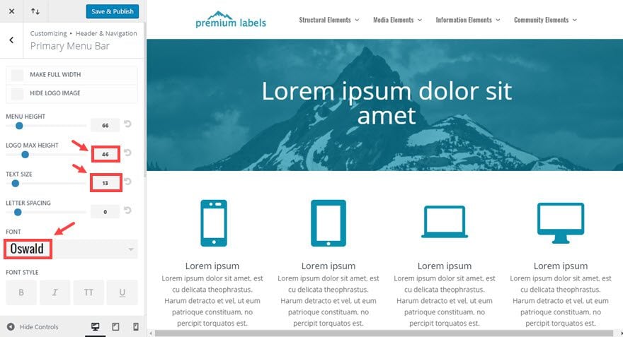
Be careful when adjusting these options because you never want to comprimise the design and readability of your Logo or menu items for the sake of making an easy fix.
Solution #3: Displaying the mobile menu at a new breakpoint.
Here are the general ranges for each of the breakpoints within Divi:
Large Desktop: 1405px and above
Standard Desktop: between 1100px and 1405px
Laptops and Large Tablets: between 980px and 1100px
Tablets: between 768px and 980px
Smartphones and small Tablets: between 320px and 768px;
Smartphones: between 320px and 480px;
The breakpoint in which the default navigation menu turns into the mobile menu (with the hamburger nav) is 980px. Any screen size less than 980px will show the mobile menu.
But, if you would like to avoid any weird menu line breaks, you change the breakpoint to a different value. Let’s say you want to display the mobile menu at around 1024px instead of 980px. To do this you would need to insert some custom CSS inside a media query to override the default styling in Divi.
Go to Theme Customizer > Additional CSS and enter the following:
@media (max-width: 1024px) {
 #et_mobile_nav_menu {
 display: block;
 }

#top-menu {
 display: none;
 }
 }
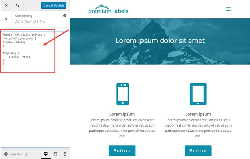
This media query does two things. It hides the regular menu and it displays the mobile menu at the 1024px breakpoint.
Solution #4: Adjusting Menu Style at a Certain Breakpoint
This solution is probably the best option because it allows you to have the most control over your menu at certain breakpoints. You can target your menu items by using their css class to create custom styling in your media query.
Here is Divi’s default CSS for your menu items:
#top-menu li {
    display: inline-block;
    padding-right: 22px;
    font-size: 14px;
}
Let’s say you want your menu font size to be 18px by default but you want it to change to 14px at a certain breakpoint. And to save even more room, you could reduce the padding to 15px instead of 22px. You can do this by targeting the css class for all menu items and creating a media query
Go to Theme Customizer > Additional CSS and enter the following:
@media (max-width: 1200px) {
 #top-menu li, #top-menu li a {
 font-size: 14px;
 padding-right: 15px;
 }
 }
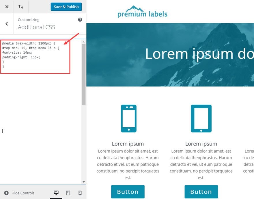
What this CSS does is change the font size to 14px and the right padding to 15px on any screen 1200px or under. This creates a smooth transition when adjusting the screen size on desktop and allows you to keep your default navigation on large tablets and small laptops.
Adjusting other Header Styles
There are five header styles to choose from within Divi’s Theme Customizer (not counting vertical navigation). The five styles include Default (the one already addressed in this post) Slide-in, Fullscreen, Centered, and Centered Inline Logo.
Slide In and Fullscreen Styles
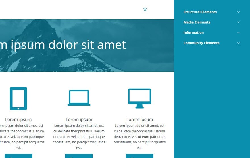
If you’re website design calls for either the slide in or fullscreen styles, then your responsive menu is pretty much foolproof since the mobile navigation hamburger icon is used to trigger the menu on all screen sizes.
Centered Style
If you are using the centered style, you have more room for you menu items to breathe, but if you still need some more room, you can use the same custom solutions we used for the default style to get it looking the way you want.
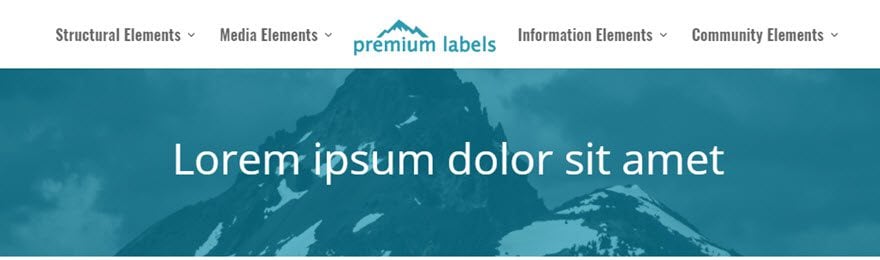
Centered Inline Logo Style
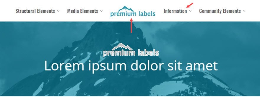
Lastly, the centered inline logo style header is a bit tricky to get right from the start. You need to get a few things right if you want the logo to be centered on the page. First you need to have an even number of menu items so the the middle logo remains the centerpiece.
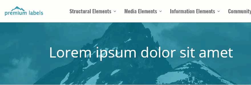
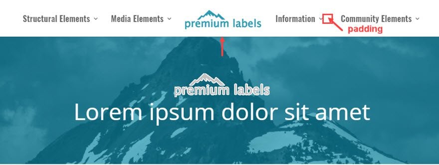
Second, the amount of text you use for each menu item will determine the centerpoint of the logo. If you have more text on one side, the logo will be off by a little bit. This is not a big deal for most situations but if you have a header with centered elements directly under the logo, this can be an obvious problem that you will need to rectify.
Notice how the logo is off centered a little bit in the menu compared to the centered logo in the header section.
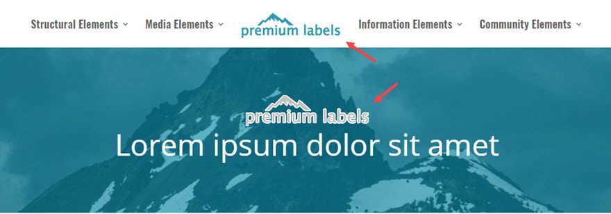
Now I’m going to shorten the menu item label “Information Elements” to “Information”. Now look at how the logo shifts more to the center.
This solution may be all you need to get the logo where you want it. You may be able to get away with changing something like “About Us” to “About” or vice versa to make those small adjustments.
But, this can get a little frustrating if you are a perfectionist (I can have my moments of it. Believe me.) So, there is a deeper level of customization you can do if you want to make even more adjustments. Instead of adjusting the actual text in the menu item to adjust the centerpoint of the logo, you can add a custom css class to any item and give it some padding to the right or left. This should give you the last nudge you need to get things all centered.
From the wordpress dashboard go to Appearance > Menus and make sure you have CSS Classes checked off in the Screen Options area.
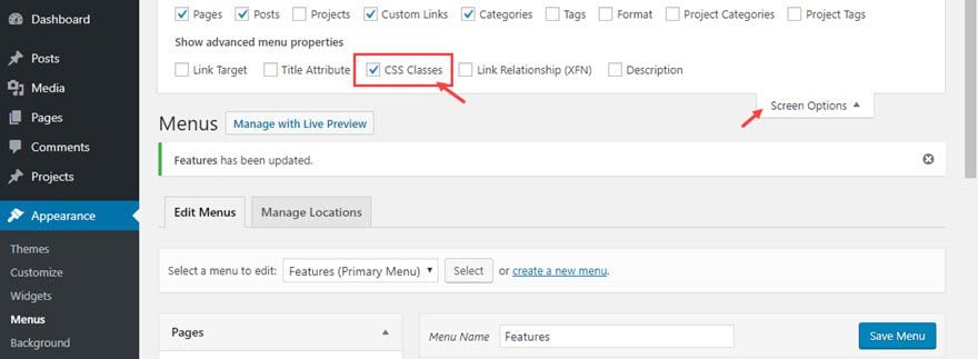
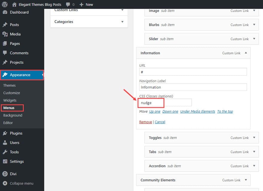
Then toggle open the menu item you would like to target. Then enter a CSS class into the CSS Classes input box. I’m calling mine “nudge”.
After that, go to Divi > Theme Customizer > Additional CSS and add the following custom CSS:
#top-menu li.nudge  {
padding-right: 32px;
}
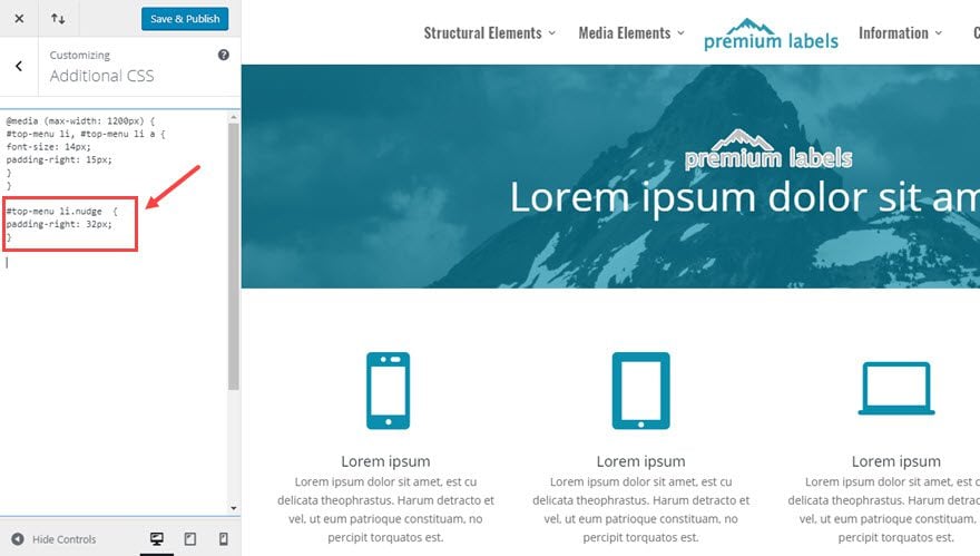
With this css, only the item with the class “nudge” is given a right padding of 32px; That pushes the logo over just enough get it centered.
That’s it!
Closing Thoughts
Divi makes building websites fun and easy. But sometimes, the demands of the job (and our clients) require us to go the extra mile to make sure our sites are stellar. And what separates good sites from great sites are the small details. The way your responsive navigation menu performs is one of those important details that you want to get right. Most of the time it is the first thing your users will see and engage with on every page of your site. A broken looking menu can leave a bad first impression. I hope this post will help “nudge” you in the right direction (sorry couldn’t help myself :)).
I’m sure there are more problems and solutions out there I didn’t address in this post. Feel free to post them in the comments. I look forward to hearing from you.
Cheers!
The post Fixing Your Responsive Navigation Menu in Divi appeared first on Elegant Themes Blog.