
In today’s Divi tutorial, we’re going to share some amazing color palettes that you can use on the next websites you build with Divi. Using the right colors for your website is one of the primary things that’ll determine how your website will look and feel like in overall.
Besides sharing some amazing color palettes with you, we’re also going to show you a solid way to add these color palettes to your website. When in doubt, you can always follow these basic steps that will help you create beautiful results.
General Tips
1. Decide on Dark-Colored or Light-Colored Website
In the color palette you’ll be using, you will undoubtedly have light and dark colors. Contrast is mandatory in a color palette so the written content doesn’t get lost.
Now, that leads us immediately to the first question you have to ask yourself when wanting to apply a color palette to your website; do you want to create a dark-colored or light-colored website? Just because you choose one doesn’t mean you can’t combine them but making a choice helps you pick your color palette more easily.
2. Color Choice
In theory, you can determine for yourself how many colors you’d like your color palette to have. There is no standard way to apply or determine color palettes. However, to create a nice balance of colors with Divi, we recommend using five colors.
To help you apply the color palettes with five colors to your website, we chose one kind of method that we’ll consistently apply to the same layout when showcasing the different color palettes. But before we dive into that, let’s have a look at the different types colors you need to have in your color palette if you want to follow our method.
2 Background Colors
Make sure the background colors you choose match each other. You’ll use these background colors near each other and to get beautiful results; they must have a certain harmony.
1 Font Color
The next thing you’ll need to choose is the font color. Logically, the font color depends on the background colors you choose. If you’ve chosen light-colored background colors, make sure your font color is dark-colored and vice versa.
1 Hyperlink & CTA Color
The hyperlink color you choose is one of the colors that bring your website to life. Make sure this color stands out from the other colors in your palette since you’ll use it for the calls to action you include on your website.
1 Color For The Final Touches
Last but not least, you can choose another out-of-the-box color that brings color to your website. Although this color is not as important as the hyperlink color, it’ll help you complete the color balance on your website.
3. Make Sure There’s Enough Contrast
As mentioned before; it’s essential to provide contrast between some of the colors in your color palette. If you’re using a color palette for a website, this contrast will primarily help you make the written content you share readable. Because; if your content is not easy to read; what’s the purpose of it after all?
4. Find the Right Color Use Balance
There are different ways to determine how frequently you want to use a particular color in your color palette. Creating a good color balance is necessary if you don’t want them to feel overwhelmed by the colors that you’re using on your website.
Make sure you use the more neutral colors in your color palette most of the time and use the other colors to accentuate the content you’re providing.
Walkthrough: Adding The Color Palette to Your Website
In the next part of this post, we’re going to walk you through applying color palettes to your website. We’ll handle the different steps we take when adding the colors to a website layout. After this walkthrough, you’ll get to the part where we share the color palettes. Not only did we share the colors, but we’ve also used them on a Divi layout to put the walkthrough into practice.
Without any further due, let’s have a look at the different steps of the process.
1. Decide How You’ll Add The Colors
You can add the color palette in two ways:
- Adding all the colors section by section
- Complete your website color by color
Although you’ll probably mix these two methods with one another, we recommend starting off by completing your website color by color. That way, you won’t have to copy and paste the different color codes continuously. You copy each color one time and then move on to the other.
2. Add The Background Colors
Once you’ve decided how you’re going to insert the colors, you can start with the background colors. One of the reasons why starting with the background colors is a good idea, is because you’ll immediately see results. You’re setting the foundation of the colors that you are using on your website.
If you’ve chosen to create a light-colored website; start off by adding the lightest color to the background of the second section and follow with the second lightest color in your third section.
3. Add The Text Color
After you’ve added the background colors for your website, you can start adding the text color to your website. All the written content on your website need to have this color (apart from the hyperlinks and calls to action).
4. Add The Hyperlink & CTA Color to Your Website
Moving on, the next thing you can do is make the hyperlinks and calls to action on your website stand out. They draw the attention of people and make them curious what a link or call to action is about.
Make sure all the clickable things on your website contain this color. By holding on to this consistency, your visitors will easily recognize where they can click to continue their stay on your site.
5. Add The Final Touch Color
The last thing you’ll need to do is add the final touch color to the website. In the examples and color palettes we’ve made, we use this final touch color in three places: the blurb circle color, the header text of the person module and the primary menu bar.
Although the final touch color is not the main color you’ll use on your website, it’ll allow you to bring that extra bit of color your website was needing. You don’t want your website to look monotonous or annoyingly serious after all.
Color Palettes
Now that we’ve analyzed the needed steps to apply the color palette to your website, it’s time to start exploring some amazing color palettes. Besides showing you the result of the example layout we’ve made, we’ll also share the color codes that we used to reach that result.
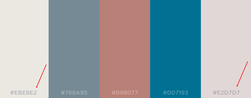
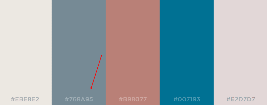
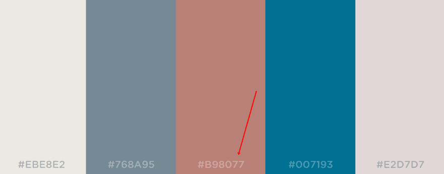
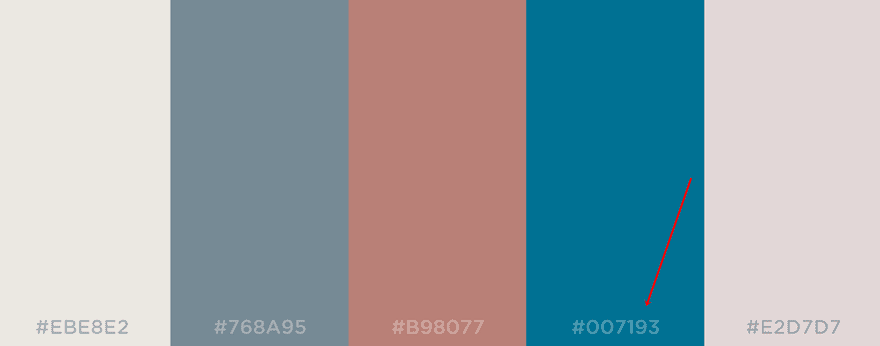
1. Tiles For Days
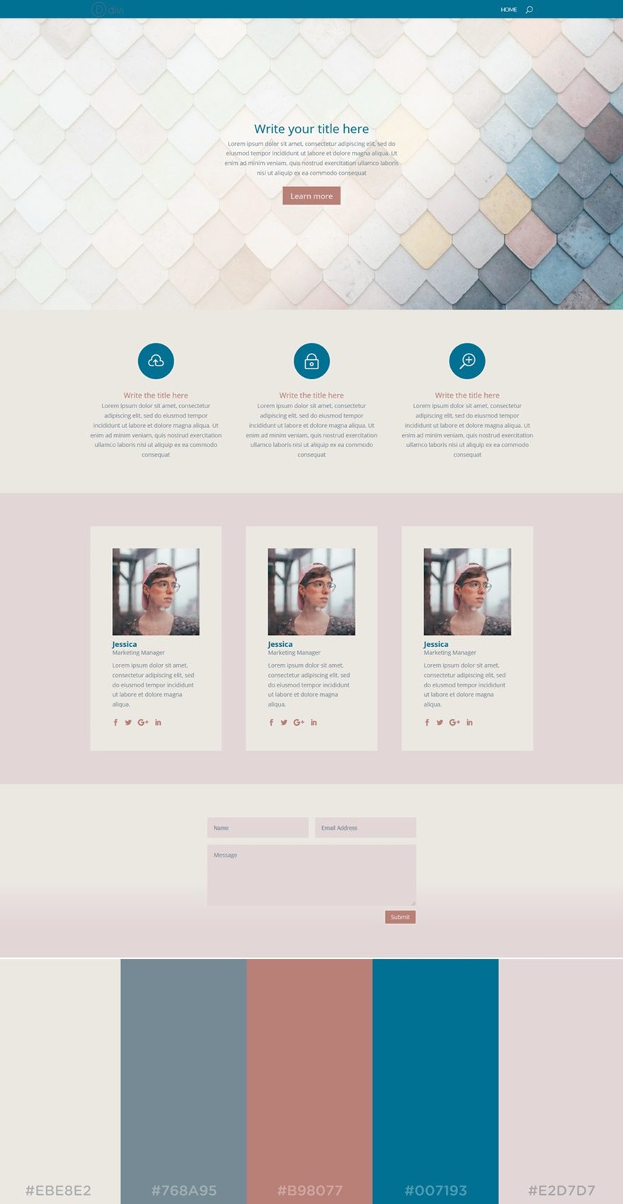
The first color palette we’ve selected contains mostly softer (and slightly pastel) kind of colors. Since we’ve chosen for a light website, the lighter colors in the color palette take up most of the website. The darker colors in our color palette, however, make sure that the website contains the needed color balance.
The colors that are being used in this example are the following (left to right):
- #EBE8E2
- #768A95
- #B98077
- #007193
- #E2D7D7
2. Desert
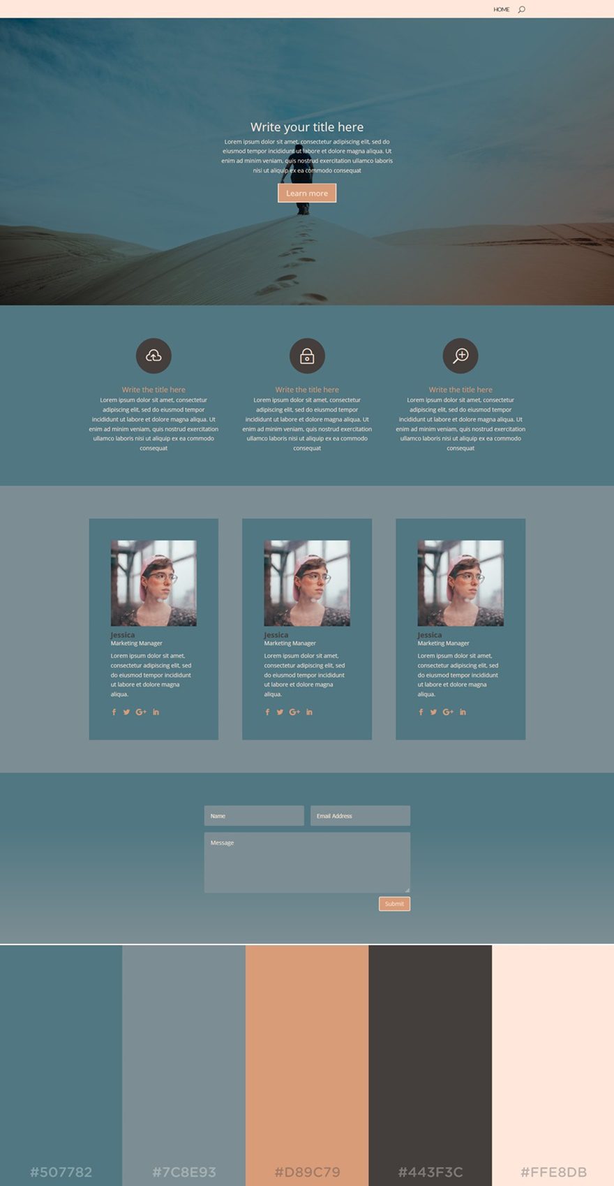
The next color palette in the list is called Desert. The color balance of this color palette leans slightly towards a darker-colored website. The color that dominates in this example is the blue color. But there’s also one very light text color that makes sure the needed contrast is there.
The colors that are used in this palette are the following (from left to right):
- #507782
- #7C8E93
- #D89C79
- #443F3C
- #FFE8D8
3. Festival
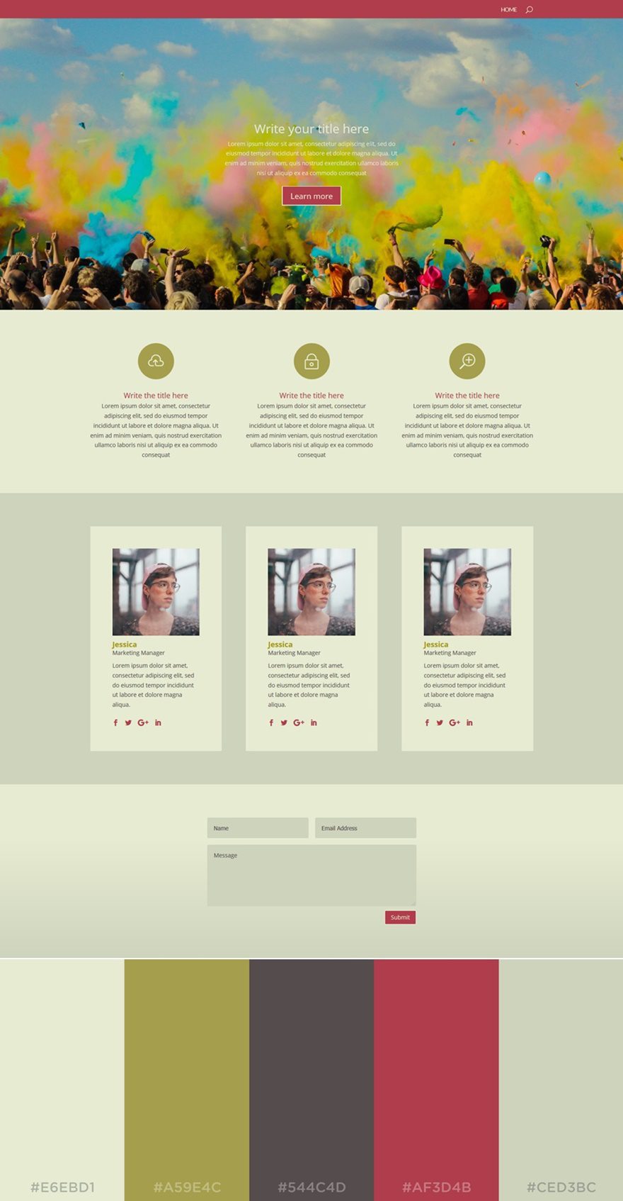
The next color palette is not one you’ll often see around. The colors don’t often show up in the same color palette, but they’re quite intriguing. If you want your website to look unique, this palette is the way to go.
The colors that are being used in this palette are (left to right):
- #E6EBD1
- #A59E4C
- #544C4D
- #AF3D4B
- #CED3BC
4. Pinky Promise
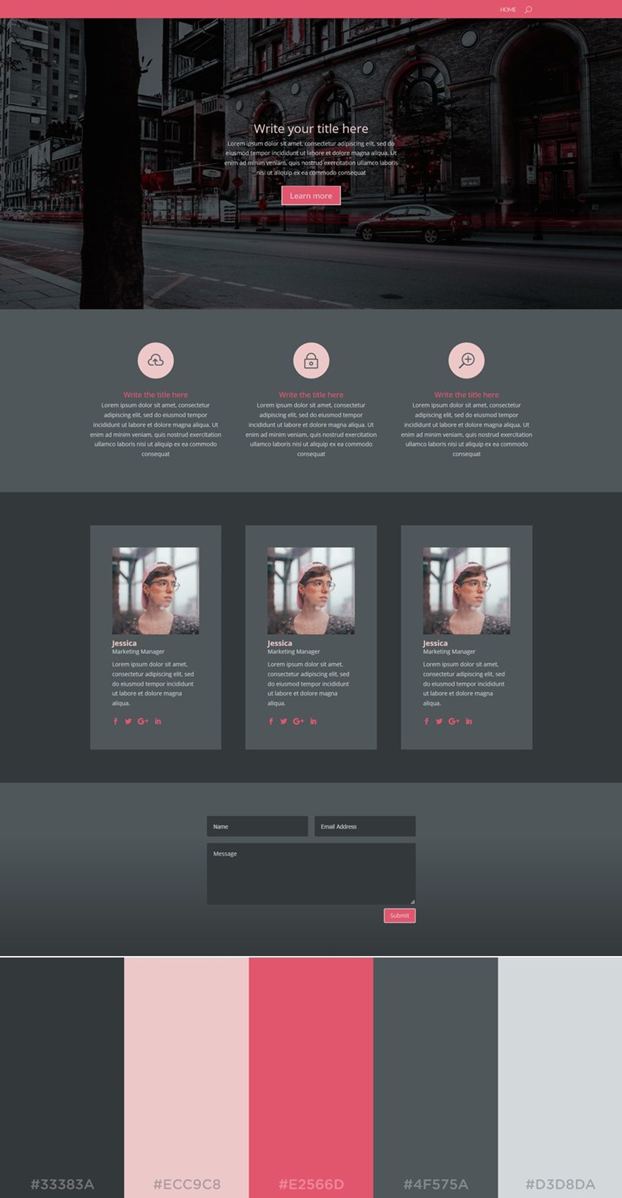
The next color palette in the row is an excellent option if you want to make a dark-colored website. Black shades and pink shades are known to be a good combination. They give a playful extra touch to the website without looking all too feminine. The black shades make sure that the look and feel of your website still contain that needed deepness.
The colors used in this palette are (from left to right):
- #33383A
- #ECC9C8
- #E2566D
- #4F575A
- #D3D8DA
5. Santorini
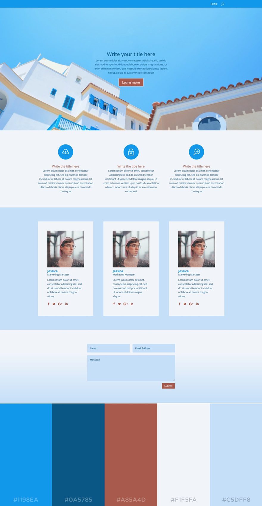
In this next palette, you can clearly notice that blue dominates the other colors. With this color palette, you immediately get a light and positive type of feeling. Blue is known to be one of those colors that people prefer when building a website. It’s a standard color that reflects professionalism. However, the shades of blue that are used in this color palette also show a playful side.
The color palette we’ve used in this example is (left to right):
- #1198EA
- #0A5785
- #A85A4D
- #F1F5FA
- #C5DFF8
6. Purple Pleasure
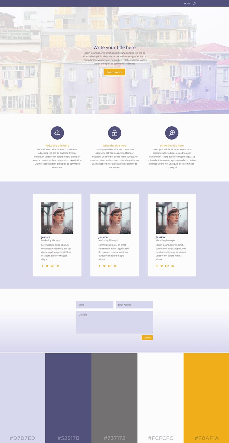
The dominating color in this color palette is obviously purple. Although it’s often perceived as a depressing color, this color palette and the use of it on a website begs to differ. When it’s combined with brighter colors, the purple color can deliver stunning results.
The colors used in this color palette are the following:
- #D7D7ED
- #52517B
- #737172
- #FCFCFC
- #F0F1A
7. Subtle
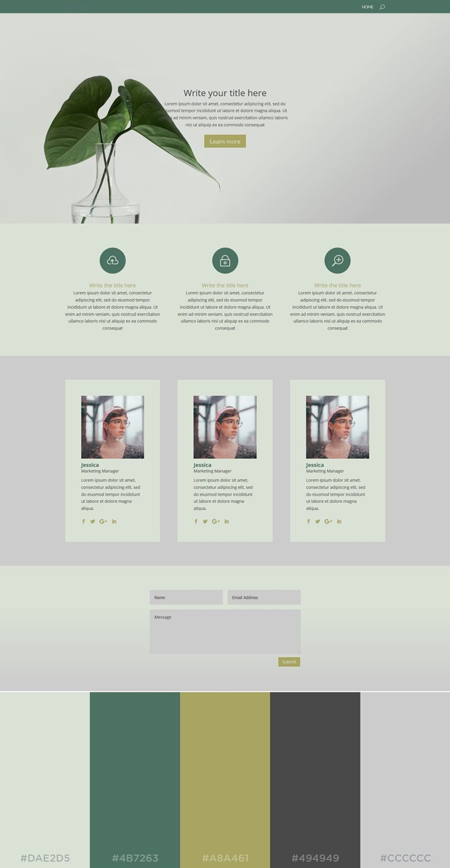
The next color palette we’d like to share is quite neutral and in the same style as the Festival color palette. You don’t see that often around that often either but it looks very clean.
The colors used in this example are (left to right):
- #DAE2D5
- #4B7263
- #A8A461
- #494949
- #CCCCCC
8. Corporate
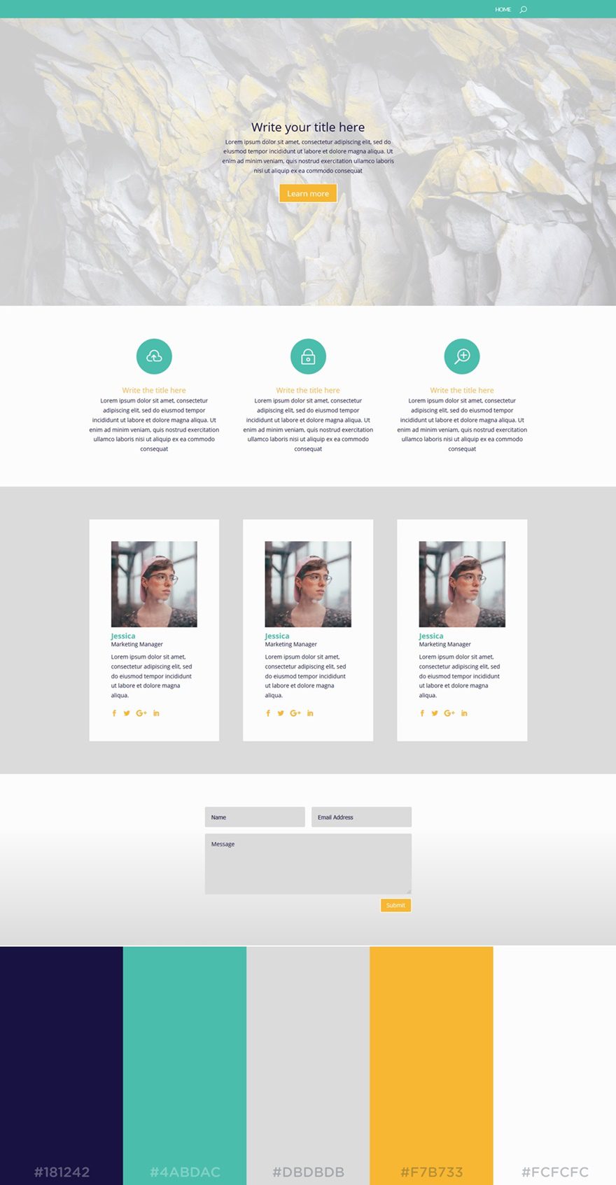
The next color palette we want to share is ideal for all kinds of business websites. The colors that are being used reflect a certain positivity and youthfulness. The light background colors allow the yellow and turquoise colors to bring added value to the website.
The colors being used in this palette are (left to right):
- #181242
- #4ABDAC
- #DBDBDB
- #F7B733
- #FCFCFC
9. Rosé

Who doesn’t love the rosé color? This next color palette brings a feminine factor to your website. The light colors are dominating the website, but they make sure the darker colors are empowered as well.
The colors that are used in this palette are (left to right):
- #152038
- #DDA199
- #FF614C
- #F5F5F5
- #E2E2E2
10. Chocolate
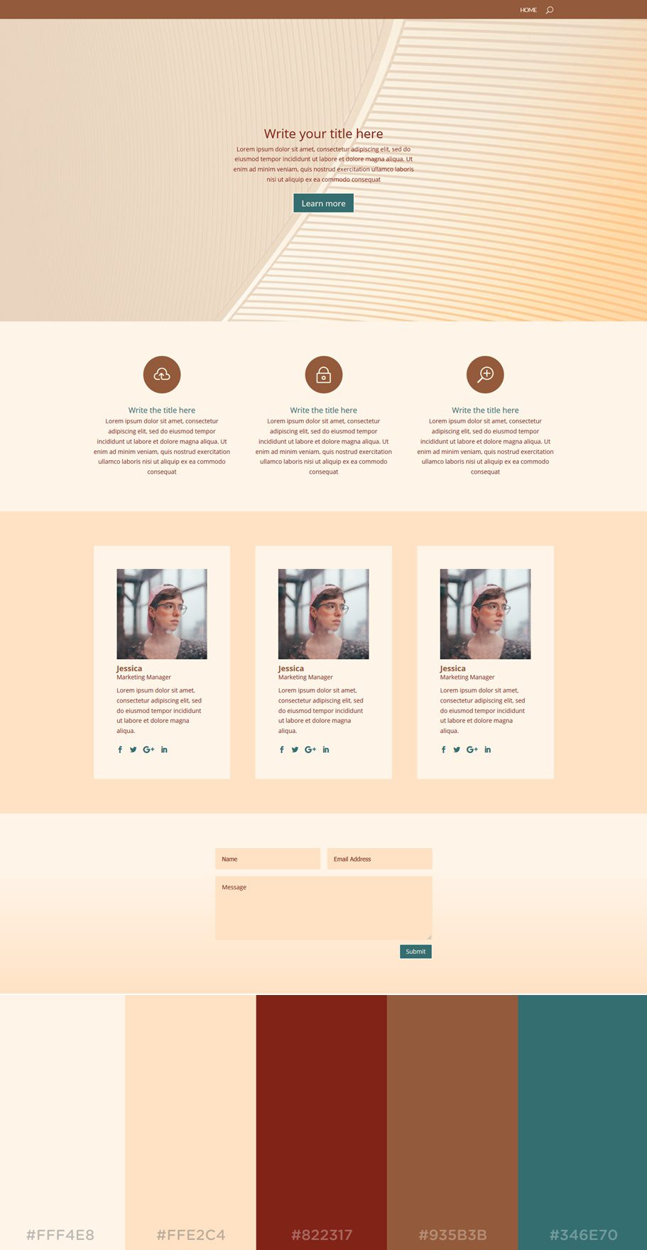
The next color palette we want to put in the spotlight is Chocolate. The nice thing about this color palette is that the background colors and text color find themselves within the same color category. That gives room for the other two colors to distinguish themselves from these colors and draw attention.
The colors used in this palette are (left to right):
- #FFF4E8
- #FFE2C4
- #822317
- #935B3B
- #346E70
11. Sophisticated
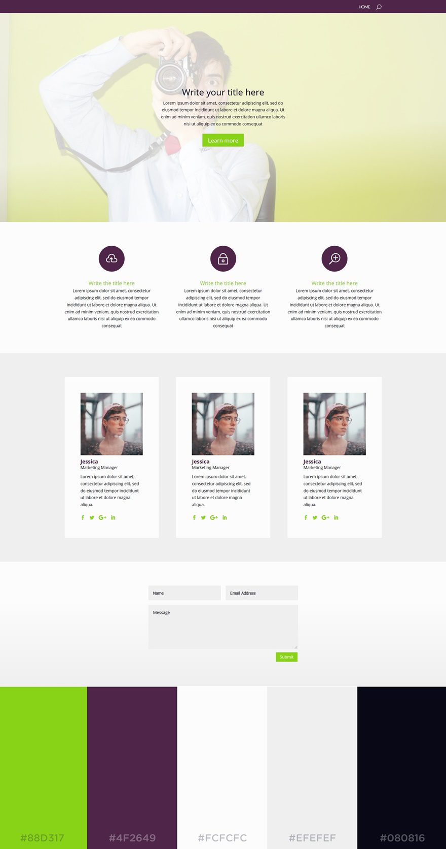
This next color combination is something you’d not expect at first sight. Purple and yellow green are not that often used together, but as you can see in the result; they match quite nicely. To keep the focus on these two colors, the background colors and text color are rather neutral.
The colors that are being used in this palette are (left to right):
- #88D317
- #4F2649
- #FCFCFC
- #EFEFEF
- #080816
12. Olivia
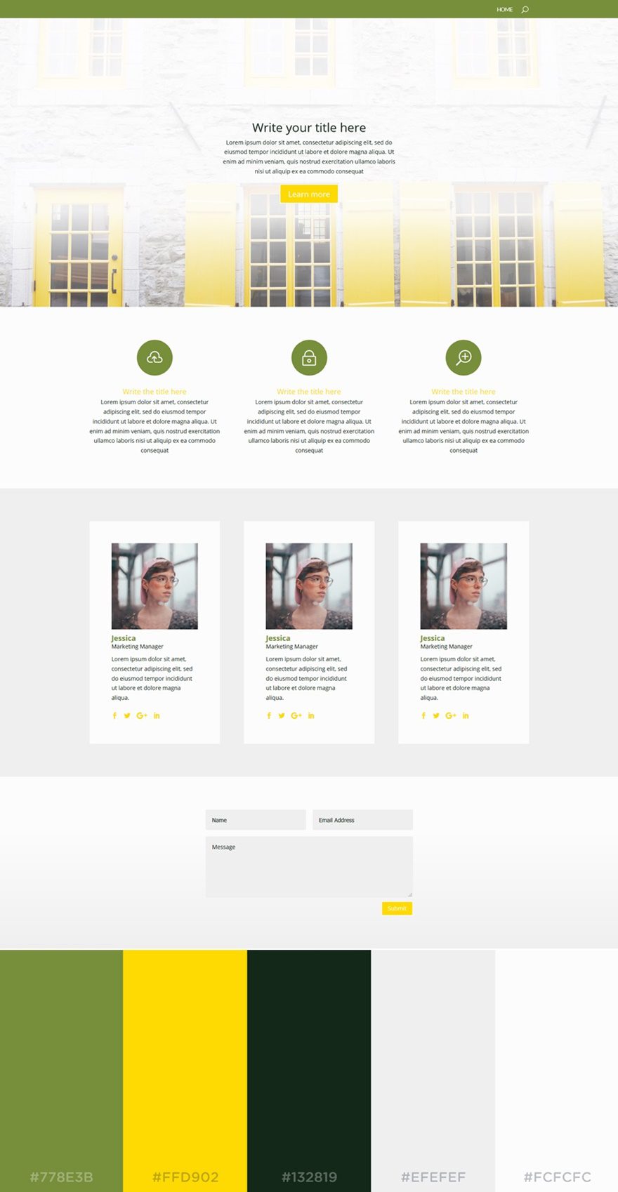
Olivia is a color palette that doesn’t need much explaining. The olive and yellow types of color combine very nicely. Keeping the lighter colors more neutral allows these colors to steal the show.
The colors being used in this palette are (left to right):
- #778E3B
- #FFD902
- #132819
- #EFEFEF
- #FCFCFC
13. Golden Gate
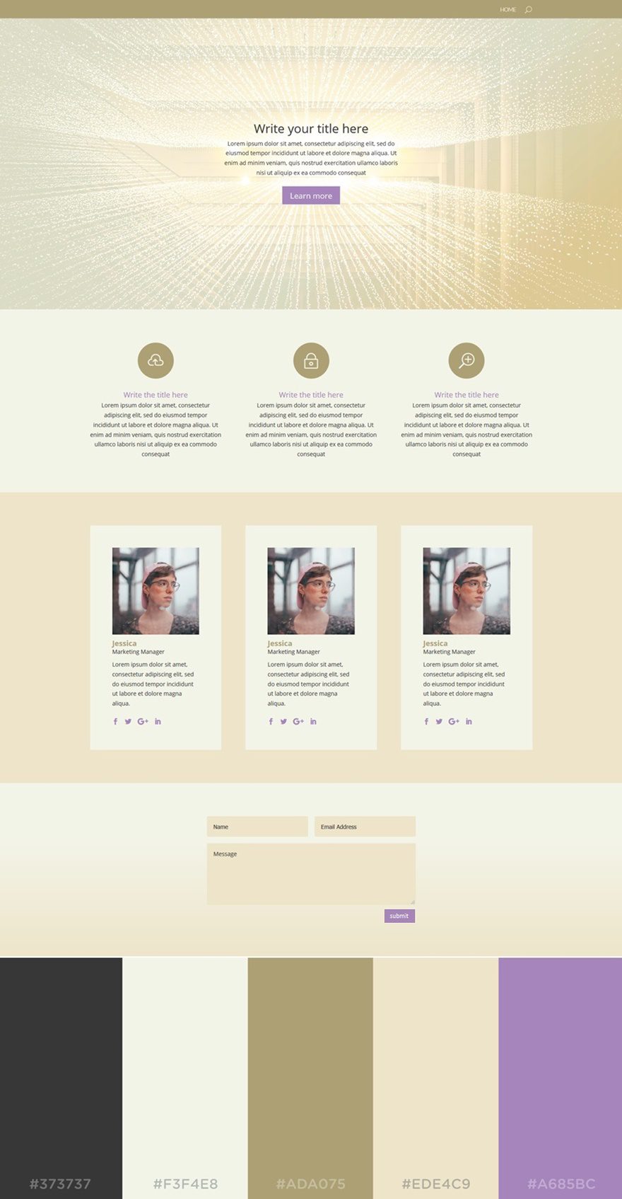
The soft beige colors allow your website to reflect a kind of exclusivity. While the color palette looks pretty sober, the purple turquoise color in this color palette manages to bring the warmth the website needs.
The colors used in this color palette are (left to right):
- #373737
- #F3F4E8
- #ADA075
- #EDE4C9
- #A685BC
14. Captain
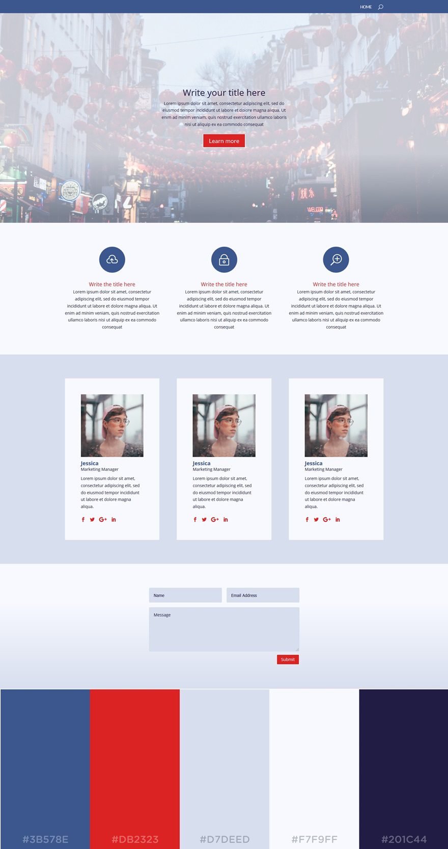
This palette is probably the most professional-looking palette in the list. The two dark blue colors in this palette are the main reason for that. The red color, however, does a great job at breaking the ice and adding some diversity to the website.
The colors used in this post are (left to right):
- #3B578E
- #DB2323
- #D7DEED
- #F7F9FF
- #201C44
15. Environmental
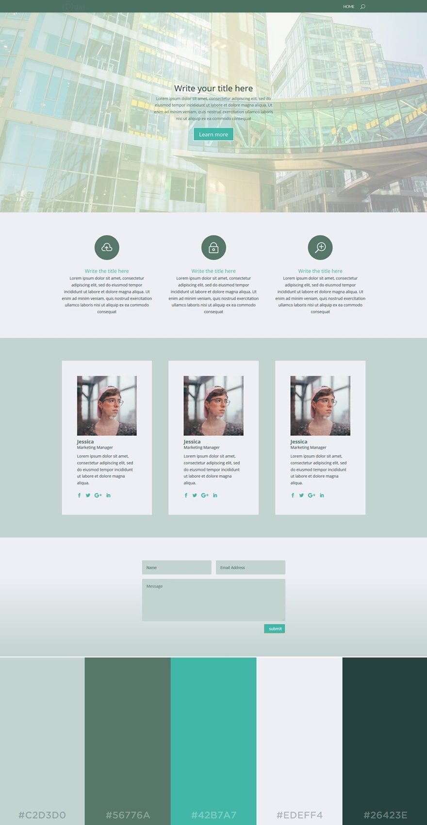
The next color palette we’d like to share is Environmental. The name gives away that green dominates this color palette. These soft green colors fit perfectly with the softened turquoise color that is provided in this palette.
The colors in this palette are (from left to right):
- #C2D3DO
- #56776A
- #42B7A7
- #EDEFF4
- #26423E
16. Soft rich
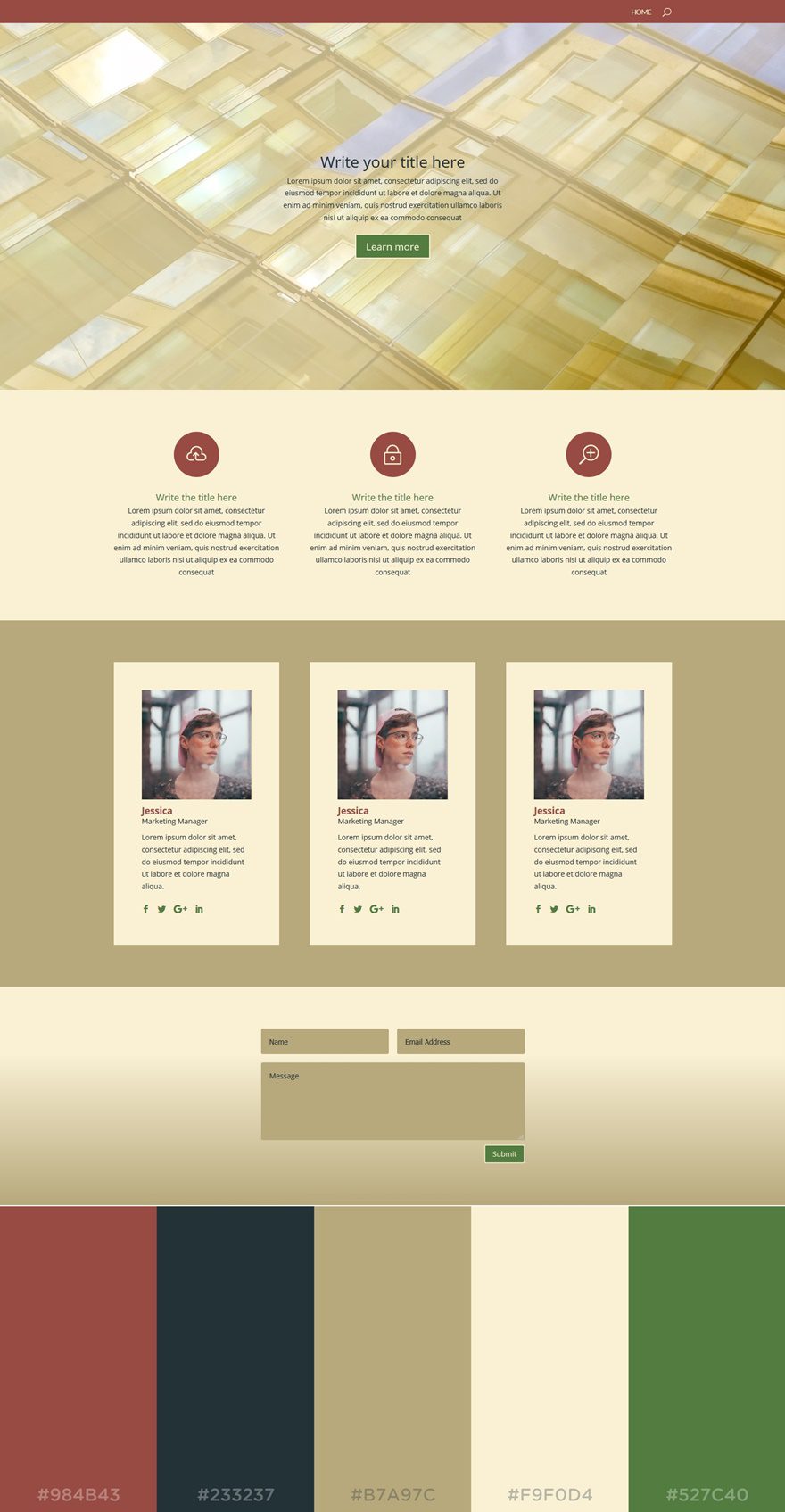
In this next palette, we can clearly see what a good combination beige and red are. They give a sense of maturity to any type of website. By adding another noticeable green color, the look and feel of your website will have some youthfulness as well.
The colors in this palette are (left to right):
- #984B43
- #233237
- #B7A97C
- #F9F0D4
- #527C40
17. Mesmerizing
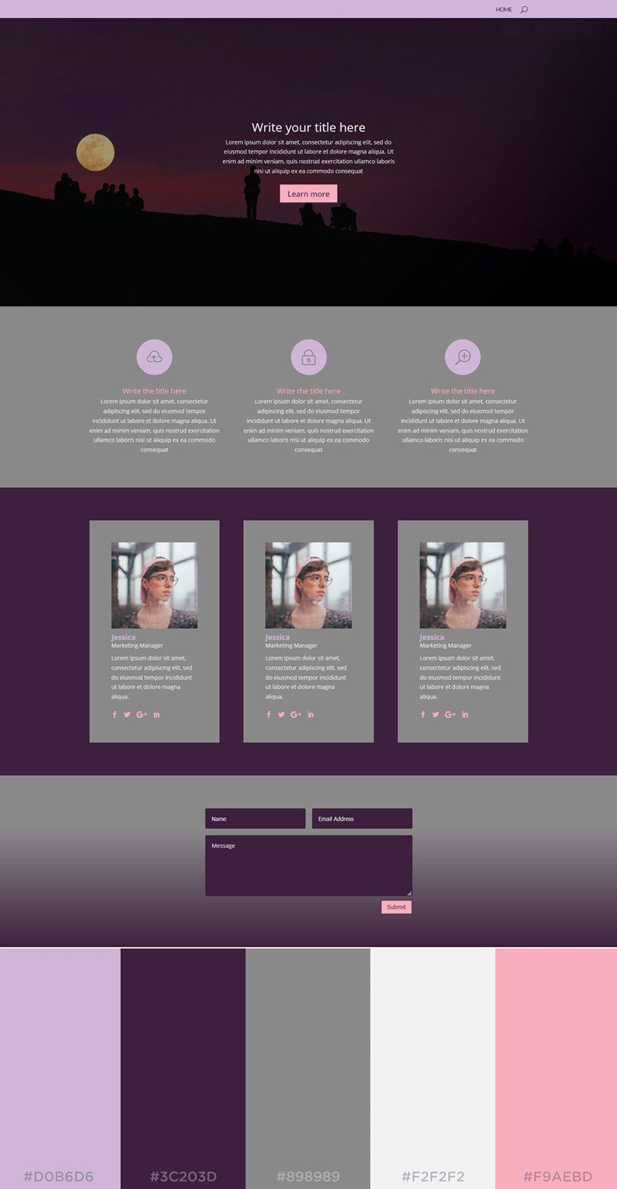
The next palette in the row is another dark-color website. The dominating colors are dark purple and gray. However, the lighter colors manage to bring some warmth to the website.
The colors in this palette are (from left to right):
- #D0B6D6
- #3CC203D
- #898989
- #F2F2F2
- #F9AEBD
18. Mint
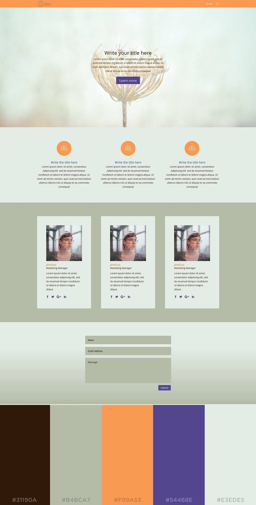
The Mint color palette brings a sense of freshness to your website. While being very sober at first sight, the orange and purple color do manage to give a fresh and reborn feeling to the website.
The colors used in this palette are (from left to right):
- #31190A
- #B4BCA7
- #F99A53
- #54468E
- #E3EDE5
19. Soft Yellow
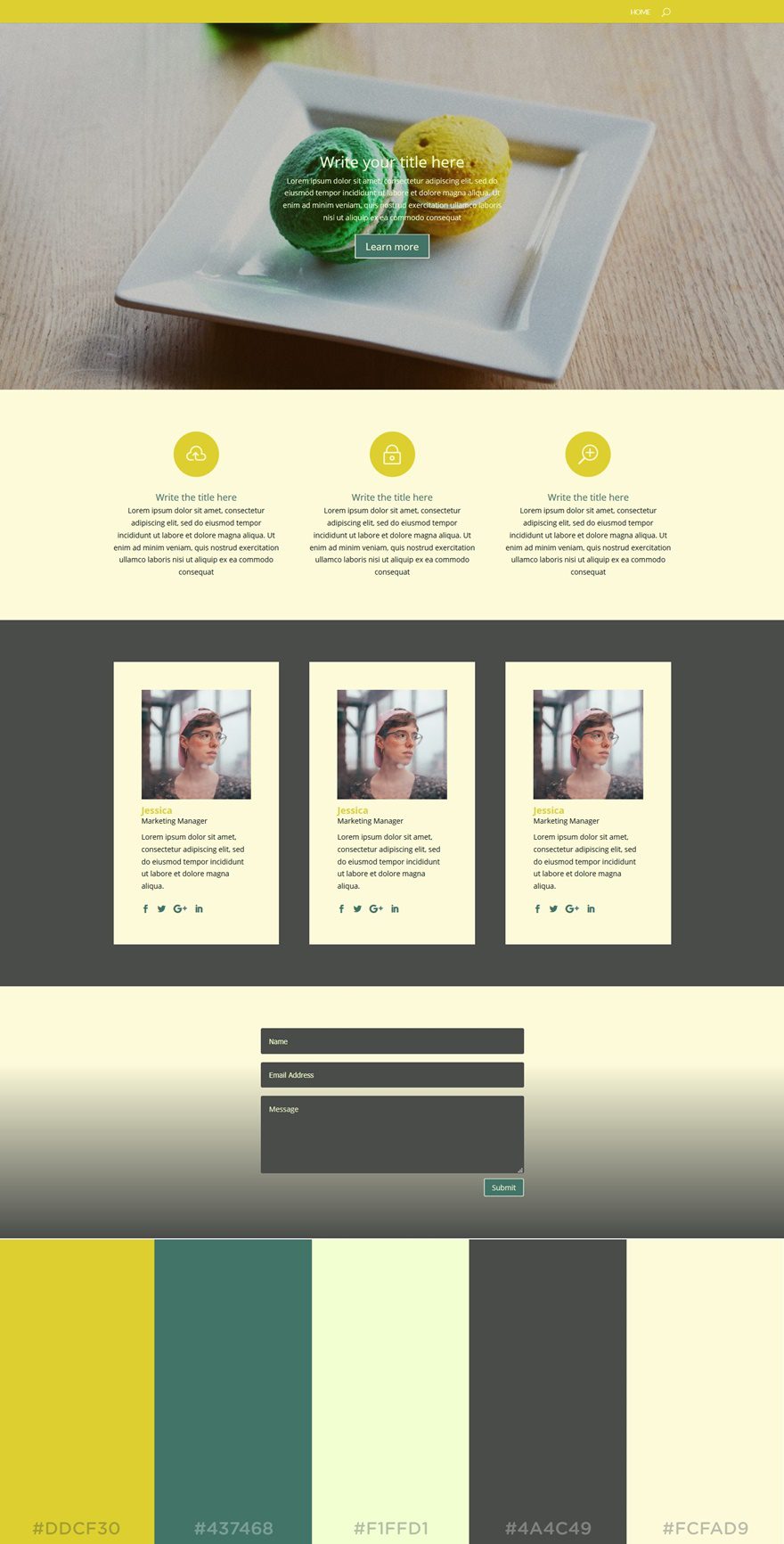
This unique color palette contains mostly warm colors. Although we have both a dark and light color as background colors, the overall feeling leans closer towards a light-colored website.
The colors in this palette are (left to right):
- #DDCF30
- #437468
- #F1FFD1
- #4A4C49
- #FCFAD9
20. Mystery
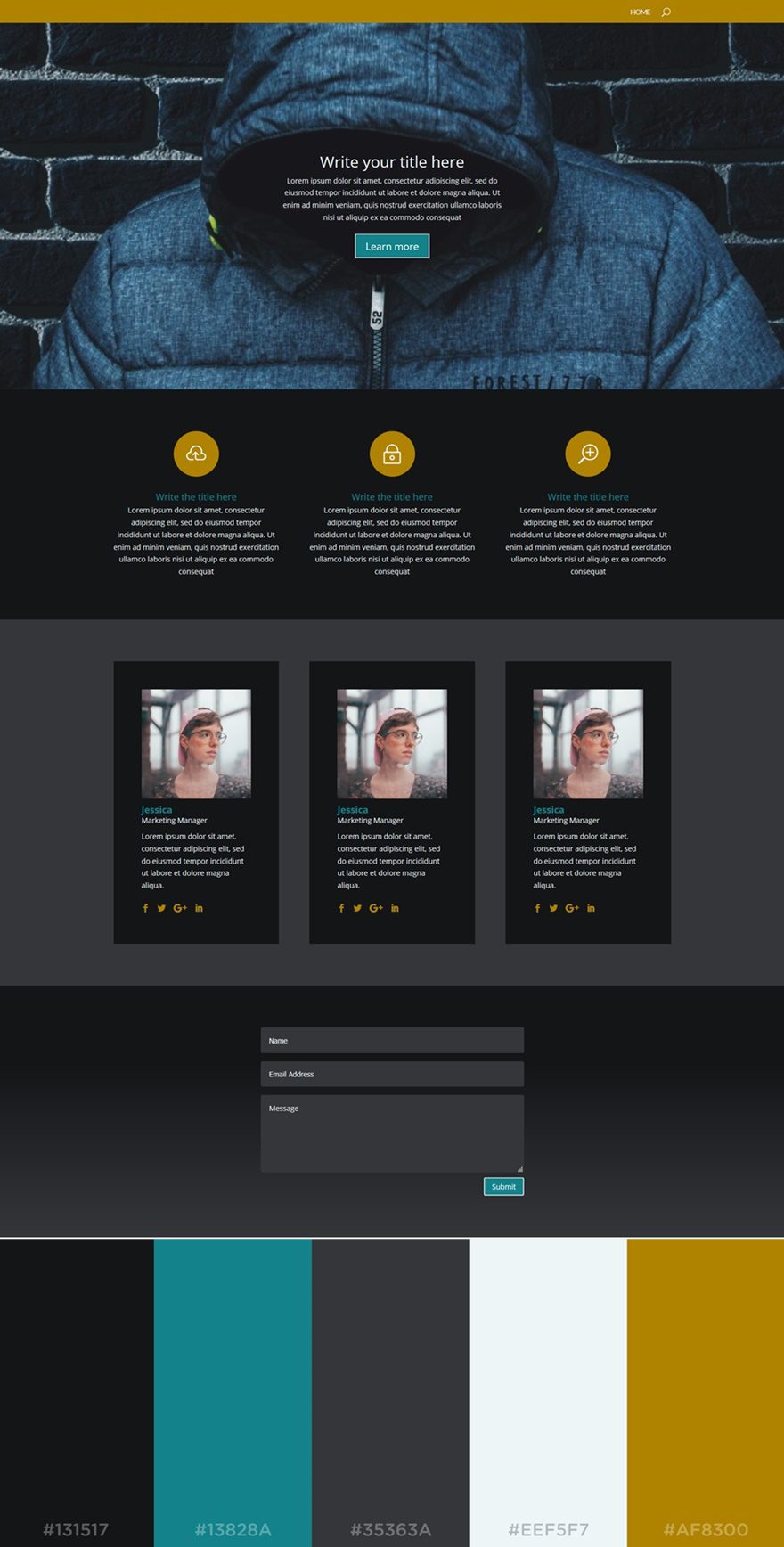
The last color palette in the row is yet another dark-colored palette you can use for your website. The background colors used in this palette are sober and allow the other brighter colors in the palette to come forth.
The colors in this palette are:
- #131517
- #13828A
- #35363A
- #EEF5F7
- #AF8300
Final Thoughts
In this post, we’ve shared some tips on how to apply the color palette you choose to your website. Besides that, we’ve also shown you 20 beautiful color palettes that could help you bring elegance to your website. If you have any questions or suggestions, feel free to leave a comment in the comment section below.
And while you’re there, let us know; which one of these color palettes is your favorite?
Featured Image by EDGOR_21 / shutterstock.com
The post How to Apply Color Palettes to Your Divi Website (20 examples!) appeared first on Elegant Themes Blog.