
Fullscreen footers are interesting design elements. The fullscreen aspect of the design gives all of the attention to the footer. The tricky part, though, is making the footer fullscreen on different screen sizes. It gets even trickier when you consider that many users will view your website at different zoom levels. Fortunately, it’s easy to make a fullscreen Divi footer using the Divi settings. In this article, we’ll see how to make a small footer adapt to become a fullscreen Divi footer regardless of the screen size or zoom level.
Preview
Here’s how our fullscreen Divi footer will look when we’re finished. I’ve included a header in my examples.
Fullscreen Divi Footer on Desktop

Here’s our fullscreen Divi footer at the regular screen size for a desktop.
Fullscreen Divi Footer on Phone
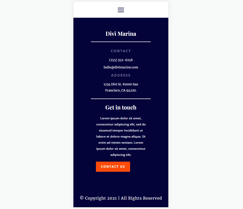
This shows how our footer will look on a phone.
Download a Divi Footer Template
First, you’ll need a footer template that’s shorter than the screen. We will expand it to fit the available space, no matter the user’s screen size or zoom level. For this tutorial, we want a template with one section. You can use a footer with multiple sections, but you’ll need to move all the rows into one section. We will make one section fullscreen.
You can create the template from scratch or modify an existing template. I will use the footer from the FREE Header and Footer Template for Divi’s Marina Layout Pack. This footer is already larger than the screen, so I will modify it for our example.
You can find more footer templates in the Elegant Themes blog. Just search for “free footer”. Once you’ve downloaded your footer template, unzip the file. You’ll upload the unzipped JSON file to the Divi Theme Builder.
Upload Your Fullscreen Divi Footer Template
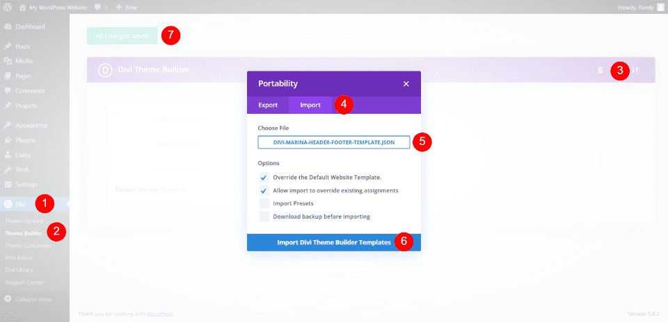
Next, upload your JSON file to the Divi Theme Builder. Go to Divi > Theme Builder in the WordPress dashboard. Select Portability and click the Import tab in the modal that opens. Click Choose File and navigate to the JSON file on your computer and select it.
Finally, click Import Divi Theme Builder Templates. Wait for the upload to complete and save the changes. You can edit the footer within the Theme Builder or on the front end.
Since this footer template is larger than the screen, I’ll delete the first row to create a modified version of this footer. The only goal here is to have a footer that’s smaller than the screen. Hover over the row you want to delete and click the garbage can icon.
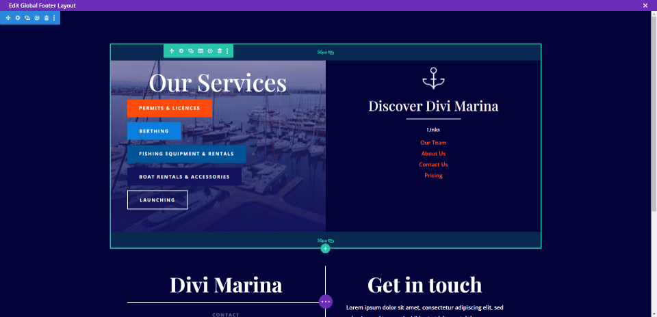
We now have a short footer template that doesn’t fill the screen. This example shows our footer in the Divi Theme Builder. You can see that the bottom of the screen is blank. Now, let’s turn this into a fullscreen Divi footer.
Fullscreen Divi Footer Settings
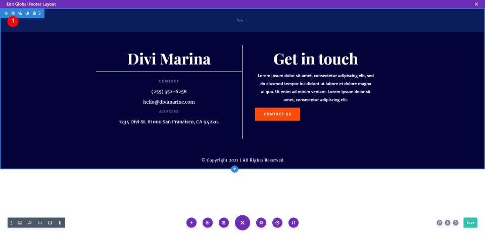
Hover over the section’s settings and click the gear icon.
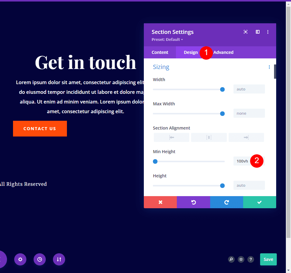
Select the Design tab. Scroll down to Sizing and enter 100vh into the Min Height field. This allows the background to fill the screen for any screen size. I’ll explain this in the next section.
- Min Height: 100vh
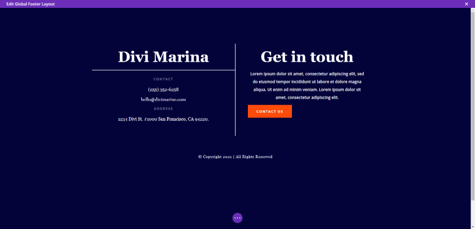
You can see the background has already filled the screen. However, the footer elements are not centered. This is at 100% screen size.
The content being off-center is even more apparent if I zoom out. This is at 75% screen size. The background still fills the screen the way we want it to, but the content is not centered.
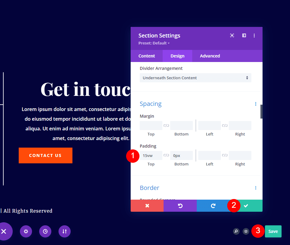
While still in the section’s Design tab, scroll down to Spacing and add 15vh to the Top Padding. This adds enough padding to the top to center the content on any screen size or zoom level. Your padding amount may vary depending on a few factors that we’ll discuss next.
- Padding Top: 15vh
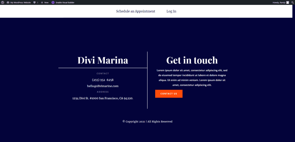
Now, even at 75%, we have a fullscreen Divi footer that centers the footer elements.
Adjusting Your Fullscreen Divi Footer
That’s the only adjustments you’ll need: 100vh to the min-height and then add vh units to the top padding in the section. Depending on the footer’s content height, you might need to tweak the padding to center your fullscreen Divi footer content. You’ll also want to consider whether or not you’re using a sticky menu. You can also add padding between the modules if needed.
About the Settings
Why 100vh? The vh measurement is a viewport unit. V stands for viewport. H stands for height. 100vh tells the viewport to display at full height. The viewport includes the entire screen. This includes the space under the header menu if we use a sticky menu. To allow for the menu’s space, add padding to the top until the content is centered.
The viewport also includes the address bar on a mobile device in browsers such as Chrome and Safari. These scroll out of the way, but keep in mind that they can be visible.
Results
Here’s how our fullscreen Divi footer looks on a desktop and smartphone. I’ve left my sticky header in place for my examples.
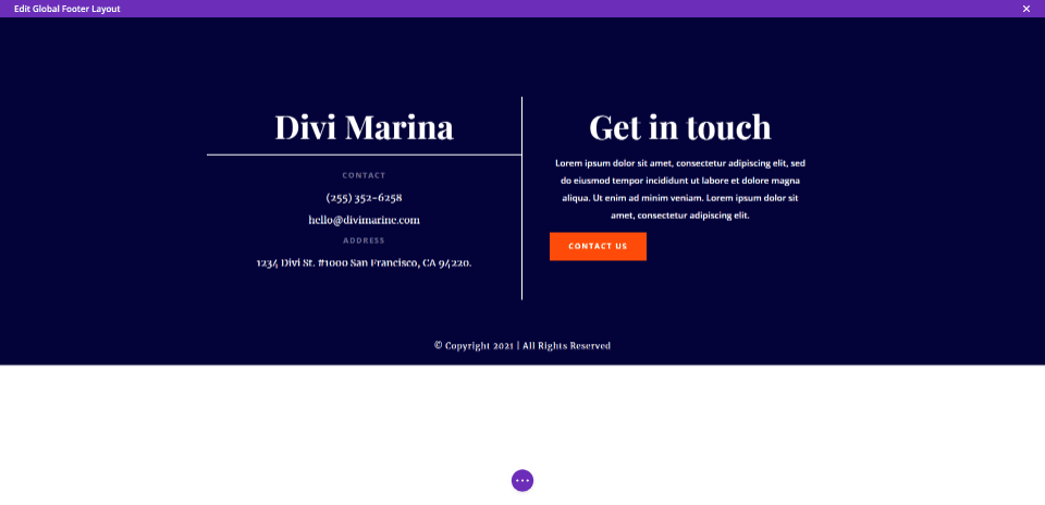
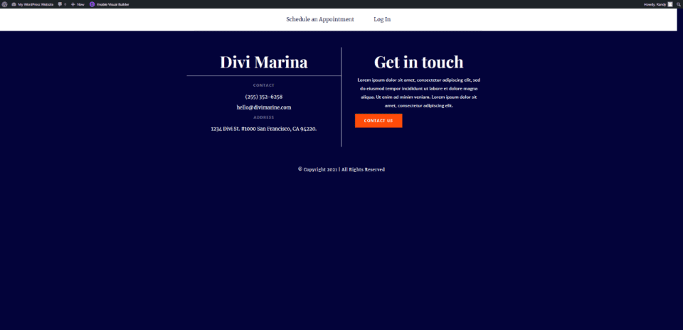
Fullscreen Divi Footer on Desktop
Here’s our Divi footer at the regular screen size for a desktop. The background is fullscreen at any zoom level and screen size, and the content remains centered.
Fullscreen Divi Footer on Phone
This shows the footer on a phone. As long as the footer is smaller than the phone’s screen, it will adapt to the screen to create a fullscreen Divi footer. In other words, it will expand to fit, but it will not reduce in size.
Ending Thoughts
That’s our look at building a fullscreen Divi footer. Any footer that’s shorter than the screen can be made fullscreen regardless of the screen size or zoom level. The Min Height and Padding in the section should be the only adjustments you need. Depending on the content of your footer, and the size of your header, you might need to make adjustments to the padding to center the content correctly.
We want to hear from you. Have you used this method to create a fullscreen Divi footer for your website? Let us know about your experience in the comments below.
The post How to Build a Fullscreen Footer with Divi appeared first on Elegant Themes Blog.

