
In this Divi tutorial, we’re going to show you how to create a contact form that appears after clicking a button (as an overlay) by using nothing else than Divi, some jQuery code and CSS code.
This is a great way to keep your site visitors focused on the action they’ve committed to by clicking a button. It doesn’t take them to a different page but locks them into that action until it’s done.
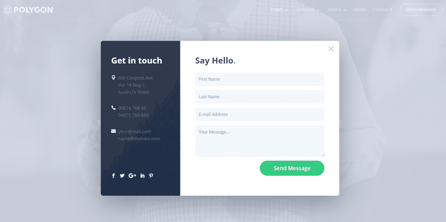
Below you can take a quick peak at what we’ll be creating and then jump into the tutorial!
Result on Desktop

Result on Phone & Tablet

Inspiration
The inspiration for this post comes from a comment request and is found on B3multimedia. Although they’re using another method to make this work, they also have a stunning way to create a contact form on click. Take a look at the result:
Create Section with Button Module
Typically we show how to do almost everything in Divi’s frontend visual builder. In today’s post however I’ll be using the backend builder. Because of the code we’re using it’s a bit easier. That said, if you love the frontend editor as much as we do, you can just as easily complete this tutorial using the frontend “skeleton” view.
Ok, let’s get into this tutorial!
The first thing we’ll need to do is add a new section where we place the button that’ll allow the contact form to pop up. Just add a standard section and select a one-column row. Once you’ve done that, add a Button Module to it.
You can style the button however you want but you have to make sure that the button URL starts with ‘#’ followed by something else. You can’t just leave it blank or use the ‘#’ character only. By adding ‘#’ and some text, the page will not move once you click on the button. If you leave it blank, the page will refresh on click. And if you only use ‘#’, you’ll get sent to the top of the page.
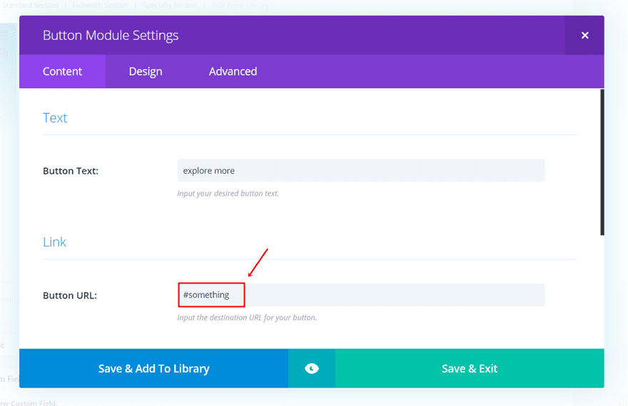
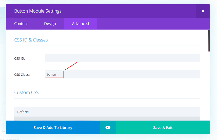
The next important thing we’ll need to do is assign a CSS class to the button. We’ll be using this CSS class later on this post in the jQuery code to make sure the contact form pops up after clicking. The class we’ll need to assign to the button is simply ‘button’.
Create Desktop Contact Form on Click
The next thing we’ll need to do is create the desktop contact form that’ll appear once someone clicks on the button that we’ve created in the previous part of this post. Later on this post, we’ll also show you how to create the mobile version.
You can basically create any design you want within a row and make it appear as a popup if you use this method. We’re only going to give you a taste of what you can achieve by showing you how to create the following example:
Add New Standard Section
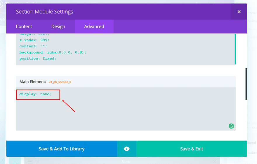
Start by adding a new standard section to the page you’re working on. Go to the Advanced tab of the section you’ve just added and add ‘popup’ to the CSS Class field. Scroll down that same tab and place the following lines of CSS code into the Before field of the Custom CSS subcategory:
top: 0px;
left: 0px;
width: 100%;
height: 100%;
z-index: 999;
content: "";
background: rgba(0,0,0, 0.8);
position: fixed;
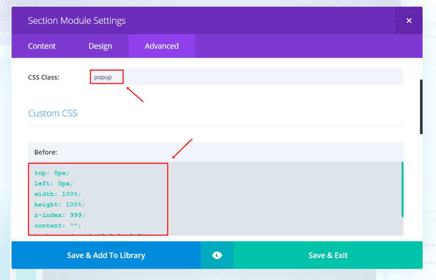
By adding this, we’re making sure that the section takes up the whole tab. You can adjust the background color in the CSS code to create the background overlay you want. In this case, we’re using the black color with some transparency. Within that same tab, add the following line of CSS code to the Main Element as well:
display: none;
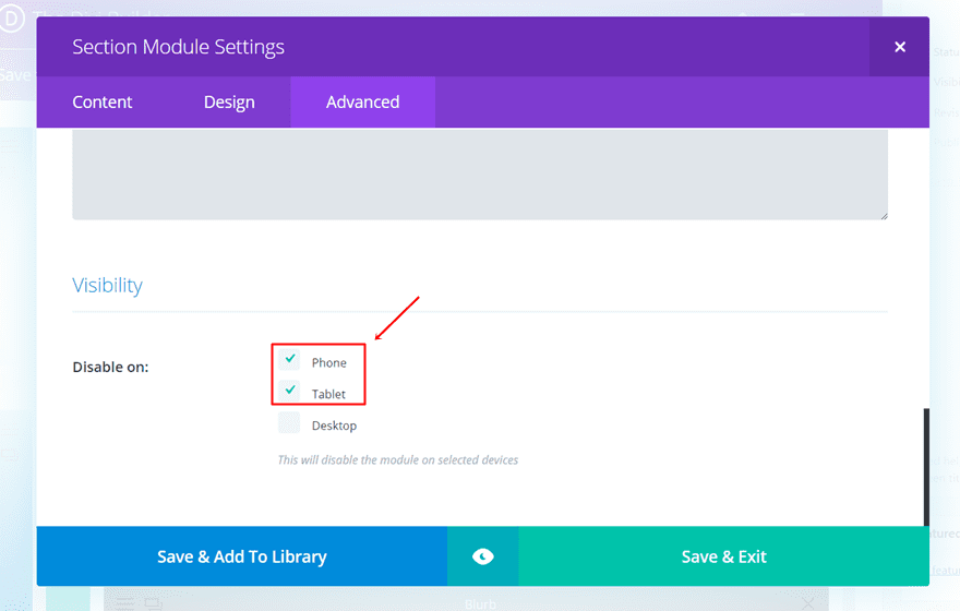
The last thing we’ll need to do in the Advanced tab is disabling the section on phone and tablet in the Visibility subcategory.
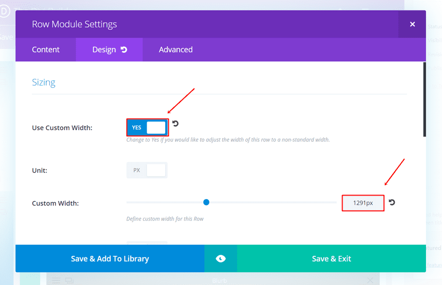
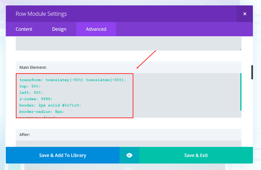
Add Two-Column Row
Continue by adding a two-column row and go to the Design tab. Start by modifying the width of the row in the Sizing subcategory. In this example, we’ve used a custom width of 1291px.
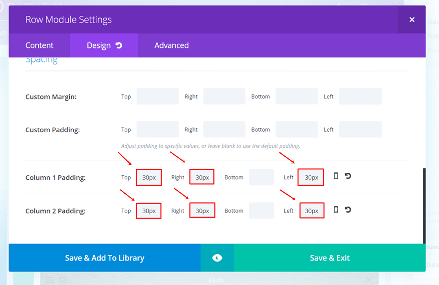
Scroll down the Design tab and use ’30px’ for the top, left and right padding of both columns within the Spacing subcategory.
Finish by going to the Advanced tab. Within the Main Element, add the following lines of CSS code:
transform: translatey(-50%) translatex(-50%);
position: fixed;
top: 50%;
left: 50%;
z-index: 1000;
border: 2px solid #0c71c3;
border-radius: 8px;
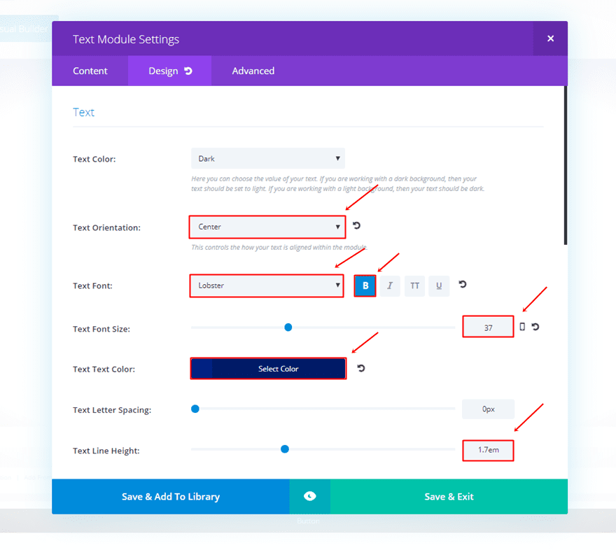
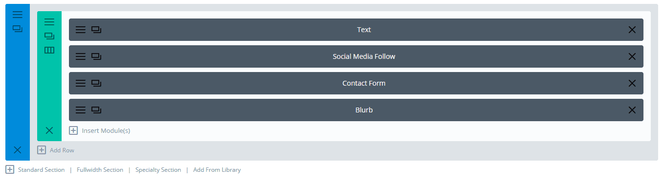
Add First Text Module
Once you’ve made all the changes to the section and the row, it’s time to add the different modules that you want to show up. The first thing we’ll add is the title that shows up. Start by adding a new Text Module to the first column of the row, writing the text within the Content tab and moving on to the Design tab. Within the Design tab, we’ve used the following settings for the Text subcategory:
- Text Orientation: Center
- Text Font: Lobster
- Font Style: Bold
- Text Font Size: 37
- Text Color: #002282
- Text Line Height: 1.7em
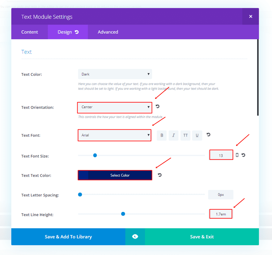
Add Second Text Module
Continue by adding a new Text Module and type down the text you want to appear in the Content tab. Move on to the Design tab and make the following settings apply to the Text Subcategory:
- Text Orientation: Center
- Text Font: Arial
- Text Font Size: 13
- Text Color: #002282
- Text Line Height: 1.7em
Add Social Media Follow Module
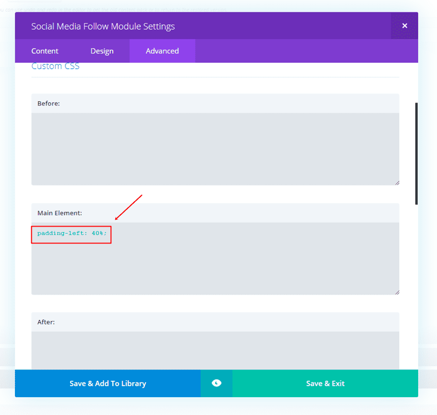
Moving on, we’re going to add the Social Media Follow Module to the first column as well. In this case, we’ve chosen three social icons; Facebook, Twitter and Instagram. Once you’ve added these social icons in the Content tab, change the Link Shape to ‘Circle’ in the Icon subcategory.
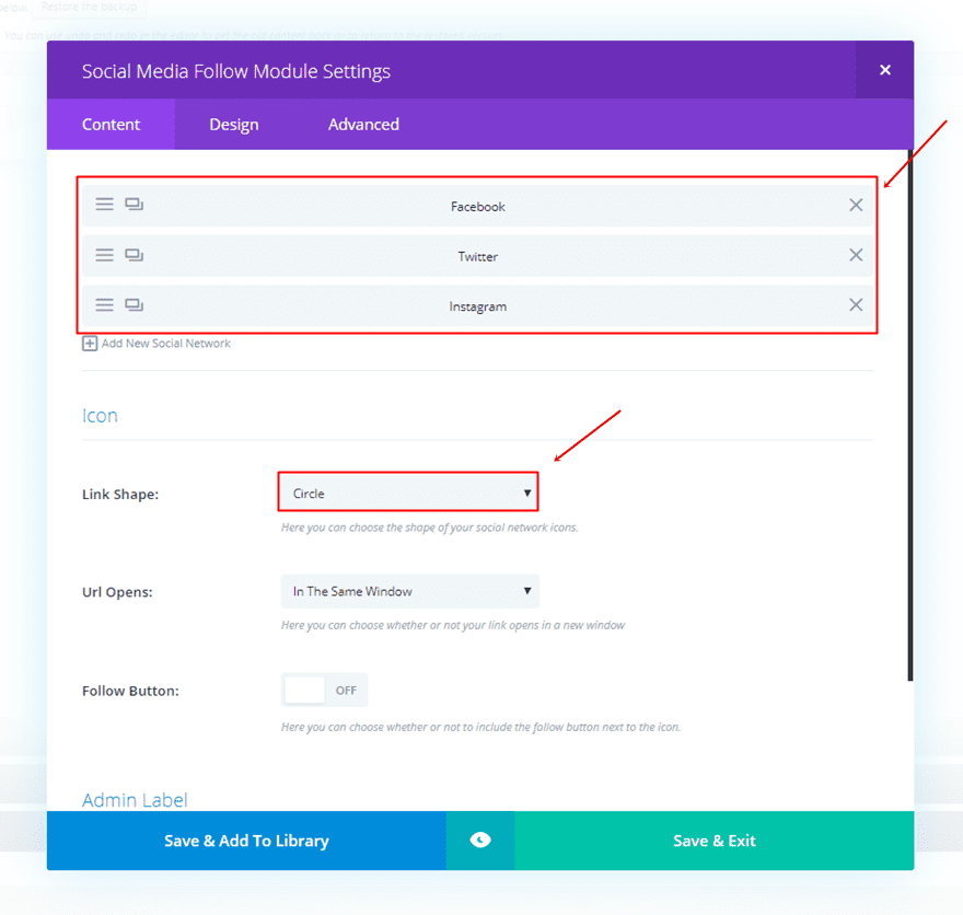
The last thing we’ll need to do is add a left padding to this module in the Advanced tab. Add the following line of CSS code to the Main Element:
padding-left: 40%;
Add Contact Form Module
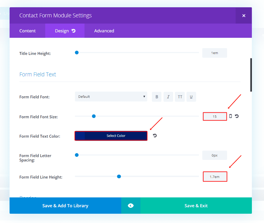
Then, we can go over to the second column of the row. In that column, the first thing we’re going to place is the Contact Form Module. For this example, we’ve only chosen two fields; the name and email. Once you’ve added the Contact Form Module, go to the Design tab of the Contact Form Module and make the following changes to the Form Field Text subcategory:
- Form Field Font Size: 15
- Form Field Text color: #002282
- Form Field Line Height: 1.7em
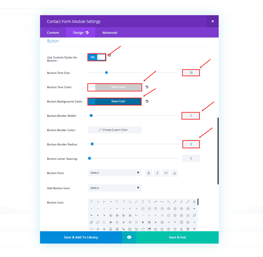
Within that same tab, make the following changes apply to the Button subcategory:
- Use Custom Style for Button: Yes
- Button Text Size: 20
- Button Text Color: #FFFFFF
- Button Background Color: #0086c4
- Button Border Width: 2
- Button Radius: 3
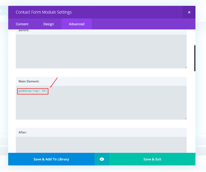
Move on to the Advanced tab and add a top padding of 5%.
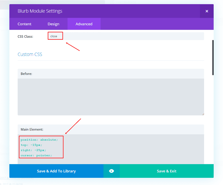
Add Blurb Module
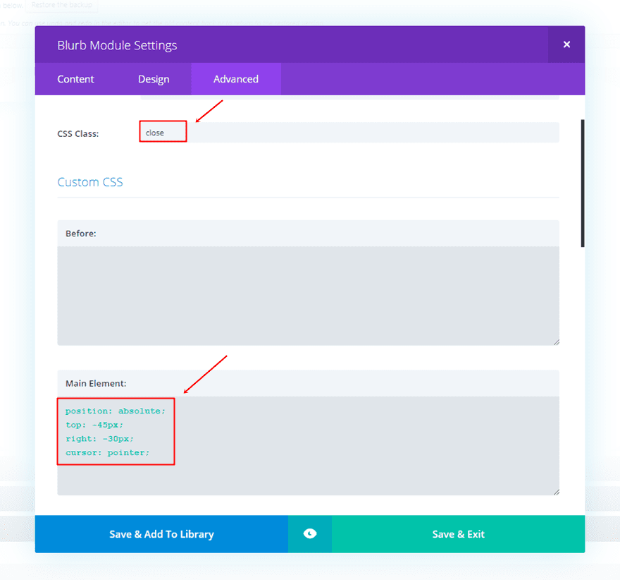
Another thing we’ll need to add to the second column is a Blurb Module. The only thing we need this Module for is the exit icon on the right top of the popup. Choose the following icon in the list of icons and leave all the other things blank.
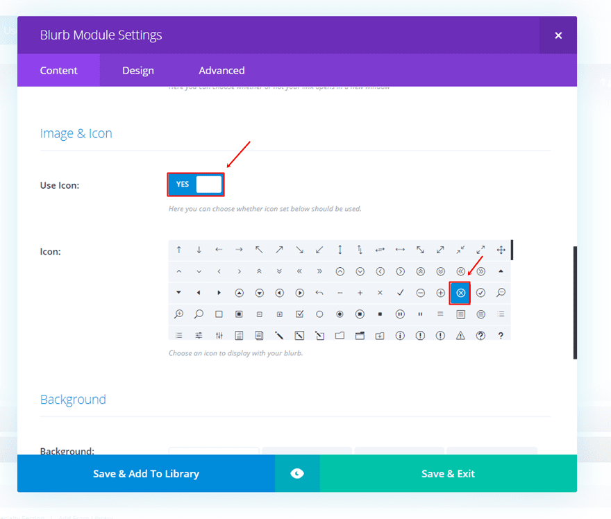
Moving on, go to the Advanced tab and type down ‘close’ as the CSS class. Within that same tab, add the following lines of code to the Main Element of the Custom CSS subcategory:
position: absolute;
top: -45px;
right: -30px;
cursor: pointer;
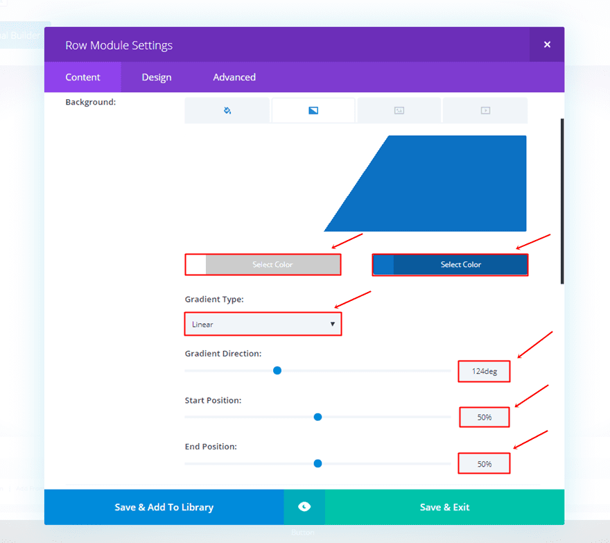
Apply Gradient Background to Row
Last but not least, we’re going to add some nice-looking gradient background to the row. Open the settings and make the following changes apply to the gradient background option:
- First Gradient Color: #FFFFFF
- Second Gradient Color: #0c71c3
- Gradient Type: Linear
- Gradient Direction: 124deg
- Start Position: 50%
- End Position: 50%
Create Tablet & Phone Contact Form on Click
Now that we’ve created the desktop version, the version for tablet and phone will go a lot faster. Most of the modules that we’ve used for the Desktop version are the same for the mobile version. The end result on mobile looks like this:
Add New Standard Section
Start by adding another standard section. This section will need to have the same settings as the section we’ve created before. Add ‘popup’ to the CSS class and add the following lines of CSS code to the Before field:
top: 0px;
left: 0px;
width: 100%;
height: 100%;
z-index: 999;
content: "";
background: rgba(0,0,0, 0.8);
position: fixed;
Add the following line of CSS code to the Main Element as well:
display: none;
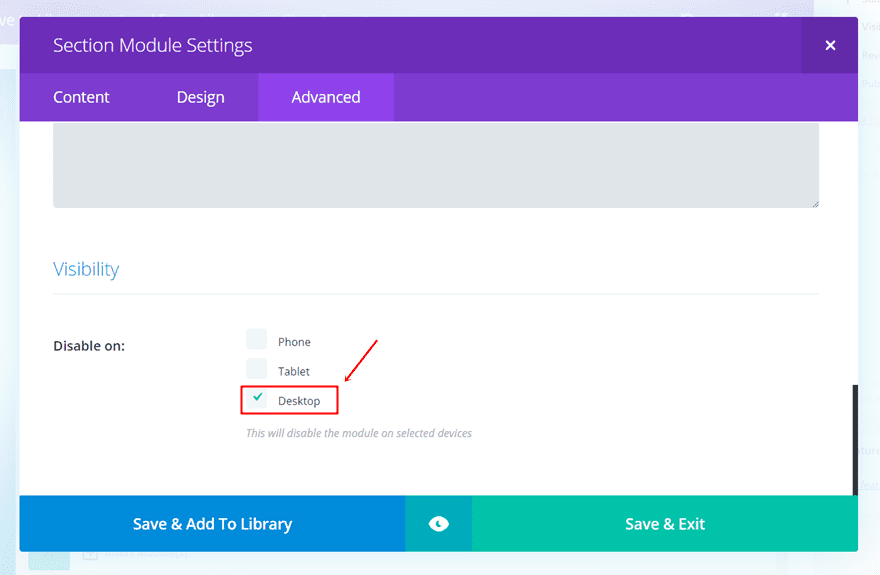
Instead of disabling it for phone and tablet, as we did for the desktop version, we’re going to disable it on desktop in the Visibility subcategory:
Add One-Column Row
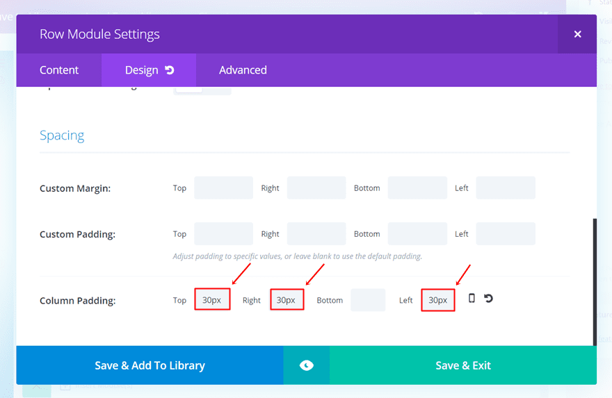
For the phone and tablet popup, we’re only going to need one column. For this row, we’re not going to use custom width. However, we are going to apply the custom padding as we did for the desktop version; 30px for the top, left and right padding of the column.
We’ll also need to make sure that the following lines of CSS code are added to the Main Element in the Custom CSS subcategory:
transform: translatey(-50%) translatex(-50%);
position: fixed;
top: 50%;
left: 50%;
z-index: 1000;
border: 2px solid #0c71c3;
border-radius: 8px;
Clone The Text, Social Media Follow & Contact Form Module
The next thing we’ll need to do is clone the first Text Module we’ve used for the Desktop version along with the Social Media Follow and Contact Form Module. After you’ve cloned them, place them in the one-column row of the new section you’ve just created.
Clone Blurb Module & Change CSS Code in Advanced Tab
You can also clone the Blurb Module that was used for the desktop version but there needs to be a small change in the CSS code. Instead of using the code for desktop, use the following instead:
position: absolute;
top: -15px;
right: -25px;
cursor: pointer;
Make sure that the ‘close’ CSS class is used for the Blurb Module as well.
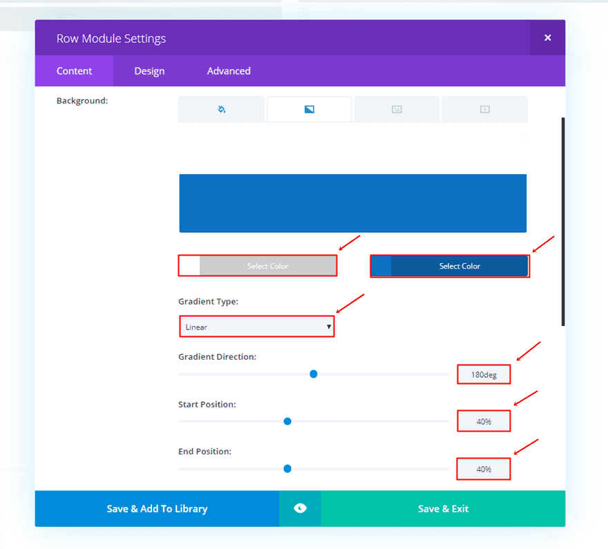
Apply Gradient Background to Row
For the mobile version, we’re using different settings for the gradient background of the row:
- First Gradient Color: #FFFFFF
- Second Gradient Color: #0c71c3
- Gradient Type: Linear
- Gradient Direction: 180deg
- Start Position: 40%
- End Position: 40%
Add jQuery Code to Theme Options
The last thing we’ll need to do for this tutorial is adding the jQuery code. You can add the code through the Theme Options or through a Code Module that you place within the page you’re working on. For this example, we’re simply going to put it in the Theme Options.
To do that, go to your WordPress Dashboard > Divi > Theme Options > Integration > And paste the following lines of jQuery code within the head of your website:
<script type="text/javascript">
jQuery(function($){
jQuery('.button').click(function() {
jQuery('.popup').css('display', 'block');
});
jQuery('.close').click(function() {
jQuery('.popup').css('display', 'none');
});});
</script> 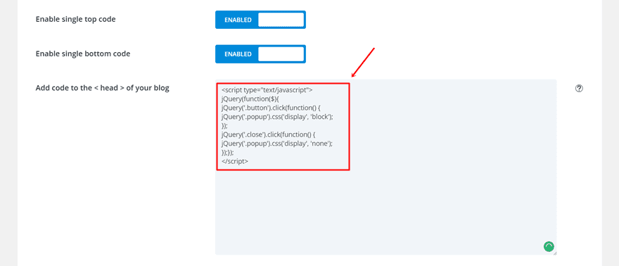
Result
If you follow the post, step by step, you should be able to achieve the following result on desktop:
And the following result on tablets and phones:
Final Thoughts
In this post, we’ve shown you how to create a contact form on click. Using this method to get in touch with your visitors is subtle yet effective. If you have any questions or suggestions; make sure you leave a comment in the comment section below.
Be sure to subscribe to our email newsletter and YouTube channel so that you never miss a big announcement, useful tip, or Divi freebie!
Featured Image by La1n / shutterstock.com
The post How to Create a Contact Form on Click with Divi appeared first on Elegant Themes Blog.