
In today’s tutorial, we’re going to show you how to create a scrollable text preview tablet on your website. The text preview will be represented in a tablet where the visitors can scroll within the tablet to read a few of the chapters that are being shared.
Adding a text preview tablet to your website is an excellent way of teasing your visitors. You’re giving them the chance to explore a piece of the content you’ve created. Once they’ve read the content and felt intrigued by it, the chances are more likely that they’ll want to read the rest as well. Using a text preview tablet can be interesting in the following cases, for example:
- When selling a book
- When sharing a free ebook with your visitors and wanting to encourage them to download the complete version (by subscribing)
- When sharing case studies or testimonials
To show you what we mean exactly, we’ve created an example that we’ll show you how to recreate step by step:
You can add as much content to the tablet as you wish. The scrollbar will allow your visitors to scroll through the content easily.
How to Create a Scrollable Text Preview Tablet with Divi
Subscribe To Our Youtube Channel
Create & Modify the Section
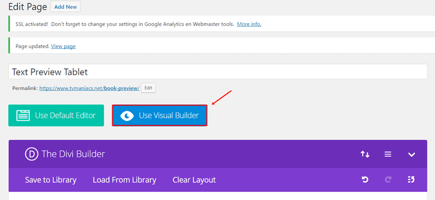
The first thing we’ll be needing to recreate the example that we made is a section. To make it easy, we’re going to add this section to a new page and switch over to the Visual Builder to explain all the steps that are being used to create the result.
Add a New Page
To add a new page, go to your WordPress Dashboard > Pages > Add New. Once you’ve added the new page, activate the Divi Builder and switch over to Visual Builder right away.
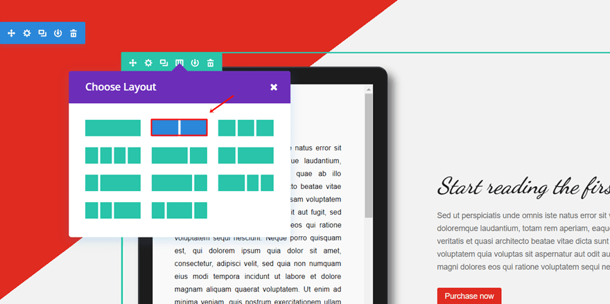
Add a Section with Two-Column Row
For the example that we’re recreating, we’ll only need one section. Add a standard section and within that section, create a two-column row. We’ll need the left column to place the text preview tablet and the second column to give information and place a call to action.
Add The Gradient Background
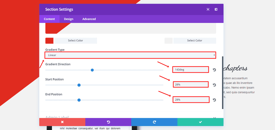
The next step we’ll be explaining is the Gradient Background. We opted for something really simple but that brings a nice added value to the section. To recreate the background gradient, go to the settings of your section. Then, use the following two colors for your gradient background in the background subcategory:
- #e02b20
- #f2f2f2
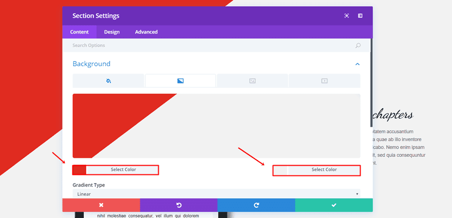
The settings that we’ve used for the gradient background are the following:
- Gradient Type: Linear
- Gradient Direction: 143deg
- Start Position: 28%
- End Position: 28%
First Column: Add The Code Module & Text Preview Tablet
For the first column, we’re going to add the code module with the text preview tablet. To complete the text preview tablet we’ll need to do three things; add the code module, add the HTML code lines within the Code Module and add the needed CSS code lines to the page itself. You can also add the CSS code lines to the Theme Options or Theme Customizer. But since that’s not necessary in this case, we’ll only add it to the page we’ve created.
Add The Code Module
Start by adding a Code Module to the first column of the row you’ve created.
Add The HTML Code
Next, open that Code Module and add the following lines within the Content Box:
<div id="tab-container">
<div class="tablet">
<div class="tab">
<h1 class="title">Chapter 1</h1>
<p>
Sed ut perspiciatis unde omnis iste natus error sit voluptatem accusantium doloremque laudantium, totam rem aperiam, eaque ipsa quae ab illo inventore veritatis et quasi architecto beatae vitae dicta sunt explicabo. Nemo enim ipsam voluptatem quia voluptas sit aspernatur aut odit aut fugit, sed quia consequuntur magni dolores eos qui ratione voluptatem sequi nesciunt. Neque porro quisquam est, qui dolorem ipsum quia dolor sit amet, consectetur, adipisci velit, sed quia non numquam eius modi tempora incidunt ut labore et dolore magnam aliquam quaerat voluptatem. Ut enim ad minima veniam, quis nostrum exercitationem ullam corporis suscipit laboriosam, nisi ut aliquid ex ea commodi consequatur? Quis autem vel eum iure reprehenderit qui in ea voluptate velit esse quam nihil molestiae consequatur, vel illum qui dolorem eum fugiat quo voluptas nulla pariatur?
</p>
<h1 class="title">Chapter 2</h1>
<p>
Sed ut perspiciatis unde omnis iste natus error sit voluptatem accusantium doloremque laudantium, totam rem aperiam, eaque ipsa quae ab illo inventore veritatis et quasi architecto beatae vitae dicta sunt explicabo. Nemo enim ipsam voluptatem quia voluptas sit aspernatur aut odit aut fugit, sed quia consequuntur magni dolores eos qui ratione voluptatem sequi nesciunt. Neque porro quisquam est, qui dolorem ipsum quia dolor sit amet, consectetur, adipisci velit, sed quia non numquam eius modi tempora incidunt ut labore et dolore magnam aliquam quaerat voluptatem. Ut enim ad minima veniam, quis nostrum exercitationem ullam corporis suscipit laboriosam, nisi ut aliquid ex ea commodi consequatur? Quis autem vel eum iure reprehenderit qui in ea voluptate velit esse quam nihil molestiae consequatur, vel illum qui dolorem eum fugiat quo voluptas nulla pariatur?
</p>
<footer>
© 2017 *Author*
</footer>
</div>
</div>
</div>
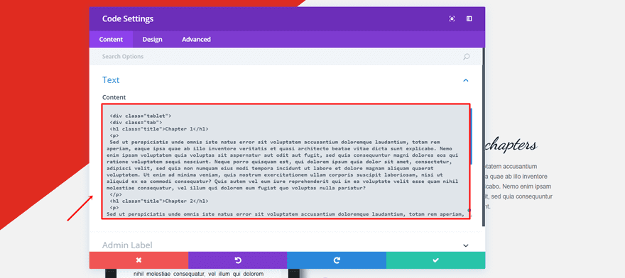
You’ll notice that there are three parts in our text preview; the title, the paragraphs and the footer. You can make the text preview as long as you want. For this example, we’ve added two chapters that are represented by one title and one paragraph each. You can, of course, add multiple paragraphs and titles wherever you want on the tablet.
Add The Needed CSS Code
Once you’ve adjusted the HTML code to your needs, you can add the CSS code that makes your tablet looks the way you want it to look. Since we’re only going to need this tablet on the page we’re creating; we’re going to add the code to the page directly. Within the Visual Builder of your page, click on the settings icon:
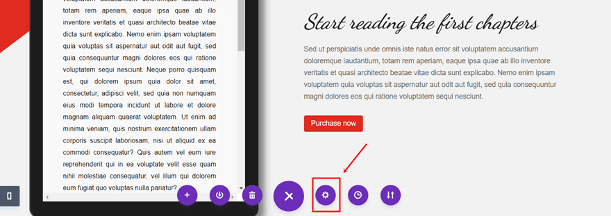
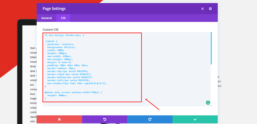
Next, go to the CSS tab and paste the following lines of CSS code into the Custom CSS field:
*{ box-sizing: border-box; }

.tablet {
position: relative;
background: #1c1c1c;
width: 100%;
height: 600px;
max-width: 450px;
max-height: 600px;
margin: 0 auto 0;
padding: 30px 24px 30px 24px;
border-radius: 18px;
border-top:2px solid #3C3F45;
border-right:2px solid #202227;
border-bottom:2px solid #202227;
border-left:2px solid #3C3F45;
box-shadow:11px 11px 24px rgba(0,0,0,0.5);
}

@media only screen and(max-width:768px) {
height: 400px;
}

.tablet .tab {
background: #f9f9f9;
color: black;
padding: 50px 40px 50px 40px;
overflow: scroll;
height: 100%;
text-align: justify;
}

.tablet .tab h1 {
font-size: 30px;
font-family: "Dancing script";
font-weight: bold;
font-style: italic;
text-align: center;
margin: 0 0 20px 0;
padding: 4px;
font-size: 25px;
}

.tablet .tab p {
margin: 0 0 20px 0;
font-family: "Arial";
font-size: 13px;
}

footer {
background: black;
color: white;
margin-bottom: 8px;
} 
You can change all the things according to your need within these CSS code lines. As you can notice in the code lines, there are five main parts where you can change the look and feel of your text preview tablet.
- The tablet outer look
- The tablet inner look
- The title
- The paragraphs
- The footer
You can make the tablet thus fit whatever kind of page you’re integrating the text preview tablet into.
Second Column: Add Two Text Modules & a CTA
The last thing we’re going to do is add the modules to the right column. It’s important to inform people what they’re going to read in the text preview tablet. It’s also the ideal opportunity to make use of a CTA. The closer the CTA is to the actual text preview tablet, and the more noticeable it is, the more likely people are going to take action after reading the text preview.
First Text Module
Start by adding the first Text Module to the second row. Open the settings and write down a title in the Content Box within the Text subcategory of the Content. Furthermore, go to the Design tab and make the following changes to the Text subcategory:
- Text Font: Dancing Script
- Text Font Style: Bold & Italic
- Text Font Size: 40 (desktop), 35 (tablet), 30 (phone)
- Text Color:#1c1c1c
- Text Line Height: 1.7em
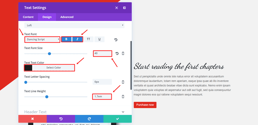
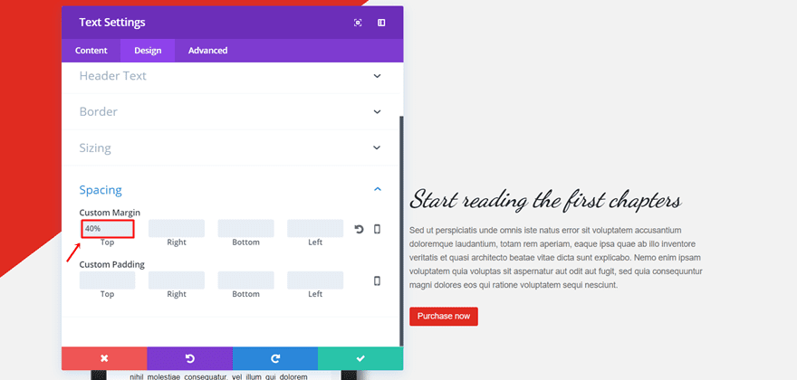
Scroll down the same tab and add ‘40%’ to the Top Margin.
Second Text Module
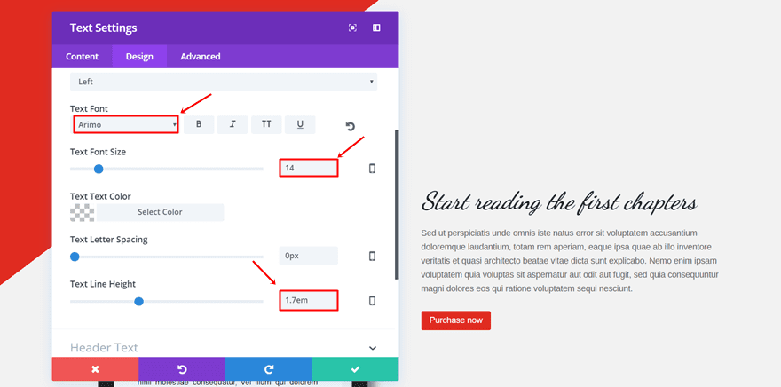
Furthermore, add the second text module. Start by adding the text in the Content box within the Content tab and move on to the Design tab. Within the Design tab, make the following adjustments to the Text subcategory as well:
- Text Font: Arimo
- Text Font Size: 14
- Text Line Height: 1.7em
Button Module
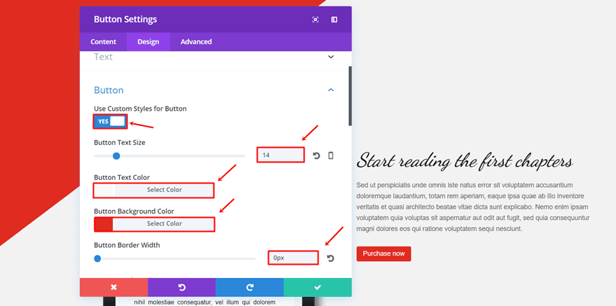
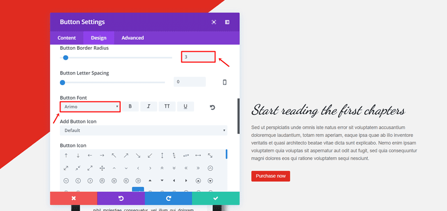
Lastly, we’ll also need to add a Button Module to the second column. We’ve matched the colors of the CTA to the gradient background. Firstly, add the Button Module and open the Settings. Then, add the CTA and URL within the Content tab. Continue by moving on to the Design tab and making the following adjustments to the Button subcategory:
- Use Custom Styles for Button: Yes
- Button Size Text: 14 (desktop & tablet), 12 (phone)
- Button Text Color: #f9f9f9
- Button Background Color: #e02b20
- Button Border Width: 0
- Button Border Radius: 3
- Button Font: Arimo
Tip: if you’re promoting your ebook through the text preview, you can also link a Trigger on Click Bloom opt-in form as explained in the following post.
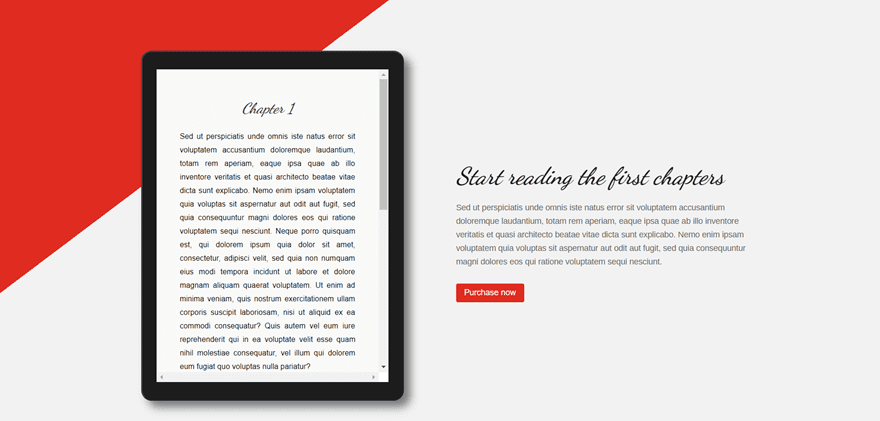
The Result
If you’ve followed all the steps in this post, you should have obtained the following result for your book preview:
Wrapping up
With the code module, you can get as creative as you want. This post was one example of how diverse you can make your Divi website look like if you integrate some elements of your personal preference. If you’ve followed this post step by step, you should’ve been able to recreate the book preview and use it on your website. Not only can you use the book preview for author websites, but you can also use it to preview an ebook you’ve created and wanted to build your email list from. If you have any questions or suggestions; feel free to drop us a comment in the comment section below!
Be sure to subscribe to our email newsletter and YouTube channel so that you never miss a big announcement, useful tip, or Divi freebie!
The post How to Create a Scrollable Text Preview Tablet with Divi appeared first on Elegant Themes Blog.