
It’s no secret that blend modes can help you give some extra attention to the aesthetics of the design you’re working on. In the past, we’ve covered blend mode tips and tricks that help you create some unique and gorgeous designs. Now, since the column update has come out, there are a few extra things you can do with these blend modes. One of those things is creating a split blend mode headline. In this post, we’ll show you how you can achieve a stunning outcome by combining module and column blend modes, column background colors and negative margins. You’ll be able to download the JSON file for free as well!
Let’s get to it.
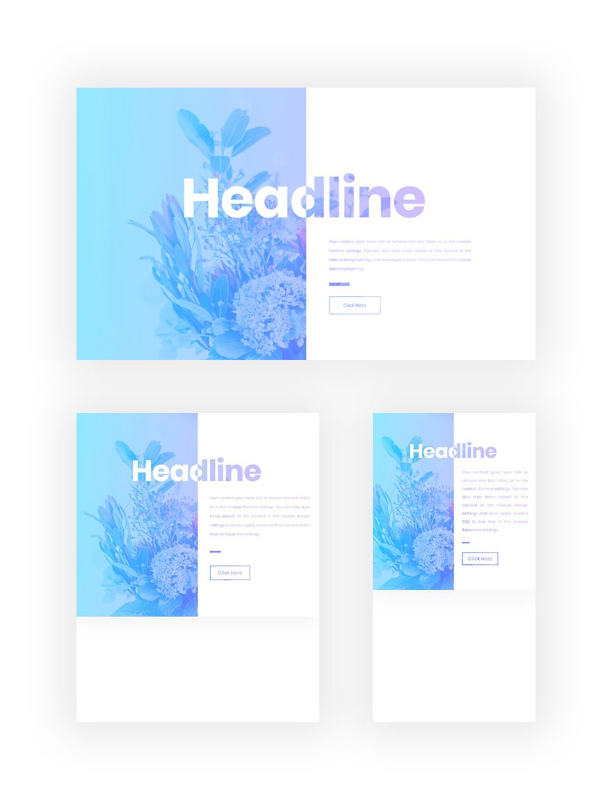
Preview
Before we dive into the tutorial, let’s take a quick look at the outcome across different screen sizes.
Download The Split Blend Mode Hero Section for FREE
To lay your hands on the free blend mode hero section, you will first need to download it using the button below. To gain access to the download you will need to subscribe to our Divi Daily email list by using the form below. As a new subscriber, you will receive even more Divi goodness and a free Divi Layout pack every Monday! If you’re already on the list, simply enter your email address below and click download. You will not be “resubscribed” or receive extra emails.
@media only screen and ( max-width: 767px ) {.et_bloom .et_bloom_optin_1 .carrot_edge.et_bloom_form_right .et_bloom_form_content:before, .et_bloom .et_bloom_optin_1 .carrot_edge.et_bloom_form_left .et_bloom_form_content:before { border-top-color: #ffffff !important; border-left-color: transparent !important; }
}.et_bloom .et_bloom_optin_1 .et_bloom_form_content button { background-color: #f92c8b !important; } .et_bloom .et_bloom_optin_1 .et_bloom_form_content .et_bloom_fields i { color: #f92c8b !important; } .et_bloom .et_bloom_optin_1 .et_bloom_form_content .et_bloom_custom_field_radio i:before { background: #f92c8b !important; } .et_bloom .et_bloom_optin_1 .et_bloom_border_solid { border-color: #f7f9fb !important } .et_bloom .et_bloom_optin_1 .et_bloom_form_content button { background-color: #f92c8b !important; } .et_bloom .et_bloom_optin_1 .et_bloom_form_container h2, .et_bloom .et_bloom_optin_1 .et_bloom_form_container h2 span, .et_bloom .et_bloom_optin_1 .et_bloom_form_container h2 strong { font-family: “Open Sans”, Helvetica, Arial, Lucida, sans-serif; }.et_bloom .et_bloom_optin_1 .et_bloom_form_container p, .et_bloom .et_bloom_optin_1 .et_bloom_form_container p span, .et_bloom .et_bloom_optin_1 .et_bloom_form_container p strong, .et_bloom .et_bloom_optin_1 .et_bloom_form_container form input, .et_bloom .et_bloom_optin_1 .et_bloom_form_container form button span { font-family: “Open Sans”, Helvetica, Arial, Lucida, sans-serif; } p.et_bloom_popup_input { padding-bottom: 0 !important;}

Download For Free
Join the Divi Newlsetter and we will email you a copy of the ultimate Divi Landing Page Layout Pack, plus tons of other amazing and free Divi resources, tips and tricks. Follow along and you will be a Divi master in no time. If you are already subscribed simply type in your email address below and click download to access the layout pack.
You have successfully subscribed. Please check your email address to confirm your subscription and get access to free weekly Divi layout packs!
Let’s Start Recreating!
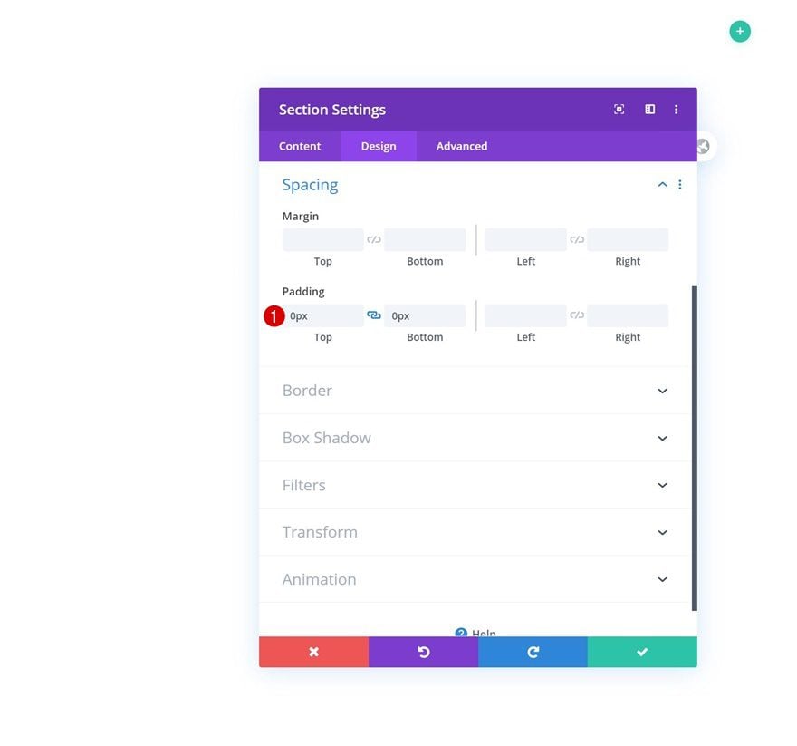
Add New Section
Spacing
Add a new regular section to the page you’re working on and remove all default top and bottom padding.
- Top Padding: 0px
- Bottom Padding: 0px
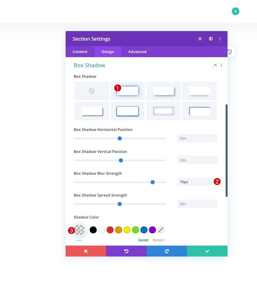
Box Shadow
Move on to the box shadow options and add a subtle box shadow.
- Box Shadow Blur Strength: 70px
- Shadow Color: rgba(0,0,0,0.07)
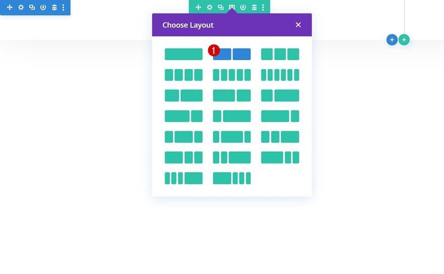
Add New Row
Column Structure
Continue by adding a new row using the following column structure:
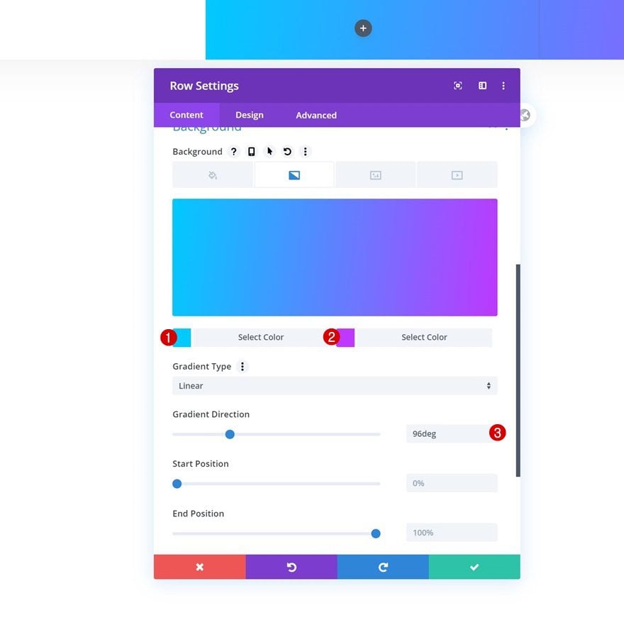
Gradient Background
Without adding any modules yet, open the row settings and apply a gradient background. In the next step of this post, we’ll merge the gradient background with a background image using a blend mode.
- Color 1: #00cbff
- Color 2: #bf35ff
- Gradient Direction: 96deg
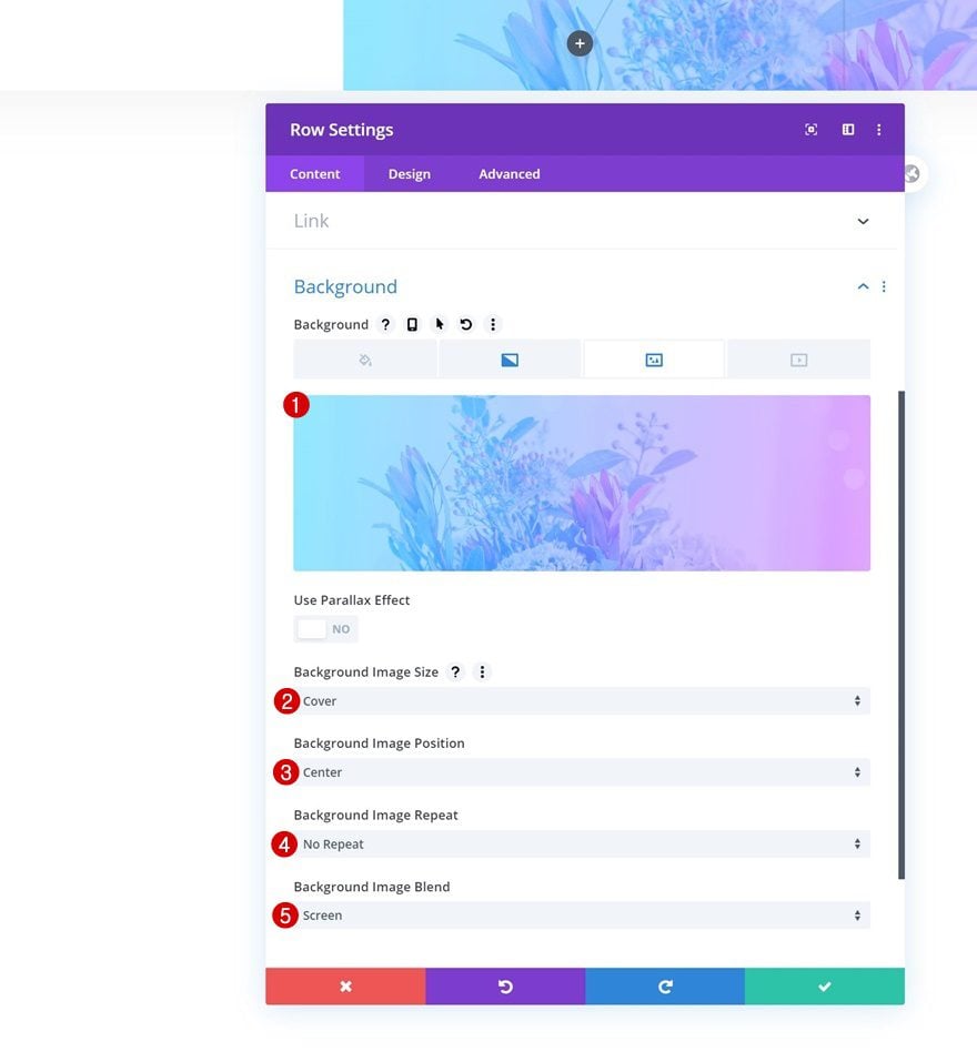
Background Image
Add a background image to the row and use it in combination with the following background image settings:
- Background Image Size: Cover
- Background Image Position: Center
- Background Image Repeat: No Repeat
- Background Image Blend: Screen
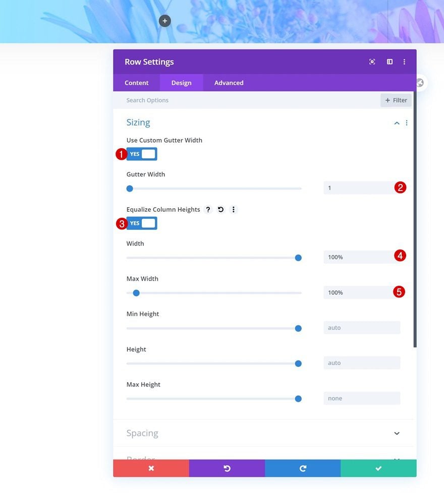
Sizing
Go to the sizing settings next and allow the row to take up the entire width of the section container.
- Use Custom Gutter Width: Yes
- Gutter Width: 1
- Equalize Column Heights: Yes
- Width: 100%
- Max Width: 100%
Spacing
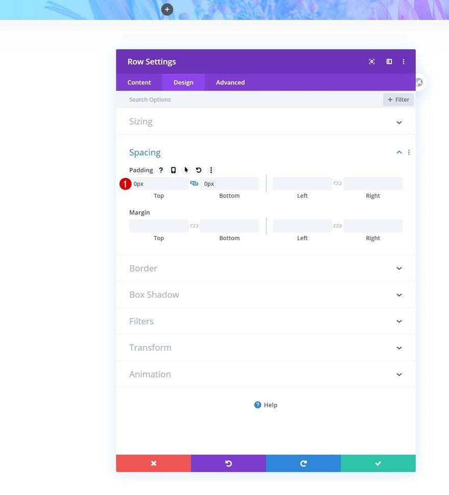
Remove all default top and bottom padding of the row next. This will make sure that the column 2 background color, which we add later on this post, touches the top and bottom border of the row and section containers.
- Top Padding: 0px
- Bottom Padding: 0px
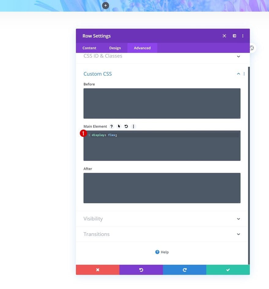
Display
To make sure both columns appear next to each other on smaller screen sizes, we’re going to add one single line of CSS code to the main element of the row.
display: flex;
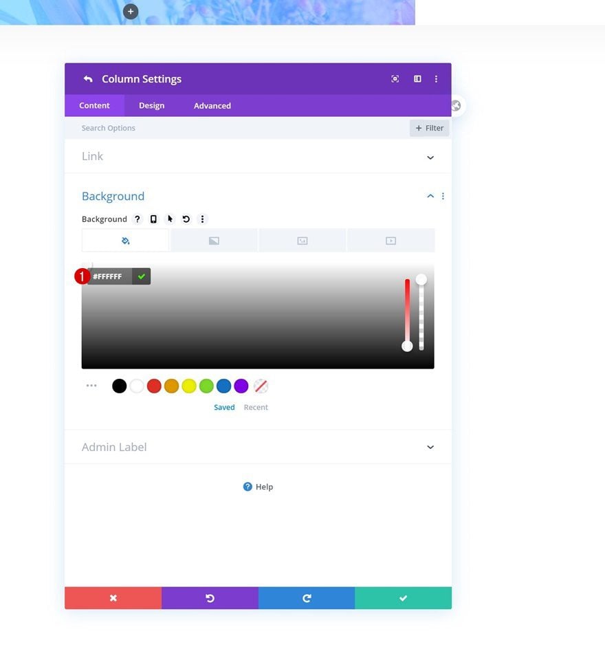
Column 2 Settings
Background Color
Once you’ve completed the general row settings, go ahead and open the second column’s settings. Start by adding a white background color.
- Background Color: #FFFFFF
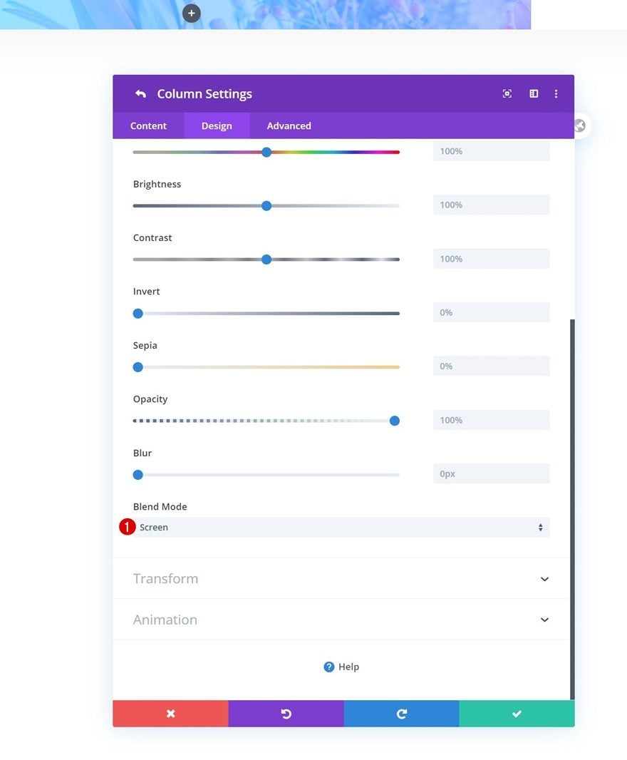
Filters
Move on to the design tab and add a blend mode to the entire column.
- Blend Mode: Screen
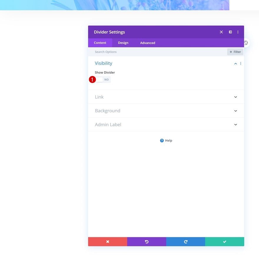
Add Divider Module to Column 1
Visibility
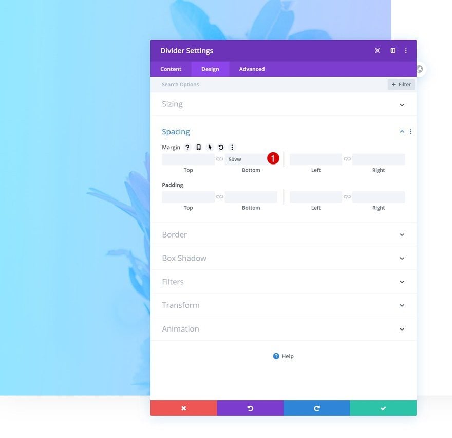
Time to start adding modules! The only module we need in the first column is a Divider Module. This module will help us create space in the first column without having a module show up. Make sure the divider’s ‘Show Divider’ option is disabled.
- Show Divider: No
Spacing
Move on to the spacing settings and add some bottom margin to create space in the first column.
- Bottom Margin: 50vw
Add Text Module #1 to Column 2
Add H1 Headline
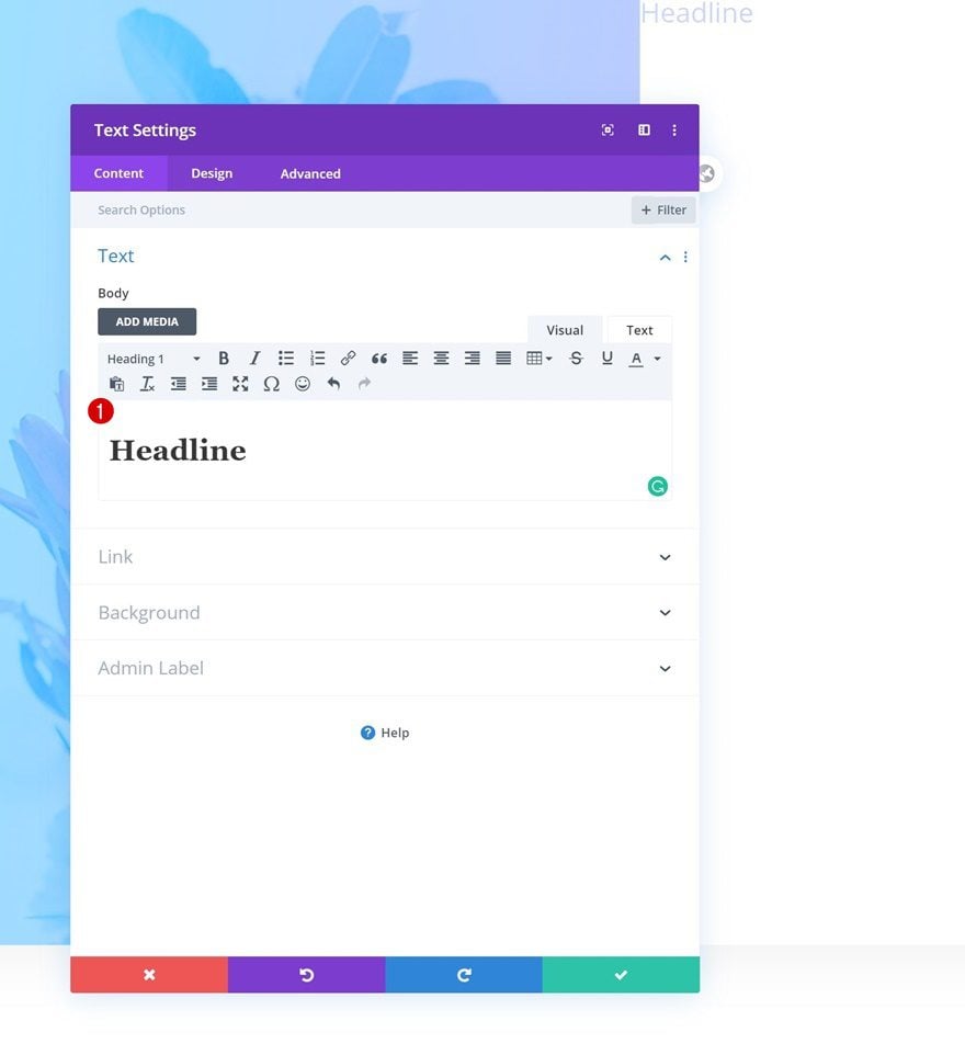
On to the second column! Here, we’ll start with the headline Text Module. Enter some H1 content of your choice.
H1 Text Settings
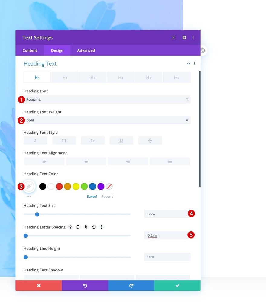
Move on to the design tab and change the text settings accordingly:
- Heading Font: Poppins
- Heading Font Weight: Bold
- Heading Text Color: #FFFFFF
- Heading Text Size: 12vw
- Heading Letter Spacing: -0.2vw
Spacing
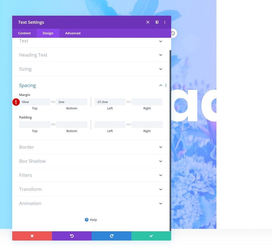
We’re also creating some space around the module and pushing it to the left by applying some custom margin values. The negative left margin plays an important part in creating the split blend mode. It allows a part of the copy to appear below the first column that doesn’t contain any background color.
- Top Margin: 18vw
- Bottom Margin: 2vw
- Left Margin: -27.3vw
Filters
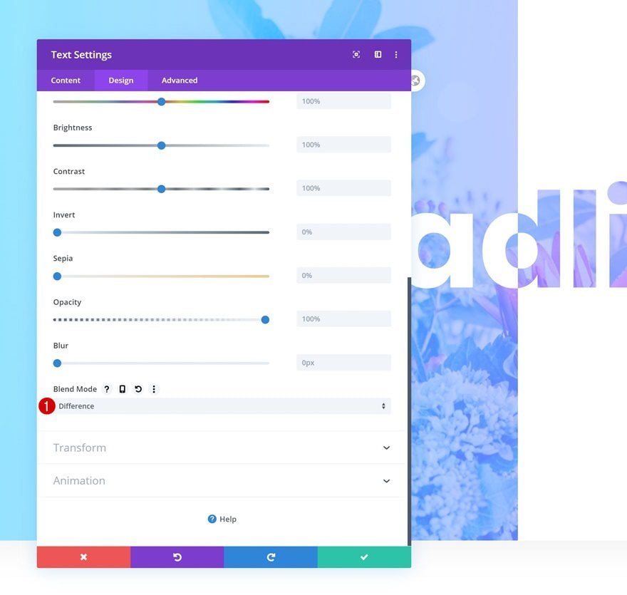
Now, in this next step, the magic will happen! We’re combining a module and column blend mode to allow the row background to show through. Make sure you select the following blend mode for the Text Module:
- Blend Mode: Difference
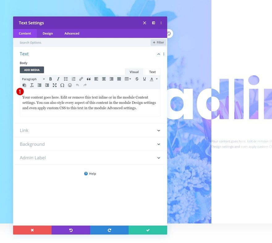
Add Text Module #2 to Column 2
Add Content
On to the second module! Add some content of your choice.
Text Settings
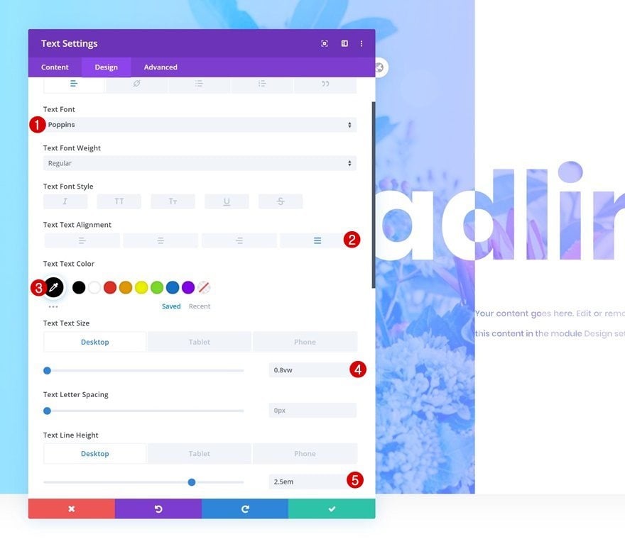
Move on to the design tab and change the text settings accordingly:
- Text Font: Poppins
- Text Alignment: Justify
- Text Color: #000000
- Text Size: 0.8vw (Desktop), 1.5vw (Tablet), 2.3vw (Phone)
- Text Line Height: 2.5em (Desktop & Tablet), 2.2em (Phone)
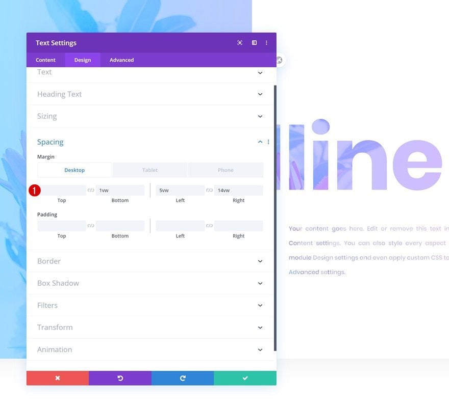
Spacing
Add some custom margin values next.
- Bottom Margin: 1vw
- Left Margin: 5vw
- Right Margin: 14vw (Desktop), 4vw (Tablet), 5vw (Phone)
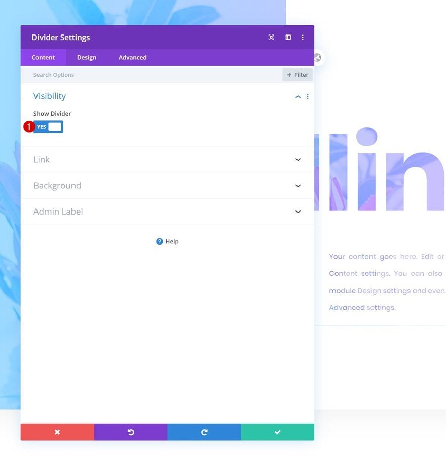
Add Divider Module to Column 2
Visibility
On to the next module, which is a Divider Module. Make sure the ‘Show Divider’ option is enabled.
- Show Divider: Yes
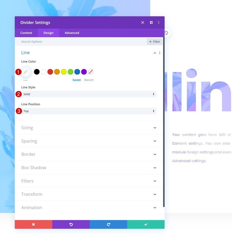
Line
Move on to the design tab and change the line settings accordingly:
- Line Color: #FFFFFF
- Line Style: Solid
- Line Position: Top
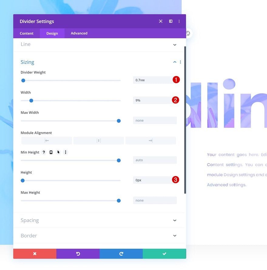
Sizing
Modify the sizing settings of the divider as well.
- Divider Weight: 0.7vw
- Width: 9%
- Height: 0px
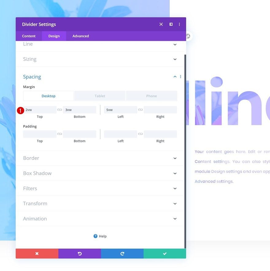
Spacing
And add some custom spacing values.
- Top Margin: 2vw (Desktop), 5vw (Tablet & Phone)
- Bottom Margin: 3vw (Desktop), 6vw (Tablet & Phone)
- Left Margin: 5vw
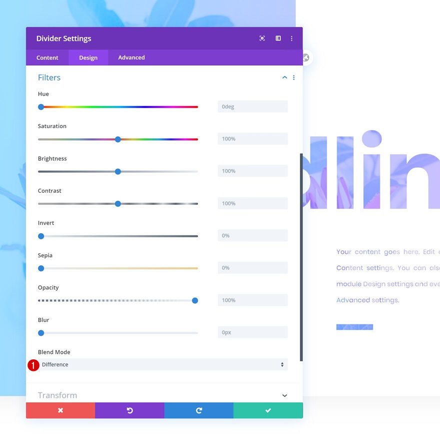
Filters
Last but not least, apply a blend mode to allow the row background image and gradient to show through.
- Blend Mode: Difference
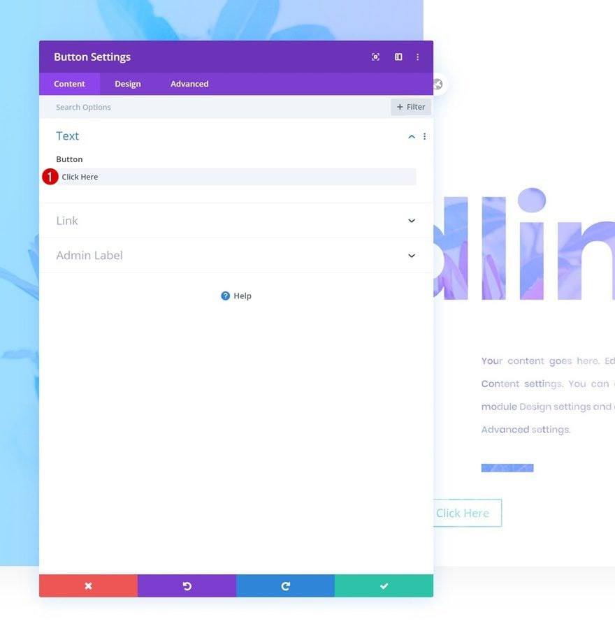
Add Button Module to Column 2
Add Copy
On to the next and last module, which is a Button Module. Enter some copy of your choice.
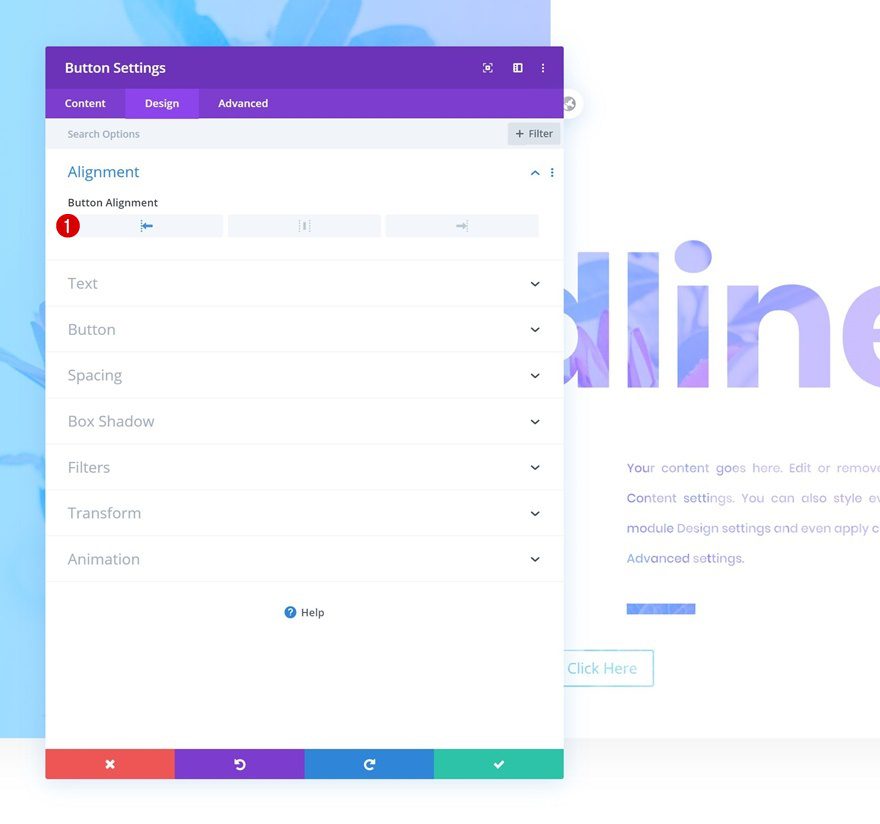
Alignment
Move on to the design tab and make sure the button alignment is set to left.
- Button Alignment: Left
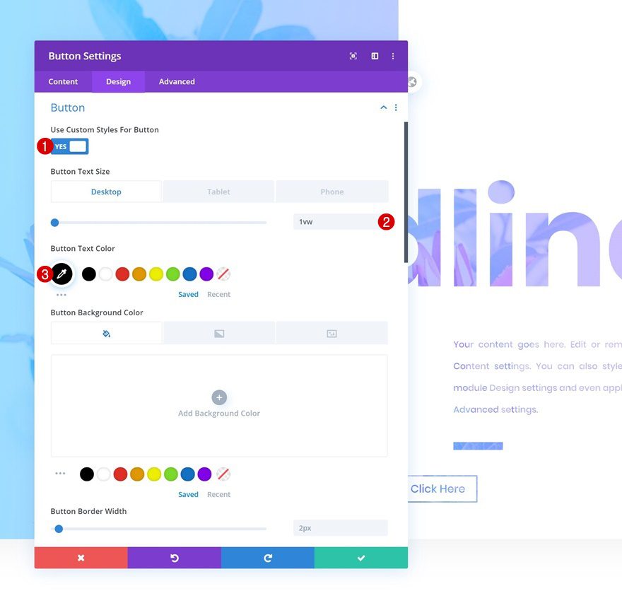
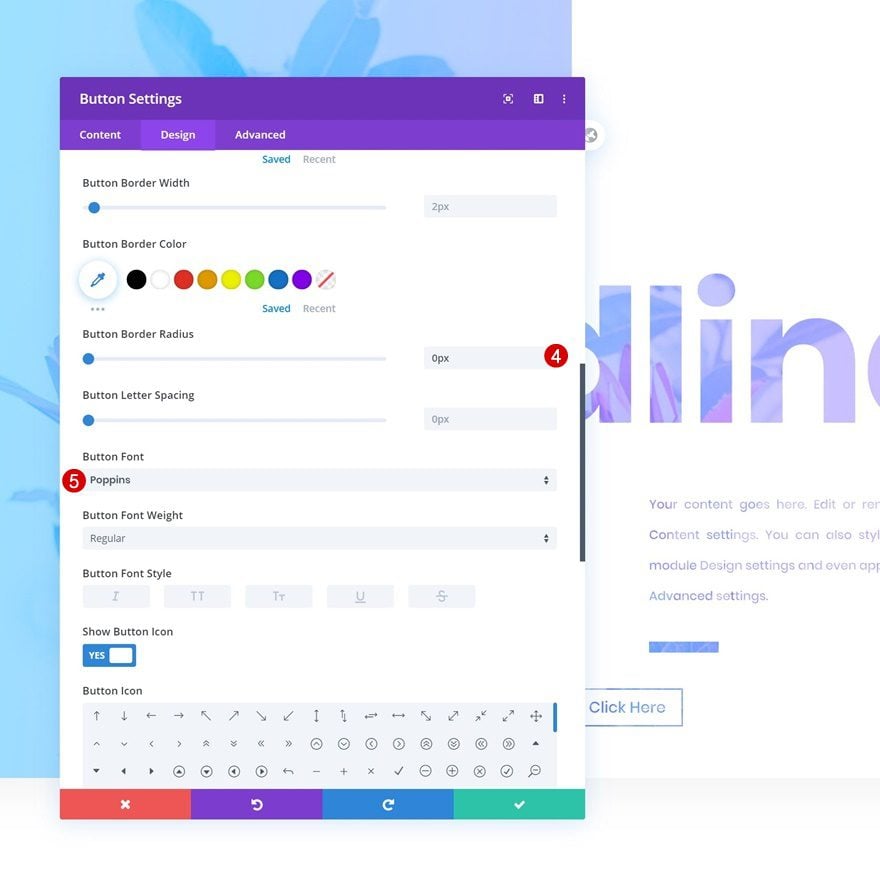
Button Settings
Modify the button settings as well.
- Use Custom Styles for Button: Yes
- Button Text Size: 1vw (Desktop), 2vw (Tablet), 3vw (Phone)
- Button Text Color: #000000
- Button Border Radius: 0px
- Button Font: Poppins
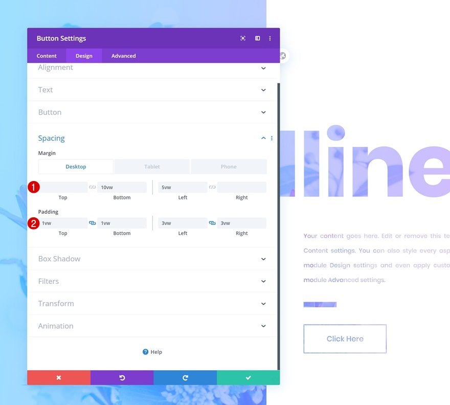
Spacing
And lastly, add some custom margin and padding values to the spacing settings.
- Bottom Margin: 10vw (Desktop), 15vw (Tablet & Phone)
- Left Margin: 5vw
- Top Padding: 1vw
- Bottom Padding: 1vw
- Left Padding: 3vw
- Right Padding: 3vw
Preview
Now that we’ve gone through all the steps, let’s take a final look at the outcome across different screen sizes.
Final Thoughts
In this post, we’ve shown you how to use Divi’s new column options to create stunning split blend mode headlines. This tutorial only goes to show how versatile Divi’s built-in options are and how with every Divi update, third-party design software becomes unnecessary. If you have any questions or suggestions, make sure you leave a comment in the comment section below!
If you’re eager to learn more about Divi and get more Divi freebies, make sure you subscribe to our email newsletter and YouTube channel so you’ll always be one of the first people to know and get benefits from this free content.
The post How to Create a Split Blend Mode Headline with Divi appeared first on Elegant Themes Blog.