
When creating a website, we want to showcase our products and services with clear calls to action (CTA’s). If you are going to create a more unique design for your buttons, it also helps to add hover effects to avoid any confusion about whether or not your buttons are clickable.
In this tutorial, we’re going to show you how to design sections to showcase featured products and services with clear and unique CTA’s. We’ll even show you how to use built-in Divi design options to add an expandable hover effect to your CTA’s.
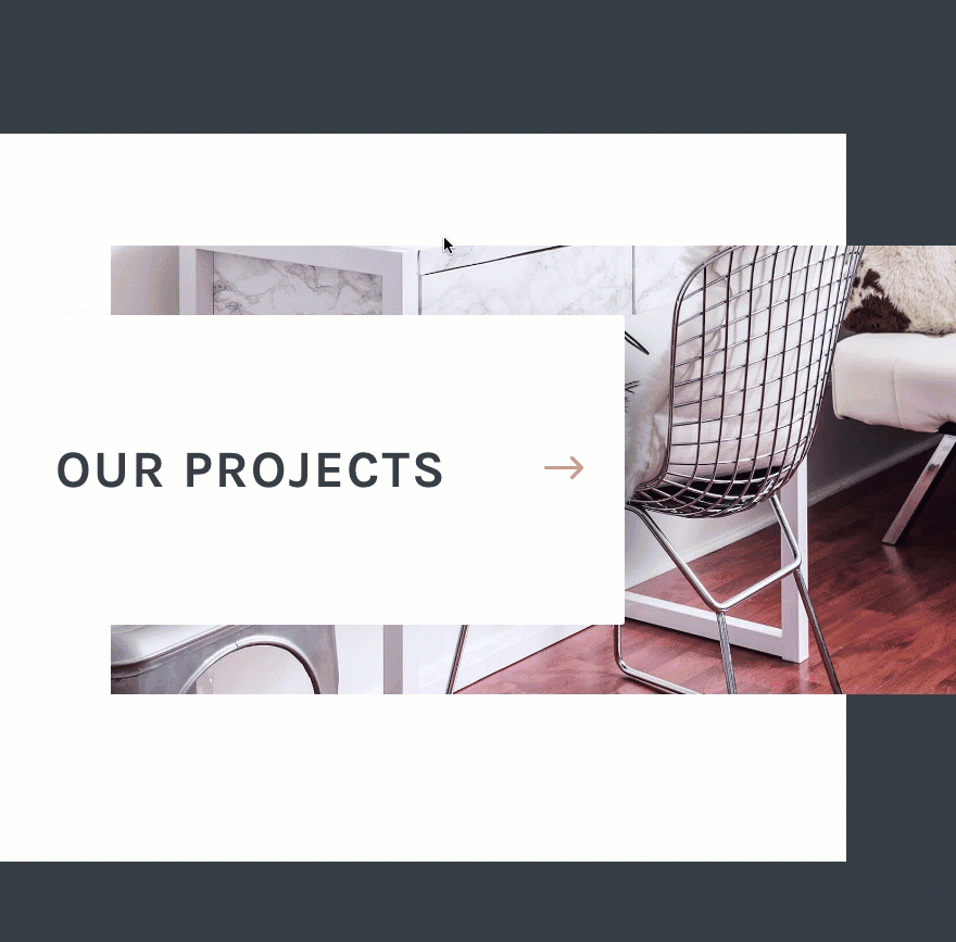
Sneak Peek
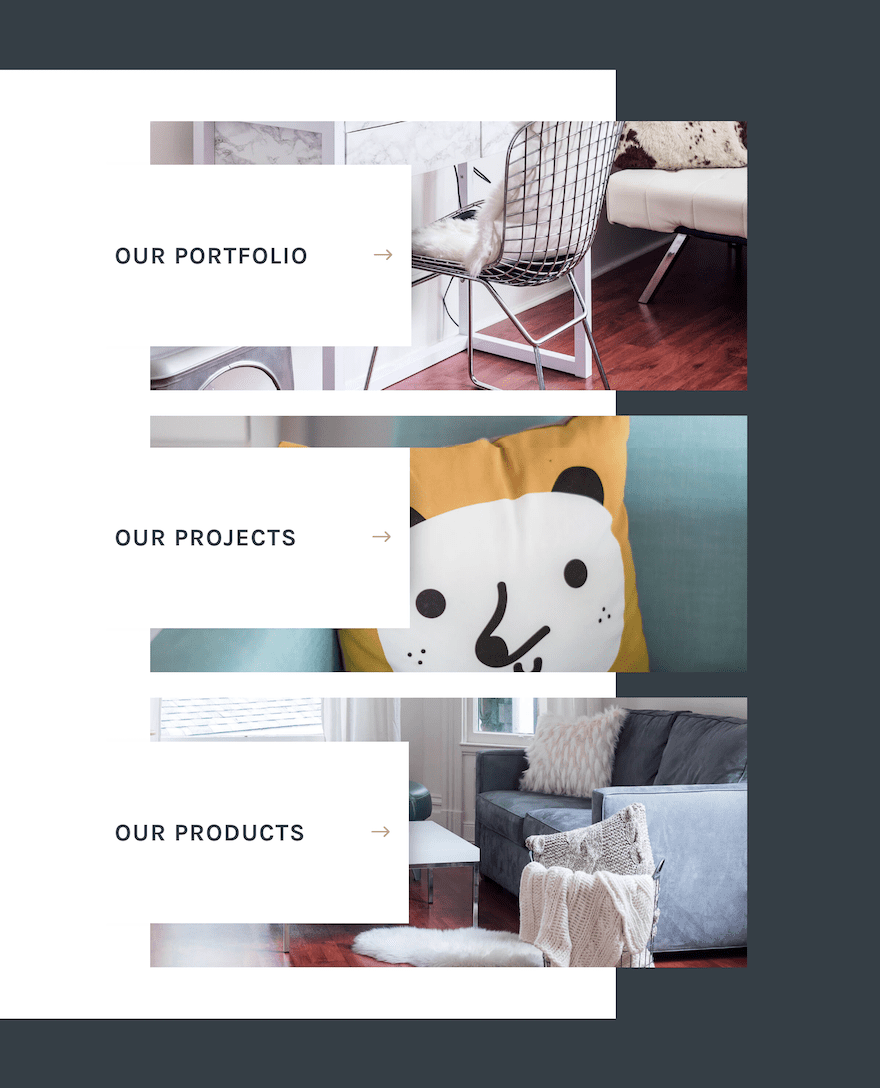
Here is a little sneak peek of the design we will be creating in this post.

What You Need
The only design tool you will need today is Divi. We’re going to be using the Divi Builder design options to add some creative spacing, borders, and buttons to create a refreshing and well-balanced design.
How to Create a Unique Expanding CTA Section with Divi
Subscribe To Our Youtube Channel
Designing the Section
Create a new page and deploy the visual builder to get started. By default, Divi will have a section with a one-column row ready for you to edit. This will work for what we need to get started. Click to update the section settings and update the options as follows.
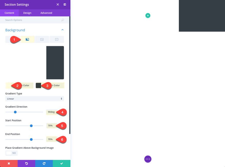
Under the content tab, click the gradient background tab and enter the following:
Left Gradient Color: #ffffff
Right Gradient Color: #353e45
Gradient Direction: 90deg
Start Position: 70%;
End Position: 70%;
This will create the dark blue color only on the right side of the section background that will serve as the right side of our frame for the section content.
Tip: As long as you select the end position to be equal to or less than the start position of the gradient, you can create an unblended contrast of the two gradient colors. The 90deg gradient direction makes it a perfectly vertical line of division.
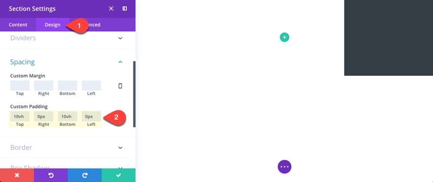
Next we need to go to the design tab and add some custom padding that will look great and work well on all devices.
Custom Padding: 10vh Top, 0px Right, 10vh Bottom, 0px Left
Note: 10vh stands for 10 percent of the viewport height (vh) of the browser. This will adjust nicely when adjusting your browser to different heights without having to give a separate value to our mobile devices.
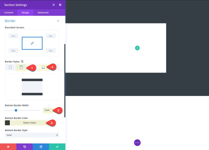
To create the top and bottom of our section frame design, we are going to add a top and bottom border to our section.
Click the Top Border style tab and add the following:
Top Border Width: 15vh
Top Border Color: #353e45
Then click the Bottom Border style tab and add the following:
Bottom Border Width: 15vh
Bottom Border Color: #353e45
Save settings.
Designing the Section Row
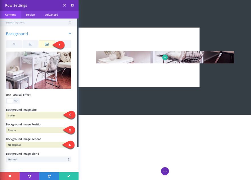
Now we are ready to customize our Row. Click to edit the row settings and give your row background image with a gradient overlay.
First, click the background image tab and upload your image. It should be around 1920px by 1200px. Then update the following:
Background image Size: Cover
Background Image Position: Center
Background Image Repeat: No Repeat
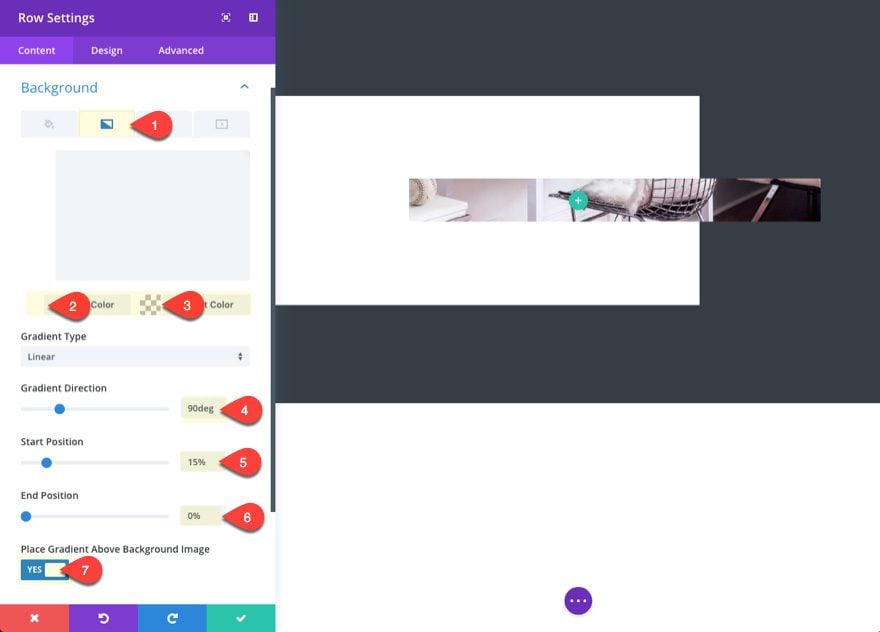
Then click the background gradient tab and enter the following:
Left Gradient Color: #ffffff
Right Gradient Color: rgba(255,255,255,0)
Gradient Direction: 90deg
Start Position: 15%
End Position: 0%
Place Gradient Above Background Image: YES
This creates a white overlay only on 15% of the row on the left side.
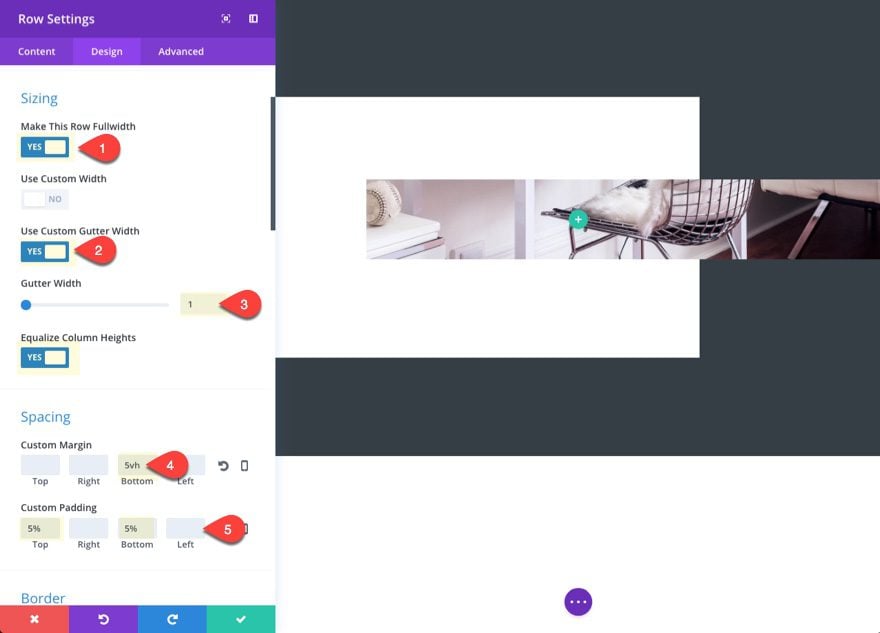
Now go over to the design tab and give your row some custom sizing and spacing.
Make this row fullwidth: YES
Use Custom Gutter Width: YES
Gutter Width: 1
Equalize Column Height: YES
Custom Margin: 5vh
Custom Padding: 5% Top, 5% Bottom
Next, add some transparent borders to adjust the width of the row.
Right Border Width: 15vw
Right Border Color: rgba(255,255,255,0)
Left Border Width: 5vw
Left Border Color: #ffffff
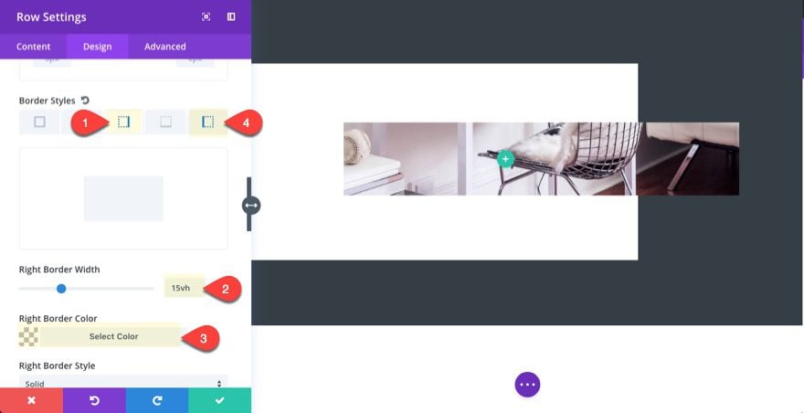
Save Settings.
Creating Your Expanding CTA
Add Your Column Structure and Design Your Button Module
Now that your row settings are in place, add a two-thirds one-third structure to your row and then add a button module to the left two-thirds column.
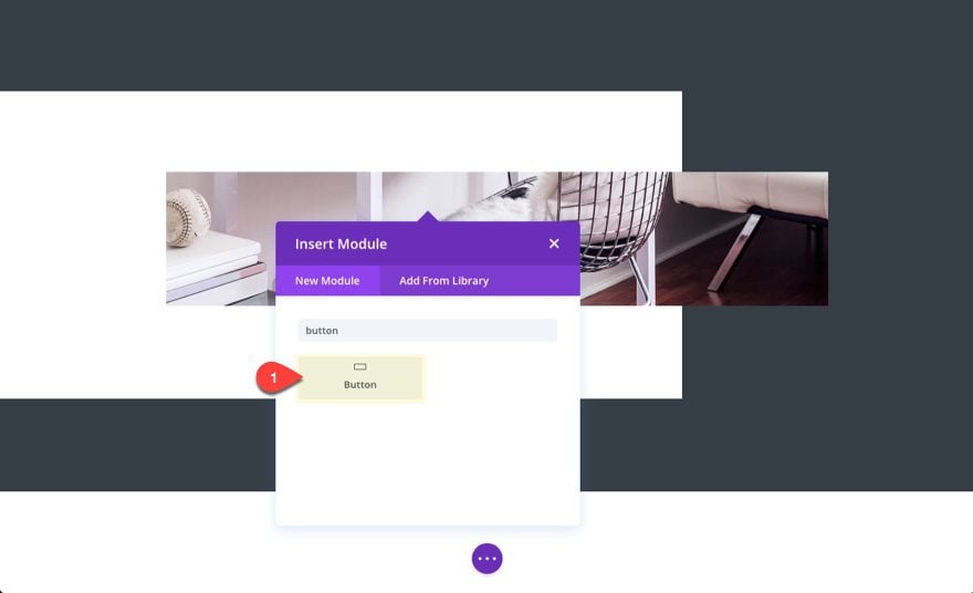
Update the following options:
Button Text: Our Projects
Button URL: [enter url]
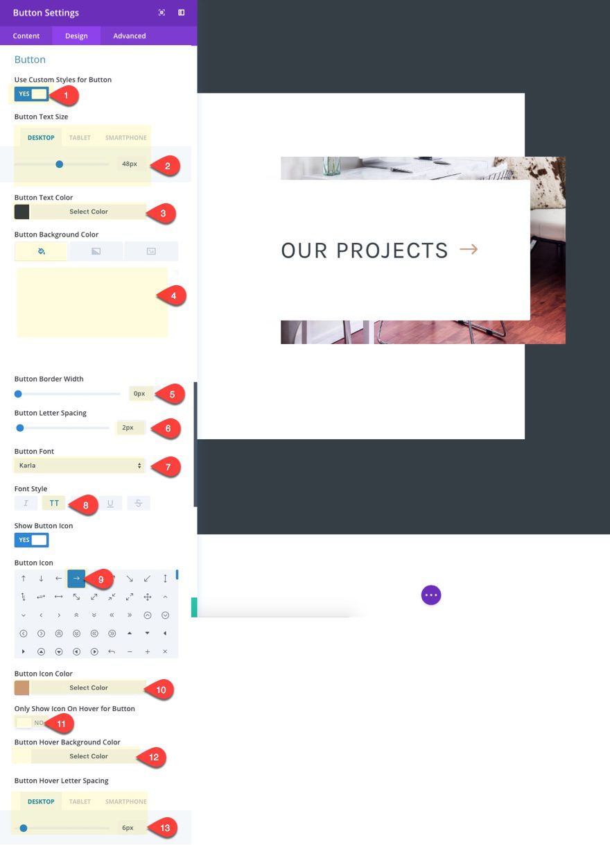
Use Custom Styles for Button: YES
Button Text Size: 48px (desktop), 30px (tablet), 18px (smartphone)
Button Text Color: #353e45
Button Background Color: #ffffff
Button Border Width: 0px
Button Letter Spacing: 2px
Button Font: Karla
Font Weight: Bold
Font: Style: TT
Button Icon: see screenshot
Button Icon Color: #cb9d85
Button Hover Letter Spacing: 6px (desktop), 3px (tablet), 2px (smartphone)
The key to this design is to use the button hover letter spacing to trigger the expanding effect when a user hovers over the button. I decreased the values on mobile to lessen the expanding distance.
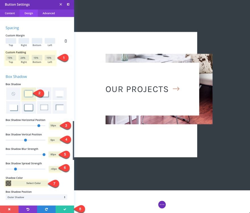
Then add some custom padding and a box shadow to your button to finish off the design.
Custom Padding: 15% Top, 24% Right, 15% Bottom, 15% Left
The right padding is set to 25%. This will change with each button depending on the amount/size of button text. You will need to adjust this value for each button to make sure all the buttons line up and appear to be the same width on the page.
Box Shadow: see screenshot
Box Shadow Horizontal Position: 58px
Box Shadow Vertical Position: 0
Box Shadow Blur Strength: 80px
Box Shadow Spread Strength: -43px
Shadow Color: rgba(0,0,0,0.5)
The key to the box shadow design is to adjust the horizontal position and spread strength so that the shadow doesn’t show on the left side of the button.
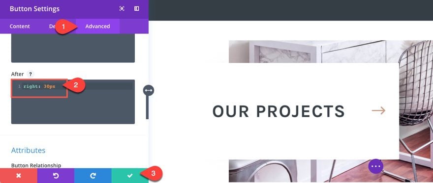
Reposition the Button Icon
To add a final touch to our button, I’m going to reposition my button arrow icon so that it always hugs the right side of the button. That way you can add buttons with different text and the arrow will always line up nicely on the right side. To do this, go to the advanced tab and add the following custom CSS in the After input box:
right: 30px;
Now let’s check out result on the live page.

Adding More Sections is Easy
All you have to do in order to create more sections on your page is duplicate the row. So, to create two more sections, duplicate the row twice and then update the row background image, button text. You will also need to update the right padding percentage value for your button in order to make sure the buttons stay the same width.
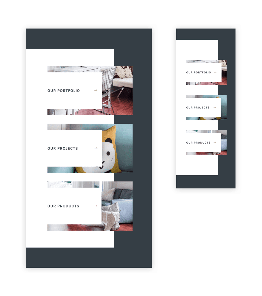
Here is the final result with all three sections.
Works great on mobile too!
Here is what the layout looks like on desktop and mobile:
Final Thoughts
You can create some pretty amazing CTA sections using some of these design techniques in this tutorial. The custom spacing and borders create unique framing for your section and rows that look clean and adjust wonderfully on all browsers. And the expanding hover effect created with the letter spacing is a great way to get a kind of microinteraction without having to use additional code.
I hope this inspires you to create beautiful calls to action on your own site.
I look forward to hearing from you in the comments.
The post How to Create a Unique Expanding CTA Section with Divi appeared first on Elegant Themes Blog.