
In today’s Divi tutorial, we’re going to show you how to create a vertical navigation that drives business for your website. The vertical navigation that we’ll show you how to make will typically be used for businesses that think it’s important to have visitors act right away. For instance, if you own a restaurant that allows customers to order online, you might want your website to help visitors act quickly.
The vertical navigation that we’ll show you how to make will contain important information and calls to action instead of pages. Including these in the vertical navigation will stimulate the visitors to order and, thus, increase the conversion rate of the website.
Result
Before diving into the different steps and the inspiration, let’s have a look at the vertical navigation result you’ll be able to achieve at the end of this post:

Besides showing you how to add all the different menu items to the vertical navigation, we’ll also use fixed navigation. That way, you’re sure the info follows visitors throughout the whole one-pager.
Inspiration
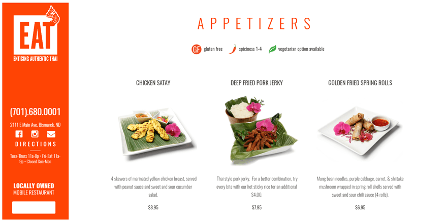
The inspiration we’ve had for this on vertical navigation that drives business comes from a website that we’ve showcased in a previous post. In that post, we’ve listed 12 websites that use vertical navigation for their own website’s purposes. One of the examples that caught people’s eye was the Eat Thai Restaurant website. Their vertical navigation is one of those out-of-the-box concepts. Their website is a one-pager but they found a nice way to still make use of the navigation possibilities. Their website looks like this:
Enable Vertical Navigation
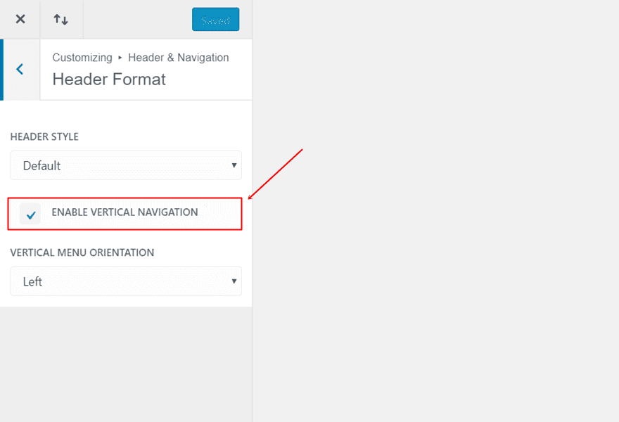
To start off, we’ll have to activate the vertical navigation option Divi offers. To do that, go to your WordPress Dashboard > Appearance > Header & Navigation > Header Format > Enable Vertical Navigation.
Enable Fixed Navigation
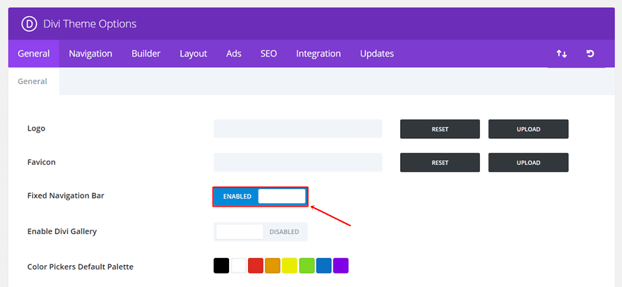
The vertical navigation we’re recreating will, like the Eat Thai Restaurant website, be fixed. To make your vertical navigation fixed, go to your WordPress Dashboard > Divi > Theme Options > General tab > Enable Fixed Navigation.
Primary Menu Settings (Theme Customizer)
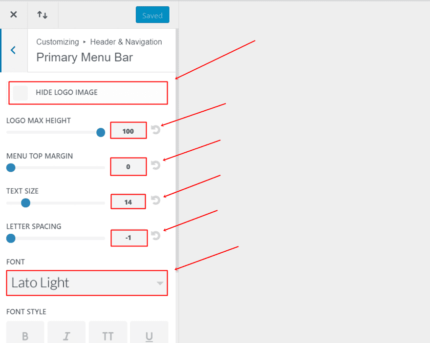
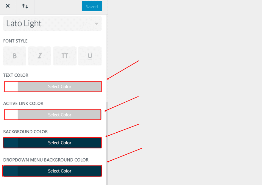
The next thing you’ll need to do is make some changes to your Primary Menu. If you’re on your WordPress Dashboard, go to Appearance > Customize > Header & Navigation > Primary Menu Bar. Once you’re there, you can make the following changes to it (or any other changes you’d wish to make):
- Hide Logo Image: Disable
- Logo Max Height: 100
- Menu Top Margin: 0
- Text Size: 14
- Letter Spacing: -1
- Font: Lato Light
- Text Color: #FFFFFF
- Active Link Color: #FFFFFF
- Background Color: #004159
- Dropdown Menu Background Color: #004159
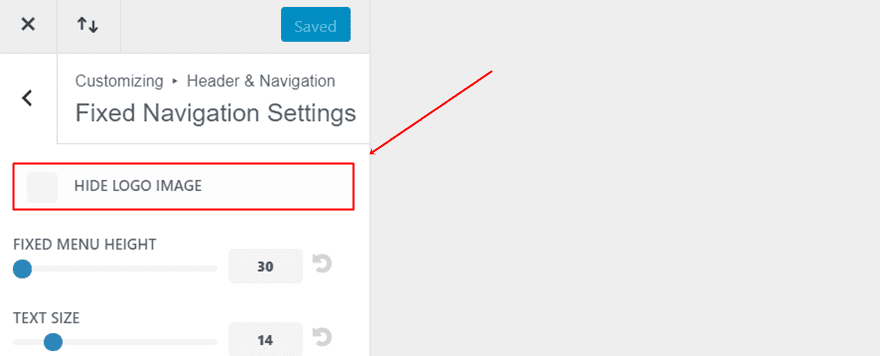
Fixed Navigation Menu Settings (Theme Customizer)
The last thing we’ll need to do in the Theme Customizer is make sure the logo appears while scrolling as well. If you’re still in your Theme Customizer, go to Header & Navigation > Fixed Navigation Settings > And make sure the ‘Hide Logo’ option is disabled.
Add Menu Items
Moving on, we’re going to add the menu items to our vertical navigation. This part of the post will probably take up most of your time. You have to add each one of the items individually through custom links.
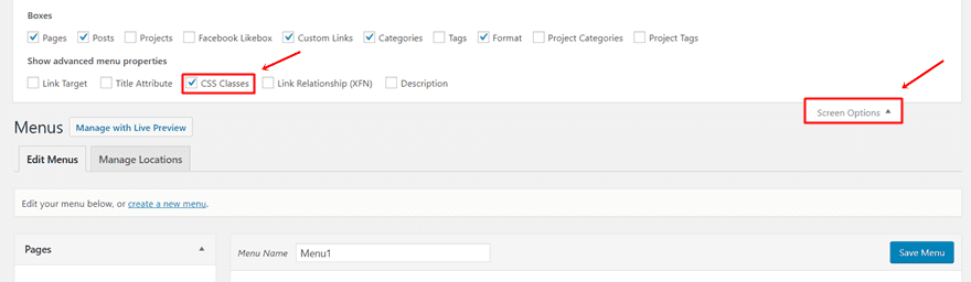
Activate CSS Classes
But before we start adding the menu items, you’ll have to make sure the CSS Classes option is enabled. This option allows you to assign a class to each one of the menu items individually. In this case, that’s necessary since most of the items will have their own style settings. To enable the CSS Classes option, click on ‘Screen Options’ at the right top of the Menu page and enable the CSS Classes option as shown in the screen shot below.
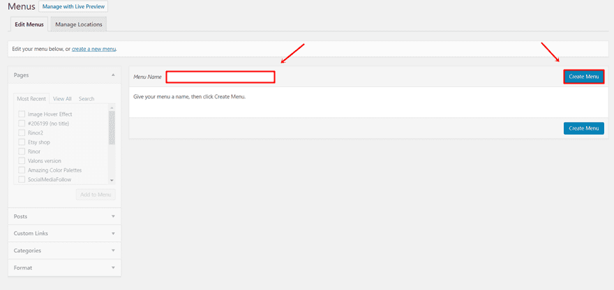
Add New Menu
Once you’ve activated the CSS classes for your menu items, you can go ahead and create a new menu. Give it a name and make sure you make this new menu your primary menu.
After having added all the menu items (which we’ll show you step by step), your menu will look like this on the backend:
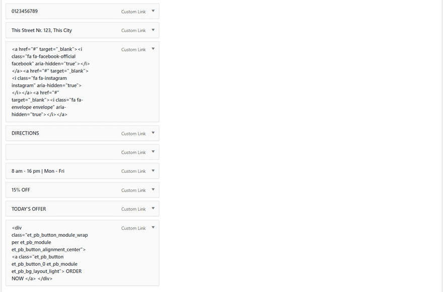
Phone Number
Since this is a one-pager, there won’t be any pages included in the menu. All the items that we’re going to add to the menu will rather be custom links. This gives us the possibility to play around with the things we want to add.
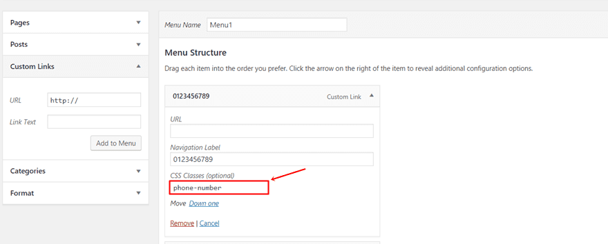
To add your first menu item, click on Custom Links and add the phone number in the Navigation Label field. You can choose if you’d like to add an URL to it or not. However, when adding the menu item to your menu, you’ll have to fill in a URL. After the menu item has been added to your menu, you can erase the URL and you’ll be sure that nothing will happen when someone clicks on the menu item.
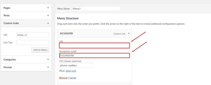
Once you’ve added the menu item to your menu, you’ll also see the CSS class appear. That’s where you’ll have to decide on a CSS class that will modify the style of the menu item. In this case, we’re using the class ‘phone-number’. If you want to just copy and paste the CSS code lines at the end of this post, then make sure you use the CSS classes mentioned in these steps.
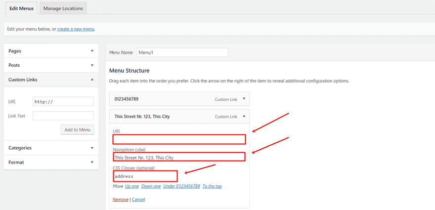
Address
Likewise, we’re going to add the address. Fill in the address in the Navigation Label and add an URL if you want. The class we’re using for the address menu item is simply ‘address’.
Social Icons
Adding the social icons to your vertical navigation requires a bit more effort. In a previous post, we’ve explicitly handled adding social icons to your primary menu. However, in this case, the method will be slightly different since we’ll have to get the icons lined up next to each other in the vertical navigation.
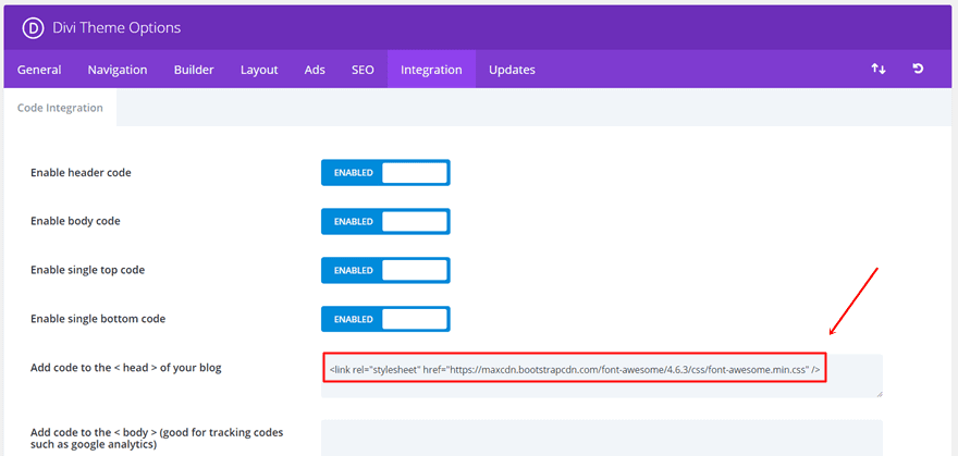
Add Font Awesome
The first thing you’ll need to do, if you haven’t already, is add Font Awesome to your Theme Options. To do that, go to your WordPress Dashboard > Divi > Theme Options > Integration > And paste the following shortcode into the head of your website:
<link rel="stylesheet" href="https://maxcdn.bootstrapcdn.com/font-awesome/4.6.3/css/font-awesome.min.css" />
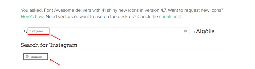
Get Shortcodes
To get the shortcodes to the social icons; open this page on Font Awesome’s website. In the search field you’ll see on that page, search for the different icons you’d like to add to your vertical navigation.
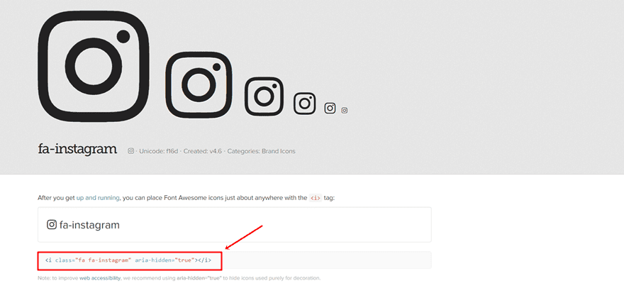
Once you click on the icon, you’ll see the shortcode that’s linked to the icon. Save each one of these shortcodes somewhere.
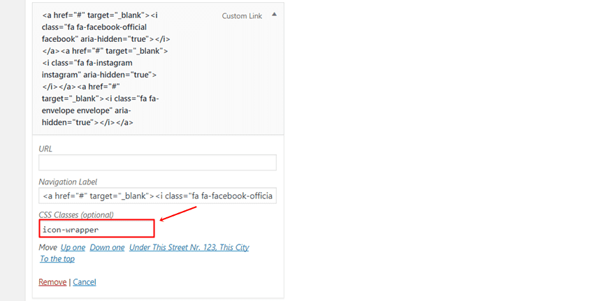
Add Social Icons to Menu
Moving on, we’re going to add the social icons. Normally, you could add each one of the social icons individually as menu items. But since we want them to appear right next to each other, we’ll have to place them into the same menu item. The HTML code that you’ll be needing to add to the Navigation Label is the following:
<a href="#" target="_blank"><i class="fa fa-facebook-official facebook" aria-hidden="true"></i></a>
<a href="#" target="_blank"><i class="fa fa-instagram instagram" aria-hidden="true"></i></a>
<a href="#" target="_blank"><i class="fa fa-envelope envelope" aria-hidden="true"></i></a>
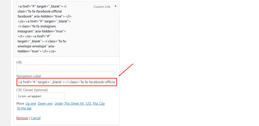
Don’t forget to add an URL to each one of the icons. The class we’re using for all three social icons combined is ‘icon-wrapper’ but we’ve also assigned an extra class to each one of the social icons to make individual adjustments. You can notice these classes right after the Font Awesome class. They’re called ‘facebook’, ‘instagram’ and ‘envelope’.
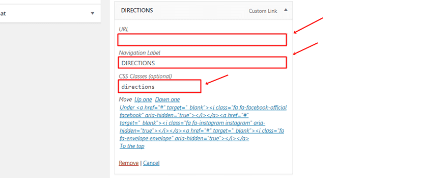
Directions
For the next menu item, we’ve used the word ‘directions’ as the CSS class name.
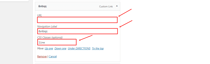
Line
To add a line right below directions, we have to add a blank character into the Label Navigation. That’s because WordPress doesn’t allow you to create a menu item without having a label linked to it. To add a blank character to your line menu item, just add ‘ ’ to the Navigation Label. Furthermore, also add ‘line’ as the CSS class name to this menu item.
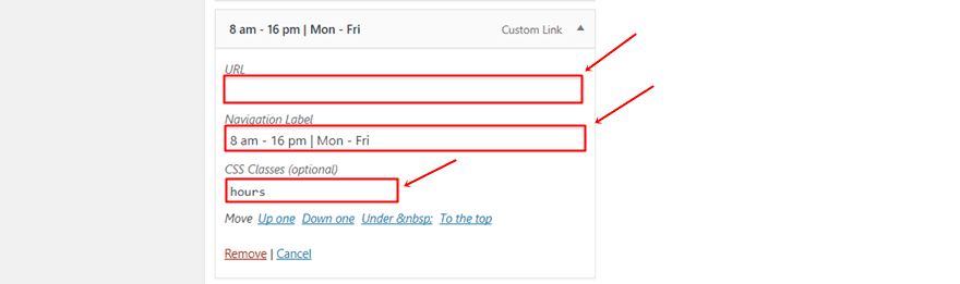
Opening Hours
Moving on, we’re going to add the opening hours and assign the ‘hours’ CSS class name to it.
CTA 1
Next, we’re going to add the first CTA. We’re going to assign the ‘cta-1’ CSS class name to it.
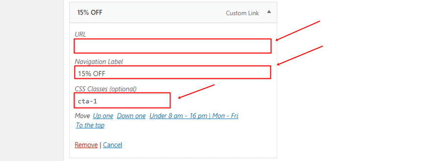
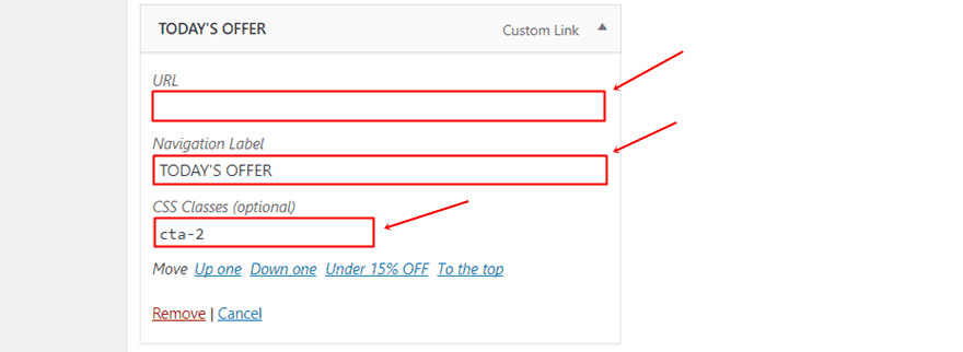
CTA 2
For the second CTA, we’re going to use the ‘cta-2’ CSS class name.
Button CTA
Adding the button CTA to your vertical navigation requires a few more steps than the regular menu items that are just text. Start by opening the page you’re using as a one-pager and follow the next steps mentioned below.
Create Button on Landing Page
If you want to use a button CTA in your Vertical Navigation than you’ll have to have that same button somewhere on your one-pager. Once you’ve created one, you can inspect the element and copy the following lines of code (linked to the button you’ve created) that appear in the code of your website:
<div class="et_pb_button_module_wrapper et_pb_module et_pb_button_alignment_center">
<a class="et_pb_button et_pb_button_0 et_pb_module et_pb_bg_layout_light">
ORDER NOW
</a>
</div>
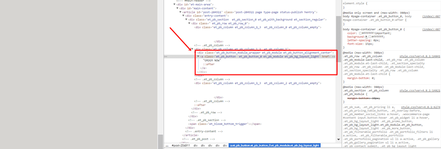
Of course, this code might differ according to the way you style it. It also depends on if there are other buttons on that same page or not. Know that the button will only appear with the style you assign to it on the page where the button is located. That’s why adding a button to your vertical navigation is usually only preferable when it concerns a one-pager.
Note: Make sure you adjust the font size and the padding of your button within the Button Module so it fits perfectly within your Vertical Navigation.
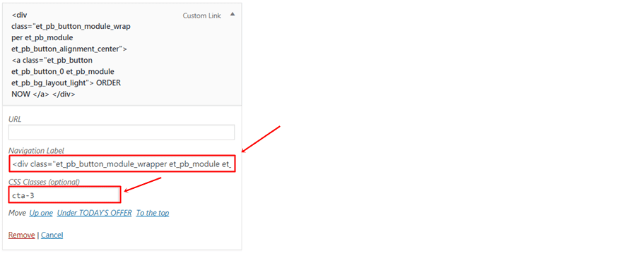
Add as Menu Item
Now that you have copied the needed HTML code linked to the button, add a new custom link and add the code to the Navigation Label. The CSS class we’re using for this menu item is ‘cta-3’.
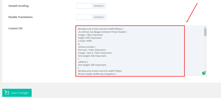
Add CSS Code Lines
The next part of this post is dedicated to sharing the CSS code lines that help you achieve the final result and layout. You’ll notice that we’ve used the CSS classes that we’ve assigned to the different menu items. If you however, decided to use different class names, make sure you change them in the CSS code to make it work.
To add the CSS code, go to your WordPress Dashboard > Divi > Theme Options > Scroll down the General tab and add the following lines of CSS code to the Custom CSS box:
@media only screen and (min-width:992px) {
.et_vertical_nav #page-container #main-header {
margin: 10px !important;
height: 93% !important;
z-index: 9999;
}}
.phone-number {
font-size: 1.9em !important;
font-weight: 400 !important;
}
.address {
font-weight: 300 !important;
}
@media only screen and (min-width:769px)
#main-header div#et-top-navigation {
padding-top: 110px;
height: 100%;
position: static !important;
}
@media only screen and (min-width:769px)
.et_vertical_nav span.logo_helper {
display: none;
}
@media only screen and (min-width:769px)
.et_vertical_nav #main-header #logo {
margin-bottom: 28px;
}
@media only screen and (min-width:769px)
.et_vertical_nav #main-header .container {
margin-left: 25px !important;
margin-right: 25px !important;
height: 100% !important;
}
.facebook, .instagram, .envelope {
padding: 7px 13px 7px 13px;
font-size: 1.6em;
}
.icon-wrapper a {
display: inline-block !important;
}
.directions {
font-size: 1.2em;
font-weight: 400;
padding-top: 0;
text-align: center;
}
.line {
border-top: 1px solid;
color: #fff;
margin: 8px auto auto;
width: 20%;
}
.hours {
color: #ffffff;
font-size: 10px;
font-weight: 300;
text-align: center;
}
.cta-1 {
margin-top: 5px !important;
font-size: 1.3em;
font-weight: 600;
text-align: center;
}
.cta-2{
font-size: 1.1em;
font-weight: 300;
letter-spacing: 0.02em;
text-align: center;
}
#page-container {
background: #d6d4d1;
}

@media only screen and (max-width:768px) {
.directions, .line, .cta-1, .cta-2, .cta-3 {
display: none !important;
}}

#main-header #top-menu-nav .nav li {
line-height: 10.5px;
} 
Change Sections Background Color
The last step you’ll need to do is change the background colors of the sections on your one-pager. Make sure this color is the same as the one you’re using for your page container. In this case, that is ‘#d6d4d1’.
Result
Once you’ve added all the menu items and the CSS code linked to each one of these menu items, you should be able to achieve the following result:
Final Thoughts
In this post, we’ve shown you how to create a vertical navigation for your one-pager. This post got inspired by the Eat Thai Restaurant website that was made with Divi as well. If you’ve followed the whole post step by step, you should’ve bee able to achieve the result that was showcased above. If you have any questions or suggestions, make sure you leave a comment in the comment section below!
Be sure to subscribe to our email newsletter and YouTube channel so that you never miss a big announcement, useful tip, or Divi freebie!
Featured Image by Vectomart / shutterstock.com
The post How to Create a Vertical Navigation with Divi that Drives Business appeared first on Elegant Themes Blog.