
Divi’s fullwidth header module comes with a full screen option that will set the height of the header to equal the height of your browser window. This is a great way to boost UX and design by keeping everything visible to the user (above the fold) no matter what size their screen may be. But you don’t have to stop at one header.
In this post, I’m going to show you how you can actually use the fullwidth header module to create multiple “full screen” sections that will cleanly adjust to the height of your browser. And, by adding some top and bottom “scroll to” buttons, this makes for a delightful viewing experience for users. Instead of scrolling, all they have to do is click and the next section will appear perfectly in their viewport.
Here is what I’m going to cover:
- How to create 4 unique full screen sections using the fullwidth header module
- How to create custom scroll up buttons for the top of each section.
- How to use vw units to size to make sure content stays proportional to screen sizes.
Sneak Peek
Here is a peek at what I will be building in this tutorial:
The Design
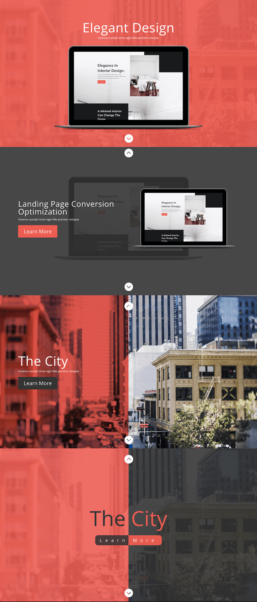
The functionality
The Goal and Strategy
My strategy for accomplishing full screen sections involves using Divi’s fullwidth header module. I’m aware that the fullwidth header module is not designed to be used for regular section content on your website. You are limited to the content and settings of the one module for the entire section.
But, these full screen sections can work extremely well for certain content. In many cases (like a product feature), you don’t want to have much content anyway. Just an image and a CTA is all you really need. And the fullwidth header module is perfect for that kind of thing. I can also see this working for portfolio pages that want to guarantee images span to the full screen as the user clicks through.
Another reason I wanted to showcase this design is to give examples of how to use length units with text and spacing to keep the content consistently centered and visible on all screen sizes.
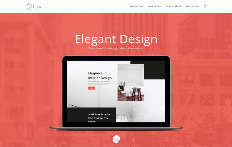
Creating Section 1
For those of you who are familiar with the fullwidth header module, this should be easy and straightforward.
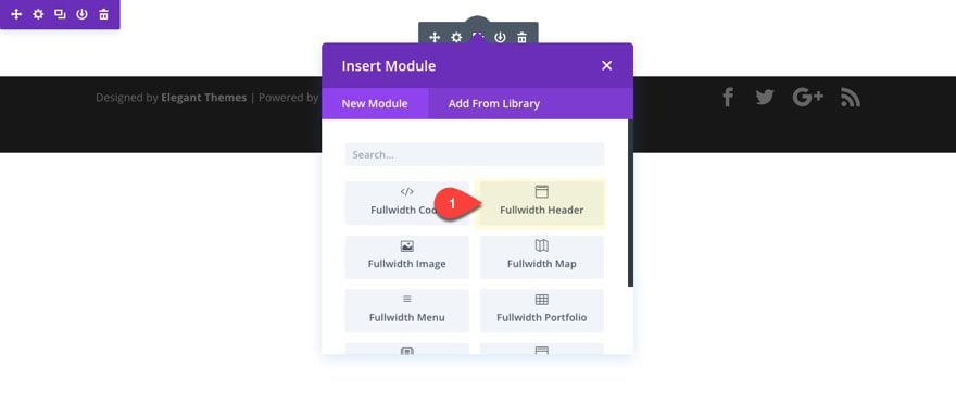
Create a new page and add a fullwidth section with a fullwidth header module.
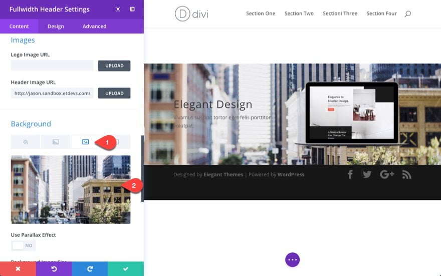
Then add a background image (about 1920px by 1080px in size).
Update the Fullwidth Header Module with the following:
Title: Elegant Design
Subheading: Vivamus suscipit tortor eget felis porttitor volutpat.
Header Image URL: [upload image at least 800px wide]
Under the design tab, update the following:
Text & Logo Orientation: Centered
Make Fullscreen: YES
Show Scroll Down Button: YES
Scroll Down Icon Size: 50px (desktop), 30px (smartphone)
Background Overlay Color: rgba(240,91,76,0.91)
Text Color: Light
Title Text Size: 5vw Desktop, 32px Smartphone
Setting the text size to a vw value will make sure the text adjusts to the browser size. Adding a pixel value for smartphone will make sure the text doesn’t scale down too small.
Under the Advanced tab, enter “one” for the CSS ID. This will allow the section below to link back (or up) to this section.
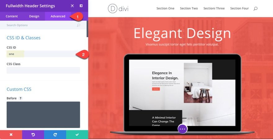
Save Settings.
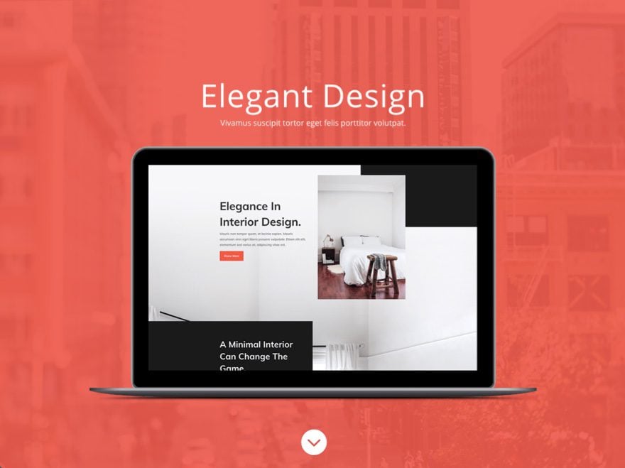
Here is the final layout. Pretty simple.
Creating Section #2
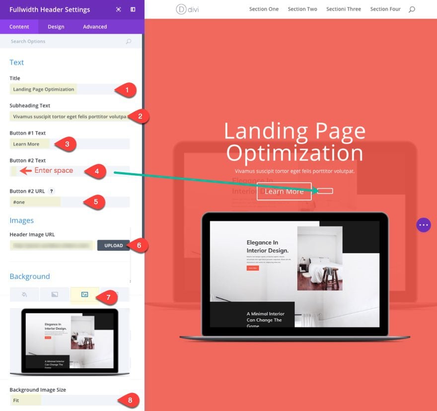
For the second section, let’s duplicate the first fullwidth header we just created and update the content as follows:
Title: Landing Page Conversion Optimization
Button #1 Text: Learn More
Button #2 Text: [press space bar to add a space so that the button shows]
Content: Curabitur placerat leo leo, id ultrices libero tincidunt a. Vestibulum turpis quam, condimentum a pellentesque.
Button #2 URL: #one
The button #2 is going to be used for the up arrow for at the top of this section. Since we are only going to need the button icon (not the text), we just need to add the space to the button #2 text input field in order to show the button. The “#one” URL for button number #2 is going to be used to scroll up to the top section.
Under the Design tab, update the following:
Text & Logo Orientation: Left
Background Overlay Color: rgba(51,51,51,0.9)
Title Text Size: 3vw (desktop), 3vw (tablet)
Button Two Text Size: 50px (desktop), 30px (smartphone)
Button Two Border Width: 0px
Button Two Icon: [see screenshot]
Only show Icon On Hover for Button Two: NO
Button Two hover Background Color: rgba(0,0,0,0)
Use Custom Styles for Button One: YES
Button One Text Size: 2vw (desktop), 16px (smartphone)
Button One Background Color: #f05b4c
Button One Border Color: #f05b4c
Show Button One Icon: NO
Custom Padding: 7vw Right, 7vw Left
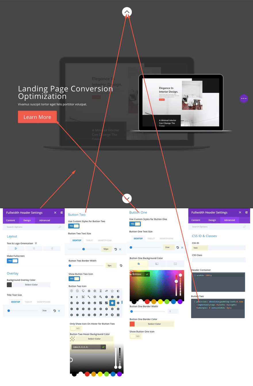
Under the Advanced tab, enter “two” for the CSS ID. This CSS ID will correspond to the anchor link url we will set in our button in the next section so that the button will scroll back to the top of this section.
Then enter the following custom CSS in the Header Container input box:
width: 100%
This is optional, but I thought it would be nice to increase the width of the content container so that it gives you more horizontal space for your content.
Also, enter the following custom css in the Button Two input box:
position: absolute;padding-left:0.4em !important;top: 0;left: 0;right: 0;margin: 0 auto;width: 0px;
This css positions the button #2 icon at the top of your section.
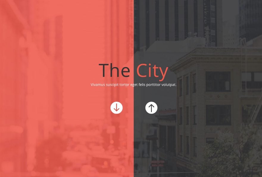
Now you have three working buttons in our section. Button #1 is the learn more button to be used in our content area. Button #2 is the custom top button with the anchor link that scrolls back up to the previous section. And Button #3 is the scroll down button that is built in to the fullwidth header already that will automatically scroll to the next section below.
You can see how this section layout can be useful for to create CTA’s for your featured services. All you would need to do is duplicate the section and add another feature. This will allow the user to easily click through your sections without having to scroll.
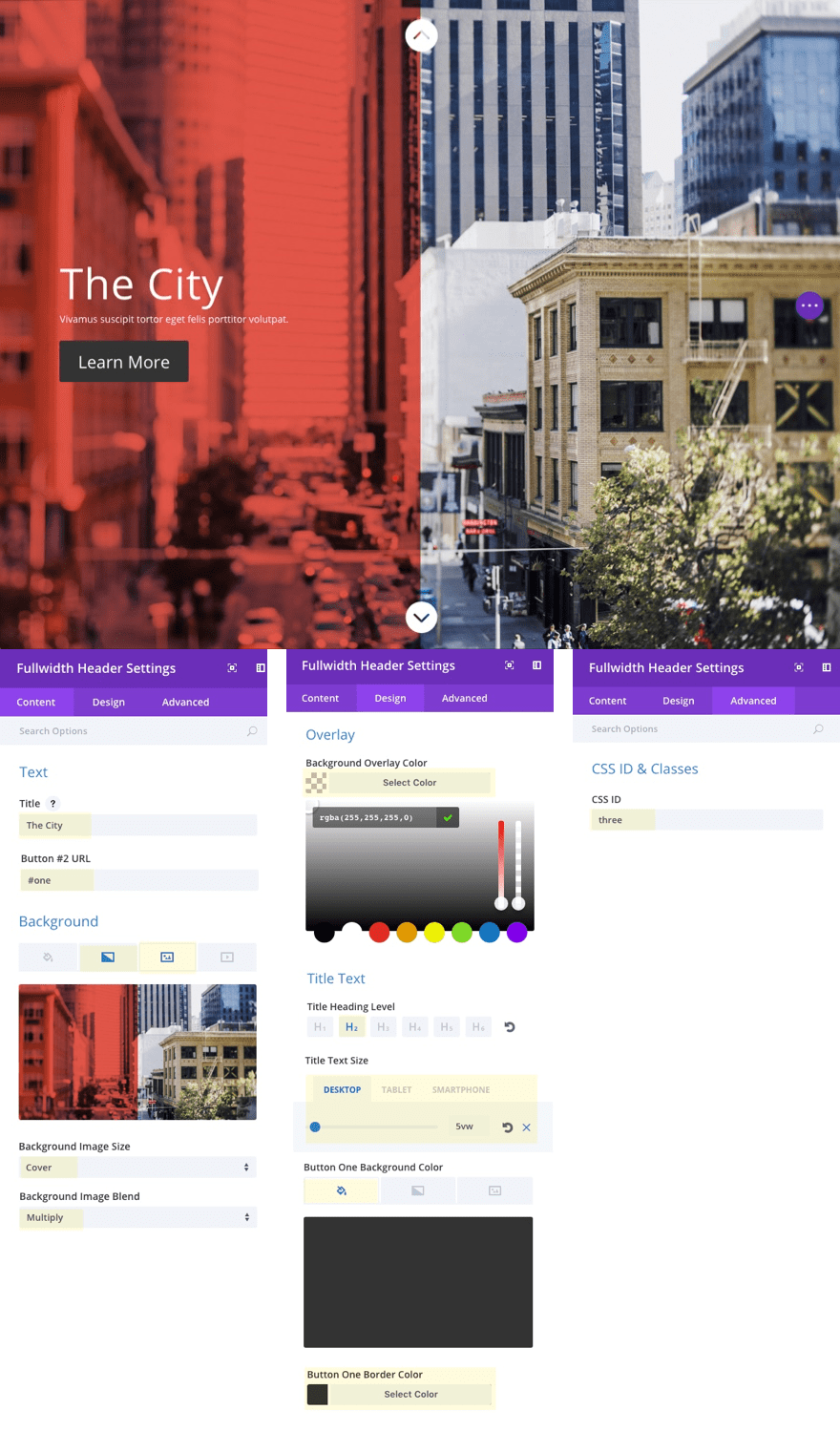
Creating Section #3
To create Section #3, duplicate Section #2 and update the fullwidth header settings as follows:
Title: The City
Button #2 URL: #two (this will link to section #2 above)
Background Image: [upload image at least 1920px by 1080px]
Background Image Size: Cover
Background Image Blend: Multiply
Background Overlay Color: rgba(255,255,255,0)
Title Heading Level: H2
Title Text Size: 5vw (desktop)
Button One Background color: #333333
Button One border Color: #333333
CSS ID: three
You may need to play with the title text size vw value depending on your needs. Look out for what happens on really large monitors since the text will continue to grow.
Creating Section #4
To create section #4, duplicate section #3 and then update the following:
For this section, I’m going to use two colors in our heading text. To do this we will need to use some html. So take out the title text and subheading text that was copied over from section #3 and paste in the following html in the content box under the text tab.
<span style="color: #333;">The</span> City
The html span is used to give the word “The” a dark gray color, leaving the word “City” to be white.
Button #2 URL: #three (this will link to Section #3 above)
Left Gradient Color: rgba(240,91,76,0.88)
Right Gradient Color: rgba(51,51,51,0.88)
Background Image Blend: Normal
Under the design tab….
Text & Logo Orientation: center
Content Text Color: #f05b4c
Content Text Size: 8vw
Content Line Height: 1.3em
Button One Text Size: 1.7vw
Delete current Button One Background Color then add the following gradient background:
Button One Left Gradient Color: rgba(51,51,51,0.87)
Button One Left Gradient Color: rgba(240,91,76,0.97)
Gradient Direction 90deg
Start Position: 50%
End Position: 50%
Button One Border Width: 0px
Button One Border Radius: 15px
Button One Letter Spacing: 1.3vw
Button One Hover Letter Spacing: 1.3vw
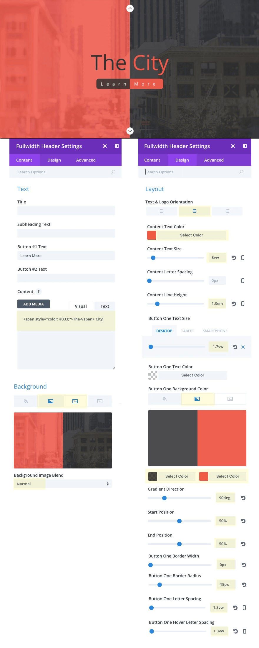
The key to this design is the content and button text size combined with the button letter spacing. What how it adjusts to the screen size without changing the design.
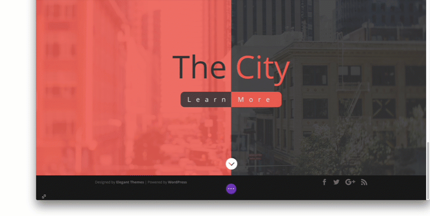
And here is the final result with all four sections completed.
Use Original Button Locations as Scroll Links
If you have a simple layout, you could use the original fullwidth header buttons as scroll links. The trick here is to set one icon position to the left and one to the right. And, of course, make sure your button URLs match the section you want users to scroll to.
How to Make Any Section Full Screen
If you are want to branch out from the simplicity of using the fullwidth header module for full screen page sections, you can do this with custom CSS. But I must warn you, this can get a little tricky, especially when you have a lot of content (rows, modules) rows and modules inside your full screen section. You really have to think mobile first for this design, so you are limited to what you can fit on a mobile screen. So a section with three rows of content will doubtedly fit on a mobile screen.
So for now, I’ll just give you the basic idea. To change a section to span the full height of the browser, you can add the following CSS to the main element box in your advanced section settings:
height: 100vh;
To account for the navigation header (and fixed nav position), you will need to add a little change to the css.
height: calc(100vh - 53px)
This trims the bottom of your section by 53px to account for the header navigation sitting at the top of the page.
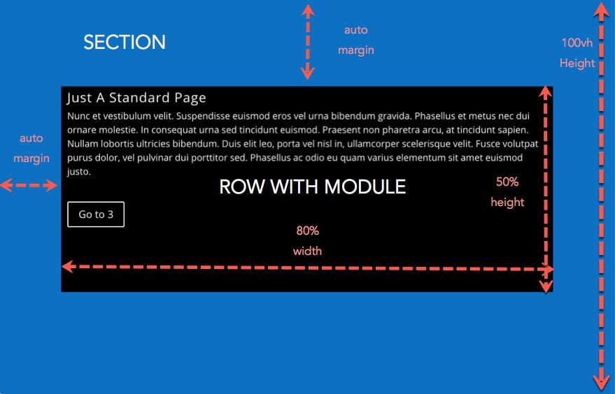
To make sure your row stays vertically and horizontally centered on the page, you will need to add the following custom CSS to the main element input box under the row settings advanced tab:
height: 50%;width: 80%;position: absolute;top: 0; left: 0; bottom: 0; right: 0; margin: auto !important;
After this, you will need to make sure your module content is scalable using the proper css length units so that the content won’t overflow the screen on mobile devices.
Here is a quick example of a section and row with the custom CSS mentioned above in place. I added a text module and a button module inside the row to show you what that would look like.
Perfect for One Page Websites
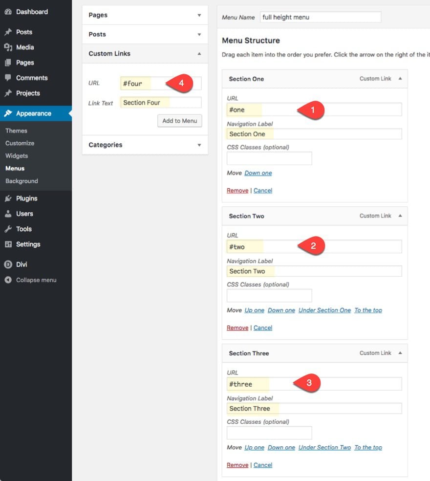
In addition to using the scroll links to bring the user through the full screen sections of the page, you can also add custom anchor links to your navigation menu that will allow the user to jump to any section of the page. This is the basic idea behind creating a one page website.
For example, if you wanted to turn this page into a one page website, you would simple create a custom menu and set your link URLs to match the CSS IDs for each of your sections.
Final Thoughts
Creating full screen sections using Divi’s fullwidth header module will definitely give more prominence to your sections. And with the scroll links, users can easily navigate through your content like a big full screen vertical slider. The challenge is to keep your content looking great and fitting on all screen sizes and using the vw length unit for text definitely makes it easier.
The designs used in this post for each of the sections was meant to inspire and get those creative juices flowing. My hope is that you take some of the techniques used here and wow us all with your own design.
I look forward to hearing from you in the comments.
Cheers!
The post How to Create Full Screen Sections with Top and Bottom Scroll Links with Divi appeared first on Elegant Themes Blog.