
Icon font buttons have many uses in the world of web design. Since font icons stay crisp in color and design as they scale to different sizes, it makes sense to use them in buttons. And, creating an icon font button in Divi is actually quite easy using the Elegant Icon Font. In this tutorial, I’m going to show you how you can use icon fonts with Divi’s button module to create a single icon button.
Some of the highlights of this tutorial include:
- How to use the Elegant Font to add an icon as button text
- How to add padding and border radius that ensures the button takes the shape of a perfect square or circle
- How to replace the button icon with a different icon on hover
- How to position a button icon to overlap an image
- and more…
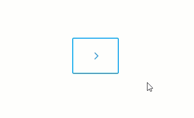
Sneak Peek
Here is a sneak peek of what’s to come…
What You Need
For this tutorial, I will be using the following:
- Divi Theme (obviously)
- The Elegant Font Icons – Once you download the zip file from the blog post, we will be dragging in the eleganticons.ttf font file to be used as a custom font for our button module.
- The Bed & Breakfast Home Page Layout (available for free from the Divi Builder)
Let’s get started!
Adding the Elegant Icon Font to your Button Module
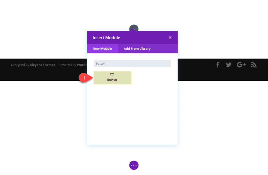
Add a Button Module
To get started, create a new page and deploy the visual builder. Choose “Build from Scratch” and then, once the visual builder is deployed, add a one column row to the section and then add a button module to the row.
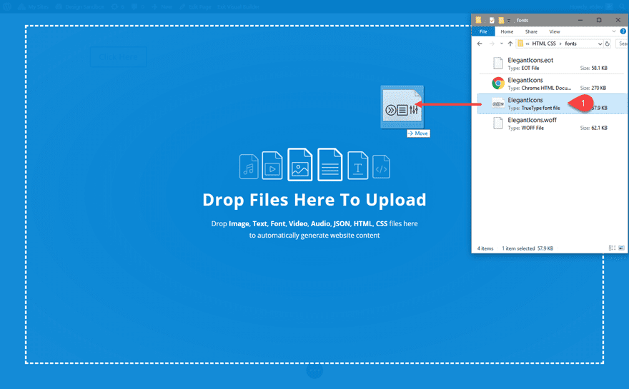
Drag in the Elegant Icon Font
To get the Elegant Icon Font, go to the Elegant Icon Font Blog Post and download the font file. Extract the zip file contents and find the elegant icon font files by navigating to elegant_font > HTML CSS > fonts. Then drag the file “ElegantIcons.ttf” from your computer file and drop it into the visual builder.
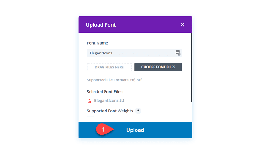
This will bring up the Upload Font modal automatically. Simply click the upload button to upload the font to the Divi Builder.
Now you will have access to the elegant Icon Font when customizing any module font in the visual builder.
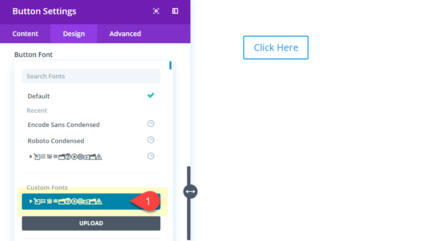
Go to the button module settings and update the button font with the new Elegant Icon Font you just uploaded. It will show up in the list of icon under “Custom Fonts”.
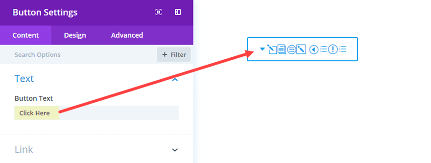
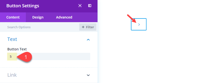
You may notice that now your button text has been transformed into a bunch of icons. This is because each character entered into the button text input box now has an icon that corresponds to the letter/character currently being used.
Since we only need one icon to be used for our button, you can select any character on the keyboard to generate the icon associated with that character. For example, enter the number 5 for your button text to get a right chevron arrow.
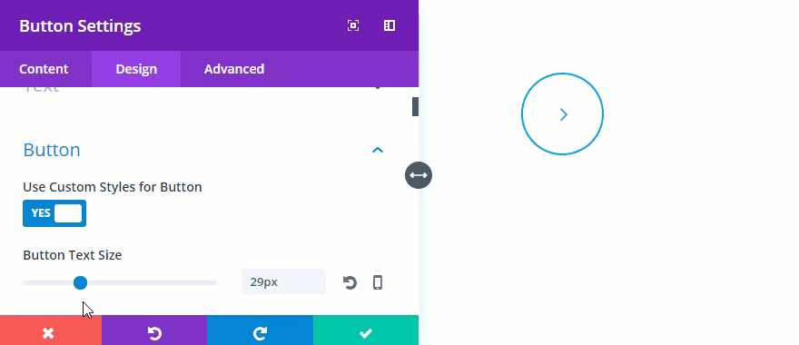
Exchange Button Icons on Hover
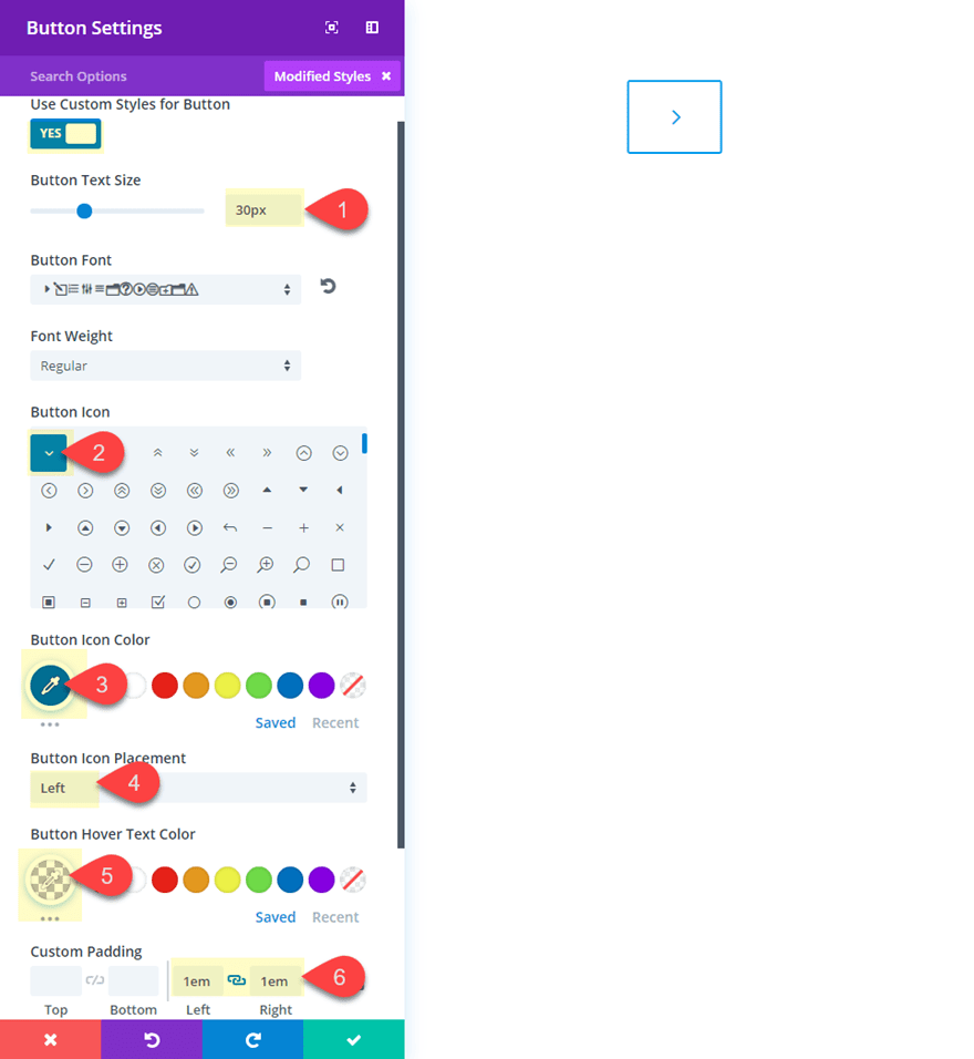
As you know, the button module includes the option to add icons on hover. We can use this functionality to replace the icon font with hover icon for a nice hover effect. All we need to do is modify the button settings as follows:
Button Text Size: 30px
Button Icon: see screenshot (this will be the icon that will replace the icon font used for the button)
Button Icon Color: #0c71c3 (this should match the color used for the button text)
Button Icon Placement: Left
Button Hover Text Color: rgba(255,255,255,0) (this is completely transparent in order to hide the button icon font on hover)
Custom Padding: 1em Left, 1em Right (this padding will override the default padding of the button and keep it from expanding on hover)
Now all we need to do is override the margin for the before element in the custom css. Go to the Advanced tab and enter the following CSS in the before box:
margin-left: 0 !important;
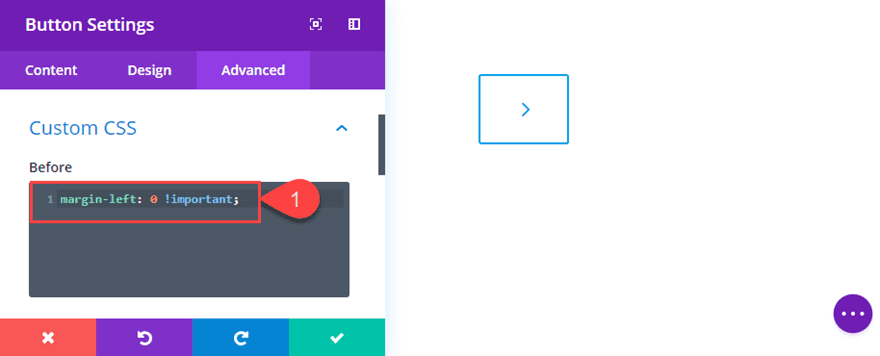
Now your button icon will be replaced by the hover icon on hover.
Creating Perfectly Circle Icon Buttons That Scale with Button Text Size
Circle button designs work really well for single icon buttons. And, if you understand the inner workings of the button module spacing, you can create perfectly circular buttons that scale according to the button text size.
The trick is to space your button using the “em” length unit. This length unit is relative to your button text size. So if you button text size is 30px, 1em is also 30px (2em would be 60px and so on…). Knowing this we just need to make sure our padding around our button will be the same on all 4 sides. But what you may not have considered is that the button text line-height is 1.7em by default. That means that we need to take that into consideration when adding our top and bottom padding values.
For those of you want to know the math behind the padding values needed to create circle buttons, here goes:
For the Left and Right padding, set them both to 1em. This means our total button width will be 90px (or 3em) because…
30px of left padding + 30px of icon font + 30px of right padding = 90px total
The button text line height is 1.7em which is the equivalent of 170% of the button text size (30px) which is equal to 51px.
For the top and bottom padding, set them both to 0.65em. 0.65em is the equivalent of 65% of the button text size (30px) which equals out to be 19.5px.
Therefore…
19.5px of top padding + 51px of line height + 19.5px of bottom padding = 90px total
This means that when the button text is set to 30px, the total button size will be 90px by 90px (a perfect square). In fact, you can think of it this way. Whatever you set as the button text size, the total size of the button will be 3x’s that value. So, a 40px button text will create a button that is 120px by 120px, and so on.
Right now, the button has the right dimensions, but it is still square. All we need to do is add a border radius of 50% to change the square button into a perfect circle button.
Here is what you need to change your button into a circle button:
Button Border Radius: 50%
Custom Padding: 0.65em Top, 0.65em Bottom, 1em Right, 1em Left
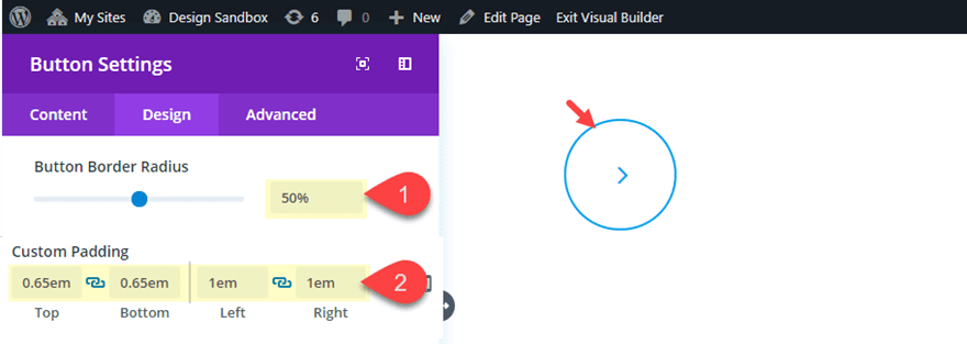
Don’t forget, you can adjust the button text size and the button will remain perfectly circle as padding scales to the size of the text.
Adding Icon Buttons to your Divi Layout
Divi makes it easy to add and customize single icon buttons to fit the design of of any premade layout.
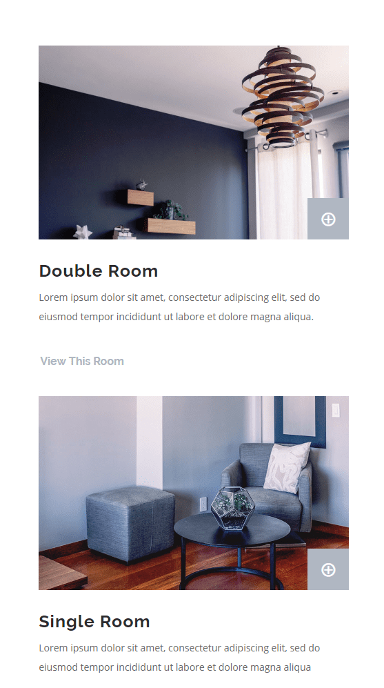
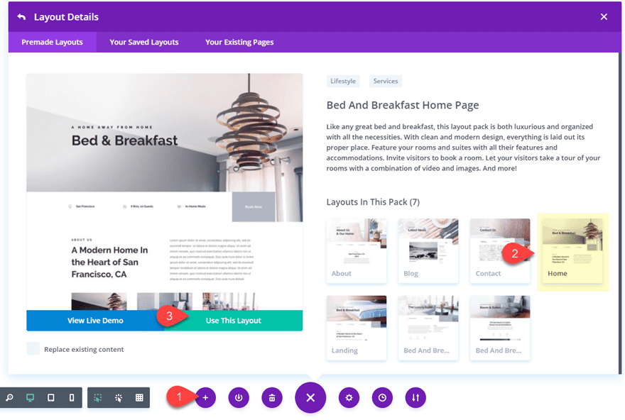
For this example, I’m going to show you how to add a single icon button to the Bed & Breakfast Home Page Layout.
To add the layout to your page, open the settings menu by clicking the purple icon at the bottom of the page (make sure the visual builder is enabled). Then click the Load from Library icon. Select the Bed & Breakfast Home Page Layout and click the “Use This Layout” button to deploy the layout to the page.
Adding an Icon Button to an Image
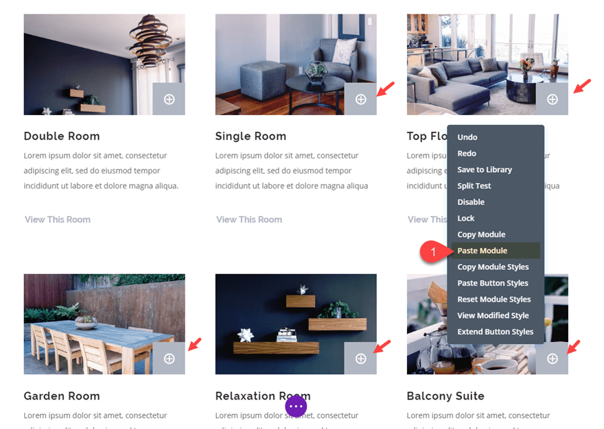
Let’s say you want to add a small icon button to overlay the corner of an image for an additional CTA that links to a particular product or service. All you need to do is add a button module under the image and customize it to include the icon font and make it overlap the image with some custom spacing.
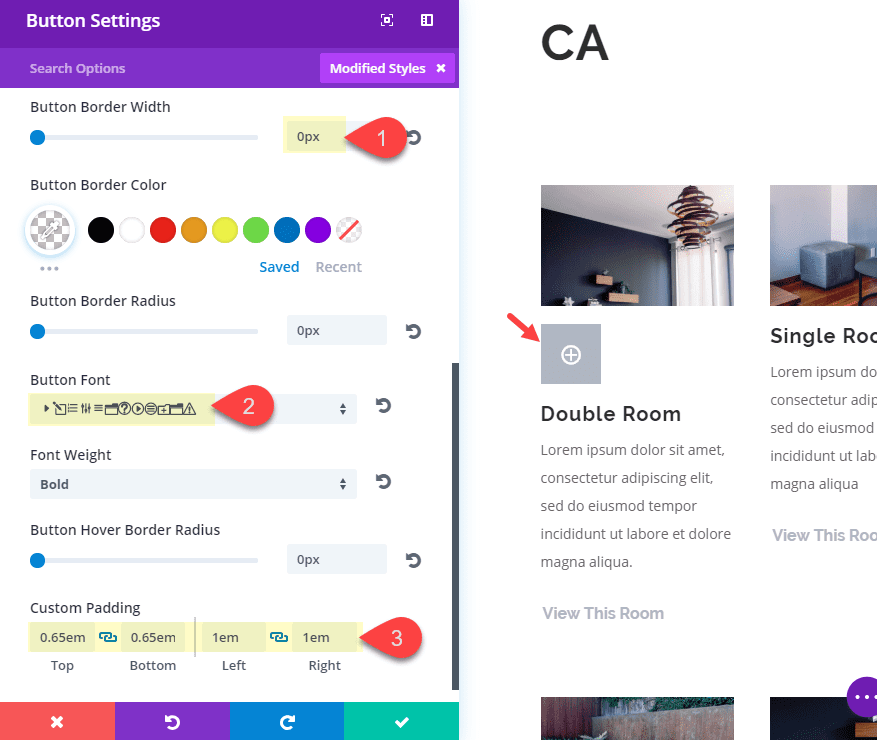
Find the “About Us” section on the home page layout. Then add a button module directly under one of the image used to feature the “Double Room” (it’s the first one in the first column of the three column row).
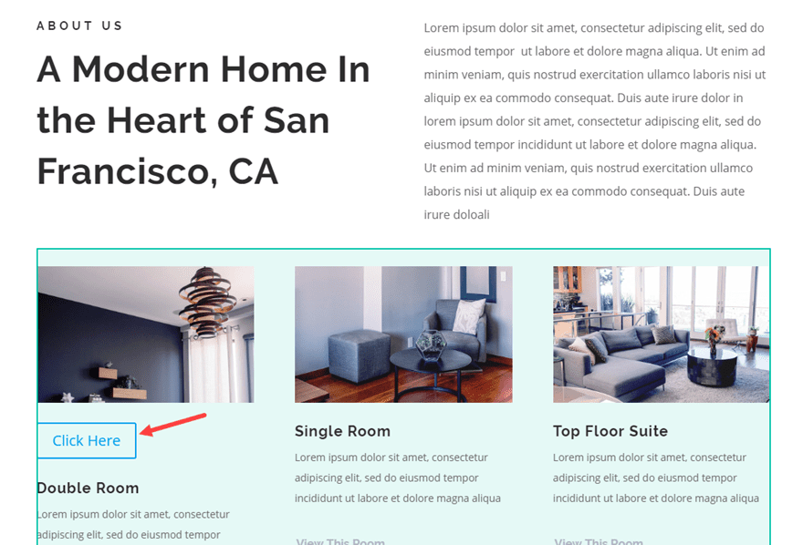
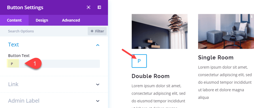
Then open the button settings and put a capital “P” in the button text box. This will change into our icon once you select the Elegant font as the Button Font.
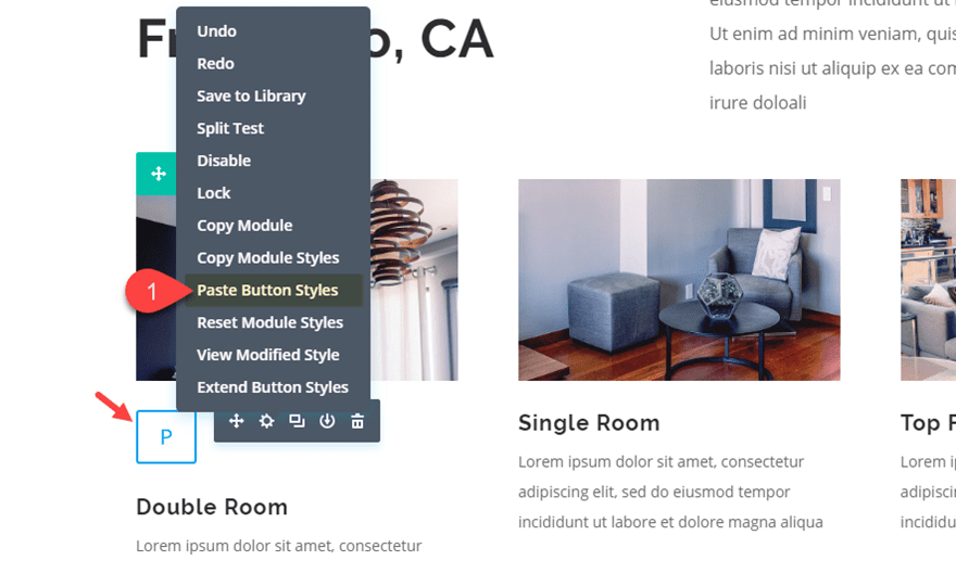
To get a jump start on matching the design of the button with the layout, save your button settings and find the “Book Now” button in the top section of the layout. Open the button settings and copy the button styles by right clicking on the Button Options Toggle Title and selecting the “Copy Button Styles” option from the list.
Now right click on the button module you added under the image and select “Paste Button Styles”.
Then update the button settings as follows:
Button Font: Elegant Font
Button Border Width: 0px
Show Button Icon: NO
Then let’s add our nifty custom padding to ensure the button is a perfect square:
Custom Padding: 0.65em Top, 0.65em Bottom, 1em Left, 1em Right
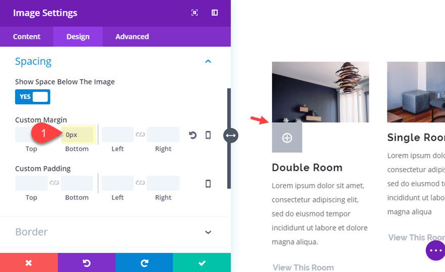
To position the button so that it overlaps the right bottom corner of the image, you will first need to get rid of the bottom margin of the image module above. Open the image module settings of the image directly above the button and set the bottom margin to 0px.
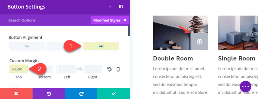
Now we need to pull the button up over the image using a custom negative margin value equal to the height of the button. To do this we need to determine the height of our button. As mentioned earlier in this post, with the custom padding in place, we can know the exact size of our button based on the current button text size. Since the button text size is 20px, we know that the height of our button is 3em (3 times the button text size) which is 60px. Therefore, we need to set a custom margin for our button as follows:
Custom Margin: -60px Top
And then we can position our button the right by adjusting the Button Alignment to Right.
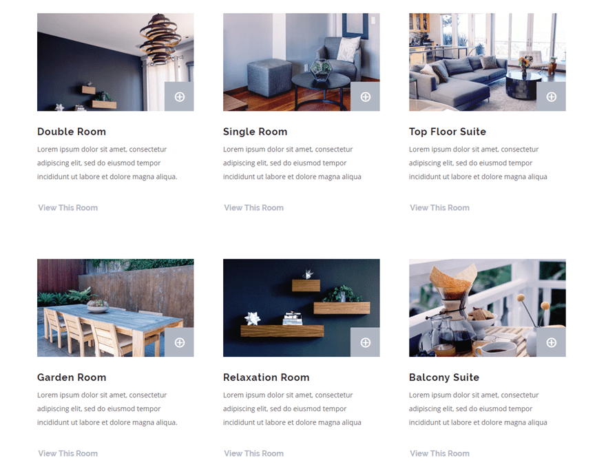
Now that we have a working design for our image and button. All we need to do is add the same button to all of the images in the section.
Since we took out the bottom margin of the image, we can easily apply that change to all of the images in the section using Extend Styles. Right click on the image and select “Extend Image Styles”.
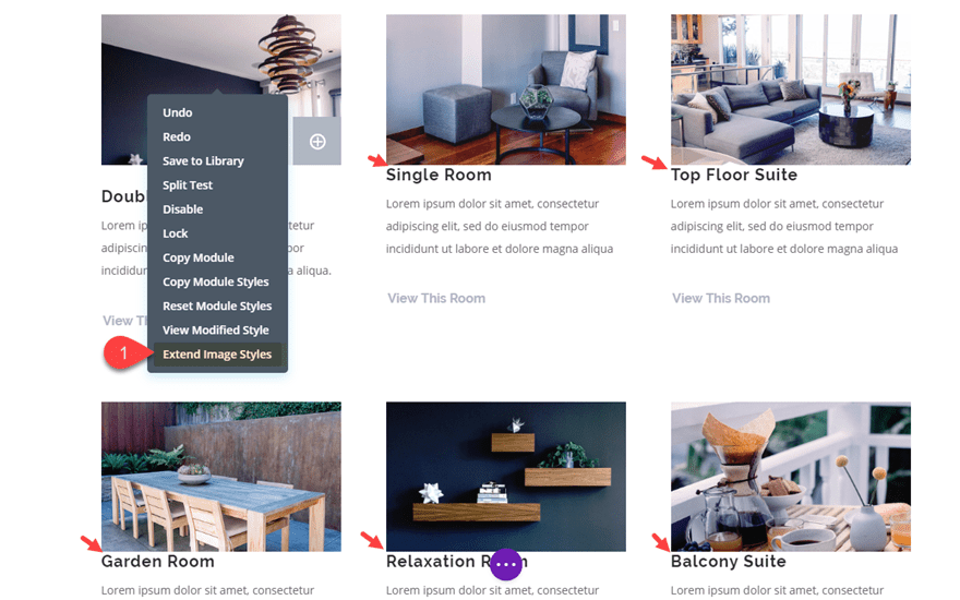
In the Extend Styles popup, select “This Section” for the Throughout option and click the extend button. Now all of the images have a bottom margin of 0px.
The last step is simply copying and pasting the Button modules under each of the images.
Here is the final design.
And because we used proper spacing techniques, the button will stay in place on mobile as well…
Icons Available Using the Button Module
Since the Button Module Button Text is limited to the characters available on the keyboard, you will need to explore those keys to find the available icons associated with each key. An easy way to do this is to create a button module with the button font set to the Elegant Font and type the characters into the button text box.
Here is screenshot of the characters with their corresponding font icon:
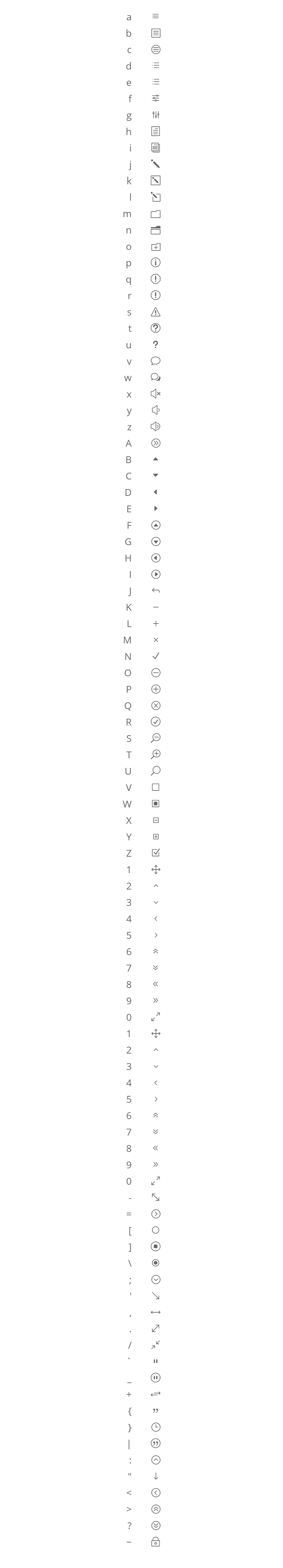
If you find this process limiting, you can always use a text module to create icon links using the unicodes listed here.
Final Thoughts
Using the Elegant Icon Font with Divi’s button module is a convenient way to create single icon buttons for your website. This opens some doors for getting creative with the module settings to customize your button with unique text styles, hover effects, and more. I particularly like those custom button spacing values that ensure the buttons take the shape of a perfect square or circle.
There are tons of uses for icon buttons. Hopefully, the example use case I covered will add a little inspiration for your own projects.
For more ideas, check out how to use the Elegant Icon Font or how to embed an icon font on your website.
I’d love to here some ideas from you in the comments below.
Cheers!
The post How to Create Icon Font Buttons with Divi appeared first on Elegant Themes Blog.