
Hero sections; they serve all kinds of purposes. They’re the first thing visitors see when they visit your website, they immediately show the style of your website and they influence the way your visitors feel and behave on your site. We’re already used to all kinds of hero sections out there, but most of them include a hero image, a tagline and a call to action. There are other possibilities as well, though. In this post, we’ll show you another approach on hero sections and we’ll follow it up with an example you can recreate using Divi.
Example
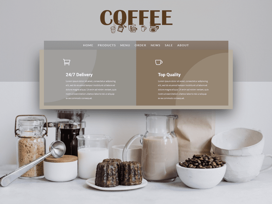
The example we’ll show you how to recreate with Divi looks like this on desktop:
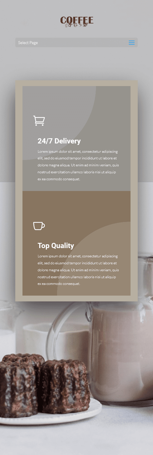
And like this on mobile:
How to Make Your Hero Section Stand Out
1. Large, Descriptive and Centralized Logo
The first thing we’re using in our example, to help make our hero section stand out, is a centered header format instead of the default. Along with that, we’re also using a transparent menu that’ll help overlap the menu items with the hero section design. The link between the logo, menu and website is clearer when using a transparent background since there’s one less division within the hero section.
2. Concentrate Written Content
Another thing you can do to make your hero section stand out is concentrating the written content you have. That way, you’ll draw the visitors’ attention to one place on the screen which makes the chance of them reading it bigger. If you’re, on the other hand, dividing written content throughout your whole hero section, the changes are more likely that they’ll miss out on a part of the message you’re trying to bring.
3. Highlight Unique Selling Propositions
Usually, a hero section contains normal Text Modules that share a product or company’s tagline. However, you can also use Blurb Modules within the hero section as well. These Blurb Modules are perfect if you want to share the unique selling propositions of your product or service right away. On top of that, you can also choose whether or not you want to include calls to action in it right away. In our example, these call to actions are built into the blurb modules themselves.
4. Clean Product Image
To top it off, and to balance the written content you’ve provided, we recommend using a clean product image as your hero section background image. You want your hero image to be as qualitative and self-explanatory as possible without taking over the whole hero section.
Recreate Example with Divi
Now that we’ve gone over the theoretical side, it’s time we start recreating it.
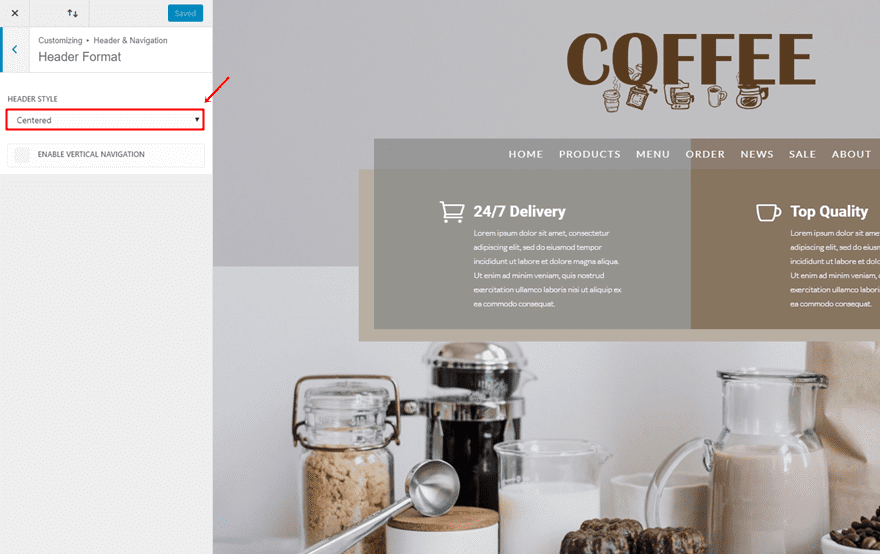
Header Format
The first thing you’ll need to do is choosing ‘Centered’ as the Header Style by going to your WordPress Dashboard > Customize > Header & Navigation > Header Format > And choose ‘Centered’ as the Header Style’.
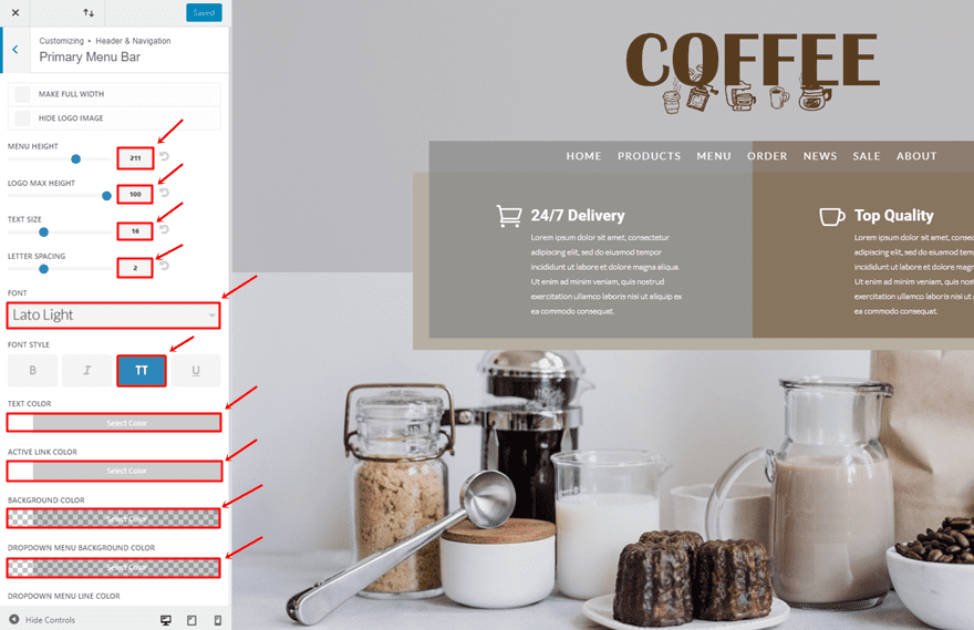
Primary Menu Bar Settings
Then, go back to the Header & Navigation > Primary Menu Bard > And make the following adjustments:
- Menu Height: 211px
- Logo Max Height: 100px
- Text Size: 16
- Letter Spacing: 2
- Font: Lato Light
- Font Style: Uppercase
- Text Color: #FFFFFF
- Active Link Color: #FFFFFF
- Background Color: rgba(255,255,255,0)
- Dropdown Menu Background Color: rgba(255,255,255,0)
Add New Section
Once done, add a new page, enable the Divi Builder, enable Visual Builder and add a new standard section.
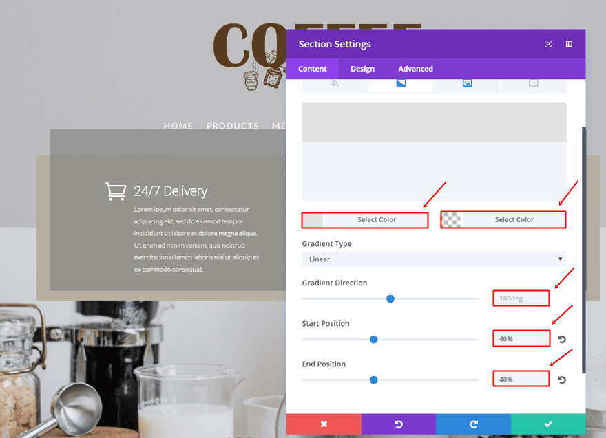
Gradient Background
Use the following gradient background for this section:
- First Color: #e2e2e2
- Second Color: rgba(255,255,255,0)
- Gradient Type: Linear
- Gradient Direction: 180deg
- Start Position: 40%
- End Position: 40%
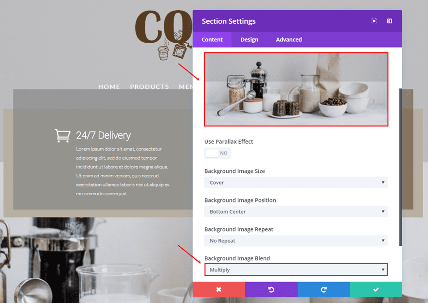
Background Image
Next, upload background image and choose ‘Multiply’ as the Background Image Blend.
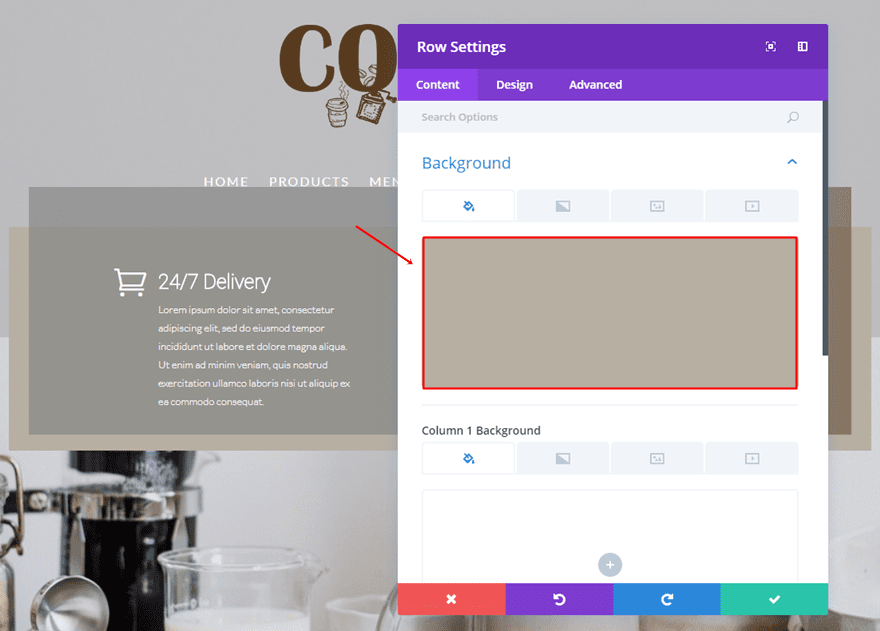
Add Two-Column Row
Background Color
Add a two-column row to the section you’ve just created and use ‘#b7afa1’ as the background color.
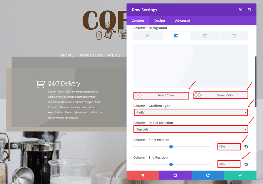
Column 1 Gradient Background
Scroll down and make use of the following gradient background for the first column:
- First Color: rgba(255,255,255,0.43)
- Second Color: rgba(255,255,255,0)
- Column 1 Gradient Type: Radial
- Column 1 Gradient Direction: Top Left
- Column 1 Start Position: 49%
- Column 1 End Position: 49%
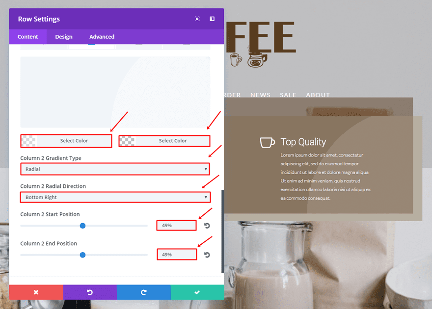
Column 2 Gradient Background
And use the following gradient background for the second column:
- First Color: rgba(255,255,255,0.43)
- Second Color: rgba(255,255,255,0)
- Column 2 Gradient Type: Radial
- Column 2 Radial Direction: Bottom Right
- Column 2 Start Position: 49%
- Column 2 End Position: 49%
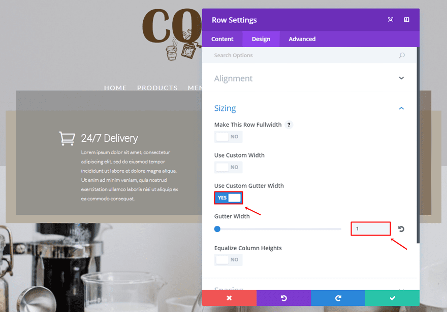
Sizing
Go to the Design tab, enable the ‘Use Custom Gutter Width’ option and use ‘1’ for the Gutter Width.
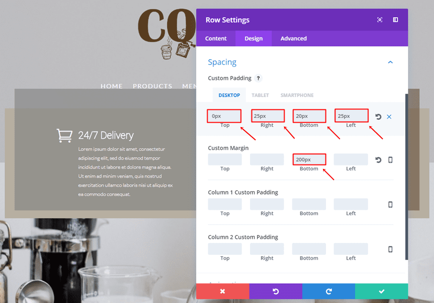
Spacing
Open the Spacing subcategory and use the following padding and margin:
- Top Padding: 0px (Desktop), 20px (Tablet & Phone)
- Right Padding: 25px
- Bottom Padding: 20px
- Left Padding: 25px
- Bottom Margin: 200px
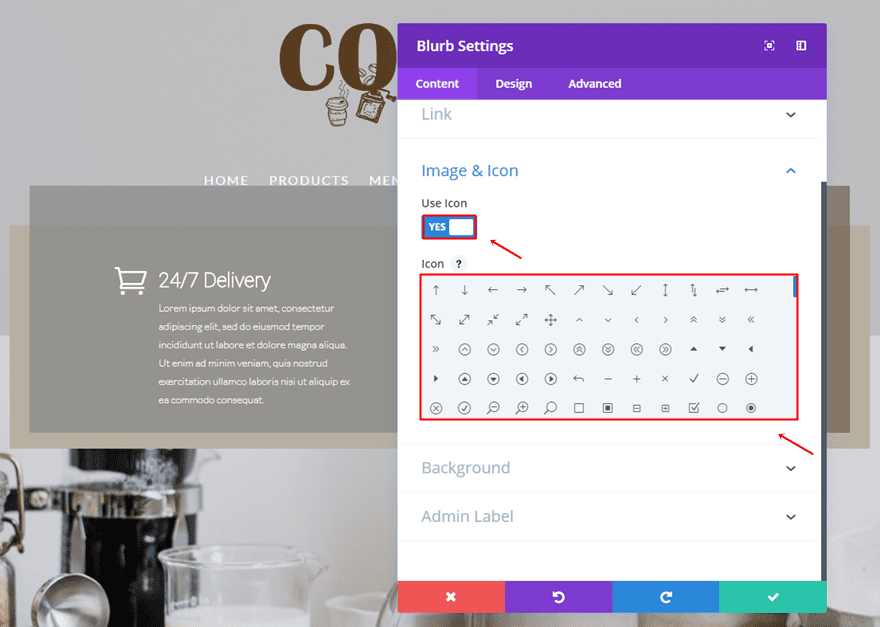
First Blurb Module
Enable Icon
Add a Blurb Module to the first column of the row, enable the ‘Use Icon’ option and choose an icon.
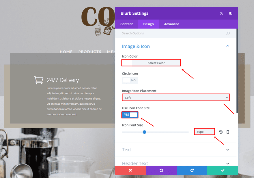
Icon Settings
Then, go to the Design settings and make the following changes to the Image & Icon subcategory:
- Icon Color: #FFFFFF
- Image/Icon Placement: Left
- Use Icon Font Size: Yes
- Icon Font Size: 40px
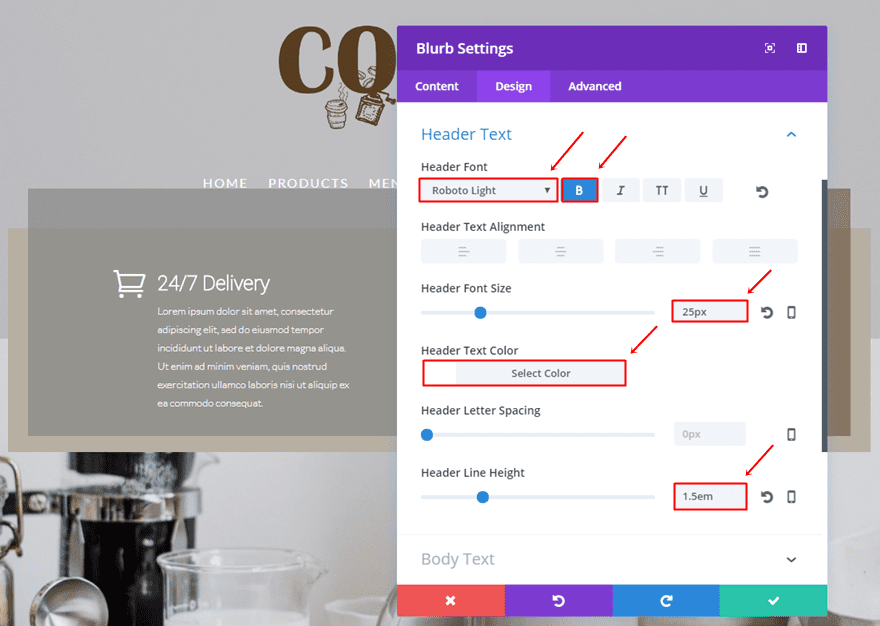
Header Text Settings
Then, make the following settings apply to the Header Text subcategory:
- Header Font: Roboto Light
- Font Style: Bold
- Header Font Size: 25px
- Header Text color: #FFFFFF
- Header Line Height: 1.5em
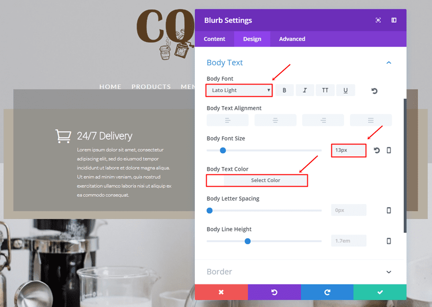
Body Text Settings
The Body Text subcategory will need the following changes:
- Body Font: Lato Light
- Body Font Size: 13px
- Body Text Color: #FFFFFF
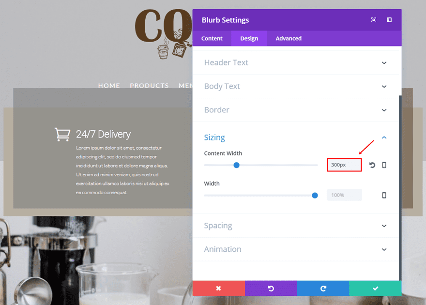
Sizing
Next, use ‘300px’ as the Content Width.
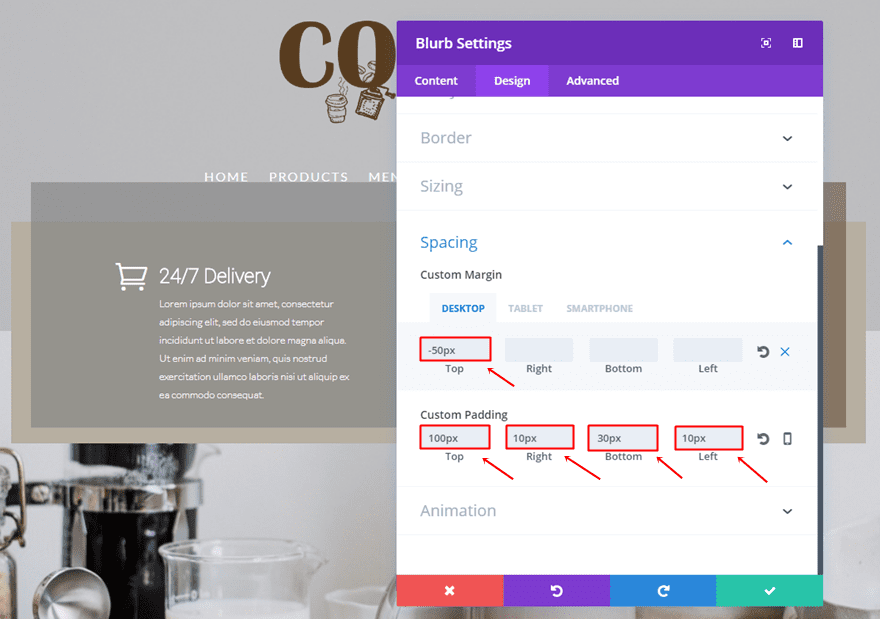
Spacing
Lastly, use the following margin and padding for the Blurb Module:
- Top Margin: -50px (Desktop), 0px (Tablet & Phone)
- Top Padding: 100px
- Right Padding: 10px
- Bototm Padding: 30px
- Left Padding: 10px
Clone Blurb Module & Place in Second Column
Continue by cloning the previously made Blurb Module and placing it in the other column as well.
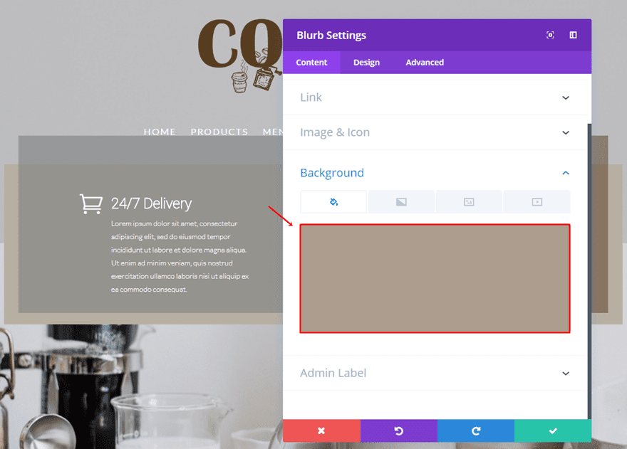
Change Background Color
The first thing you’ll have to change in this cloned Blurb Module is the background color. Change it into ‘rgba(89,60,31,0.5)’.
Change Icon
The next and last thing you’ll need to change is the icon within the content tab.
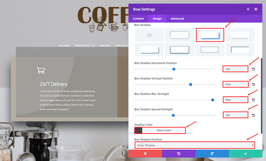
Extra: Add Divi’s New Box Shadow Option to Row
With the recent update, you’re now also able to add box shadows to rows, modules and sections. For this example, we’re going to add some box shadow to the row. That’ll help create some depth and emphasize the written content in our hero section.
- Box Shadow Horizontal Position: -3px
- Box Shadow Vertical Position: 31px
- Box Shadow Blur Strength: 79px
- Box Shadow Spread Strength: -4px
- Shadow Color: #424242
- Box Shadow Position: Outer Shadow
Result
Let’s take another quick result at the result you should be able to achieve on desktop after following this post:
And on mobile:
Final Thoughts
In this post, we’ve shown you a different approach on hero sections. We’ve given you some tips and elaborated those tips by showing you how to recreate an example we’ve made in advance with Divi. If you have any questions or suggestions; make sure you leave a comment in the comment section below!
Be sure to subscribe to our email newsletter and YouTube channel so that you never miss a big announcement, useful tip, or Divi freebie!
Featured Image by Ellagrin / shutterstock.com
The post How to Create Showstopping Hero Sections with Divi appeared first on Elegant Themes Blog.