
Welcome to post 2 of 5 in our miniseries How to Create Stunning Grid Layouts with Divi’s Video Module. In this series we are going to walk you through how to create amazing grid layouts from scratch using the Divi Visual Builder. And if you are worried about this being too complicated, think again! All of these layouts can be created and styled using the Visual Builder without additional code.
We made it to part 2 of the series! And I have to say that I am really enjoying building these layouts. Today, I’m going to show you how to create a grid layout for your videos that resembles a feature section of a product page or a landing page. This layout is made up of a sequence of ½ ½ column rows with each row containing a video and its corresponding description in each of the two columns. Then the next section alternates the order of the video and description from left to right and then from right to left. Since each of the rows stretch the fullwidth of the page and each of the columns keep the same vertical height, the layout looks stunning on all screen sizes.
I’m going to use the video module to add the videos and the blurb module to serve as a title and description section adjacent to the video. Like all of the layouts in this series, this one is also surprisingly easy to implement using Divi.
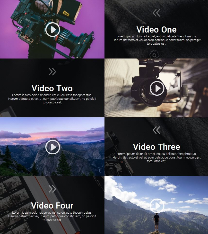
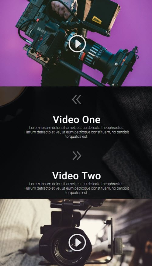
Here is what the Final Result will Look Like
The Concept & Inspiration
This concept is not new by any means. I was actually inspired to create this layout because of it’s familiarity with users. Many websites use a similar layout for showcasing features for their products or services. It allows for bigger content areas which I think creates great negative space for the text and striking imagery for the video.
This would be perfect for a company that uses video to promote product features but has many other uses as well. I hope you take advantage of this design for your next project.
Let’s get started.
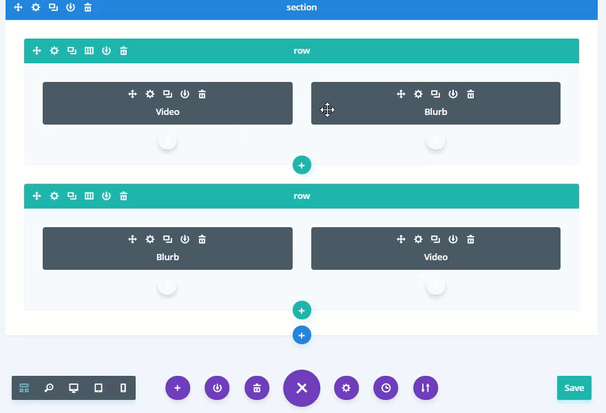
Implementing The Design With Divi
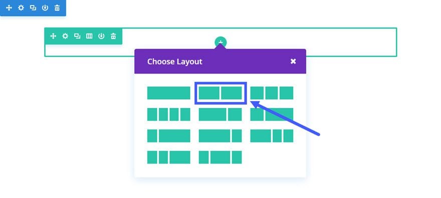
First, add a regular section with a ½ ½ (2-column) structure.
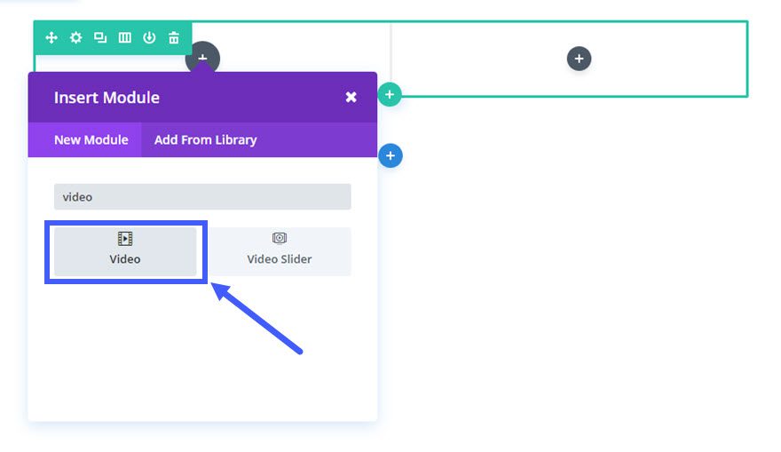
Next add a Video Module to the left column.
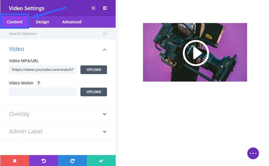
Update the Video Settings as follows:
Content Options
Video MP4/URL: [enter URL for video]
Image Overlay URL: [upload a custom image for your video or generate one automatically from the video]
Design Options
Play Icon Color: rgba(255,255,255,0.87)
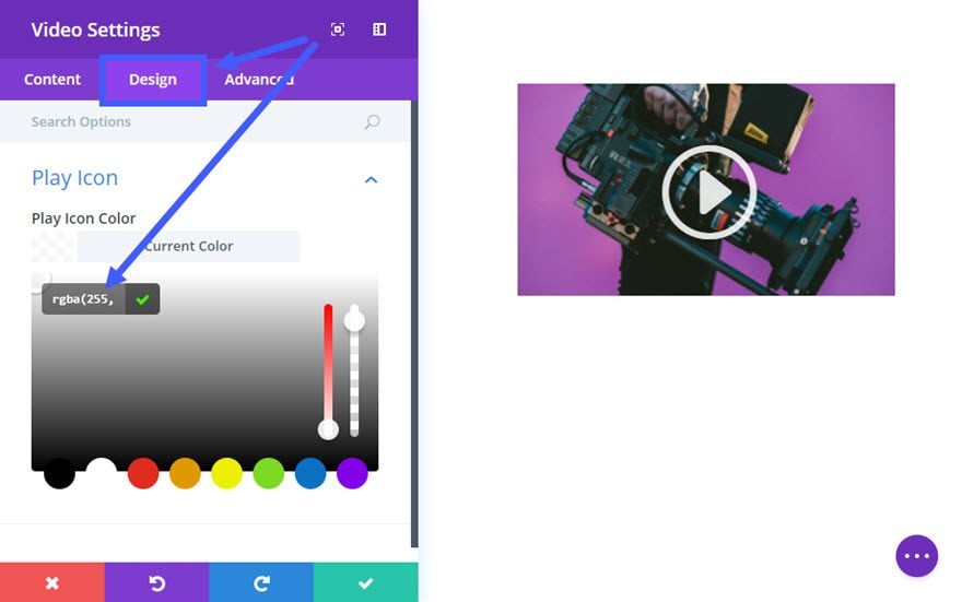
Save Settings
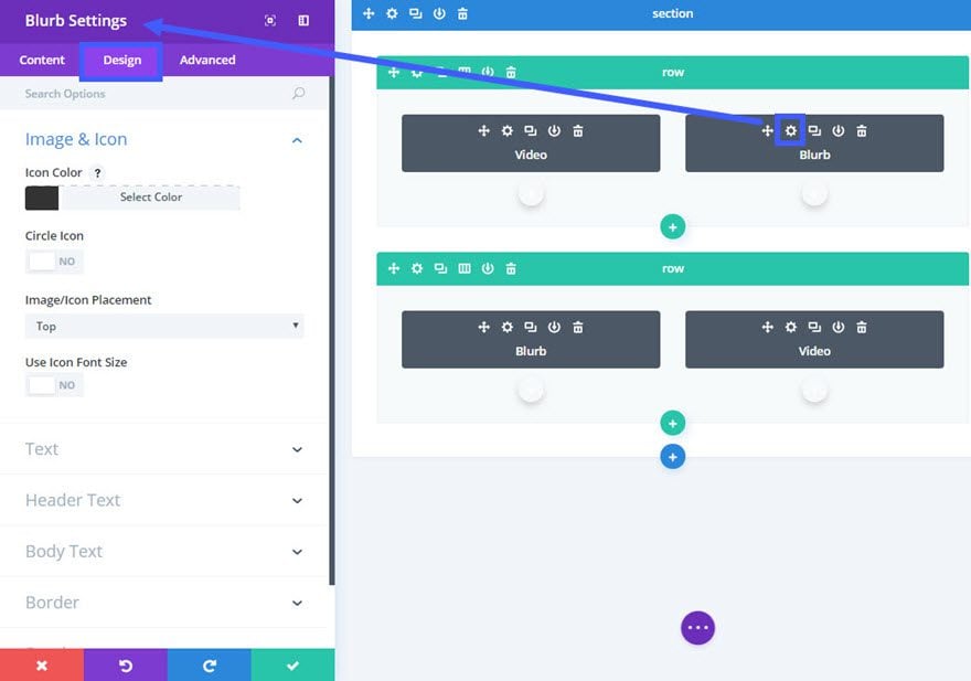
Next add a Blurb Module in the right column directly adjacent to the Video Module you just created.
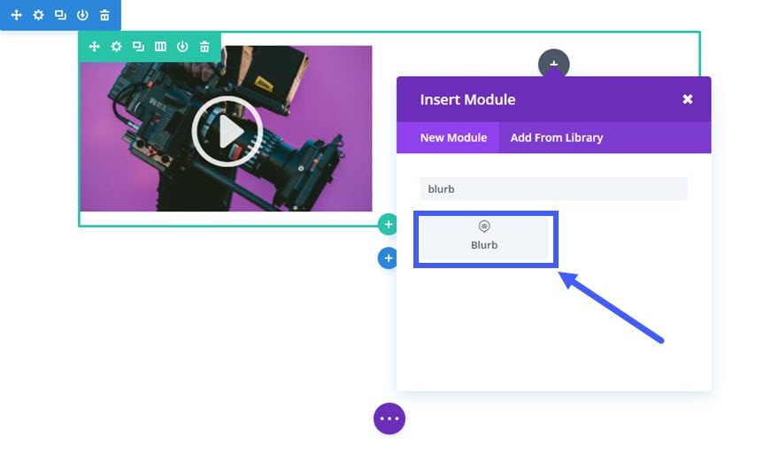
Update Blurb Settings as follows:
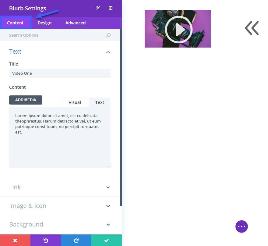
Content Options:
Title: [enter title of video]
Content: [enter description of video]
Link: [you can enter the link url to another page if you want]
Use Icon: YES
Icon: [select icon]
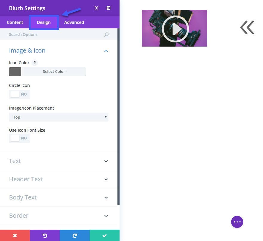
Design Options:
Icon Color: #666666
Text Color: Light
Text Orientation: Center
Header Font: Roboto
Header Font Size: 52px
Header Letter Spacing: 1px
Body Font: Open Sans
Body Font Size: 20px
Body Text Color: #dddddd
Custom Padding on Desktop: 5% Top (you may need to adjust this depending on the amount of text you have in your description)
Custom Padding on Tablet and Smartphone: 20px Top, 20px Bottom
Advanced Options
Image/Icon Animation: Right To Left (this animation combined with the arrow icon will draw further attention to the video to the left.
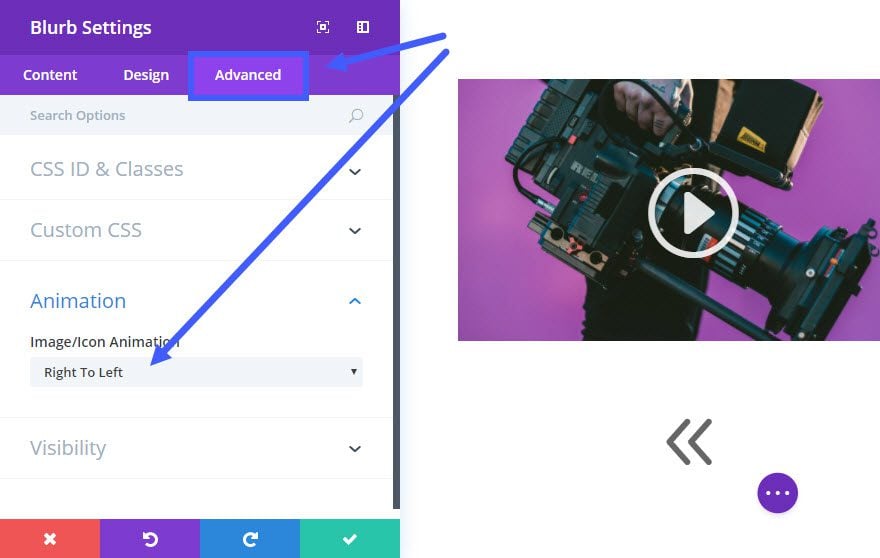
Save Settings
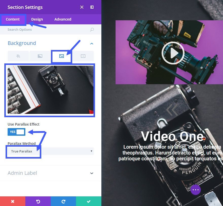
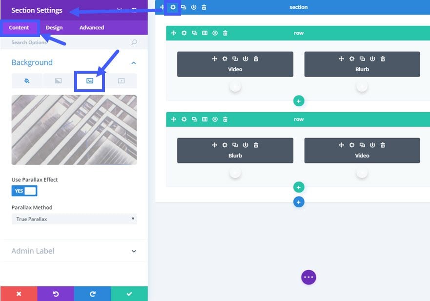
Before we continue, go ahead and add your background image to your section. Go to the Section settings (blue area) and update the following:
Content Options:
Background Image: [enter a background image (mine is 2000 x 2200)]
Use Parallax Effect: YES
Parallax Method: True Parallax
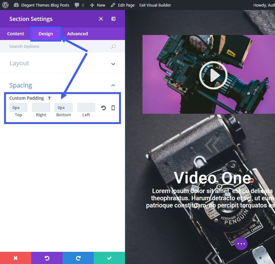
Design Options:
Custom Padding: 0px Top, 0px Bottom
Things are started to come into place now. You have your background image and you have created your first row. Now you are ready to duplicate that row. Click the duplicate icon on the row menu bar within the visual builder.
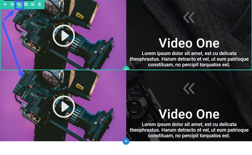
In the new row you just duplicated, drag the video module over to the right column and drag the blurb module over to the left column.
Now you just have to update the content of the video module to include the new video URL and the new cover image. For the Blurb Module, you will need to update the header and content that corresponds to your video. And you will also need to adjust the blurb icon to an arrow that points right (if you used the same icon I did) and switch the Image/Icon Animation to “Left To Right”.
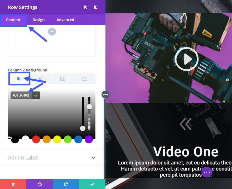
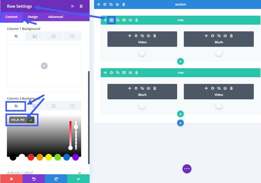
Next we need to update the duplicated row settings to set the background of the first column. Go to row settings and update the following under the Content tab:
Column 1 Background Color: rgba(0,0,0,0.69)
Column 2 Background Color: none
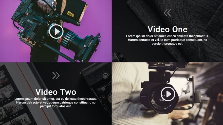
We are making some headway. Now let’s see what our first two rows look like…
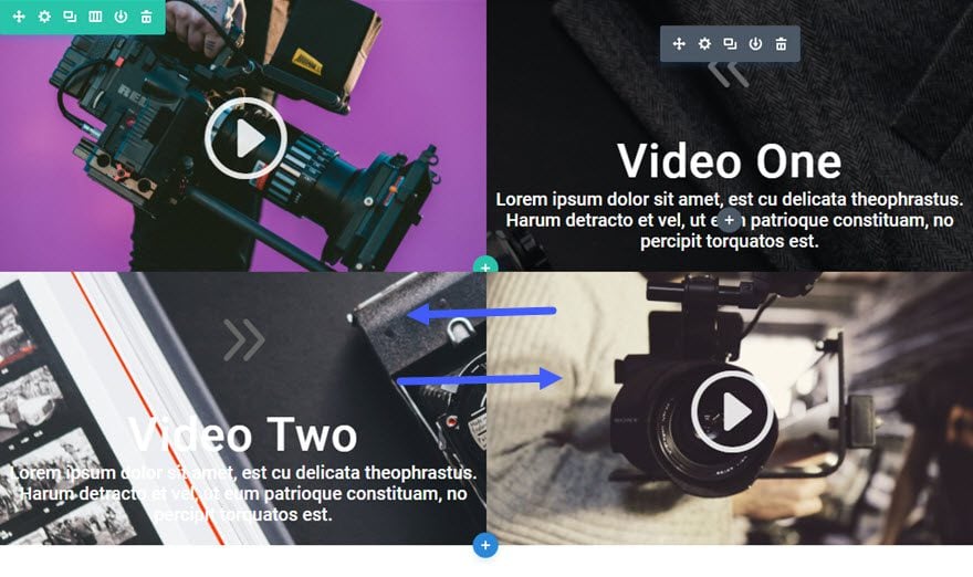
For the next two rows repeat the duplication process and update the content. Just remember that the more rows you have the longer your section background image will have to stretch to accommodate for the length of content.
For this example I added two more rows making it a total of four rows. Check out the final result.
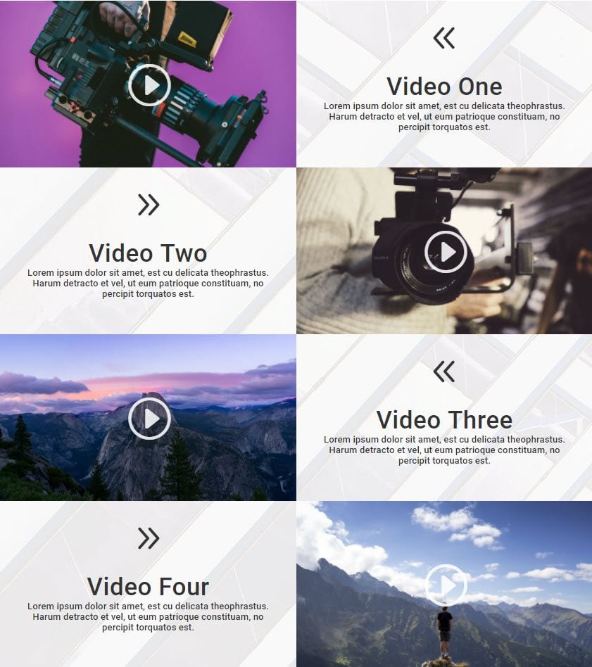
Creating the Light Version
To change the previous dark video grid design into a light version, all you need to do is update a few of the design options.
For these edits, it may be a little easier to use the wireframe view.

Update Section Settings as follows:
Content Options
Background Image: [enter a light background image]
Update First Row Settings as follows:
Content Options
Column 2 Background Color: rgba(255,255,255,0.68)
Update the first row Blurb Module Settings as follows:
Design Options
Icon Color: #333333
Text Color: Dark
Header Text Color: #444444
Body Font: Roboto
Body Text Color: #666666
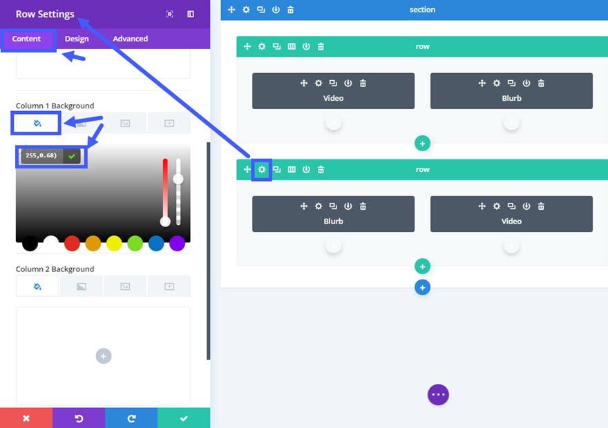
Update Second Row Settings as follows:
Content Options
Column 1 Background Color: rgba(255,255,255,0.45)
Use the right click options to copy the design of the blurb module in the first row and paste it to the blurb module on the second row.
That’s it! Check out the final result.
Responsive?
This one is a little tricky when it comes to how it behaves on smaller screen sizes. Because the default stacking order puts the left column above the right column, the result of this layout is a bit confusing. You can learn how to fix this problem on my previous post on how to change Divi’s column stacking order.
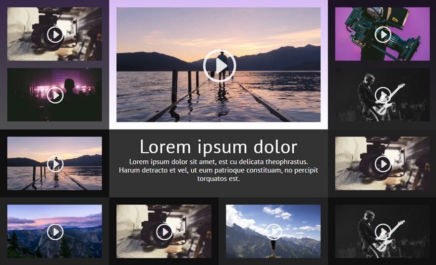
Coming Up…
The next grid is going to surprise you. The semi-transparent background colors and gradients make the design very easy to match your own site. Check out the preview…
I hope you are enjoying the series so far. I look forward to hearing from you in the comments.
Cheers!
The post How to Create Stunning Grid Layouts with Divi’s Video Module (Part 2) appeared first on Elegant Themes Blog.