
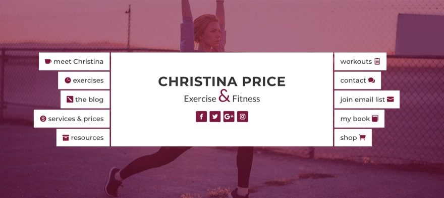
Today’s post is about combining two very important elements on your website: header and navigation. This unique design organizes multiple buttons inside your header to serve as a navigation menu that is both functional and attractive.
This design would work great for personal sites that want to keep things simple and blogs that need to showcase categories in a fresh way.
If anything, I hope this will inspire you to build another great design with Divi.
Sneak Peek

All You Need is Divi
For this tutorial I am going to use the Divi visual builder to design this navigation header. I think you will enjoy the simple yet powerful way Divi enables you to create something completely unique.
I will be offering you an alternative design involving adding an image background to your buttons, so you will want to use images with a size of 100px by 150px if you go down that road.
Designing the Header Section
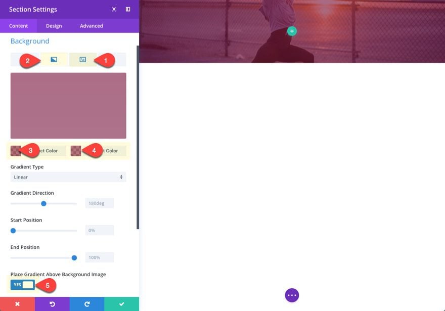
Let’s get things rolling by creating a new page and deploying the visual builder. By default, there will be a section waiting for you to edit at the top of the page. Go to the section settings and add a background image and gradient overlay by updating the following:
Background Image: [insert 1920px by 1080px image]
Background Gradient Left Color: rgba(127,23,60,0.61)
Background Gradient Right Color: rgba(127,23,60,0.59)
Place Gradient Above Background Image: YES
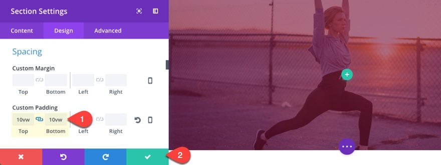
Then add some top and bottom padding to give our future content some breathing room.
Custom Padding: 10vw Top, 10vw Bottom
I like using the vw length unit here because it does a good job keeping content above the fold on different screen sizes.
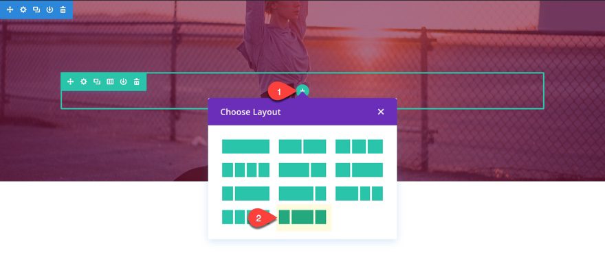
Creating the Row
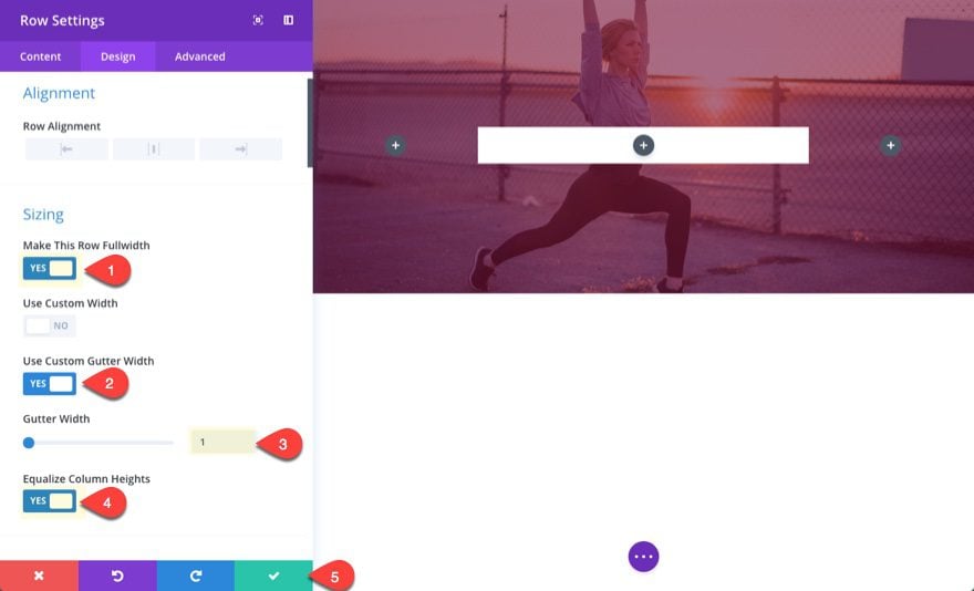
Now set your column layout within your row to be one-third one-half one-third.
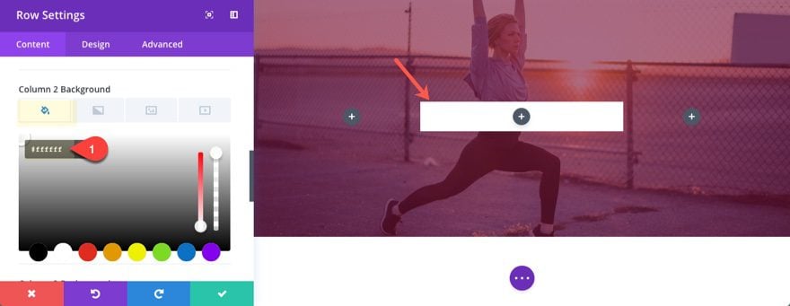
Then edit the row settings to set your column 2 background color to #ffffff.
And update the design settings as follows:
Make This Row Fullwidth: YES
Use Custom Gutter Width: YES
Gutter Width: 1
Equalize Column Heights: YES
This creates more space for our future navigation buttons on the left and right. The gutter width set to 1 gets rid of the margins between columns so that our buttons can easily be positioned on each side of our middle column content.
Designing the Title Section
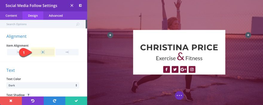
For the middle title section we are going to stack a text module and a social media follow module.
Add the Title
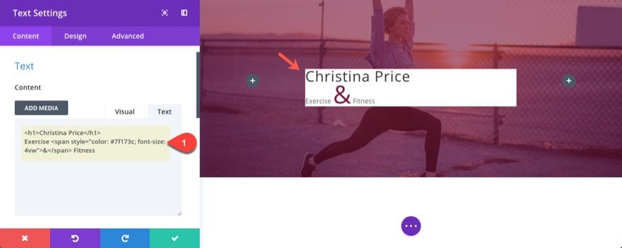
First add a text module to the middle column and update the following:
Content:
<h1>Christina Price</h1>
Exercise <span style="color: #7f173c; font-size: 4vw;">&</span> Fitness
Since this is a page title, I used the h1 tag. I also wrapped the subtitle text ampersand (&) in a span tag with a custom color and font size to add a little flair to the text design.
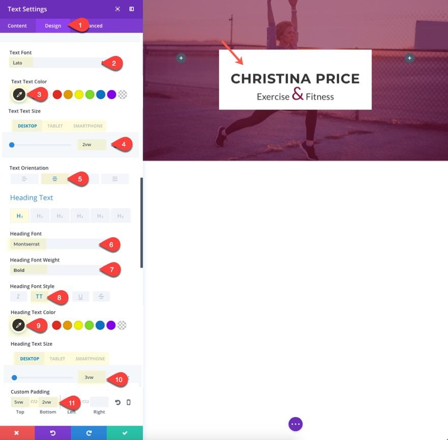
Now go to the design tab and update the following:
Text Font: Lato
Text Text Color: #333333
Text Text Size: 2vw (desktop), 30px (tablet), 22px (smartphone)
Text Orientation : Center
Heading Font: Montserrat
Heading Font Weight: Bold
Heading Font Style: TT
Heading Text Color: #333333
Heading Text Size: 3vw (desktop), 40px (tablet), 32px (smartphone)
Custom Padding: 5vw Top, 2vw Bottom
Add the Social Follow Icons
To add the social icons, add a social media follow module under the text module.
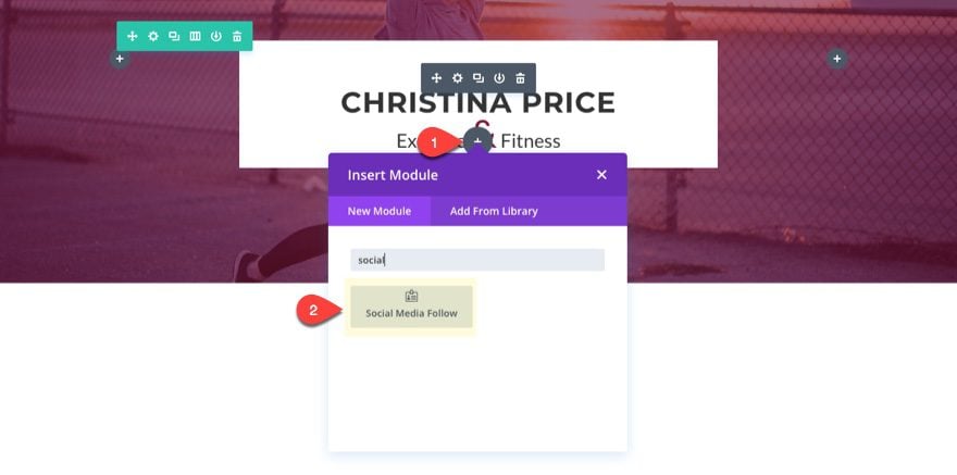
Add four social networks to the module, each with the same background color:
background color: #7f173c
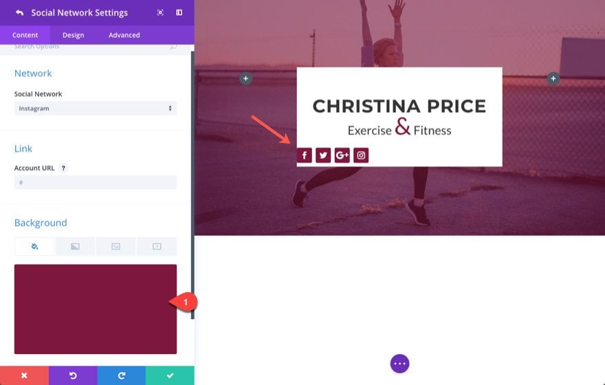
Then set the item alignment to center.
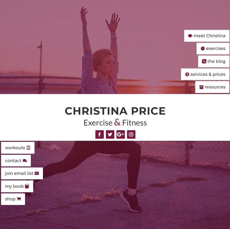
Designing Left Column Navigation Header Buttons
To design the navigation buttons on the left column, we are going to start by designing one button and then duplicating that button to help us create the rest.
To create the first button, add a button module to the left column and update the following:
Button Text: meet Christina
Under the design tab…
Button Alignment: Right
Use Custom Styles for Button: YES
Button Text Size: 1.5vw (desktop), 16px (tablet)
Button Text Color: #333333
Button Background Color: #ffffff
Button Border Width: 4px
Button Border color: #ffffff
Button Border Radius: 0px
Button Icon: your choice
Button Icon Color: #7f173c
Button Icon Placement: Left
Only Show Icon On Hover For Button: NO
Custom Margin: 4px Right
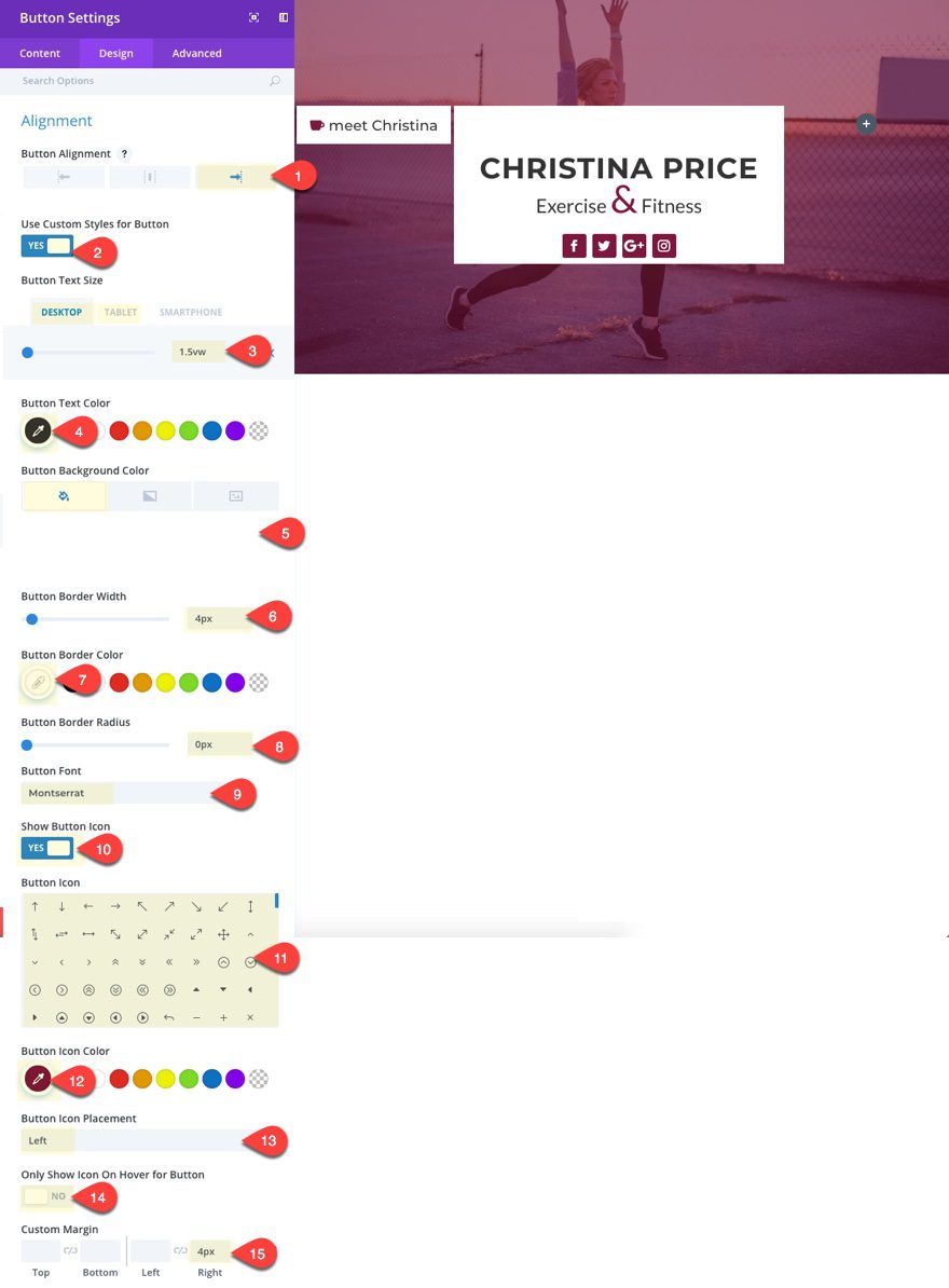
Save settings.
Then duplicate that button, update the content (button text, icon, link url, etc.) and add a custom top margin of 5px.
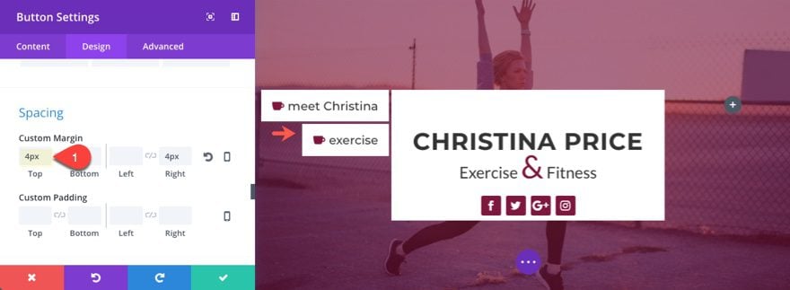
Save Settings.
Now duplicate that module three more times and update the button content for each. You should have a total of five buttons adjacent to the middle column.
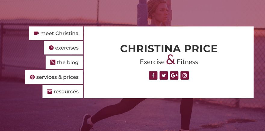
Notice that because our row is set to have equal column heights, the height of the left column with the buttons also pulled down the middle column to match the height.
Designing Right Column Navigation Header Buttons
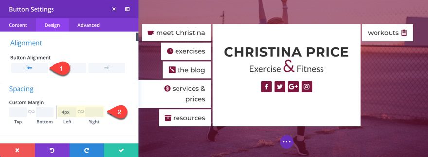
To create the buttons in the right column go ahead a copy the top button in the left column and paste it into the third column.
Then update the button content (button text, icon, link url, etc.) and update the following settings.
Button Alignment: Left
Button Icon Placement: Right
Custom Margin: 4px Left, 0px Right
Now duplicate the button you just created and update the spacing to have a custom top margin of 4px.
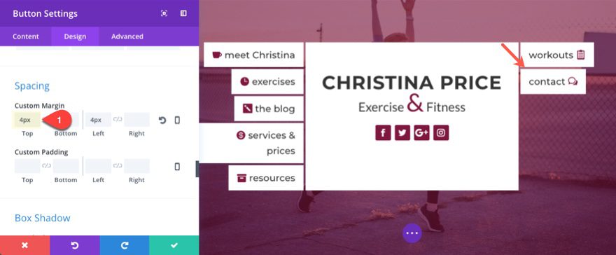
Save settings.
Then duplicate that module three more times and update the button content for each. You should have a total of five buttons adjacent to the middle column.
Check out the final design.
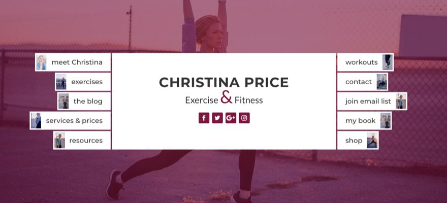
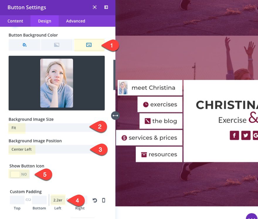
Add Images to the Buttons
As an alternate design option, you can switch you button icons for images. To do this you will need to use images that are 100px by 150px in size.
For example, to add an image to the left column buttons, edit the button module settings as follows:
Background Image: [enter 100×150 image]
Background Image Size: Fit
Background Image Position: Center Left
Show Button Icon: NO
Custom Padding: 2.2em Left
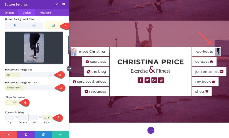
To add an image to the right column buttons, edit each of the button module settings as follows:
Background Image: [enter 100×150 image]
Background Image Size: Fit
Background Image Position: Center Right
Show Button Icon: NO
Custom Padding: 2.2em Right
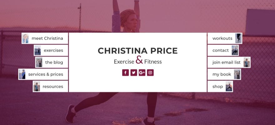
Once you add images to all of your buttons, here is what the design would look like.
Responsive Options for the Navigation Header
Right now the design will work on mobile devices and will look like this:
But that may not be exactly how you want it. You may want to think about a couple of other options.
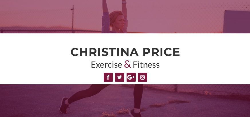
Hide buttons on Mobile
A simple and functional solution for this design on mobile is to hide your buttons on tablet and smartphones and just use your actual primary mobile navigation menu as a fall back.
To hide a button, simply go to the button module advanced settings and check to disable the module on tablet and smartphone.
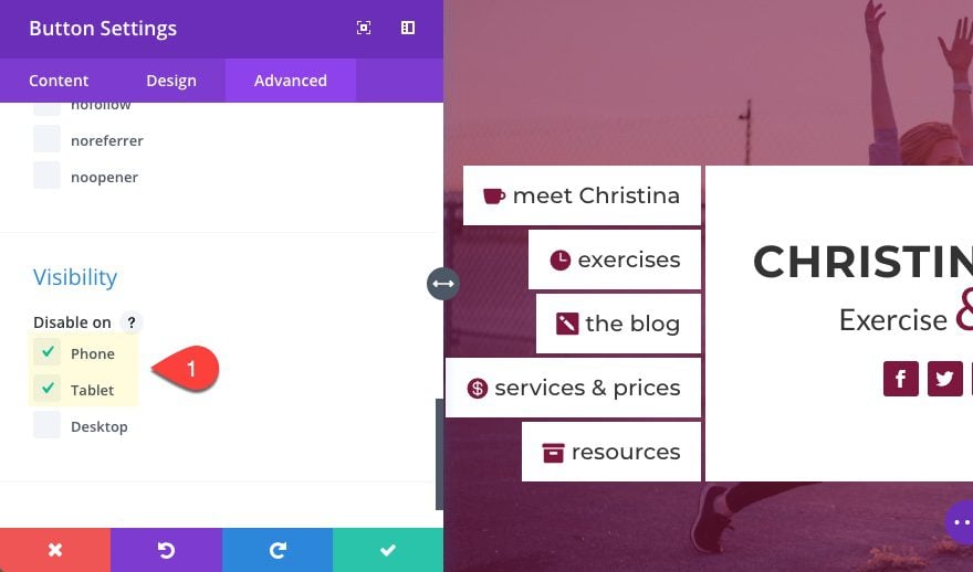
The result would look like this on tablet and smartphone.
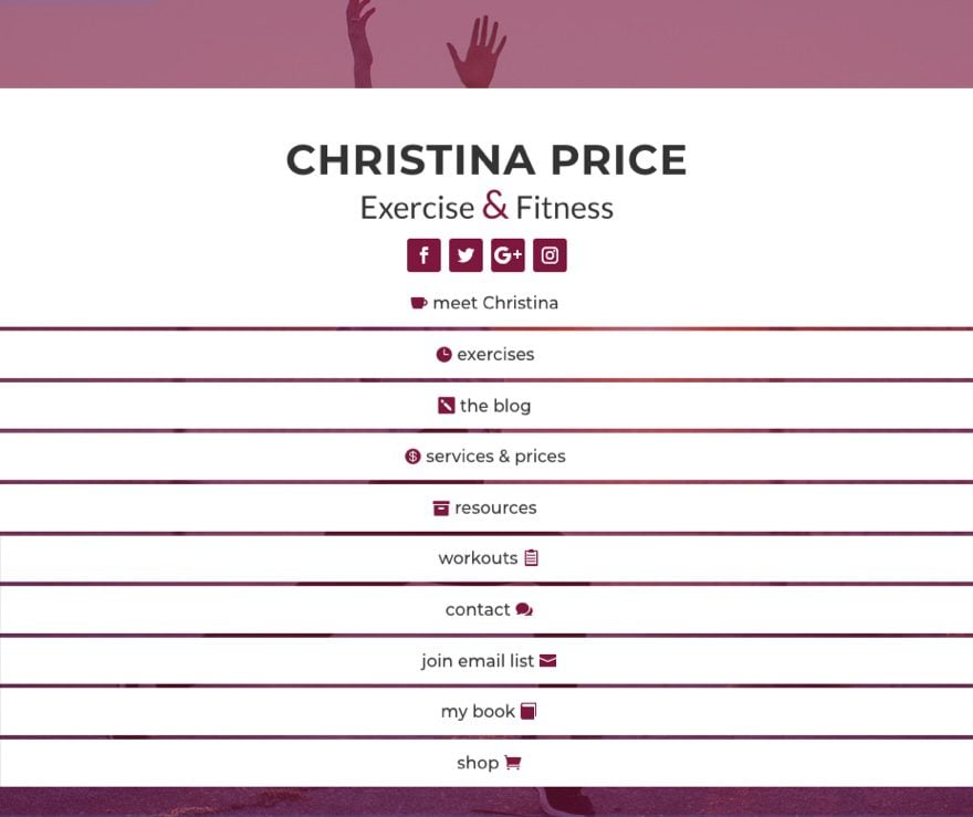
Advanced Solution: Change column order on Mobile
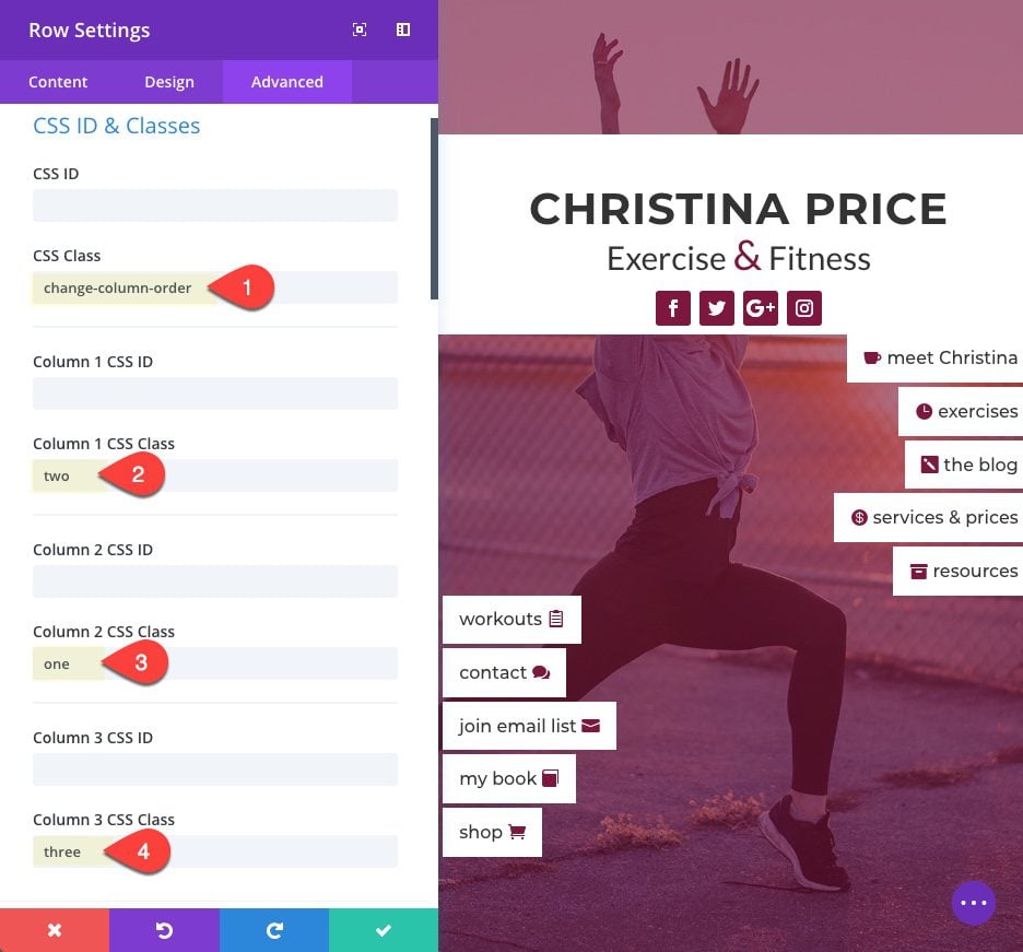
If you want to change the column order on mobile so that the title section (currently in the second or middle column) displays at the top (or first in order), you can add a few lines of custom CSS.
Open the main settings menu at the bottom of the visual builder and then click the page settings button. Then enter the following in the Custom CSS input box:
@media (max-width:980px) {
/*** class that will wrap row in a flex box ***/
.change-column-order {
  display: -webkit-box;
  display: -moz-box;
  display: -ms-flexbox;
  display: -webkit-flex;
  display: flex;
  -webkit-flex-wrap: wrap; /* Safari 6.1+ */
  flex-wrap: wrap;

}
/*** custom classes that will designate the order of columns in the flex box row ***/
.one {
     -webkit-order: 1;
     order: 1;
  }
.two {
     -webkit-order: 2;
     order: 2;
  }
.three {
     -webkit-order: 3;
     order: 3;
  }
/*** changes buttons to full width and centers button text ***/
.change-column-order .et_pb_button {
      display:block;
      text-align: center !important;
  }
}
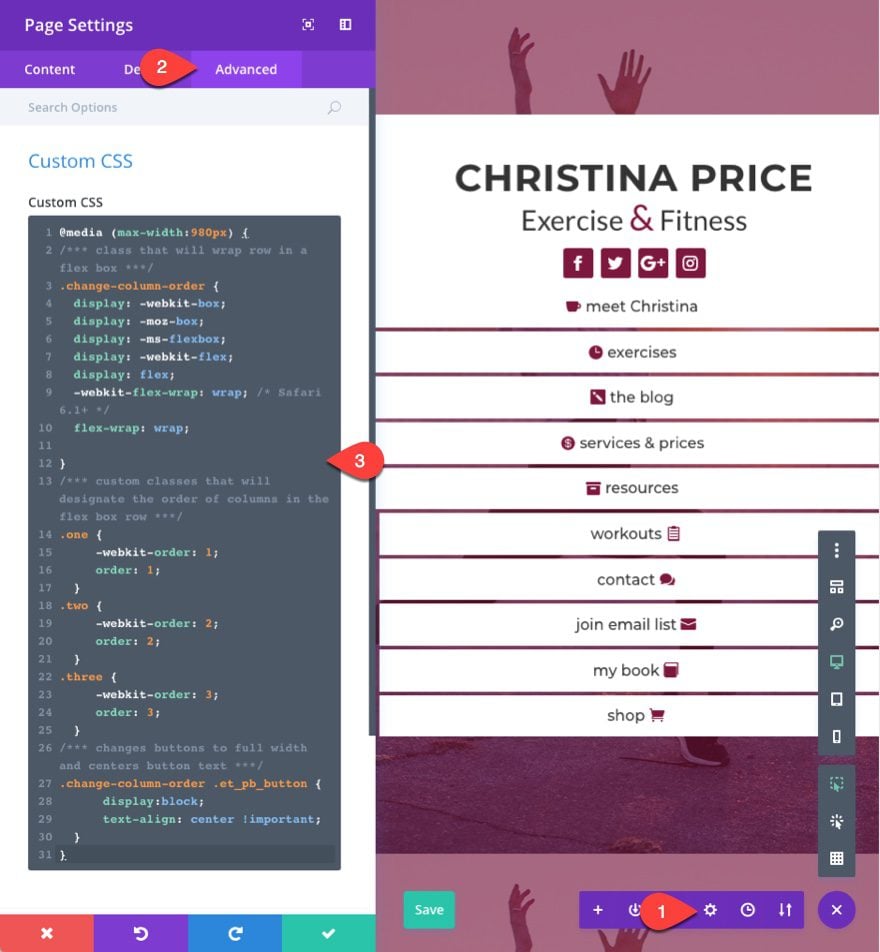
This css reorders the columns and changes your buttons so that they span the fullwidth of the column with the text centered. This method for changing the column stacking order on mobile does come in handy.
Now go to your row settings, under the advanced tab, and add the class “change-column-order” to the CSS Class input box. Then add “one” to the Column 2 CSS Class input box, add “two” to the Column 1 CSS Class input box, and add “three” to the Column 3 CSS Class input box.
You may have to add 4px margin to the top right column button on tablet and smartphone so that the separation is consistent.
Here is the final result.
Final Thoughts
This custom navigation header design can be a unique alternative to a traditional navigation menu. It is not meant as a replacement for your primary navigation. In fact, this would work really well as a sub navigation for blog categories or something similar.
I hope the responsive fallbacks aren’t too problematic and the solutions offered will be helpful.
I look forward to hearing from you in the comments about other ideas on how to use this design and any other thoughts or questions you may have.
Cheers!
The post How to Design a Creative Navigation Header with Divi appeared first on Elegant Themes Blog.