Creating page designs that interact isn’t always an easy task. Besides focusing on user experience, design principles and design trends, you also need to create something that matches your company branding and mesmerizes your visitors at first glance.
If you search our blog, you’ll find a ton of creative ways to approach your web design using Divi and Divi’s versatile built-in options. Today, we’re adding another creative approach to that list. We’ll show you how to creatively overlap row borders to create a stunning design. We’re making sure we have the same type of design on all screen sizes.
Let’s get to it!
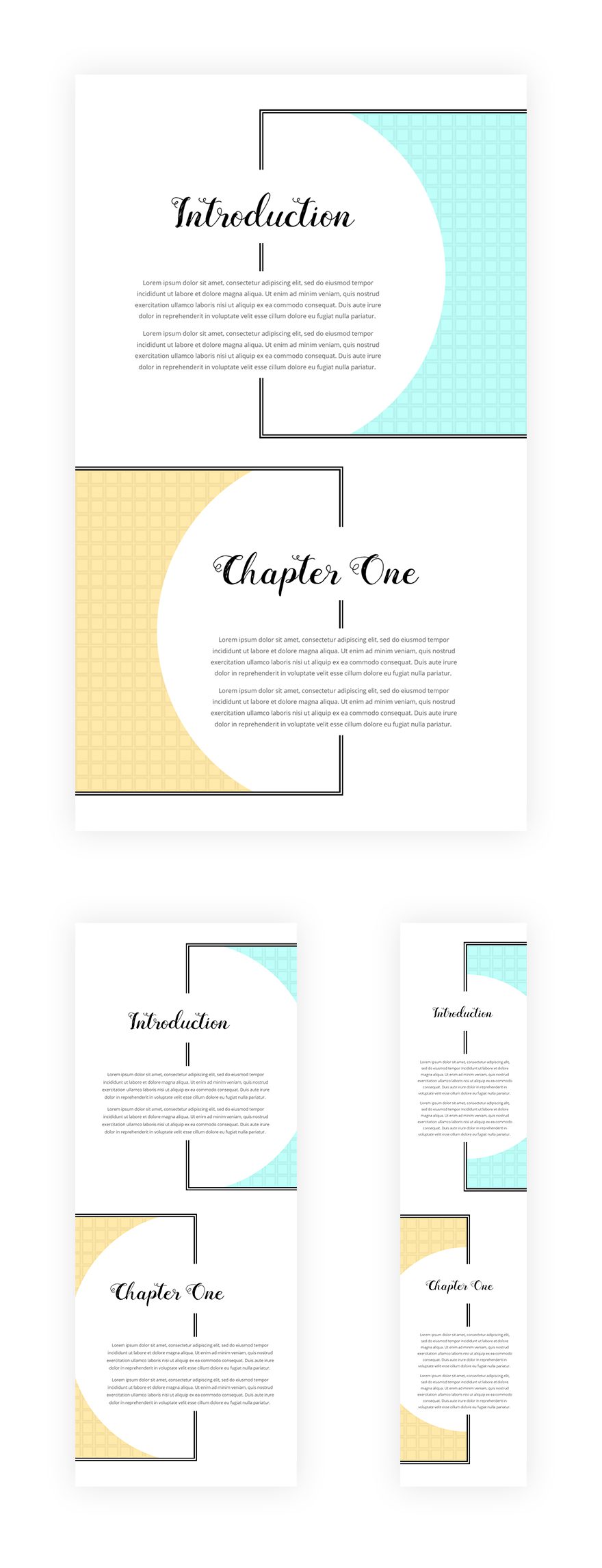
Preview
We’ll create an example from scratch but before we dive into it, let’s take a look at the end result on different screen sizes.
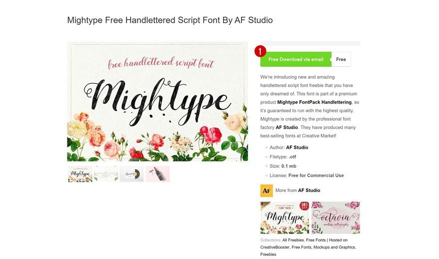
Download Free Mightype Font
The first thing you’ll need to do is download the free Mightype hand-lettered font by AF studio. Go to the following link and enable the free download via email.
Add New Section
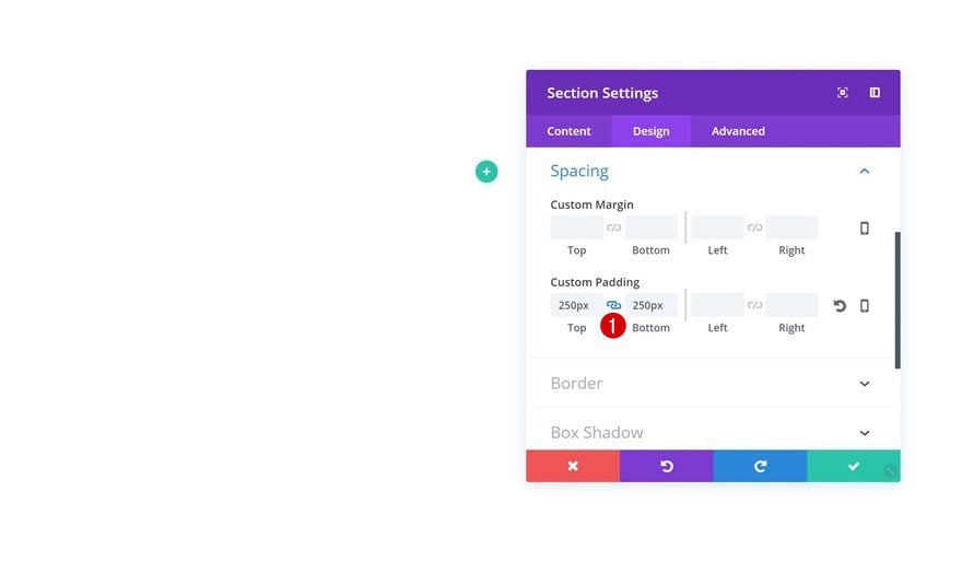
Spacing
Once you’ve downloaded the free font mentioned in the previous step, you can go ahead and create a new page. After you do so, enable the Visual Builder, open the first section of your new page and add some custom padding:
- Top Padding: 250px
- Bottom Padding: 250px
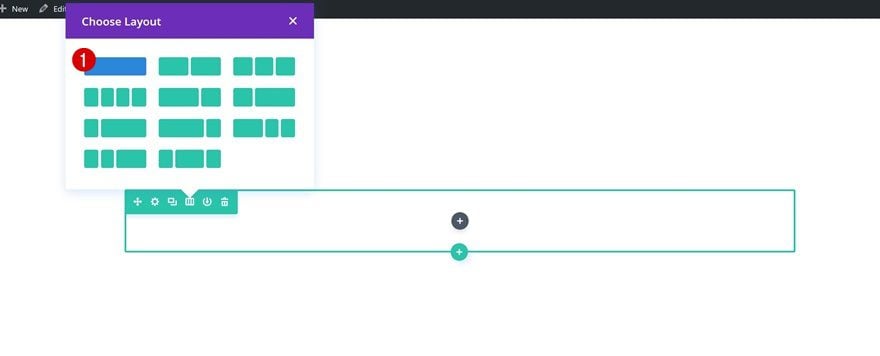
Add New Row
Column Structure
We’ll need two rows in total. We’ll start with the first one and clone it afterwards once it’s done. Add a new row to your section using the following column structure:
Column 1 Gradient Background
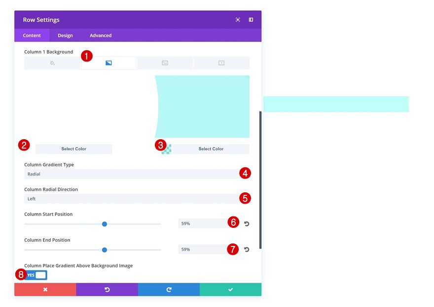
Without adding any modules yet, open your row settings and add the following column 1 gradient background:
- Color 1: #ffffff
- Color 2: rgba(0,255,233,0.25)
- Column Gradient Type: Radial
- Column Radial Direction: Left
- Column Start Position: 59%
- Column End Position: 59%
- Column Place Gradient Above Background Image: Yes
Column 1 Background Pattern
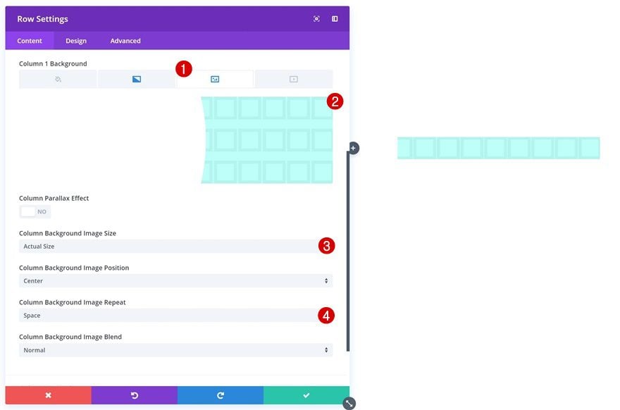
Continue by saving the following pattern to your computer and uploading it as your column 1 background image:

Once you’ve uploaded the pattern, make use of the following background image settings:
- Column Background Image Size: Actual Size
- Column Background Image Repeat: Space
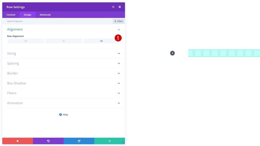
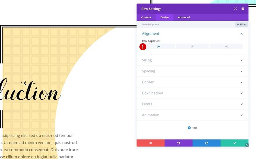
Row Alignment
Enable right Row Alignment as well.
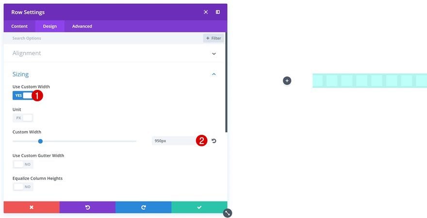
Sizing
We’re also using some custom Sizing settings for this row:
- Use Custom Width: Yes
- Custom Width: 950px
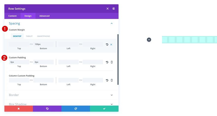
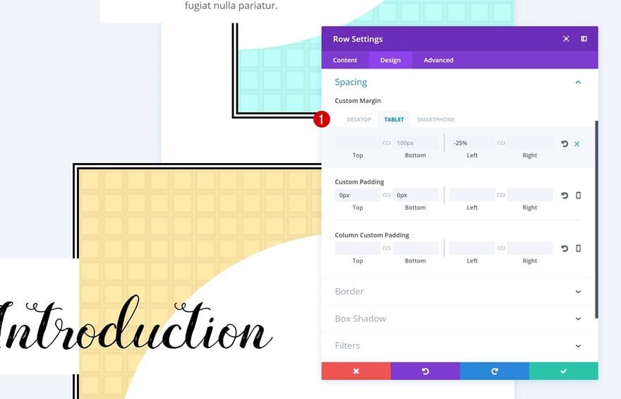
Spacing
These are the Spacing values you need to add next:
- Bottom Margin: 100px
- Right Margin: -30px (Tablet & Phone)
- Top Padding: 0px
- Bottom Padding: 0px
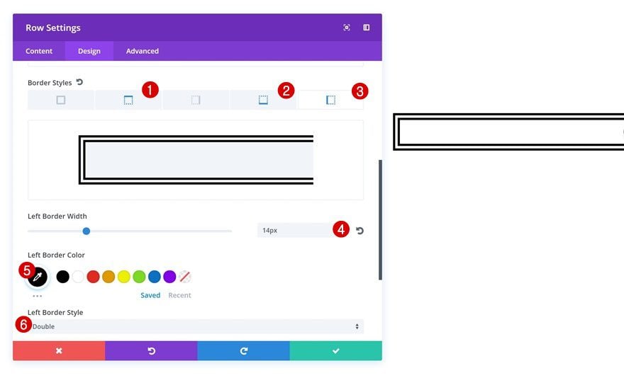
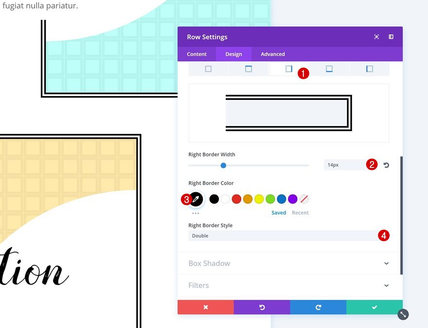
Border
Last but not least, add a border to the top, left and bottom of your row:
- Border Width: 14px
- Border Color: #000000
- Left Border Style: Double
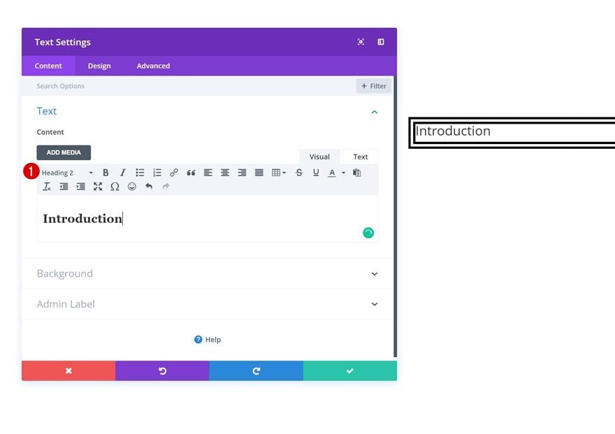
Add Title Text Module
Add H2 Copy
We can now start adding our modules! Add a title Text Module and make sure your copy is H2.
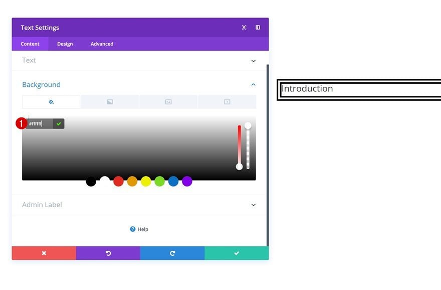
Background Color
We’re going to interrupt the left border of our row by adding a white background color to the Text Module.
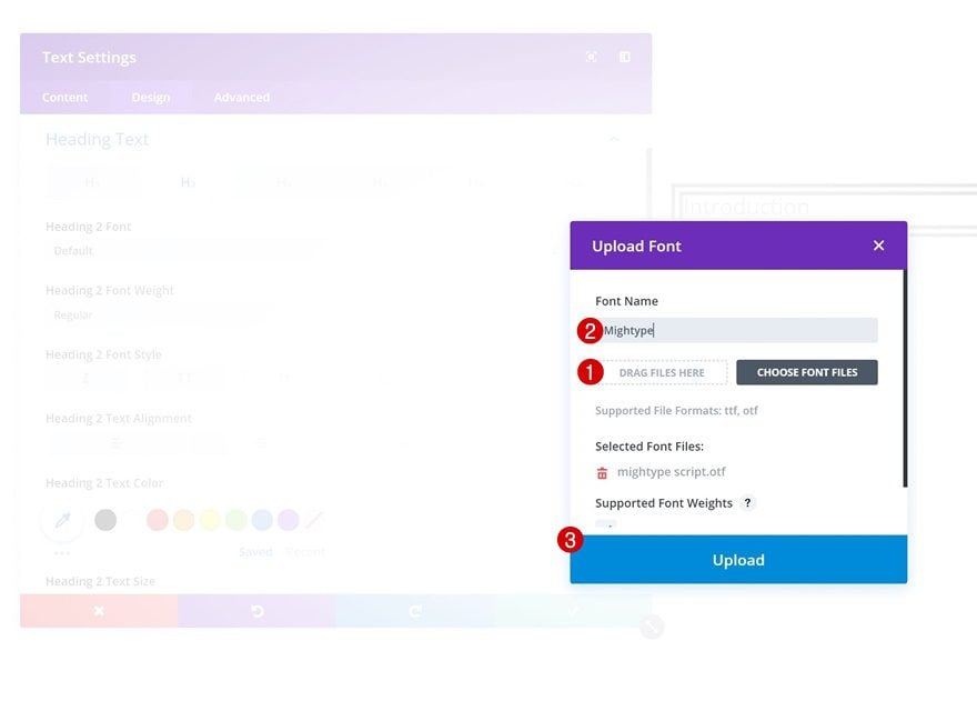
Upload Mightype Font
Locate the Mightype font on your computer next and upload it to your font library by clicking on the upload button in your list of fonts.
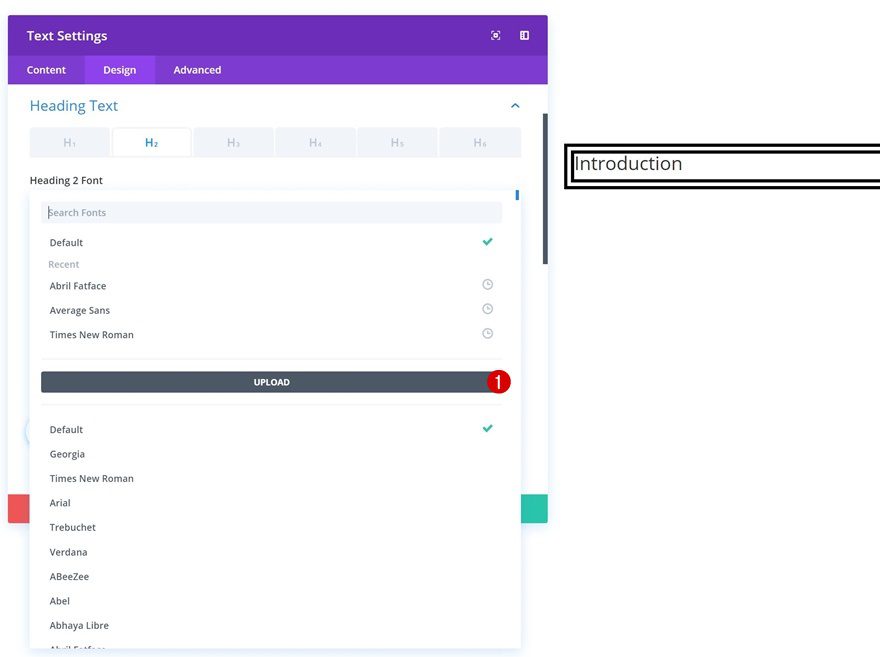
Select the Mightype font file, give your font a name and upload it to your font library.
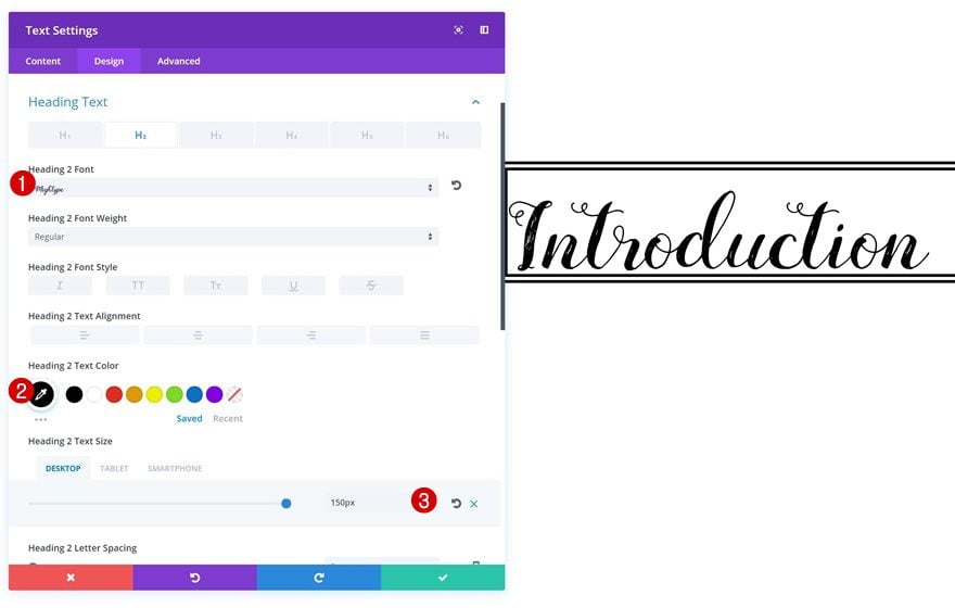
H2 Text Settings
Once you’ve added the new font, go ahead and make some other changes to the H2 text settings:
- Heading 2 Font: Mightype
- Heading Text Color: #000000
- Heading 2 Text Size: 150px (Desktop), 100px (Tablet), 60px (Phone)
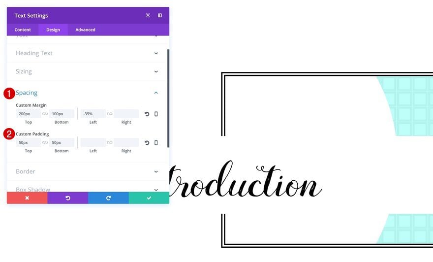
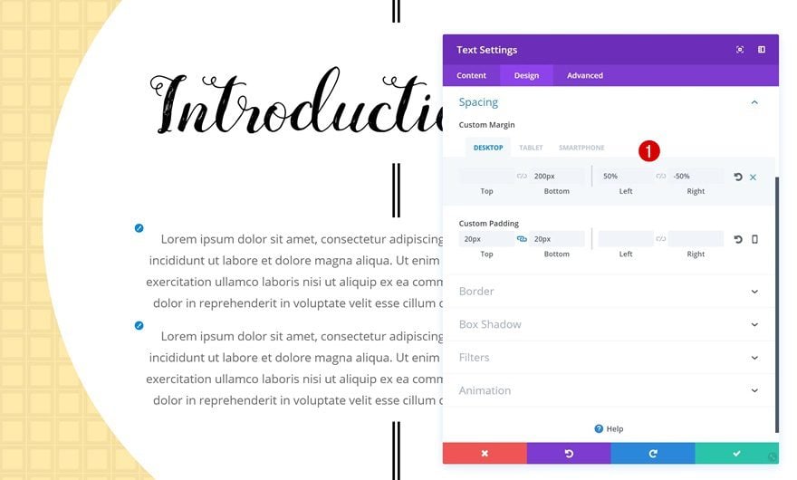
Spacing
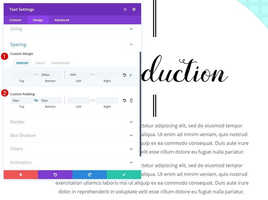
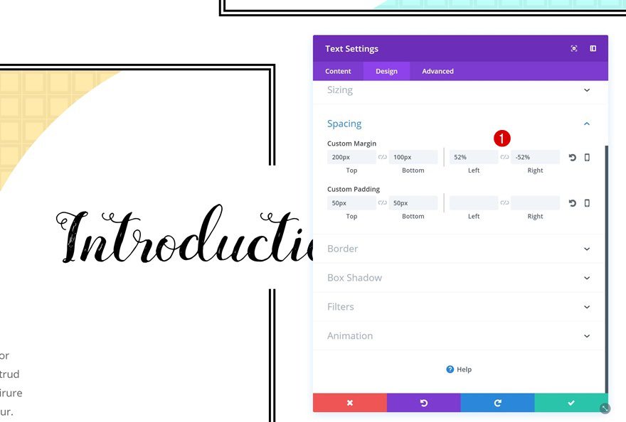
For each one of the modules you want to overlap the row borders, you’ll need to add negative margin. This negative margin will only affect the module in question, not the row it was placed in. The negative margin you’ll need to add depends on the number of characters that are used in your copy.
- Top Margin: 200px
- Bottom Margin: 100px
- Left Margin: -35%
- Top Padding: 50px
- Bottom Padding: 50px
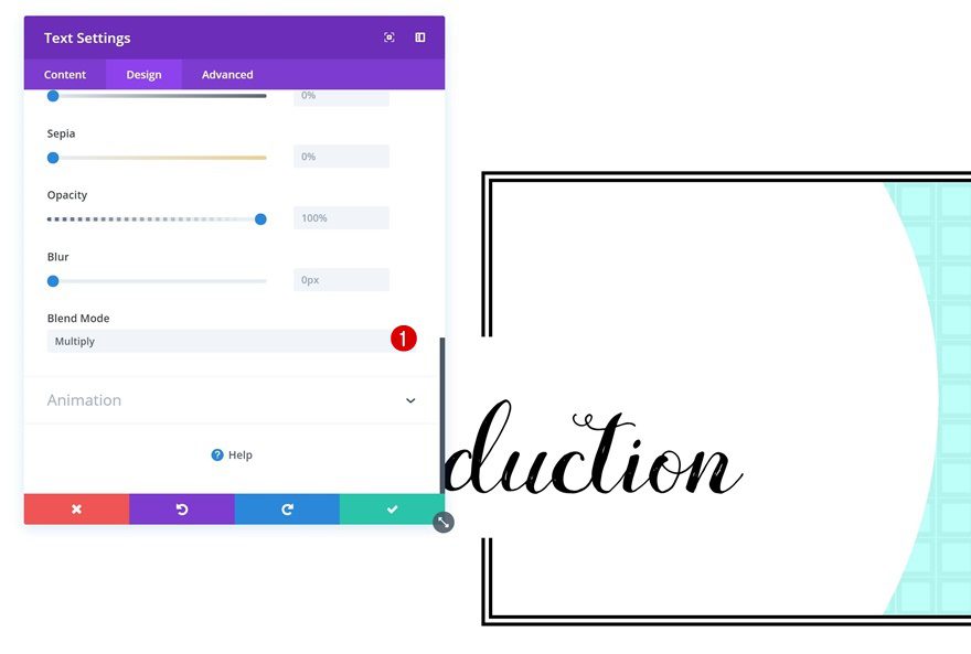
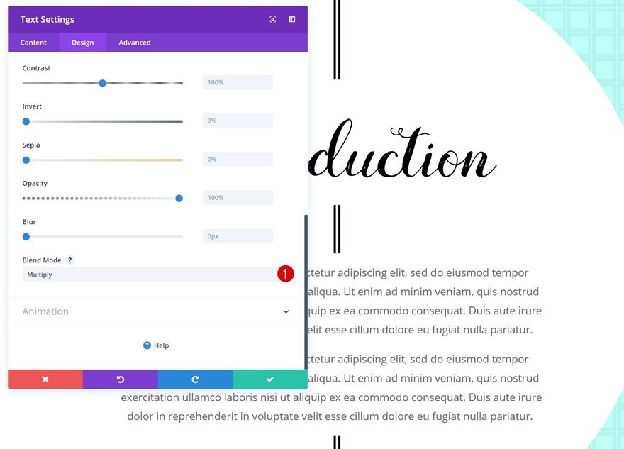
Blend Mode
And to make sure the Text Module background color only affects the border of the row, and not the column 1 background, enable the ‘Multiply’ Blend Mode in the Filters settings.
Add Description Text Module
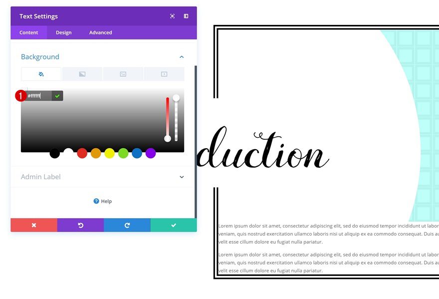
Background Color
Right below the title Text Module, go ahead and add a description Text Module with a white background color.
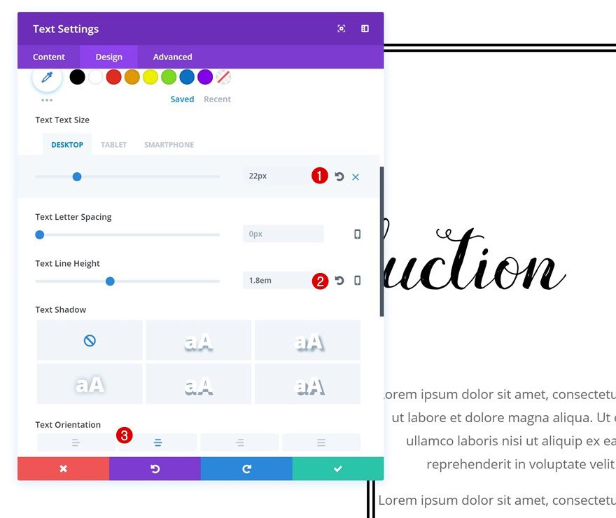
Text Settings
Go to the text settings and make some changes:
- Text Size: 22px (Desktop), 18px (Tablet), 15px (Phone)
- Text Line Height: 1.8em
- Text Orientation: Center
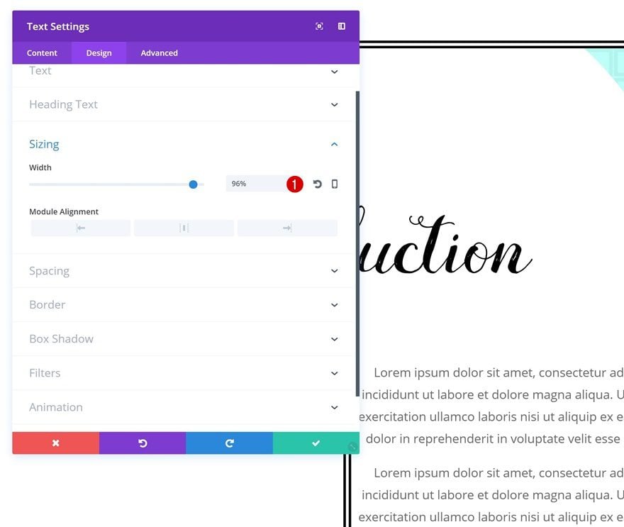
Sizing
Decrease the Sizing of this Text Module to ‘96%’ next.
Spacing
Add some spacing as well:
- Bottom Margin: 200px
- Left Margin: -50%
- Top Padding: 20px
- Bottom Padding: 20px
Blend Mode
And use the ‘Multiply’ Blend Mode here too.
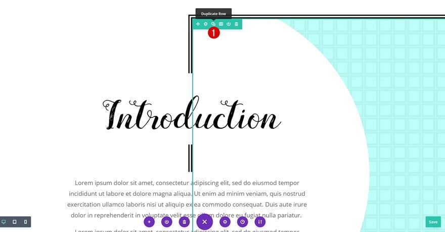
Clone Row
We’re done modifying the first row! Let’s create the same result but on the other side of the page. To save ourselves some time, we’ll clone the row we already have and make some changes along the way.
Change Row Settings
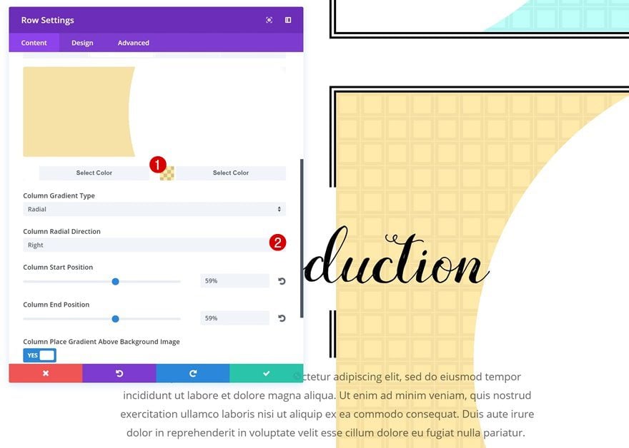
Column 1 Gradient Background
The first thing you’ll need to change is the column 1 gradient background:
- Color 2: rgba(255,187,0,0.33)
- Column Radial Direction: Right
Row Alignment
We want the row to appear on the other side, that’s why we’ll choose left Row Alignment.
Spacing
We’re adjusting the Spacing settings as well:
- Left Margin: -25% (Tablet & Phone)
Border
Remove the left border that’s been applied to your row and apply it to the right side instead:
- Right Border Width: 14px
- Right Border Color: #000000
- Right Border Style: Double
Change Title Text Module Settings
Spacing
Change the Spacing settings of your title Text Module next:
- Left Margin: 52% (Desktop & Tablet), 58% (Phone)
- Right Margin: -52% (Desktop & Tablet), 58% (Phone)
Change Description Text Settings
Spacing
Last but not least, the description Text Module needs some other Spacing values as well:
- Left Margin: 50%
- Right Margin: -50%
Preview
Now that we’ve gone through all the different steps, let’s take a final look at the end result on different screen sizes.
Final Thoughts
Overlapping row borders using Divi’s built-in options can bring your website the customization and personalization you might have been looking for. In this post, we’ve shown you exactly how to do that. We’ve recreated a beautiful example from scratch. This example looks great on all screen sizes and we’ve used Divi’s built-in options only! If you have any questions or suggestions, make sure you leave a comment in the comment section below!
The post How to Horizontally Overlap Row Borders with Divi appeared first on Elegant Themes Blog.

