
With the arrival of Divi’s new section dividers, creating stunning websites without extra CSS code has become incredibly easy. By default, section dividers are used to create elegant transitions for your sections. But you can use section dividers for other purposes as well. In a previous post, How to Create Background Textures with Divi’s Section Dividers, for instance, we’ve used sections to enhance the design of the section itself instead of focusing on transitioning to other sections.
In this two-part post, we’re going to show you another great approach to using section dividers, without having to use any additional CSS code. In this first part, we’re going to focus on applying section dividers indirectly to rows. In the second part, we’ll add section dividers to modules.
Let’s get to it!
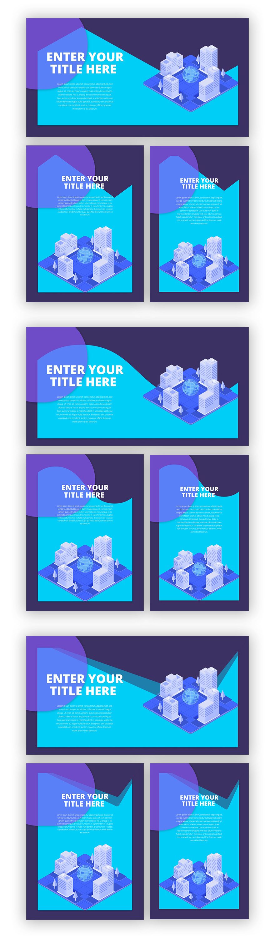
Preview
Before we dive into the tutorial, let’s take a quick look at what you can visually expect from this blog post tutorial on different screen sizes:
Approach
- We’ll use three different section divider styles that you can apply to this design
- We’ll start off by creating the entire design from scratch, afterwards you can choose the divider style of your choice and apply it
- As mentioned in the title and introduction, we’re indirectly applying these section dividers to our row
- This means that the section dividers will still be part of the section settings, not the row settings
- However, to make it seem like it’s part of the row, we’ll use the same color for both the divider and the section background color
- That way, the divider will blend in with the background color at the beginning of your section and will only show once in contact with another background color
- We’ll also make the divider appear underneath section content
- This will ensure that the height of your divider doesn’t overlap modules you’ve added to your row
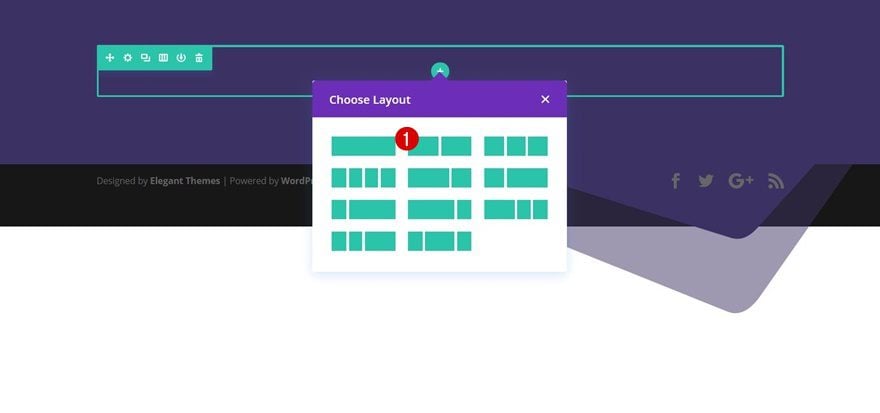
Add New Section
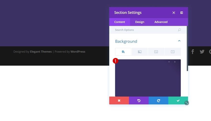
Background Color
Create a new page or open an existing one. Then, add a regular section, open its settings and add ‘#3c3163’ as the background color.
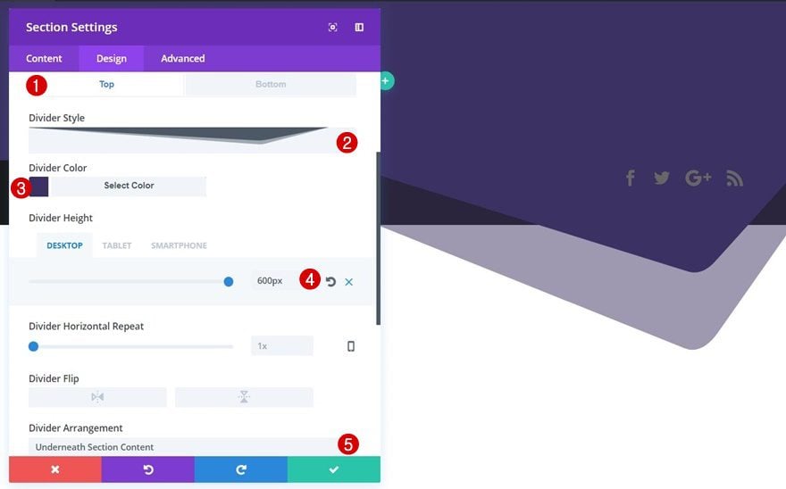
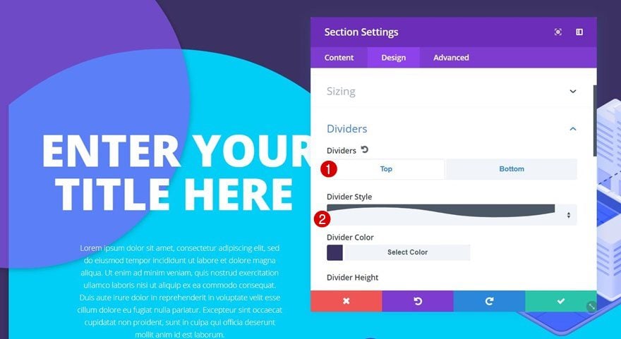
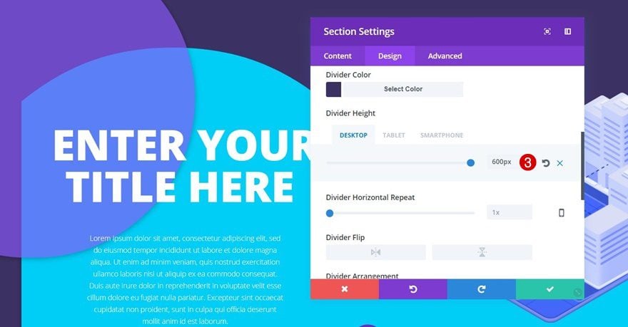
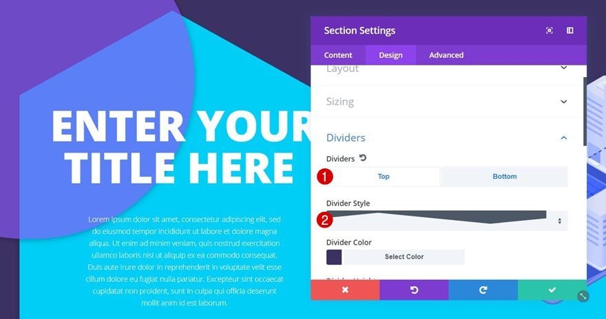
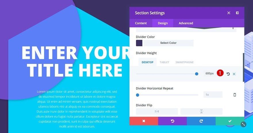
Top Divider #1
Open the Design tab next and add a top divider to your section. As mentioned in the ‘Approach’ section of this post, you’ll definitely need to use the same color for the divider and the section background. That way, the divider won’t show up in the section itself:
- Divider Style: Find in List
- Divider Height: 600px (Desktop), 400px (Tablet & Phone)
- Divider Arrangement: Underneath Section Content
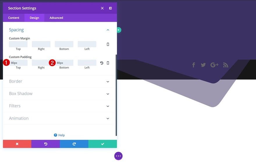
Spacing
We’ll also add some additional space at the top and bottom of our section by adding ’80px’ to these padding options.
Add New Row
Column Structure
Once you’re done modifying the section settings, add a row with the following column structure:
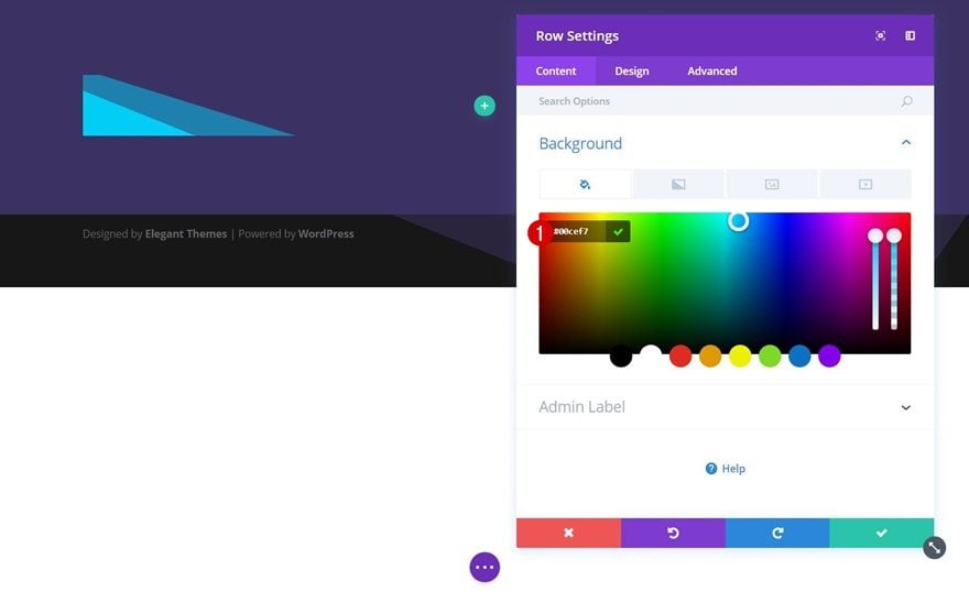
Background Color
Before adding any modules, open the row settings and use ‘#00cef7’ as the background color.
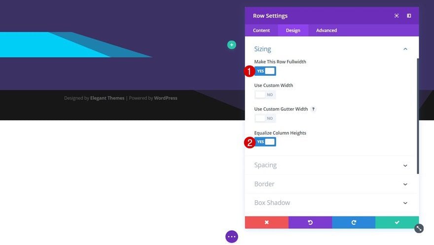
Sizing
Go to the Design tab next and apply the following changes to the Sizing subcategory:
- Make This Row Fullwidth: Yes
- Equalize Column Heights: Yes
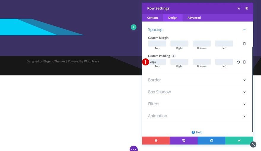
Spacing
We’ll need a top padding of ’28px’ as well.
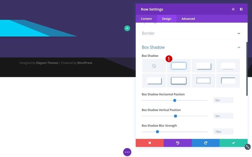
Box Shadow
And lastly, we’ll enable the first box shadow option without modifying any of its default settings (but of course, you can, if you want to).
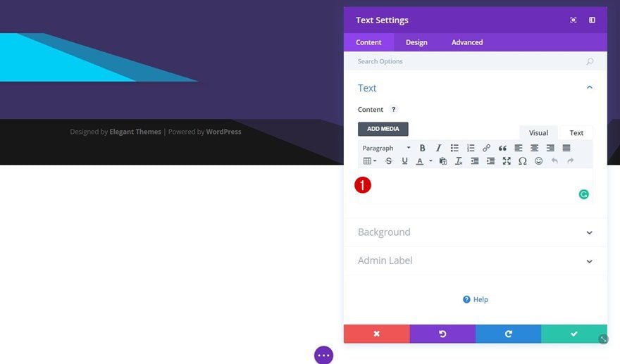
Add Empty Text Module for Circle to Column 1
Leave Content Box Empty
We can now start adding our modules. We’ll start with column 1. The first module we’ll need to add is an empty Text Module.
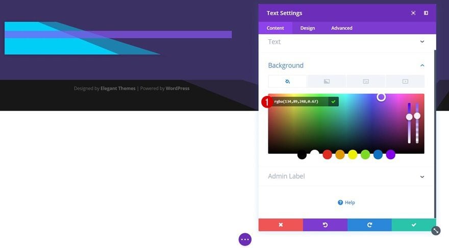
Background Color
Open the Background subcategory and use ‘rgba(134,89,248,0.67)’ as the background color of this module.
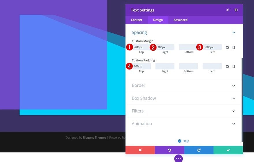
Spacing
We’ll make this empty Text Module overlap our row and section by using some custom margin. We’ll also create a shape using top padding:
- Top Margin: -200px
- Right Margin: 300px
- Left Margin: -300px
- Top Padding: 600px
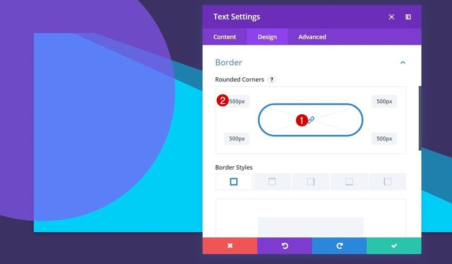
Border
To create a circle out of this shape, we’ll also need to add ‘500px’ to each one of the corners within the Border subcategory.
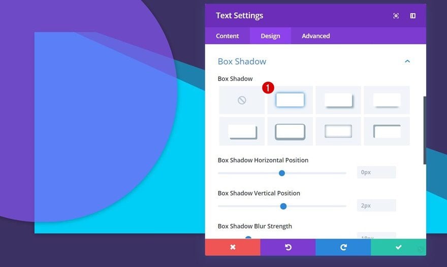
Box Shadow
Lastly, and totally depending on your preference, you can add a box shadow to this shape as well.
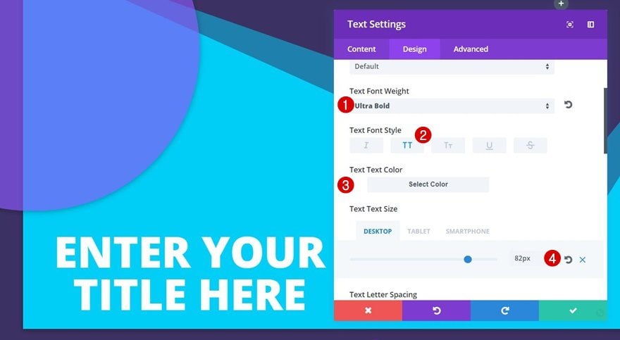
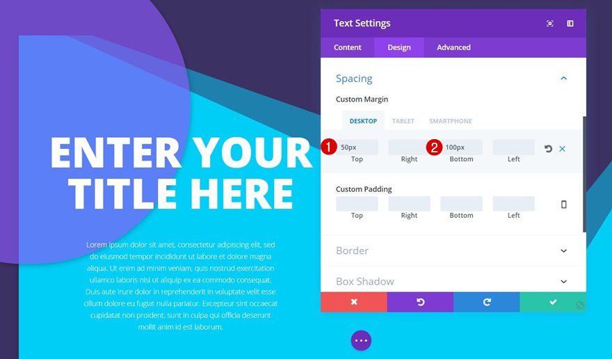
Add Title Text Module to Column 1
Text Settings
Right below the empty Text Module, add another Text Module containing your title. Go to the Design tab and apply the following text settings to it:
- Text Font Weight: Ultra Bold
- Text Font Style: Uppercase
- Text Color: #ffffff
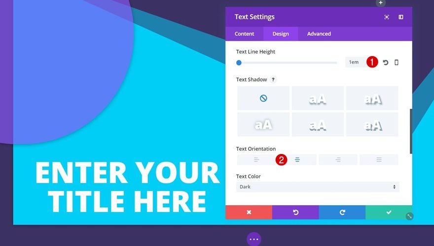
- Text Size: 82px (Desktop), 60px (Tablet), 45px (Phone)
- Text Line Height: 1em
- Text Orientation: Center
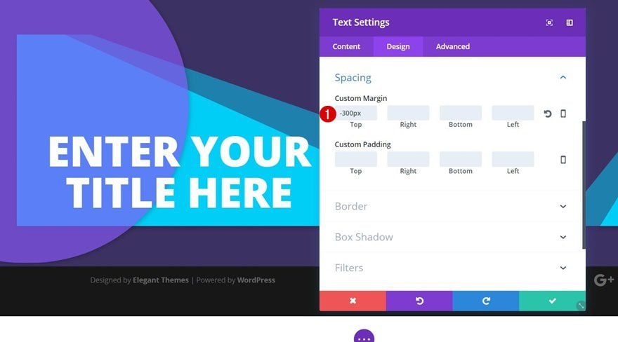
Spacing
We’ll overlap this module and the previous empty Text Module by adding ‘-300px’ to the top margin of the title Text Module.
Add Description Text Module to Column 1
Text Settings
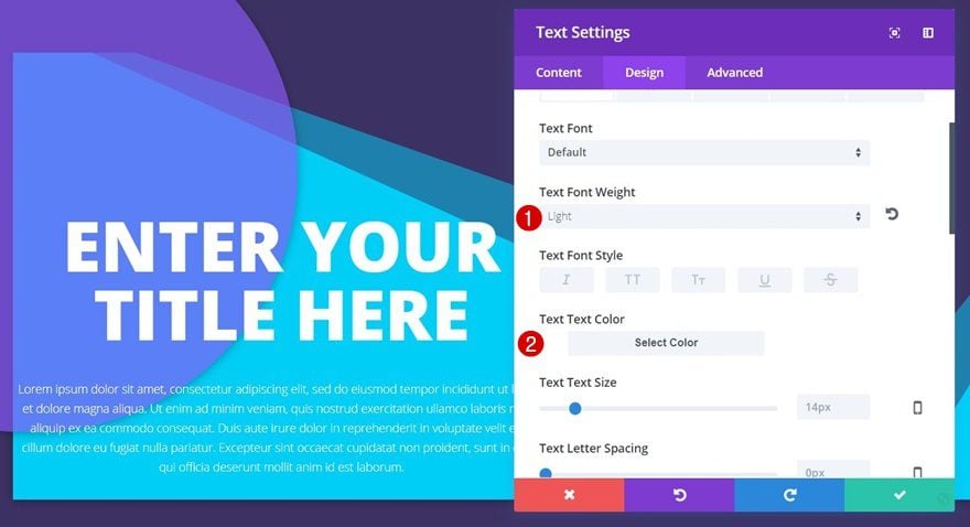
Right below the title Text Module, we’ll add a description Text Module as well containing the following text settings:
- Text Font Weight: Light
- Text Color: #ffffff
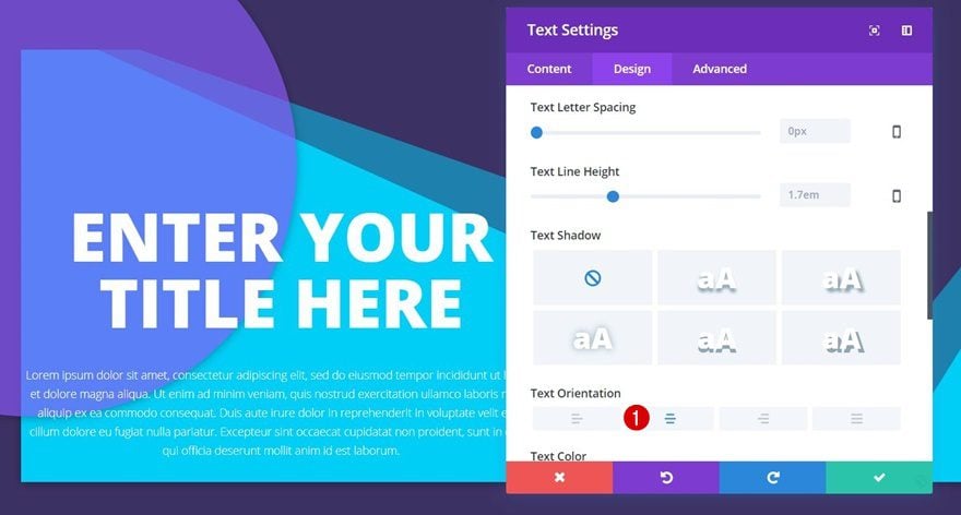
- Text Orientation: Center
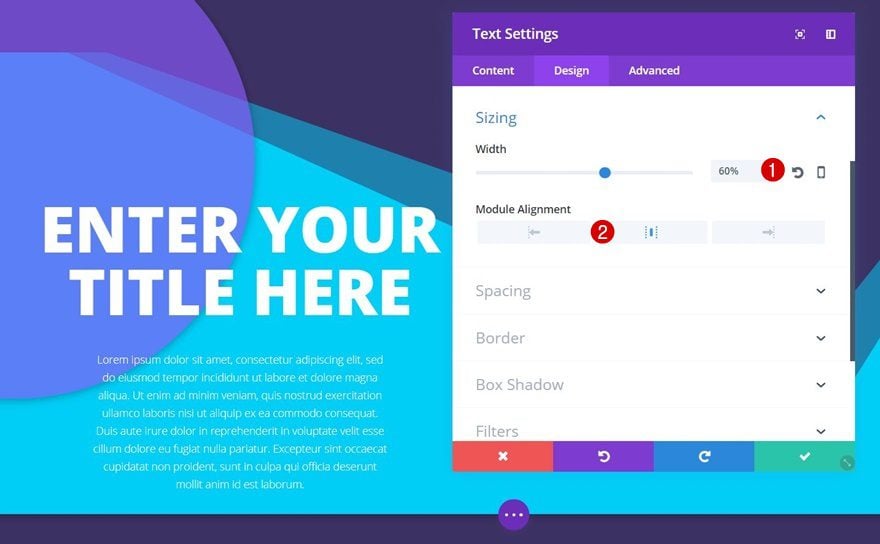
Sizing
We’ll adjust the Width of this description Module to ‘60%’ and use center Module Alignment as well.
Spacing
Lastly, to create some space between the title Text Module, the row and the description Text Module, we’ll add the following custom margin:
- Top Margin: 50px
- Bottom Margin: 100px (Desktop), 0px (Tablet & Phone)
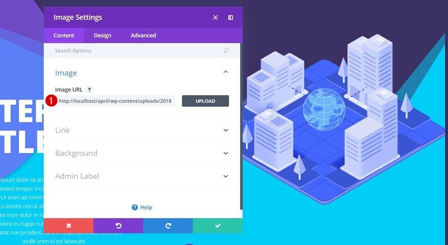
Add Image Module to Column 2
Upload Image
We have all the modules we need in the first column. The only module we need in the second one is an Image Module. We’ve uploaded a free illustration which you can download by going to the Digital Payments Layout Pack blog post, scrolling down and downloading the image assets.
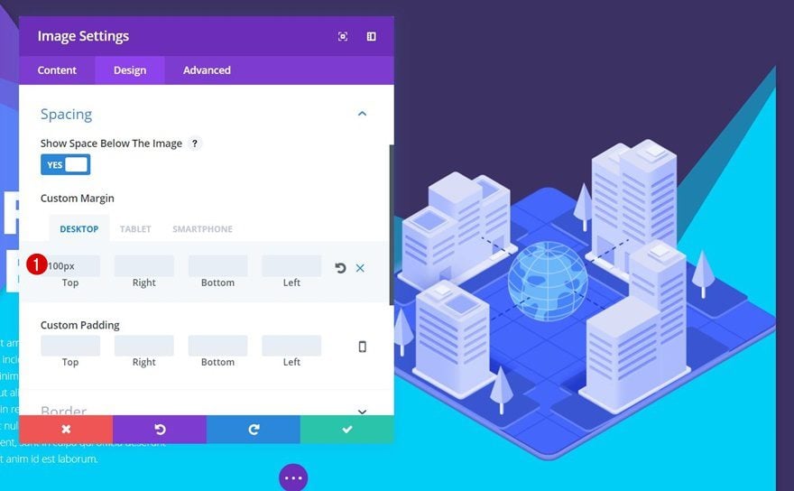
Spacing
We’ll add some top padding to this Image Module as well:
- Top Margin: 100px (Desktop), 50px (Tablet & Phone)
Section Divider #2
Change Divider Style
You can apply any section divider to this design. In the preview, we’ve shared three top dividers that look great on this design. The first one was applied during the general steps of this post, but you can easily change it to the following divider style:
Change Divider Height
However, the Divider Height for different screen sizes changes slightly for it:
- Divider Height: 600px (Desktop), 500px (Tablet), 400px (Phone)
Result

Section Divider #3
Change Divider Style
Did you prefer the third divider style that was shown in the preview section? Find it within your Divider Styles:
Change Divider Height
This divider contains the following Divider Height on different screen sizes:
- Divider Height: 600px (Desktop), 500px (Tablet), 400px (Phone)
Result

Preview
Now that we’ve gone through all the steps, and applied different section divider styles to it, let’s take a final look at the result on different screen sizes:
Final Thoughts
That was it for part one of this post! We’ve created a stunning result using section dividers in an indirect way. The main thing to remember about this post is that you’ll need to use the same color for your divider and section background. In the second part of this post, we’ll show you how to indirectly apply section dividers to modules. If you have any questions or suggestions, make sure you leave a comment in the comment section below!
The post How to Indirectly Apply Divi Section Dividers to Your Design (Part 1: Rows) appeared first on Elegant Themes Blog.