People are spending more time consuming online content than ever before. That’s why content marketing is a universal way to boost brand awareness and expand customer reach. Yet, when designing content marketing strategies, marketers rarely consider web design. Here’s what they fail to realize – consistency is key to successful branding. And consistency goes far beyond the product, content, and messaging.
All branding elements must stay consistent for your brand to be recognized across the web. This means that, ideally, your content marketing efforts should be consistent with your website design. But how do you make sure your content and your website stay on the same wavelength? The answer is by taking into account the following aspects.
Brand tone
Your brand’s tone of voice refers to the language, wording, and style you use to communicate your offering, brand’s values, and personality. Quite confusingly, the term “tone of voice” refers to written content rather than oral communications.
Regardless of whether you’ve decided to build a website before the content or vice versa, you should ensure both of them match your brand’s tone of voice.
Each brand’s tone of voice is unique and should reflect everything behind the brand. Thus, the tone of voice of a respectful law firm will differ from the tone of voice of an eCommerce store for teenagers. When designing your brand’s tone of voice, consider your target audience, brand personality, values, and core principles.
In general, there are four dimensions of the brand’s tone of voice:
- Formal (gives a sense of professionalism and authority) vs. Casual (gives a sense of personality and friendliness)
- Serious (inspires credibility and trust) vs. Funny (facilitates social sharing)
- Respectful (gives a sense of friendliness and sociability) vs. Cheeky (gives a sense of your advantage over competitors)
- Matter-of-fact (gives a feeling of transparency and simplicity) vs. Enthusiastic (gives a sense of willingness to help)
If your brand is more business-like and strict, your website and content have to relay that. If you aim to be closer to your customer, you can create more personalized content and a website that is more colorful and creative.
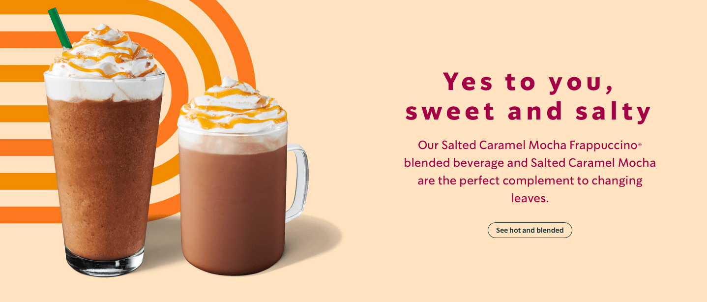
Here is a great example of how Starbucks uses an informal conversational tone of voice on its website. If you go through the website, you will notice that all content pieces match in how they talk directly to a customer. This is done to provoke a sense of personality and friendliness.
Image source: Starbucks.com
User experience
Both your website design and content marketing pieces have a dramatic impact on the way your audience perceives and interacts with your brand. That’s why user experience (UX) is another aspect that should stay consistent throughout your content and your website.
If you don’t have an eye for design yourself there are numerous platforms where you can hire web designers to create layouts that are visually appealing, functional, and intuitive to use. Apply the same principles to your content marketing efforts. All of your content pieces would be well-formatted, scrollable, and easy to browse.
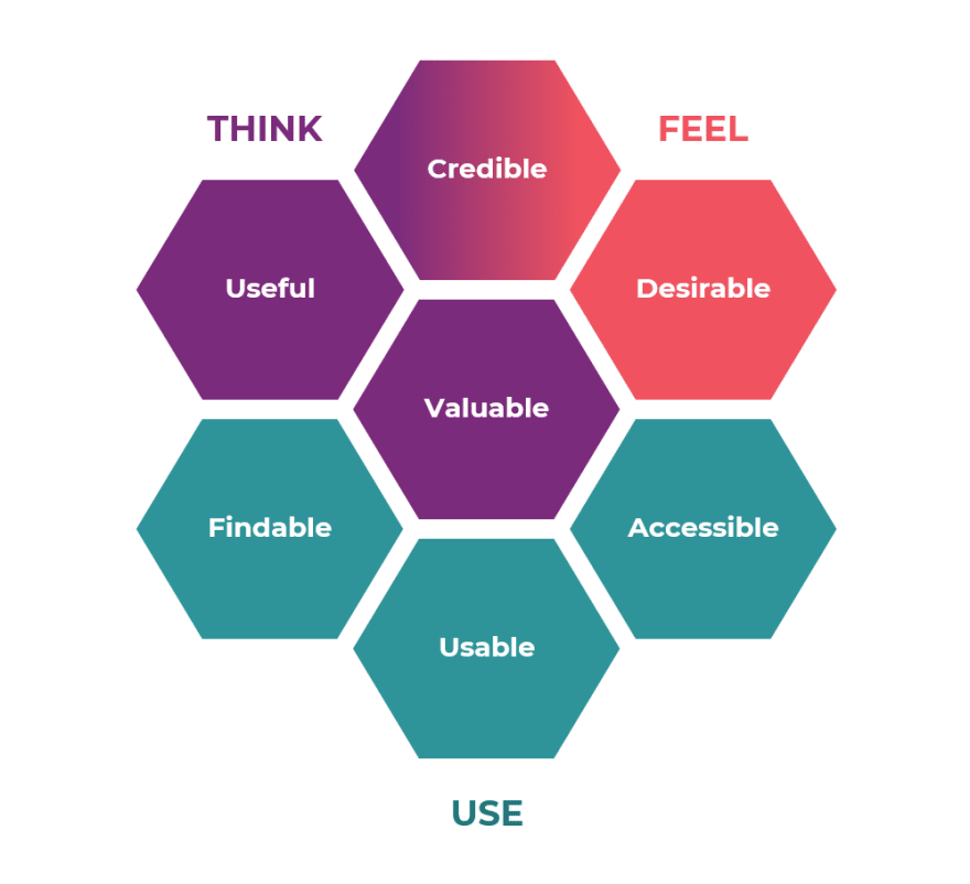
Image source: cloudinary
When matching your content and web design to improve UX, it’s useful to think from the perspective of the UX honeycomb. The UX honeycomb framework suggests that in order to achieve meaningful and valuable user experience, the web design and content you create must be:
- Useful. Your web design and content should be relevant, original, and fulfill the need.
- Desirable. Design elements and content pieces should be designed to evoke emotion and appreciation.
- Accessible. Your web design and content pieces should be accessible to persons with disabilities.
- Usable. Your web design and content should be easy to consume and discover.
- Findable. Your website and content should be easy to navigate on the web.
- Credible. Your web design and content should inspire trust and be reliable.
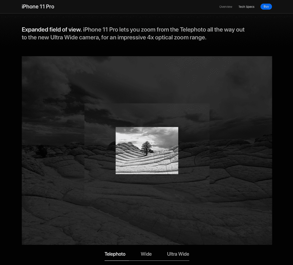
Apple is well-known for its minimalistic UX. Even though all design solutions are not complex, they perfectly match the six criteria suggested by the UX honeycomb framework.
Image source: apple.com
Visual Style
The visual appeal is the first thing website visitors experience when exploring your brand online. The first impression can either make or break your relationships with future clients. That’s why your content marketing pieces and website design should be more or less visually vibrant.
Make sure that your website layout and graphic design pieces match the typography and style of your content. Also, the visual appeal of your website should match your brand’s tone of voice. More formal and matter-of-fact websites should use standard typography, stock pictures, and graphs to illustrate key points. On the contrary, if you’re a less formal and more casual brand, include colorful illustrations and GIFs to spice things up.
Keep in mind that consumers tend to make emotional purchases and then rationalize their buying decisions. That’s why it’s important to know how to connect with your audience emotionally. The visual component is crucial to emotionally appeal to your customers and prompt them to buy more.
Use these tips to connect with your audience emotionally through visuals:
- Infuse the feeling of urgency by adding timers and expiration dates on good deals and pop-ups.
- Channel desire in your visual content to capture the audience’s interest.
- Create visuals that inspire delight. If consistent with your brand’s tone of voice, use the humor appeal in your visual content.
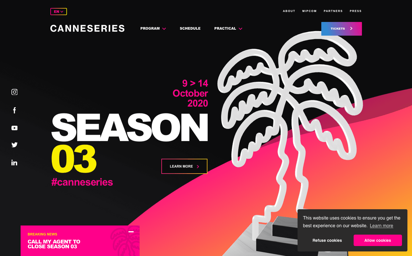
Here is a great example of how the Canne Series’ website uses typography and visuals to appeal to the target audience.
image source: canneseries.com/en/
Pop-ups to introduce more content
Pop-ups are the place where web design meets your content marketing efforts for moving users down the content marketing pipeline.
Studies show that pop-ups with context have higher conversion rates. In fact, context can increase the conversion rate of your pop-ups by as much as 40%. That’s why you want to create pop-ups that are relevant to users and contextual. For example, you can introduce a pop-up that offers to download an e-book or take part in a webinar when a person is reading a relevant piece of content.
Additionally, you can match your content marketing and web design to create the following pop-up alternatives:
- Notification ads
- Stationary banner ads
- Stationary sidebar ads
- Exit pop-ups
- Pop-unders
- Time-driven pop-ups
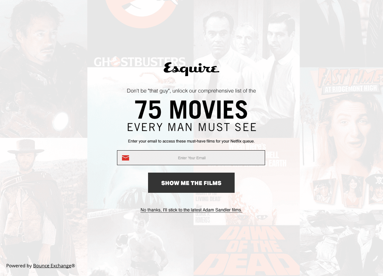
Esquire shows us a great example of how pop-ups should be done. This pop-up is great because it looks organic with other website content and helps the website collect emails for their newsletter.
Image source: Esquire.com
Conclusion
Companies across the globe increasingly turn to content marketing and inbound marketing to attract customers and build meaningful relationships. The success of your content and inbound marketing efforts largely depends on the quality of your content pieces. Yet, your contents’ compatibility with your web design is a crucial factor, though commonly overlooked.
By keeping your web design and content in sync, you can establish a strong brand image and ultimately achieve better results. Follow the listed tips to reach the perfect mix of content marketing and web design!
Featured Image via Micromaniac / shutterstock.com
The post How to Match Your Content Marketing to Your Website Design appeared first on Elegant Themes Blog.


