
Image masks are often used to add interesting shapes to images. They allow the image to peek through the shape, giving the page a unique design element. With Divi’s Gradient Builder, you don’t necessarily have to use masks to create shapes. Instead, you can use the Gradient Stops and settings to create them! In this post, we’ll look at how to shape your images with Divi’s Gradient Builder to help you add unique designs to your images.
Let’s get started.
Preview
First, let’s take a look at what we’ll build in this tutorial.
First Example – Circular Image Shape
Desktop
Tablet
Phone
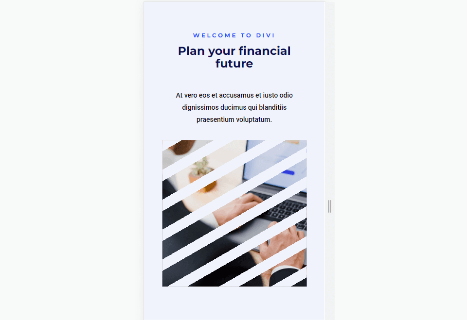
Second Example – Linear Image Shape
Desktop

Tablet
Phone
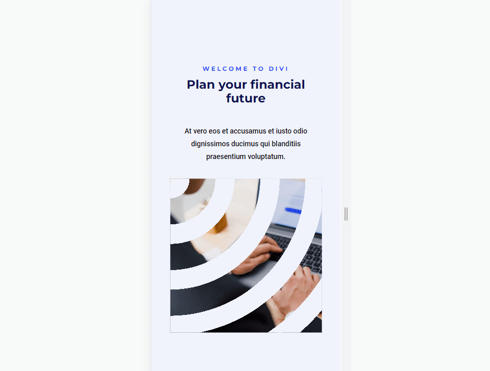
Third Example – Elliptical Image Shape
Desktop

Tablet

Phone
Fourth Example – Conical Image Shape
Desktop

Tablet

Phone
Create the Layout
First, let’s create the layout that we’ll use in all the examples. This layout can be used as a hero section. It will include a title and description on one side and the image on the other. We’ll then use that layout and image for the examples.
Customize the Section
First, create a new Divi page and customize the Section. Open the section’s settings and change the Background Color to #f0f3fb.
- Background Color: #f0f3fb
Next, go to the Design tab and add 10% Padding to the Top and Bottom. Close the settings.
- Padding: 10% Top, Bottom
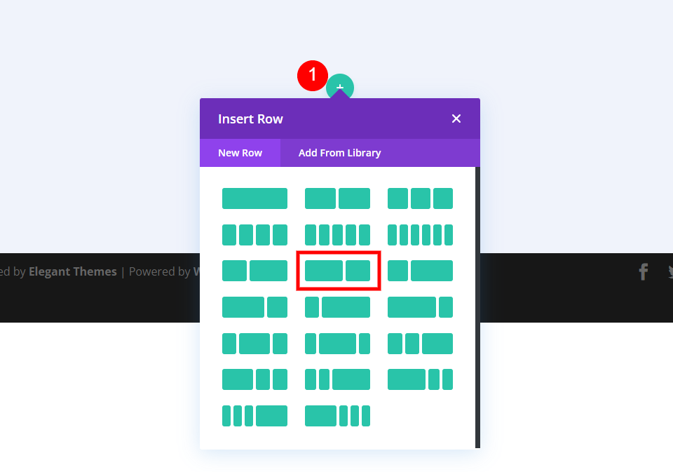
Add a Row
Next, add a Row with a 2/3 column and a 1/3 column.
- 2/3, 1/3 Row
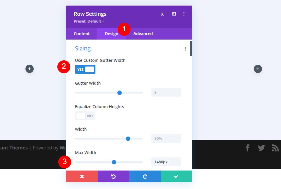
Go to its Design tab. Enable Use Custom Gutter Width and set the Max Width to 1480px.
- Use Custom Gutter Width: Yes
- Max Width: 1480px
First Column Settings
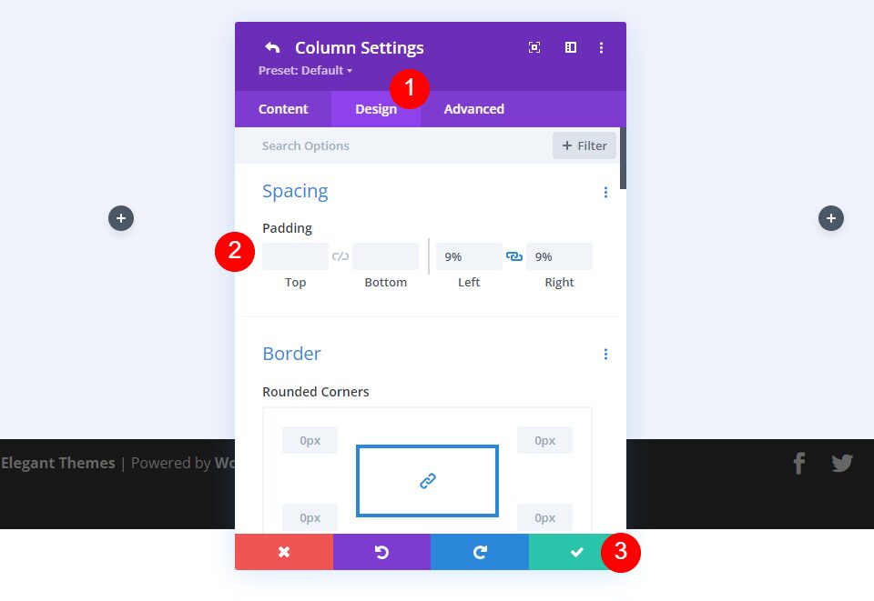
In the Row’s Content tab, open the settings for the Row’s first column, go to the Design tab and add 9% Padding to the Left and Right. Close the Column and Row settings.
- Padding: 9% Left, Right
First Text Module Settings
Next, add a Text Module to the left column.
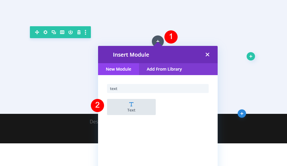
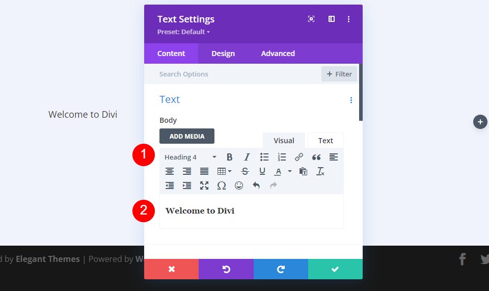
Select Heading 4 for the content text and add your body content.
- Heading: 4
- Body: Welcome to Divi
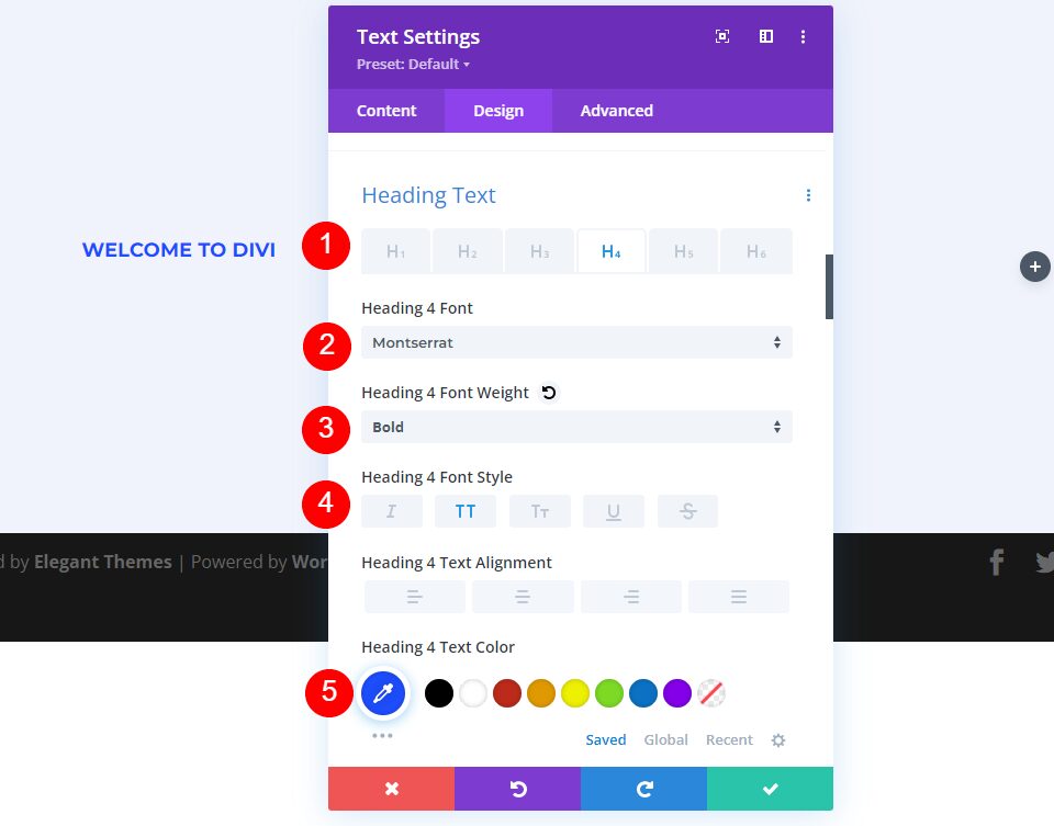
Next, go to the Design tab. Set the H4 Font to Montserrat, the Weight to bold, the Style to TT, and the Color to #1d4eff.
- Heading 4 Font: Montserrat
- Weight: Bold
- Style: TT
- Color: #1d4eff
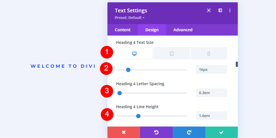
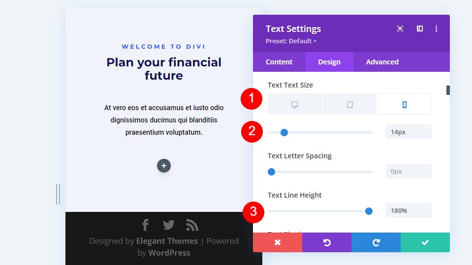
Set the desktop Font Size to 16px, the tablet size to 14px, and the phone size to 12px. Change the Letter Spacing to 0.3em and the Line Height to 1.6em.
- Size: 16px Desktop, 14px Tablet, 12px Phone
- Letter Spacing: 0.3em
- Line Height: 1.6em
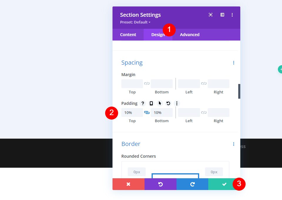
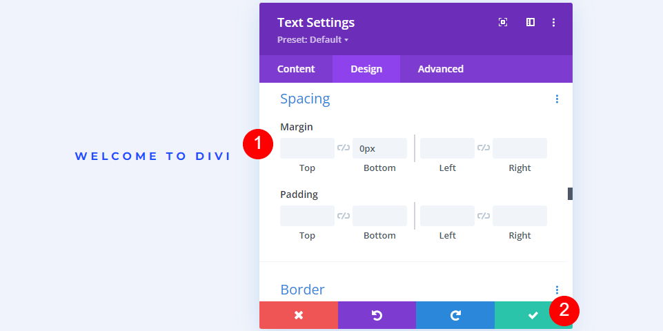
Scroll down to Spacing and change the Bottom Margin to 0px. Close the module.
- Margin: 0px Bottom
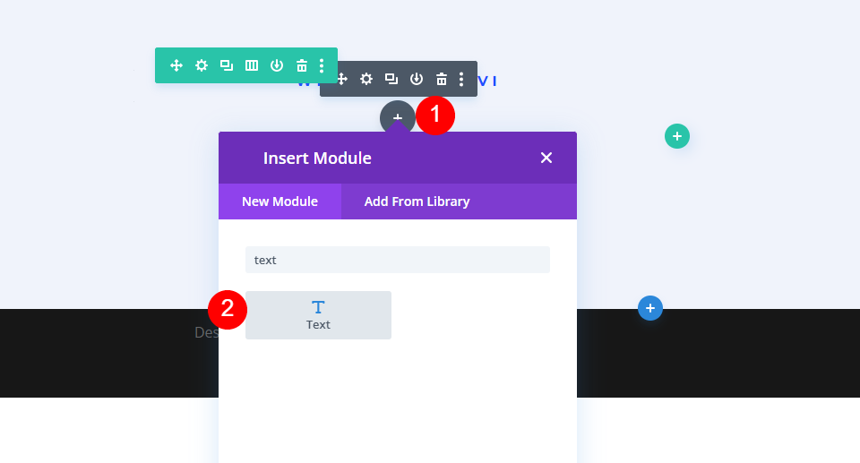
Second Text Module Settings
Next, add a Text Module under the first one.
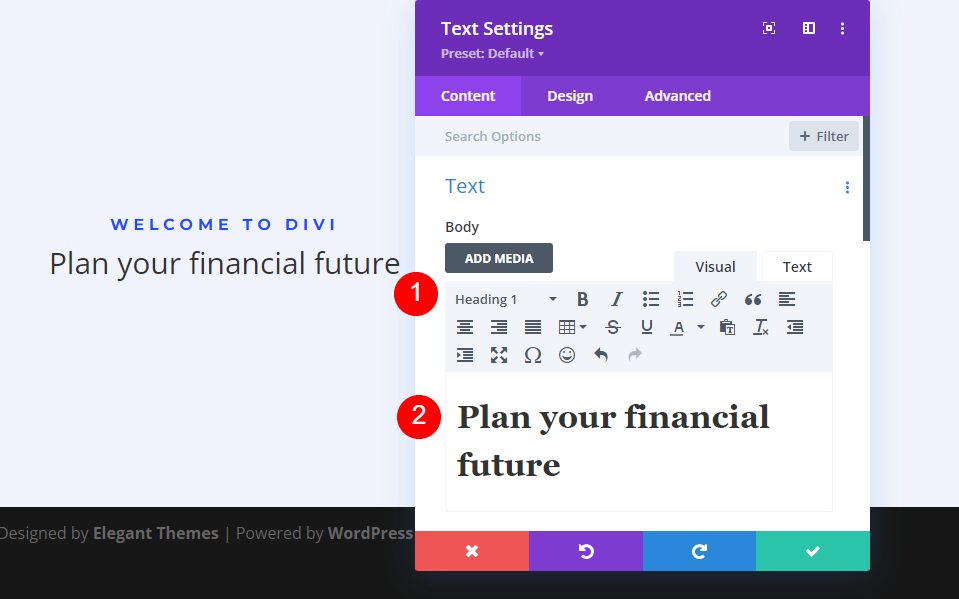
Set the text type to Heading 1 and add your body content.
- Heading: 1
- Body: Plan your financial future
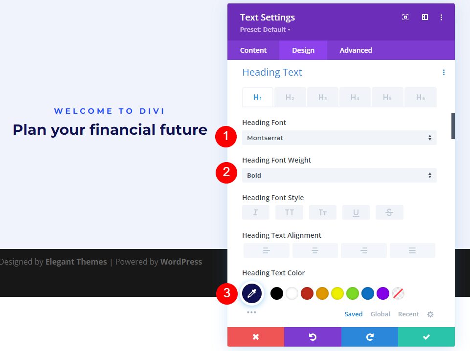
Next, select the Design tab. Change the Heading Font to Montserrat, the Weight to Bold, and the Color to #0f1154.
- Heading 1 Font: Montserrat
- Weight: Bold
- Color: #0f1154
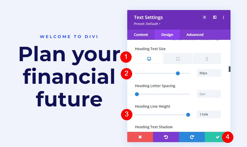
Set the Font Size to 80px for the desktops, 40px for tablets, and 24px for phones. Change the Line Height to 110%. Close the module.
- Size: 80px Desktop, 40px Tablet, 24px Phone
- Line Height: 110%
Third Text Module Settings
Next, add a Text Module under the second one.
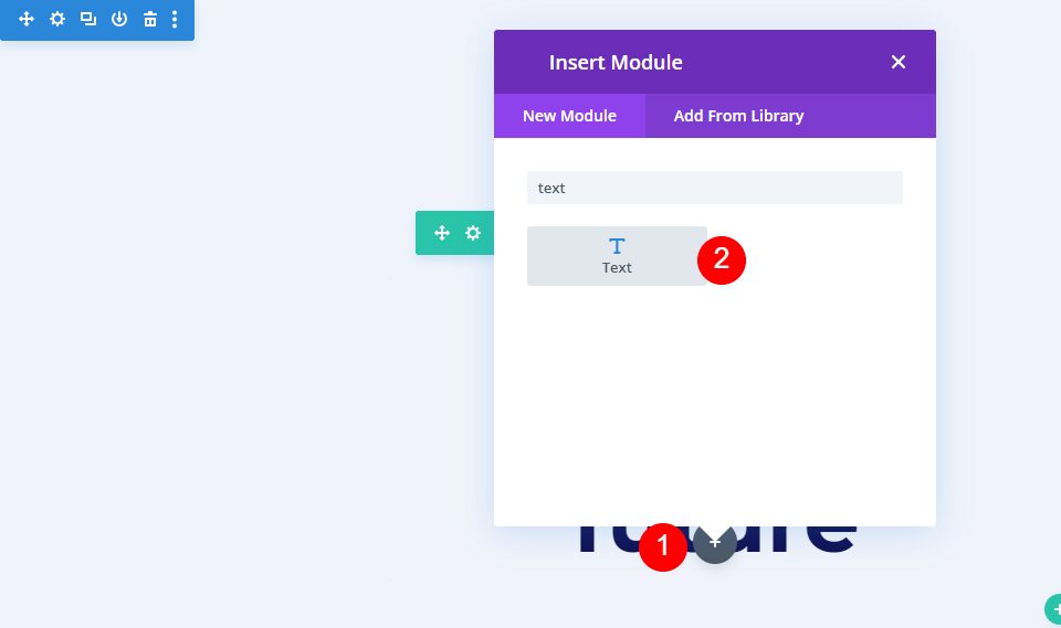
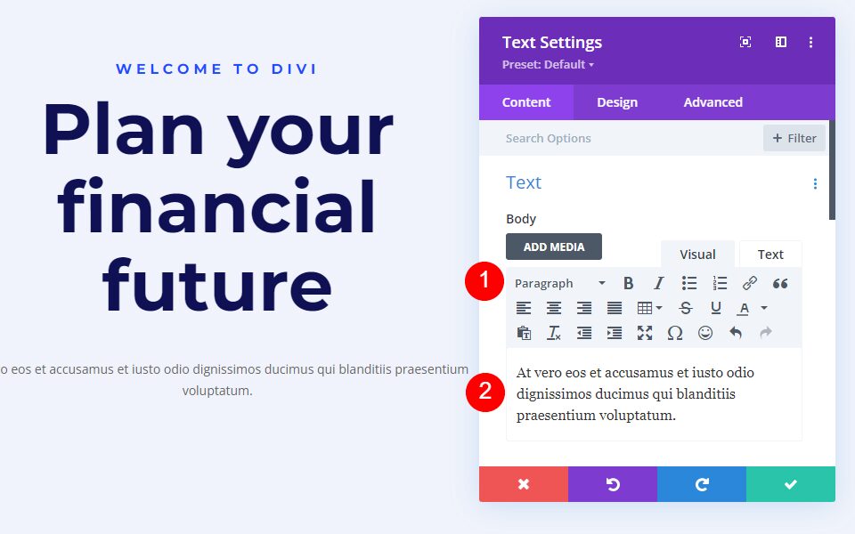
Leave the text type to Paragraph and add your body content.
- Heading: Paragraph
- Body: content
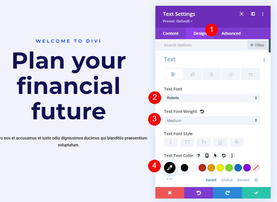
Next, go to the Design tab. Change the Text Font to Roboto, set the Weight to Medium, and the Color to black.
- Text Font: Roboto
- Weight: Medium
- Color: #000000
Change the Size for desktops and tablets to 18px, and phones to 14px. Set the Line Height to 180%.
- Size: 18px Desktop, 18px Tablet, 14px Phone
- Line Height: 180%
Finally, scroll down to Spacing and set the Bottom Margin to 0%. Close the module’s settings.
- Margin: 0px Bottom
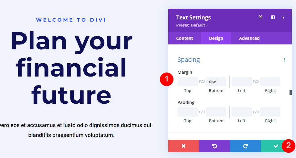
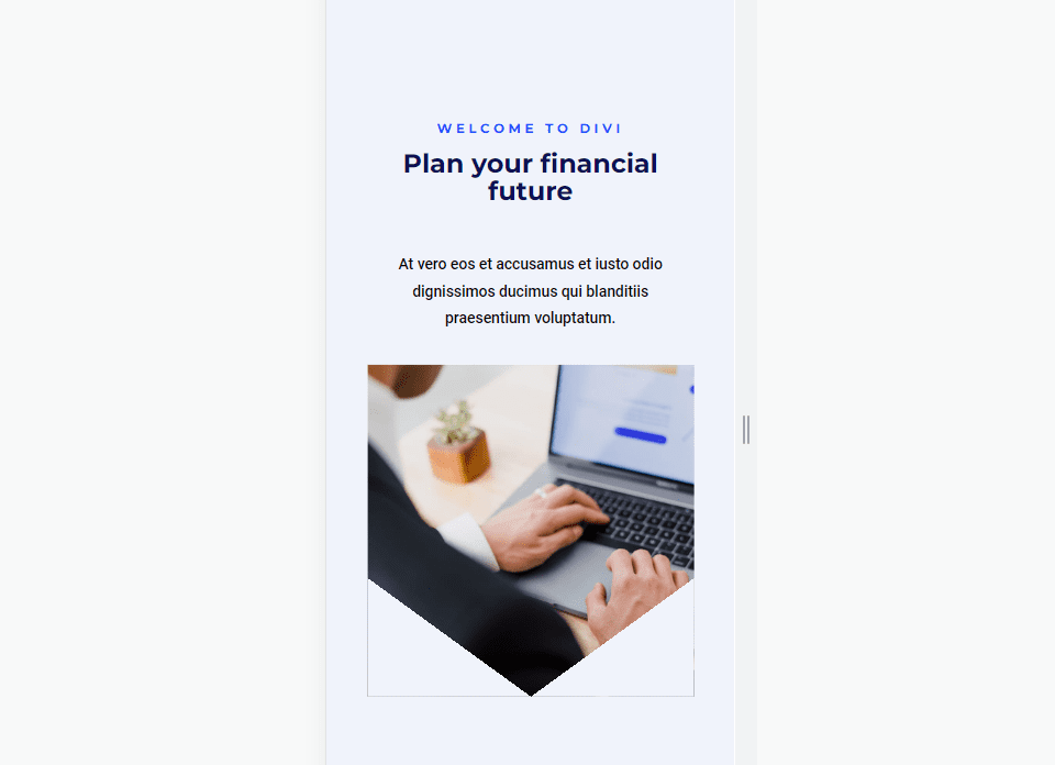
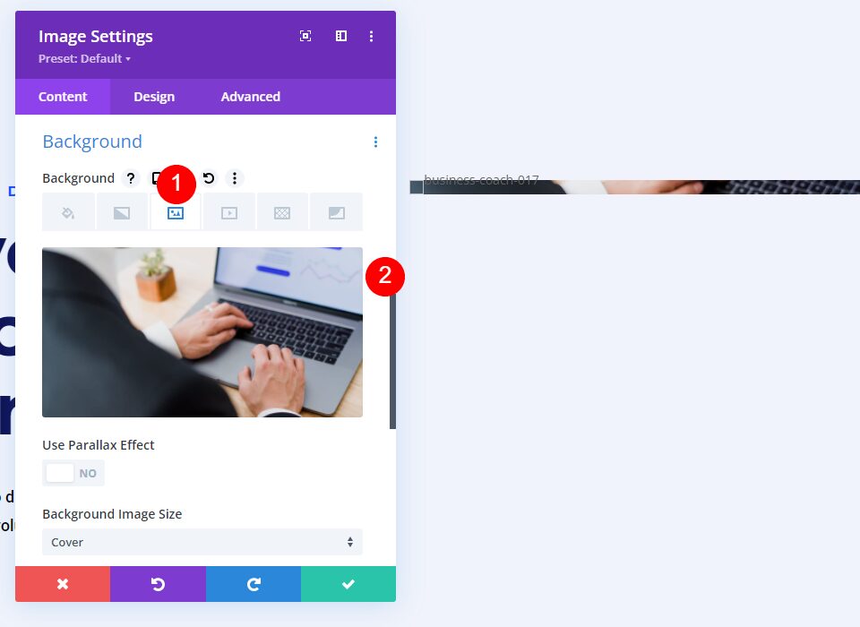
Image Module Settings
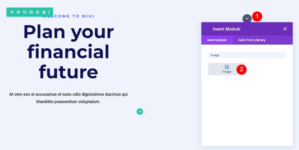
Now, add an Image Module to the column on the right.
First, delete the dummy image by clicking the trash can or the reset icon above the image.
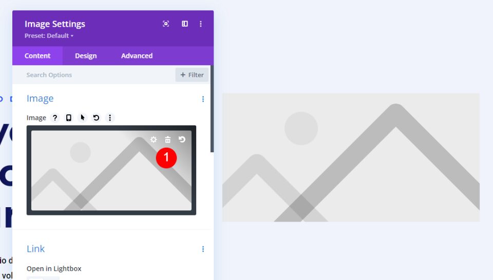
Next, scroll down Background, select the Image tab, and add your image. Leave all the image settings at their defaults. The image won’t show much at first. We’ll fix this as we go.
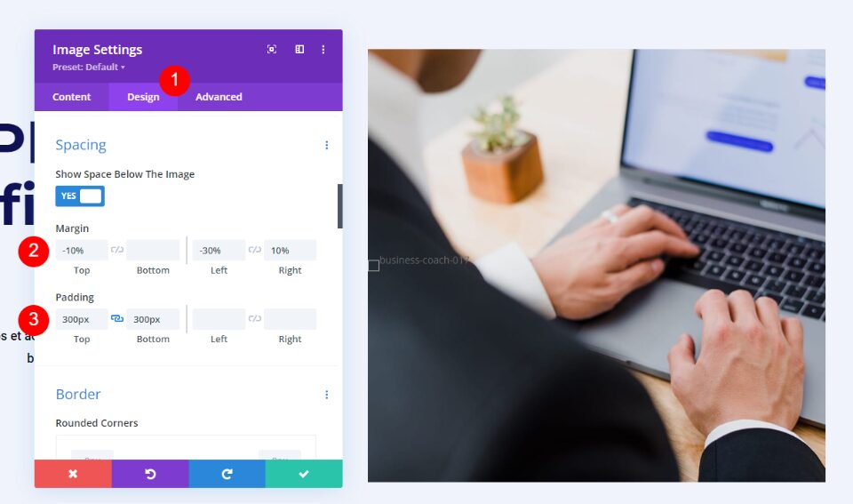
Next, select the Design tab and scroll down to Spacing. For desktops, add -10% Top, -30% Left, 10% Right Margin. Add 300px Top and Bottom Padding. These are the desktop settings. We’ll make adjustments for tablets and phones.
- Margin (Desktop): -10% Top, -30% Left, 10% Right
- Padding: 300px Top, 300px Bottom
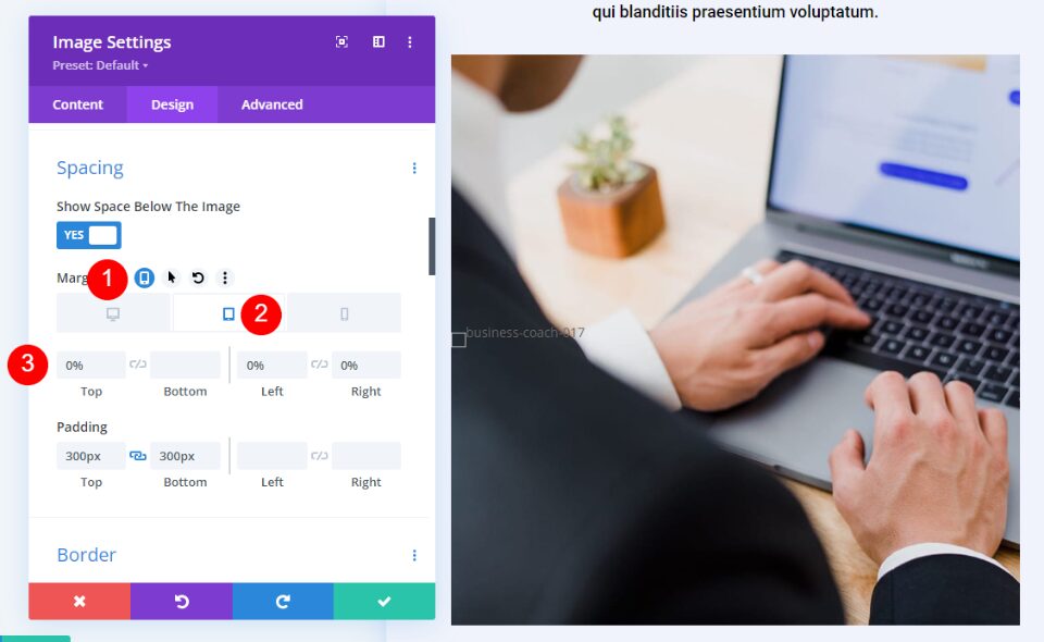
Next, we want to ensure that the image shape is responsive. Select the tablet icon to open the settings for tablets and phones. Hover over the Margin settings and select the tablet icon that appears. This opens a set of tabs with a tab for each device type. Choose the Tablet tab and change the Margin to 0% Top, 0% Left, 0% Right Margin. The Phone tab will follow the Tablet settings, so we won’t need to adjust it for Margin.
- Margin (Tablet/Phone): 0% Top, 0% Left, 0% Right
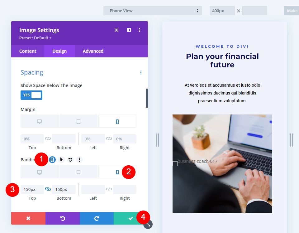
Next, select the tablet icon that appears when you hover over the Padding settings. Choose the Phone tab and change the Padding to 150px Top and 150px Bottom. The tablet Padding will follow the desktop settings. Close the module’s settings.
- Padding: 150px Top, 150px Bottom
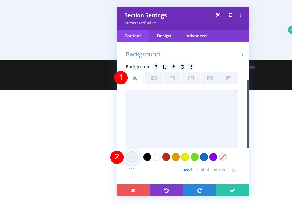
Shape Images with Divi’s Gradient Builder Examples
Next, we’ll use those settings and shape the images with Divi’s Gradient Builder. As we’ll see, several settings help us create interesting image shapes with Divi’s Gradient Builder.
Some key settings to keep in mind include stacking Gradient Stops and setting the pattern to repeat. Be sure to test your patterns on all screen sizes to make sure you like the shape.
For more information on using Divi’s Gradient Builder, search the Elegant Themes blog for “Gradient Builder“. You’ll find several posts with detailed tutorials to step you through the controls and settings.
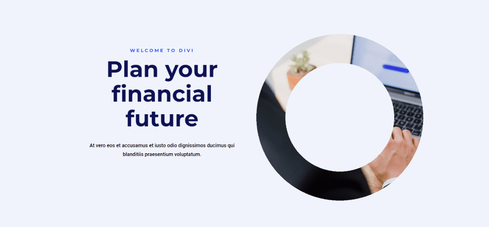
First Example – Circular Gradient Builder Image Shape
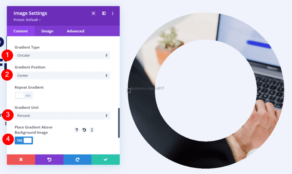
Our first example gives the image a circular shape with a hole in the center.
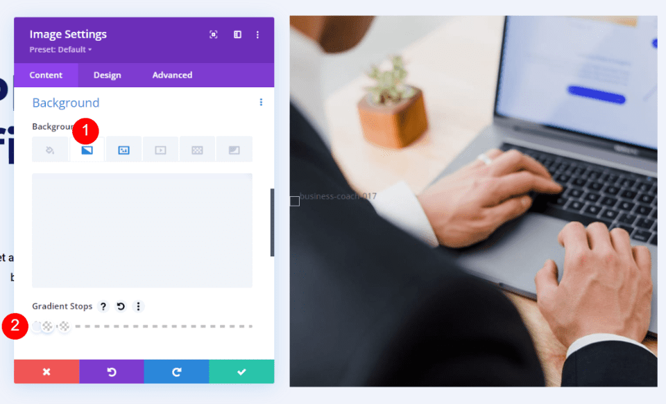
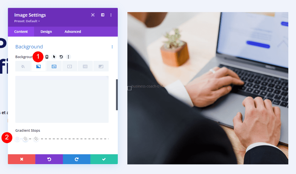
Open the Image Module’s settings and scroll down to Background. Select the Background Gradient tab and set 6 Gradient Stops:
- First Stop: 0%, #f0f3fb
- Second: 45%, #f0f3fb
- Third (on top of Second): 45%, rgba(41,196,169,0)
- Fourth: 69%, rgba(250,255,214,0)
- Fifth (on top of Fourth): 69%, #f0f3fb
- Sixth: 100%, #f0f3fb
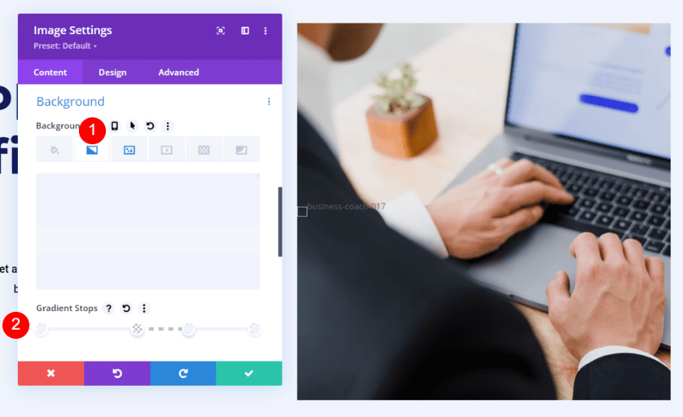
Next, choose Circular for the Gradient Type, set the Position to Center, use Percent for the Unit, and enable Place Gradient Above Background Image.
- Type: Circular
- Position: Center
- Unit: Percent
- Place Gradient Above Background Image: Yes
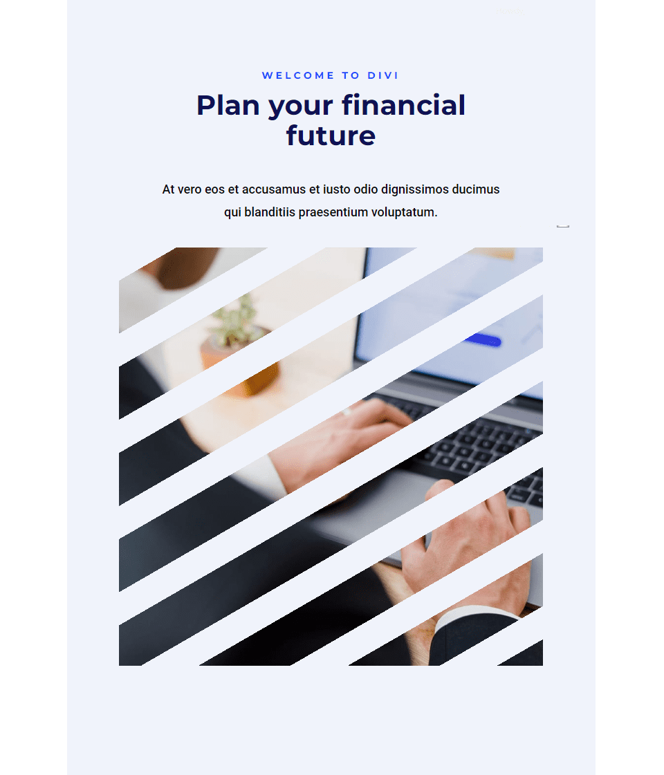
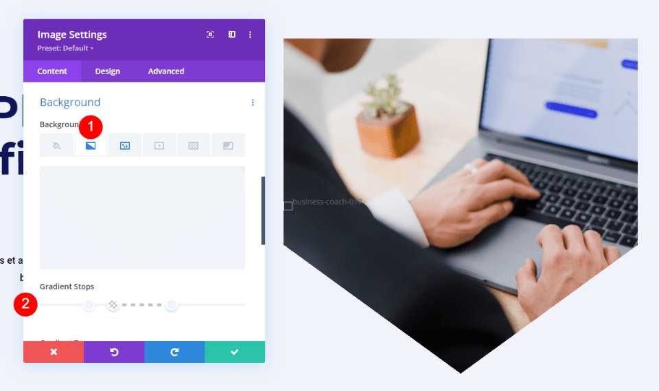
Second Example – Linear Gradient Builder Image Shape
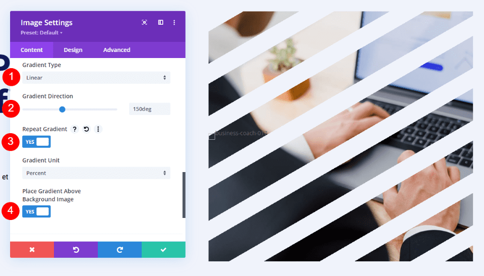
Here’s a look at the second image shape example. This example places diagonal lines across the image.
Open the settings, scroll dowl to Background, and select the Background Gradient tab. Add four Gradient Stops:
- First Stop: 0%, #f0f3fb
- Second: 5%, #f0f3fb
- Third (on top of Second): 5%, rgba(175,175,175,0)
- Fourth: 13%, rgba(41,196,169,0)
Set the Gradient Type to Linear with a Direction of 150deg. Set it to Repeat. Use Percent for the Unit and enable Place Gradient Above Background Image.
- Type: Linear
- Direction: 150deg
- Repeat: Yes
- Unit: Percent
- Place Gradient Above Background Image: Yes
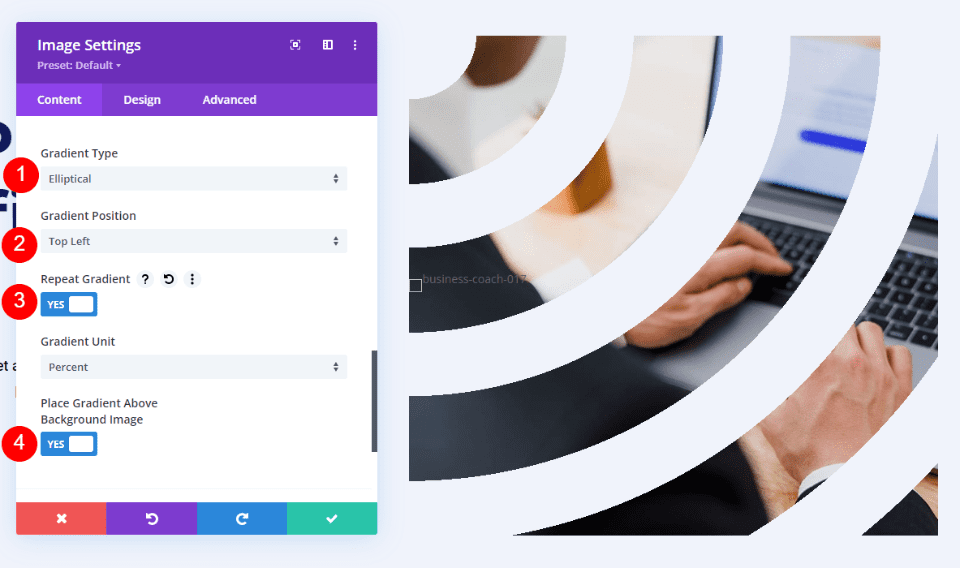
Third Example – Elliptical Gradient Builder Image Shape
Here’s our third image shape example. This one uses an elliptical shape.
Open the Image Module’s settings and scroll down to Background. Select the Background Gradient tab and create four Gradient Stops:
- First Stop: 0%, #f0f3fb
- Second: 9%, #f0f3fb
- Third (on top of Second): 9%, rgba(175,175,175,0)
- Fourth: 21%, rgba(41,196,169,0)
Next, change the Gradient Type to Elliptical and set the Position to Top Left. Choose Repeat Gradient, use Percentage as the Unit and enable Place Gradient Above Background Image.
- Type: Elliptical
- Position: Top Left
- Repeat Gradient: Yes
- Unit: Percent
- Place Gradient Above Background Image: Yes
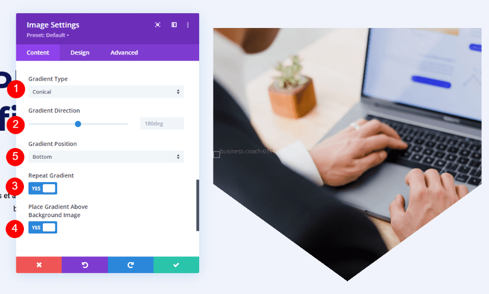
Fourth Example – Conical Gradient Builder Image Shape
Our fourth example uses Conical to create a unique image shape.
Open the Image Module’s settings, scroll down to Background, and select the Background Gradient tab. This one has 5 Gradient Stops:
- First Stop: 23%, #f0f3fb
- Second: 35%, #f0f3fb
- Third (on top of Second): 35%, rgba(41,196,169,0)
- Fourth: 65%, rgba(250,255,214,0)
- Fifth (on top of Fourth): 65%, #f0f3fb
Set the Gradient Type to Conical and leave the Direction at the default setting. Set the Position to Bottom, use Percent for the Unit, and enable Place Gradient Above Background Image.
- Type: Conical
- Direction: 180deg
- Position: Bottom
- Unit: Percent
- Place Gradient Above Background Image: Yes
Gradient Bulder Shape Results
All the layouts turned out well. The image shapes stand out and the images are still easy to understand. All are responsive, so they look great on any device.
First Example – Circular Image Shape
Desktop
Tablet
Phone
Second Example – Linear Image Shape
Desktop
Tablet
Phone
Third Example – Elliptical Image Shape
Desktop
Tablet
Phone
Fourth Example – Conical Image Shape
Desktop
Tablet
Phone
Ending Thoughts
That’s our look at how to shape your images with Divi’s Gradient Builder. The Gradient Builder can create some interesting image shapes. Playing around with the Gradient Stops, trying different Gradient Types, and enabling Gradient Repeat are great ways to create new designs. Be sure to check your designs on all screen sizes and make adjustments if needed.
We want to hear from you. Have you used Divi’s Gradient Builder to shape your images? Let us know about your experience in the comments.
The post How to Shape Your Images with Divi’s Gradient Builder appeared first on Elegant Themes Blog.

