
Post sliders are an elegant solution for presenting a variety of content to your readers. The posts that are highlighted can be organized in a number of ways from categories to date. In today’s project we’re looking at an example from the Facebook Newsroom blog page which presents a category of posts called “Top Stories”. It’s a very attractive slider that emphasizes the post title and the featured image. We’ll recreate the look of this slider using Divi’s Post Slider module.
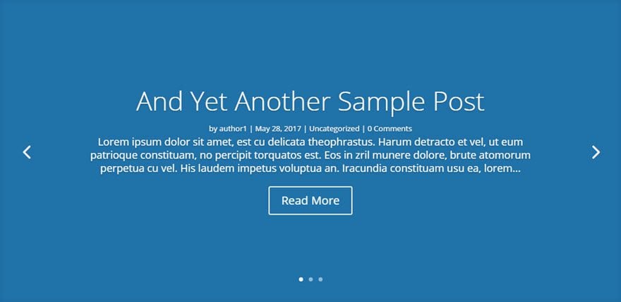
Before & After: The Divi Post Slider Module
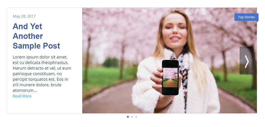
The first image below shows the divi post slider module with it’s default settings, while the second is a modification created with just a few tweaks in settings and some custom CSS.
Before
After

The Concept & Inspiration

As mentioned, the model for today’s post slider style comes from Facebook Newsroom. This is a news blog dedicated to, as you may have guessed, all things Facebook. While most of us know facebook as the social media giant, a quick look through this blog will broaden your perspective. With $8.8 billion in revenue last quarter and 1.23 billion active users per day, the blog post slider on the Facebook Newsroom page provides a worthy model for today’s project.
Preparing the Design Elements
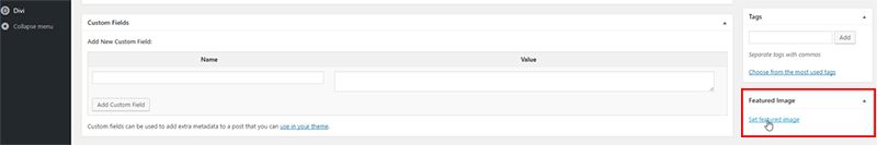
In preparation for this design, you’ll need a few blog posts with featured images. If you aren’t familiar with setting featured images for your posts, you’ll find the setting on the edit post page at the lower right side of the page.
This slider design will work best if each of the featured images is 600px x 400px, but the exact size isn’t critical.
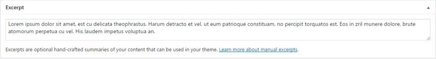
You may also want to add some excerpt text for each of your posts in the “Excerpt” input box found toward the bottom of the post editor page. The post will display your post excerpt if you have one, but will use a portion of your actual content if you don’t.
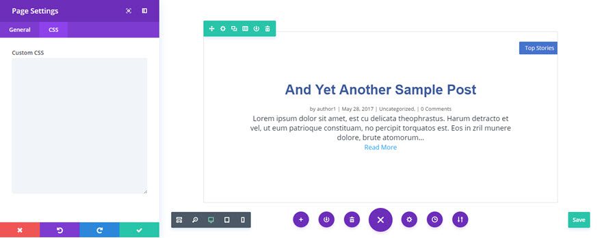
Implementing the Design with Divi
If you’re following along and don’t already have a page setup to display your post slider, simply create a new page and click on “Use Visual Builder” to start making the needed modifications.
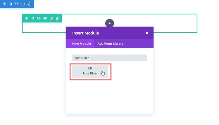
We begin by adding a Regular Section with a 1 Column structure row.
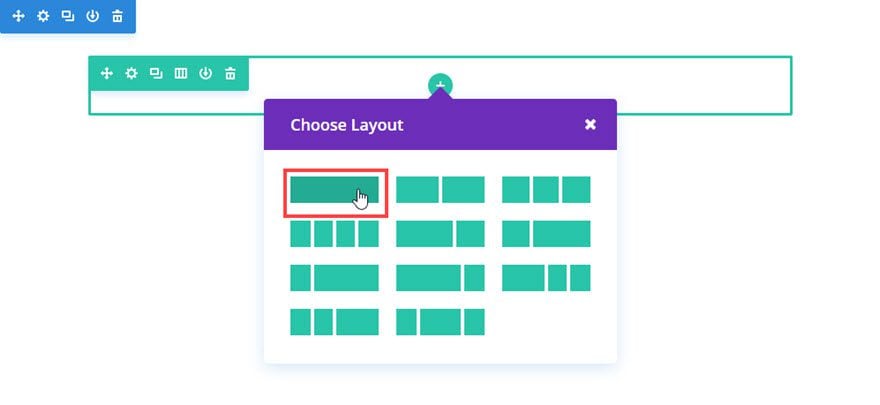
Then add the Post Slider Module to the row.
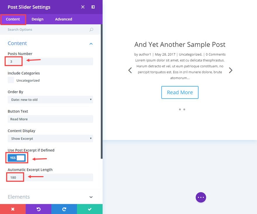
Our modifications begin with “Content” settings, which is where you are by default after adding any new module in the Visual Builder.
Make the following changes to the default Content settings:
Set “Post Number” to however many posts you want. For this example, I’m using 3.
Then set “Use Post Excerpt if Defined” to yes, and set “Automatic Excerpt Length” to 180.
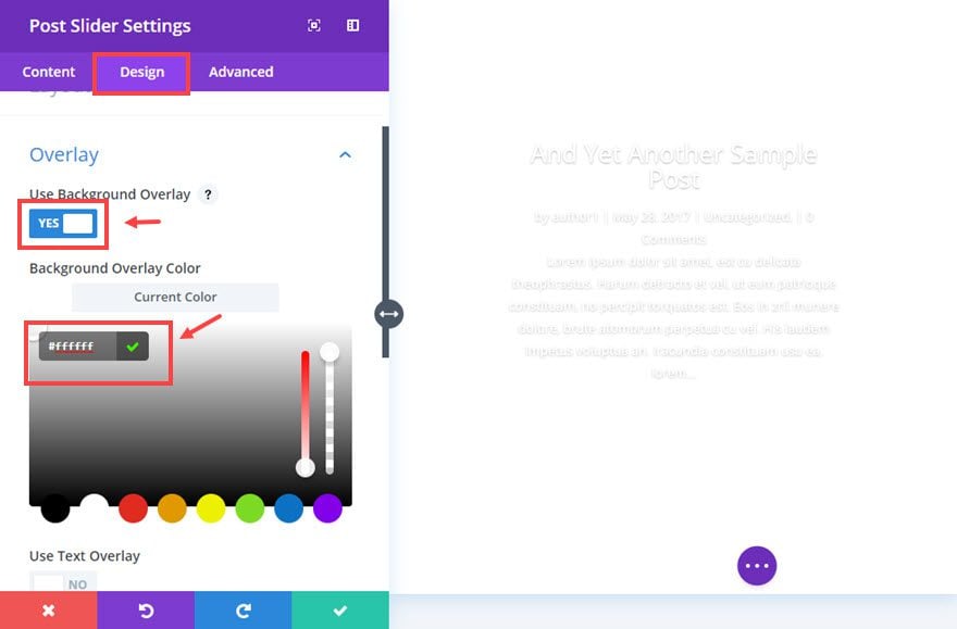
Now we are ready to move to the design settings by clicking the tab at the top of the module settings modal.
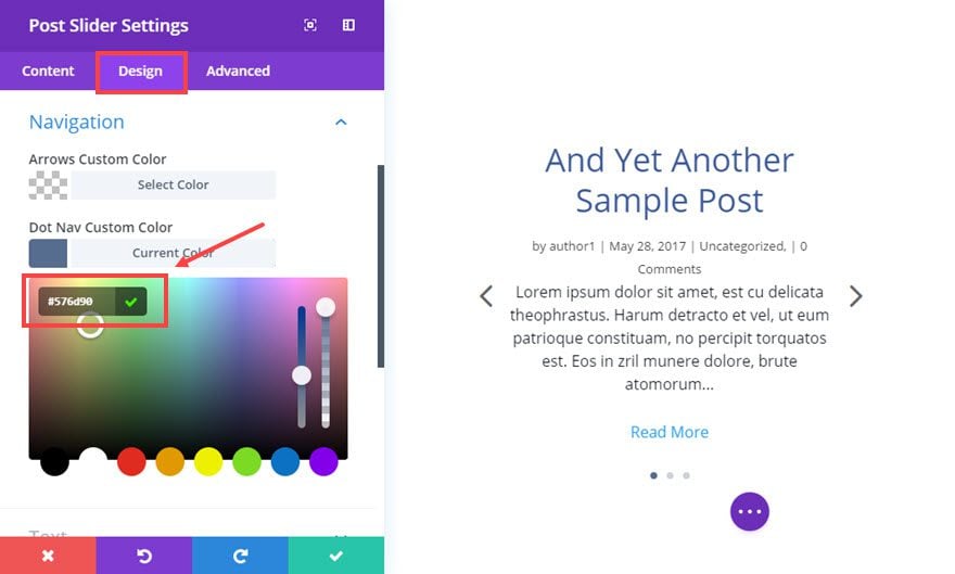
Make the following changes to the design settings:
Change the “Background Overlay Color” to white (#ffffff).
Change “Dot Nav Custom Color” to #576d90.
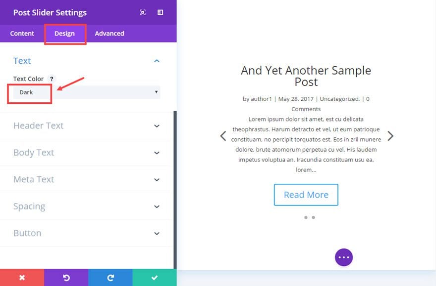
Change the “text Color” to Dark.
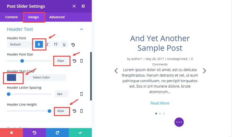
Now make the “Header Font” bold, set the “Header Font Size” to 34px, set “Header text Color” to #3b5998, and “Header Line Height” to 42px.
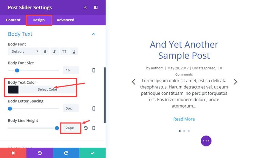
Now set the “Body Text Color” to #141924, and the “Body Line Height” to 24px.
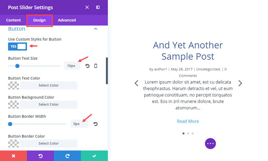
Now click on “Use Custom Styles for Button” to change it to yes. Change the “Button Text Size” to 16px, “Button Border width” to 0px, the “Button Hover Text Color” to #666666, and the “Button Hover Background Color” to rgba(0,0,0,0).
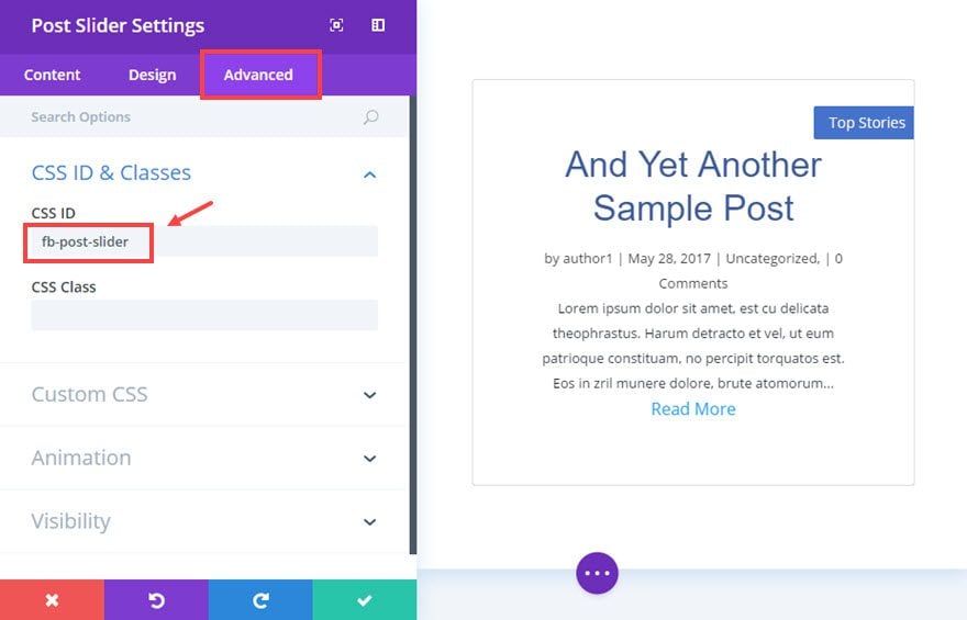
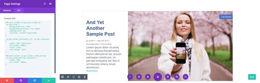
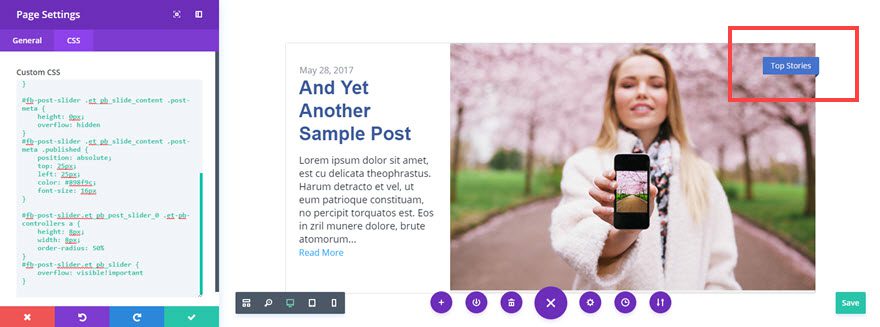
Now click the “Advanced” tab at the top of the module settings modal. In the text input under CSS ID, add “fb-post-slider”. This allows us to add styles to this specific module without having any effect on other post modules that may be displayed on the page.
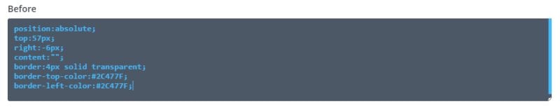
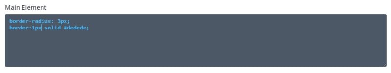
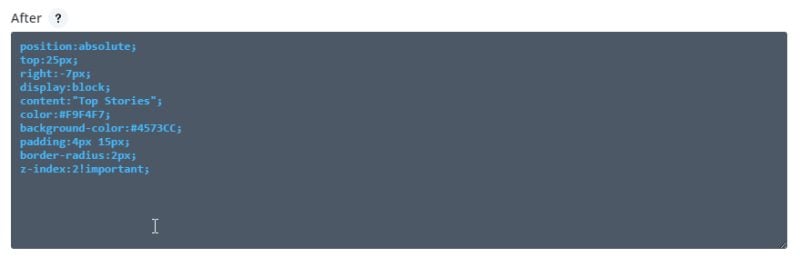
Now add CSS code to the various elements as follows:
Before
position:absolute;
top:57px;
right:-6px;
content:"";
border:4px solid transparent;
border-top-color:#2C477F;
border-left-color:#2C477F;
Main Element
border-radius: 3px;
border:1px solid #dedede;
After
position:absolute;
top:25px;
right:-7px;
display:block;
content:"Top Stories";
color:#F9F4F7;
background-color:#4573CC;
padding:4px 15px;
border-radius:2px;
z-index:2!important;
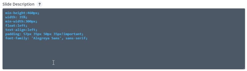
Slide Description
min-height:460px;
width: 35%;
min-width: 300px;
float:left;
padding: 57px 45px 50px 35px!important;
font-family: 'Alegreya Sans', sans-serif;
text-align:left
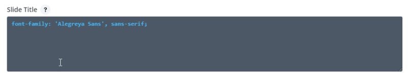
Slide Title
font-family: 'Alegreya Sans', sans-serif;
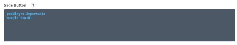
Slide Button
padding:0!important;
margin-top:0;
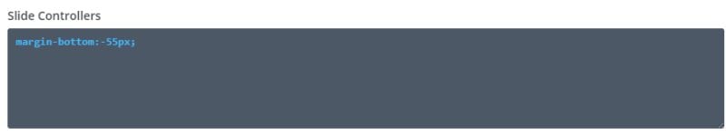
Slide Controllers
margin-bottom:-55px;
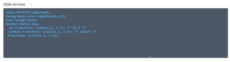
Slide Arrows
color:#ffffff!important;
background-color:rgba(0,0,0,.4);
font-weight:bold;
border-radius:2px;
 -ms-transform: scale(1.2, 2.5); /* IE 9 */
 -webkit-transform: scale(1.2, 2.5); /* Safari */
 transform: scale(1.2, 2.5);
Now save the module settings by clicking on the check mark in the lower right corner of the modal.
You can see in the Visual Builder that there’s still a little ways to go to get our post slider looking just like the one on the Facebook Newsroom page.

That’s nothing a bit of CSS can’t take care of, and we’ll be able to watch it take shape by adding the remaining code to the Page Settings right from the Visual Builder. To get there, click on Expand Settings icon at the bottom center of the page, then click the “Page Settings” icon.
If you are working on a larger monitor, I suggest moving the modal to the side of the Post Slider so that you can see what each bit of code does as we add it. That will better help you to understand the CSS used to style our module.
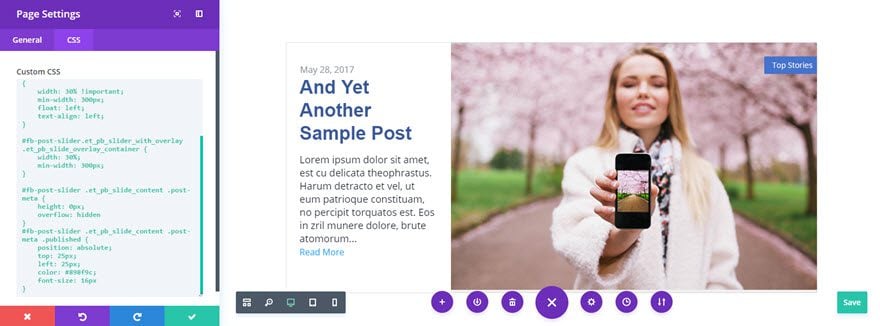
First we will take care of the background image size and position (currently hidden behind the white overlay), as well as the position of the slider text and overlay by adding the following CSS to the “Custom CSS” textarea.
#fb-post-slider.et_pb_post_slider_0 .et_pb_slide {
    background-size: 70%;
    background-position: top right;
    padding-left: 0;
    overflow: visible!important;
}

#fb-post-slider.et_pb_slider_with_overlay .et_pb_slide_overlay_container {
    width: 30%;
    min-width: 300px;
}
Now we’ll take care of hiding our post meta, with the exception of the date, and moving the position of the date above the title. To accomplish this add the following code to the Custom CSS text input just below the previously entered code.
#fb-post-slider .et_pb_slide_content .post-meta {
    height: 0px;
    overflow: hidden
}
#fb-post-slider .et_pb_slide_content .post-meta .published {
    position: absolute;
    top: 32px;
    left: 35px;
    color: #898f9c;
    font-size: 16px
}
We’re just about there with only some minor exceptions. You’ll notice when you hover over our Post Slider module, that both the previous and the next arrows appear. On the Facebook newsroom slider, only the next arrow appears. That’s easily fixed by adding the following CSS to the Custom CSS text input just below the previously entered code.
#fb-post-slider .et-pb-arrow-prev {
    display: none
}
Now we need to reposition the navigation dots underneath the slider with the following code. By the way, you’ll also notice that setting the slider’s overflow property to visible reveals the 3D effect we created earlier for the “Top Stories” tag that wraps around the upper right corner.
#fb-post-slider.et_pb_post_slider_0 .et-pb-controllers a {
    height: 8px;
    width: 8px;
    order-radius: 50%
}
#fb-post-slider.et_pb_slider {
    overflow: visible!important
} 
Finally, this last bit of code will change the animation of our slider to more closely match our model slider. Albeit not a perfect match, it’s the closest I could get without getting into jQuery solutions. There’s also some media queries to make our slider a bit more responsive.
.et-pb-active-slide .et_pb_slide_description {
    animation-name: fadeIn;
}
.et_pb_slide.et-pb-active-slide {
    transition: opacity 2.5s!important
}

@media all and (max-width: 1252px) {
    #fb-post-slider.et_pb_post_slider_0 .et_pb_slide {
        background-size: 90%
    }
}
@media all and (max-width: 980px) {
    #fb-post-slider.et_pb_post_slider_0 .et_pb_slide {
        background-size: 100%;
        background-position: top center;
    }
}
Now you can save the page by clicking the save button at the bottom right corner of your screen. Once the page is saved, exit the visual builder to see the finished post slider, inspired by the post slider on the Facebook Newsroom page.
Final Thoughts
Well, whether you found this particular design useful or not, I hope it has provided a detailed look into some of the more advanced settings within Divi’s Post Slider Module, as well as piqued your imagination as to what is possible.
The post How to Style Divi’s Post Slider Module like Facebook Newsroom’s Post Slider appeared first on Elegant Themes Blog.