
Here at Elegant Themes, we have one main thing going for us: we make a slew of awesome stuff. You’re probably familiar with Divi, but do you know about our plugin, Monarch? No? Maybe? That’s okay. Monarch social buttons are a fantastic way to increase sharing and engagement on your site, and when you combine them with one of our amazing, free layout backs for the Divi Builder, you just can’t go wrong.
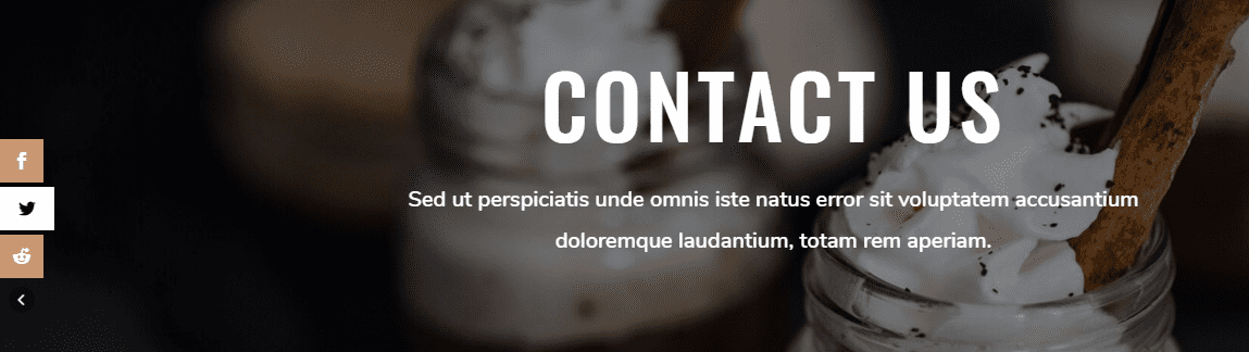
I am going to be working with the delightfully sleek Coffee Shop layout pack today to show you how to style your Monarch social buttons to match you’re site’s design. Don’t worry if you’re not using the free layout pack–the principles still apply.
But if you do happen to be using it (or one of our others), just follow these steps to get things as pretty as a picture.
Put Monarch to Work
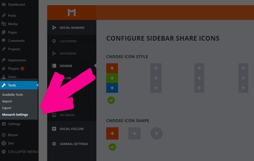
First off, you gotta get Monarch installed. So head over to the member’s area and download the plugin. You install it the same as anything else, and when it’s activated, you can find the settings under Tools -> Monarch Settings
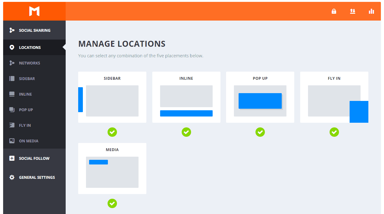
Once you’re up and running, head to the Locations tab so that you can pick where you want your Monarch social buttons to appear. It doesn’t matter, really, which ones you choose because the settings work the same way for each of them (but remain separate for you to customize on each page you want to use them on.)
Choices, Choices
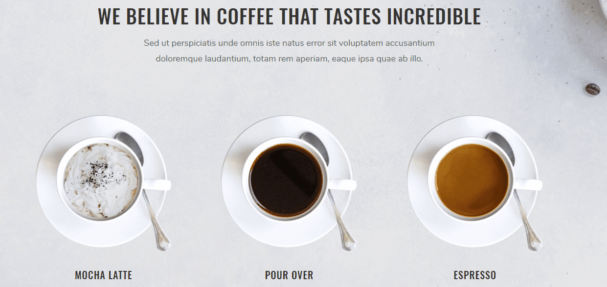
The Coffee Shop layout back is definitely a dark, earthy, and comforting theme that embodies exactly how rich and pleasing your website and business is. The primary palette is a simple black, white, brown, and light orange.
Amazingly, the bright and garish colors of standard social media buttons clash more than we want.
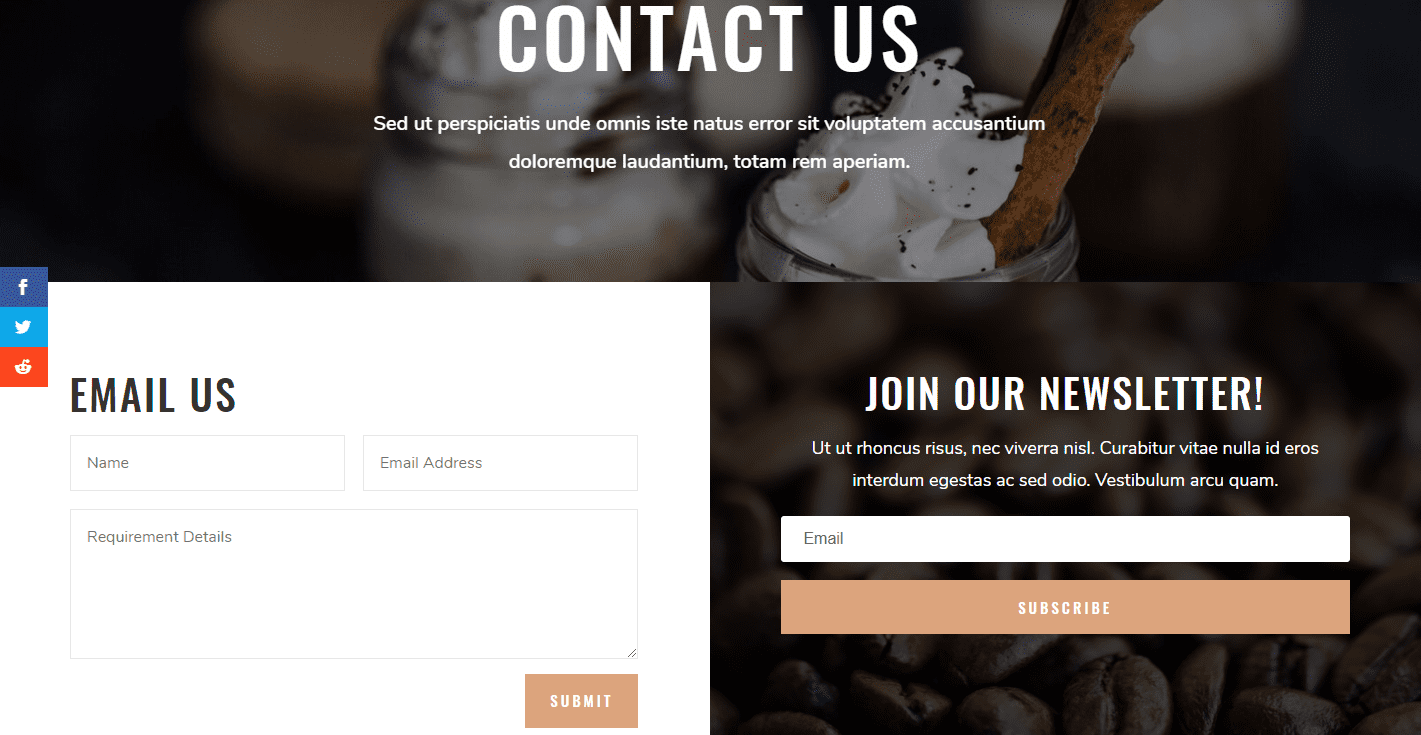
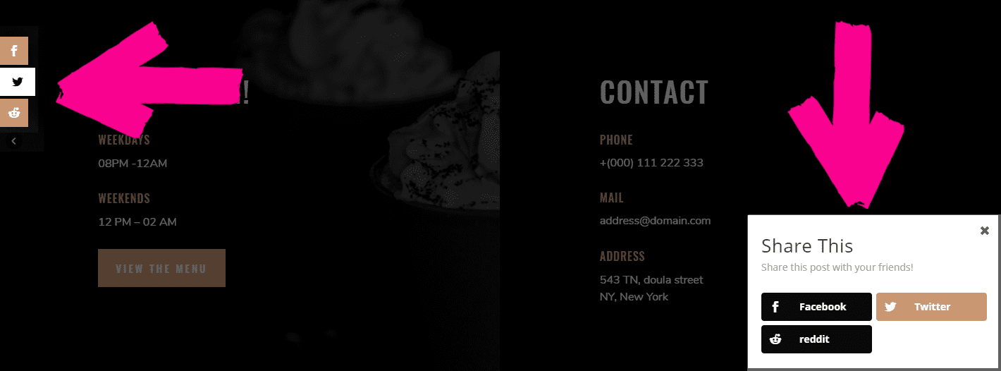
Thanks to Monarch, though, we can fix that. I am going to be mainly working with the sidebar widget sharing buttons, but remember: this will work with all of these Monarch locations.
Shapely, Fit, and Toned
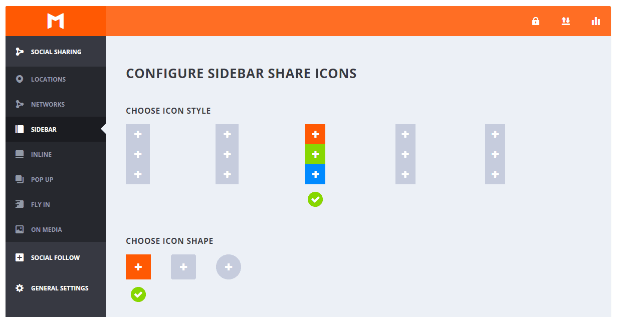
For the Coffee Shop layout, the sleek edges and sharp corners mean that I am choosing the square icon shape and the third hover effect–because those are the ones that match that same aesthetic. You want your Monarch social buttons to stand out, but not in such a way that they appear out of place. That’s the whole point of this, after all.
Once you’ve set those options, it’s time to work on colors. This gets a little more complicated to get right. A good rule of thumb for web design is having no more than four base colors for your theme. And we’ve stuck with that here, too, like I said above with the primaries being black, white, brown, and light orange.
When choosing to style your Monarch social buttons, you can really make use of that four-color palette to make your buttons really scream at your visitors.
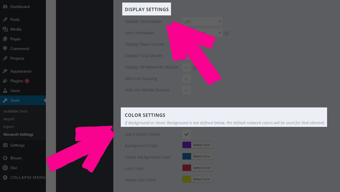
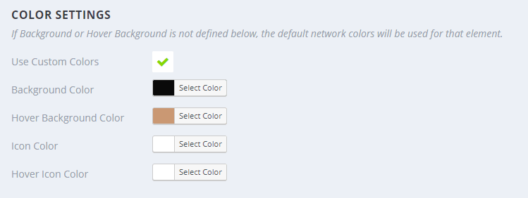
While the default values for Monarch uses the network’s built-in colors, if you scroll down past the icon style, you will get to the Display Settings and Color Settings.
Space It Out
First of all, set the Add Icon Spacing to active (otherwise your buttons are gonna look cramped). Then make sure that you put the Intro Animation on Fade In to match the other animations that are included in the layout pack. If you use lots of slide-ins or something else, feel free to choose another option. This one just matches Coffee Shop.
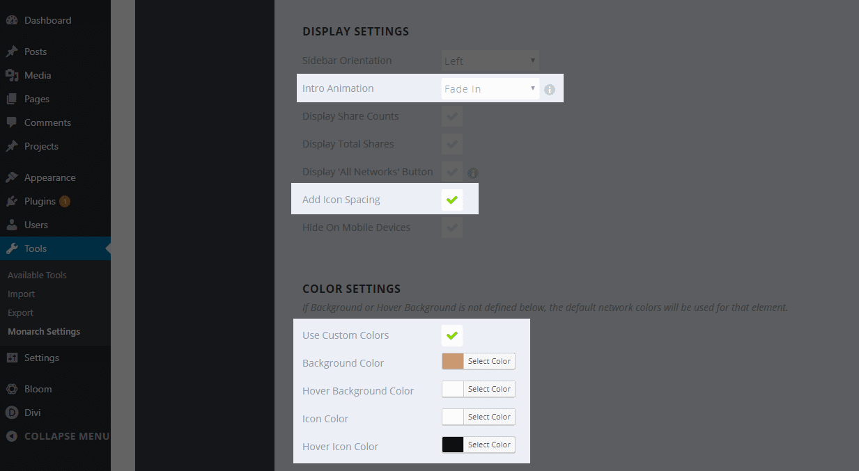
Additionally, we then go in and turn on Use Custom Colors.
- Background Color: #c99872
- Hover Background Color: #ffffff
- Icon Color: #ffffff
- Hover Icon Color: #000000
Save your changes. Your live site now looks even more awesome! There are options for what post types you want to display each kind of Monarch social buttons on, so if you want, say, the sidebar only to show on pages, while you want a Fly In on blog posts, you can set that, too. It’s all personal preference.
Pretty, huh?
Other Design Options
Like I said above, the third option in the Icon Style and the square Icon Shape are the best choices for this layout pack. Also, each location we have for the Monarch social buttons gives you slightly different options. Outside of the Intro Animation and Icon Spacing, it is all preference on how you wish to display them, not how they are designed.
That said, when you’re using multiple instances of the buttons, it’s not a bad idea to mix up the color scheme for maximum effect. I personally like to invert my colors in different locations.
I flipped around the exact same hex codes I used above. Now, we have aa handy-dandy new fly-in that looks completely different from the sidebar! Just use that exact same premise on all the other locations, and you will definitely be able to mix-and-match your Monarch social buttons enough so that your visitors don’t tune them out.
Sit Down and Have a Drink
As garish and unpleasant as most social buttons are, we tend to ignore them because they look the same on every single site they visit. Sure, the idea is that the branded colors are eye-catching and recognizable. You can always find Facebook by its trademark blue. But sometimes (a lot of times?), that blue looks terrible.
That’s where Monarch comes in. You can make your site look more professional and sleeker, and honestly become more user friendly by styling your social buttons with our plugin. Hopefully, you’ll have seen the benefit in Monarch over some of the other social sharing plugins out there, too. We do include the Monarch with your Elegant Themes membership. If you’re not a member, you can head over and sign up right now and get to styling your social buttons this very day.
And don’t forget, too, about the other amazing layout packs like the Coffee Shop one mentioned here. We put out a new one each and every Monday on the blog, so you can download them all and style Monarch to look like every one of them, if you want!
Article featured image by 32 Pixels / shutterstock.com
The post How to Style Your Monarch Social Buttons to Match Your Site’s Design appeared first on Elegant Themes Blog.