
Every week, we provide you with new and free Divi layout packs which you can use for your next project. For one of the layout packs, we also share a use case that’ll help you take your website to the next level.
This week, as part of our ongoing Divi design initiative, we’re going to show you how to use empty sections in Divi to create unique design elements. We’re going to use these empty sections on the Jeweler Layout Pack‘s landing page. However, you can add these empty sections on any layout pack or website you’re creating using Divi’s Visual Builder.
Let’s get to it!
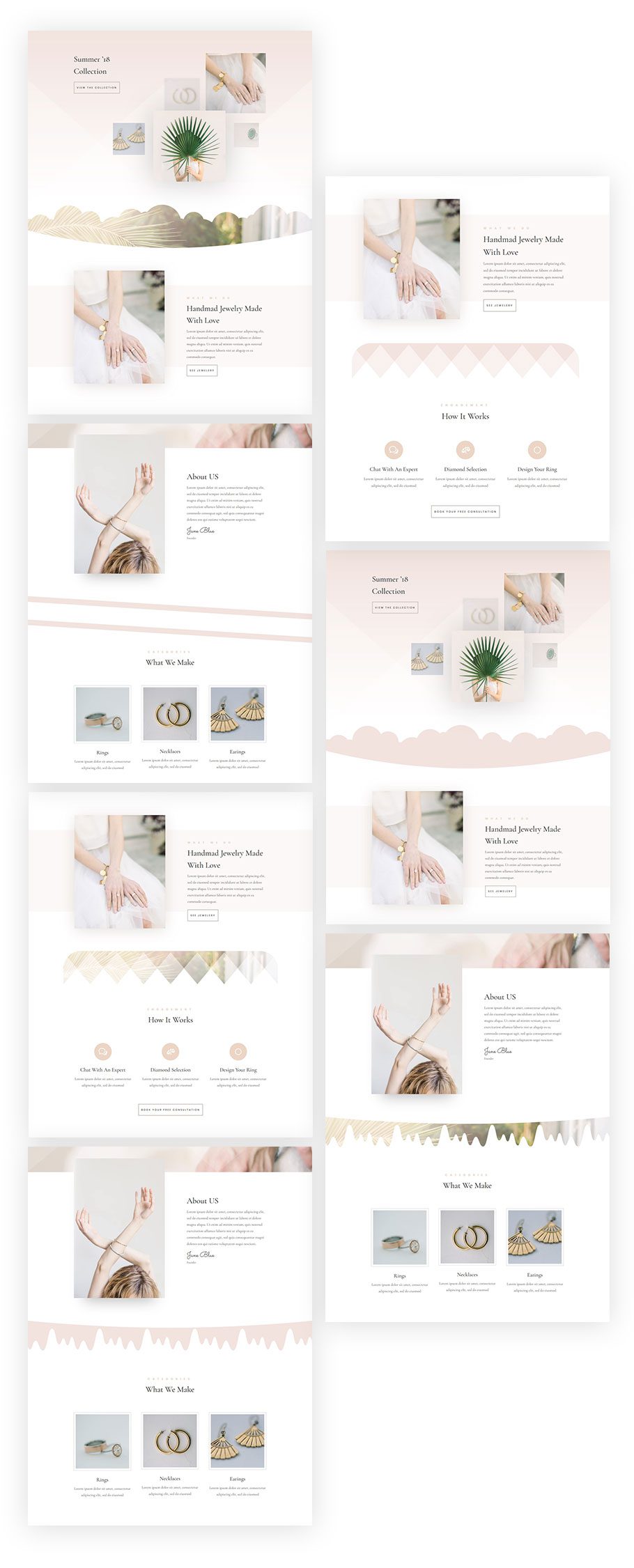
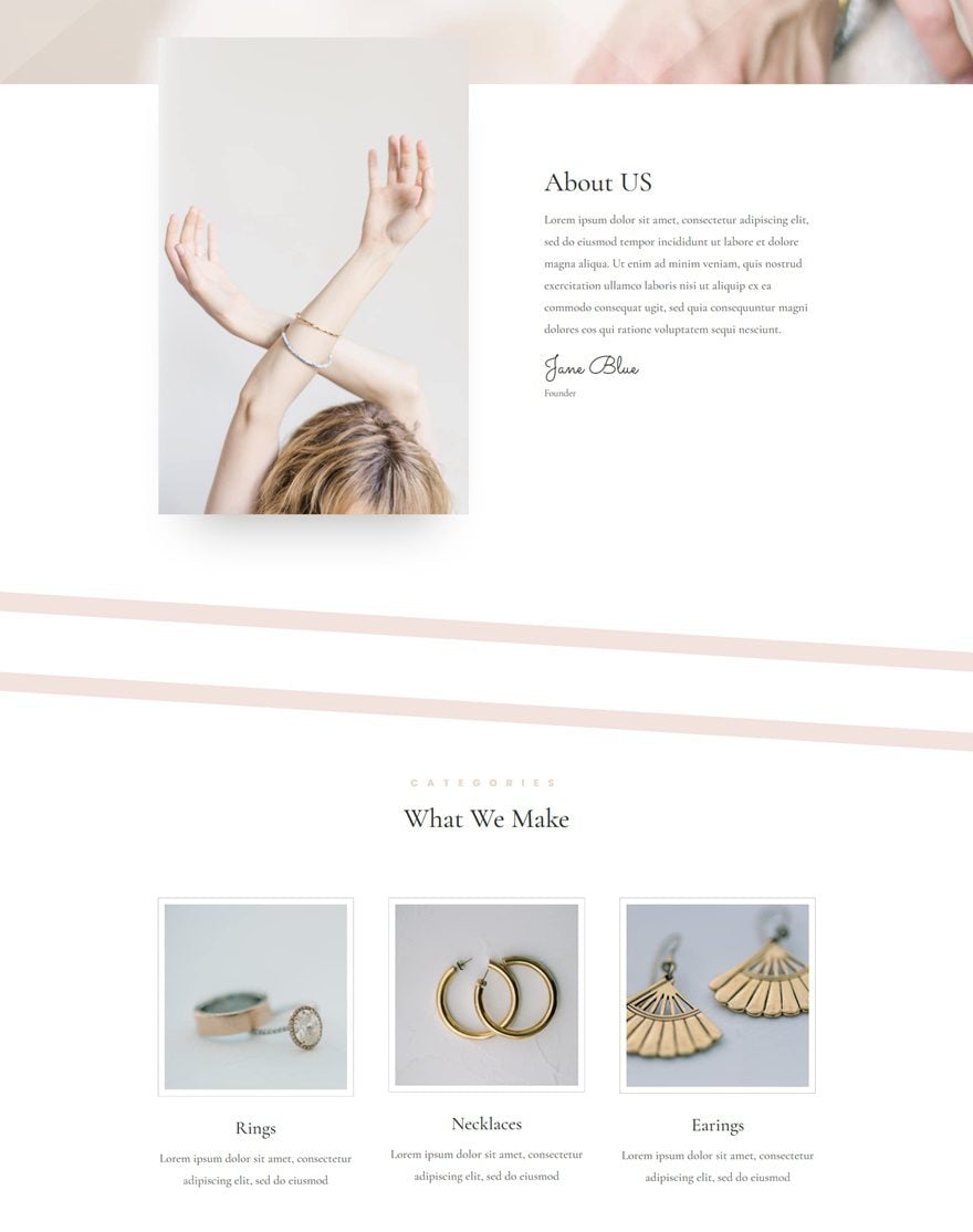
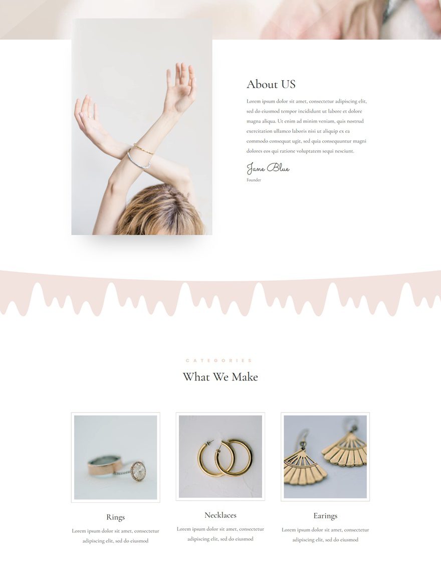
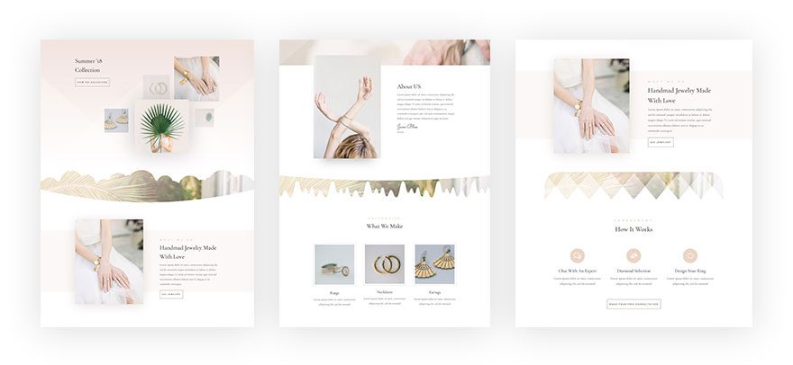
Preview
Before we dive into the tutorial, let’s take a look at the design elements we’ll create:
Approach
- We’re using empty sections to create unique design elements without having to change the settings of other sections
- We’re giving our section dividers the same color as the section background color of the previous and next section which is in this case white
- We’re reusing a color from our color palette as the background color of our new section
- We’re combining different section dividers for the top and bottom to create different designs
- Without modules, a section will not show up properly on desktop and won’t show up at all on tablet and phone
- That’s why instead of leaving it empty, we’re creating an illusion of an empty section
- Adding a Text Module with an invisible character will do the trick
- Our new sections will be independent which means we can play around with the margin as well without affecting the previous or next section
- You can apply this design to any page or layout pack you’re working on
- The four examples we’ll recreate within this tutorial are great for the Jeweler Layout Pack
- You can, however, use other section dividers and experiment with other layout packs
General Steps
Add New Standard Section
Before we handle each one of the examples individually, we’ll go over the general steps first. This means that before starting an example, you’ll need to go through these steps. The general steps are the same for each one of the examples. Start by adding a new standard section to one of your pages using Divi’s Jeweler Layout Pack. For the examples, we’ve used the landing page.
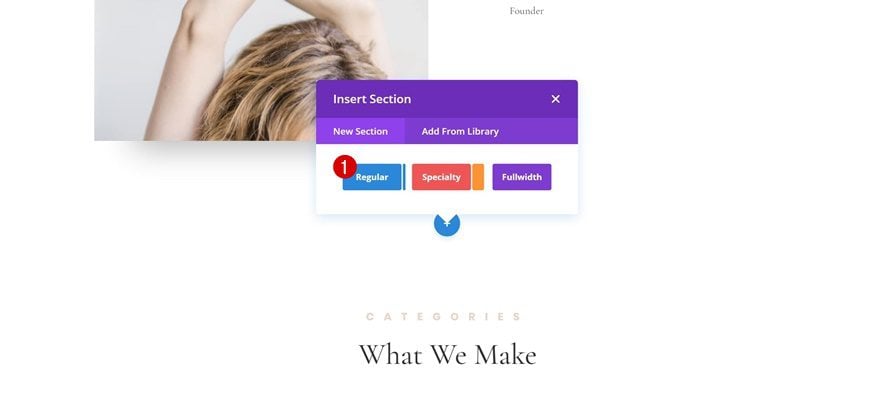
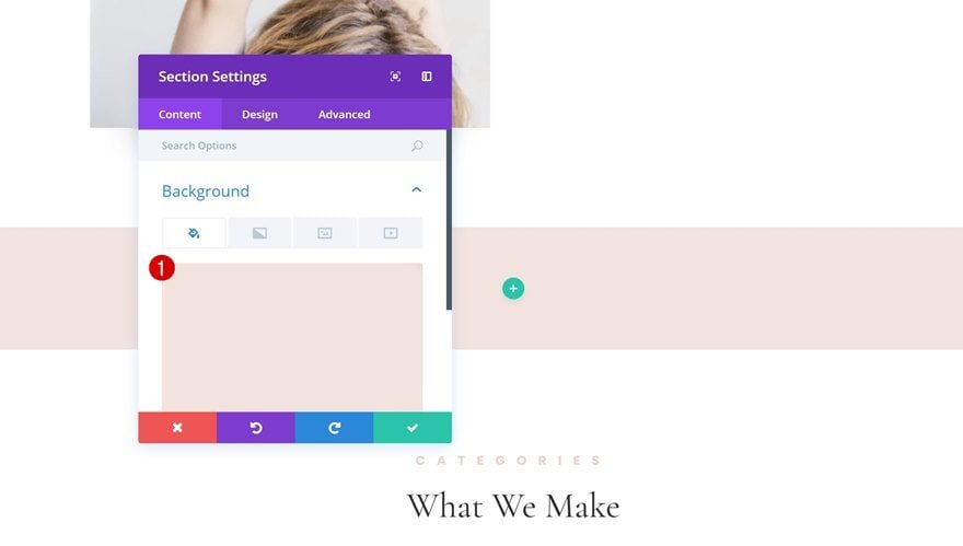
Add Background Color to Section
Then, add ‘#f2e3de’ as the background color of this section.
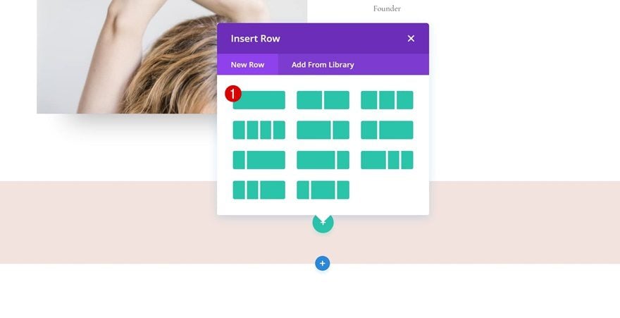
Add One-Column Row
Add a row with one column next.
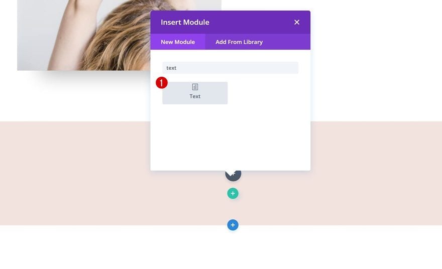
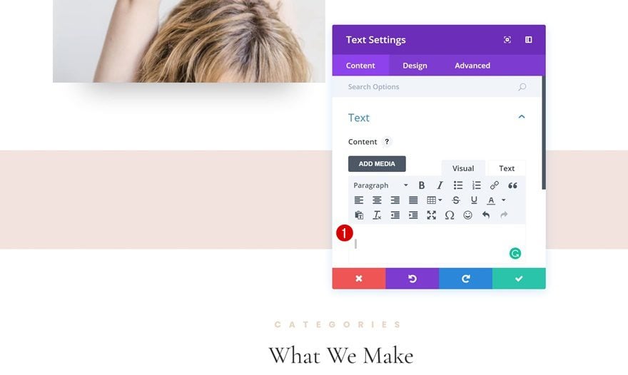
Add Text Module with Invisible Character
And finish off by adding a Text Module with an invisible character to it. As mentioned in the approach of this post, we can’t just leave a section completely empty. Doing so would cause the section to disappear on tablet and phone. That’s why we’re rather going to trick the section into thinking there’s content using an invisible character. You can add an invisible character by holding your ALT button and typing 0160 with your numpad. Or, you can simply clone the following character between the quotes: ‘ ‘.
Create Section #1
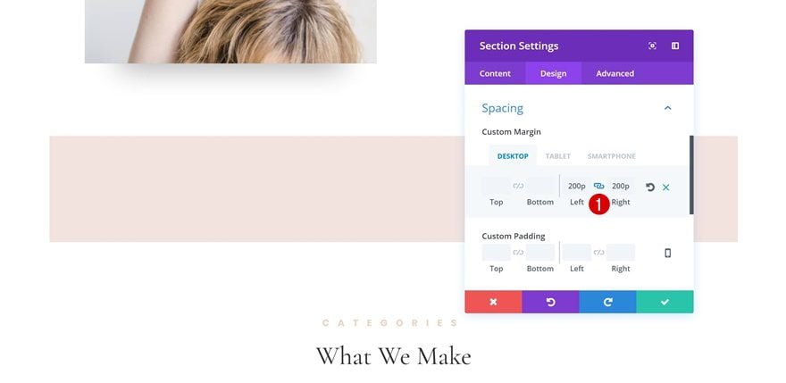
Add Left & Right Margin to Section
Now let’s start creating the first example by adding the following custom margin to the section:
- Top Margin: 200px (Desktop), 100px (Tablet), 50px (Phone)
- Bottom Margin: 200px (Desktop), 100(Tablet), 50px (Phone)
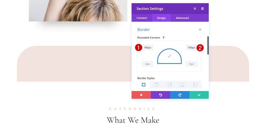
Add Rounded Corners
Open the Border settings next and add ‘100px’ to the top left and top right corner.
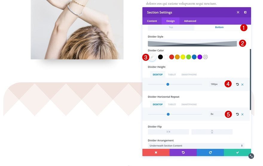
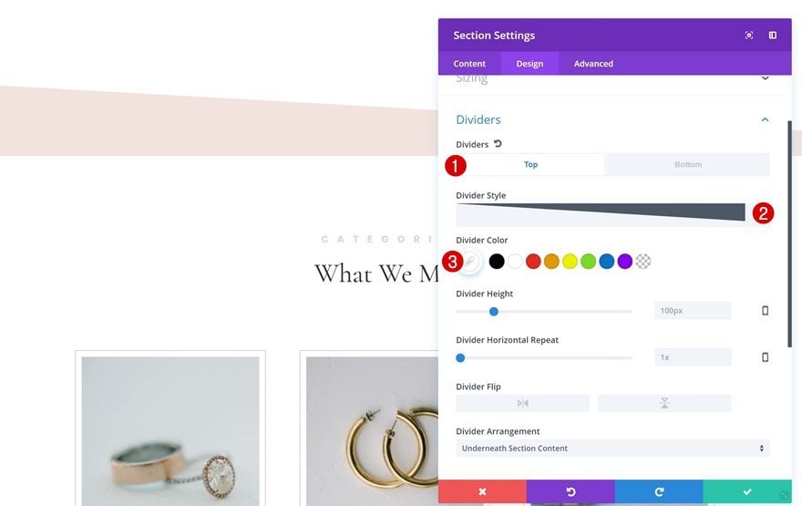
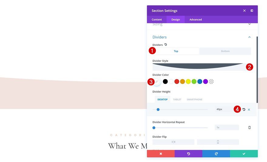
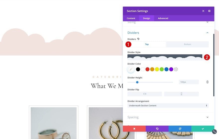
Add Bottom Divider
Lastly, add the following bottom divider to your section:
- Divider Style: Find in List
- Divider Color: White
- Divider Height: 180px (Desktop), 150px (Tablet), 120px (Phone)
- Horizontal Repeat: 8x (Desktop), 5x (Tablet), 4x (Phone)
Create Section #2
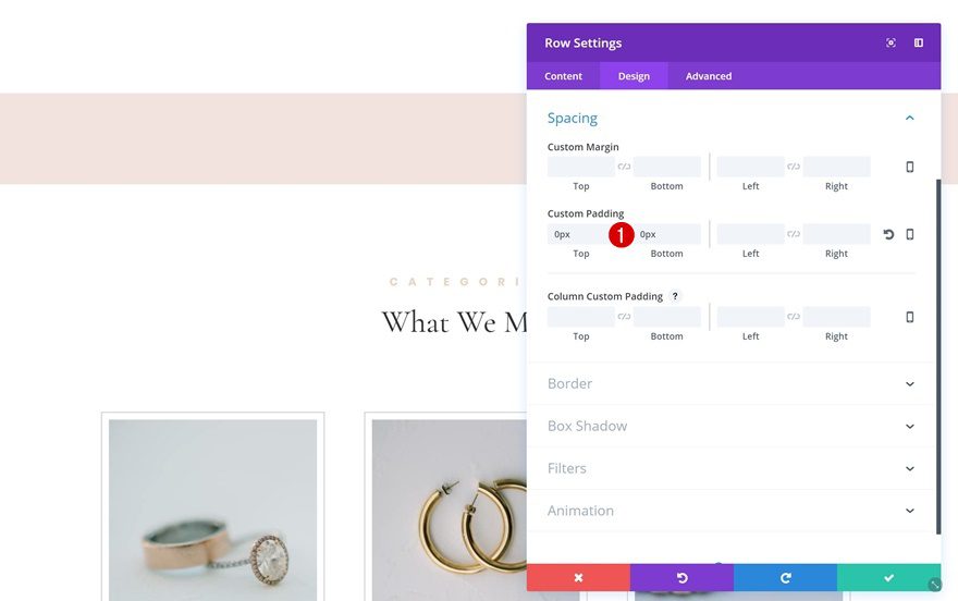
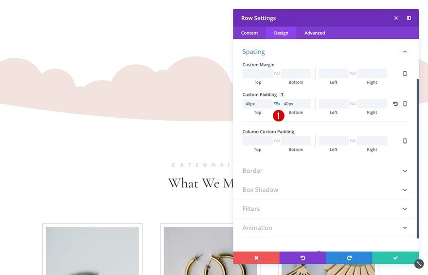
Remove Row Padding
Want to create the second example? Start by removing all the row padding by adding ‘0px’ to the top and bottom padding.
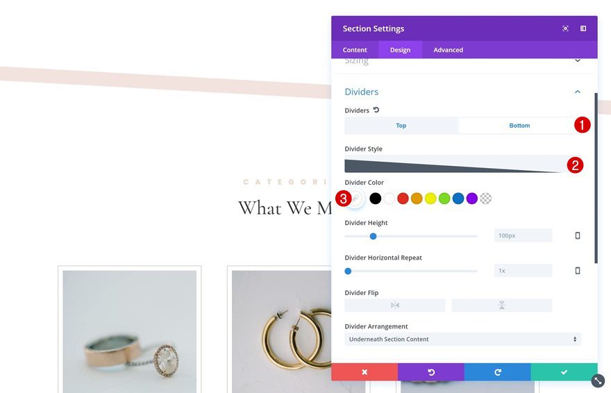
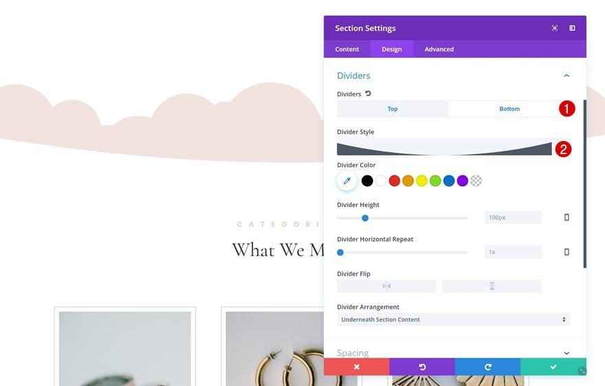
Add Top Divider
Continue by adding a top divider to your section:
- Divider Style: Find in List
- Divider Color: White
Add Bottom Divider
Use the same divider for the bottom as well:
- Divider Style: Find in List
- Divider Color: White
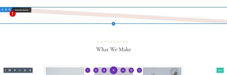
Clone Section
You can clone this section up to as many times as you want. To achieve the same result as shown in the example, clone the section once and there you have it!
Create Section #3
Add Top Divider
The third example uses the following top divider:
- Divider Style: Find in List
- Divider Color: White
- Divider Height: 40px (Desktop), 30px (Tablet), 20px (Phone)
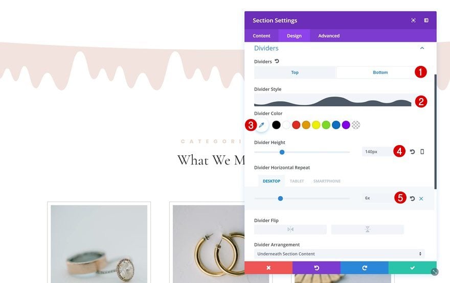
Add Bottom Divider
Once you’ve added to top divider, switch over to the bottom divider and apply the following settings:
- Divider Style: Find in List
- Divider Color: White
- Divider Height: 140px
- Divider Horizontal Repeat: 6x (Desktop), 5x (Tablet), 4x (Phone)
Create Section #4
Add Top Divider
For the last example in the row, choose the following top divider:
- Divider Style: Find in List
- Divider Color: White
Add Bottom Divider
Along with the following bottom divider:
- Divider Style: Find in List
- Divider Color: White
Add Extra Padding to Row
If you want to increase the height of your design, you can also add ’40px’ to the top and bottom padding of your row.
Extra: Background Image + Gradient Overlay
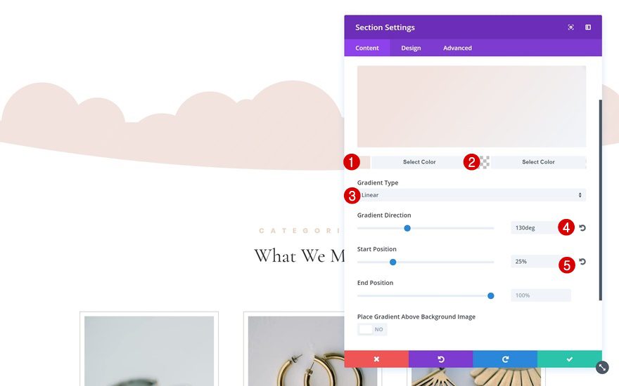
Add Gradient Background to Section
You can make each one of the empty sections unique by adding a background image and gradient overlay to your section as well. The gradient background and background image will fill up your design and give it an even more advanced effect. Start by adding a gradient background to your section:
- First Color: #f2e3de
- Second Color: rgba(255,255,255,0)
- Gradient Type: Linear
- Gradient Direction: 130deg
- Start Position: 25%
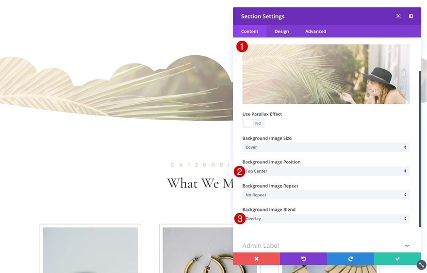
Add Background Image to Section
Then, add a background image (you can find the one we’ve used in your Media Library after uploading Divi’s Jeweler Layout Pack) along with the following settings:
- Background Image Position: Top Center
- Background Image Blend: Overlay
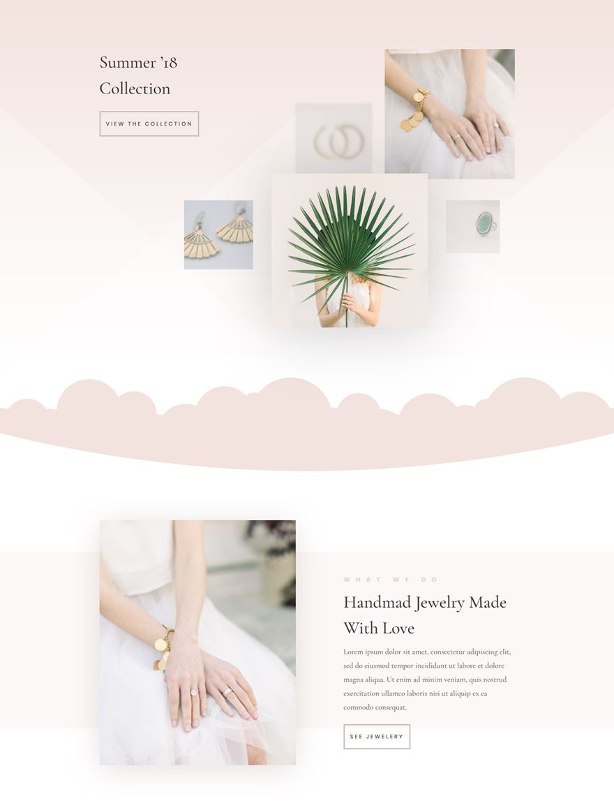
Preview
Now that we’ve gone through all the steps, let’s take a final look at the result:
Final Thoughts
In this use case blog post, we have shown you how to use empty sections to create unique design elements. We’ve added these design elements to the Jeweler Layout Pack‘s landing page. However, you can add these empty sections to any design and layout packs you want. If you have any questions, make sure you leave a comment in the comment section below!
The post How to Use Empty Sections in Divi to Create Unique Design Elements appeared first on Elegant Themes Blog.