Stop Shaking the Ketchup Bottle: A Small Business Guide to Better Website Experiences
You’ve seen it happen. A nonprofit invests thousands in a beautiful website redesign—stunning photography, elegant fonts, perfect color palette. Three months later, donations are flat, and volunteers still can’t figure out how to sign up. Welcome to the ketchup bottle problem.
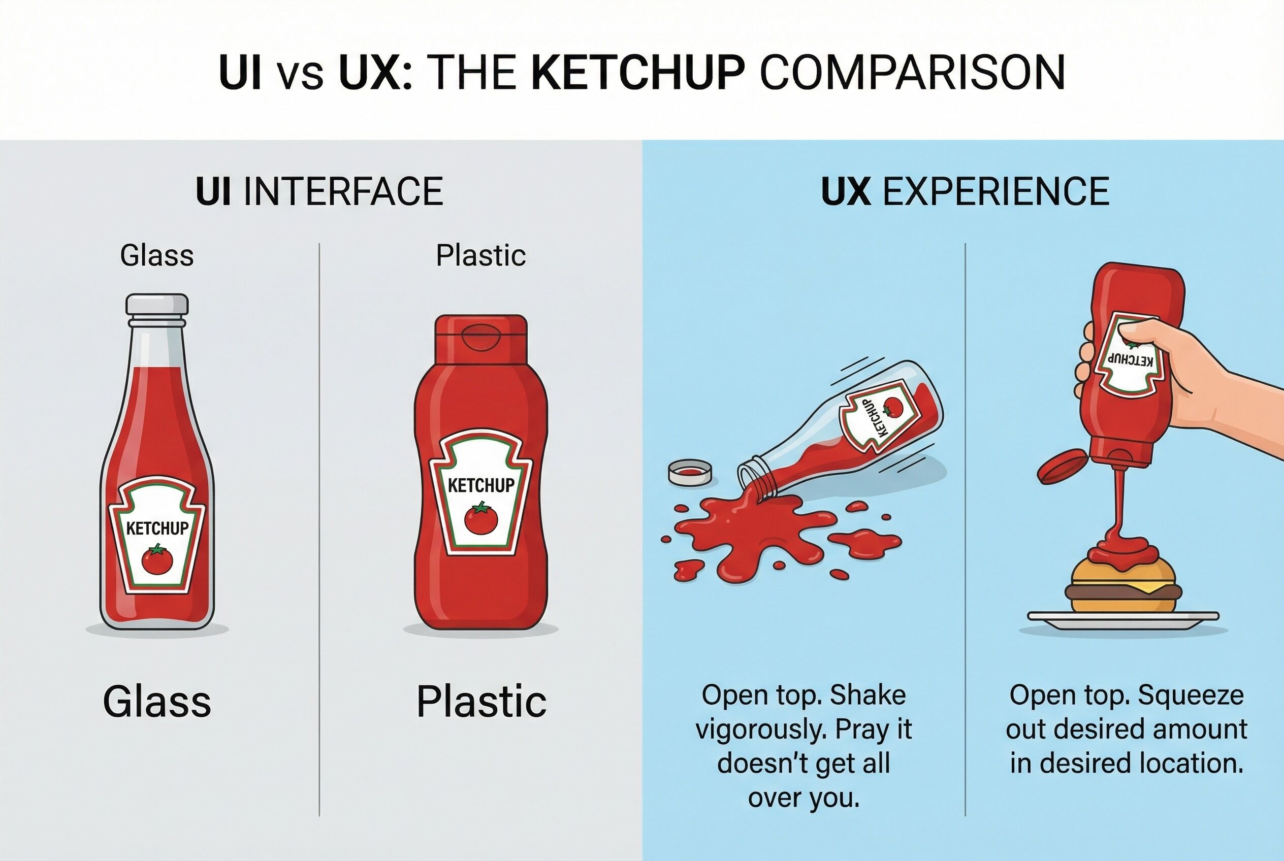
The UI vs. UX Disconnect
Just like the difference between a gorgeous glass ketchup bottle and an easy-to-use squeeze bottle, there’s a critical gap between how your website looks (UI) and how it works (UX). For nonprofits and small businesses operating on tight budgets, understanding this distinction isn’t just academic—it’s survival.
UI (User Interface) is your glass bottle. It’s the visual design, the brand colors, the logo placement, the hero image that makes visitors say “wow.” UX (User Experience) is whether someone can actually donate, purchase, or contact you without ketchup flying everywhere.
Where Nonprofits Go Wrong
Most small organizations make the same mistake: they shake the glass bottle harder. They add more animations, bigger images, flashier slideshows. Meanwhile, their donation button is buried three clicks deep, their contact form asks for 15 fields of information, and their mobile site requires zooming and pinching like a carnival game.
Consider this: A local animal shelter spent $8,000 on a website redesign with beautiful photography. Donations dropped 30%. Why? The new “Donate” button was smaller, used a muted color, and required users to create an account before giving. Beautiful interface. Terrible experience.
The Squeeze Bottle Approach for Small Budgets
Smart nonprofits and small businesses are flipping the script. They’re asking:
- Can someone donate in under 60 seconds on their phone?
- Is the “Contact Us” button visible on every page?
- Does the volunteer signup form only ask for essential information?
- Can elderly users read the text without squinting?
One community health clinic achieved a 150% increase in appointment bookings not through a redesign, but by adding a prominent “Book Now” button to their existing (admittedly dated) website. They chose the squeeze bottle.
The Bottom Line
Your website doesn’t need to win design awards. It needs to work. For nonprofits chasing mission impact and small businesses watching every dollar, prioritize UX over UI. Make it easy for people to give, buy, volunteer, or contact you.
Remember: nobody admires the ketchup bottle while they’re wearing their dinner. They just want their fries.