
If you haven’t taken advantage of Divi’s new background options interface, you are missing out. The background design possibilities are astounding. But wouldn’t it be awesome to have the same powerful design options for our buttons? If the answer is yes then I think you are going to love this post.
Today I’m going to show you how to bring the same powerful background design features to style buttons. This design trick layers the Row and Column background behind the button module to give you 3 layers of design capabilities. With this kind of power, things could get dangerous. Best to stay calm and go slow at first 
Let’s go.
Sneak Peek
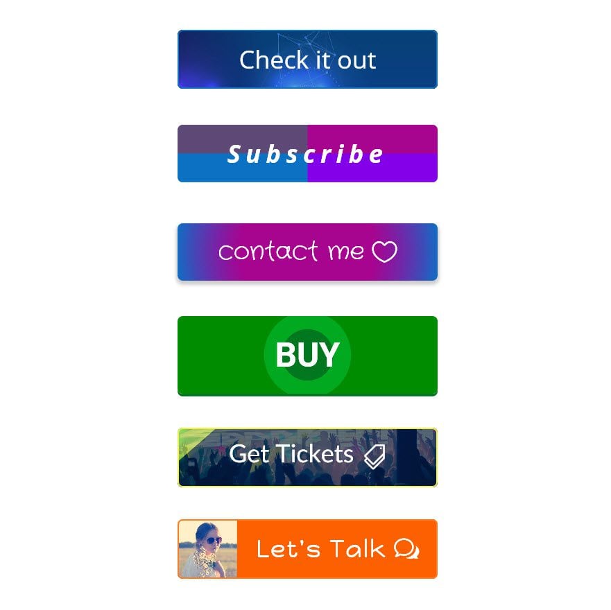
Here are the example button designs covered in this post.
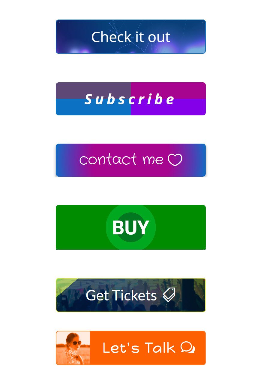
Styling Buttons with Divi’s New Background Options (6 Designs Included)
Subscribe To Our Youtube Channel
The Set Up
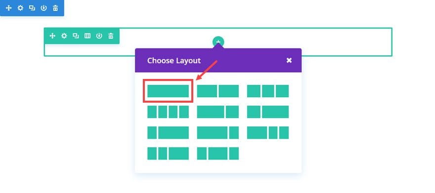
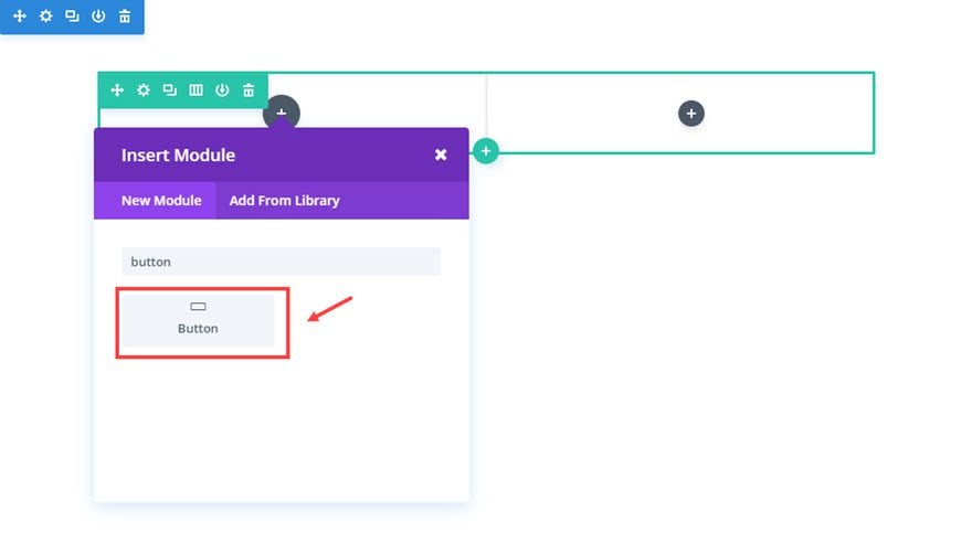
Using the Visual Building, add a regular section with a one column row.
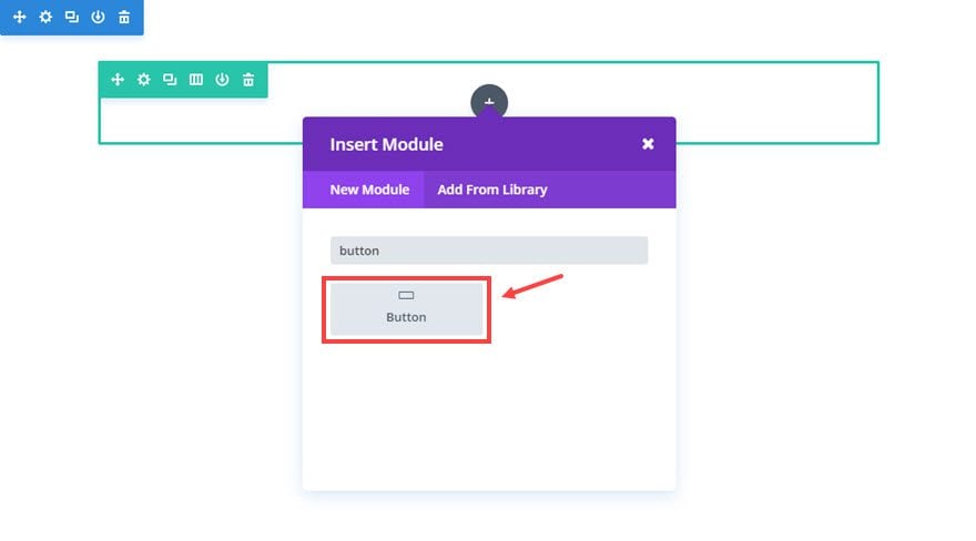
Next add a Button Module to the row.
Then update the button module settings as follows:
Content Options
Button Text: [enter text]
Button URL: [enter URL]
Design Options
Button alignment: Center
Text Color: Light
Use Custom Styles for Button: YES
Button Text Size: 48px
Advanced Options
We need the width of 100% will be needed to fill the width of the column. To do this, enter the following custom CSS in the Main Element box:
Width: 100%;
Save settings
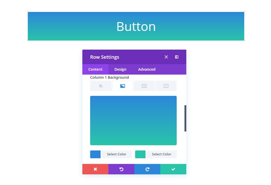
You can’t see anything on the page right now because your button border and text is white. Instead of styling the button’s background color using the button module settings, we are going to customize the background color of the row/column behind the button using the more advanced background options. We will be revisiting the button module settings once we start doing more specific designs on the buttons. But for now, let’s finish setting up the row.
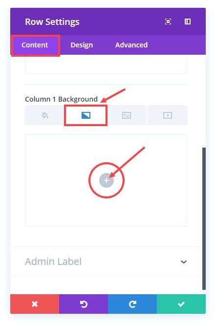
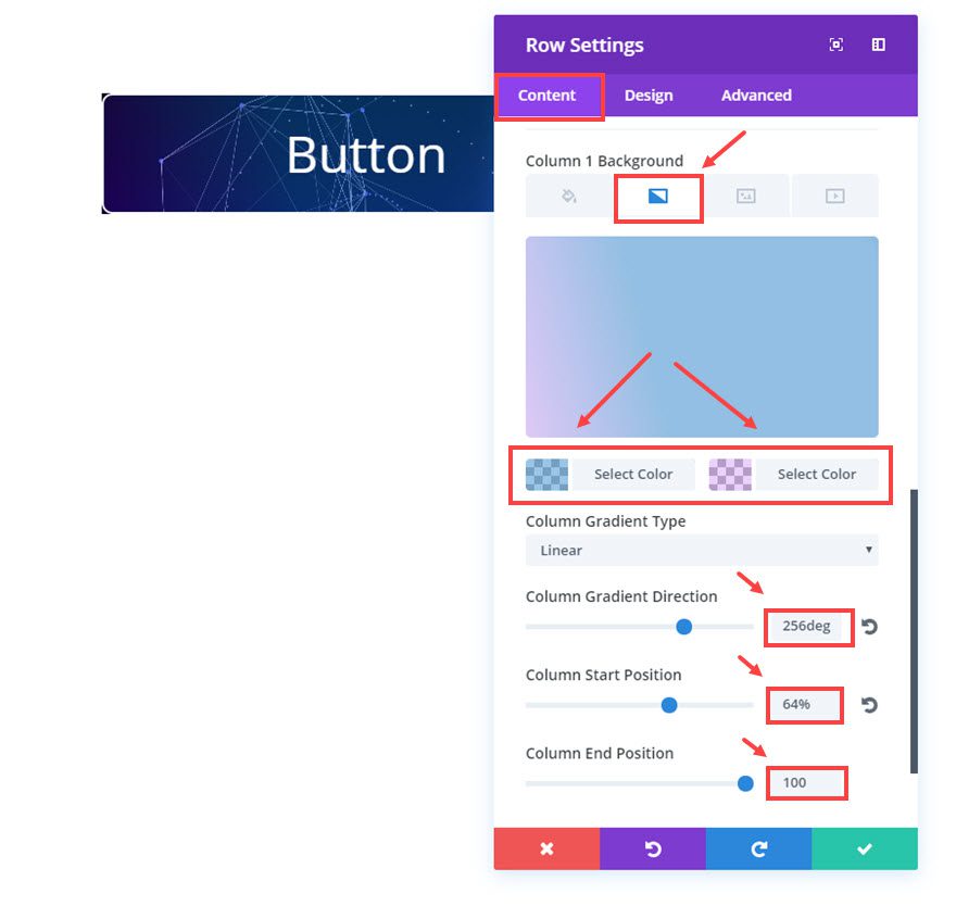
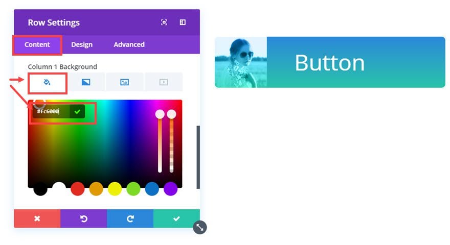
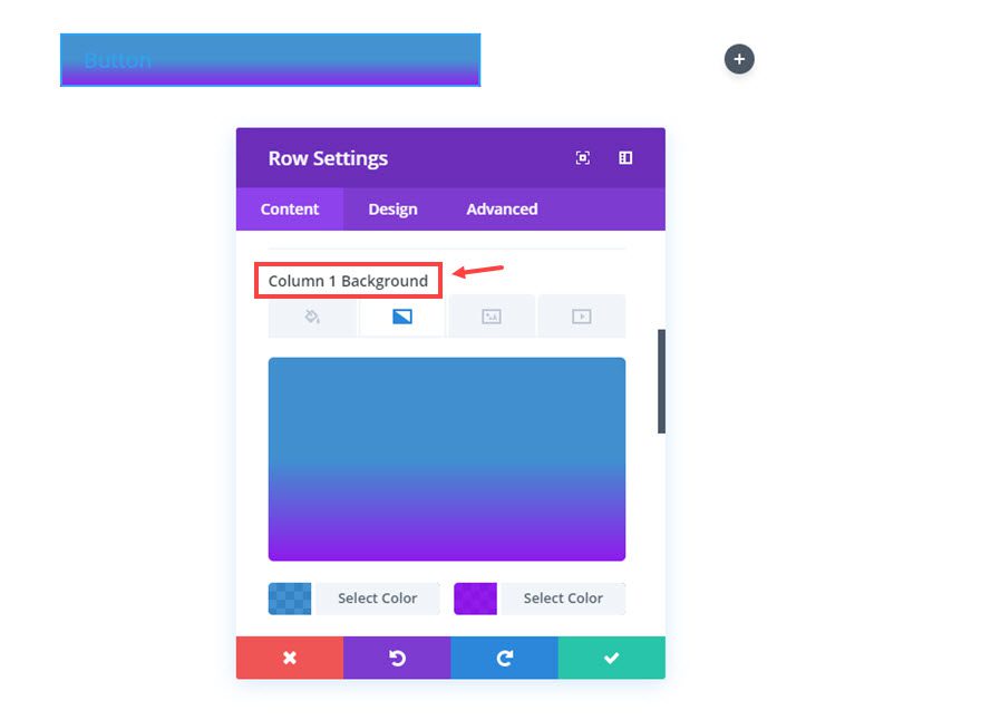
Go to the Row Settings that your new button is sitting in and update the following:
Content Options
Select the Column 1 Background Gradient tab and then click the gray circular button with a white plus symbol.
Now you should see the default gradient colors show up behind your white button.
The column is fitting nicely behind our button now, but we need to decrease the width of the button. To do this we are going to use the row sizing settings. By setting a custom width for our row, we also set the width of our button.
Design Options
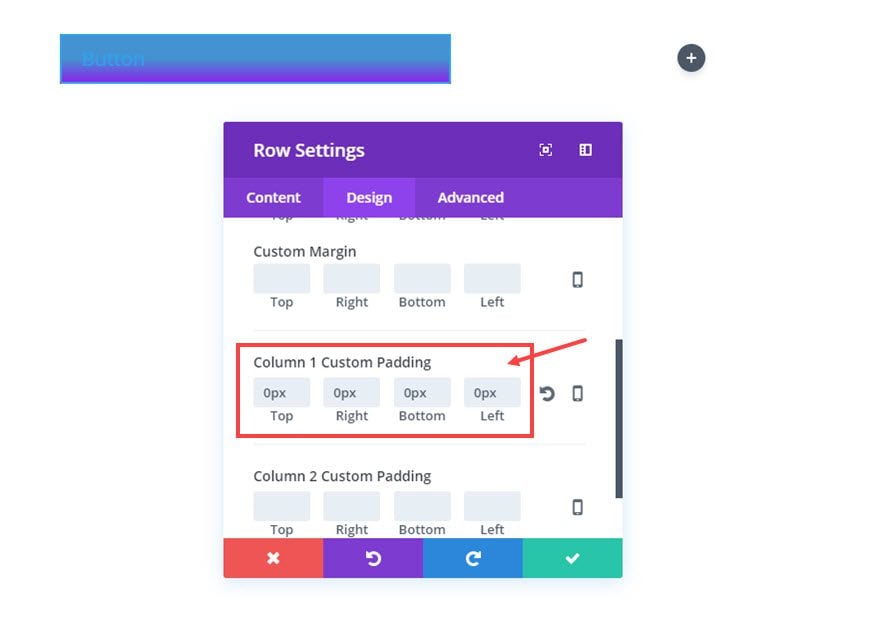
Under the design options, we are going to adjust the sizing of the row to fit our new button by adjusting the following:
Use Custom Width: YES
Custom width: 500px (this sets the max width of the button to 500px)
Custom Padding: 0px Top, 0px Right, 0px Bottom, 0px Left
Advanced Options
We need the match the border radius of the row and column to what we have set for our button so that they all match.To do this, enter the following custom CSS in the Main Element box:
border-radius: 10px;
Enter the same CSS into the Column Main Element box:
border-radius: 10px;
Save settings
Now that the Row settings have been updated to have a custom width and padding, two things have been accomplished. First, we have successfully set a custom width for our button. And Second, we now have another layer of background options we can use to style our button.

That’s a total of 3 background layers (button, column, row) we could use for styling later on.
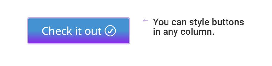
Here is an illustration of how the button is currently built.
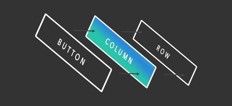
Pretty cool right?
That’s it for the basic setup. Now it’s time for the fun part of creating awesome designs for your buttons.
Creating Awesome Button Designs
#1 Video Background Button
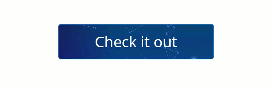
To create this button, you are going to use all 3 layers, the row background for the video, the column background for the gradient, and the button background for the slight blue overlay.
For the Row Settings update the following Content options:
Background Video: [upload video]
Column 1 Background Gradient Colors: rgba(12,113,195,0.41), rgba(131,0,233,0.18)
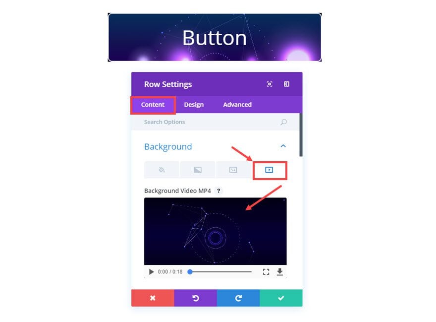
Save Settings
For the Button Module Settings, update the following:
Content Options
Button Text: “Check it out”
Design Options
Button Background Color: rgba(12,113,195,0.25)
Button Border Color: #0c71c3
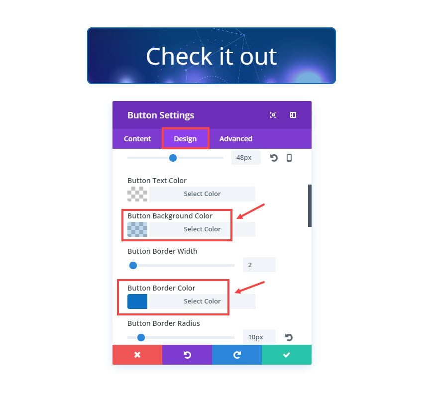
Save settings
Now the only problem we have left is the border radius of the video background. We have to add some custom CSS to give the video a border radius that matches the button. This extra code is only necessary for the video background button.
To add the custom CSS, go to page settings from the Visual Builder and click the Advanced tab. Then update the Custom CSS input box with the following CSS:
.et_pb_section_video_bg {

border-radius: 10px;

}
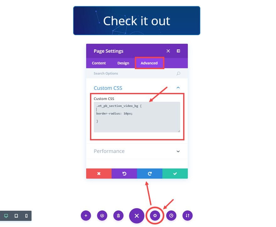
Save Settings
Tip: Another cool design option is to have the video show on hover. Just give your button module a solid background color and change it to transparent on hover.
That’s it! Now you have a button with a video background.
#2 Checkered Button
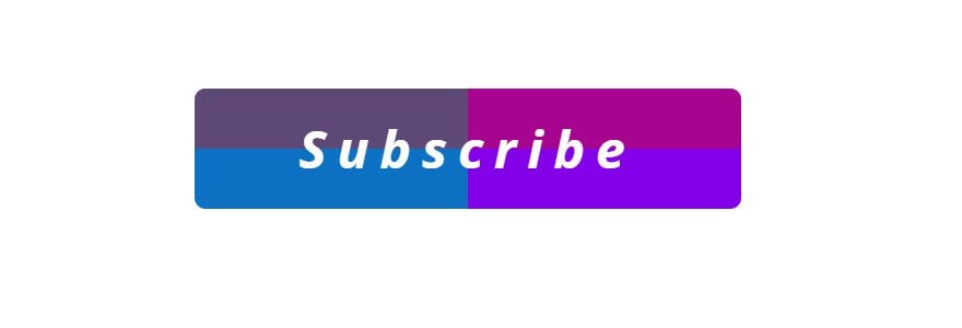
The checkered button requires using two layers (row and column) of background color gradients.
To create this button, you are going to use 2 layers, the row background for the first level of gradients and the column background for the last layer of gradient color.
For the Row Settings update the following Content options:
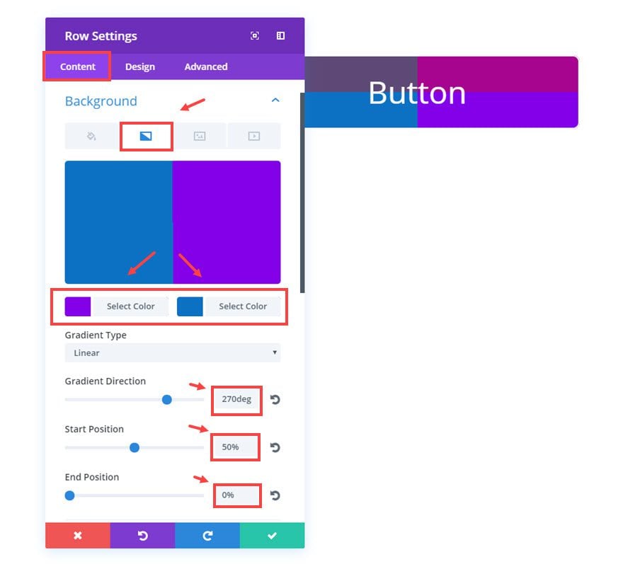
Background Gradient Colors: #8300e9, #0c71c3
Gradient Direction: 270deg
Start Position: 50%
End Position: 0%
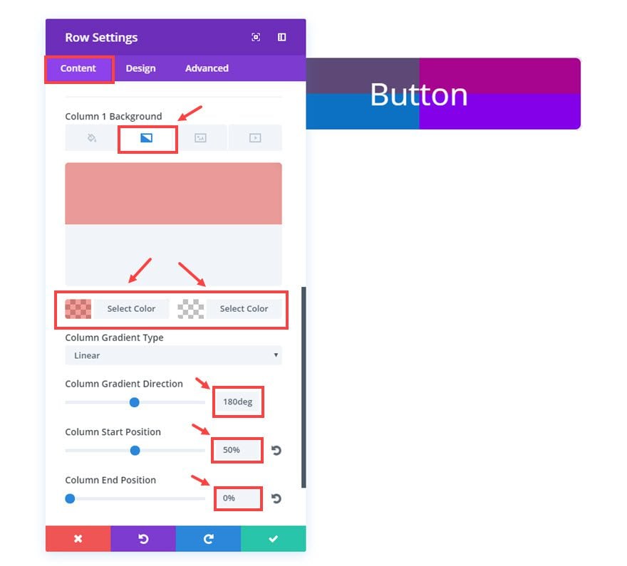
Column1 Background Gradient Colors: rgba(224,11,0,0.39), rgba(255,255,255,0)
Gradient Direction: 180deg
Start Position: 50%
End Position: 0%
Save Settings
Now go to the Button Module Settings and update the following
Content Options
Button Text: “Subscribe”
Design Options
Button Border Width: 0px
Button Letter Spacing: 10px
Button Font: Default, Bold (B), Italic (I)
Button Hover Letter Spacing: 10px
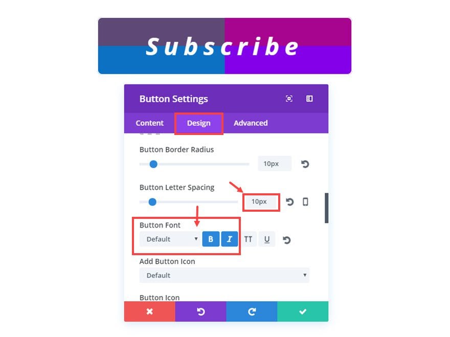
That’s it. Here is the final result.
Now you know how to add a checkered effect to your buttons.
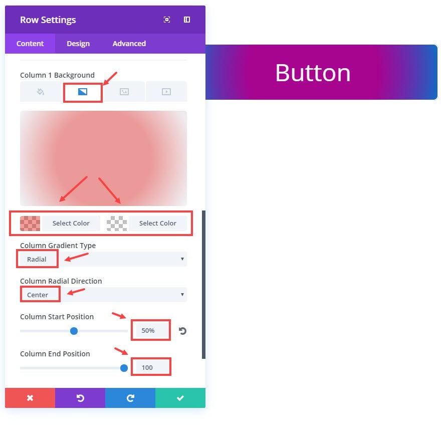
#3 Radial Gradient Button
To create this button, you are going to use 2 layers (row and column) of background color gradients.
For the Row Settings update the following Content options:
Background Gradient Colors: #8300e9, #0c71c3
Gradient Type: Radial
Radial Direction: Center
Start Position: 50%
End Position: 100%
Column1 Background Gradient Colors: rgba(224,11,0,0.39), rgba(255,255,255,0)
Gradient Type: Radial
Radial Direction: Center
Start Position: 50%
End Position: 100%
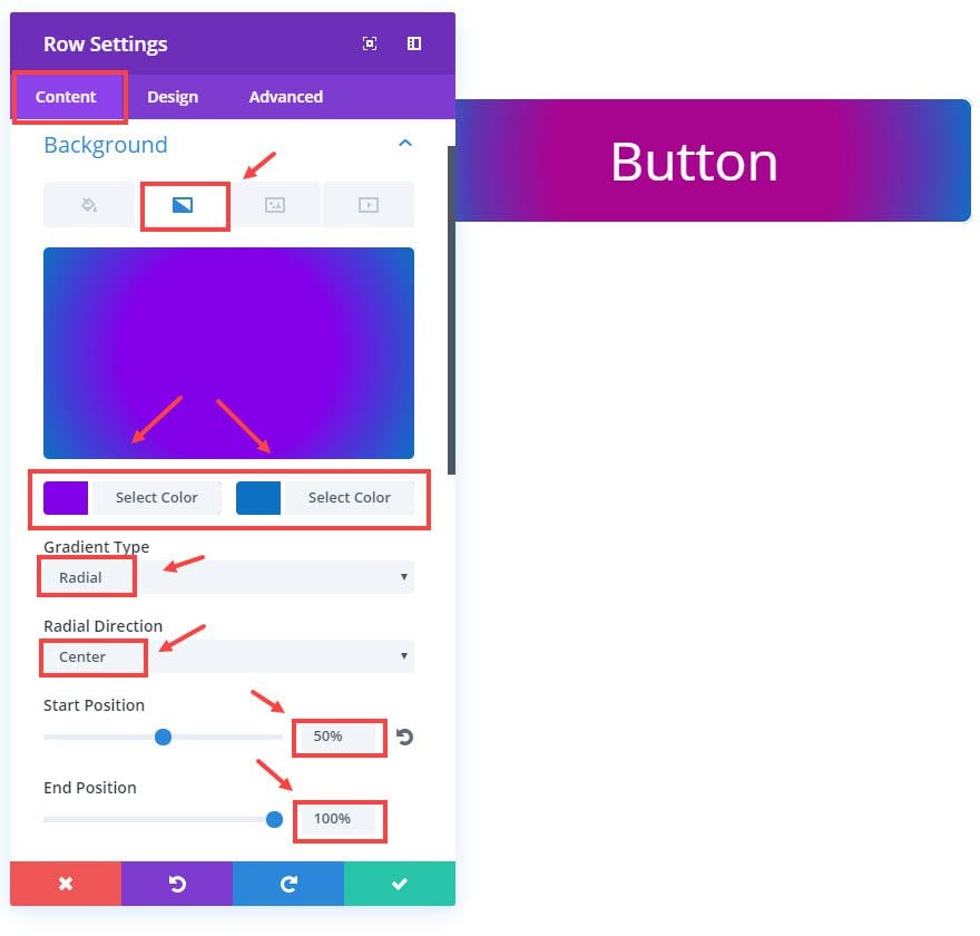
Save Settings
Now go to the Button Module Settings and update the following:
Content Options
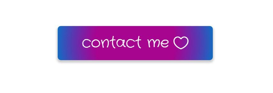
Button Text: “contact me”
Design Options
Button Border Width: 0px
Button Font: Crafty Girls
Button Icon: [choose heart icon]
Only show Icon On Hover for Button: NO
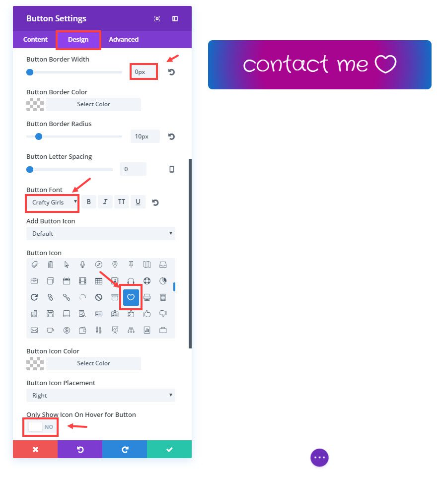
Advanced Options
For a final touch, let’s add a slide shadow to the button. In addition to the previous code, enter the following Custom CSS in the Main Element box:
box-shadow: 0px 5px 10px 3px #ccc;
That’s it! Here is your final result:
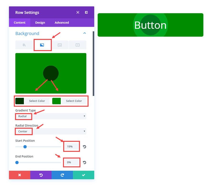
#4 Bullseye Button
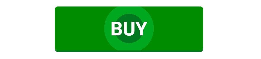
To create this button, you are going to use 2 layers (row and column) of background color gradients. Plus we are going to add some custom css in the button module to create the bottom border popup effect.
For the Row Settings update the following Content options:
Background Gradient Colors: #023500, #008c02
Gradient Type: Radial
Radial Direction: Center
Start Position: 19%
End Position: 0%
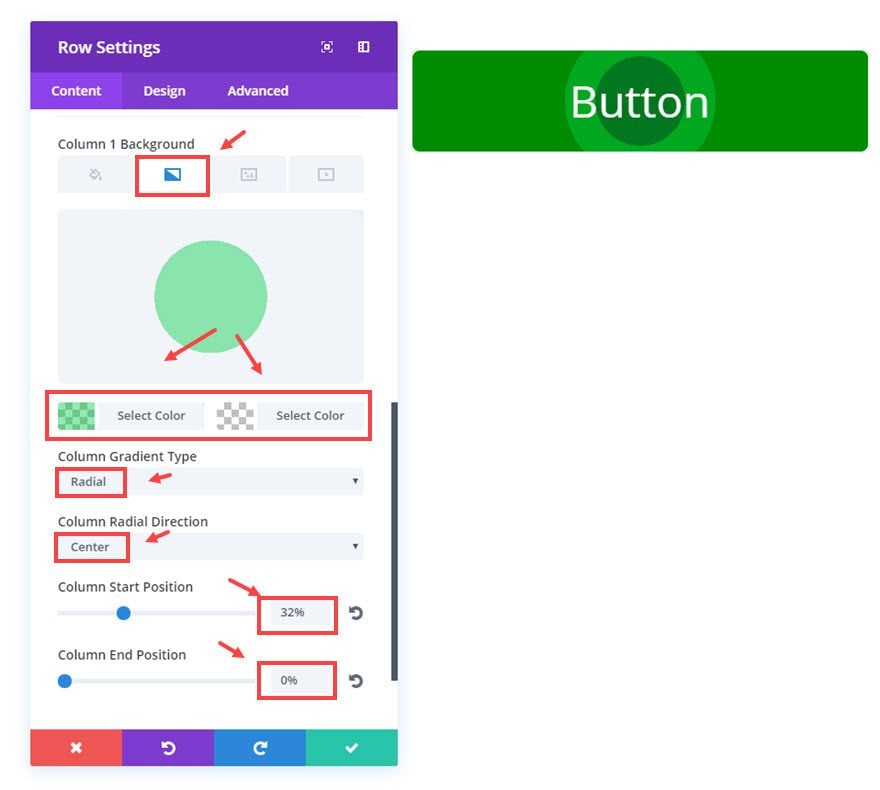
Column1 Background Gradient Colors: rgba(0,206,72,0.43), rgba(255,255,255,0)
Gradient Type: Radial
Radial Direction: Center
Start Position: 32%
End Position: 0%
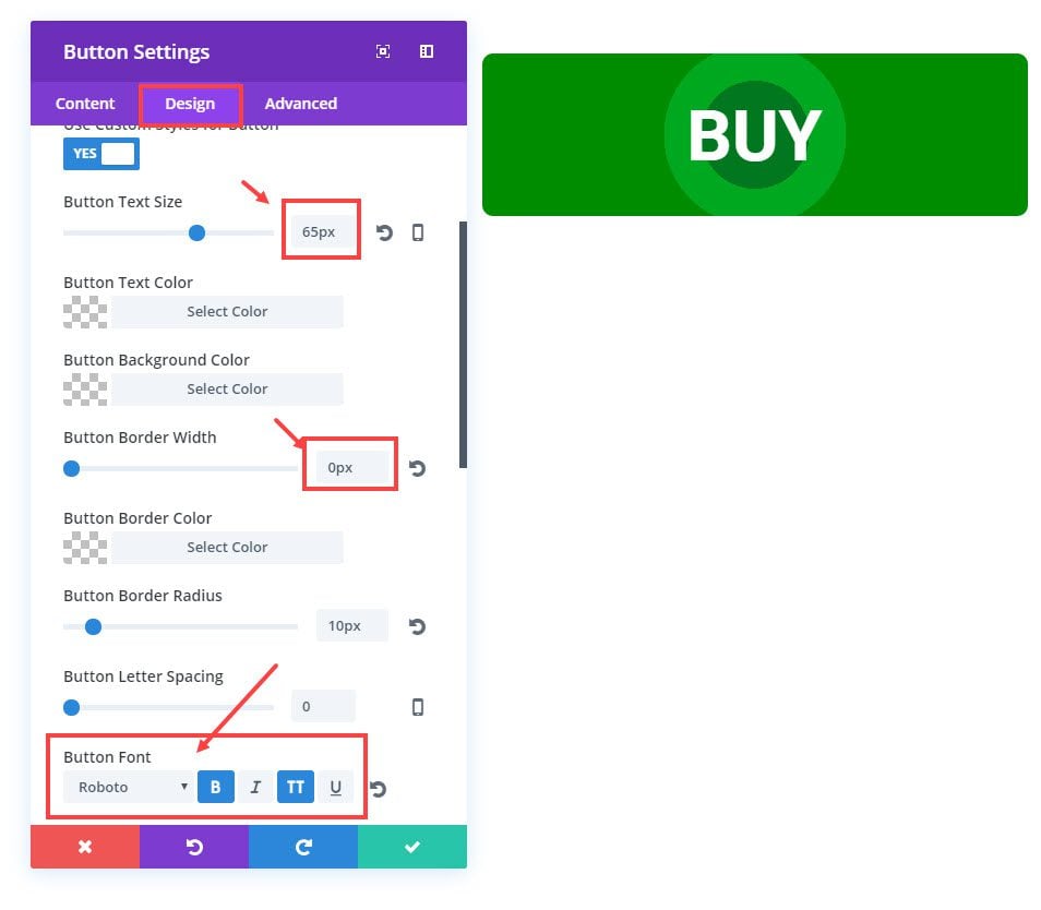
Now go to the Button Module Settings and update the following:
Content Options
Button Text: “Buy”
Design Options
Button Text Size: 65px
Button Border Width: 0px
Button Font: Roboto, Bold(B), Uppercase(TT)
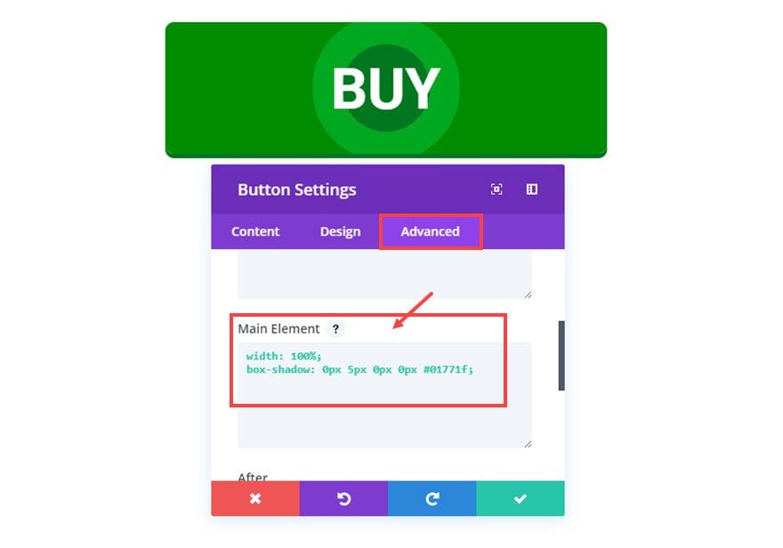
Advanced Options
Now for the final touch. Add the following Custom CSS to the existing code in the Main Element input box:
box-shadow: 0px 5px 0px 0px #01771f;
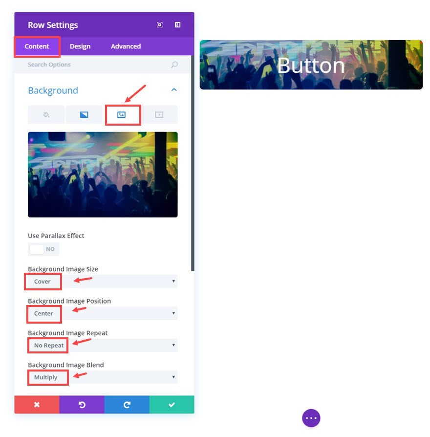
#5 Image Button
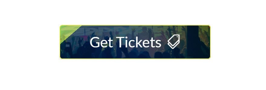
To create this button, you are going to use all 3 layers, the row for the background image, the column for the gradient background, and the button background for the semi-transparent blue color overlay.
For the Row Settings update the following Content options:
Under the Background Image tab
Background Image: [upload image]
Background Image Size: Cover
Background Image Position: Center
Background Image Repeat: No Repeat
Background Image Blend: Multiply
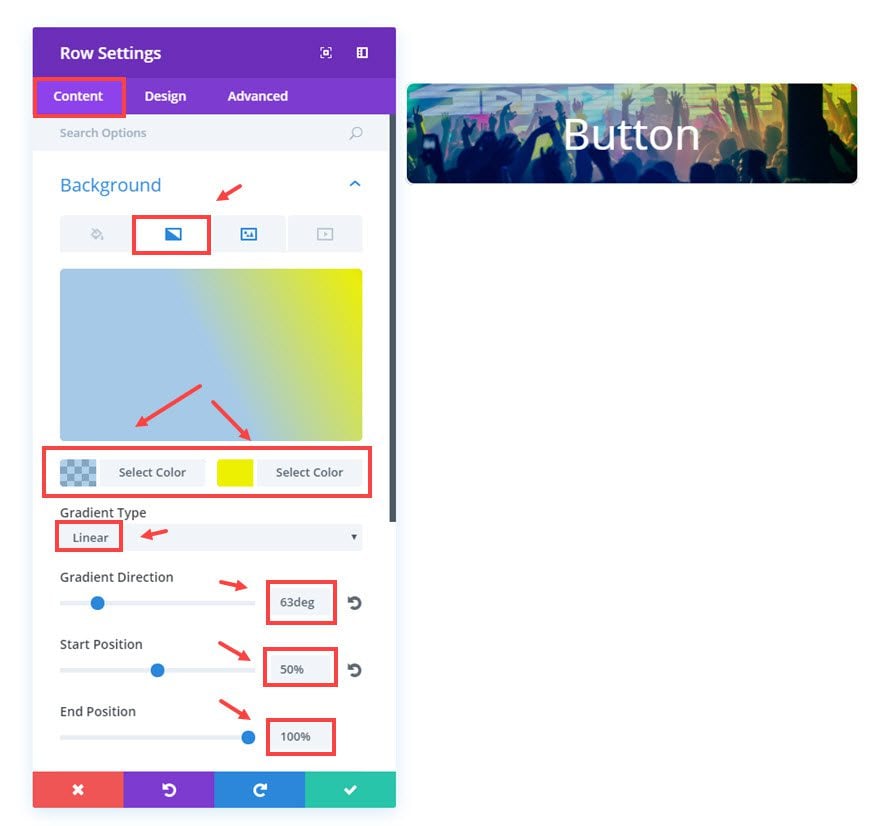
Under the Background Gradient tab
Background Gradient Colors: rgba(12,113,195,0.33), #edf000
Gradient Type: Linear
Gradient Direction: 63deg
Start Position: 50%
End Position: 100%
Now scroll down to the Column 1 Background options and select the gradient tab.
Column 1 Background Gradient Colors: rgba(236,239,31,0.66), rgba(0,0,0,0.49)
Column Gradient Type: Linear
Column Gradient Direction: 139deg
Column Start Position: 12%
Column End Position: 0%
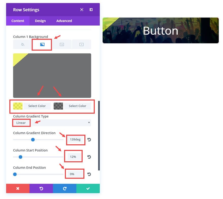
Save Settings
That takes care of our second level of background designs. One more left.
Go to the Button Module Settings and update the following:
Content options
Button Text: “Get Tickets”
Design Options
Button Background Color: rgba(12,113,195,0.16)
Button Border Color: #efef4f
Button Font: Lato
Button Icon: [select Tickets icon]
Only Show Icon On Hover for Button: NO
Button Hover Text color: #023b7c
Button Hover Background color: #023b7c
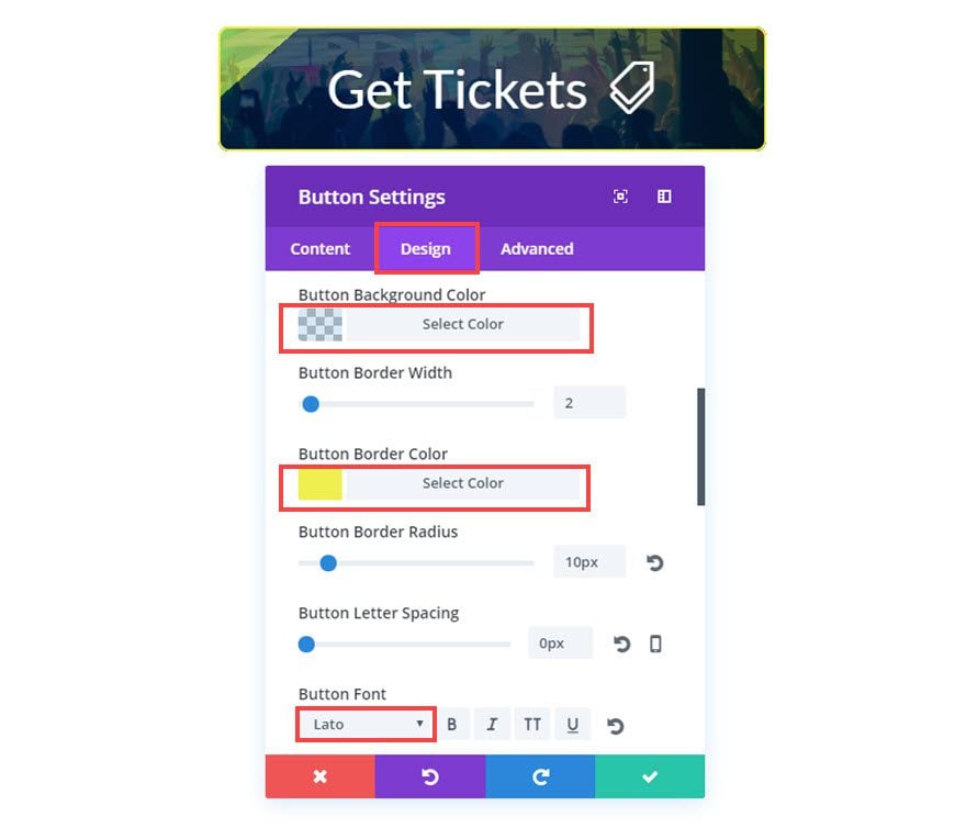
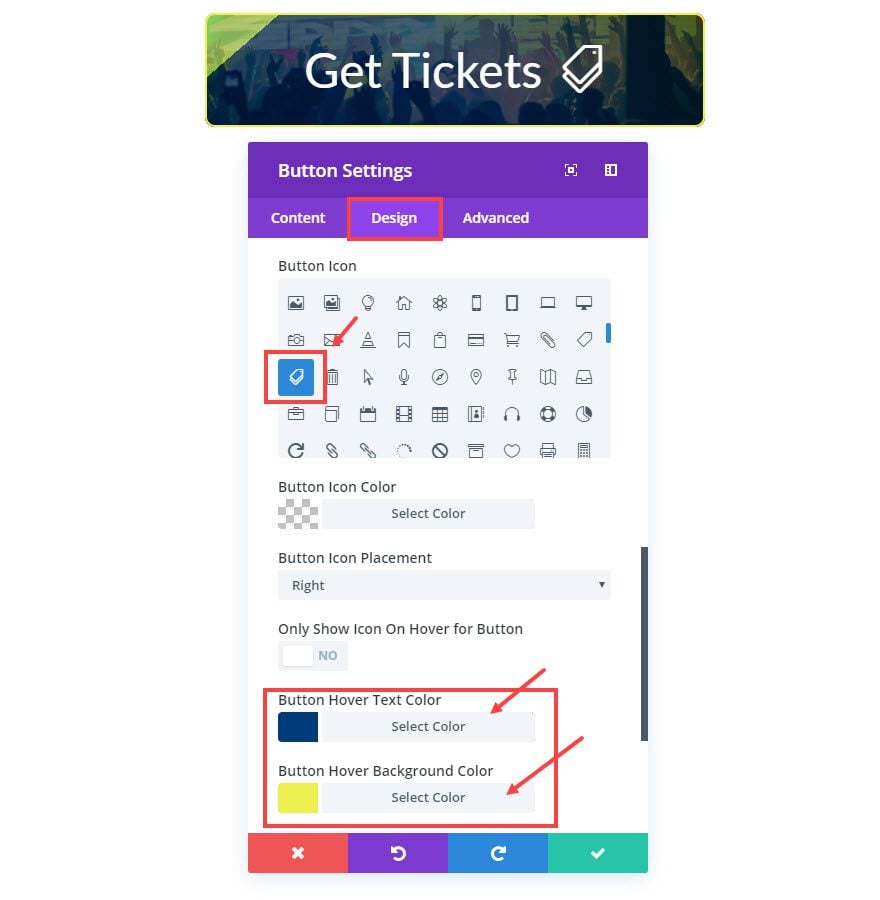
That’s it!. Check out your image button.
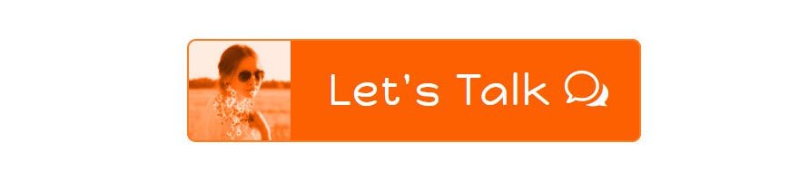
#6 Portrait Button
To build this last button, we are only going to use one layer of background design. We are going to use an image blend of the background image and the background color to create a unique look.
For the Row Settings, scroll down to the Column 1 Background Options and update the following:
Column Background Image: [upload portrait image]
Column Background Image Size: Fit (this will make sure the portrait always fits within the button)
Column Background Image Position: Center Left (this aligns your portrait to the left of the button)
Column Background Image Repeat: No Repeat
Column Background Image Blend: Luminosity (this creates a nice blending of the orange color with the portrait)
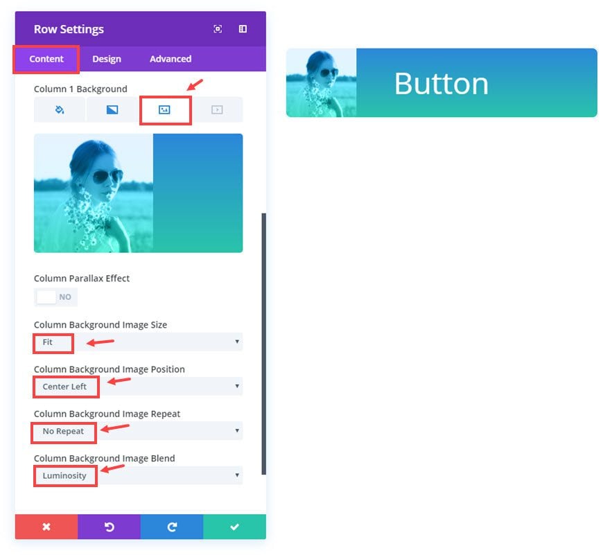
Make sure to delete the current gradient colors if you have them set. If not, you want be able to blend the orange background. Just click on the gradient tab and hover over the color picker box and click on the trash can icon that pops up on the top right.
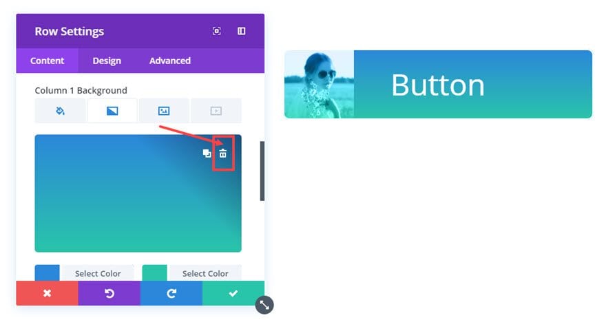
Now you can see the orange blend on your button.
Save settings
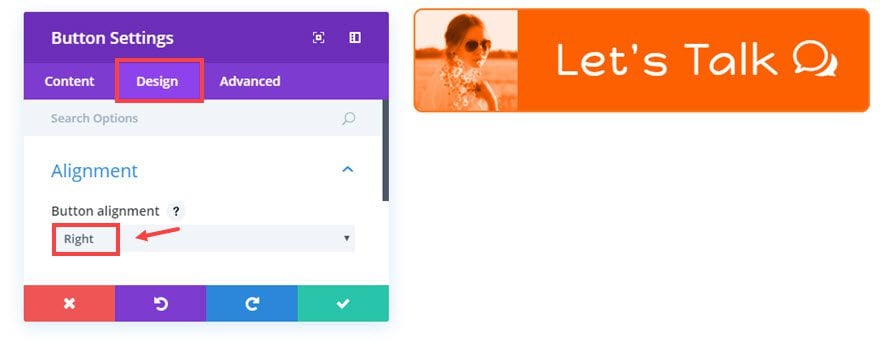
Now go to the Button Module Settings and update the following:
Content Options
Button Text: “Let’s Talk”
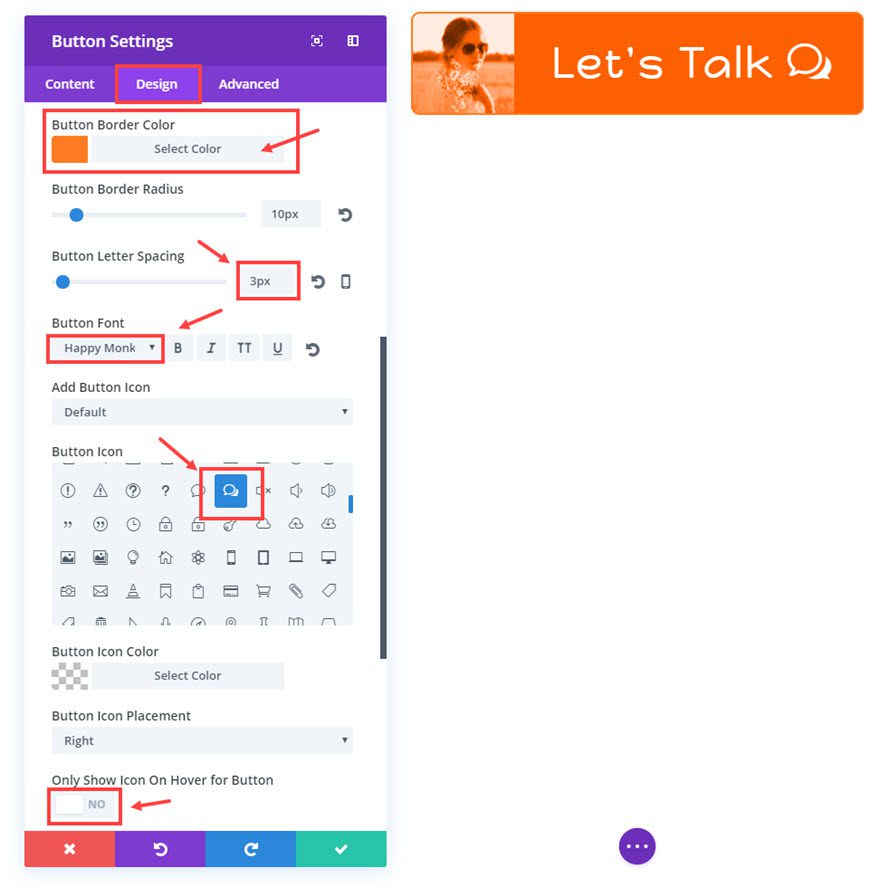
Design Options
Button Alignment: Right
Button Border Color: #ff7b23
Button Letter Spacing: 3px
Button Font: Happy Monkey
Button Icon [add chat icon]
Only Show Icon On Hover for Button: NO
Button Hover Letter Spacing: 3px
All done! I like this design for a blog contact button. I think it adds a nice personal touch.
Designing buttons on different column structures
So far, we have been using the single column rows to serve as the backgrounds to our buttons. This allows us 3 layers of background design. However, if you would like to include a button on a different column structure, you can. You will just lose the row as a background layer.
For example, let’s say you want to add a ½ ½ column row with a button on the left and some text on the right. Here is what you would do.
Start with a new regular section and select the ½ ½ column row structure. Then add a button module to the left column.
In the Button Module settings, make sure you insert the following CSS in the Main Element input box under the Advanced tab:
Width: 100%;
You can customize the rest of the button module later.
Next, go to the Row Settings and scroll down to Column 1 Background options and update the background settings how you want.
Then go to the Design tab and update the following:
Column 1 Custom Padding: 0px Top, 0px Right, 0px Bottom, 0px Left
Save settings
Now you have a button on the left column that is able to use column 1 background options for the design. Once you go back and update the button style to your liking, add your text on the right column and you are done!
Responsive?
Yes. Because the buttons are built within the column structure of Divi, the buttons will respond nicely on all devices. You may need to revisit the button module settings to adjust how certain button elements adjust to different devices.
Cross Browser Support
Currently, the background-blend-mode CSS property is not supported by Internet Explorer or Edge and Safari has limited blending options. However the fallback is not considerable in my experience for most cases.
Here is what the buttons look like on IE:
If you are committed to IE, I would suggest testing them to find a happy medium that looks great on both IE and other browsers.
Final Thoughts
I have to admit, this tutorial is pretty groundbreaking for me personally. In the past, I had to add a bunch of classes and additional CSS to my child theme if I wanted to style buttons creatively. But now that I can use Divi’s background options, my life became much easier. I hope that you can use this design trick to take your buttons to the next level.
Look forward to hearing from you in the comments.
Cheers
The post Styling Buttons with Divi’s New Background Options (6 Designs Included) appeared first on Elegant Themes Blog.