
You’ve probably heard that colors can influence emotions. Red makes people more angry, yellow signifies happiness, and so on. The psychology of color is an incredibly interesting topic. For website owners and designers, however, the real question is: How can you use colors effectively to connect with your audience?
In other words, it’s not enough to simply pick out colors that look nice together. That’s why in this article, we’ll talk about the connection between colors and emotions. Then we’ll discuss four ways you can use color to better connect with your audience.
Let’s get to work!
The Connection Between Colors and Emotion
There is a clear connection between visual stimuli and emotions. The easiest example of that is art – which can inspire some people, and make others wonder how that got into a museum. Colors are one of the most basic components of almost all art, so it stands to reason that they should be able to evoke emotions on their own.
There’s a lot of research on the links between colors and the feelings they inspire. You’ve probably heard about some of the most well-known connections before – red is often associated with anger and arousal, yellow with optimism and energy, blue with calmness, and so on.
It’s also important to understand that the emotions we associate with colors can vary a lot, depending on your culture and even the language itself. For the purposes of this article we’ll be focusing on associations related to Western culture, but this is a fact worth keeping in mind if your audience is global in nature.
Color theory can be applied in many ways, and that includes web design. There is plenty of literature that covers some of the most common color associations. However, there’s not as much information out there about the practical applications of color within web design, which is what we’re going to discuss next.
4 Ways You Can Use Colors to Connect With Your Audience
Without further ado, let’s look at four methods for using colors to design a more effective website. You should be able to put these techniques into practice with just about any color combinations you like, so don’t be afraid to do some experimenting.
1. Put Together a Color Palette With Specific Emotions in Mind
Every website has at least one goal. That may involve selling a product or service, promoting someone else’s offerings, cultivating a community, and so on. The primary ways website owners try to accomplish those goals include creating compelling content, and putting people into the right frame of mind via smart design.
Let’s say, for example, that you run an e-commerce store. Your main goal will likely be to drive sales, and you’ll want to target a specific set of emotions that can help you achieve that. In this case, those feelings could be:
- Excitement
- Possibility
- Trust
- A fear of missing out
Traditional color theory would suggest that using reds, yellows, and blues is a good way to center in on those feelings. The thing is, the color palette you choose also needs to look good, and represent your unique brand.
Red and blue have excellent contrast, for example, which usually makes for a solid combination. However, mixing yellow with red can be trickier. A red-orange tone works well with a darker, ochre yellow, but not as well with the brighter classic tone that usually comes to mind.
What you want is a set of colors that not only combine well, but also enable you to target specific emotions that align with your goals. To do this, you’ll want to check out a quick guide to color combinations, and read up on what emotions the basic colors elicit.
Once you have a set of colors you like, take note of them, because you’ll want to use them throughout your site’s various elements. In the next two sections, we’ll discuss practical examples of how to do that.
2. Design Your Website’s Header Around a Specific Color
The first thing people see when they visit your website is your home page’s header. That makes it the perfect element to set the tone for the emotions you want to focus on throughout the rest of your pages.
If you followed our advice in the last section, you should have a color palette ready to go. Now, it’s just a matter of figuring out an effective way to use it. One example of a header section we really like can be seen on ConversionLab:

It’s nothing flashy, but the use of color here is excellent. The light blue serves to communicate trust, and the orange inspires impulse. Combining orange with a Call to Action (CTA) is a particularly smart move, and using blue for the background overlaid with a personal photo is right out of the handbook for “how to inspire trust in your visitors”.
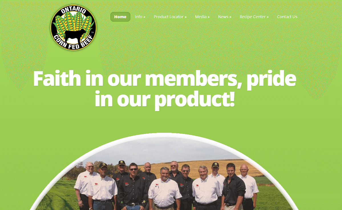
Moving on to a second example, the Ontario Corn Fed Beef website uses green to excellent effect. As you might imagine, green is a color often associated with nature, organic products, and similar subjects. Choosing it for a food-related website is perfect if you want to play up the health angle:
As always, remember that the colors you choose to use need to work well with each other. That’s particularly relevant if you want to include text within your header. When it comes to text, the classic white or black options tend to work best, since they provide good contrast and are highly readable.
3. Use the Right Colors for Your Calls to Action
In the last section, we touched on a specific example of how to combine your choice of color with your CTAs. If you know anything about A/B testing, you’ll be interested to know that in plenty of cases, just changing a CTA’s color can be enough to increase conversions.
Let’s look at a few of the tones that are usually the best fit for CTAs:
- Reds. These are often associated with passion and aggressive marketing.
- Oranges. As we mentioned before, you can use oranges to play up impulsiveness.
- Blues. A lot of websites use blue color palettes, due to their calming association. That can play to your advantage if you want to design more attractive and welcoming CTAs.
- Purples. Throughout history, purple has been associated with luxury. This can make it an interesting option for CTAs.
Keep in mind that these are only some suggestions to get your creative juices flowing. You can always think outside the box with the colors you choose. Generally speaking, however, you want your CTAs to stand out visually and elicit a strong reaction.
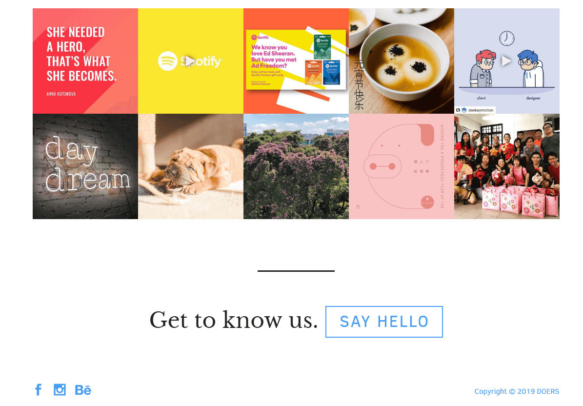
That means you need to ask yourself how aggressive you want to be with your design. Doers, for example, opts for a more subdued approach that’s very inviting:
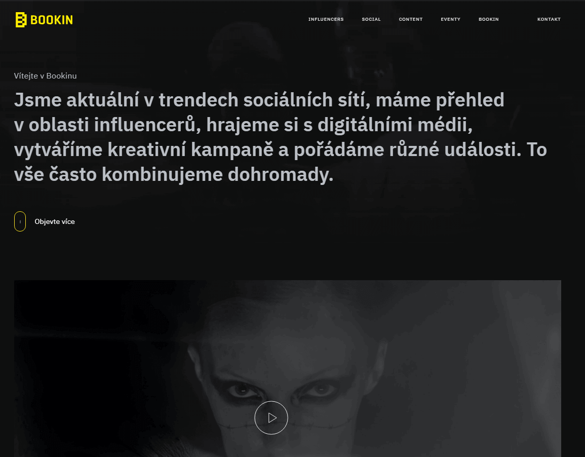
Hupla, on the other hand, goes for a bold combo of red and purple. It’s an aggressive approach, but combined with the right imagery, it works to elicit a sense of ‘wanting to fit it’ and urgency:

Whatever combination you choose for your CTAs, it’s always smart to test them. Some emotions might not be as effective, depending on who your audience is. That means A/B testing will be your strongest ally.
4. Don’t Be Afraid to Use Less Popular Colors
Throughout this article, there are a few colors that have gotten a lot of attention. Reds, oranges, and blues tend to get a lot of love when people talk about using colors to elicit emotions, and the reason for that is two-fold:
- Those particular colors work fantastically together.
- They target a set of emotions that’s particularly valuable, including urgency, calmness, trust, and impulsiveness.
However, you have a lot more colors to play with. Color theory is a pretty deep rabbit hole, and chances are there are some palettes aside from the blue-red-orange trifecta that might be a much better fit for your audience.
Black and yellow, for example, make for an unexpectedly classy combination. We often associate black with sophistication or edge, and yellow contrasts with it in both a visual and emotional sense:
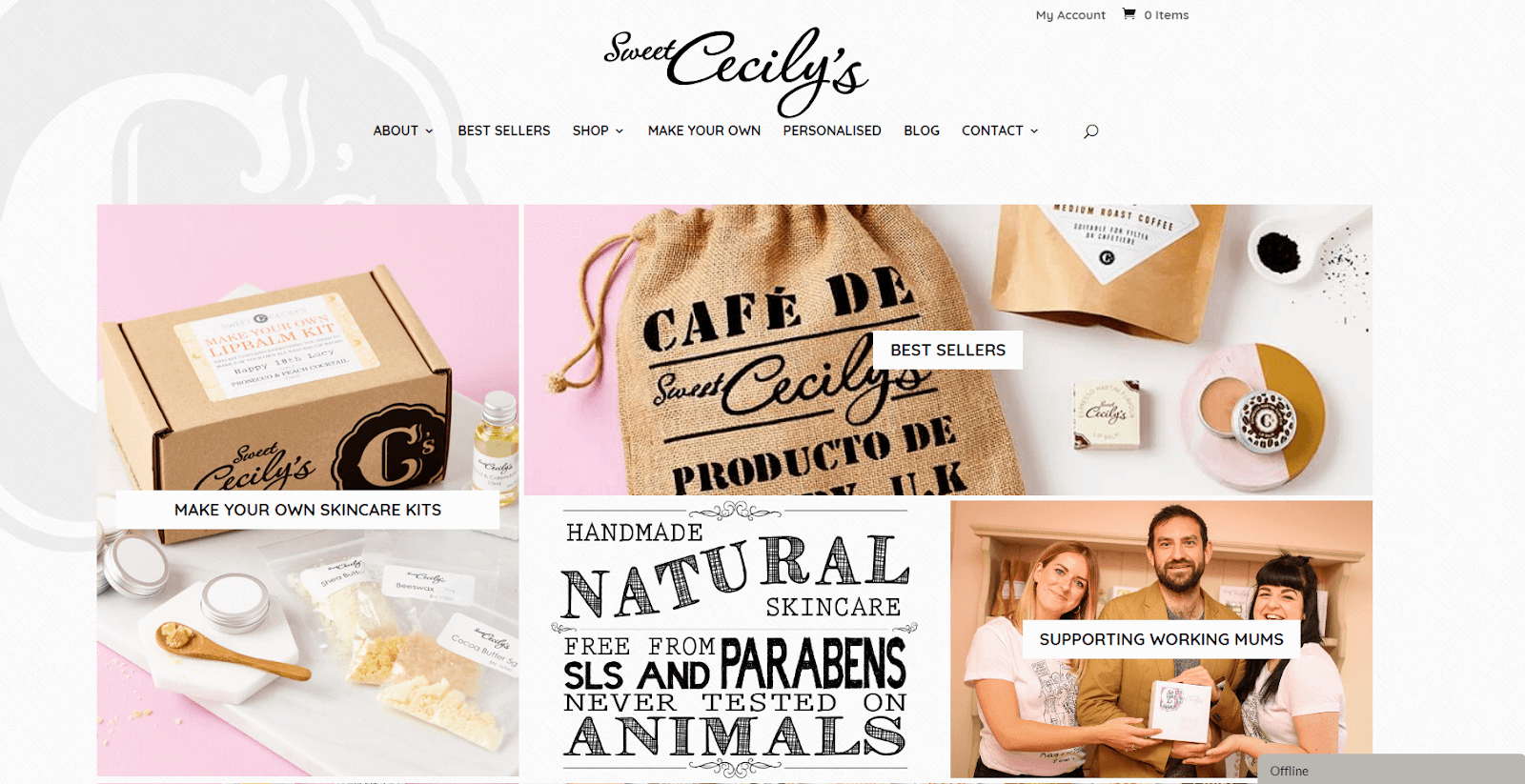
You can also use colors more sparingly, if you don’t want to be as overt in the emotions you’re trying to elicit. Sweet Cecily’s for example, is all about pastel colors, and we quite like its use of pink. Since that color is associated with youth and femininity, it resonates perfectly with their intended audience:
The main takeaway is that you have many options when it comes to color, and hundreds of elements you can implement them in. You can focus in on the emotions you want to elicit by featuring related colors prominently, or be more subtle about the associations you’re going for. The key lies in experimentation, and knowing who your audience is.
Conclusion
The way you use colors in your website’s design is very important. Some color combinations look and feel amazing, while others can make your website seem jarring. However, using the right colors isn’t just about style. You also need to be aware of the emotions colors can convey, and how to take advantage of those powerful effects.
Let’s review the four ways you can use color in web design to connect with your visitors:
- Put together a color palette with specific emotions in mind.
- Design your website’s header around a specific hue.
- Use the right colors for your CTAs.
- Don’t be afraid to use less popular shades.
Do you have any questions about how to use colors to convey emotion in web design? Let’s talk about them in the comments section below!
Article thumbnail image by Hardyguardy / shutterstock.com
The post Using Color Emotion to Connect More Deeply With Your Audience appeared first on Elegant Themes Blog.