
Welcome to part 5 of this 6 part series that will teach you how use Divi’s new Animation options to design awesome page sections. I’m going to be walking you through how to build the different sections of our live demo page in order to show you techniques for adding animations to your website. The Animation features truly are fun and easy to use. And with the Visual Builder, you can see your creation come to life every stage of the way. Come and join me as we explore the power of Divi animations.
In our last post we built section 6 of our animation demo page. I showed you how to design a layout for displaying product downloads with bright colors, glowing shadows, and precise animation.
Today, we are going to be building Section 7 of our animation demo page which is a perfect example for how to use the roll animation effect to add life-like movement to your content. The end product will give the impression of text and cell phones sliding and rotating into view from different angles as you scroll down the page.
This is one of my favorite animations. Let’s get started.
Here is a Sneak Peek of the Design and Animation We Will Be Building in Today’s Post

Preparing the Design Elements
You will need three images for this tutorial. The first two images vertical images should be around 580×950 rotated at a 10% counter clockwise angle. The horizontal image should be 1250×608 (also rotated at a 10% counter clockwise angle) with about 300px of extra transparent background space to the right of the image so that it fits nicely in the column provided. Make sure the phone images are in png format with a transparent background. Here are the images I used for today’s post.
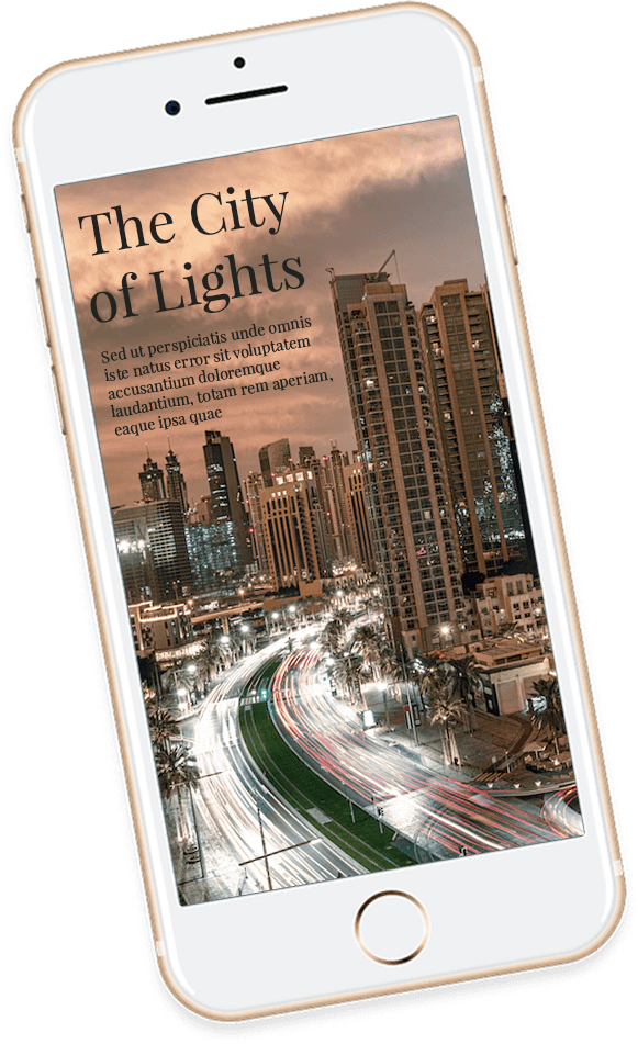
Vertical Phone Image #1
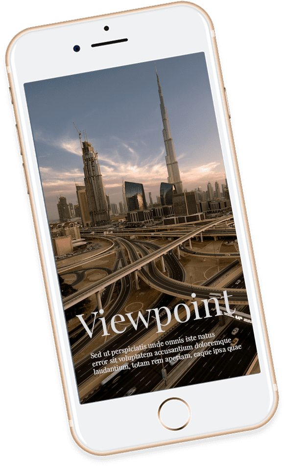
Vertical Phone Image #2
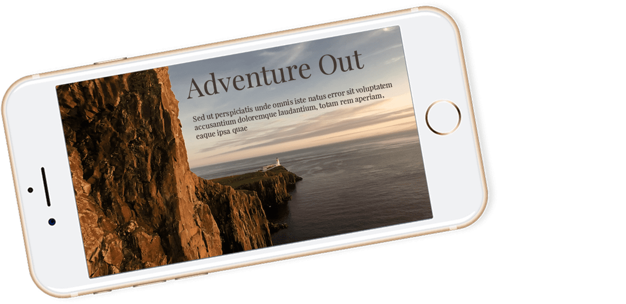
Vertical Phone Image #3
Using Divi’s Animations to Roll Your Content into View
Subscribe To Our Youtube Channel
Building Section 7 of the Demo
Before we start the building process, here is a glimpse at the wireframe view of the section layout we will be creating using the visual builder.
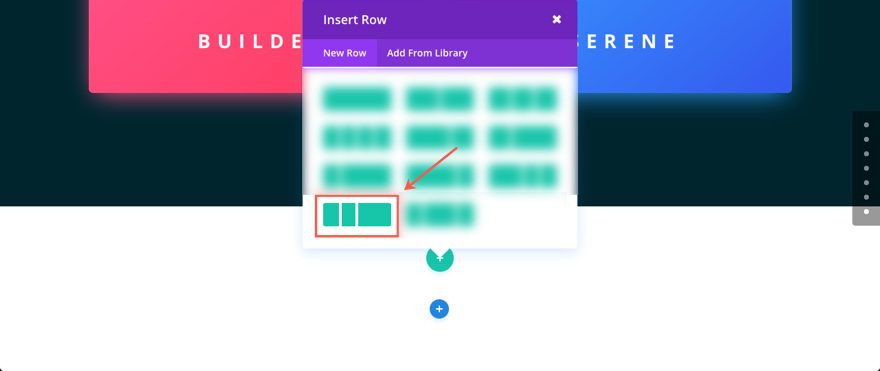
Using the Visual Builder, Let’s start by adding another regular section to our layout. Then add a three column (one-fourth one-fourth one-half) row to your section.
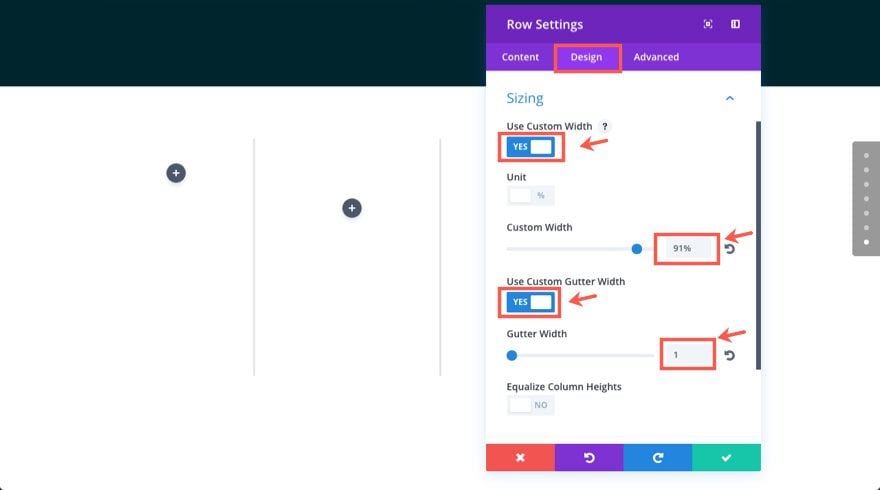
Update Row Settings
Before we add our first module, go to the row settings and update the following:
Under the Design tab…
Use Custom Width: YES
Custom Width: 91%
Use Custom Gutter Width: YES
Gutter Width: 1
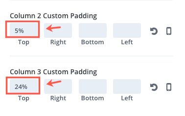
Column 2 Custom Padding: 5% Top
Column 3 Custom Padding: 24% Top
Adding Image #1
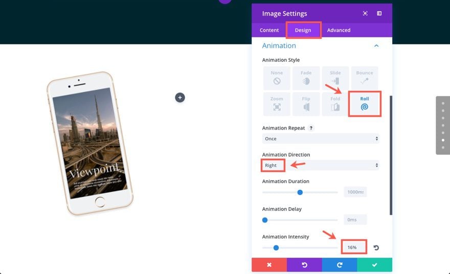
In the first (far left) column of our layout, add an Image Module and update the image settings as follows:
Under the Content tab…
Image URL: [upload image #1]
Under the Design tab…
Force Fullwidth: YES
Animation Style: Roll
Animation Direction: Right
Animation Intensity: 16%
Animation Starting Opacity: 100%
Save Settings
Adding Animated Text with the Divider and Call to Action Modules
Now move over to the middle (one-fourth) column where the divider module will be used to add a short divider line above the text.
Add a divider module to the column.
Then update the settings as follows:
Under the Content tab…
Show Divider: YES
Under the Design tab…
Color: #e0c48f
Divider Weight: 3px
Width: 60px (you have to type this value in since the default is percentage)
Module Alignment: default (left)
Custom Padding: 80px Top, 80px Left
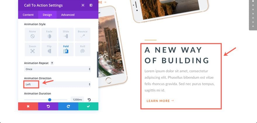
Animation Style: Fold
Animation Direction: Right
Animation Duration: 1200ms
Animation Delay: 50ms
Animation Intensity: 70%
Animation Starting Opacity: 0%
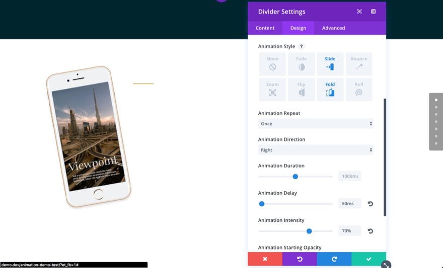
Save Settings
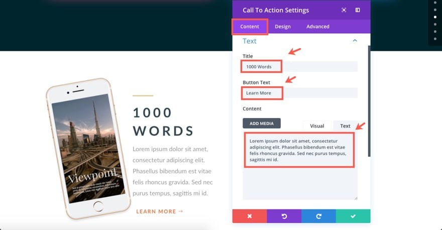
Under the Divider Module add a Call to Action Module with the following settings:
Under the Content tab…
Title: “1000 Words”
Button Text: “Learn More”
Content: “Lorem ipsum dolor sit amet, consectetur adipiscing elit. Phasellus bibendum est vitae felis rhoncus gravida. Sed nec purus tempus, sagittis mi id.”
Link: #
Use Background Color: NO
Under the Design tab…
Text Color: Dark
Text Orientation: Left
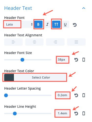
Header Font: Lato, Bold (B) Uppercase (TT)
Header Font Size: 38px
Header Text Color: #33454f
Header Letter Spacing: 0.2em
Header Line Height: 1.4em
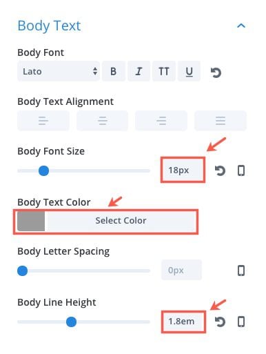
Body Font: Lato
Body Font Size: 18px
Body Text Color: #9b9b9b
Body Line Height: 1.8em
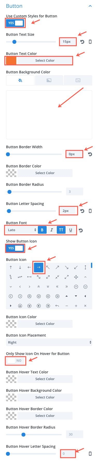
Use Custom Styles for Button: YES
Button Text Size: 15px
Button Text Color: #f2733c
Button Background Color: rgba(225,225,225,0)
Button Border Width: 0px
Button Letter Spacing: 2px
Button Font: Lato, Bold (B), Uppercase (TT)
Button Icon: right arrow
Only show Icon On Hover for Button: NO
Button Hover Letter Spacing: 0px
Animation Style: Fold
Animation Direction: Right
Animation Duration: 1200ms
Animation Delay: 50ms
Animation Intensity: 70%
Animation Starting Opacity: 0%
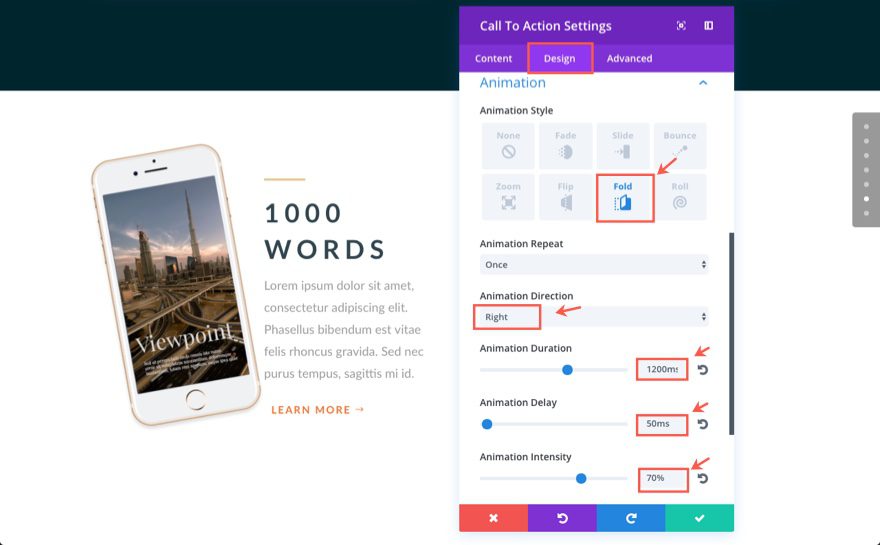
Save Settings
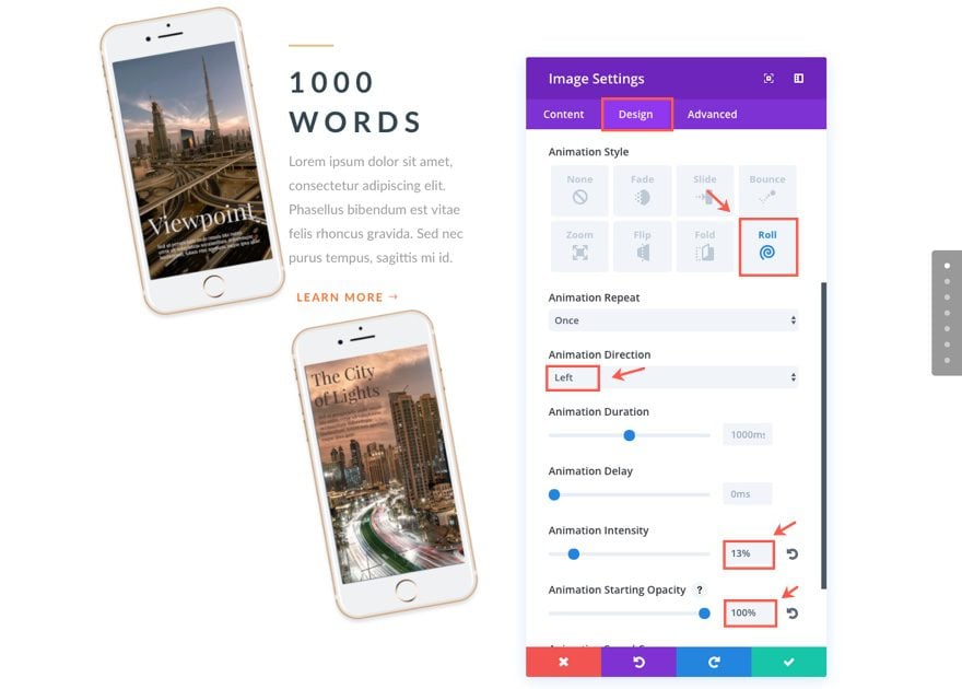
Adding Image #2
Next add an Image module under the Call to Action module you just created. Update the image settings as follows:
Under the Content tab…
Image URL: [upload image #2]
Under the Design tab…
Force Fullwidth: YES
Animation Style: Roll
Animation Direction: Left
Animation Intensity: 13%
Animation Starting Opacity: 100%
Add Image #3
That’s it for our second (middle) column. Now let’s add Image #3 in the third (far right) column. To do this, we can duplicate/copy the image module you just added to the bottom of the second column and paste it into the third column. Since the Animation styles are the same, all you need to update for the new image module is the actual image URL.
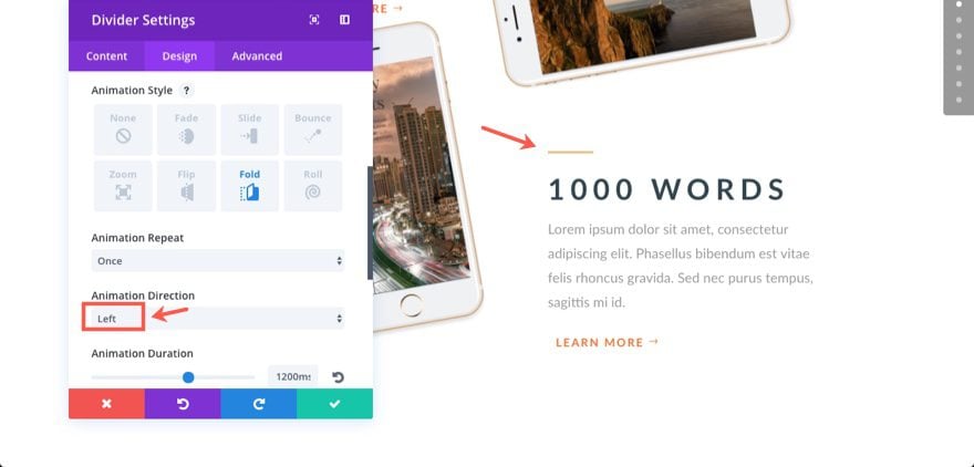
Duplicate and Customize the Divider and Call To Action MOdule
After you add the new image URL to the duplicated image in column three, go ahead a duplicate/copy both the Divider Module and the Call to Action Module that you created at the top of the second column and drag/paste the two modules under image #3 in the third column.
For the Divider Module, change the Animation Direction setting under the Design tab to “Left”.
For our new Call to Action Module, go ahead and update the following settings:
Under the Content tab…
Title: A new way of building
Under the Design tab…
Custom Padding: 80px Right, 80px Bottom, 80px Left
Animation Direction: Left
Now let’s check out our final result…
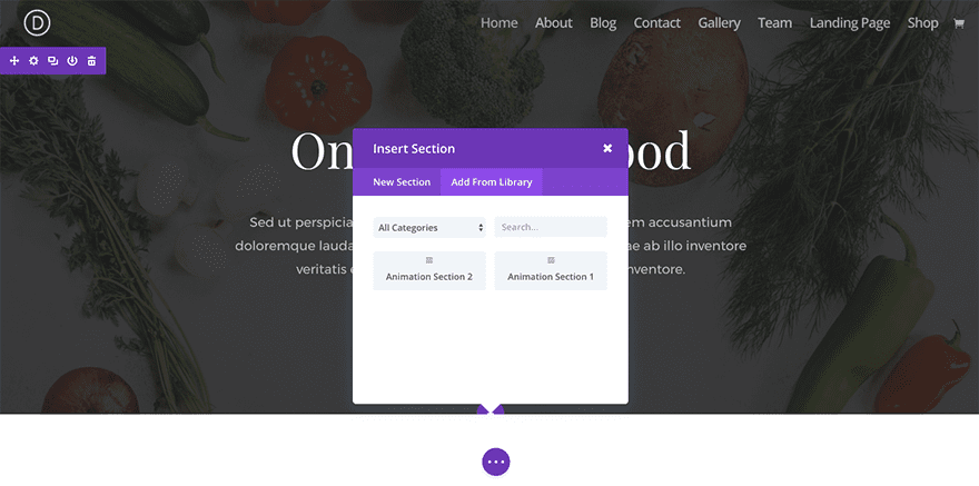
Bonus: Download These Sections for Easy Import
As a bonus perk we’ve packaged the sections built in today’s tutorial into a free download that you can get using the email opt-in form below. Simply enter your email and the download button will appear. Don’t worry about “re-subscribing” if you’re already part of our Divi Newsletter. Re-enter your email will not result in more emails or duplicates. It will simply reveal the download.
Enjoy!

To use these downloads, start by locating the zipped file called Animation_Effects_Part_5.zip in our downloads folder. Unzip it to reveal the following imports.
Animation Effects Part 5 (section 1).json
Animation Effects Part 5 (section 2).json
Navigate in your WordPress Admin to Divi > Divi Library > Import & Export. When the portability modal pops up, click the import tab and the button labeled choose file.
Select the json file you prefer and click “Import Divi Builder Layouts”. Once the import is complete navigate to the post or page you would like to add one of the above sections to.
Activate the visual builder. Navigate to the part of the page you would like to add one of the above sections to. When you click the add new section icon, you will be presented with the option to “Add From Library”. Choose this option and select the layout you want.
Wrapping Up
This layout is a bit tricky to pull off. But, once you get the right images and the right spacing, the animation brings the whole layout together nicely. The life-like rolling of the phone images almost look like someone is sliding them on a white table into our view as we scroll down the page. This example of roll animation is definitely one that stands out.
Coming Up

In the next post, I will be concluding our series with part 6. I will show you how to use the slide animation with some custom images and css to create a stunning layout for featuring cooking recipes. However the same layout could be tweaked and used for many different featured items.
I look forward to hearing from you in the comments.
The post Using Divi’s Animations to Roll Your Content into View appeared first on Elegant Themes Blog.