
Today, we’re going to highlight the transform scale design option that comes with Divi’s new transform options. More so, we’re going to recreate a stunning design that allows sections to expand on hover in an elegant way.
You can use this design for any kind of website you’re creating. It’ll help you share relevant content in a structured and minimal way. At the end of this tutorial, you’ll be able to download the entire page layout for free.
Let’s get to it!
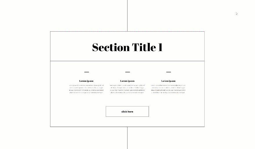
Preview
Before we dive into the tutorial, let’s take a quick look at the outcome across different screen sizes.
Desktop
Mobile
Let’s Start Recreating!
Add Section #1
Spacing
Start by creating a new page. Add your first regular section to the page, open the section settings and remove all default top and bottom padding in the spacing settings.
- Top Padding: 0px
- Bottom Padding: 0px
Add New Row
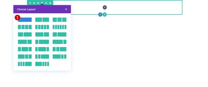
Column Structure
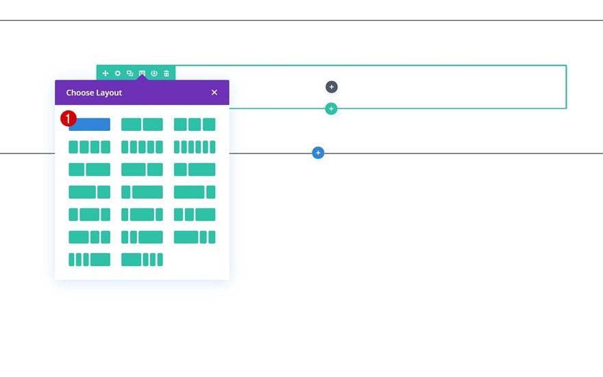
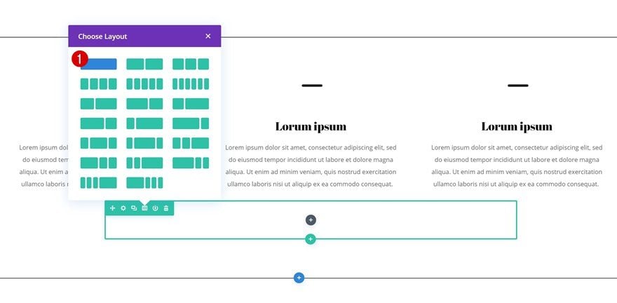
Continue by adding the first row using the following column structure:
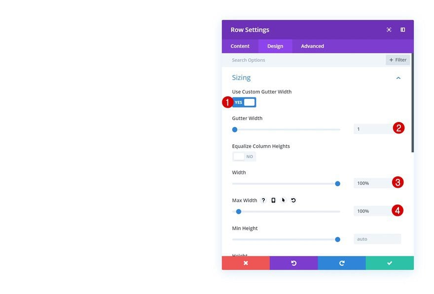
Sizing
Without adding any modules yet, open the row settings and allow the row to take up the entire width of the screen.
- Use Custom Gutter Width: Yes
- Gutter Width: 1
- Width: 100%
- Max Width: 100%
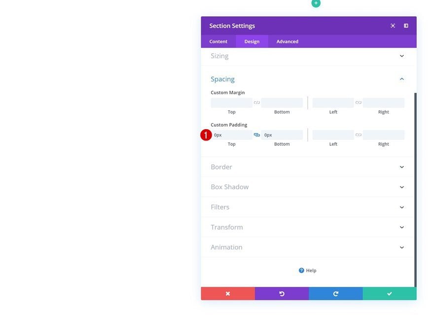
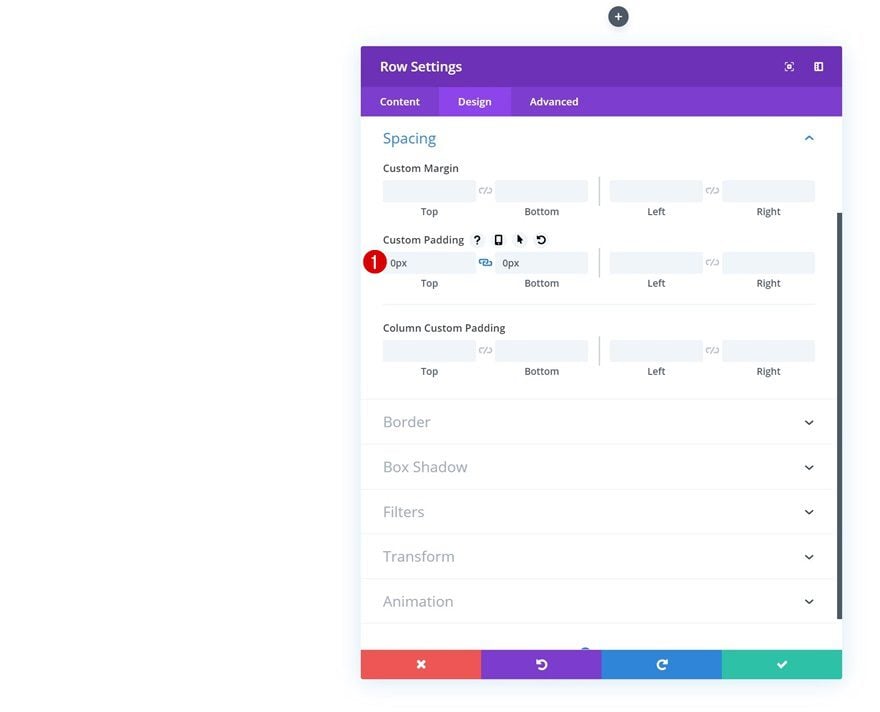
Spacing
Remove all default top and bottom padding as well. We’re doing this to limit the space that will be taken up by the row and section.
- Top Padding: 0px
- Bottom Padding: 0px
Add Divider Module
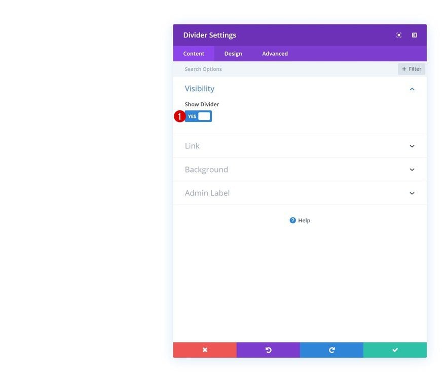
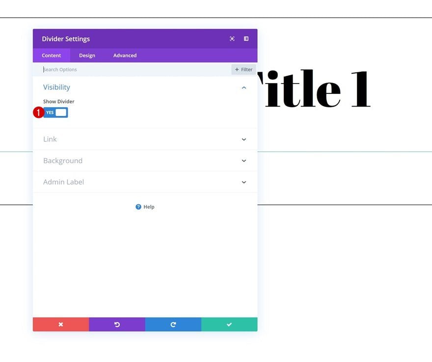
Visibility
The only module we need in this row is a Divider Module. At the end of this tutorial, we’ll transform the divider into a vertical one that’ll connect all upcoming sections. Once you’ve added the Divider Module, make sure the ‘Show Divider’ option is enabled.
- Show Divider: Yes
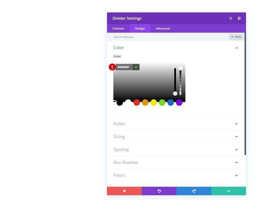
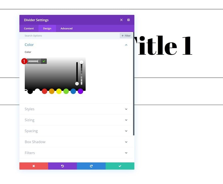
Color
Then, go to the design tab and change the color of the divider into black.
- Color: #000000
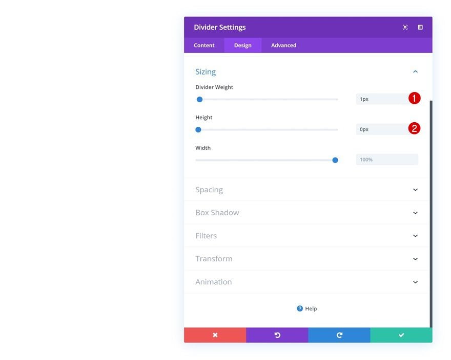
Sizing
Modify the sizing values as well.
- Divider Weight: 1px
- Height: 0px
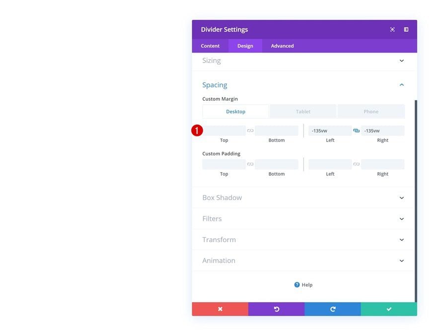
Spacing
And increase the length of the divider by adding some negative left and right margins.
- Left Margin: -135vw (Desktop), -300vw (Tablet), -340vw (Phone)
- Right Margin: -135vw (Desktop), -300vw (Tablet), -340vw (Phone)
Add Section #2
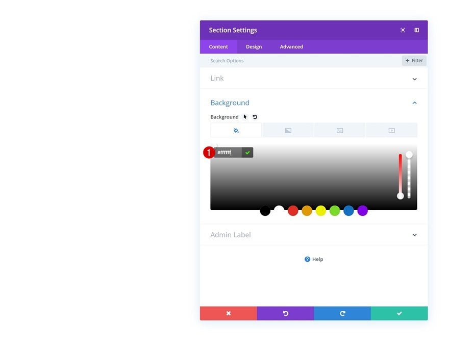
Background Color
On to the next regular section! Once you’ve added the new section, open the section settings and add an entirely white background color.
- Background Color: #ffffff
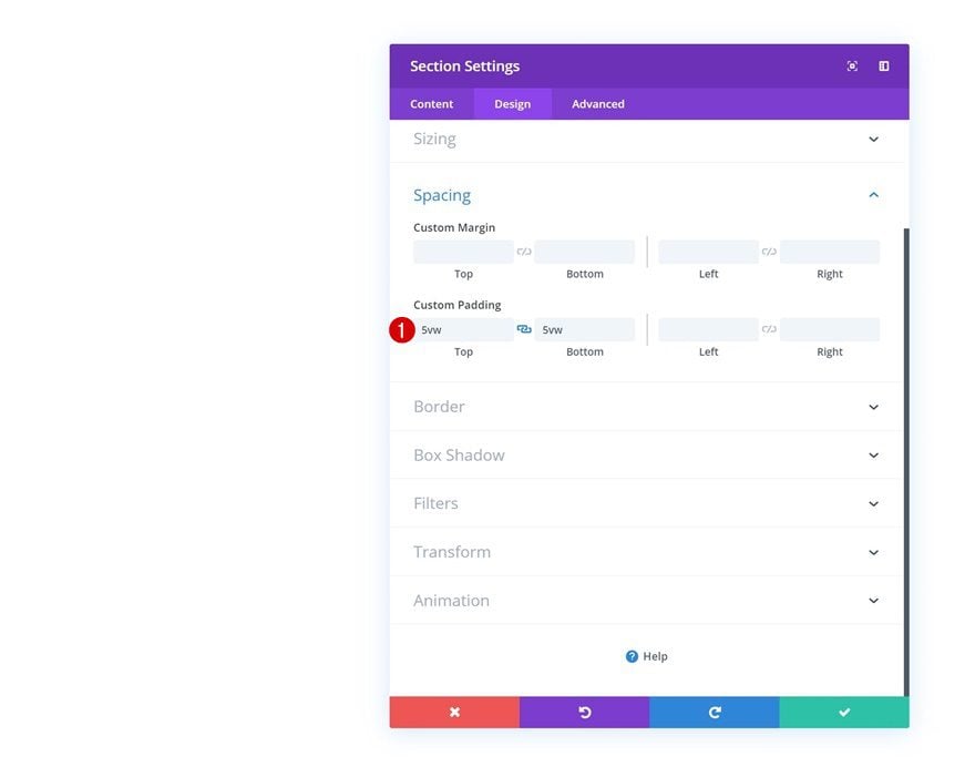
Spacing
Then, go to the spacing settings and add some custom top and bottom padding.
- Top Padding: 5vw
- Bottom Padding: 5vw
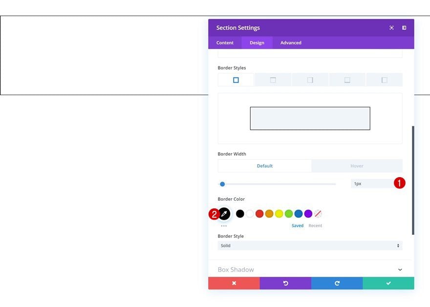
Default Border
Add a border to the section as well.
- Border Width: 1px
- Border Color: #000000
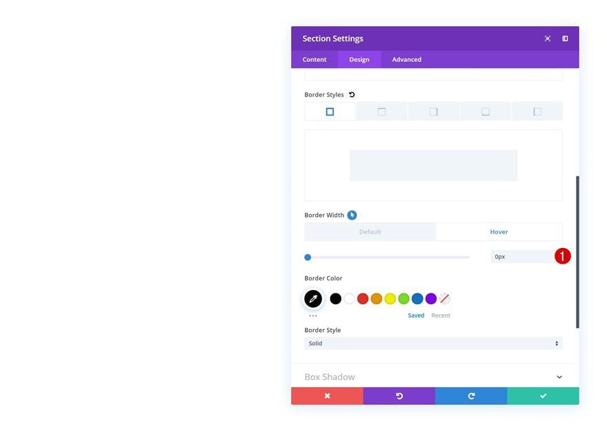
Hover Border
And remove the border width on hover.
- Border Width: 0px
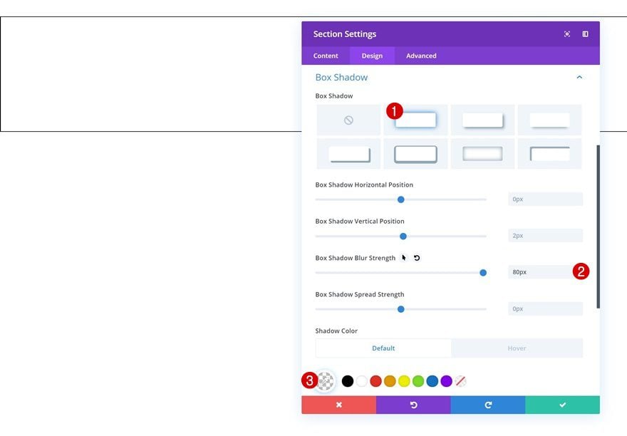
Default Box Shadow
We’re also adding a box shadow on hover. To do that, we’ll need to add a default one first. To make sure the box shadow doesn’t show up by default, we’re using an entirely transparent shadow color.
- Box Shadow Blur Strength: 80px
- Shadow Color: rgba(0,0,0,0)
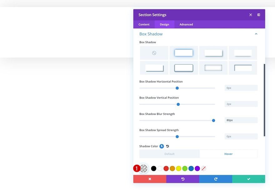
Hover Box Shadow
Change the shadow color on hover using the following color code:
- Shadow Color: rgba(0,0,0,0.13)
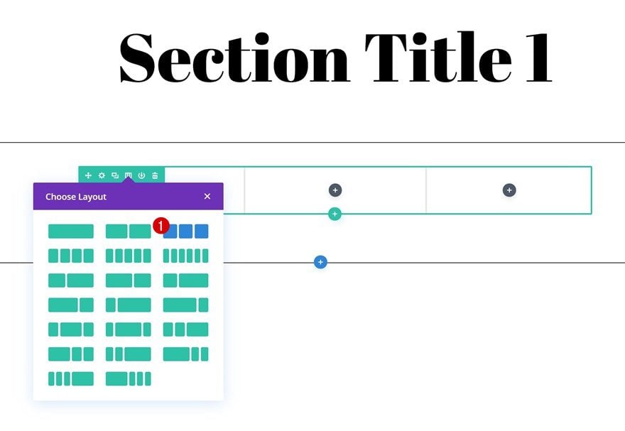
Add Row #1
Column Structure
Continue by adding the first row to the section using the following column structure:
Sizing
Without adding any modules yet, open the row settings and allow the row to take up the entire width of the section.
- Use Custom Gutter Width: Yes
- Gutter Width: 1
- Width: 100%
- Max Width: 100%
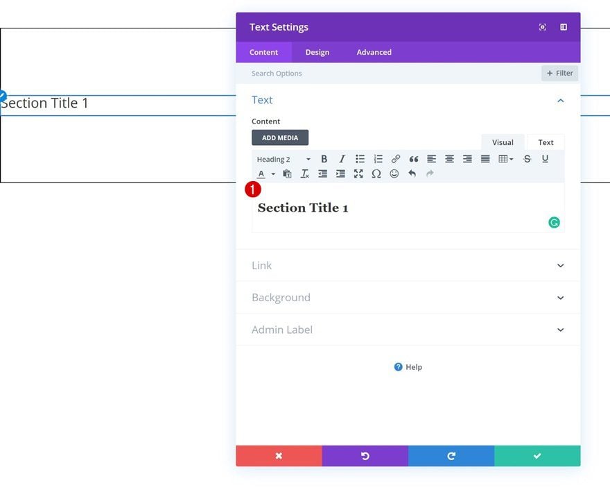
Add Text Module
Add H2 Content
Time to start adding modules! The first module we need is a Text Module with some H2 content.
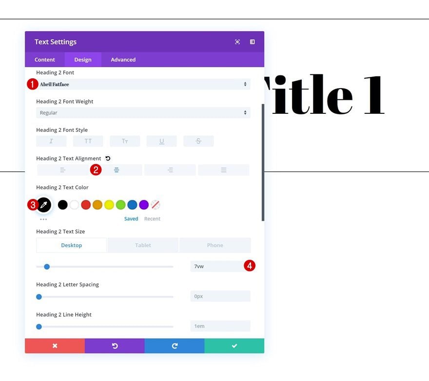
H2 Text Settings
Go to the design tab and modify the H2 text settings according to your own preference.
- Heading 2 Font: Abril Fatface
- Heading 2 Text Alignment: Center
- Heading 2 Text Color: #000000
- Heading 2 Text Size: 7vw
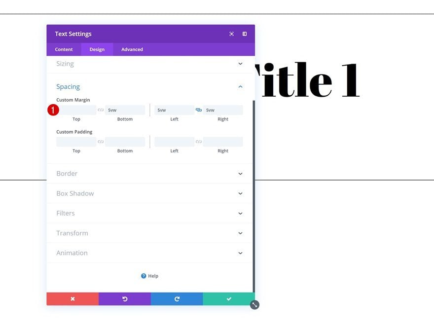
Spacing
Add some custom margin values as well.
- Bottom Margin: 5vw
- Left Margin: 5vw
- Right Margin: 5vw
Add Divider Module
Visibility
The next and last module we need in this row is a Divider Module. Make sure the ‘Show Divider’ option is enabled.
- Show Divider: Yes
Color
Then, go to the design tab and change the divider color into black.
- Color: #000000
Add Row #2
Column Structure
On to the second row! Use the following column structure:
Sizing
We’re, again, making sure the row takes up the entire width of the screen by modifying the sizing settings in the design tab.
- Use Custom Gutter Width: Yes
- Gutter Width: 1
- Width: 100%
- Max Width: 100%
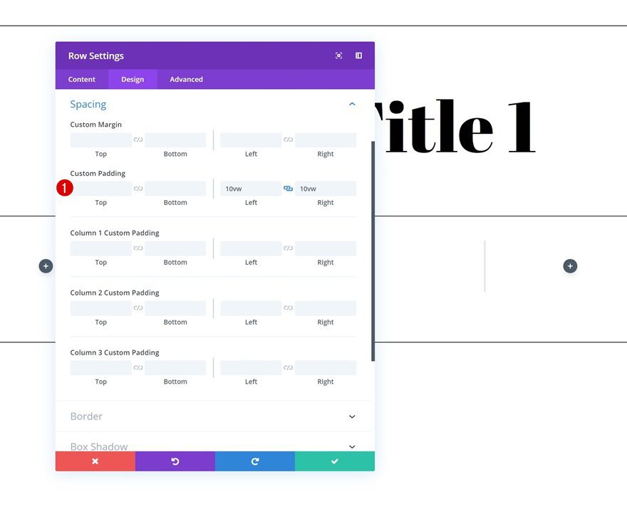
Spacing
We’re also slightly shrinking the size of the row by adding some custom left and right padding in the spacing settings.
- Left Padding: 10vw
- Right Padding: 10vw
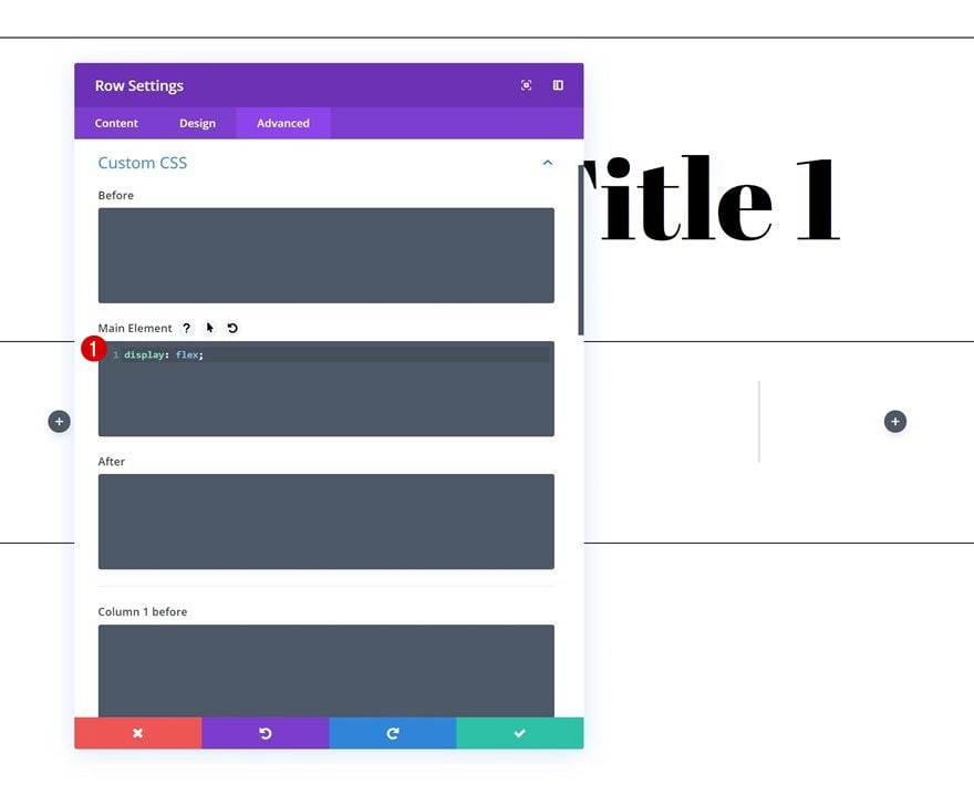
Display
To make sure all three columns show up next to each other on smaller screen sizes, we’re going to add one single line of CSS code to the main element of the row.
display: flex;
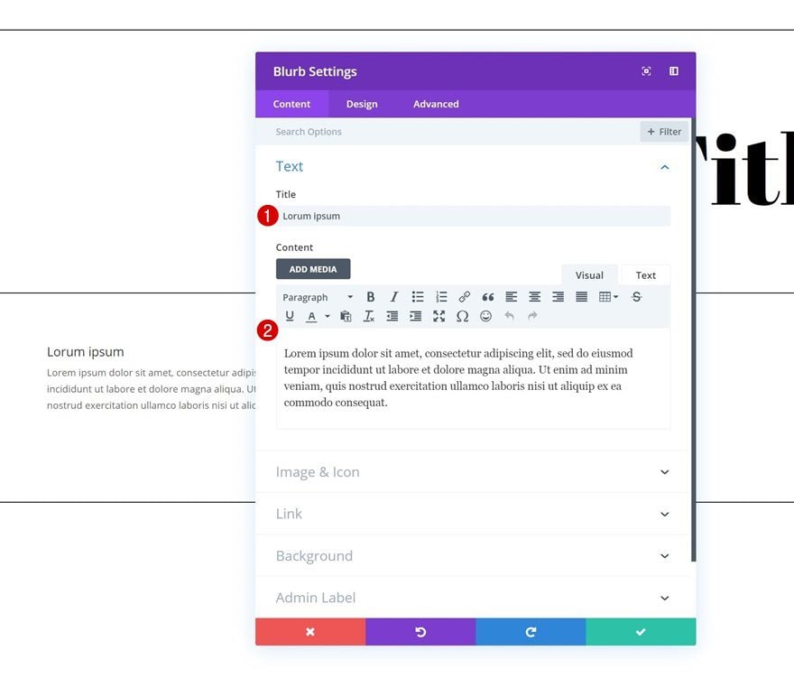
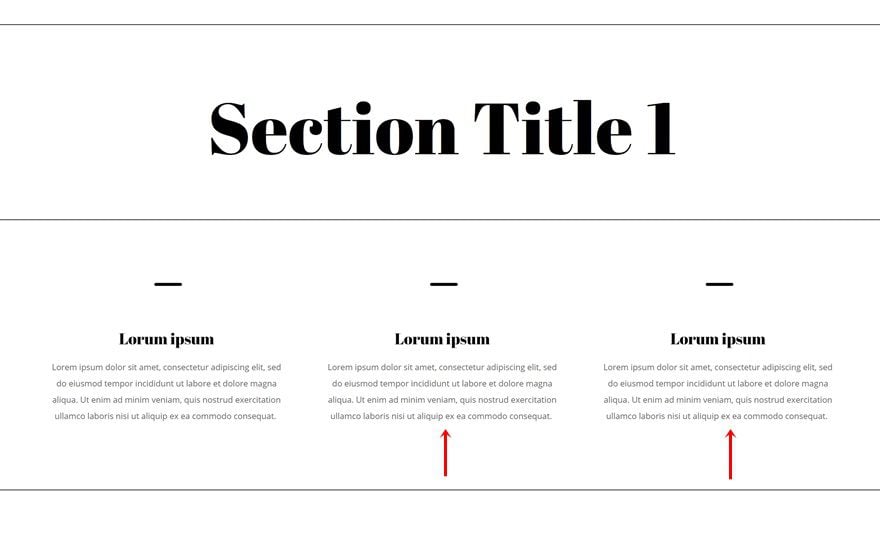
Add Blurb Module to Column 1
Add Content
Continue by adding a Blurb Module to the first column of the row. Enter some content of your choice.
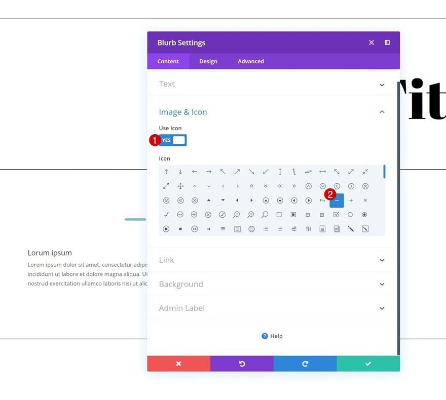
Select Icon
Select an icon next.
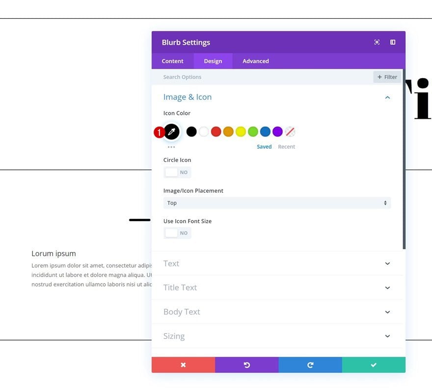
Icon Settings
Then, go to the design tab and change the icon color.
- Icon Color: #000000
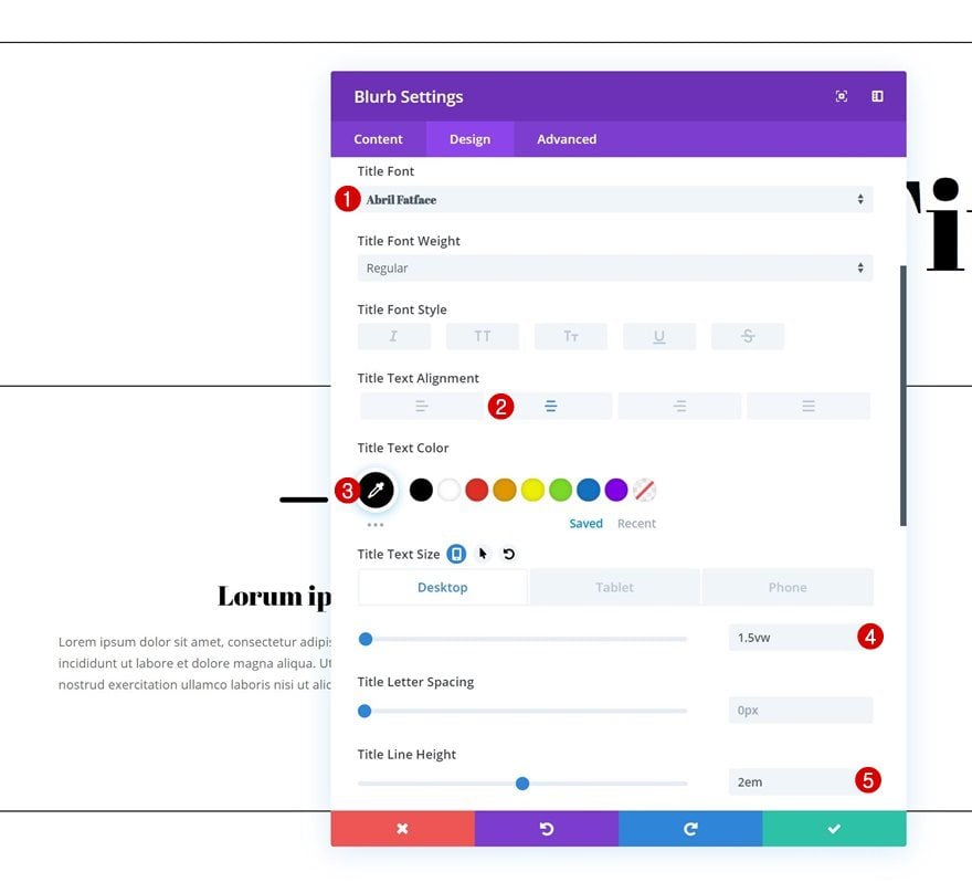
Title Text Settings
Move on to the title text settings and change the settings according to your own preference.
- Title Font: Abril Fatface
- Title Text Alignment: Center
- Title Text Color: #000000
- Title Text Size: 1.5vw (Desktop), 2.5vw (Tablet), 3.5vw (Phone)
- Title Line Height: 2em
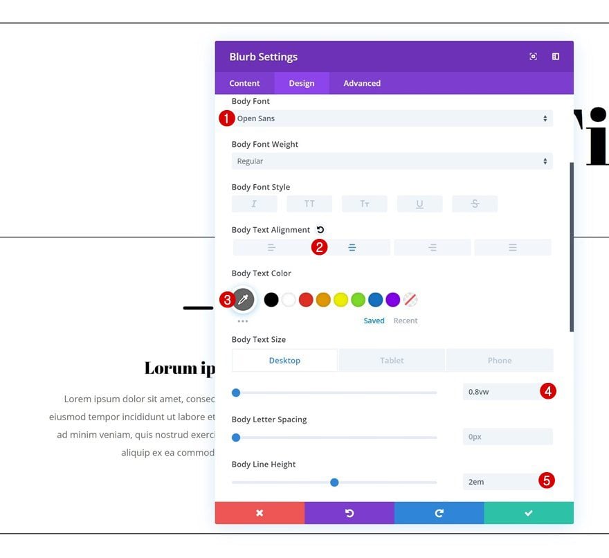
Body Text Settings
Do the same thing for the body text settings.
- Body Font: Open Sans
- Body Text Alignment: Center
- Body Text Color: #666666
- Body Text Size: 0.8vw (Desktop), 1.5vw (Tablet), 2vw (Phone)
- Body Line Height: 2em
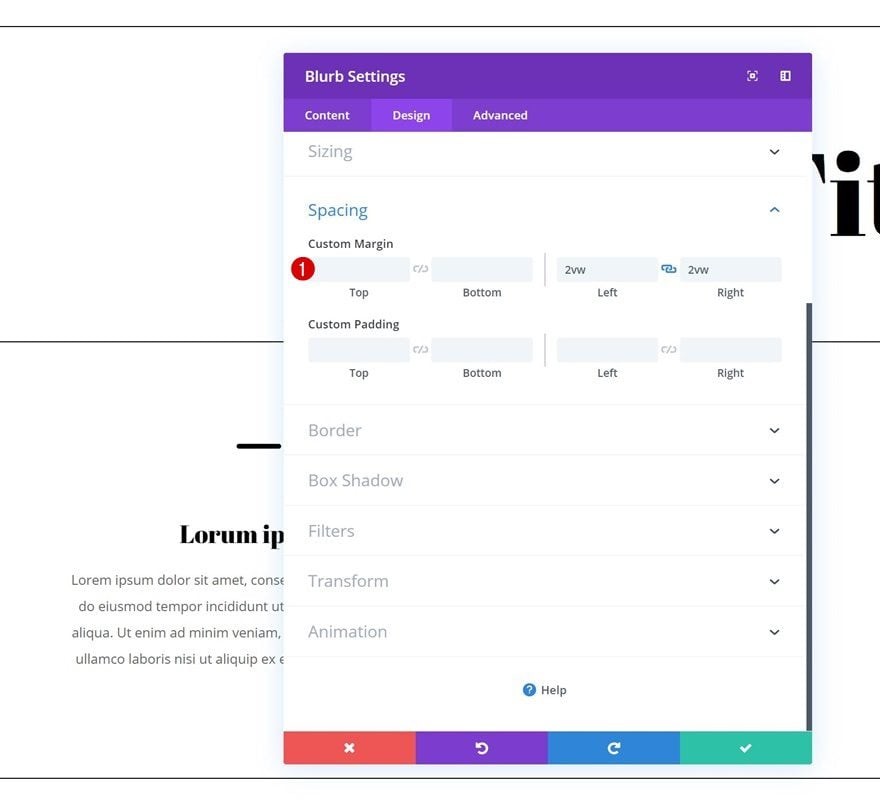
Spacing
Last but not least, add some custom left and right margin to the Blurb Module.
- Left Margin: 2vw
- Right Margin: 2vw
Clone Blurb Module Twice & Place in Remaining Columns
Once you’re done customizing the Blurb Module, you can go ahead and clone it twice. Place the duplicates in the two remaining columns of the row.
Add Row #3
Column Structure
On to the next and last row. Choose the following column structure for it:
Sizing
Without adding any modules yet, open the row settings and allow the row to take up the entire width of the section by modifying the sizing settings.
- Use Custom Gutter Width: Yes
- Gutter Width: 1
- Width: 100%
- Max Width: 100%
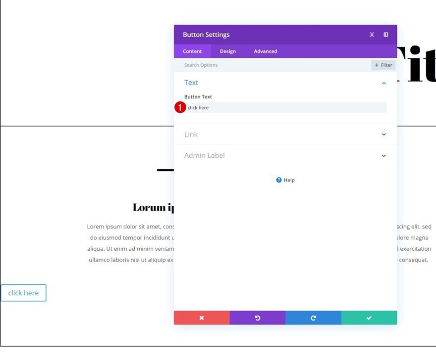
Add Button Module
Add Content
The only module we need here is a Button Module. Add some copy of your choice.
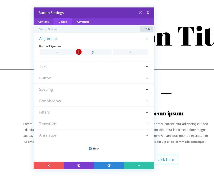
Alignment
Then, go to the design tab and change the button alignment.
- Button Alignment: Center
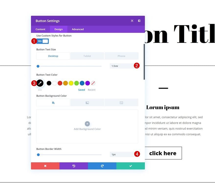
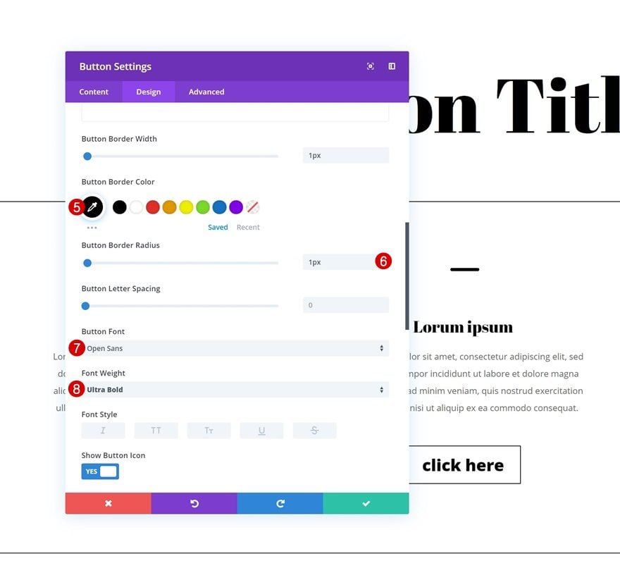
Button Settings
Change the button settings next.
- Use Custom Styles for Button: Yes
- Button Text Size: 1.5vw (Desktop), 2.5vw (Tablet & Phone)
- Button Text Color: #000000
- Button Border Width: 1px
- Button Border Color: #000000
- Button Border Radius: 1px
- Button Font: Open Sans
- Font Weight: Ultra Bold
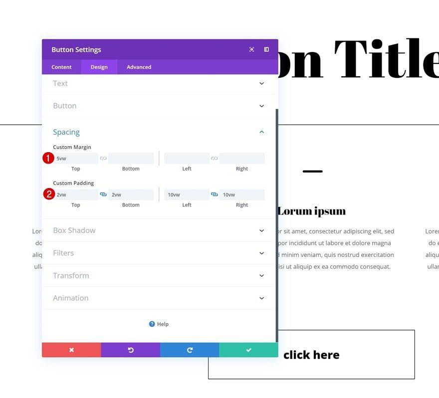
Spacing
And create a shape for the button using some custom margin and padding values.
- Top Margin: 5vw
- Top Padding: 2vw
- Bottom Padding: 2vw
- Left Padding: 10vw
- Right Padding: 10vw
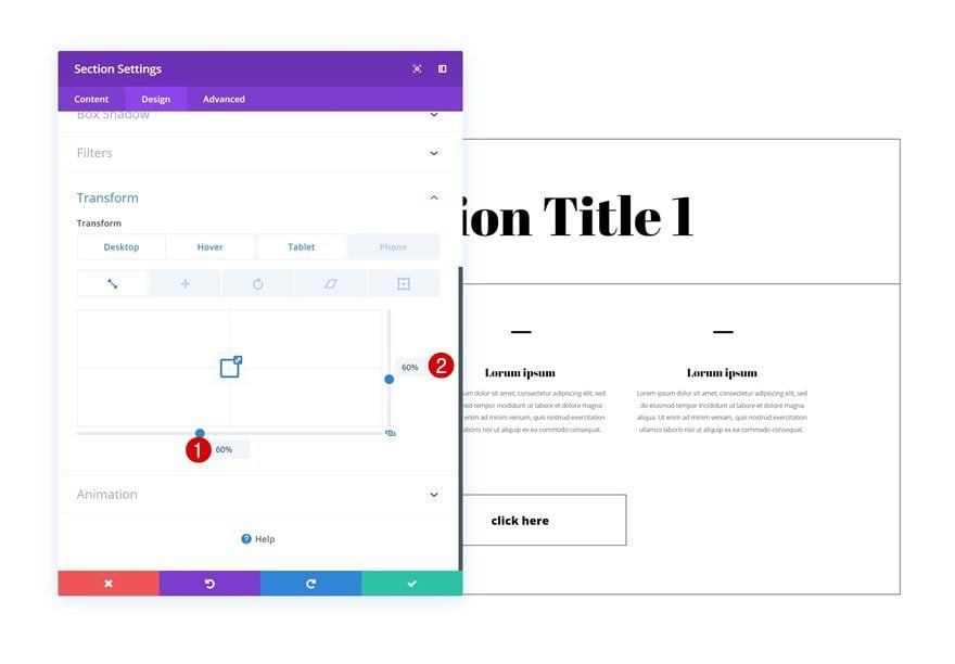
Add Transform Settings to Section #2
Add Default Transform Scale to Section #2
Now that we’re done creating and modifying the two sections we’ve added to our page, we can start applying the transform options. Open section #2 and add some custom transform scale values.
- Bottom: 60% (Desktop), 90% (Tablet & Phone)
- Right: 60% (Desktop), 90% (Tablet & Phone)
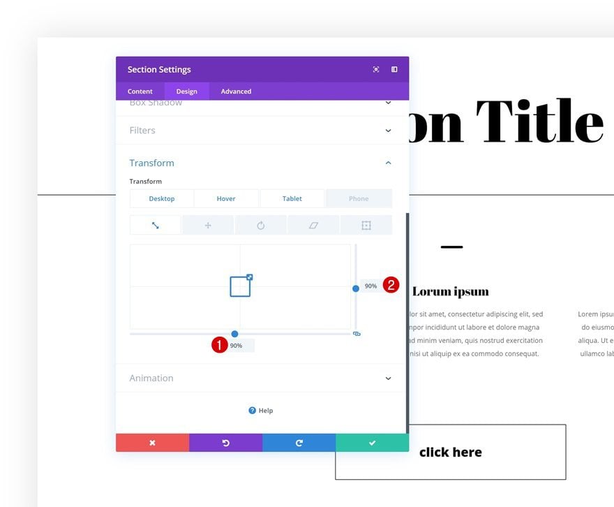
Hover Transform Scale to Section #2
Modify these values on hover. Notice how we’re using the same value as we did for smaller screen sizes. Doing this will make sure the hover effect will only take place on larger screen sizes.
- Bottom: 90%
- Right: 90%
Clone Section Twice
Then, clone the second section twice (or up to as many times as you want).
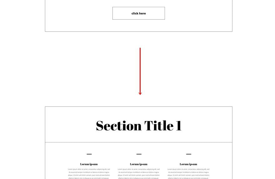
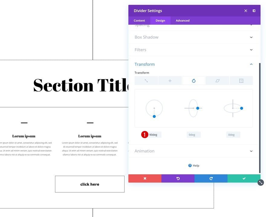
Add Transform Rotate to Divider Module in Section #1
And transform the divider you’ve added to the first section by playing around with the transform rotate value.
- Left: 90deg
Download The Expanding Section Layout for FREE
To lay your hands on the expanding section layout, you will first need to download it using the button below. To gain access to the download you will need to subscribe to our Divi Daily email list by using the form below. As a new subscriber, you will receive even more Divi goodness and a free Divi Layout pack every Monday! If you’re already on the list, simply enter your email address below and click download. You will not be “resubscribed” or receive extra emails.
@media only screen and ( max-width: 767px ) {.et_bloom .et_bloom_optin_1 .carrot_edge.et_bloom_form_right .et_bloom_form_content:before, .et_bloom .et_bloom_optin_1 .carrot_edge.et_bloom_form_left .et_bloom_form_content:before { border-top-color: #ffffff !important; border-left-color: transparent !important; }
}.et_bloom .et_bloom_optin_1 .et_bloom_form_content button { background-color: #f92c8b !important; } .et_bloom .et_bloom_optin_1 .et_bloom_form_content .et_bloom_fields i { color: #f92c8b !important; } .et_bloom .et_bloom_optin_1 .et_bloom_form_content .et_bloom_custom_field_radio i:before { background: #f92c8b !important; } .et_bloom .et_bloom_optin_1 .et_bloom_border_solid { border-color: #f7f9fb !important } .et_bloom .et_bloom_optin_1 .et_bloom_form_content button { background-color: #f92c8b !important; } .et_bloom .et_bloom_optin_1 .et_bloom_form_container h2, .et_bloom .et_bloom_optin_1 .et_bloom_form_container h2 span, .et_bloom .et_bloom_optin_1 .et_bloom_form_container h2 strong { font-family: “Open Sans”, Helvetica, Arial, Lucida, sans-serif; }.et_bloom .et_bloom_optin_1 .et_bloom_form_container p, .et_bloom .et_bloom_optin_1 .et_bloom_form_container p span, .et_bloom .et_bloom_optin_1 .et_bloom_form_container p strong, .et_bloom .et_bloom_optin_1 .et_bloom_form_container form input, .et_bloom .et_bloom_optin_1 .et_bloom_form_container form button span { font-family: “Open Sans”, Helvetica, Arial, Lucida, sans-serif; } p.et_bloom_popup_input { padding-bottom: 0 !important;}

Download For Free
Join the Divi Newlsetter and we will email you a copy of the ultimate Divi Landing Page Layout Pack, plus tons of other amazing and free Divi resources, tips and tricks. Follow along and you will be a Divi master in no time. If you are already subscribed simply type in your email address below and click download to access the layout pack.
You have successfully subscribed. Please check your email address to confirm your subscription and get access to free weekly Divi layout packs!
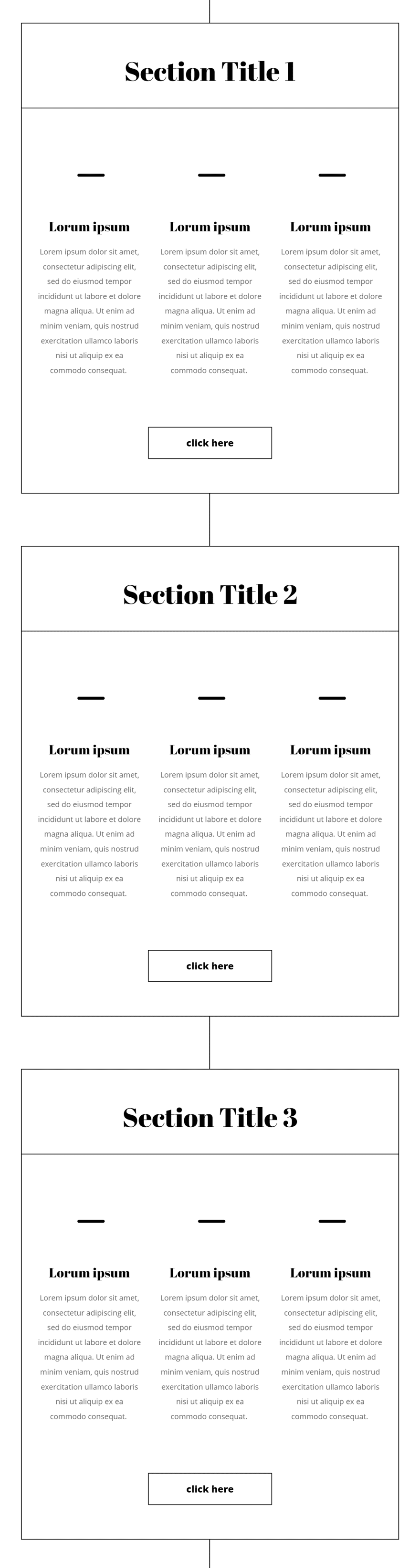
Preview
Now that we’ve gone through all the steps, let’s take a final look at the outcome across different screen sizes.
Desktop
Mobile
Final Thoughts
In this tutorial, we’ve highlighted the transform scale option that comes with Divi’s new transform options. On top of that, we’ve recreated a stunning design that allows the hover effect to make sense and enhance the overall user experience people have when visiting the page. At the end of the tutorial, you were also able to download the entire layout for free. If you have any question or suggestions, feel free to leave a comment in the comment section below!
The post Using Divi’s Transform Options to Create Expanding Section Content on Hover appeared first on Elegant Themes Blog.