Since the release of Divi’s new background options interface, Divi has become even more powerful. The new features have opened up a lot of new design possibilities. Today, I am going to introduce some new design tricks you may not be aware of and, hopefully, I can inspire you to create some awesome background designs.
There are countless background design combinations and blends you could create using the Visual Builder. The 10 tricks I settled on for this post will only scratch the surface, but they are meant to introduce you to different concepts and spark your interest. Most of these design tricks are accomplished using the new background options like the new gradient background options and combining background images with gradient colors.
I must warn you though. Once you start digging into the background options you may never quit! It is so much fun. Well, at least it was like that for me.
Enjoy.
Here is a Sneak Peek of the Design Tricks

How to Follow This Post
Instead of having to start from scratch every time I explain a new design trick, I used the same example design for most of them and added different tricks to that design. This means that most examples require you to have a previous design trick completed before you can tack on the new trick. Trick #1-9 all follow the same basic setup and require trick #1 as a prerequisite. So if you are testing out the features, I would suggest beginning with Trick #1.
10 Background Design Tricks with Divi
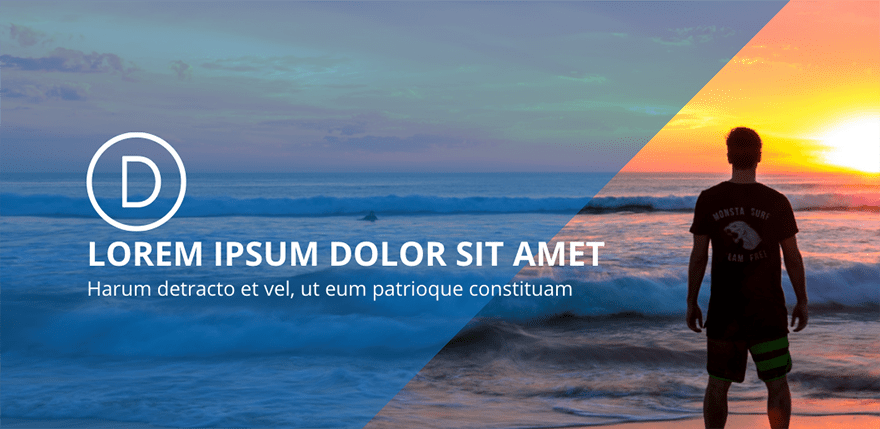
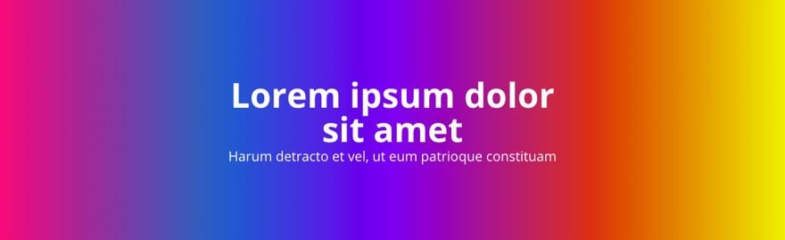
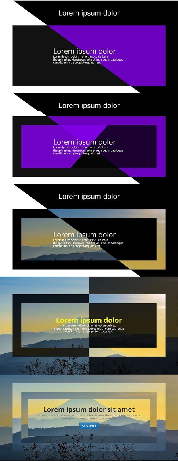
Trick #1: Diagonal overlay
Add a fullwidth section and then insert a fullwidth header module.
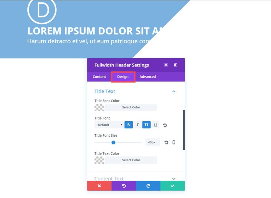
Then update the header module settings as follows:
Content Options
Title: [enter title]
Subheading: [enter subheading]
Logo Image URL: [enter logo]
Background Gradient Colors: rgba(12,113,195,0.55), rgba(255,255,255,0)
Gradient Type: Linear
Gradient Direction: 135deg
Start Position: 60%
End Position: 60% (anything 60% or below will work)
Since the gradient is beginning and ending at the same point, there basically is no gradient effect happening at all. So the result is the two colors on each side the of the 60% marker. That combined with the angle of the gradient direction creates the effect.
Design Options
Text Color: Light
Title Font: Default, Bold (B), Uppercase (TT)
Title Font Size: 40px
Subhead Font Size: 24px
Advanced Options
Under Custom CSS in the Main Element box, add the following CSS:
Padding: 150px 0;
This is just to add some additional padding to the top and bottom of the header module
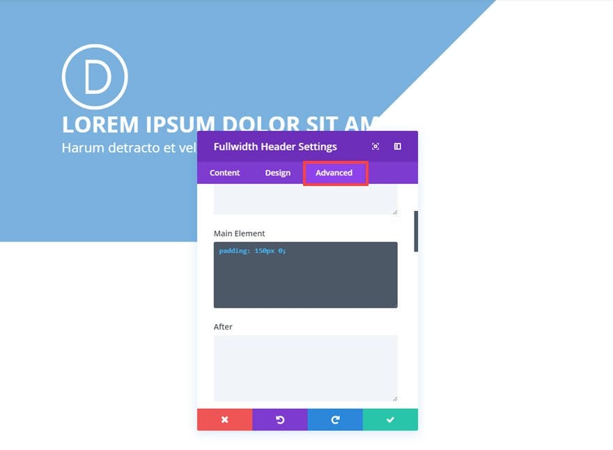
Save settings
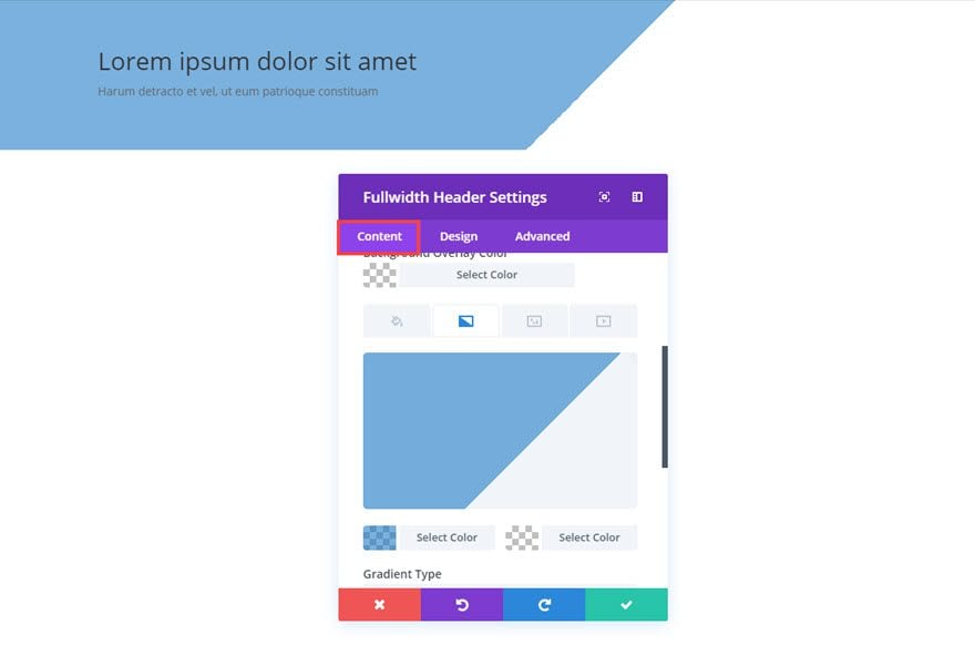
Now it’s time to add a background to your fullwidth section. Go to the Fullwidth Section Settings by clicking the gear icon in the purple control box.
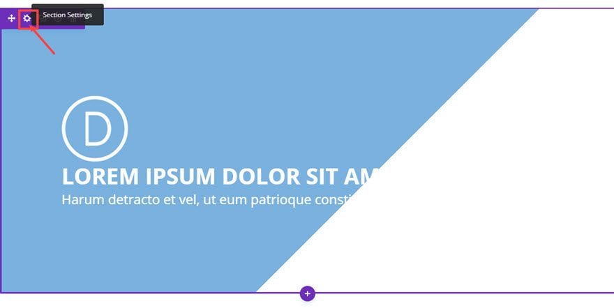
Then update the Section Settings Content Options as follows:
Background Image: [enter background image here. It should be at least 1960px wide. I chose this image from unsplash.com and cropped it so that the standout section of the image is on the right side.]
Use Parallax Effect: YES (this is optional but I think it works well with the diagonal overlay)
Parallax Method: True Parallax
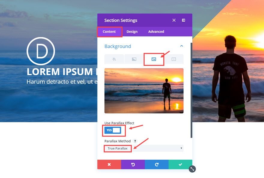
That’s it! Feel free to adjust the opacity of the gradient color and the degree of the gradient direction to your liking.
We are off to a good start I think. Let’s go on to the second trick.
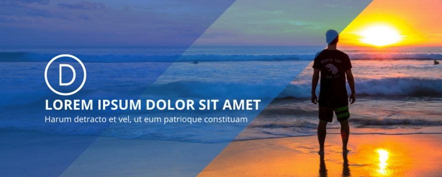
Trick #2 : Layering Diagonal Overlays
This design trick is a continuation from Trick #1 so make sure you have trick #1 completed before continuing.
In trick #1, we left off with a diagonal overlay using the background gradient option in the Fullwidth Header Module.
Using the same example, add an additional background gradient to the fullwidth section. We already have a background image for that section, but with Divi’s new options we can combine gradient colors to your background image and then blend them with certain effects.
Go to the Fullwidth Section settings and update the following Content options:
Background Gradient Colors: rgba(131,0,233,0.38), rgba(255,255,255,0)
Gradient Type: Linear
Gradient Direction: 135deg (the same as the other gradient direction in your header module)
Start Position: 38%
End Position: 38%
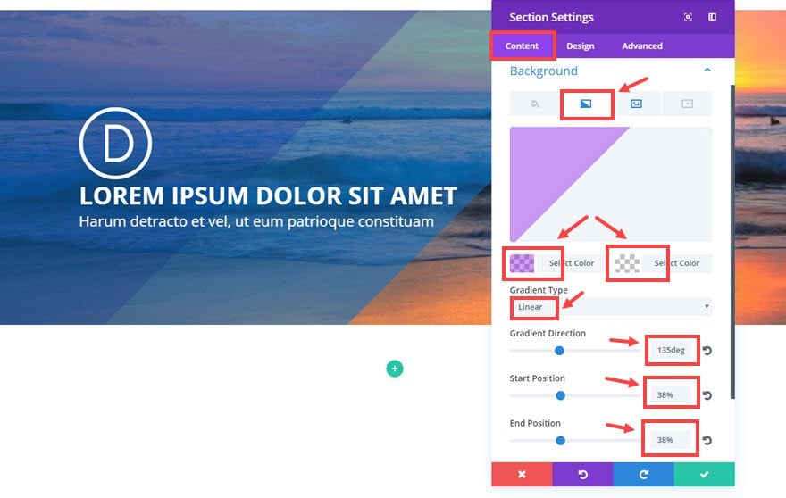
Now click the background image icon and change the the following:
Use Parallax Effect: No
Background Image Blend: Multiply
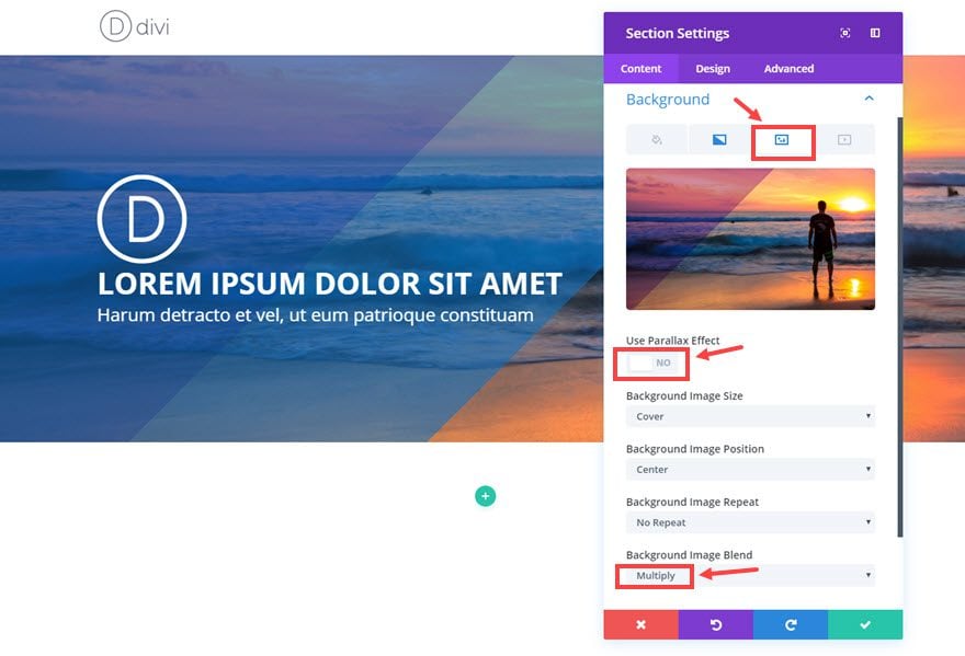
Now you have 2 overlapping diagonal overlays which can easily be customized for a unique background design.
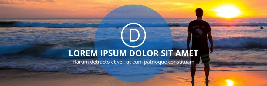
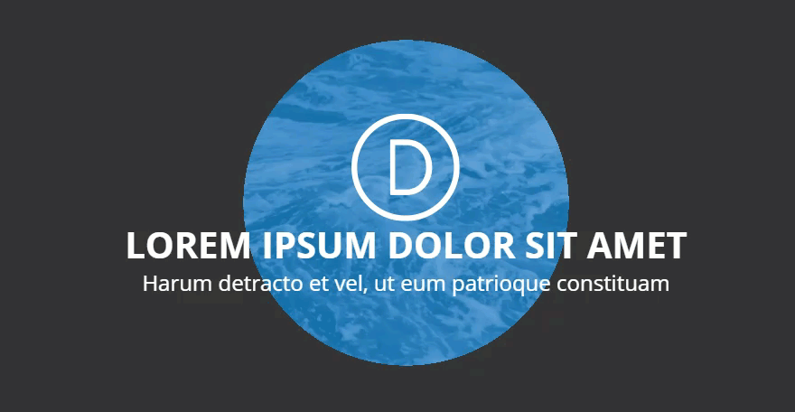
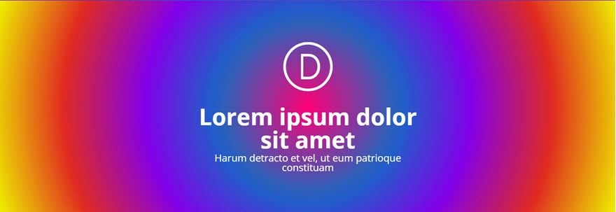
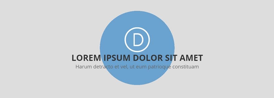
Trick #3: Circle overlay
This design trick is a continuation from Trick #1 so make sure you have trick #1 completed before continuing.
Now we are going to turn that diagonal overlay from Trick #1 into a circle overlay. To do this, go to the Fullwidth Module Settings and update the following:
Content Options
Background Gradient Type: Radial
Radial Direction: Center
Start Position: 30%
End Position: 30%
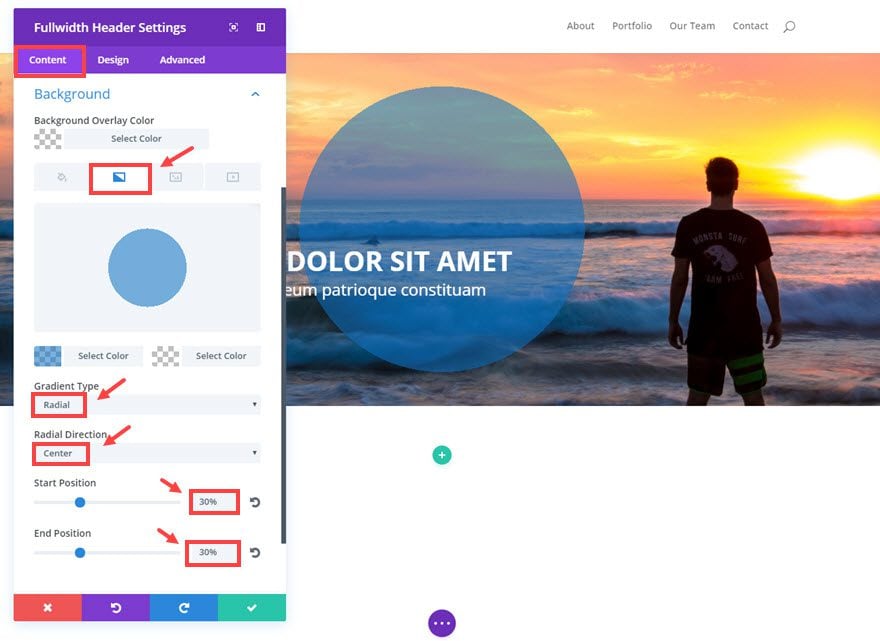
Design Options
Text & Logo Orientation: Center
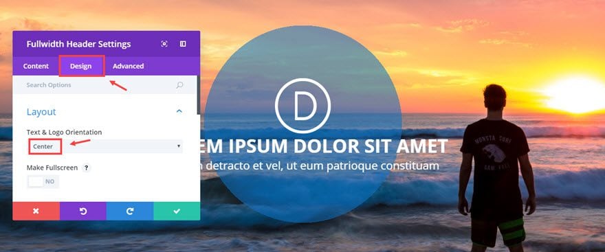
Now check out the new header background.
This trick creates great looking headers or call to actions. The size of the circle overlay can easily be adjusted and responds well to different screen sizes. Right now I’m using a semi-transparent gradient color on top of a background image, but this would look great without a background image.
Here is an example of what it would look like without a background image and with a darker text color.
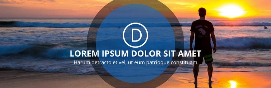
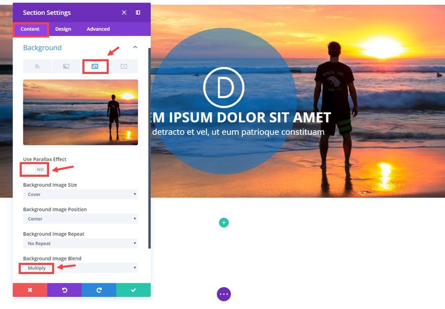
Trick #4 : Layering Circle Overlays to create a circle border
This is a continuation from Trick #3 where we left off with adding a circle overlay to a fullwidth header module. Once your circle overlay is in place, we can add a second circle overlay to serve as a border for the first. We do this by adding another background gradient to the Fullwidth Section which sits behind the Fullwidth Header Module.
Go to the Fullwidth Section Settings and update the following:
Content Options
Under the Background Image tab:
Use Parallax Effect: NO
Background Image Blend: Multiply
Under the Background Gradient tab:
Background Gradient Colors: rgba(0,0,0,0.45), rgba(255,255,255,0)
Background Gradient Type: Radial
Radial Direction: Center
Start Position: 34%
End Position: 34%
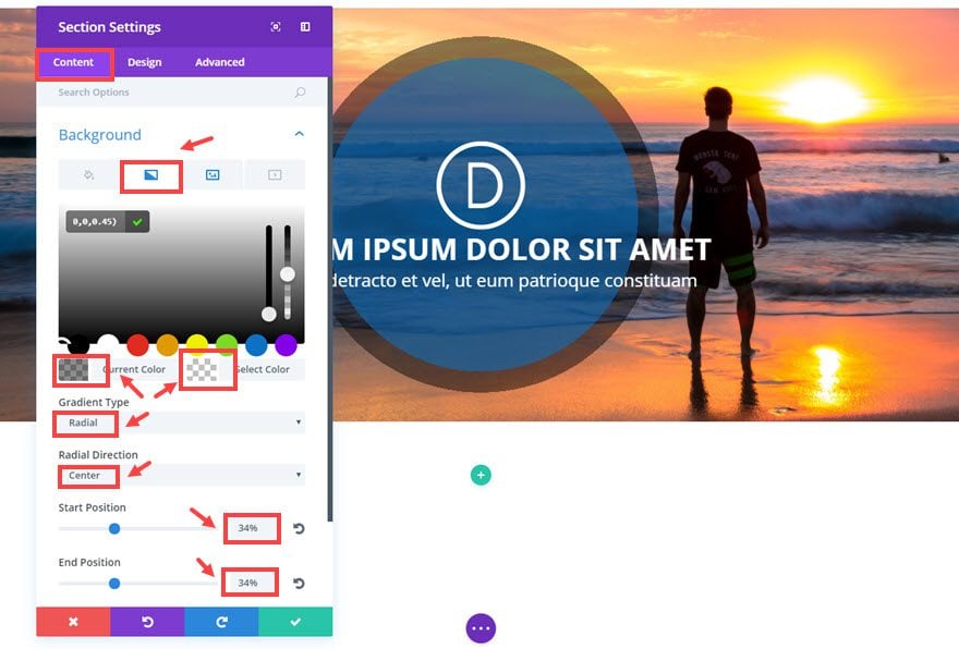
Save settings
That’s it.
You can also easily change the size of your background gradient circle by adjustng the percentage of the Start Position.
Trick #5: Inverse Circle Overlay
This is a continuation from Trick #3 which left off with a circle overlay in the fullwidth header module. Right now the circle is semi-transparent blue and the rest of the background image has no gradient overlay color at all. For this trick, I’m going to switch this out and inverse the circle overlay so that the semi-transparent blue gradient overlay will surround the circle and inside the circle will expose the background image behind it.
To do this, go to the Fullwidth Header Settings and update the following:
Content Options
Background Gradient Colors: rgba(255,255,255,0), rgba(12,113,195,0.79)
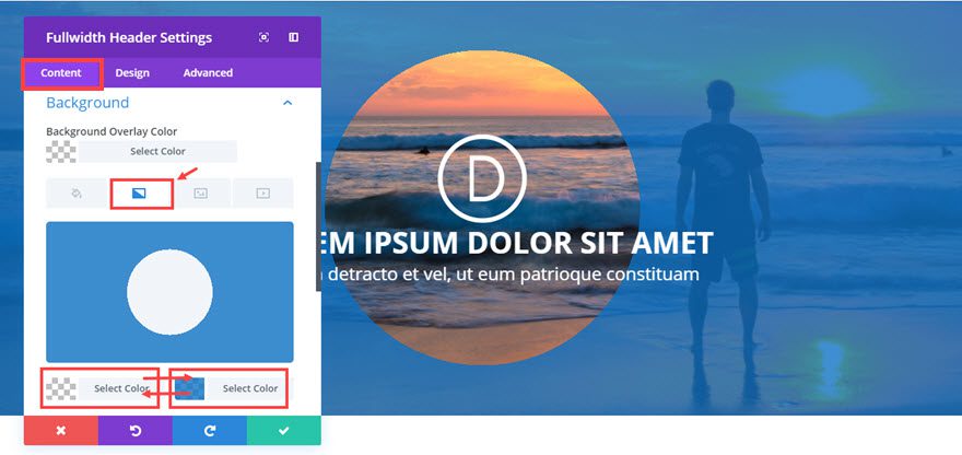
Note: All you are really doing here is swapping the colors on the left and right. Now the transparent color is what shows inside the circle and the blue gradient surrounds it. I would increase the opacity of the blue so that it is a little darker.
Check it out…
Trick #6: Inverse circle Overlay with Video Background
This is a continuation from Trick #5 which left us with an inverse circle overlay with a surrounding blue background. Currently the circle exposes a background image behind it. You can easily add a video background to sit behind this circle overlay. I would suggest using a video that is not too distracting. Also whenever you are using videos make sure the file size is small so that your page load time doesn’t suffer.
To replace the background image with a video, go to Fullwidth Section Settings, click on the
background video icon and add your video.
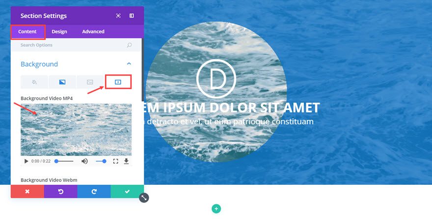
Now go to the Fullwidth header Settings and update the following:
Content Options
Background Gradient Colors: rgba(12,113,195,0.67), #333333
With the new gradient colors, the background video is only visible within the circle. And the overlaying colors really make the text pop.
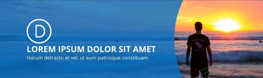
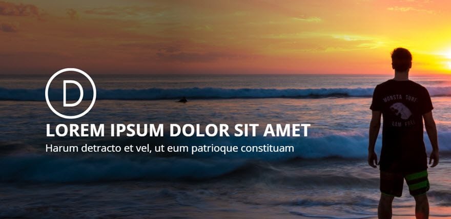
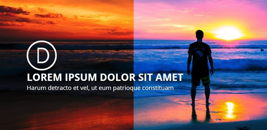
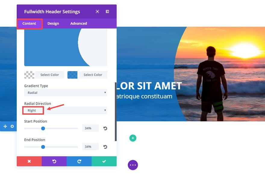
Trick #7: Off-centered Inverse circle Overlay
This is a continuation of Trick #5 which left us with a inverse circle overlay. If you go back to the Fullwidth Header Settings, you can adjust the Radial Direction to different settings to create different looks for your header.
Go to Fulwidth Header Settings and update the following:
Content Options
Radial Direction: Right
Design Options
Text & Logo Orientation: Left
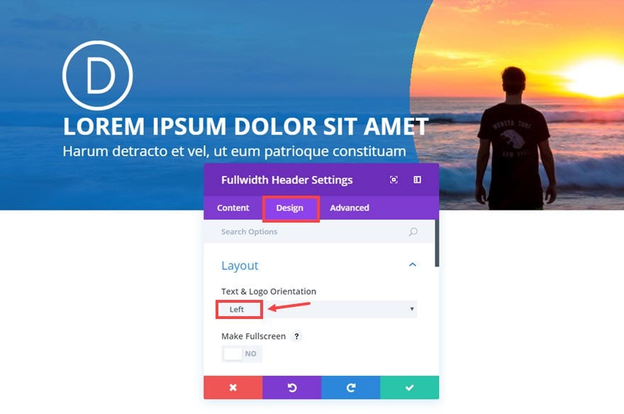
Here is the final result and a few examples of different radial directions:
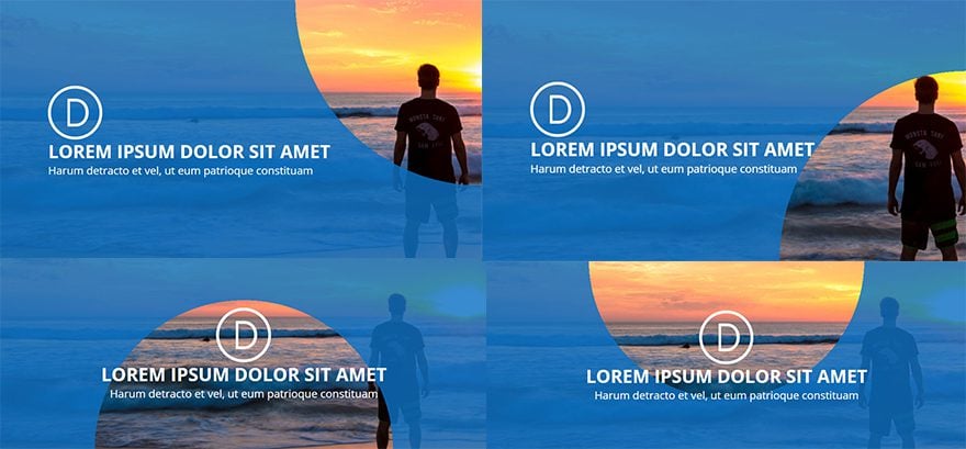
These examples obviously need some work but you get the idea.
Trick #8: Using Gradients for shadow effects
This trick may not be jaw-dropping, but it is extremely useful. For those of us who don’t want to bother with using a photo editor like Photoshop to add shadowing to your images, this is for you.
This is a continuation of Trick #1 which left off with a diagonal overlay using the background gradient option in the Fullwidth Header Module. Now let’s change the semi-transparent blue overlay to some dark shadowing that starts on the left of the image and gradually fades out to the right. This way the main portion of the image on the right remains untouched and the dark shadow on the left helps to make the text more readable.
To add the shadow effect go to the Fullwidth Header Settings and update the following:
Content Options
Background Gradient Colors: rgba(0,0,0,0.55), rgba(0,0,0,0)
Gradient Direction: 90deg
Start Position: 38%
End Position: 85%
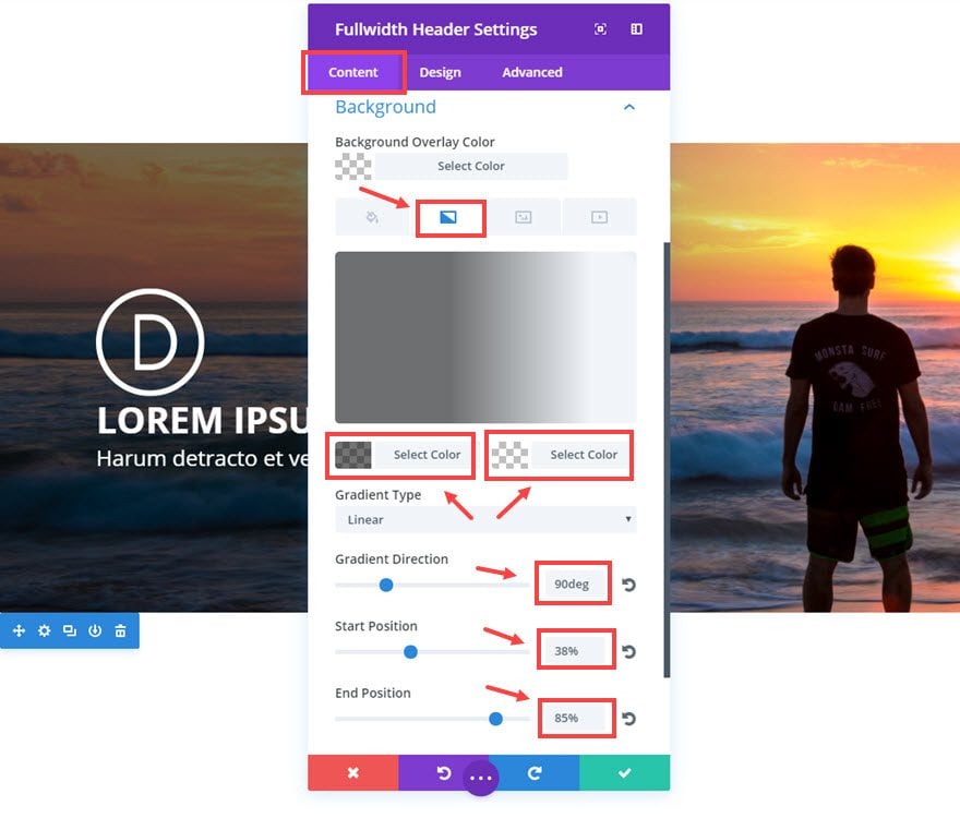
Here is the result.
Trick #9: Background Image Blend
Divi’s new background options include CSS blend modes for customizing images. Exploring the different image blends are a lot of fun and tend to create some surprising designs. For those of you who aren’t designers, you don’t have to know the definition of Saturation or Luminosity in order take advantage of these cool options. You will need to have a background color or gradient set in combination with the background image in order to see all of the cool effects (it won’t really work with just a background image). Then play around until you get the look you want. The results may surprise you.
For this example, I’m going to continue from Trick #1 which left off with a diagonal overlay using the background gradient option in the Fullwidth Header Module.
Go to the Fullwidth Header Settings and delete the background gradients under the Content Options.
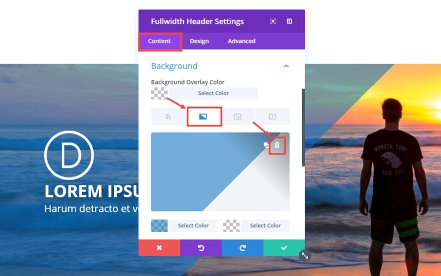
Save settings
Now go to the Section Settings and update the following:
Content Options
Background Gradient Colors: rgba(0,0,0,0.76), #0c71c3
Gradient Direction: 90deg
Start Position: 50%
End Position: 50%
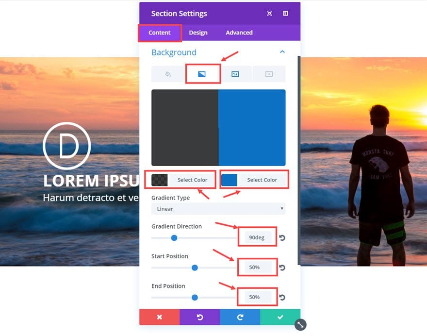
You can’t see any changes yet. That’s okay. Go to Background Image tab and update the following:
Use Parallax Effect: NO
Background Image Blend: Hard Light
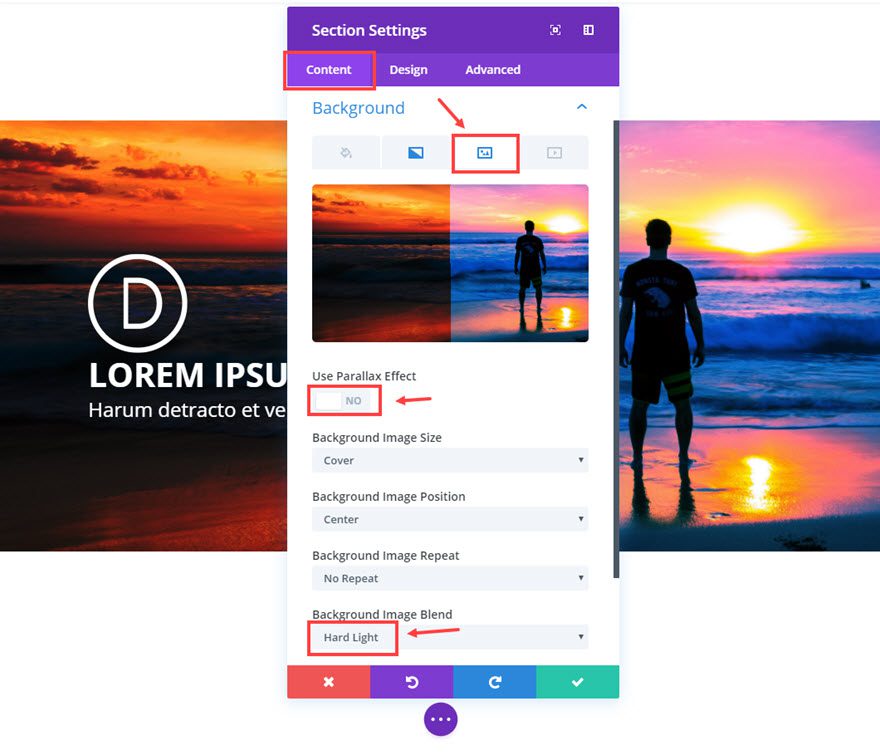
That’s it. Check out the result.
Note: the colors used here will create different effects based on the background image you use. So I suggest playing around with the colors and blend options until you get one you like.
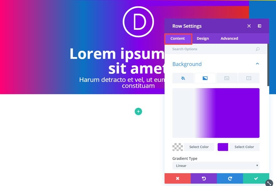
Trick #10: Layering to add more colors to your gradient background.
By default, every section, row, column, and module can have two color gradients. However, when you combine them and layer them on top of one another, you can create 5 colors for your gradient background. And when these 5 colors blend together you can create a pretty cool spectrum.
Here is how you do it. First, add a Regular Section with a 1 column structure row. Then inside the row, add a Blurb Module.
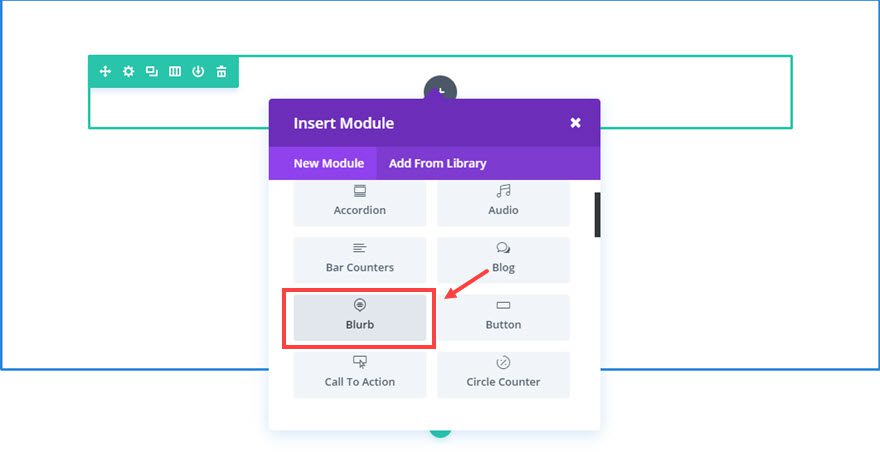
Update the Blurb Module settings as follows:
Content Options
Title: [enter title]
Content: [enter content]
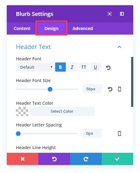
Design Options
Text Color: Light
Text Orientation: Center
Header Font: Default, Bold(B)
Header Font Size: 56px
Body Font size: 22px
Custom Padding: 100px Top, 100px Bottom
Since the blurb text is white on a white background you can’t see it yet, but that’s okay. You will soon. It’s time to start adding the gradient colors.
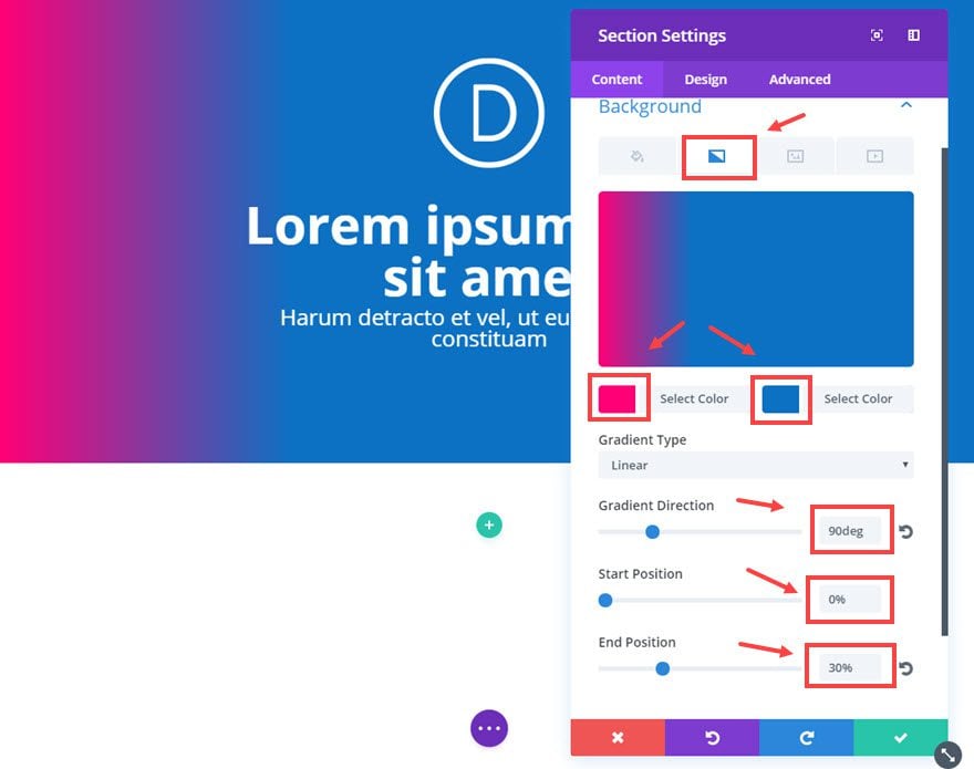
We will be working our way from the back to the front, left to right. To start, go to the Section Settings and update the following:
Content Options
Background Gradient Colors: #ff0077, #0c71c3
Gradient Direction: 90deg
Start Position: 0%
End Position: 30%
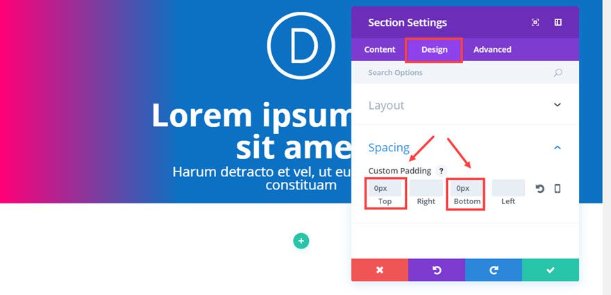
Design Options
Custom Padding: 0px Top, 0px Bottom
Now let’s update our next level of gradient color – our row. Go to the Row Settings and update the following:
Content Options
Background Gradient Colors: rgba(255,255,255,0), #8300e9
Gradient Direction: 90deg
Start Position: 25%
End Position: 50%
Column 1 Background Gradient Colors: rgba(255,255,255,0), #e02b20
Gradient Direction: 90deg
Start Position: 50%
End Position: 75%
Design Options
Make This Row Fullwidth: YES
Use Custom Gutter Width: YES
Gutter Width: 1
Custom Padding: 0px Top, 0px Bottom
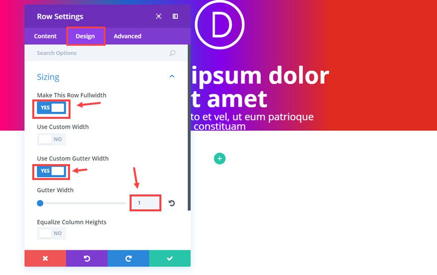
Save settings
Now for the final layer of gradient we need to go to the Blurb Module and update the following:
Content Options
Background Gradient Colors: rgba(255,255,255,0), #edf000
Gradient Direction: 90deg
Start Position: 75%
End Position: 100%
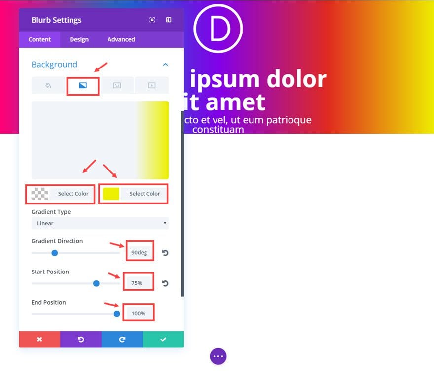
Design Options
Custom Padding: 100px Top, 100px Bottom
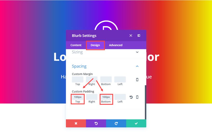
That’s it. Now you have five gradient colors blending together to create quite a colorful background.
Don’t forget, you can also change the Gradient Type to Radial (circular) and completely change the design (takes about 20 seconds).
If you change the Gradient Type to Radial for all of the the layers (section, row, column, and blurb module), you will get something like this.
Bonus Trick
Here is an example of how you can layer background images with parallax. This is a regular section with a background image using True Parallax. Inside the section is a 1 column row that was made fullwidth and without padding so it stretches the full width of the section. To the row, I added a transparent background image with some gradient circles (supposed to look like bubbles) using the CSS Parallax method. Then I added a Call to Action Module to the row with a transparent background. This combination creates movement when scrolling down the section on the page.
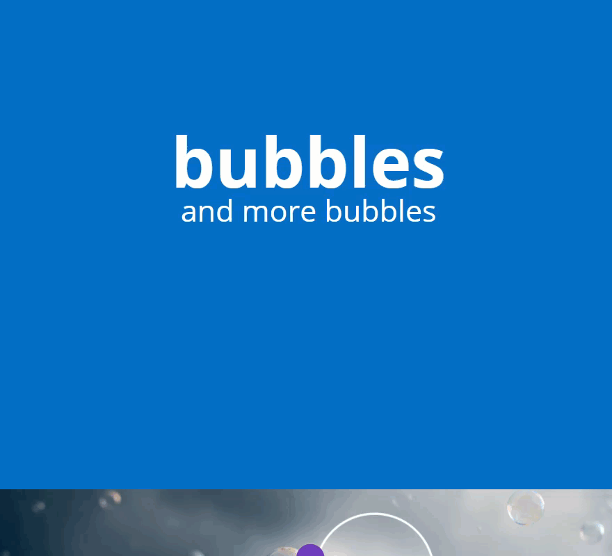
This trick is a tad bit more involved since it requires creating a custom photo outside of Divi. I simply hope to show you the possibilities.
A few more examples
I’ll end this with some design examples that I built while testing these same tricks mentioned in this post.
Final Thoughts
I hope you have enjoyed exploring these new background options and are excited about the possibilities they bring. And, since these options are available on sections, rows, columns, and modules, you can apply these design tricks on any part of your website. If you haven’t already, take some time to dig a little deeper and let those creative juices flow. I’m confident that if you take the time to explore the background options for yourself, you will be excited to implement them on your next project. I can’t wait to see what you come up with.
Looking forward to hearing from you in the comments.
The post 10 Background Design Tricks Now Possible with Divi’s New Background Settings appeared first on Elegant Themes Blog.