
When creating a website, there are a lot of different things to consider. It usually starts off with how you want the overall layout of your website to look and feel. You want it to match with what the content on your website is about in order for it to empower the message you’re trying to send.
One of the factors that play a major role in how your website will influence visitors’ behavior is the primary menu. With Divi, there are tons of possibilities that allow you to style your menu in a beautiful way that matches the rest of your website and helps you guide your visitors through your website.
One of those possibilities is using a vertical navigation instead of the top menu. Although vertical navigation is not that often used, it can deliver stunning results if it’s thought out well and if it matches the rest of your website. Like the top menu, the vertical menu follows visitors throughout their whole stay on the website.
To get you inspired, we’ve chosen 12 websites that use the vertical navigation to optimize the visitor’s experience by improving the way they navigate throughout the website.
1. Máster en Diseño de Interiores
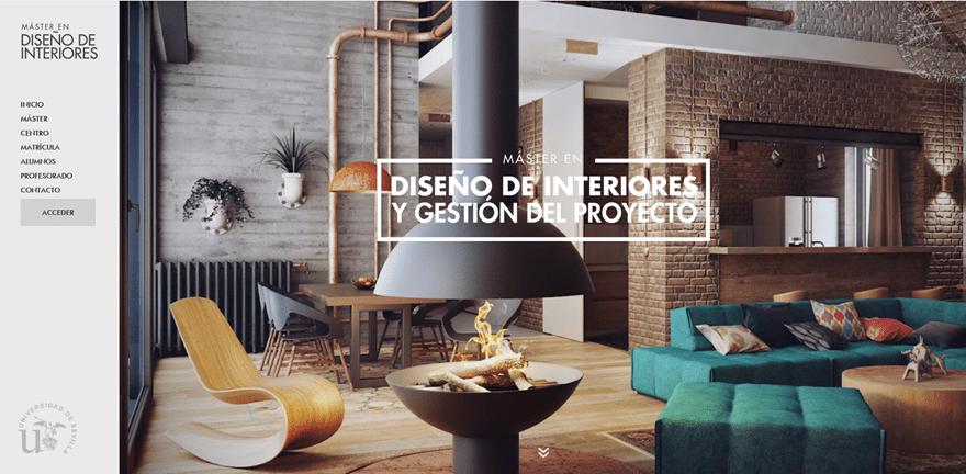
Master en Diseño de Interiores is a stunning website that is all about interior design. In the image above, you can see how they’ve used the vertical menu to give that nice extra touch to their website.
The colors that are being used on the website are very neutral, which give that modern touch and feel to the website as well as to the company or brand in question.
The vertical navigation is no exception. The colors that are being used are very subtle and do not bother the eyes while reading.
2. Model On Top
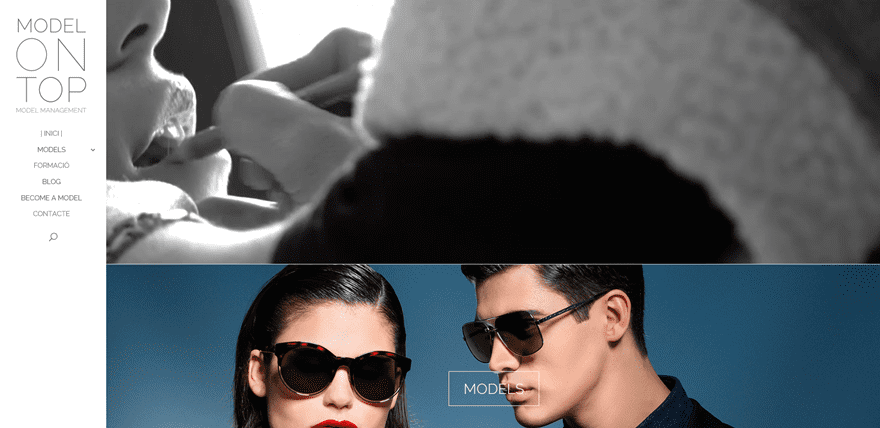
Model On Top is a model management website. This website, created with Divi, allowed a certain harmony to come together and show the professionality and expertise that they want to link to their company.
Besides having a very nice vertical navigation that contains all the needed elements such as a logo, the pages and a search bar, they’ve also created that engagement by using a video background right in the beginning of their website.
The vertical navigation didn’t need a lot of special designing, they rather decided to keep it clean and let the visuals throughout the rest of the page do the work.
3. Art-On-The-Run Filmschool Berlin
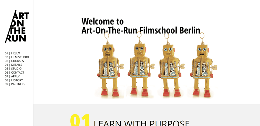
Art-On-The-Run Filmschool Berlin perfectly represented the artistical side a film school needs on their website. The vertical navigation has a special purpose in the whole picture.
They deliberately used a vertical navigation to enjoy the benefits of making the menu look like a kind of ‘list’. They’ve used numbering that is in line with what the website is about. The numbering could, besides pages, also easily be interpreted as scenarios or episodes.
The combination of the pages and the logo that’s being shown give a certain sense of simplicity and structure. They did not fail to represent visuals as well that are quite in line with what their website is all about.
4. Alex Brands
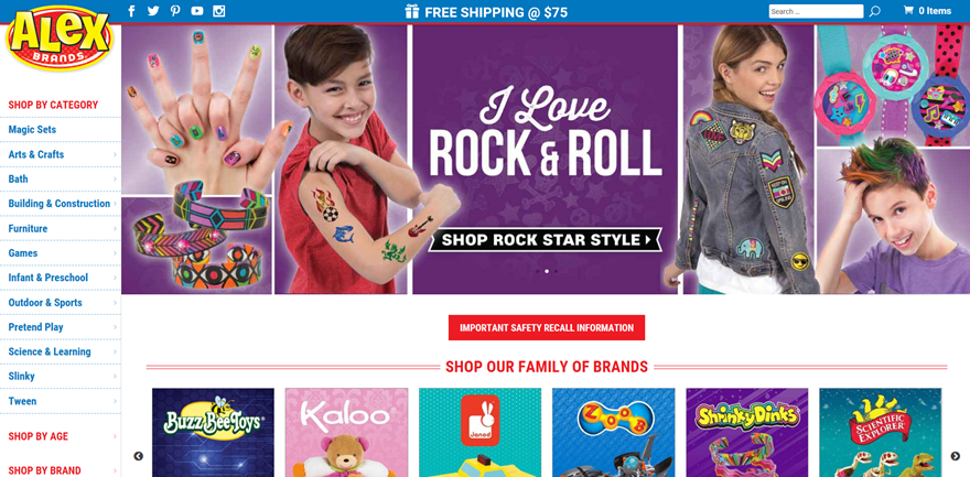
Alex brands is a Divi e-commerce website that sells all kinds of things for kids; from arts & crafts to furniture and games. The website immediately shows the kind of feeling they want to represent; playful and inviting.
The vertical navigation was in this case also very deliberately chosen. There are a lot of different pages, if they would’ve opted for a top menu, the structure would be lost and there would not be enough space.
5. Devlin Photos
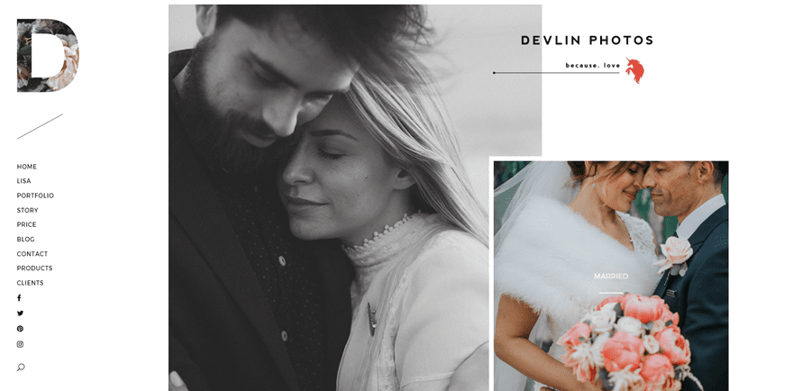
Delvin Photos is probably the most elegant website of all the ones mentioned in this post. Delvin Photos uses their website to display all of their work in an original and engaging way to attract new customers for the services they offer.
They used the vertical navigation to emphasize the elegance that they’re using throughout the rest of their website and by including social media icons in their primary menu; they also make sure that people can access the social media channels at any time during their stay on the website.
6. Soirée Makeup
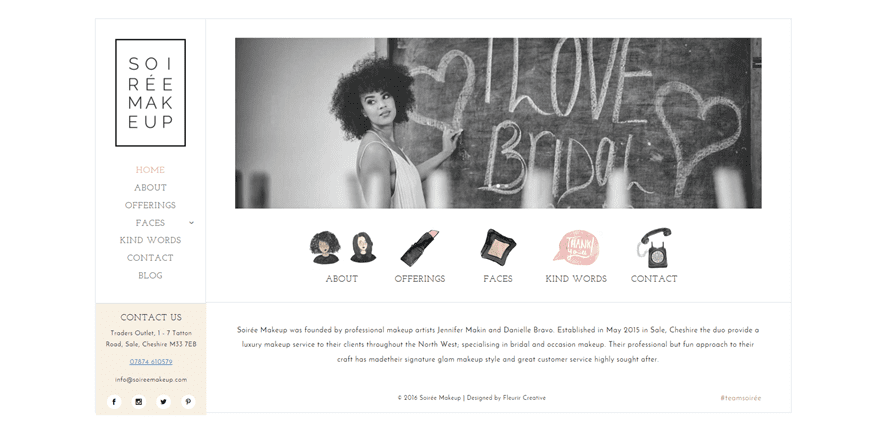
Soirée Makeup is a website that revolves all around makeup. The website is specifically made to offer the makeup services of a makeup artist. The website immediately shows the simplicity and elegance that is expected from every makeup artist. Not too much extravagance but pretty to look at.
The website, in general, doesn’t take up the whole screen which makes the content more concentrated. In the vertical navigation, most of the attention goes to the logo and the contact box.
Including a contact box within the vertical navigation allows the makeup artist to emphasize to the most important purpose the website has; getting new leads, new customers and new reservations.
7. Nathan Welton Photography
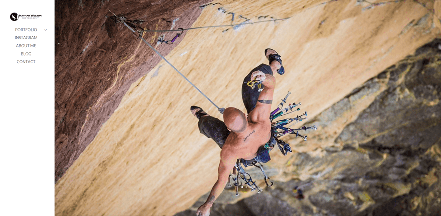
Nathan Welton Photography is the second photography website we selected for this post. Using vertical navigation for a photography website is a lot more common than for other websites. That’s usually because the pictures on the website speak for themselves.
Website owners of photography websites use a simple vertical navigation to keep the focus on the images by having a menu that is easy to use and not distracting.
The images Nathan Welton used on his website are exactly that; they’re full of adventure and tell their own story. The vertical navigation is only there for practical purposes and doesn’t interrupt with the page like a top menu would do.
8. Lilly Photography
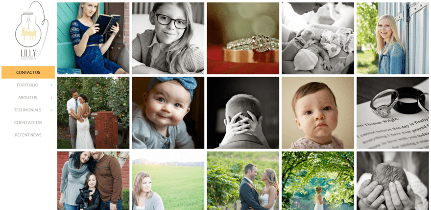
Lilly Photography is the last photography website we chose for this post. The great thing about this website is that it uses a gallery on the homepage.
The gallery shows work that has been done in the past to create a certain feeling of experience. Because in the end; people are looking for a photographer that takes pictures that are in line with what they expect.
The vertical navigation is similar to the vertical navigation used by Nathan Welton; simplistic but getting the job done.
9. Film Pittsburgh
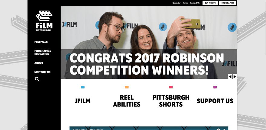
Film Pittsburgh is a film presenting organization. One of the nice things they did is create a second menu on the top of their page that allows the visitors to get the practical information.
The vertical navigation, on the contrary, is rather informative but helps the visitors understand their story and mission by leading them to the right pages. Dividing the practical and narrating pages from one another empowers the storytelling in the primary menu.
Besides using vertical navigation, Film Pittsburgh also didn’t use the whole size of the screen which left them with space to enhance their design with a relevant background image.
10. BlendLove
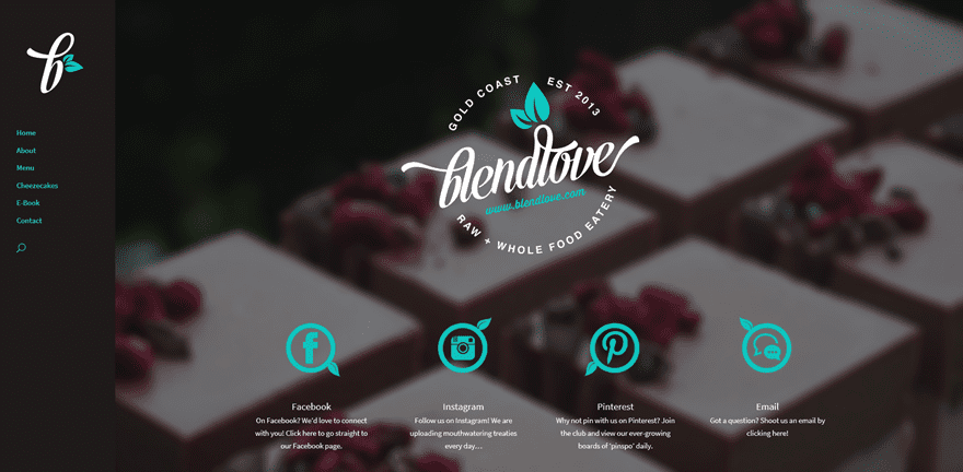
BlendLove is a food shop located in Australia. They’ve built a website to inform their customers about all the practical information they need to know.
One of the nice extra’s they provide on their website is the opportunity of buying an ebook full of the healthy food they make. It’s a nice way of engaging with customers, getting to know who they are and even making profit.
The website itself has a dark tone color palette that creates a nice contrast with the logo they have. They made sure the colors were consistent throughout their whole website, in their vertical navigation as well. Making sure the consistency is there is important because the vertical navigation takes up a relatively big part of the screen, whereas a top menu usually isn’t as noticeable.
11. Bon Appetit
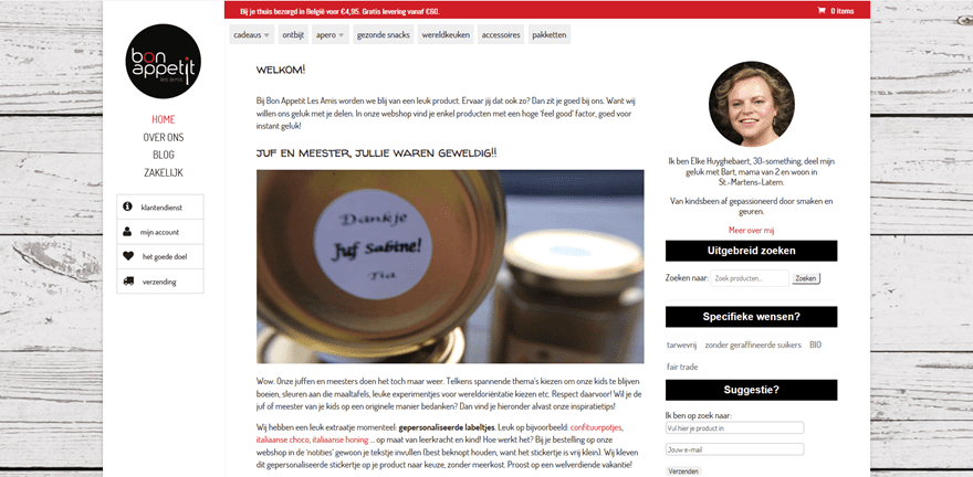
Bon Appetit is a Belgian website focused on giving workshops that involve a lot of flavors and scents. The previous examples and this example differ on one thing for sure; the Bon Appetit website is more focused on the written content they provide than on the visuality.
The vertical menu has been split up into 3 kinds of pieces; the logo, the pages, and extra services such as customer service and shipping. The difference in style between the pages and extra services gives an extra organized feeling and touch to the website.
12. Eat Thai Restaurant
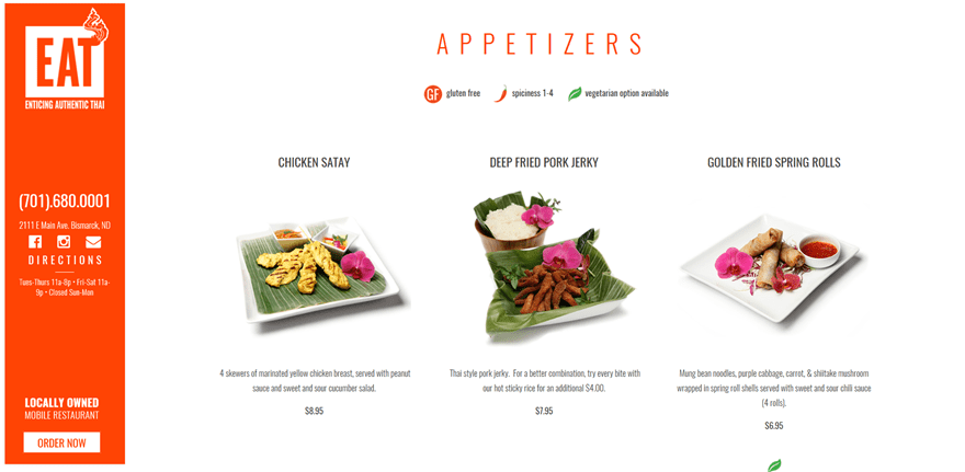
Eat Thai Restaurant is the last example in this post. It’s a locally owned mobile restaurant that gets to the point. Their website doesn’t have multiple pages. They rather took one page and focused on the thing that is most important; the food. The site is used to redirect people who want to order to an ordering website.
The nice thing about the vertical navigation used in this example is that it’s really not there to navigate but more to inform. The vertical navigation follows a visitor during their whole stay on the website, which means the information does too. They provided all the relevant information in the menu, along with the social icons and an ‘Order Now’ CTA.
Final Thoughts
We hope this post gives you tons of inspiration that helps you think of great concepts for current websites you have or future websites you’re making. If you have any suggestions or comments; feel free to leave a comment in the comment section below! And while you’re there, let us know; what kind of website would you use the vertical navigation for?
Be sure to subscribe to our email newsletter and YouTube channel so that you never miss a big announcement, useful tip, or Divi freebie!
Featured Image by LuckyDesigner / shutterstock.com
The post 12 Examples of Divi’s Vertical Navigation appeared first on Elegant Themes Blog.