Artists and artisans have been around for many millennia and are popular both on and off the web. They need websites to show their work and tell potential clients about their services and products. As expected, there are a lot of artists and artisans that use Divi to create their websites. In this article we’ll take a look at 14 examples artists and artisan’s websites built with Divi.
The topic of artists and artisans covers a lot of topics and their need differ depending on the types of services and products they provide. Most include products, commission information, events, courses and workshops, signup forms, contact info, blogs, and more. They’re in are in no particular order.
1. Artfully Designed Creations
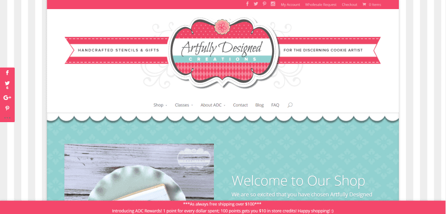
Artfully Designed Creations uses a boxed design with striped background an extra-large header and logo with styled section separator to create a curtained look. Sections include a post slider, featured products, latest products, and testimonials. The message bar at the bottom remains on screen on scroll. The red/pink and seafoam green work well with the site’s design.
2. Abbart JC
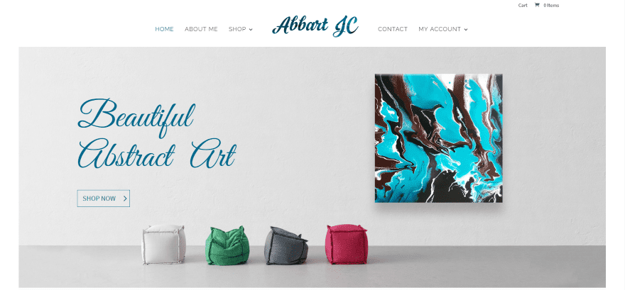
Abbart JC is a simple site that uses a boxed design with a narrow border. A full-screen CTA (call to action) draws visitors into the shop. The featured products section displays images for three product categories with hover animation and parallax. The shop pages also include hover animation and a styled back-to-top button. The shop is powered by WooCommerce.
3. Art By Lexi
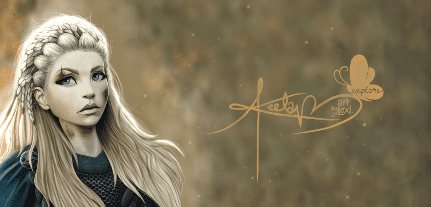
Art By Lexi is a simple design that displays a full-screen image with fog elements and signature in true parallax. The bright red logo and full-width menu are placed under the image followed by a filtered image gallery. The simple design draws attention to the artwork.
4. La Tienda Del Desvan
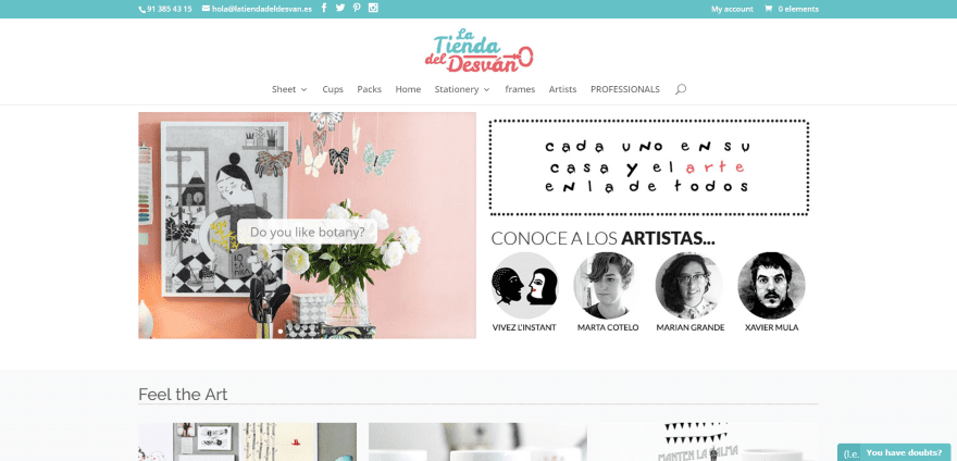
La Tienda Del Desvan uses a magazine design. The logo disappears on scroll, leaving the menu at the top of the screen. The first section includes a slider and links to the artists. Another section displays categories in a grid with a small subscription opt-in form. The shop section is powered by WooCommerce. Another section integrates artist’s photos into a CTA.
5. Autsome Artist
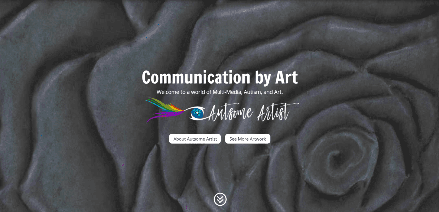
Autsome Artist uses a full-screen header in parallax with links to the about page and portfolio. Artwork is displayed in a full-width portfolio in a masonry grid. The portfolio page displays even more artwork using a filtered portfolio in a masonry grid layout.
6. John Sampson Art
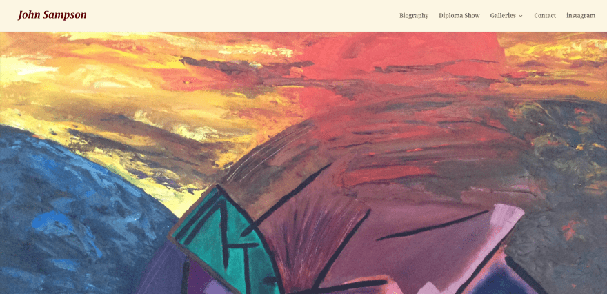
John Sampson Art use a full-screen image slider as a homepage. The site includes seven gallery pages – each page displaying a full-screen background header in parallax with a single page title. Work is displayed in a gallery grid with images opening in a lightbox. The biography page shows a schedule for events using headers for the dates with each separated by a line, creating a simple and interesting event’s calendar.
7. David Welch Art
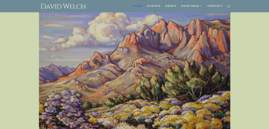
David Welch Art displays paintings in a full-screen image slider followed by social follow buttons and a full-width menu. The event calendar shows event locations and dates. The Paintings pages include an introduction to that type of media followed by the image gallery, which uses hover effects and opens in a lightbox using FooBox Image Lightbox. The site uses elegant fonts and colors.
8. Toula Boula
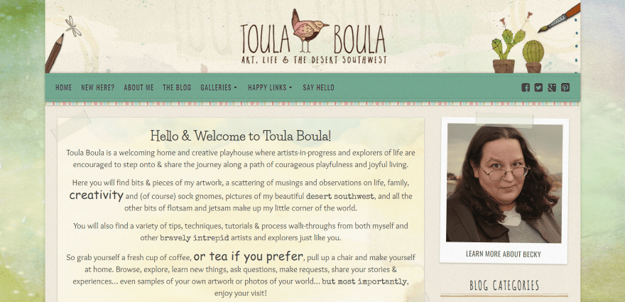
Toula Boula is an art blog that uses a boxed design with art background. Each of the design elements use details such as watercolor backgrounds and tape and staples holding the elements to the canvas. Links appear offset under the elements. The menu includes fonts within the navigation. The site is a single-column design with sidebar and includes a welcome and about section, post slider, subscription, samples of work, custom footer, and lots more. This is one of the most artistically designed sites on the list and makes great use of color, artwork, fonts, and details.
9. Nancy Hughes Art
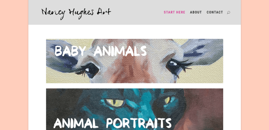
Nancy Hughes Art uses a boxed design with a soft background. The homepage displays images of artwork with category names as links to the various categories. Clicking on them opens a non-clickable image gallery in one or two columns (or combination of the two). The Contact page places the contact form over an artistic background and use multiple colors for the form fields. The fonts add to the artistic look of the site.
10. Gentle Moments Studio
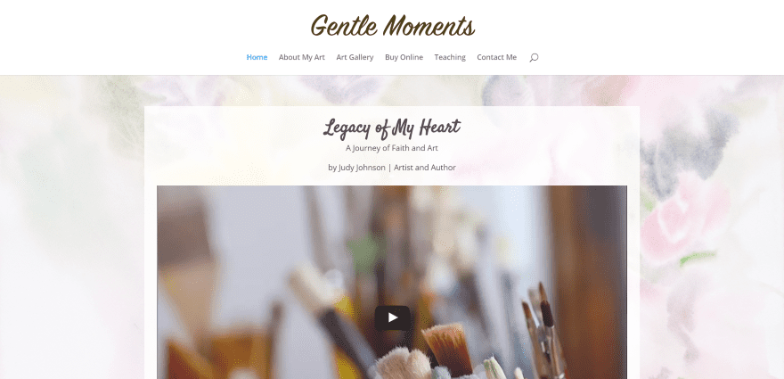
Gentle Moments Studio uses a boxed design with artistic background. The content is placed with a box with a slight reduction in opacity, allowing the background to peek through. The page includes an embedded video, a two-column CTA, a full-width image that works as a page sample which opens in a lightbox, a gallery grid, and about sections. The site uses elegant fonts and backgrounds.
11. Second Touch Art
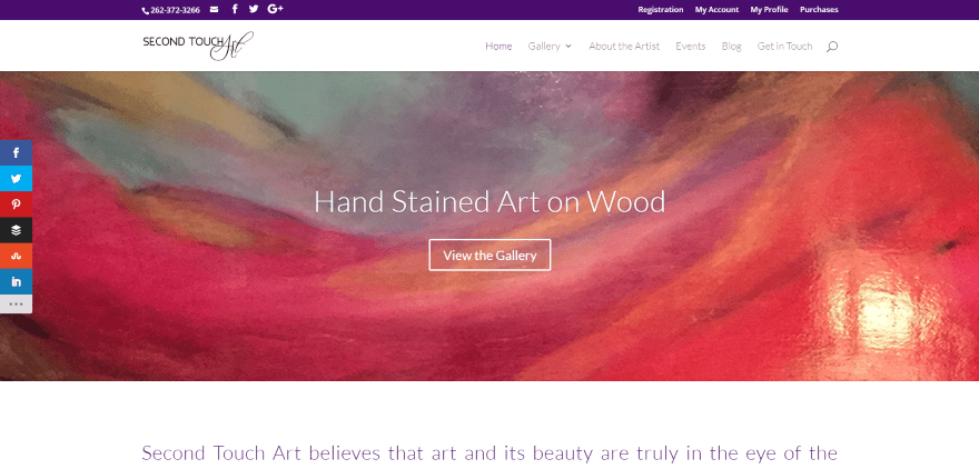
Second Touch Art uses a clean design that displays a full-width image with link to the gallery followed by a prominent company statement, a two-column section with sign-up form and contact info, and a gallery. The gallery and shop are powered by iThemes Exchange. The Events page is powered by The Events Calendar. The site uses branded colors for fonts throughout.
12. Joanna Marie Art
Joanna Marie Art uses a full-width image slider to display artwork. Following this is a section displaying three shop categories with link, a two-column about section, a full-width inspirational quote, and footer with Facebook and Instagram feeds. I love the sweet logo design that uses an open heart to create the J, M, and A. The art portfolio pages display images over a dark background with each opening in a lightbox. The shop is powered by WooCommerce.
13. Lovingly Artisan
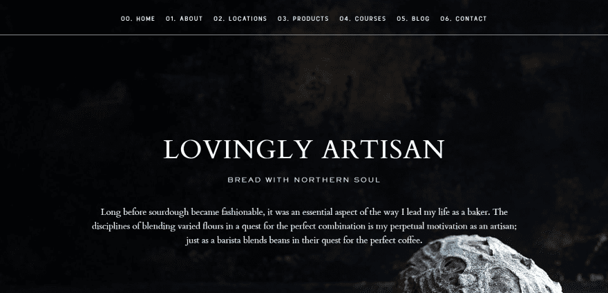
Lovingly Artisan displays a full-screen background with company name and quote. Following this is a two-column about section, a locations section in parallax, a section describing the products, links to courses, a blog section, contact form, and footer with the artisan’s signature. It uses a numbered menu structure with no logo. Each of the sections include the number to tie them with the menu. This is a Design Space design and all of the expected details are here. It makes great use of parallax and black and white.
14. Craft Industry Alliance
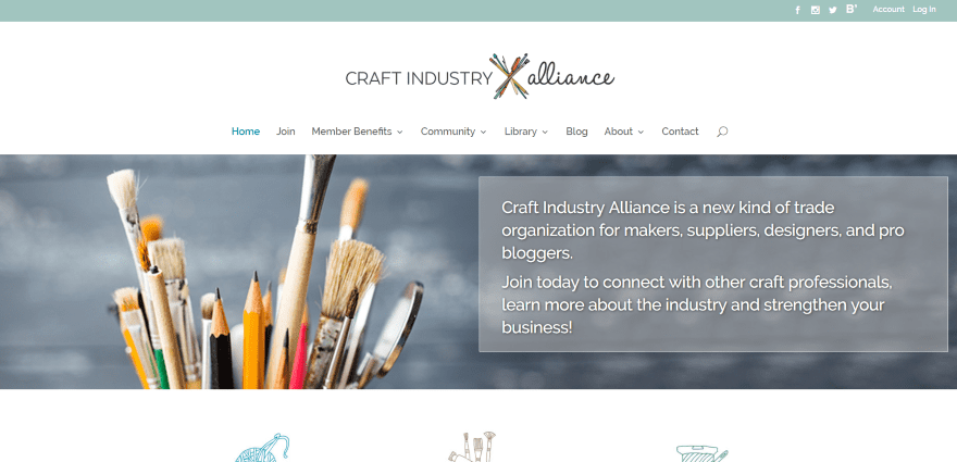
Craft Industry Alliance is a trade website for the crafting industry. It uses a full-width image with company information in a text module with reduced opacity. Scrolling reveals three blurb modules with custom icons and text. A slider provides information and links to read the magazine. It includes lots of integrated community areas including a forum, member’s only area, community groups, business directory, and lots more.
Final Thoughts
These 14 Divi sites are great examples of websites for artists and artisans. While most use a simple design with the focus on artwork, a few pull out all the stops and display some amazing design elements.
Whether you need inspiration for include products, commission information, events, courses and workshops, signup forms, contact info, blogs, etc., there’s sure to be something here to help with your next artist or artisan website built with Divi.
We’d like to hear from you. What are your favorite design elements from these examples of artists and artisans websites built with Divi? Let us know what you think in the comments below.
Featured Image via Visual Generation / shutterstock.com
The post 14 Examples of Artists and Artisans Websites Built with Divi appeared first on Elegant Themes Blog.