
Digital consulting is a popular online business model. Lots of digital consultants develop with Divi for both them and their clients, which is one reason why Divi has become one of the top development themes for WordPress. This means there are lots of examples of digital consultant websites built with Divi to help provide creative inspiration. In this article we’ll take a look at 16 of them.
Whether the digital consultant provides services such as web design, logos, graphic design, app development, etc., these sites can help with inspiration for your next design. The sites are in no particular order.
1. Smart Coder 3
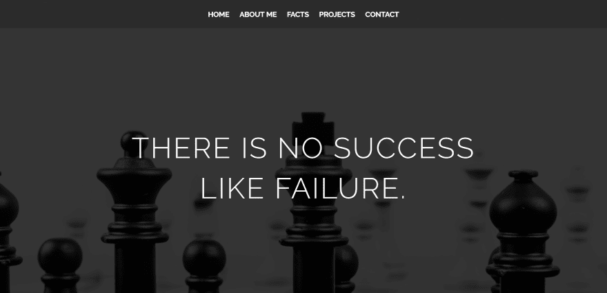
Smart Coder 3 uses a full-screen image slider with chess background images and quotes in an overlay. Red fonts provide some visual highlighting. The About Me section displays a nice digital painting of the developer. Multiple sections provide quotes from famous names. Other sections include a number counter, projects, testimonial slider, and contact form. The red, white, and black color-scheme works well for the site’s design.
2. XD Web Design
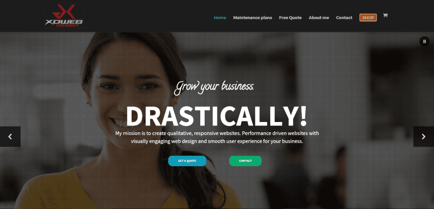
XD Web Design includes some interesting transitions within the header’s slider, which includes a CTA and social buttons. Blurbs display as cards with shadows, hover effects, and icons that overlaps the image and text. The CTA (call to action) modules also use shadows and hover effects. Large icons draw attention to services and contact information. The project process is described in a horizontal numbered list. The site makes great use of color, animation, and layout design.
3. Zachery Nielson
Zachery Nielson mostly uses a black background with white text, images, and a full-screen background in parallax. Selected work is shown within a monitor and mobile device. The sites uses a minimal approach with large fonts.
4. Vicente Latag Jr
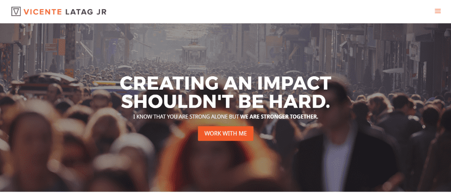
Vicente Latag Jr displays a full-width video background in parallax that moves in the opposite direction on scroll. With orange and white branding, large icons draw attention to services, testimonials, and the contact form. Projects are shown in a full-width grid.
5. Taltool
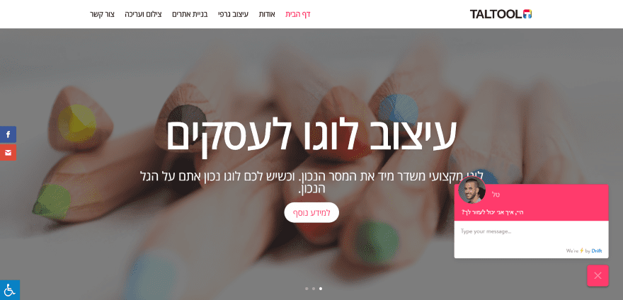
Taltool is a Hebrew site with RTL (right-to-left) text. It uses a full-screen slider with zoom animation. Most of the sections are full-screen and include several recent project sections and an About section with a color-pencil styled digital drawing of the developer with a CTA. The site makes great use of color.
6. Sensi Web
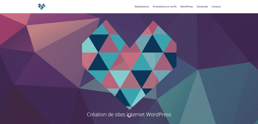
Sensi Web uses an interesting particle background with a heart-shaped graphic in parallax (which doubles as the logo). The section backgrounds throughout the site match the colors from this background and graphic. The sections use two-columns of text and graphics in an alternating pattern. Work is shown in a project slider using a zoomed version of the background image. The fonts and icons match the design perfectly, giving the site a visual appeal that looks clean and professional.
7. John Gonzalez
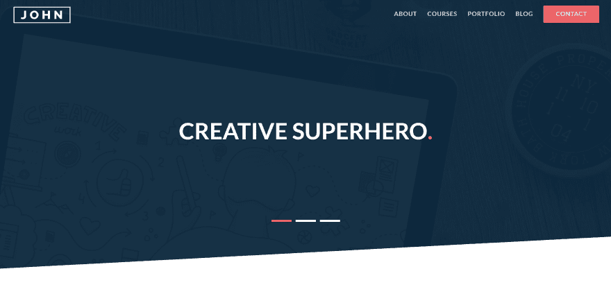
John Gonzalez uses an image slider with zoom effect on scroll. Each slide provides a short statement. Services are shown in tiles that use nice hover effects to provide a shadow for the card, change the title to red, and enlarge and bold the icon. Testimonials show images that you can select to read their statement. The courses and blog also use hover effects, but slightly different from the services. The site makes excellent use of red and white color branding, animation, and parallax.
8. Brian Torpie
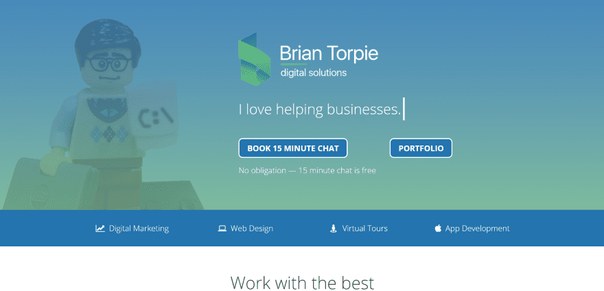
Brian Torpie uses a gradient background overlay in parallax with CTA’s and a nice typing effect. A thin full-width section describes each section of the layout starting with the first one which displays the services provided. Each of the services are described or demonstrated with full-width sections using background images with text and CTA to one side.
9. Zeljko Skipic
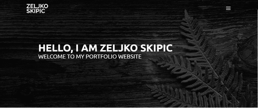
Zeljko Skipic uses black and white (mostly shades of gray), along with sections of light gray backgrounds, and dark overlays in parallax to highlight the portfolio and services. The sections are separated with titles that use code graphics behind the text. The right site vertical menu displays the contact and social follow buttons in a separate section from the navigation. The dark grays look elegant against the light grays and create a contrast that’s smooth and easy to look at.
10. Charlotte Jourdain
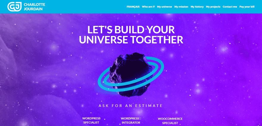
Charlotte Jourdain uses an animated header with elements that follow or react to your mouse. The header’s background is used in every other section in parallax. Large circled patterns that match the logo overlap sections, creating an interesting visual design element. The projects use zoom hover effects with overlays. The site has options to read in French or English and makes great use of color branding and section separators.
11. Carone Designs
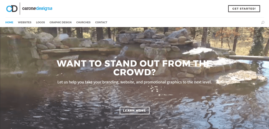
Carone Designs displays a video background, an interesting header with CTA button and right side menu with both sections separated with a line. Services are displayed in white text over a blue background. Images of the city of Knoxville are used as backgrounds in parallax including one that displays client logos in an overlay. The site makes good use of fonts and color branding.
12. BJ Keeton
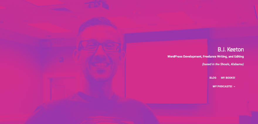
BJ Keeton displays the name, description, and navigation on the right side over a background with overlay in parallax. The blue and red from the overlay are used throughout the site for backgrounds and icons. Books and portfolio images use thick borders to make them stand out. The site uses humor throughout while remaining professional, which actually made me want to read all of the text.
13. MoxieCreek
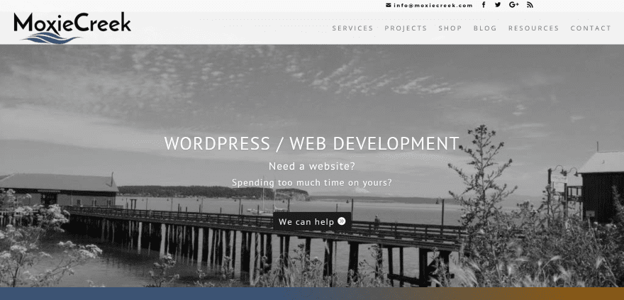
MoxieCreek displays a black and white image with CTA in parallax. The top bar places all of the elements to the right side. The logo overlaps on scroll. A blue and orange gradient is used over an interesting background pattern to display a statement and services. The service’s details are provided within toggles. I love the black and white photo behind the contact form that shows a lady bug in color.
14. Juice Creative Web Design
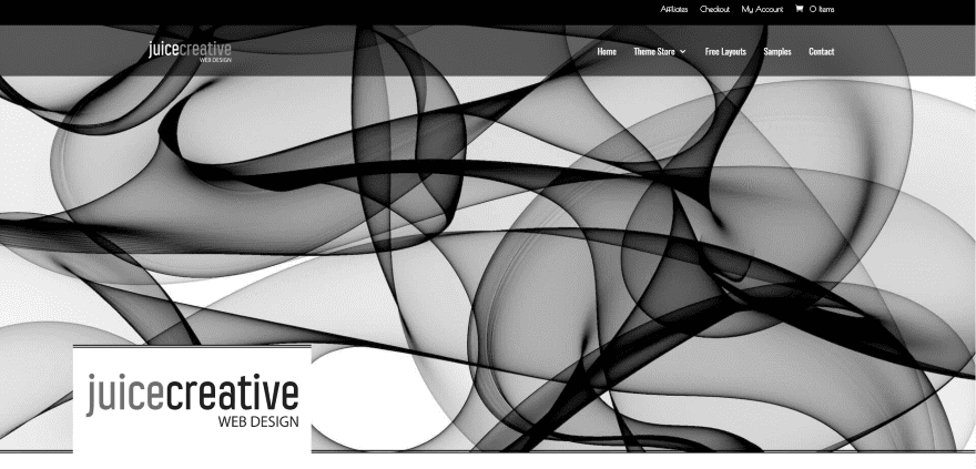
Juice Creative Web Design uses an intricate background pattern throughout the site including backgrounds for the various CTA links. Examples of work, links, and the contact form are displayed with a nice shadow effect with lines above the images. The download links include simple hover effects. Although they are intricate, the visuals never get in the way of the site’s clean design.
15. In-Formation-Design
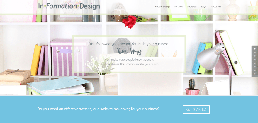
In-Formation-Design uses a feminine and elegant design throughout with soft colors, watercolor splashes behind the section title’s elegant fonts, pastel background patterns, flowers, and a watercolor splash in the About Me section. The page includes a portfolio grid in parallax, pricing tables for the web design packages, a FAQ displayed in toggles, transparent testimonial slider, and a simple contact form.
16. Kaya Digital Media
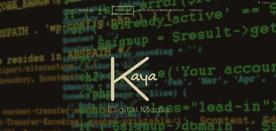
Kaya Digital Media displays a video background with the logo and list of services. It includes a slim newsletter opt-in form, description of services in an alternating multi-layout section, a section with a window in true parallax, a two-column portfolio grid within a three-column section, post slider, and an elegant testimonial over a parallax background. I love the font and background colors.
Final Thoughts
These 16 examples of digital consultant websites built with Divi go to show that Divi is not only a popular theme for client work, but it’s also powerful enough that digital consultants use it for their own websites. With Divi you can create interesting designs for any type of digital consultant website, no matter how complex or simple, from one-page sites to display services with a contact form to large sites with animation and portfolios.
These sites a great for providing ideas for layouts, use of color, images, CSS effects, navigation, video, and lots more, and give you inspiration for your next Divi design.
What are some of your favorite elements of these digital consultant websites built with Divi? Let us know in the comments below!
Featured Image via BarsRsind / shutterstock.com
The post 16 Examples of Digital Consultant Websites Built with Divi appeared first on Elegant Themes Blog.