
In this Divi tutorial, we’re going to show you a couple of interesting ways to style the active link in your vertical navigation. This tutorial follows up a previous tutorial where we’ve shown you how to create active links on scroll for one-page Divi websites. So, before you try out the different ways of styling, you should first set up the active links on scroll through the previous article since the code we’ll be using will build further upon that.
Something you should keep in mind during this tutorial is the fact that you can only see the results once you’ve saved the page. By just previewing your page, the changes will not show up.
How it Works
To create a navigation that automatically adjusts the active link as you scroll down the page, we’ve used the Page Scroll to ID plugin that easily helps you achieve the results you want. Besides, the plugin also offers you different options that you can manually choose from within the settings.
The plugin helps identify the position a visitor has on your website and will change the menu item according to what section on your website they are currently looking at. This is a small interaction that’ll definitely help your visitors navigate throughout the one-pager. They’ll automatically know what part of your page they are exploring and how far away they are from other sections that they might be interested in.
Note: know that this method only applies to websites that are made out of only one page.
Activate Vertical Navigation
The examples we’ll be showing you how to make will especially be valuable if you’re using vertical navigation. So, go ahead and enable vertical navigation in the Theme Customizer (if you haven’t done that already in the previous post).
If you’re on your WordPress Dashboard, go to Appearance > Customize > Header & Navigation > Header Format > Enable Vertical Navigation.
Active Link Style #1
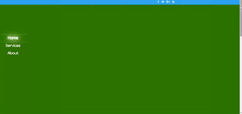
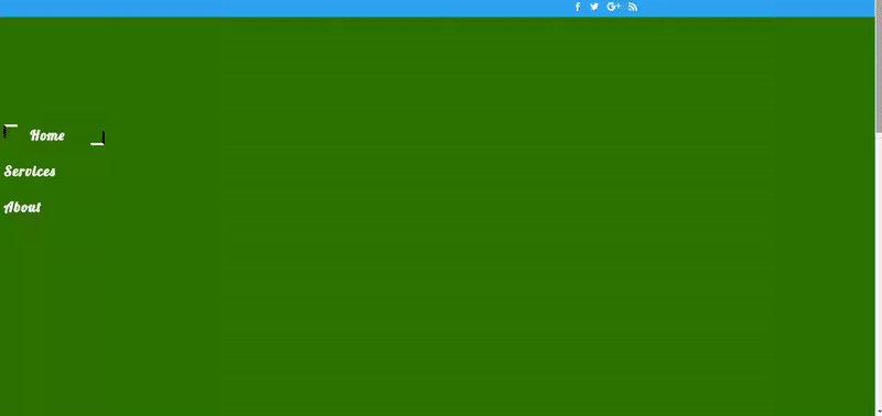
The first example we’d like to show you is a glowy one. Every time a visitor passes by one of the sections, another menu item will start to glow. It’s a subtle but beautiful and elegant way to help your visitors navigate through the one-pager.
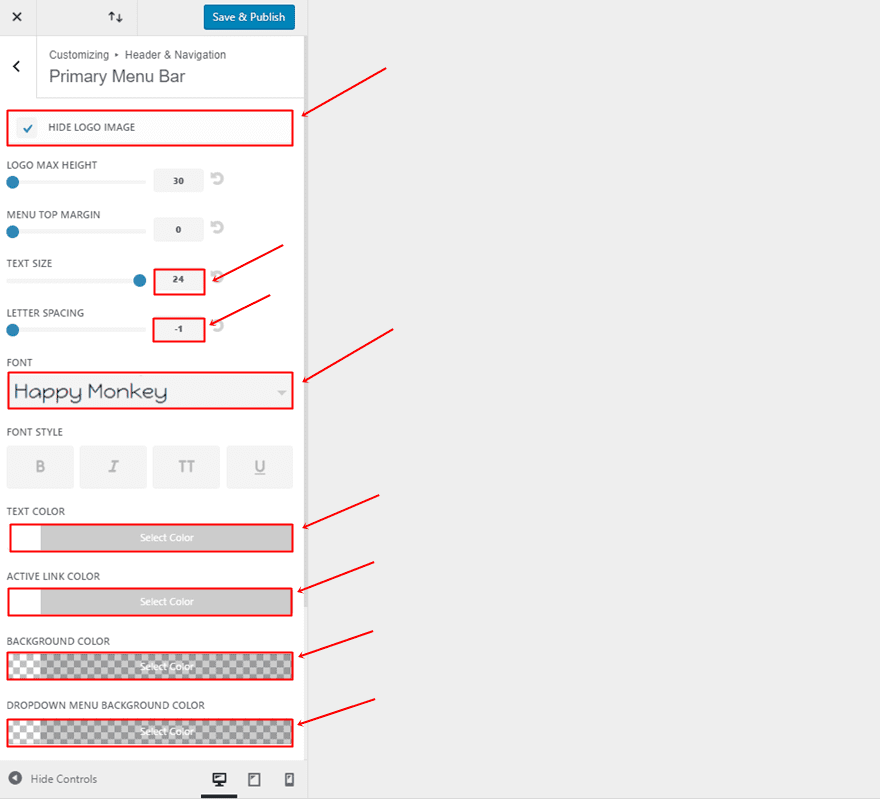
Primary Menu Bar Settings
Start by making some changes to your Primary Menu Bar. If you’re on your WordPress Dashboard, go to Appearance > Customize > Header & Navigation > Primary Menu Bar and make the following modifications:
- Hide Logo Image: Enable
- Text Size: 24
- Letter Spacing: -1
- Font: Happy Monkey
- Text Color: #FFFFFF
- Active Link Color: #FFFFFF
- Background Color: rgba(255,255,255,0)
- Dropdown Background Color: rgba(255,255,255,0)
Add CSS Code to Theme Options
The next thing you’ll need to do is add some CSS code. There are a couple of ways you can add CSS code to your website. We’re going to handle three methods in these examples, starting with the Theme Options. If you’re on your WordPress dashboard, go to Divi > Theme Options > Scroll down the General tab and place the following lines of CSS Code in the Custom CSS box:
@media (min-width: 981px) {
.et_vertical_nav #et-main-area, .et_vertical_nav #top-header {
margin-left: 0px !important;
}
.container {
margin-left: 3% !important;
}
.et_vertical_nav #page-container #main-header {
box-shadow: none !important;
}
#top-menu .current-menu-item a.mPS2id-highlight{
text-shadow:  0 0 10px #fff,  0 0 30px #fff,  0 0 50px #e3e98e,  0 0 70px #e3e98e, 0 0 90px #e3e98e;
border-top: 1px dotted #FFFFFF;
border-bottom: 1px dotted #FFFFFF;
padding-top: 15px;
}
nav#top-menu-nav {
width:80% !important;
}
.et_vertical_nav #main-header #top-menu > li > a {
text-align: center;
margin-bottom: 15px;
padding-left: 25%;
}
#et-top-navigation {
padding-top: 100% !important;
}
#top-menu {
text-align: center;
padding-left: 10%;
}}
Active Link Style #2
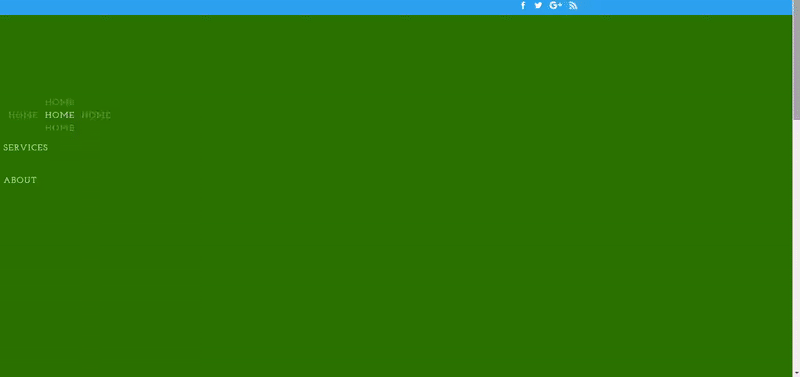
The second active link style is one that has a very clean and elegant look. As usual, the active links will change according to the way you’re scrolling down the one-page website. When clicking on one of the menu items, the same style will apply.
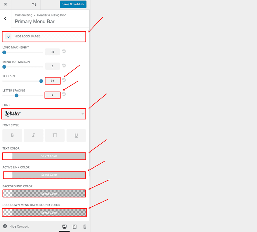
Primary Menu Bar Settings
We’ll start by doing the same as we did in the first example of this post; making modifications to the Primary Menu Bar. To do that, go to Appearance within your WordPress Dashboard > Customize > Header & Navigation > Primary Menu Bar and make sure you have the following settings:
- Hide Logo Image: Enable
- Text Size: 24
- Letter Spacing: 2
- Font: Lobster
- Text Color: #FFFFFF
- Active Link Color: #FFFFFF
- Background Color: rgba(255,255,255,0)
- Dropdown Menu Background Color: rgba(255,255,255,0)
Add CSS Code to Theme Customizer
As told in the previous example, you can add the CSS code to your website through multiple ways. Besides adding the custom code to the Theme Options, you can add it to the Theme Customizer as well. If you’re on your WordPress Dashboard, go to Appearance > Customize > Additional CSS and place the following lines of code within the Custom CSS field:
@media (min-width: 981px) {
.et_vertical_nav #et-main-area, .et_vertical_nav #top-header {
margin-left: 0px !important;
}
.container {
margin-left: 3% !important;
}
.et_vertical_nav #page-container #main-header {
box-shadow: none !important;
}
#top-menu .current-menu-item a.mPS2id-highlight {
padding: 0.5em 1.9em;
}
#top-menu .current-menu-item a.mPS2id-highlight:before,
#top-menu .current-menu-item a.mPS2id-highlight:after {
height: 20px;
width: 20px;
position: absolute;
content: '';
-webkit-transition: all 0.35s ease;
transition: all 0.35s ease;
opacity: 0;
}
#top-menu .current-menu-item a.mPS2id-highlight:before {
left: 0;
top: 0;
border-left: 4px solid #000000;
border-top: 4px solid #FFFFFF;
-webkit-transform: translate(100%, 50%);
transform: translate(100%, 50%);
}
#top-menu .current-menu-item a.mPS2id-highlight:after {
border-right: 4px solid #000000;
border-bottom: 4px solid #FFFFFF;
-webkit-transform: translate(-100%, -50%);
transform: translate(-100%, -50%);
}
#top-menu .current-menu-item a.mPS2id-highlight:before,
#top-menu .current-menu-item a.mPS2id-highlight:after {
-webkit-transform: translate(0%, 0%);
transform: translate(0%, 0%);
opacity: 1;
}
nav#top-menu-nav {
width:87% !important;
}
.et_vertical_nav #main-header #top-menu > li > a {
margin-bottom: 30px;
}
#et-top-navigation {
padding-top: 100% !important;
}}
Active Link Style #3
The third active link style that we’ve chosen to share with you is one that primarily focuses on the keyword that’s being used as a menu item. By using the right settings for the text shadow, the same text will surround the menu item which emphasizes the position a visitor has on your website.
Primary Menu Bar Settings
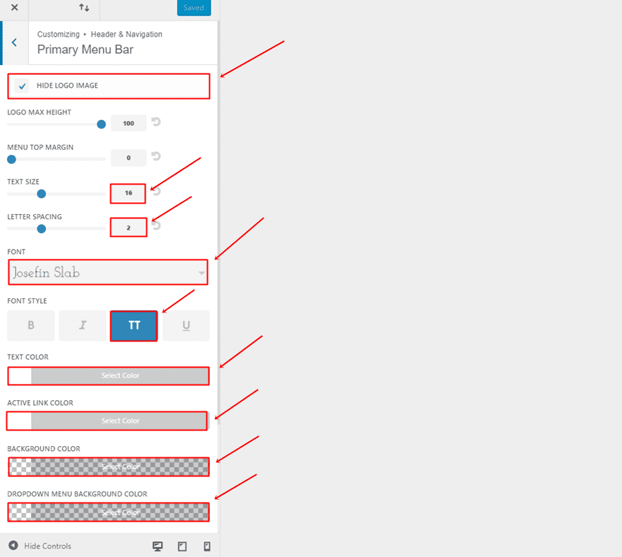
For this last example, start by making some changes to the Primary Menu Bar. If you’re on your WordPress dashboard, go to Appearance > Customize > Header & Navigation > Primary Menu Bar and make the following changes apply to the vertical navigation:
- Hide Logo Image: Enable
- Text Size: 16
- Letter Spacing: 2
- Font: Josefin Slab
- Font Style: Capitals
- Text Color: #FFFFFF
- Active Link Color: #FFFFFF
- Background Color: rgba(255,255,255,0)
- Dropdown Menu Background Color: rgba(255,255,255,0)
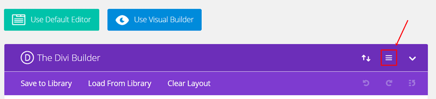
Add CSS Code to One Page in Particular
Another option you have to add CSS code is by adding it to one page in particular. Open your front page (and thus, the page where you have placed all the content) with the Divi Builder and click on the following icon:

Once you’ve clicked on the icon, place the following lines of CSS code within the Custom CSS field:
@media (min-width: 981px) {
.et_vertical_nav #et-main-area, .et_vertical_nav #top-header {
margin-left: 0px !important;
}
.container {
margin-left: 3% !important;
}
.et_vertical_nav #page-container #main-header {
box-shadow: none !important;
}
#top-menu .current-menu-item a.mPS2id-highlight {
margin-left: 80px;
text-shadow:0 0 0 #000, -70px 0 0 rgba(255, 255, 255, .4), 70px 0 0 rgba(255, 255, 255, .4), 0 25px 0 rgba(255, 255, 255, .4) , 0 -25px 0 rgba(255, 255, 255, .4) ; }
}
nav#top-menu-nav {
width:95% !important;
}
.et_vertical_nav #main-header #top-menu > li > a {
margin-bottom: 30px;
}
#et-top-navigation {
padding-top: 100% !important;
}}
Final Thoughts
In this post, we’ve shown you a few nice and easy ways to style the active link in your menu. This post was a follow up on a previous post where we’ve shown you how to create active links on scroll for one-page Divi websites. Remember that you’ll have to save the changes first before you can see the results, just previewing your page won’t do the job. If you have any questions or suggestions; make sure you leave a comment in the comment section below!
Be sure to subscribe to our email newsletter and YouTube channel so that you never miss a big announcement, useful tip, or Divi freebie!
Featured Image by Botond1977 / shutterstock.com
The post 3 Creative Ways to Style Your Divi Vertical Navigation’s Active Link appeared first on Elegant Themes Blog.