
Looking for a cool way to showcase images on your next Divi website? Keep on reading, because in this post, we’re going to handle 3 image transform hover effects that will help elevate the overall look and feel of your page. You’ll be able to follow the A to Z recreation process of three different examples and even download them for immediate use. The main purpose of this tutorial is inspiring you to combine Divi’s new transform options with the already-existing options out there to create beautiful web design.
Let’s get to it!
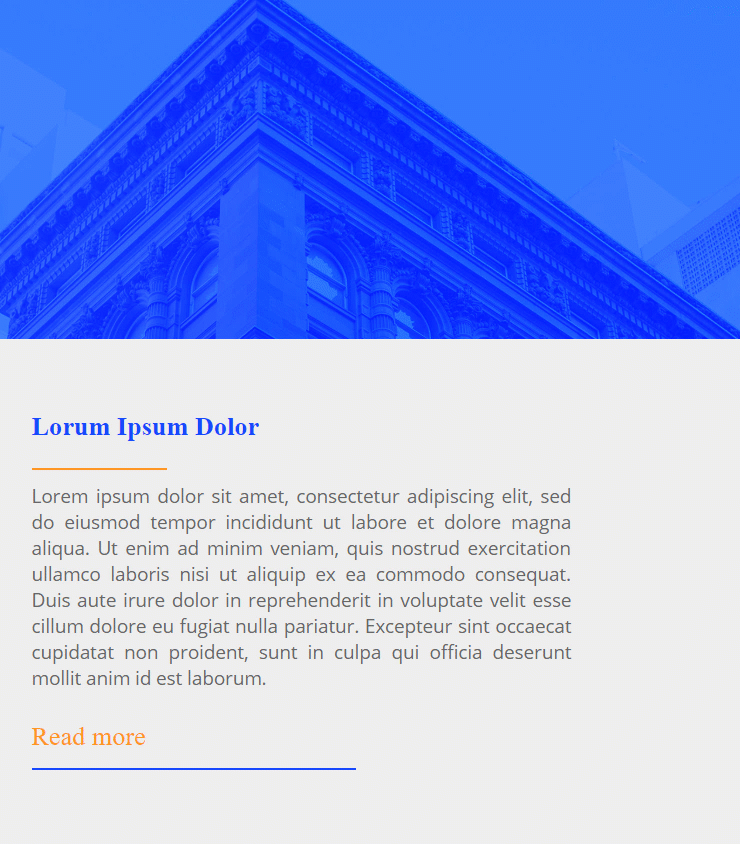
Preview
Before we dive into the tutorial, let’s take a quick look at the outcome of all three examples across different screen sizes.
Desktop
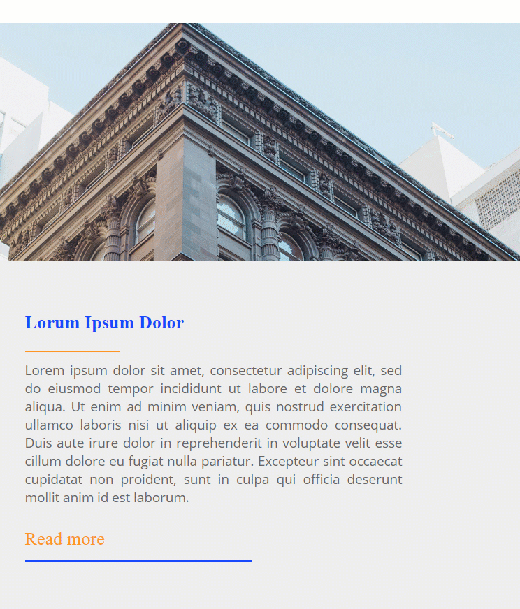
Example #1
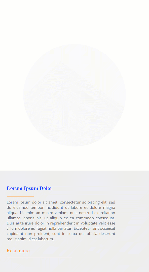
Example #2
Example #3
Mobile
Example #1
Example #2
Example #3
Download The Image Transform Hover Effects for FREE
To lay your hands on the free image transform hover effects, you will first need to download them using the button below. To gain access to the download you will need to subscribe to our Divi Daily email list by using the form below. As a new subscriber, you will receive even more Divi goodness and a free Divi Layout pack every Monday! If you’re already on the list, simply enter your email address below and click download. You will not be “resubscribed” or receive extra emails.
@media only screen and ( max-width: 767px ) {.et_bloom .et_bloom_optin_1 .carrot_edge.et_bloom_form_right .et_bloom_form_content:before, .et_bloom .et_bloom_optin_1 .carrot_edge.et_bloom_form_left .et_bloom_form_content:before { border-top-color: #ffffff !important; border-left-color: transparent !important; }
}.et_bloom .et_bloom_optin_1 .et_bloom_form_content button { background-color: #f92c8b !important; } .et_bloom .et_bloom_optin_1 .et_bloom_form_content .et_bloom_fields i { color: #f92c8b !important; } .et_bloom .et_bloom_optin_1 .et_bloom_form_content .et_bloom_custom_field_radio i:before { background: #f92c8b !important; } .et_bloom .et_bloom_optin_1 .et_bloom_border_solid { border-color: #f7f9fb !important } .et_bloom .et_bloom_optin_1 .et_bloom_form_content button { background-color: #f92c8b !important; } .et_bloom .et_bloom_optin_1 .et_bloom_form_container h2, .et_bloom .et_bloom_optin_1 .et_bloom_form_container h2 span, .et_bloom .et_bloom_optin_1 .et_bloom_form_container h2 strong { font-family: “Open Sans”, Helvetica, Arial, Lucida, sans-serif; }.et_bloom .et_bloom_optin_1 .et_bloom_form_container p, .et_bloom .et_bloom_optin_1 .et_bloom_form_container p span, .et_bloom .et_bloom_optin_1 .et_bloom_form_container p strong, .et_bloom .et_bloom_optin_1 .et_bloom_form_container form input, .et_bloom .et_bloom_optin_1 .et_bloom_form_container form button span { font-family: “Open Sans”, Helvetica, Arial, Lucida, sans-serif; } p.et_bloom_popup_input { padding-bottom: 0 !important;}

Download For Free
Join the Divi Newlsetter and we will email you a copy of the ultimate Divi Landing Page Layout Pack, plus tons of other amazing and free Divi resources, tips and tricks. Follow along and you will be a Divi master in no time. If you are already subscribed simply type in your email address below and click download to access the layout pack.
You have successfully subscribed. Please check your email address to confirm your subscription and get access to free weekly Divi layout packs!
General Steps
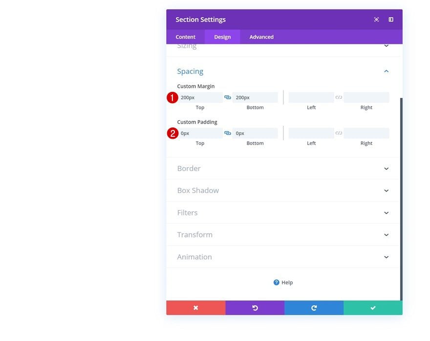
Add New Section
Spacing
Before we recreate each one of the examples individually, we’ll go through some general steps. Add a new regular section to your page using the following margin and padding values:
- Top Margin: 200px
- Bottom Margin: 200px
- Top Padding: 0px
- Bottom Padding: 0px
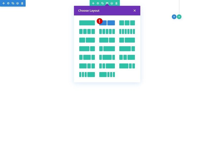
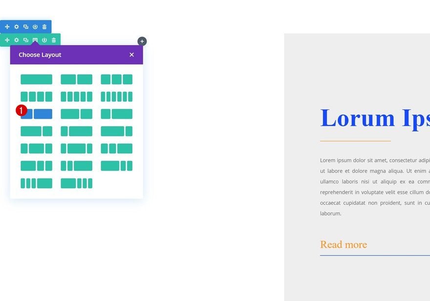
Add New Row
Column Structure
Continue by adding a new row using the following column structure:
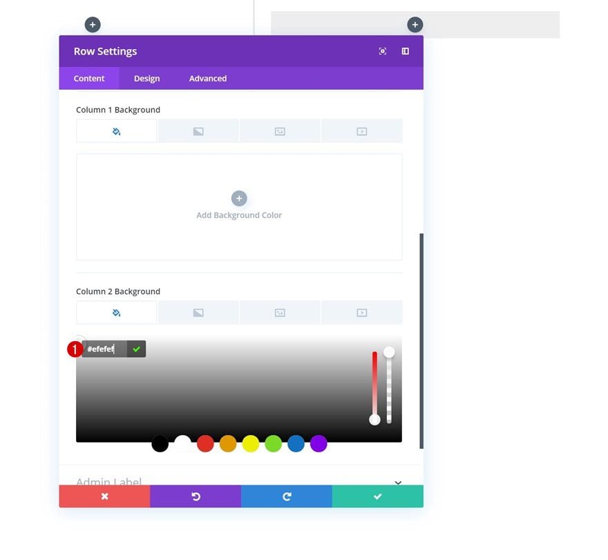
Column 2 Background Color
Without adding any modules yet, open the row settings and add a background color to the second column.
- Column 2 Background Color: #efefef
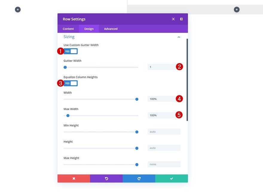
Sizing
Go to the sizing settings next and allow the row to take up the entire width of the screen.
- Use Custom Gutter Width: Yes
- Gutter Width: 1
- Equalize Column Heights: Yes
- Width: 100%
- Max Width: 100%
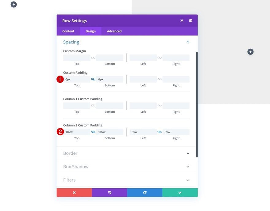
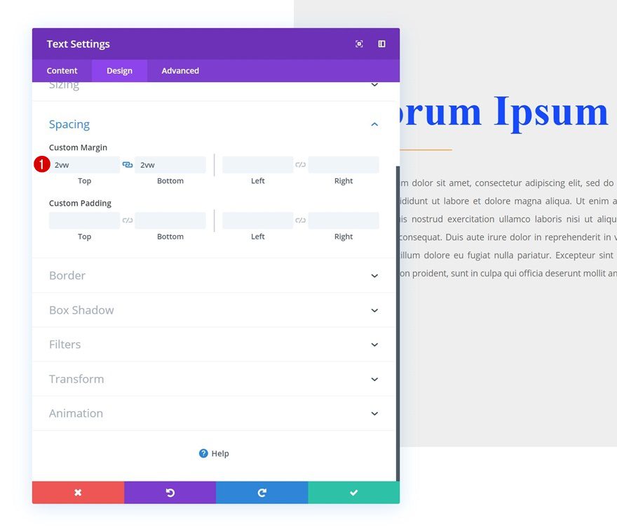
Spacing
Add the following custom padding values next:
- Top Padding: 0px
- Bottom Padding: 0px
- Column 2 Top Padding: 10vw
- Column 2 Bottom Padding: 10vw
- Column 2 Left Padding: 5vw
- Column 2 Right Padding: 5vw
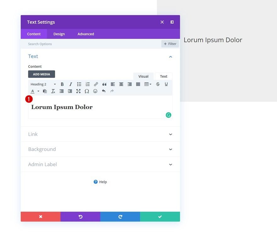
Add Text Module #1 to Column 2
Add H2 Content
Time to start adding the various modules to column 2, starting with a Text Module. Enter some H2 content of your choice.
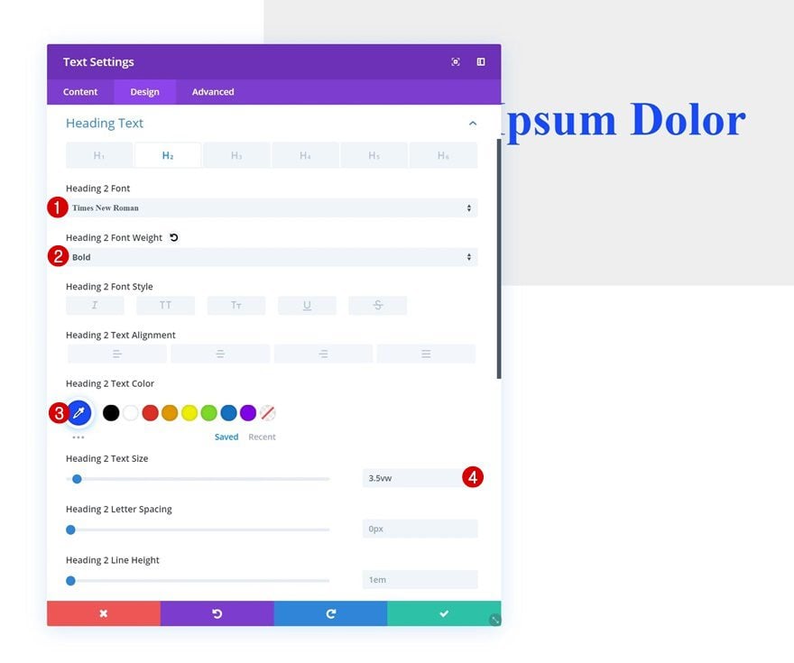
H2 Text Settings
Move on to the design tab and modify the H2 text settings.
- Heading 2 Font: Times New Roman
- Heading 2 Font Weight: Bold
- Heading 2 Text Color: #0f47ff
- Heading 2 Text Size: 3.5vw
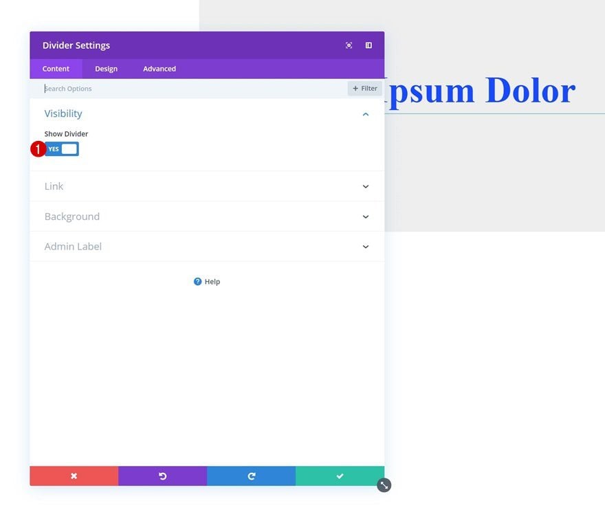
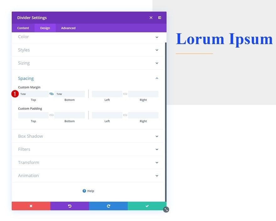
Add Divider Module to Column 2
Visibility
The next module we need in the second column is a Divider Module. Make sure the ‘Show Divider’ option is enabled.
- Show Divider: Yes
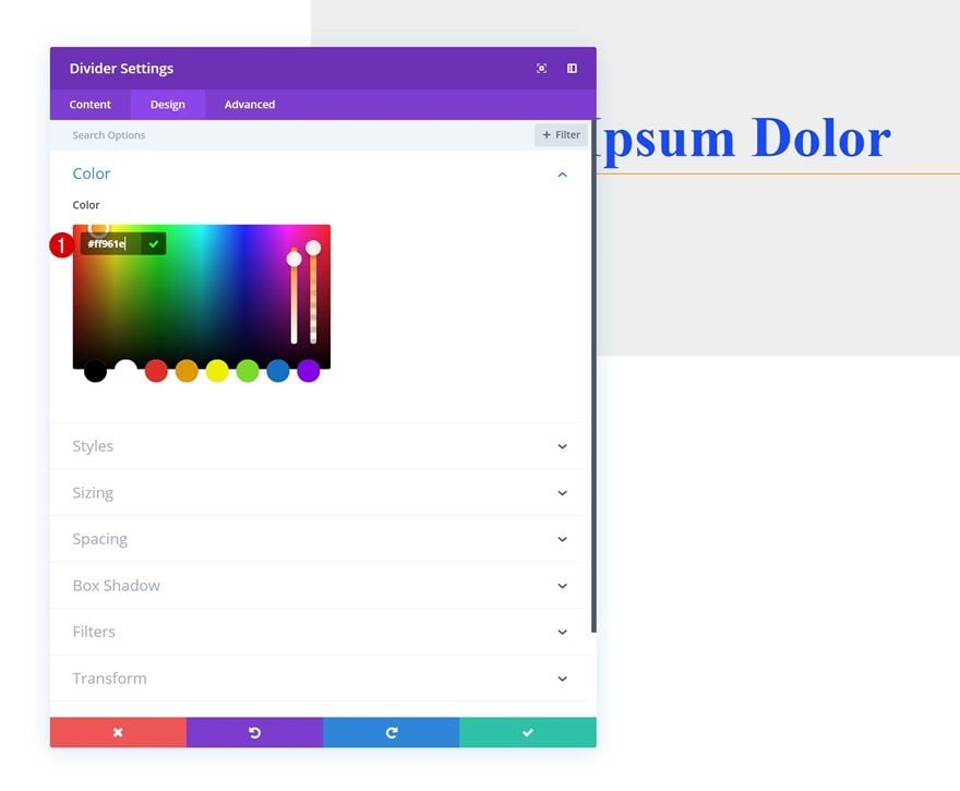
Color
Then, go to the design tab and change the divider color.
- Color: #ff961e
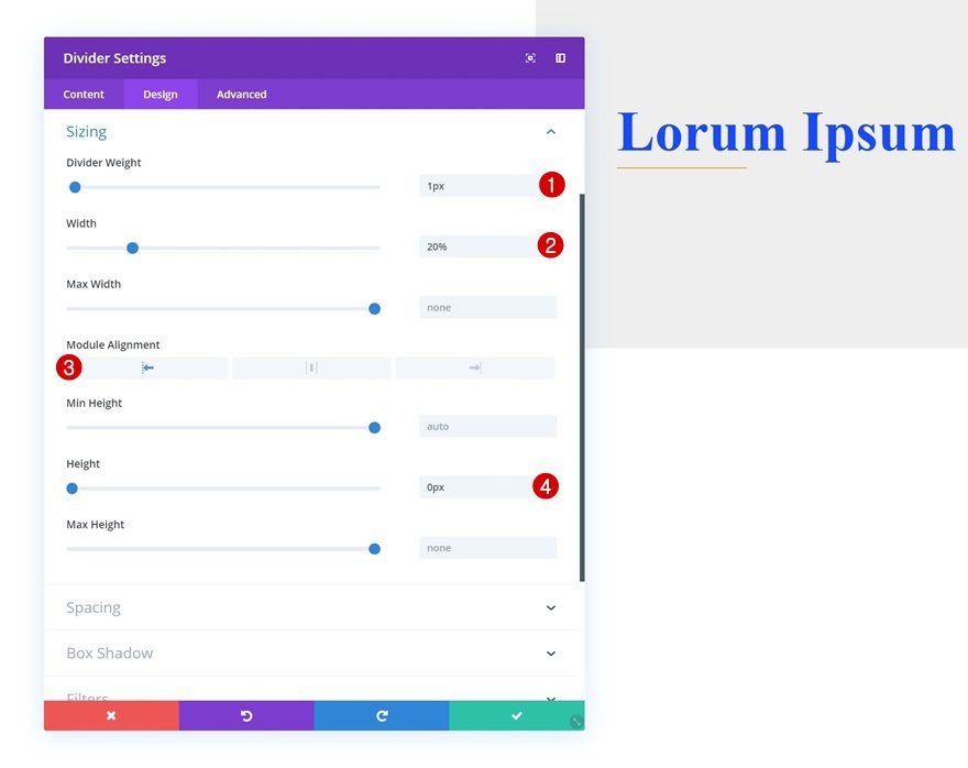
Sizing
Modify the sizing values as well.
- Divider Weight: 1px
- Width: 20%
- Module Alignment: Left
- Height: 0px
Spacing
And create some space for the module using the following top and bottom margin values:
- Top Margin: 1vw
- Bottom Margin: 1vw
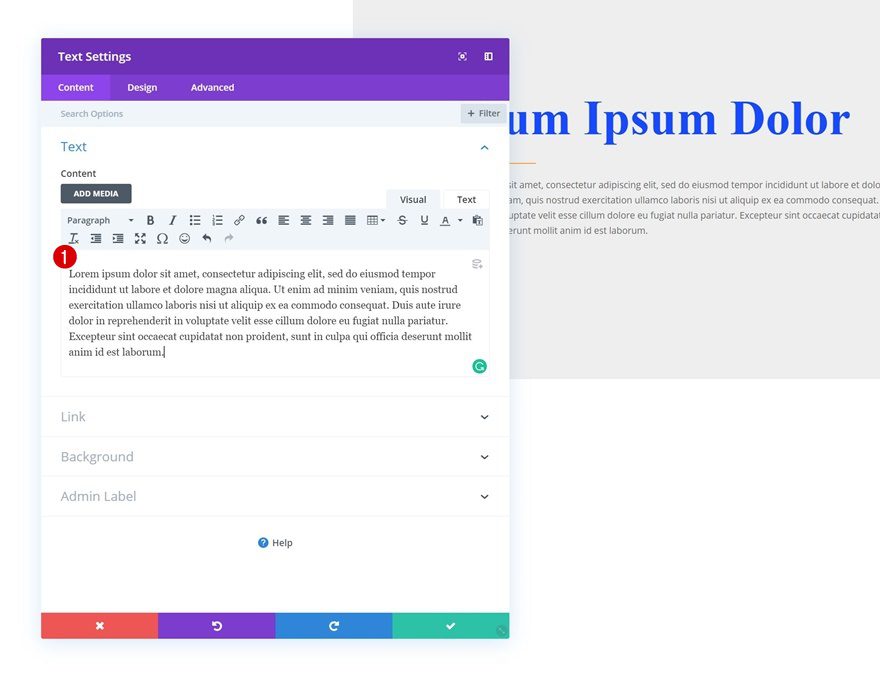
Add Text Module #2 to Column 2
Add Content
On to the next module, which is another Text Module. Enter some paragraph content of your choice.
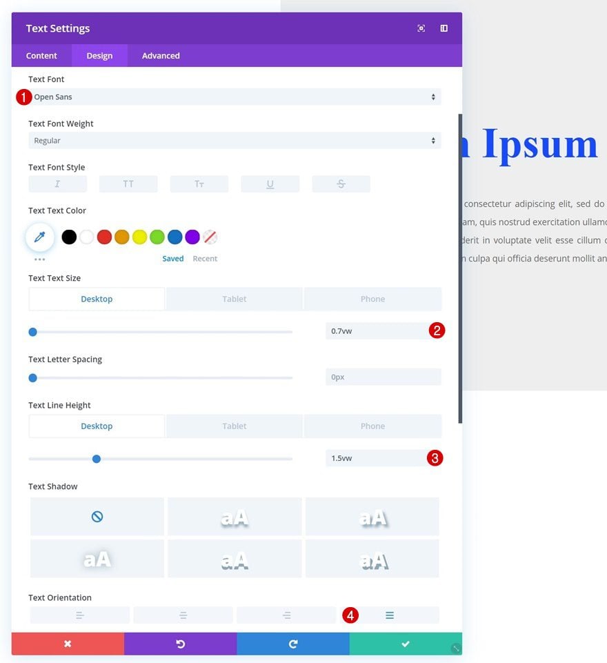
Text Settings
Move on to the design tab and change the text settings.
- Text Font: Open Sans
- Text Size: 0.7vw (Desktop), 1.7vw (Tablet), 2.5vw (Phone)
- Text Line Height: 1.5vw (Desktop), 2.5vw (Tablet), 3.5vw (Phone)
- Text Orientation: Justify
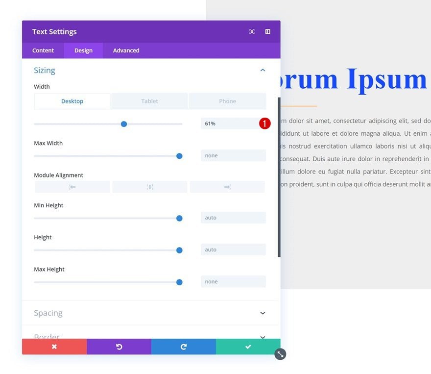
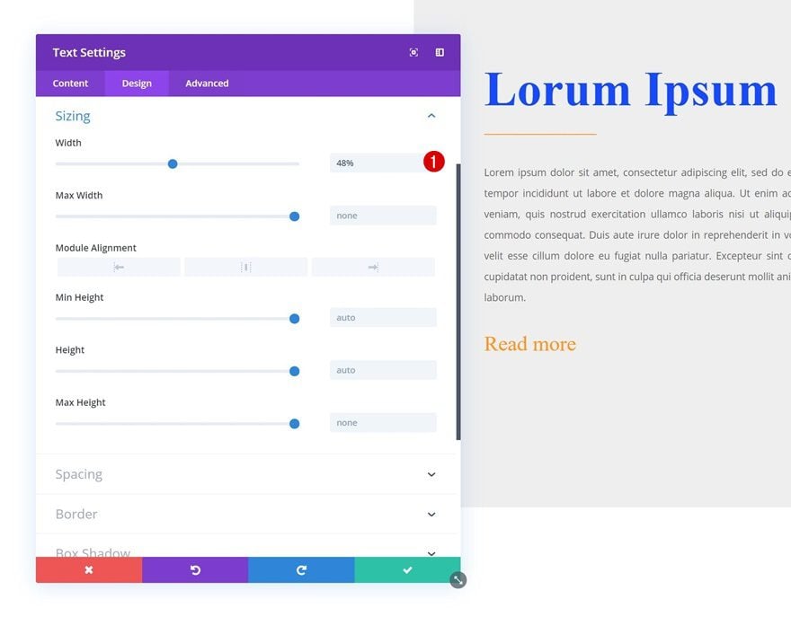
Sizing
Modify the sizing settings as well.
- Width: 61% (Desktop), 80% (Tablet & Phone)
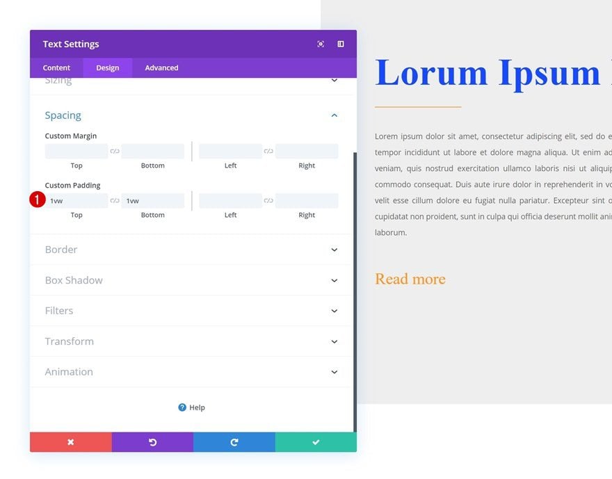
Spacing
And add some custom top and bottom margin.
- Top Margin: 2vw
- Bottom Margin: 2vw
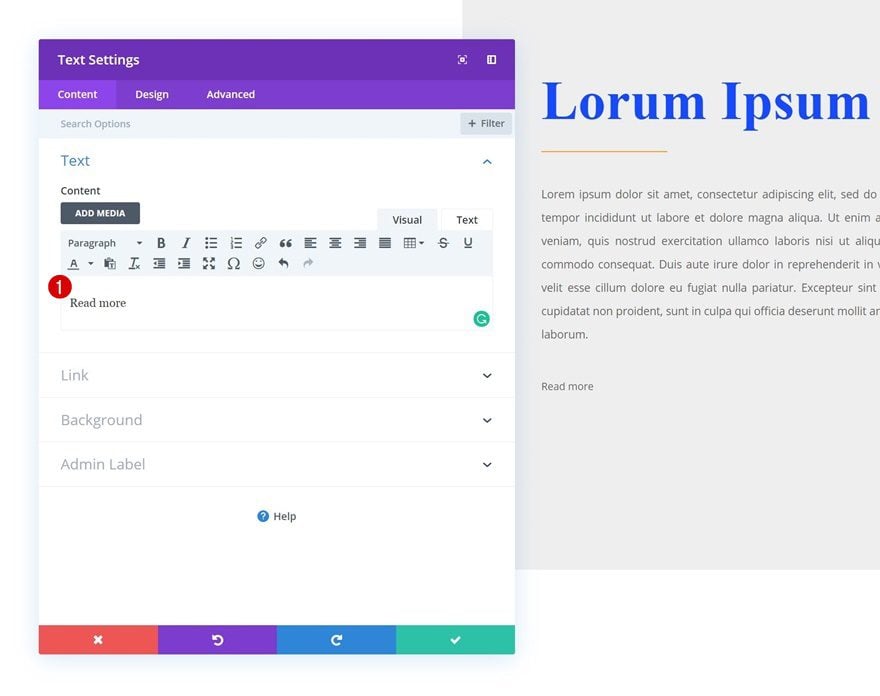
Add Text Module #3 to Column 3
Add Content
On to the next and last module we need in the second column, which is another Text Module. We’ll use this module as a button by adding some paragraph content.
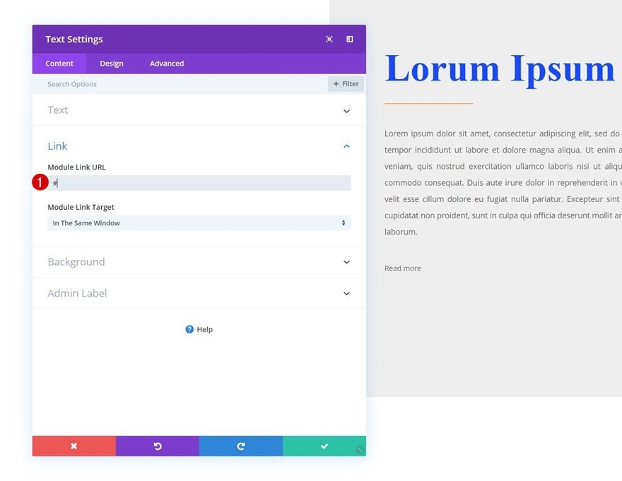
Add Link
Continue by adding a link to the CTA.
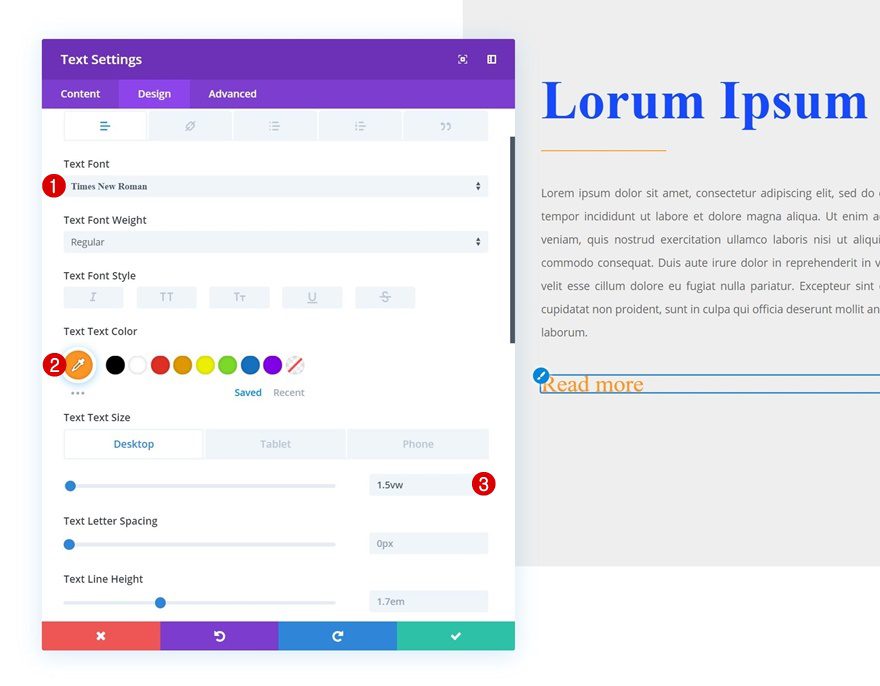
Text Settings
Move on to the design tab and change the text settings accordingly:
- Text Font: Times New Roman
- Text Color: #ff961e
- Text Size: 1.5vw (Desktop), 2.5vw (Tablet), 3.5vw (Phone)
Sizing
Change the width of the module in the sizing settings as well.
- Width: 48%
Spacing
Then, go to the spacing settings and add some custom padding.
- Top Padding: 1vw
- Bottom Padding: 1vw
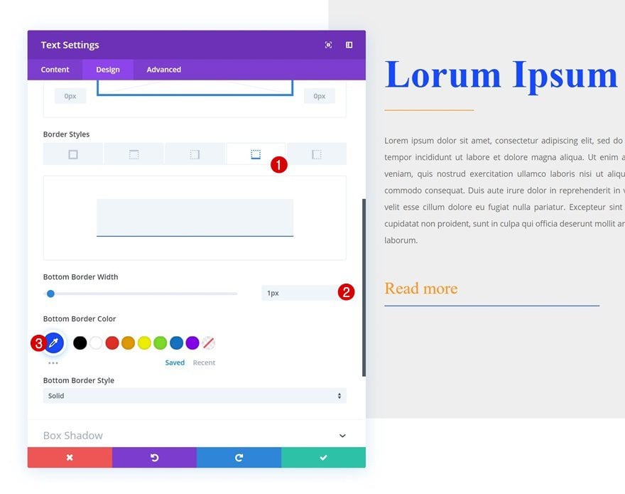
Border
Finish the Text Module by adding a bottom border with the following settings:
- Bottom Border Width: 1px
- Bottom Border Color: #0f47ff
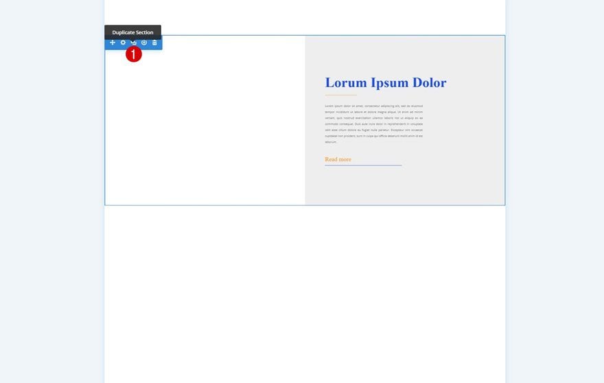
Clone Section Twice
Once you’re done customizing the section and all of the elements in it, you can go ahead and clone it twice. We’ll use each one of the sections on our page to recreate the three examples that were shared at the beginning of this post.
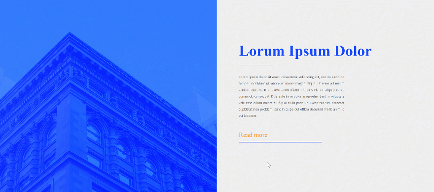
Recreate Example #1
Add Image Module to Column 1
Leave Image Box Empty
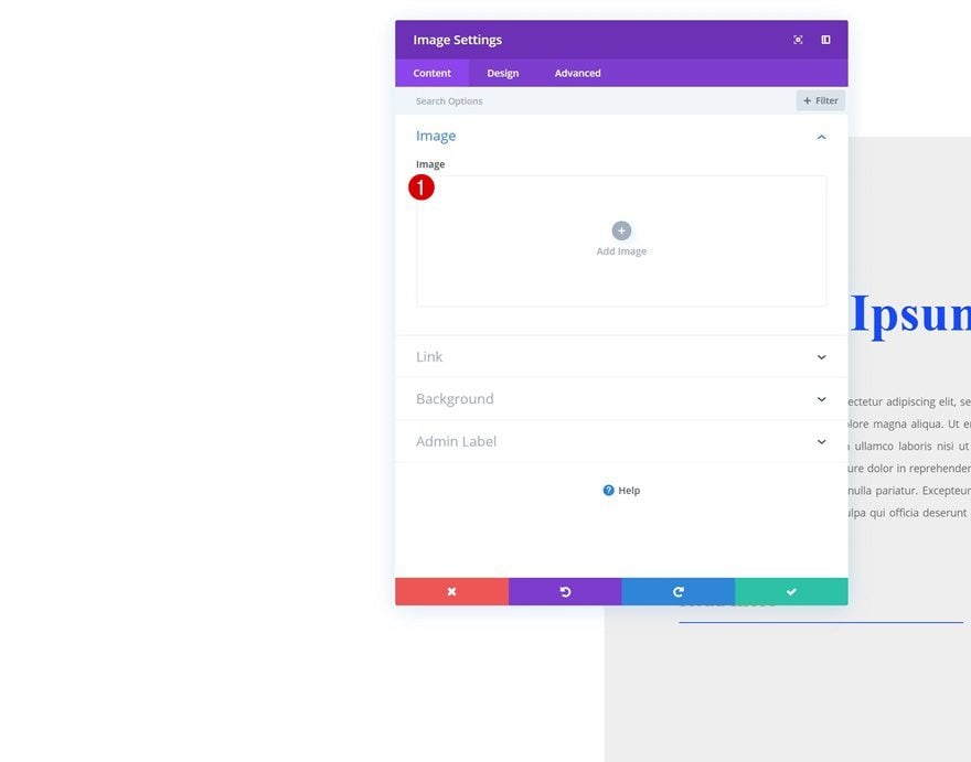
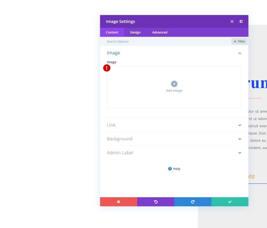
Let’s start with the first example! Add a new Image Module to the first column and make sure you leave the image box empty.
Default Background Color
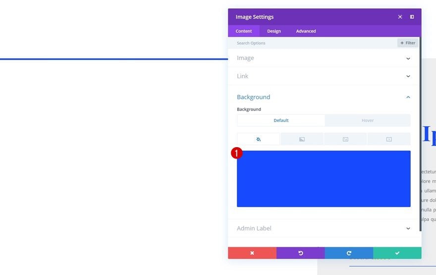
Change the background color of the Image Module:
- Background Color: #0f47ff
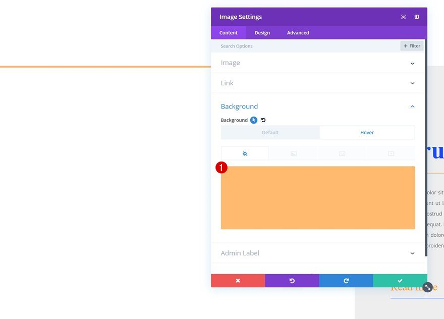
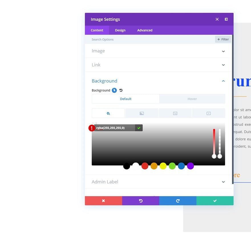
Hover Background Color
Modify the background color on hover.
- Background Color: rgba(255,150,30,0.65)
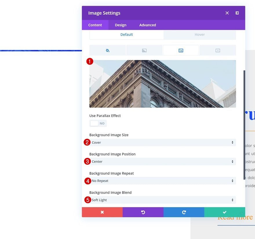
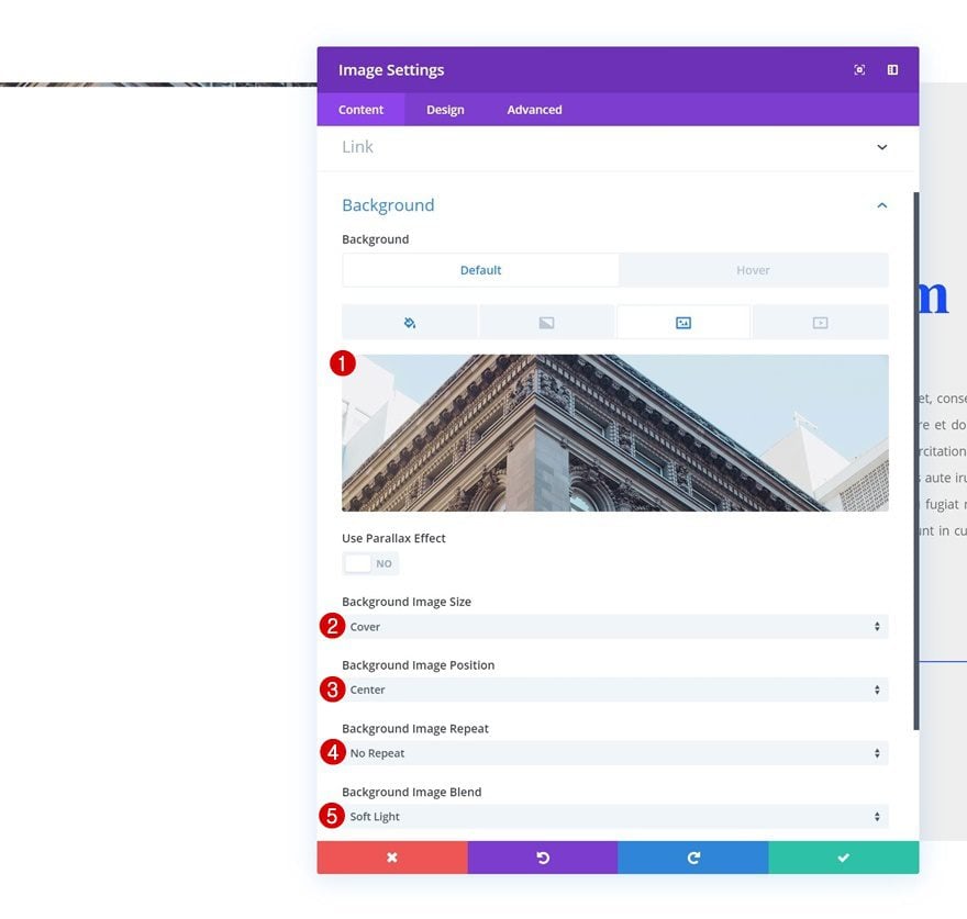
Background Image
Instead of uploading an image, we’ll add one to the background instead, accompanied by the following settings:
- Background Image Size: Cover
- Background Image Position: Center
- Background Image Repeat: No Repeat
- Background Image Blend: Soft Light
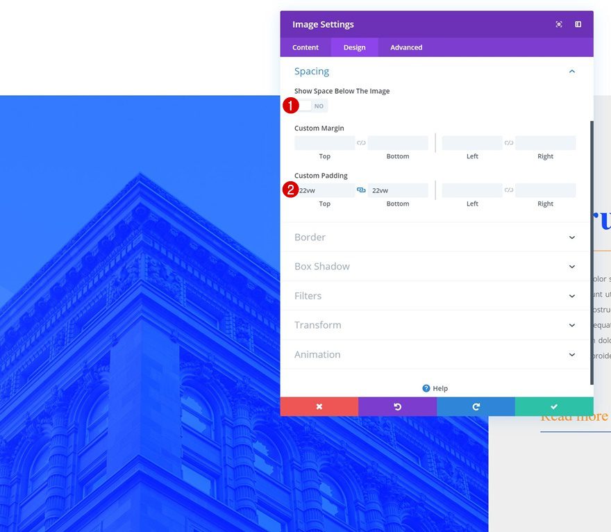
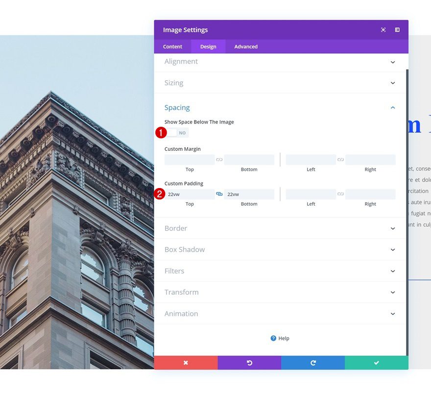
Spacing
Move on to the spacing settings of the module and add some custom padding values:
- Show Space Below The Image: No
- Top Padding: 22vw
- Bottom Padding: 22vw
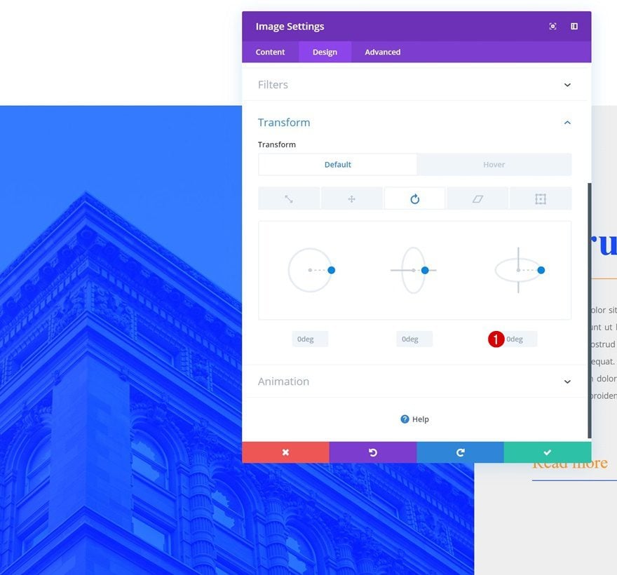
Default Translate Rotate
We’ll also rotate the image on hover. Make sure the image appears in its original state before hovering by adding ‘0deg’ to the right option.
- Right: 0deg
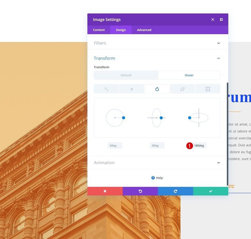
Hover Translate Rotate
Change this value on hover:
- Right: 180deg
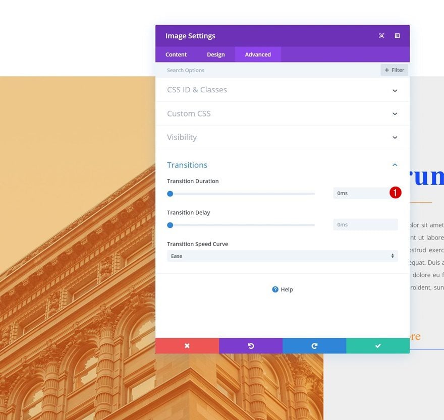
Transitions
To create an immediate effect, we’ll remove the transition duration:
- Transition Duration: 0ms
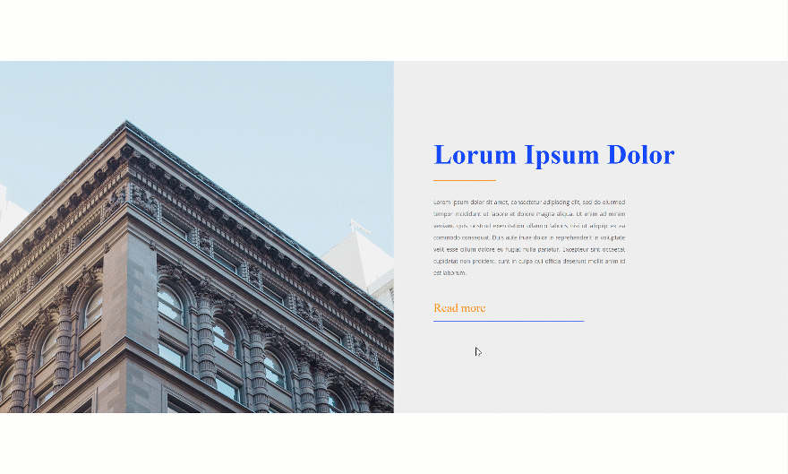
Recreate Example #2
Add Image Module to Column 1
Leave Image Box Empty
On to the second example! Again, make sure you leave the image box empty.
Default Background Color
Go to the background settings and add the following (completely transparent) background color:
- Background Color: rgba(255,255,255,0)
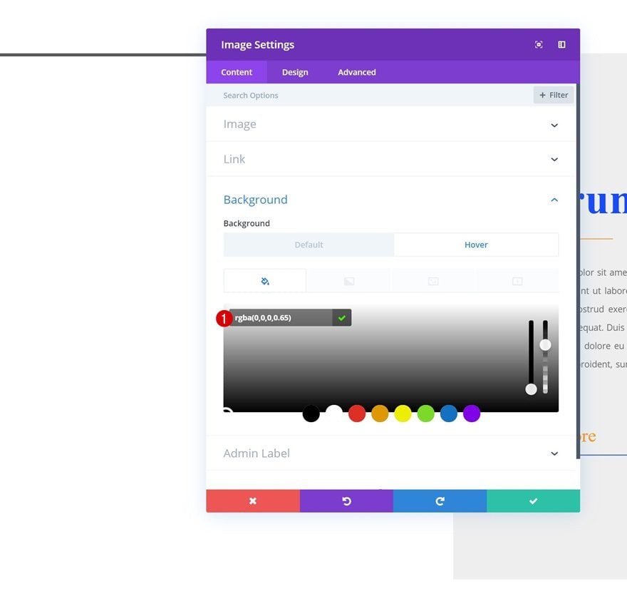
Hover Background Color
Modify this color on hover:
- Background Color: rgba(0,0,0,0.65)
Background Image
We’re, again, using a background image instead of uploading one to the module itself. Combine the background image with the following settings:
- Background Image Size: Cover
- Background Image Position: Center
- Background Image Repeat: No Repeat
- Background Image Blend: Soft Light
Spacing
Then, go to the spacing settings and modify the top and bottom padding:
- Show Space Below The Image: No
- Top Padding: 22vw
- Bottom Padding: 22vw
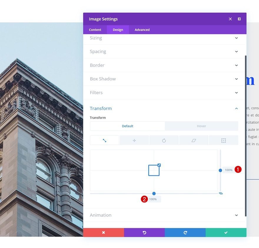
Default Transform Scale
Make sure the default transform scale values remain ‘100%’.
- Right: 100%
- Bottom: 100%
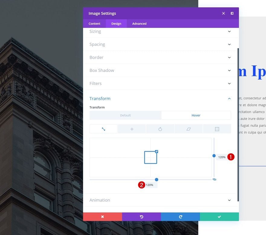
Hover Transform Scale
And change these values on hover to create a scaling effect.
- Right: 120%
- Bottom: 120%
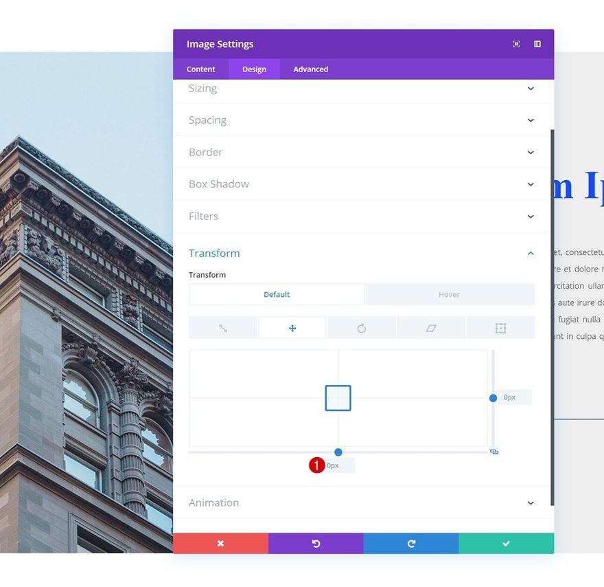
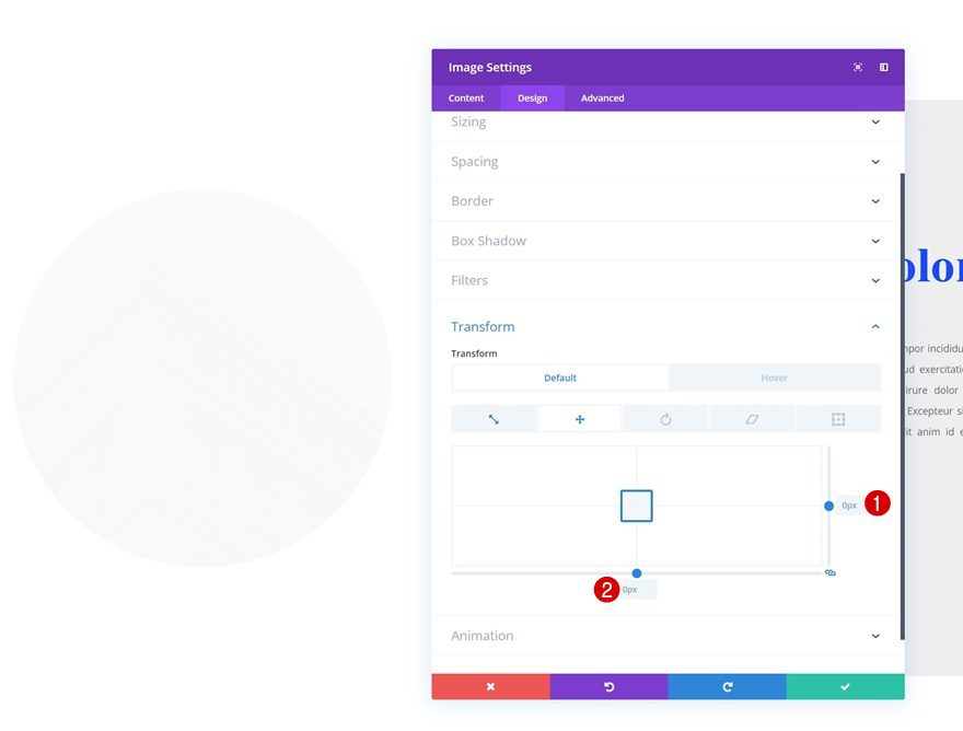
Default Transform Translate
By default, we’re keeping ‘0px’ for the bottom option in the transform translate settings.
- Bottom: 0px
Hover Transform Translate
Modify this value on hover to reposition the element.
- Bottom: 9vw
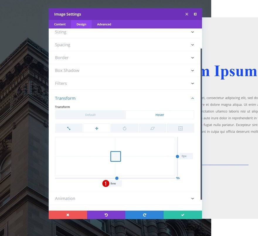
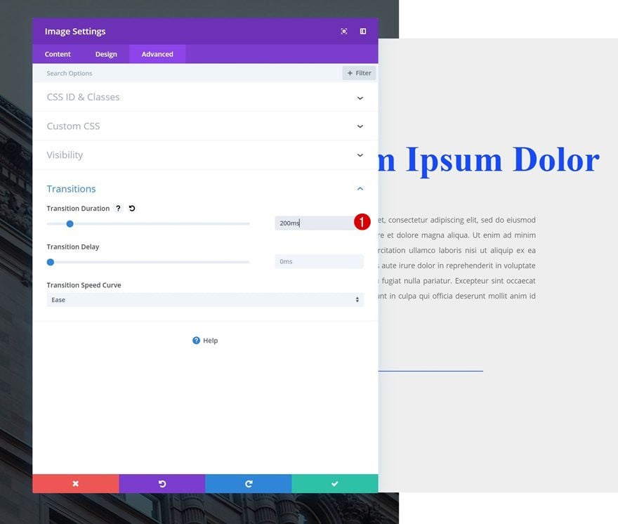
Transitions
We’re also creating a slightly faster transition by changing the transition duration in the advanced tab:
- Transition Duration: 200ms
Recreate Example #3
Change Column Structure
On to the next and last example! Start by modifying the column structure of the row.
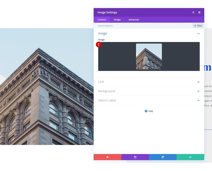
Add Image Module to Column 1
Upload 1:1 Image
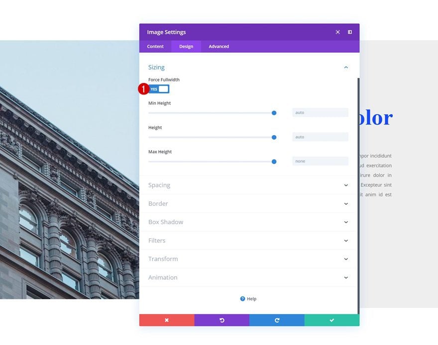
Then, add an Image Module to the first column. In contrast to the first two examples, we’re going to upload an image with a 1:1 ratio (same width and height).
Sizing
Move on to the design tab and force the image to be fullwidth in the sizing settings.
- Force Fullwidth: Yes
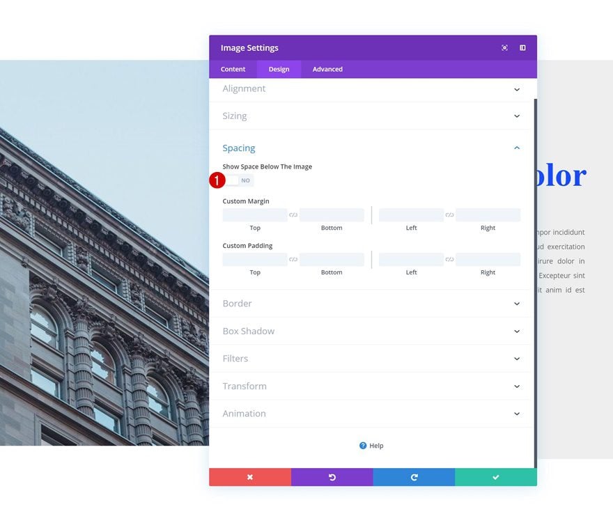
Spacing
Remove the space below the image in the spacing settings next.
- Show Space Below The Image: No
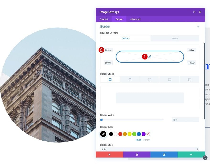
Default Border
Then, go to the border settings and add ‘500vw’ to each one of the corners. We’re making sure this value is high enough to cover all screen sizes.
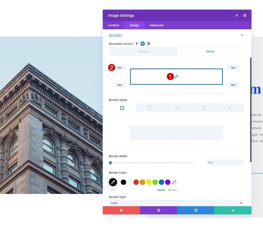
Hover Border
Remove the rounded corners you’ve added on hover.
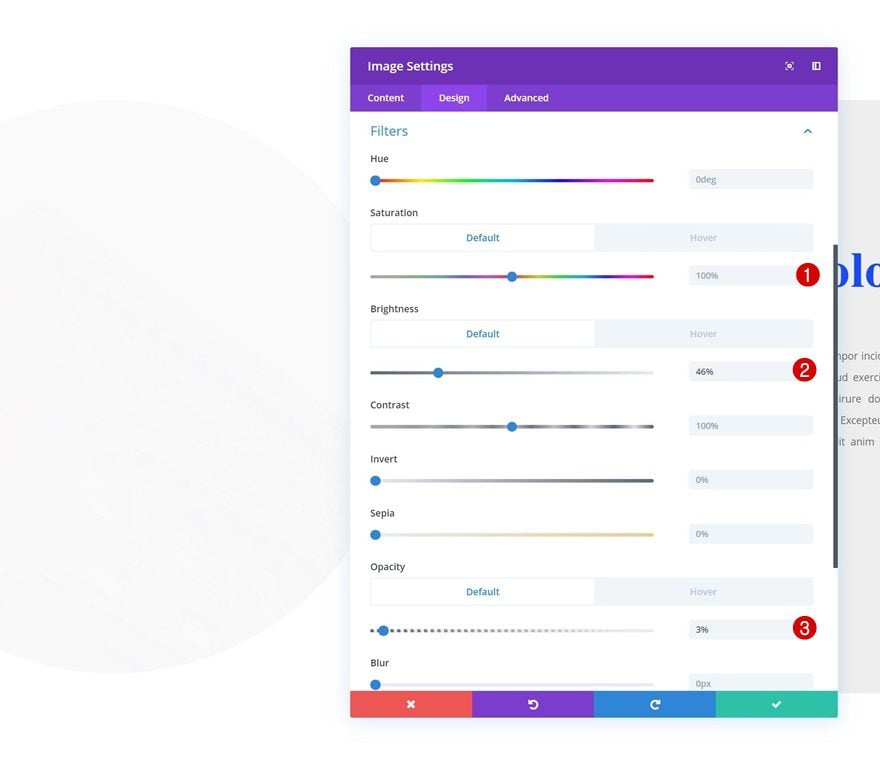
Default Filters
Then, go to the filters settings and make sure these default values are added:
- Saturation: 100%
- Brightness: 46%
- Opacity: 3%
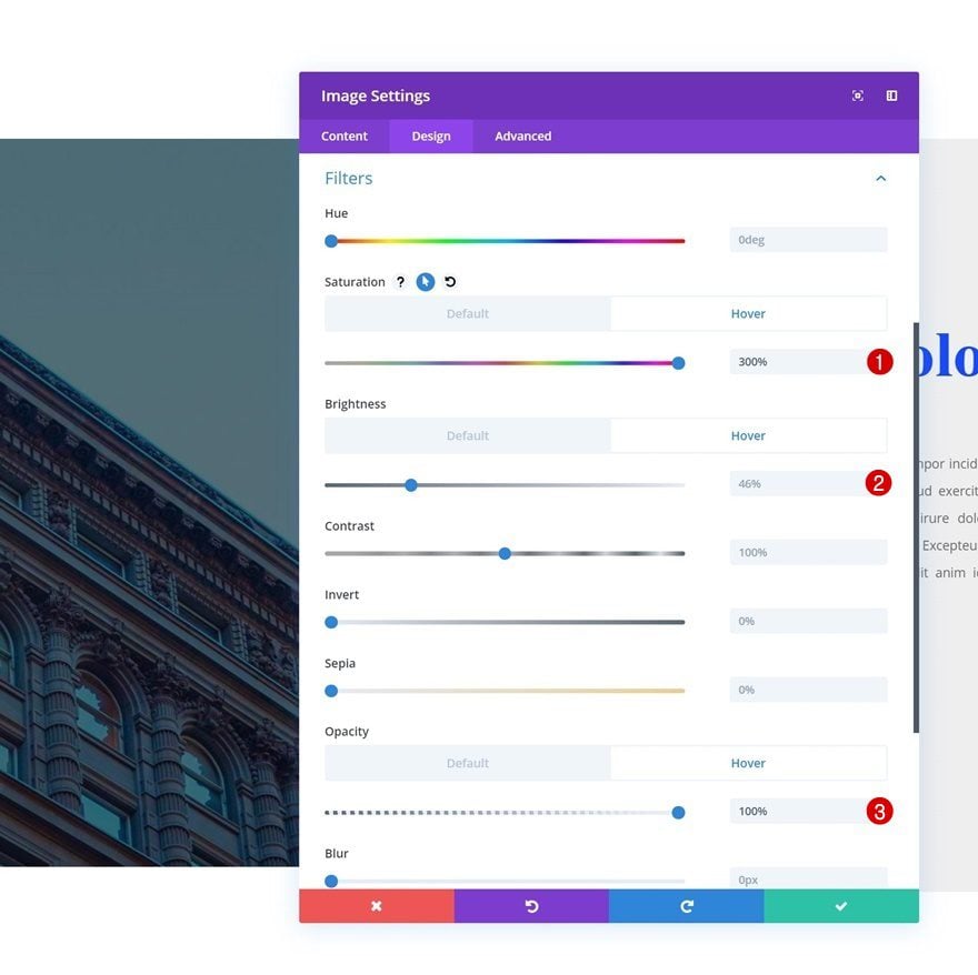
Hover Filters
Enable the hover option on each one of the modified settings and use the following values:
- Saturation: 300%
- Brightness: 46%
- Opacity: 100%
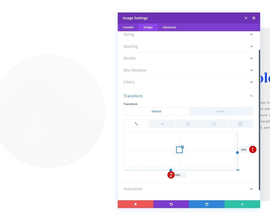
Default Transform Scale
Then, go to the transform options and modify the default transform scale options:
- Right: 68%
- Bottom: 68%
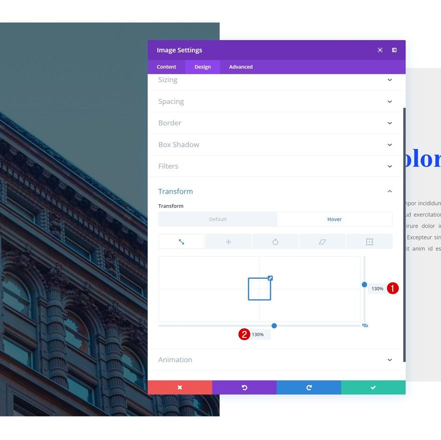
Hover Transform Scale
Change these values on hover.
- Right: 130%
- Bottom: 130%
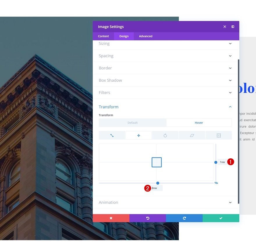
Default Transform Translate
Move on to the transform translate values and make sure the default transform translate values remain the same:
- Right: 0px
- Bottom: 0px
Hover Transform Translate
Modify the values on hover.
- Right: 1vw
- Bottom: 8vw
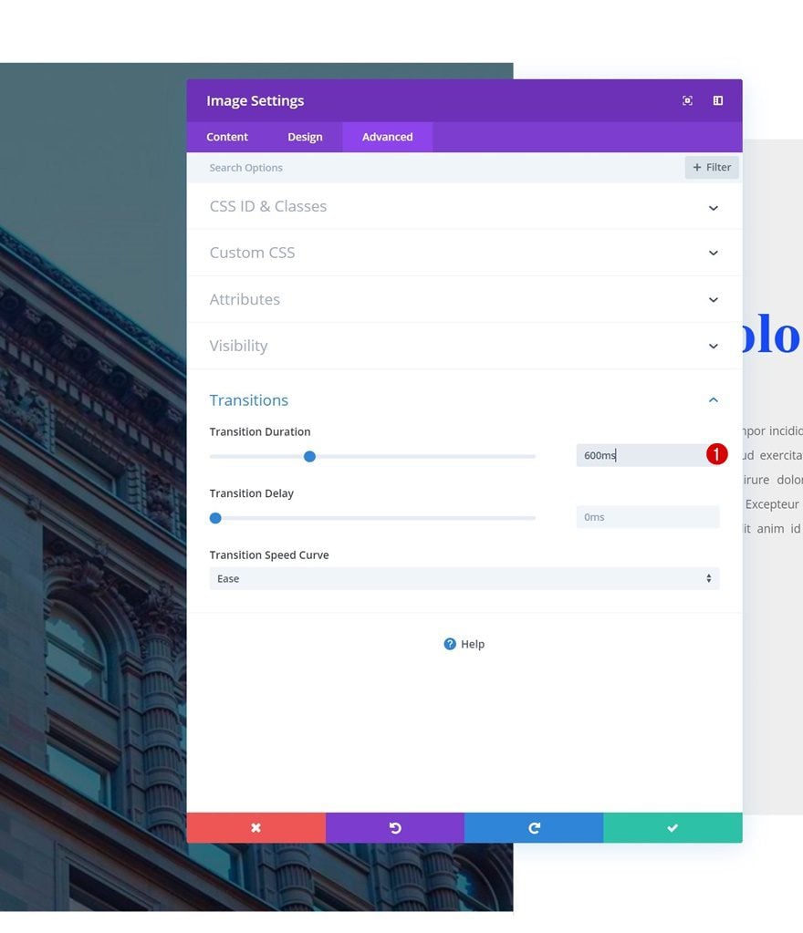
Transitions
Last but not least, increase the transition duration in the advanced tab to create a smooth transition and you’re done!
- Transition Duration: 600ms
Preview
Now that we’ve gone through all steps, let’s take a final look at the outcome across different screen sizes.
Desktop
Example #1
Example #2
Example #3
Mobile
Example #1
Example #2
Example #3
Final Thoughts
In this post, we’ve shown you how to get creative with the Image Module and Divi’s hover and transform options. The effects we’ve recreated are just a few of the many beautiful possibilities out there. If you have any questions or suggestions, make sure you leave a comment in the comment section below!
If you’re eager to learn more about Divi and get more Divi freebies, make sure you subscribe to our email newsletter and YouTube channel so you’ll always be one of the first people to know and get benefits from this free content.
The post 3 Seamless Transform Hover Effects That You Can Apply to Your Images with Divi appeared first on Elegant Themes Blog.