Contact forms are a vital part of many websites. Their primary purpose is being intuitive and helping visitors easily get in touch. But that doesn’t mean all contact forms should look a certain and predefined way. You can easily combine an intuitive experience with a beautiful design. That’s exactly what we’ll do in this post. We’re going to share 5 unique Divi contact form module designs that you can build using Divi’s built-in options only.
Let’s get to it!
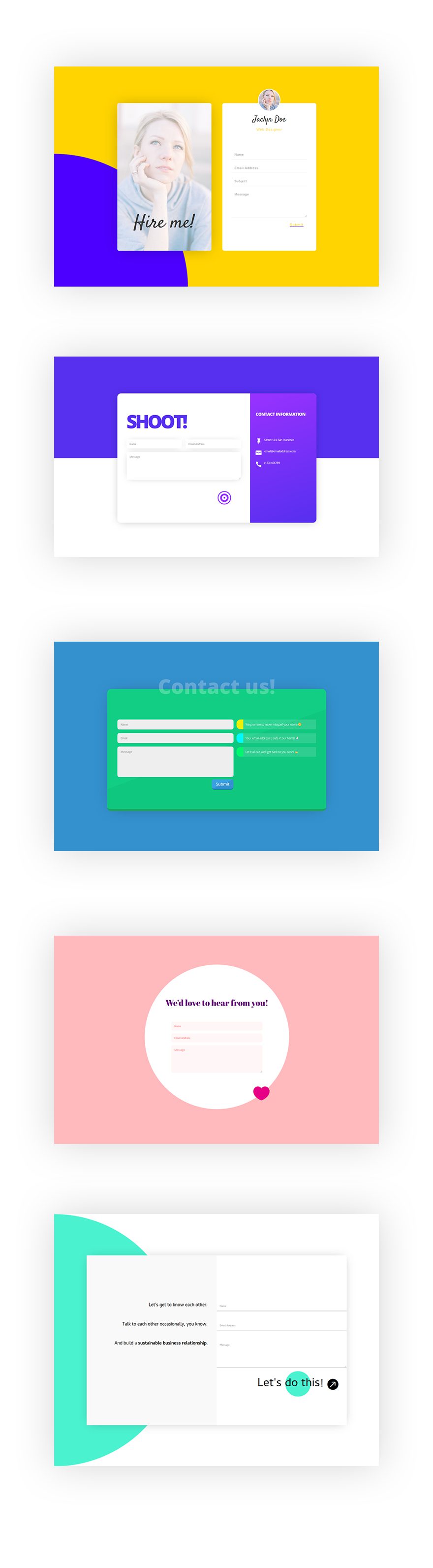
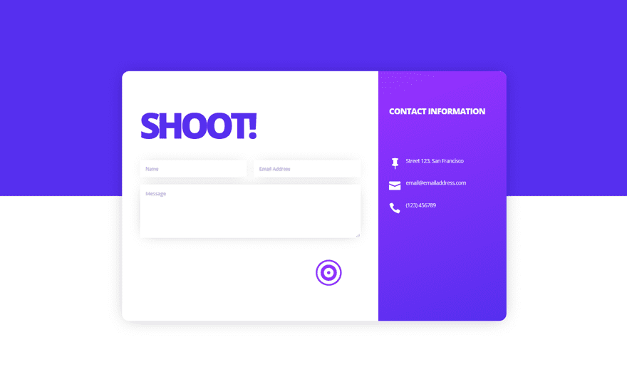
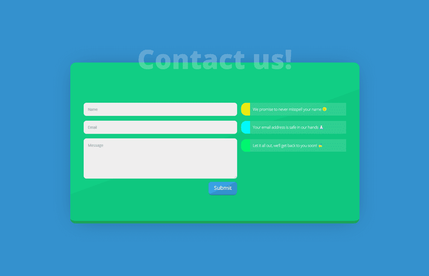
Preview of Divi Contact Form Module Designs
Desktop
Let’s start off by taking a look at the Divi contact form module designs on desktop.
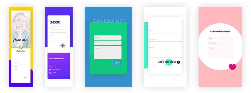
Mobile
And this is what the Divi contact form module designs look like on smaller screen sizes:
Creating Contact Form #1
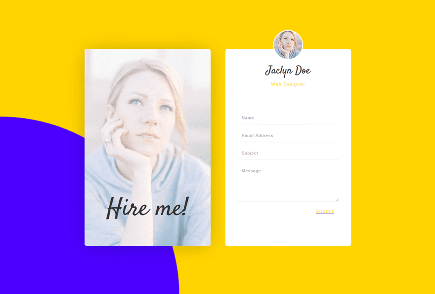
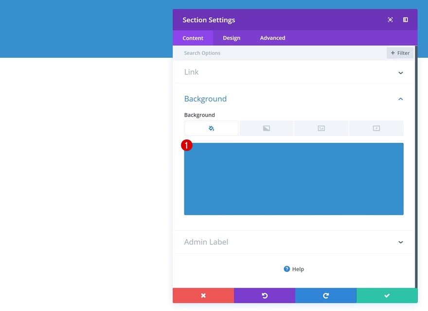
Add New Section
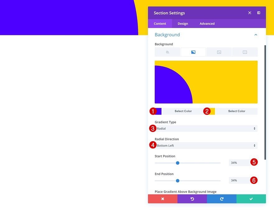
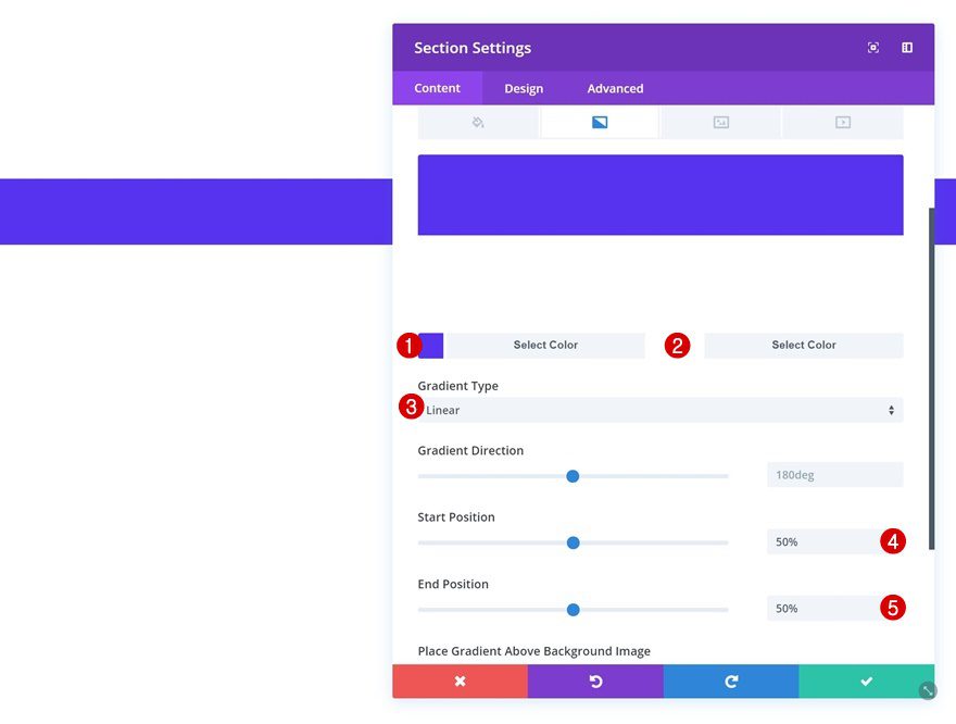
Gradient Background
Let’s get started with the first example! Add a new section, go to the background settings and add a gradient background.
- Color 1: #4c00ff
- Color 2: #ffd400
- Gradient Type: Radial
- Radial Direction: Bottom Left
- Start Position: 34%
- End Position: 34%
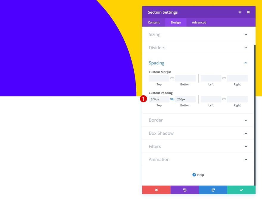
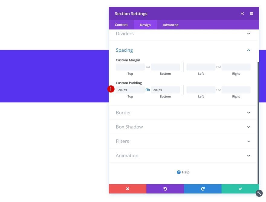
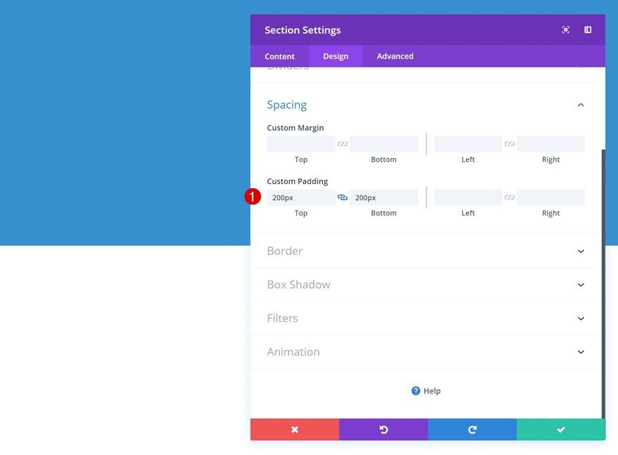
Spacing
Then, go to the spacing settings and add some custom padding values.
- Top Padding: 200px
- Bottom Padding: 200px
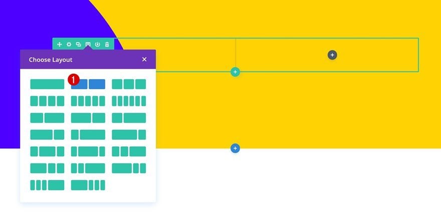
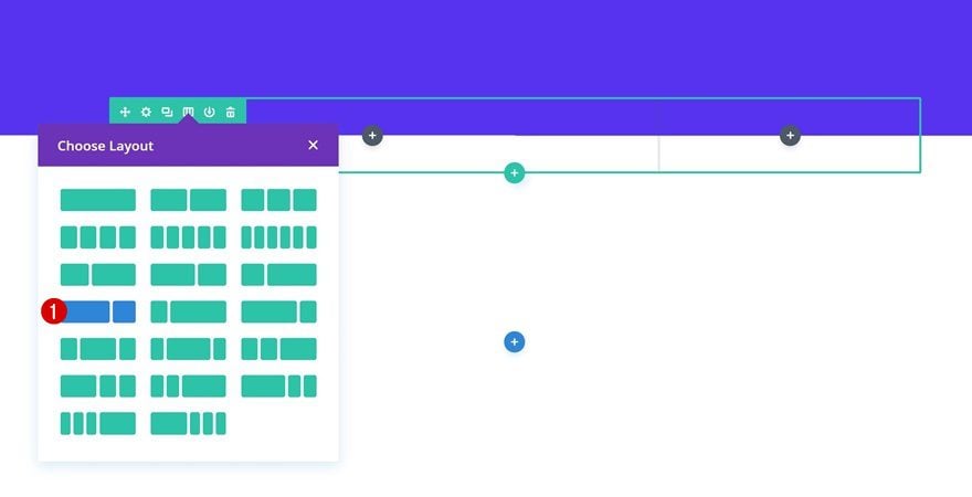
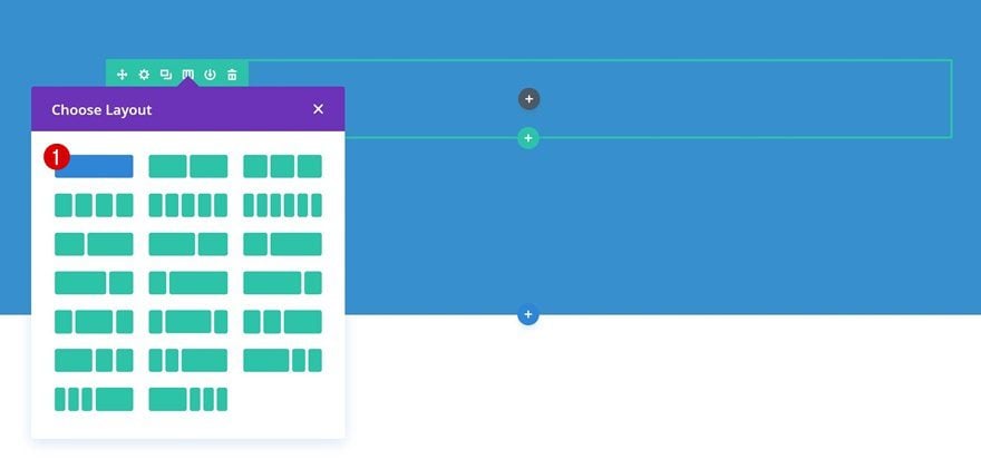
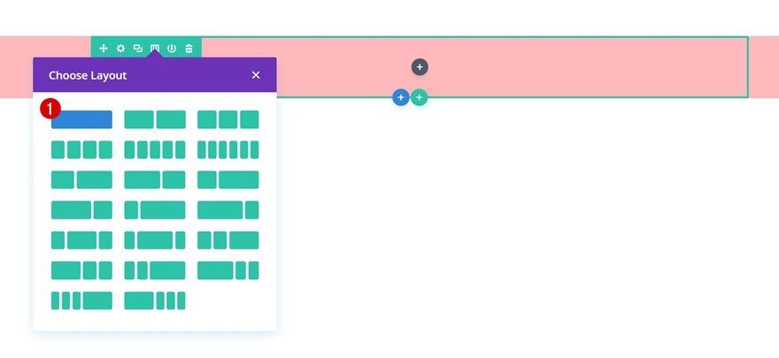
Add New Row
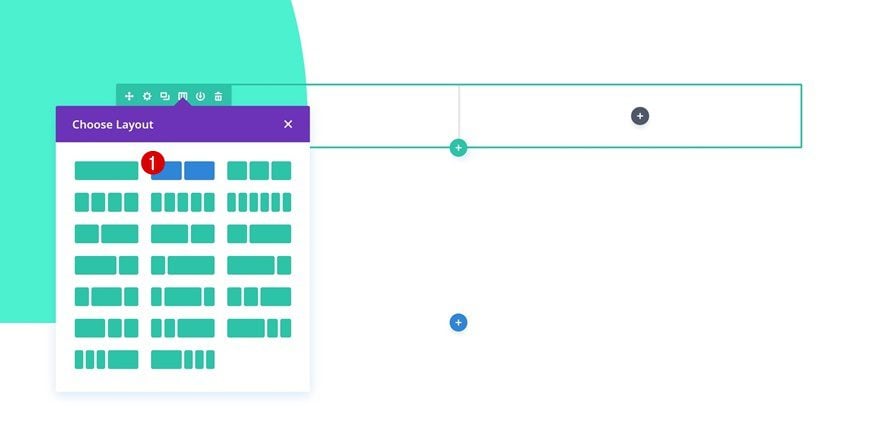
Column Structure
Add a new row using the following column structure:
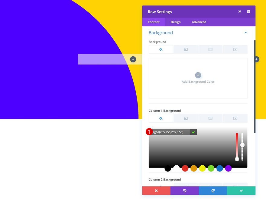
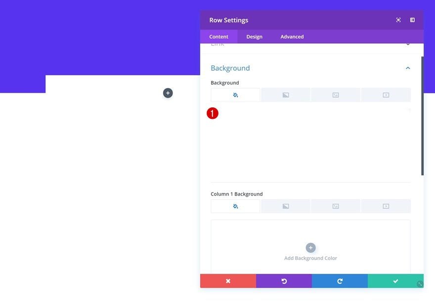
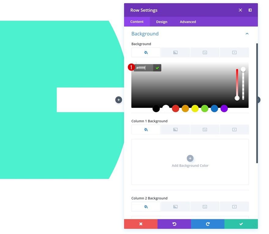
Column 1 Background Color
Without adding any modules yet, open the row settings and add a column 1 gradient background.
- Column 1 Background Color: rgba(255,255,255,0.55)
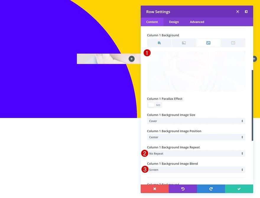
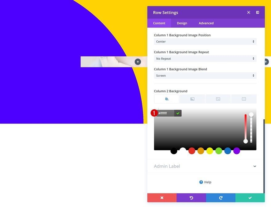
Column 1 Background Image
Add a background image to the first column as well.
- Column 1 Background Image Repeat: No Repeat
- Column 1 Background Image Blend: Screen
Column 2 Background Color
And a white background color to the second column.
- Column 2 Background Color: #ffffff
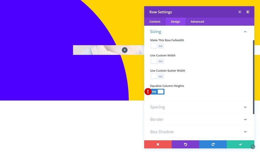
Sizing
Change the sizing settings next.
- Equalize Column Heights: Yes
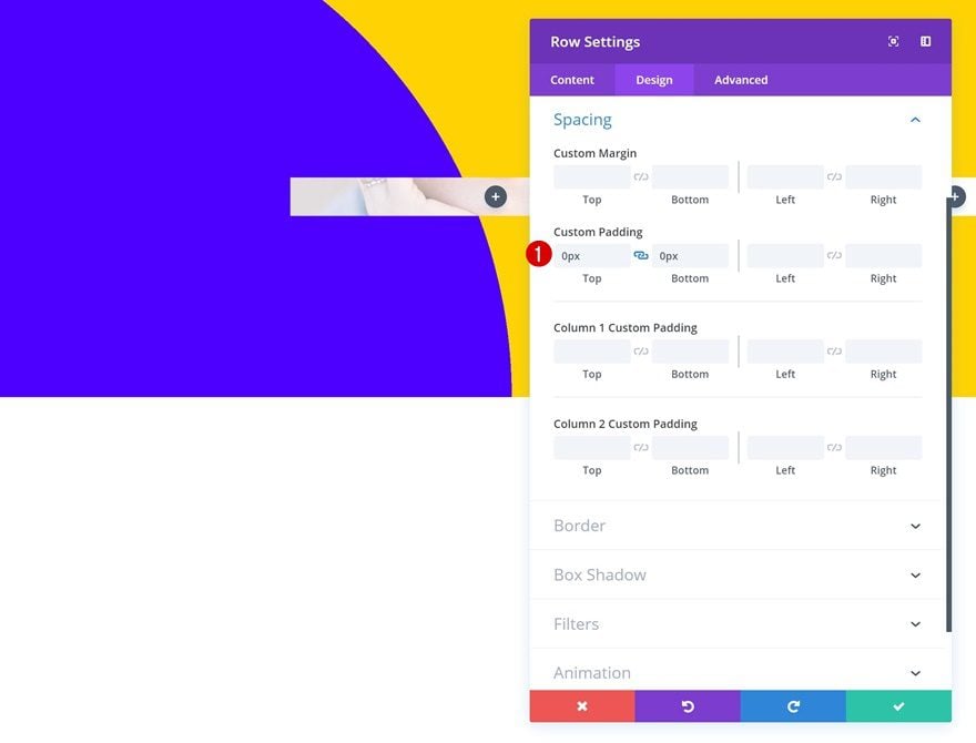
Spacing
Remove all default custom padding as well.
- Top Padding: 0px
- Bottom Padding: 0px
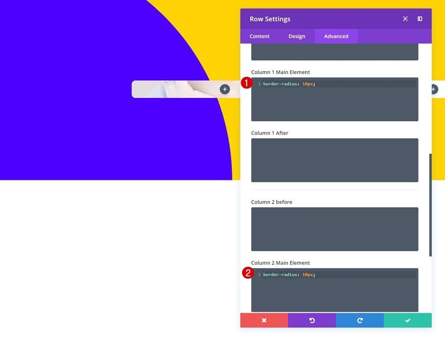
Column Border Radius
Add some border radius to both columns in the advanced tab.
border-radius: 10px;
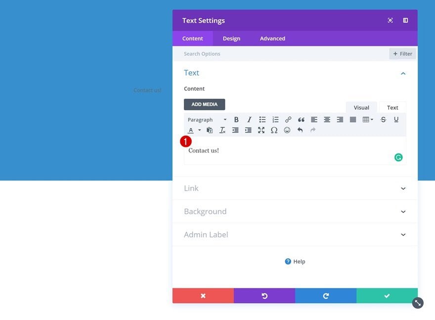
Add Text Module to Column 1
Add Content
Time to start adding the various modules! Add a Text Module to the first column with some content of choice.
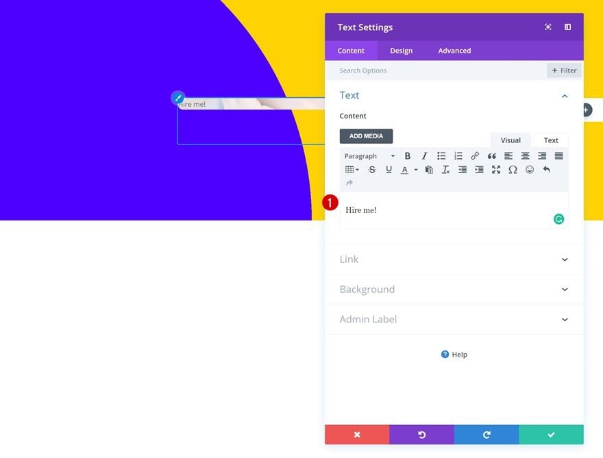
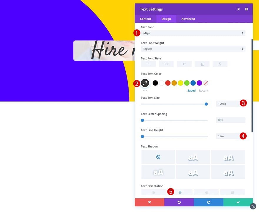
Text Settings
Then, go to the text settings and make some changes.
- Text font: Satisfy
- Text Color: #333333
- Text size: 100px
- Text Line Height: 1em
- Text Orientation: Center
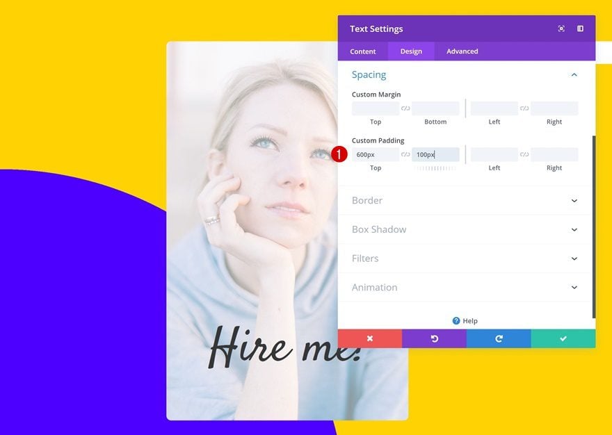
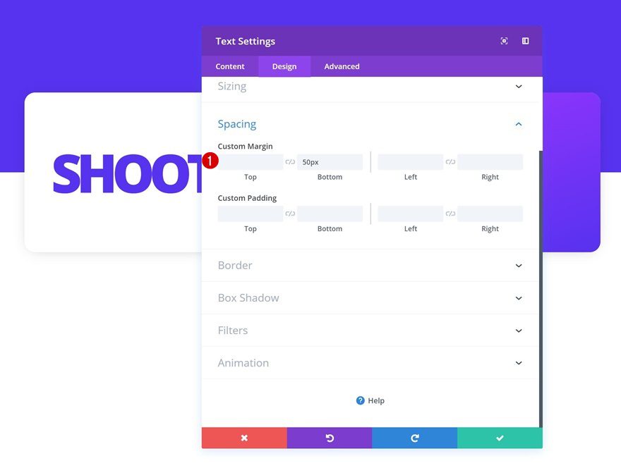
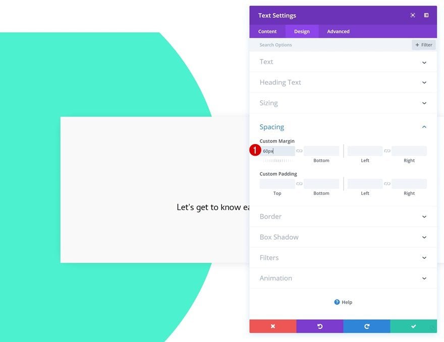
Spacing
Add some custom padding values as well.
- Top Padding: 600px
- Bottom Padding: 100px
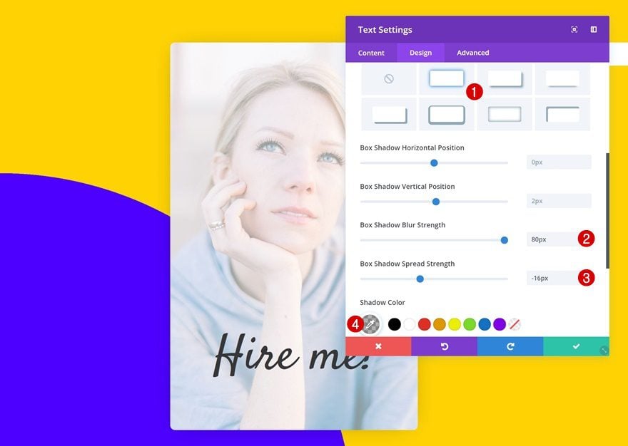
Box Shadow
To add depth to the design, use a subtle box shadow.
- Box Shadow Blur Strength: 80px
- Box Shadow Spread Strength: -16px
- Shadow Color: rgba(0,0,0,0.3)
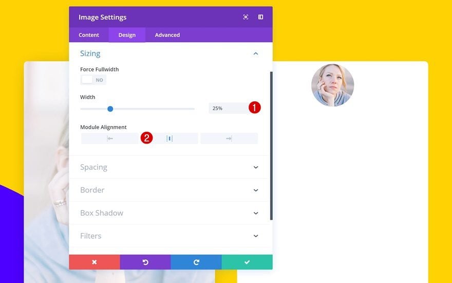
Add Image Module to Column 2
Upload PNG Image
Continue by adding an Image Module to the second column. Upload a PNG image of choice.

Sizing
Change the sizing settings of this module.
- Width: 25% (Desktop), 50% (Tablet), 60% (Phone)
- Module Alignment: Center
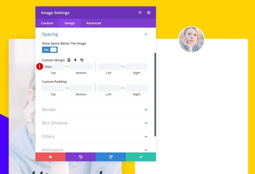
Spacing
Create an overlap by using some negative top margin.
- Top Margin: -60%
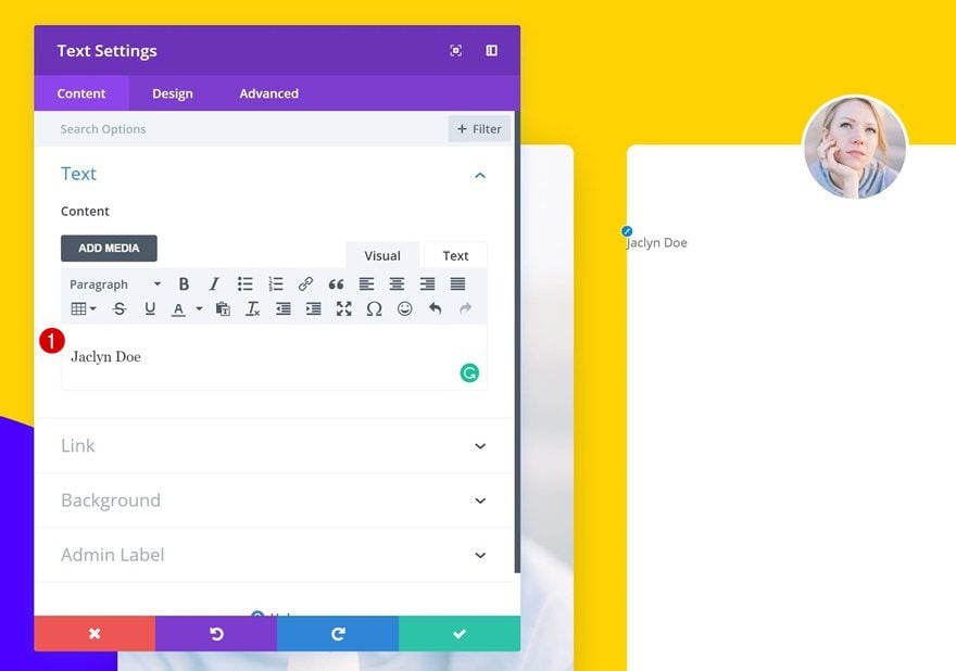
Add Text Module #1 to Column 2
Add Content
Right below the Image Module, add a Text Module with some content.
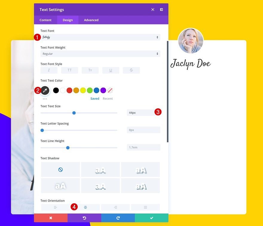
Text Settings
Change the text settings of this module.
- Text Font: Satisfy
- Text Color: #333333
- Text Size: 44px
- Text Orientation: Center
Add Text Module #2 to Column 2
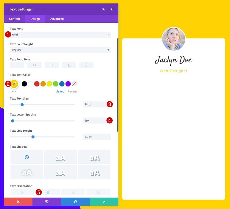
Add Content
Add another text module next.
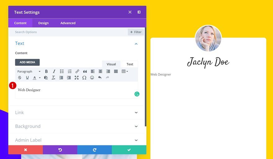
Text Settings
Change the text settings of this module as well.
- Text Font: Arial
- Text Color: #ffd400
- Text Size: 18px
- Text Letter Spacing: 2px
- Text Orientation: Center
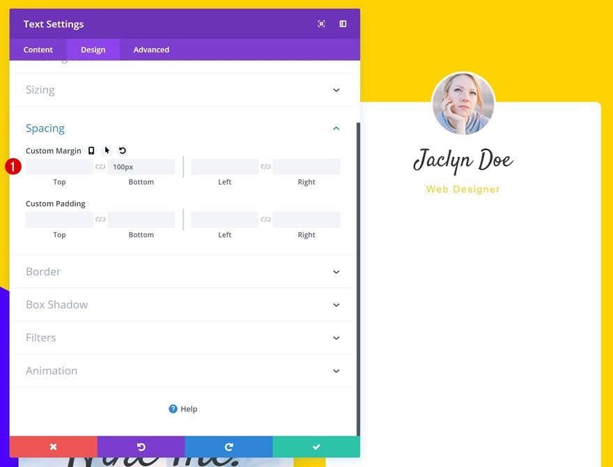
Spacing
Add some bottom margin next.
- Bottom Margin: 100px
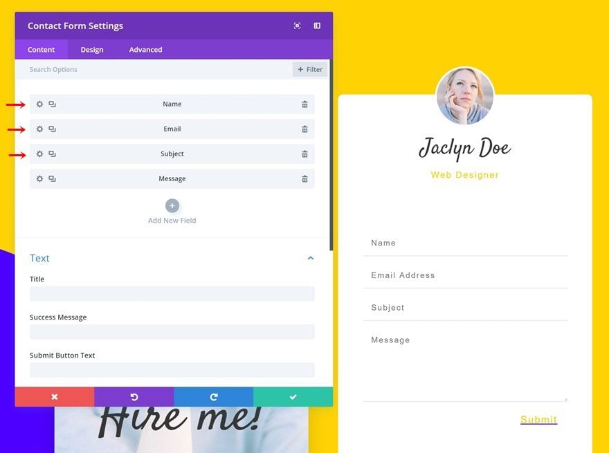
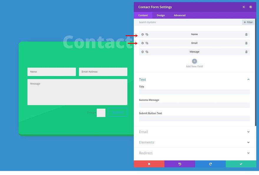
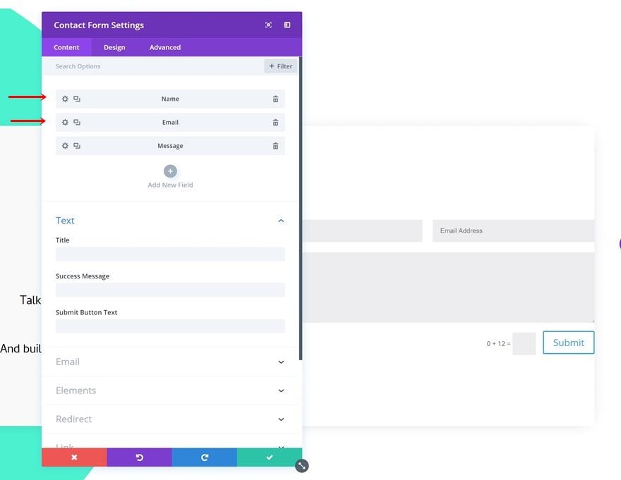
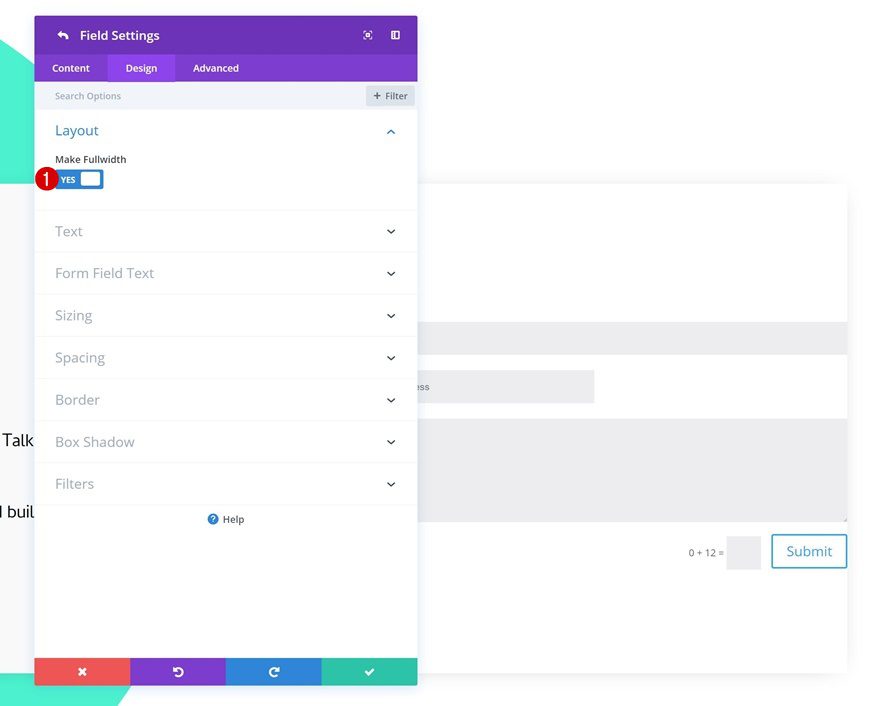
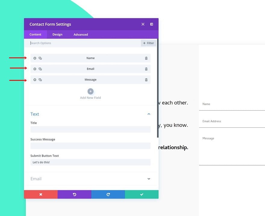
Add Contact Form Module to Column 2
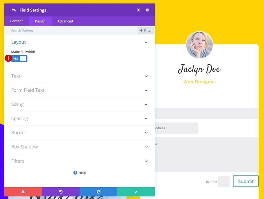
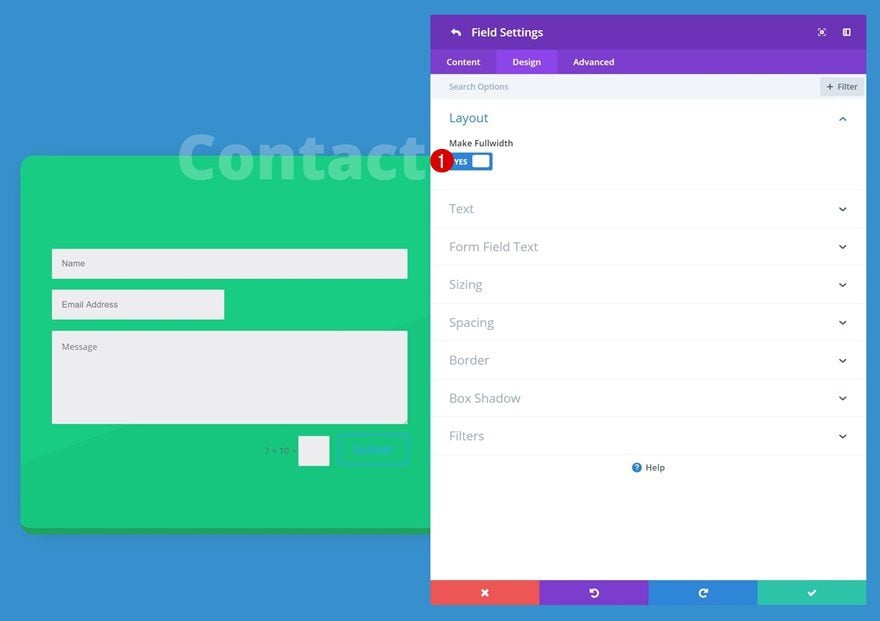
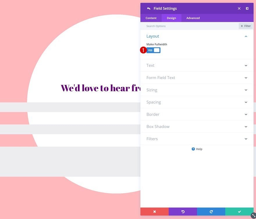
Enable ‘Make Fullwidth’ Option on Name & Email Field
The last module needed is the Contact Form Module. Before you do anything else, open the name and email fields and change the layout.
- Make Fullwidth: Yes
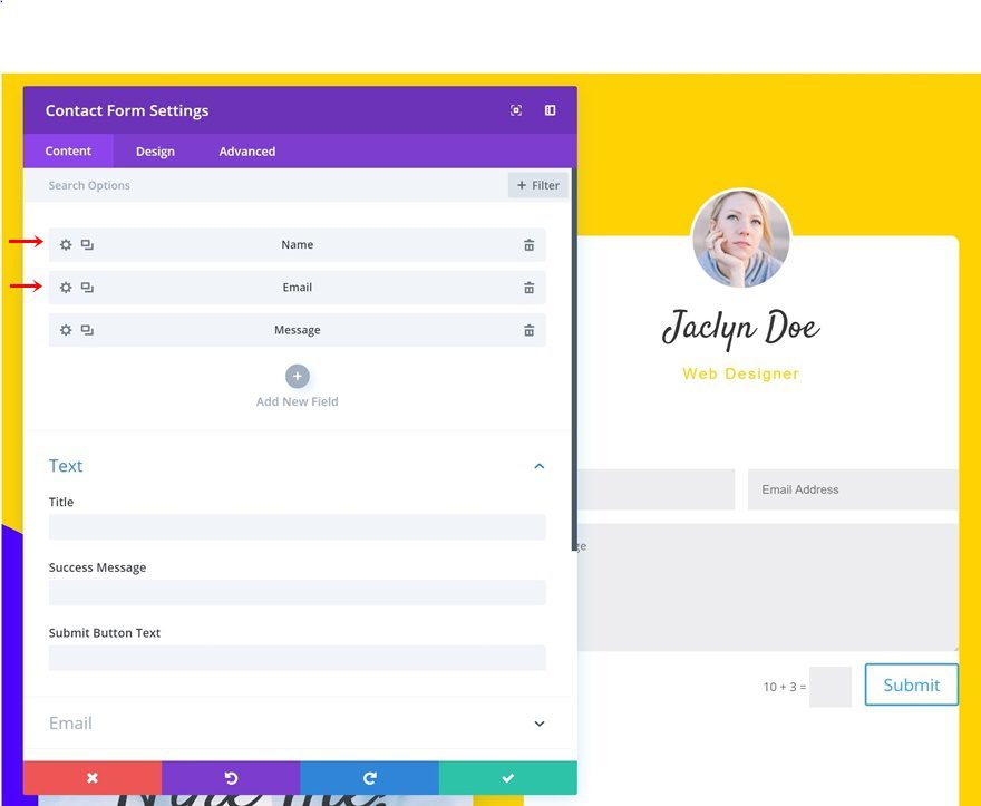
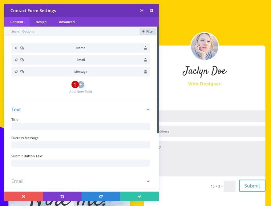
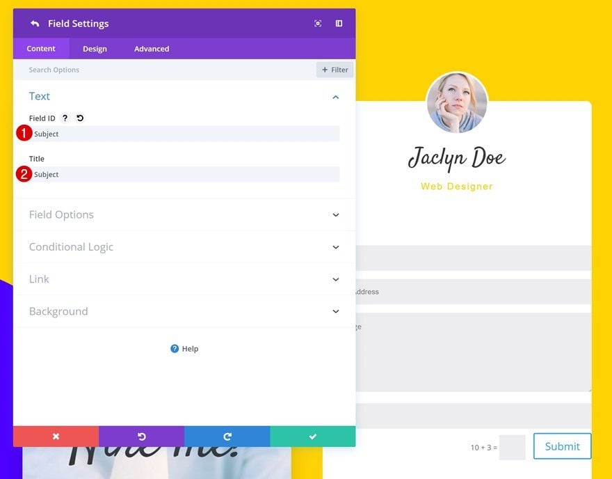
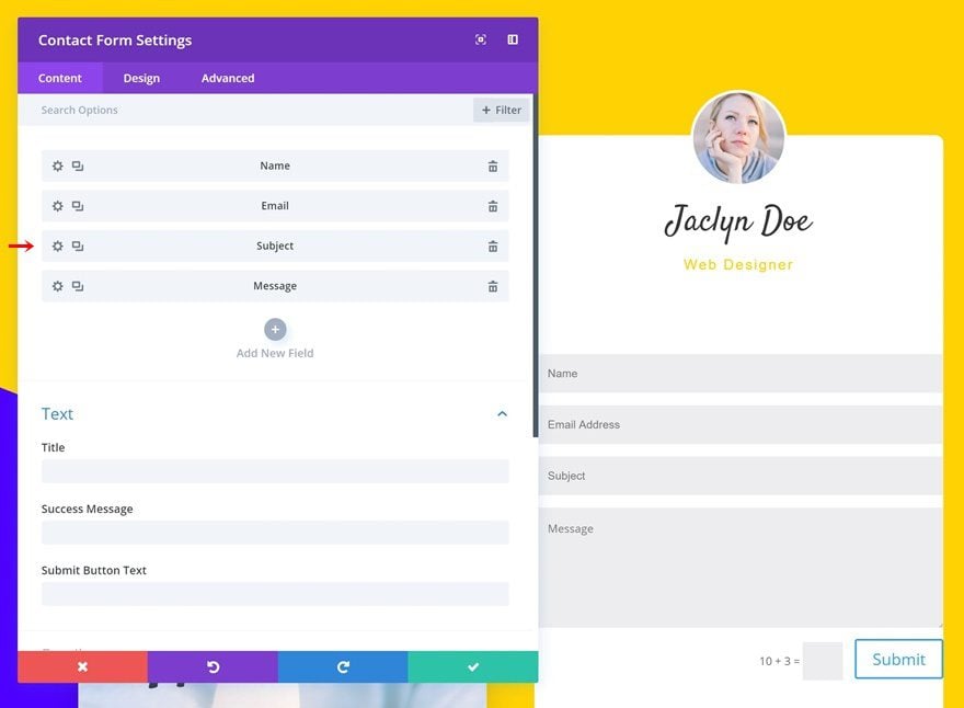
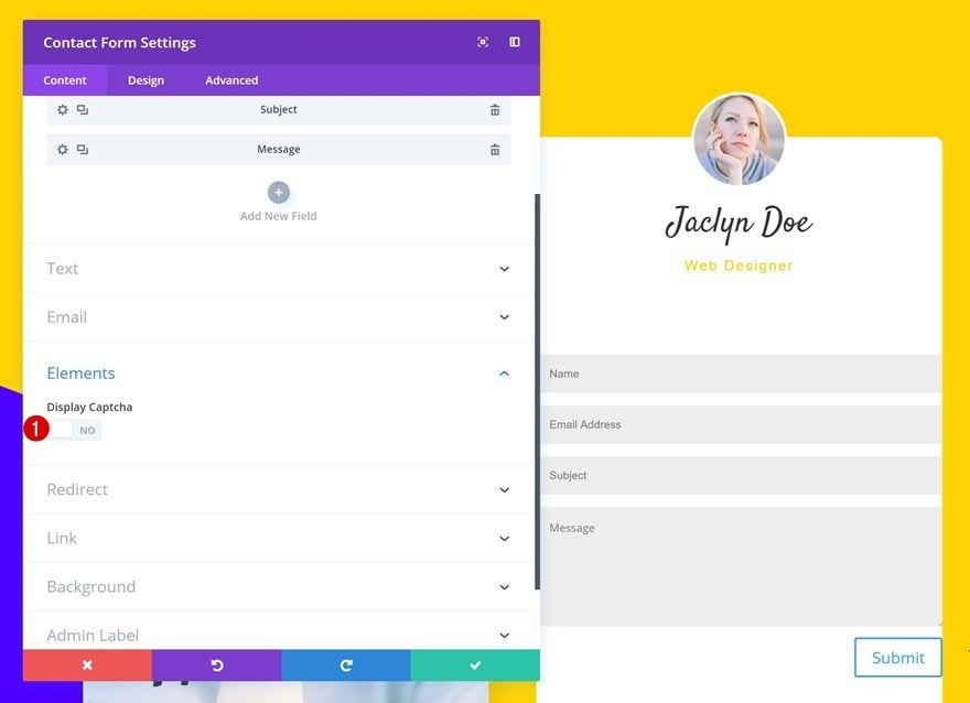
Add Subject Field
To create this design, we’ve added another field for the subject.
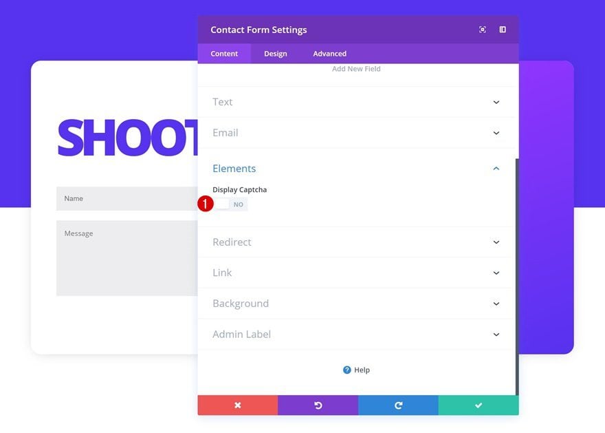
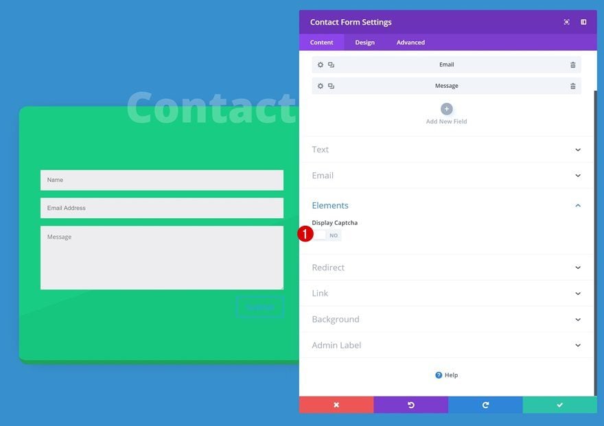
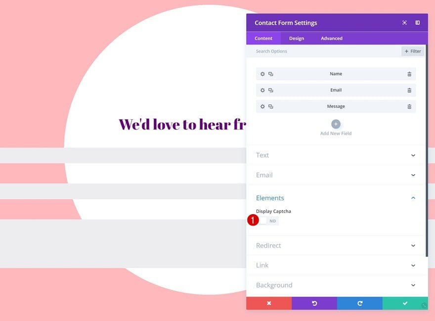
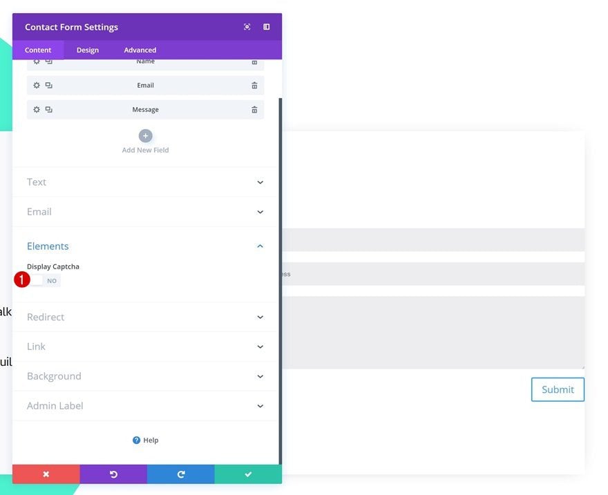
Elements
Disable the captcha option next.
- Display Captcha: No
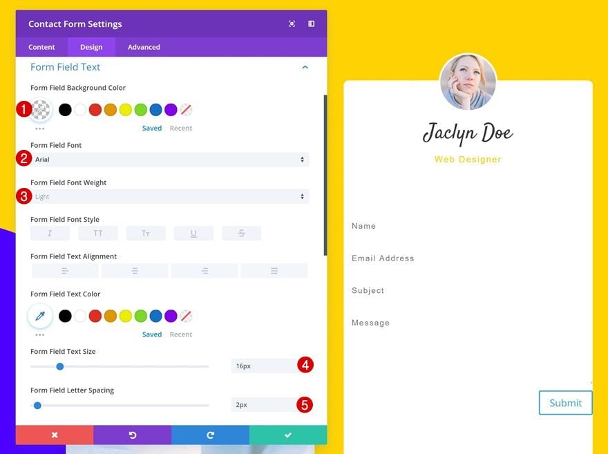
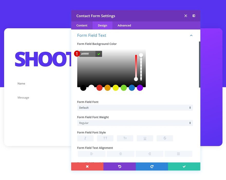
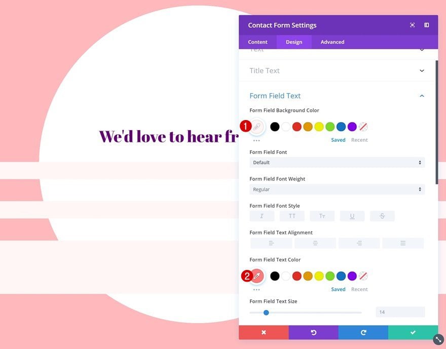
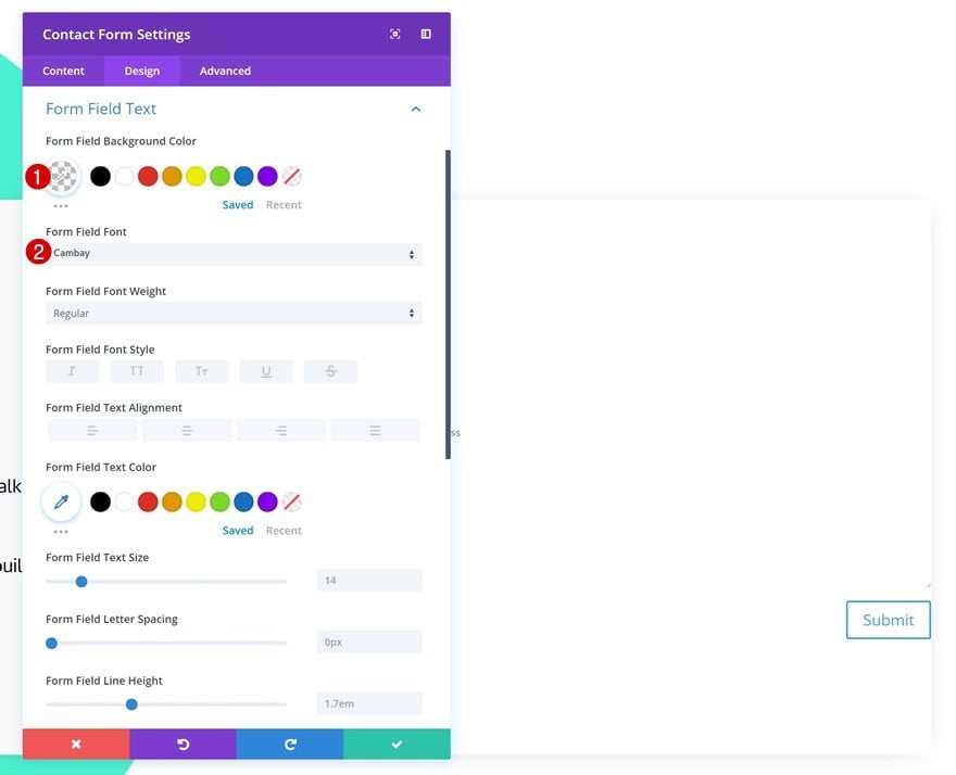
Form Field Text Settings
Make some changes to the form field text settings of this Contact Form Module.
- Form Field Background Color: rgba(255,255,255,0)
- Form Field Font: Arial
- Form Field Font Weight: Light
- Form Field Text Size: 16px
- Form Field Letter Spacing: 2px
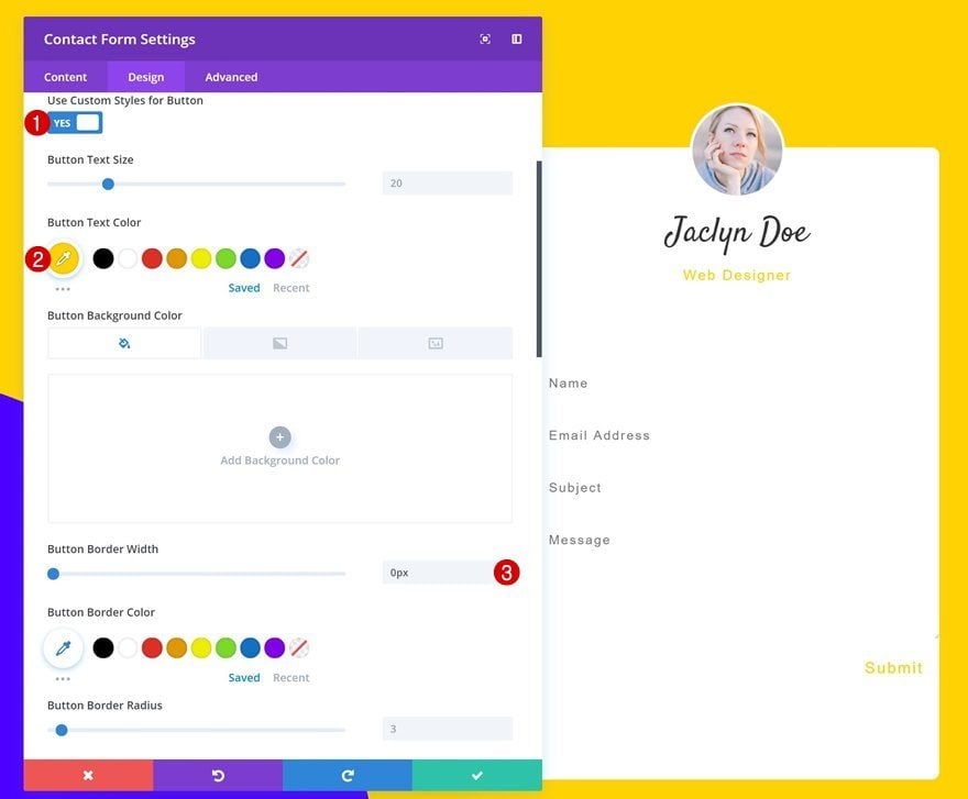
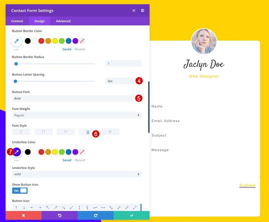
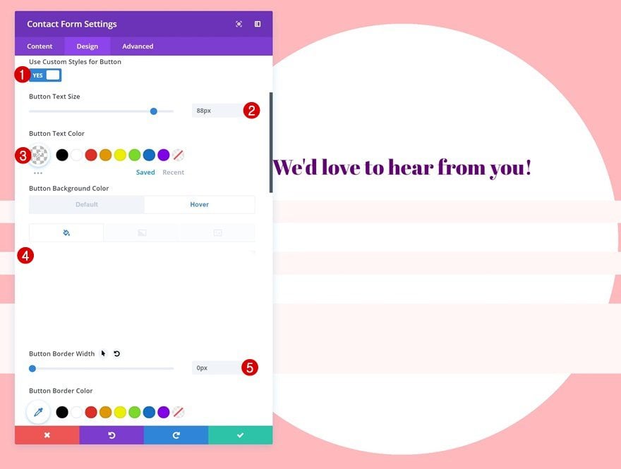
Button Settings
We’re modifying the button appearance as well.
- Use Custom Styles for Button: Yes
- Button Text Color: #ffd400
- Button Border Width: 0px
- Button Letter Spacing: 2px
- Button Font: Arial
- Font Style: Underline
- Underline Color: #4c00ff
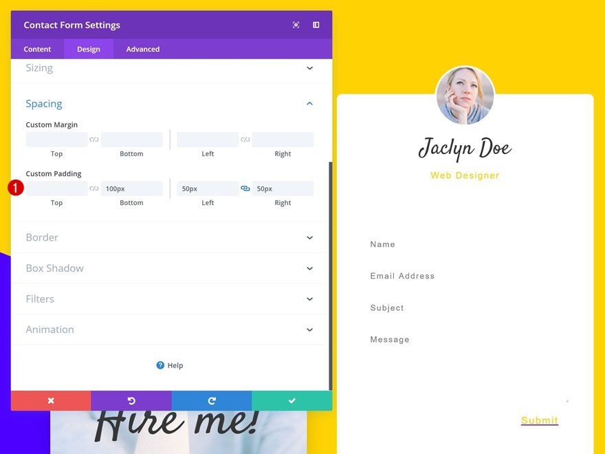
Spacing
Add some custom padding values next.
- Bottom Padding: 100px
- Left Padding: 50px
- Right Padding: 50px
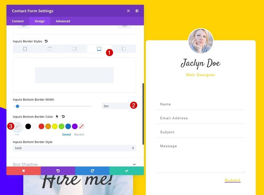
Border
And add a subtle bottom border to each one of the fields.
- Bottom Border Width: 2px
- Bottom Border Color: #efefef
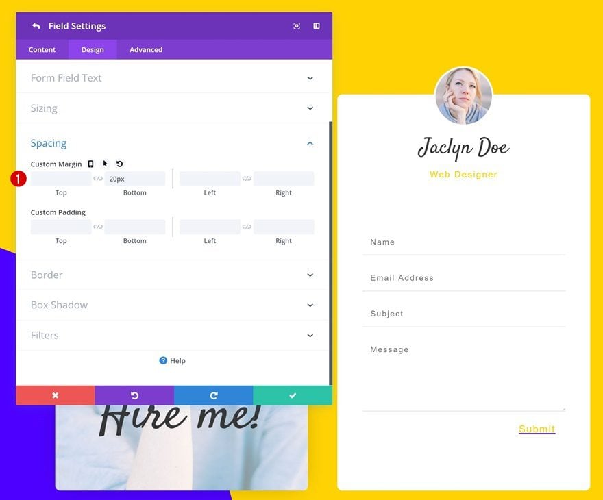
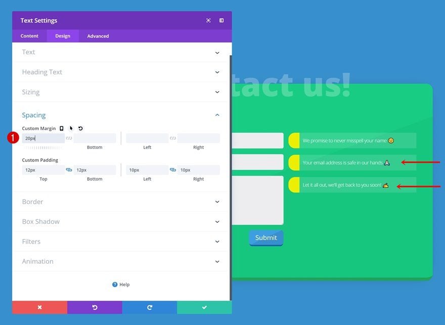
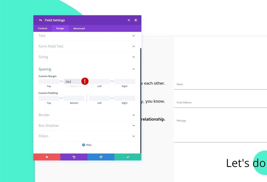
Individual Field Spacing
Last but not least, add some bottom margin to each one of the individual fields except for the message one.
- Bottom Margin: 20px
Creating Contact Form #2
Add New Section
Gradient background
On to the next example! Add a new section with a gradient background.
- Color 1: #562fef
- Color 2: #ffffff
- Gradient Type: Linear
- Start Position: 50%
- End Position: 50%
Spacing
Add some custom padding values to the spacing settings of this section.
- Top Padding: 200px
- Bottom Padding: 200px
Add New Row
Column Structure
Add a new row using the following column structure:
Background Color
Without adding any modules yet, open the row settings and add a background color to the row.
- Background Color: #ffffff
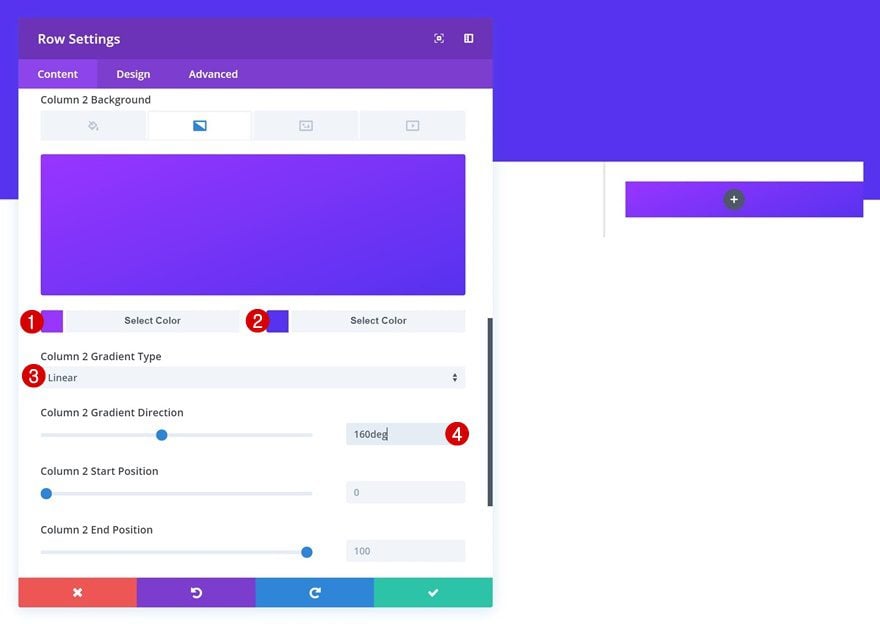
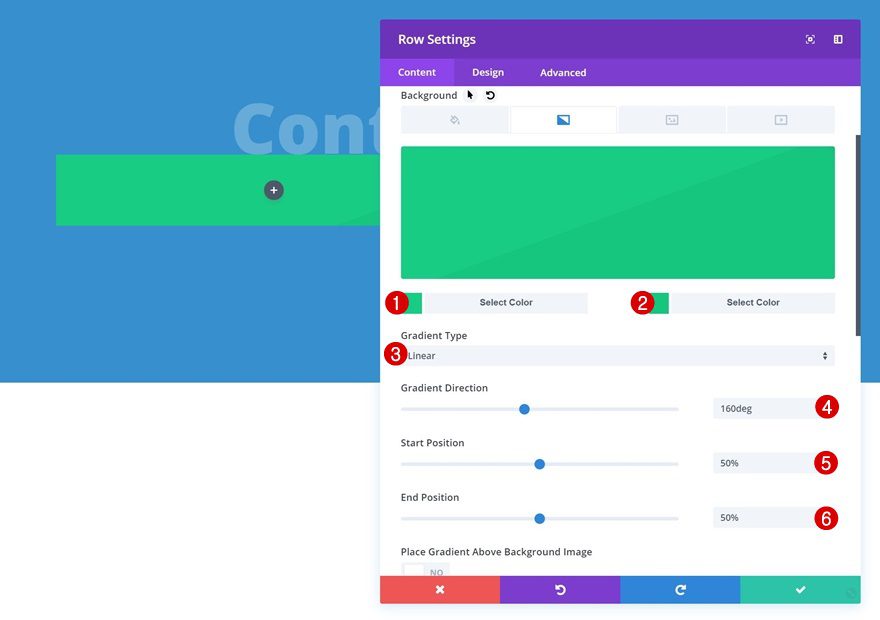
Column 2 Gradient Background
Add a gradient background to the second column of the row next.
- Color 1: #9932ff
- Color 2: #562fef
- Column 2 Gradient Type: Linear
- Column 2 Gradient Direction: 160deg
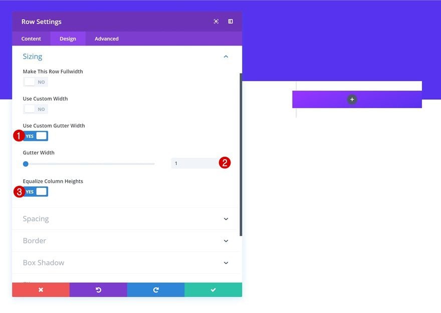
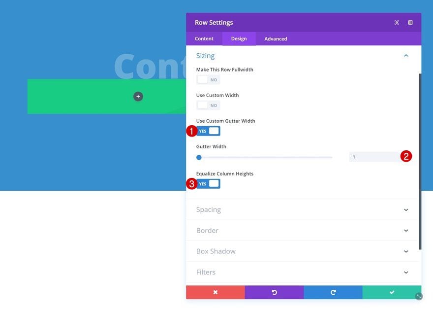
Sizing
Change the sizing settings of the row as well.
- Use Custom Gutter Width: Yes
- Gutter Width: 1
- Equalize Column Heights: Yes
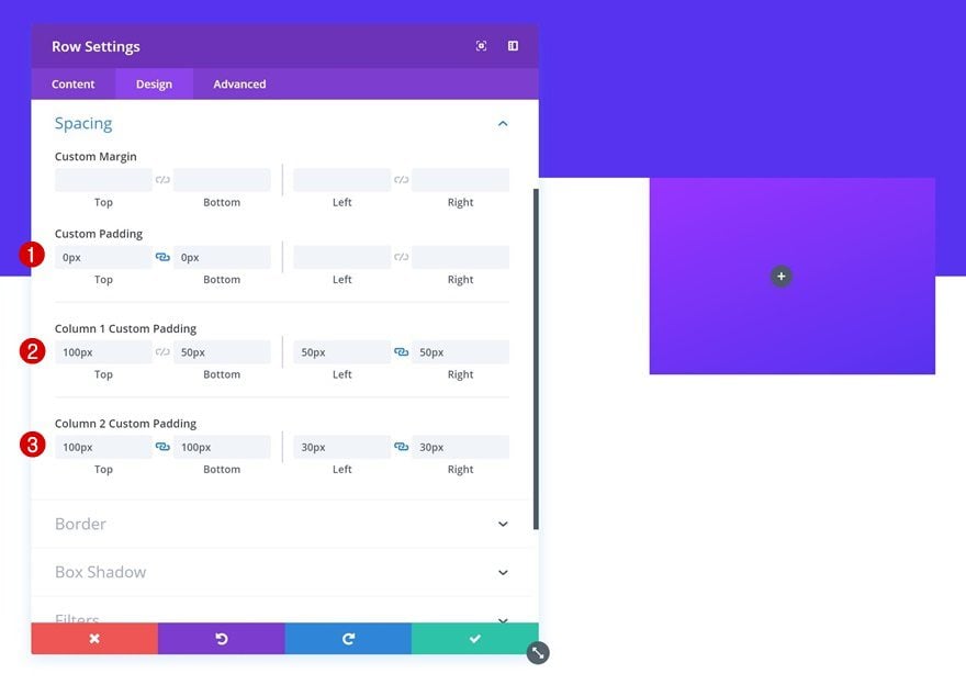
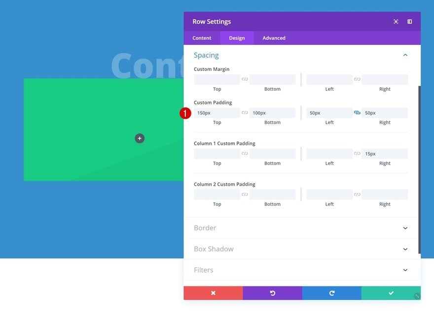
Spacing
Then, add some custom spacing values.
- Top Padding: 0px
- Bottom Padding: 0px
- Column 1 Top Padding: 100px
- Column 1 Bottom Padding: 50px
- Column 1 Left Padding: 50px
- Column 1 Right Padding: 50px
- Column 2 Top Padding: 100px
- Column 2 Bottom Padding: 100px
- Column 2 Left Padding: 50px
- Column 2 Right Padding: 50px
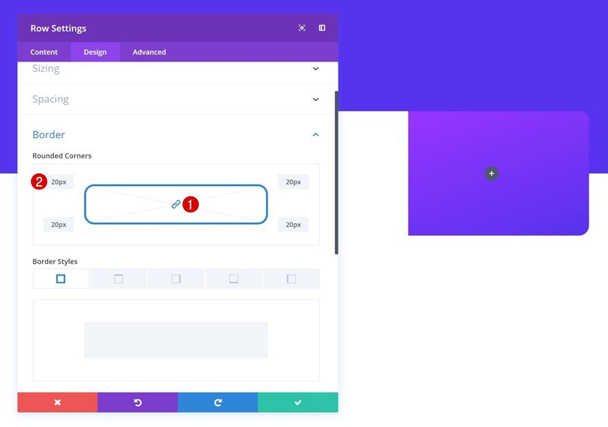
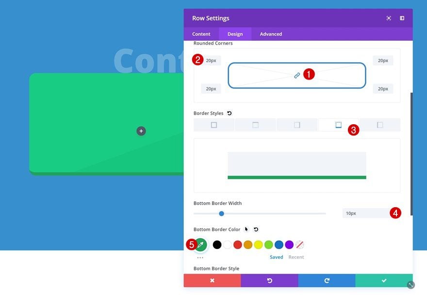
Border
Add ’20px’ to each one of the borders of the row.
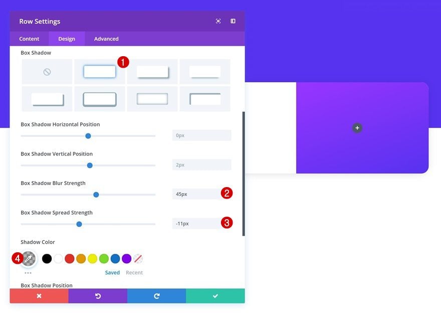
Box Shadow
Lastly, add a subtle box shadow to the row.
- Box Shadow Blur Strength: 45px
- Box Shadow Spread Strength: -11px
- Shadow Color: rgba(0,0,0,0.3)
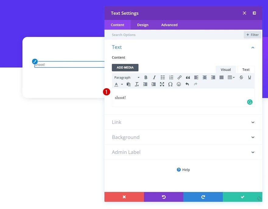
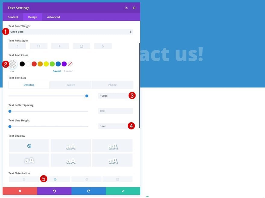
Add Text Module to Column 1
Add Content
Time to start adding the modules! Start with a Text Module in the first column.
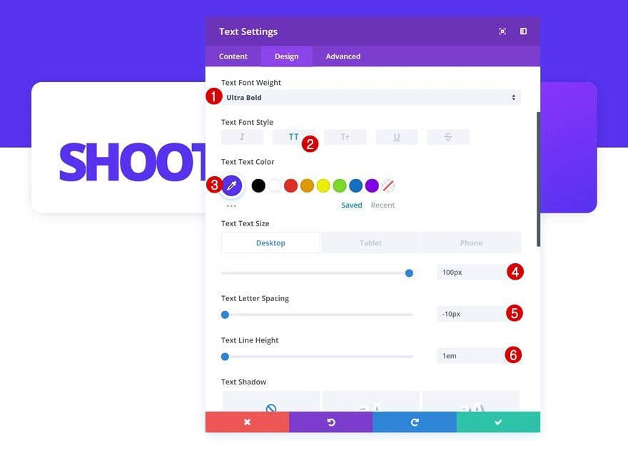
Text Settings
Change the text settings of this module.
- Text Font Weight: Ultra Bold
- Text Font Style: Uppercase
- Text Color: #562fef
- Text Suze: 100px (Desktop), 80px (Tablet), 60px (Phone)
- Text Letter Spacing: -10px
- Text Line Height: 1em
Spacing
Add some bottom margin as well.
- Bottom Margin: 50px
Add Contact Form Module to Column 1
Elements
The second module we’ll need in the first column is a Contact Form Module. Once you’ve added the module, disable the ‘Display Captcha’ option.
- Display Captcha: No
Form Field Text Settings
Change the form field background color next.
- Form Field Background Color: #ffffff
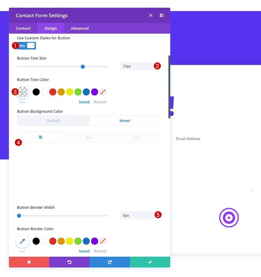
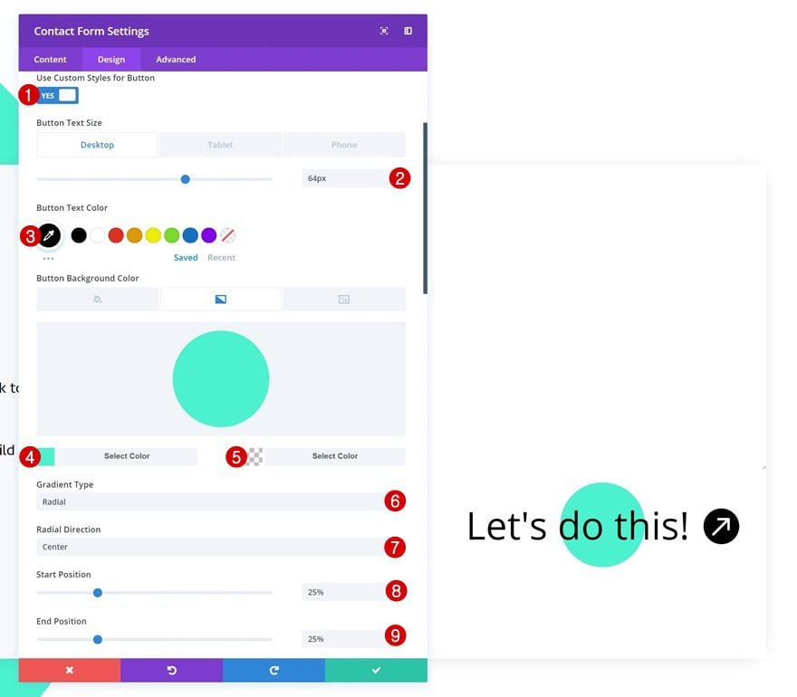
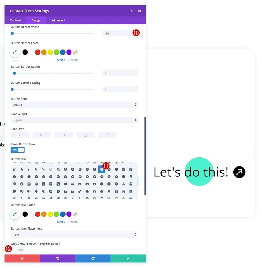
Button Settings
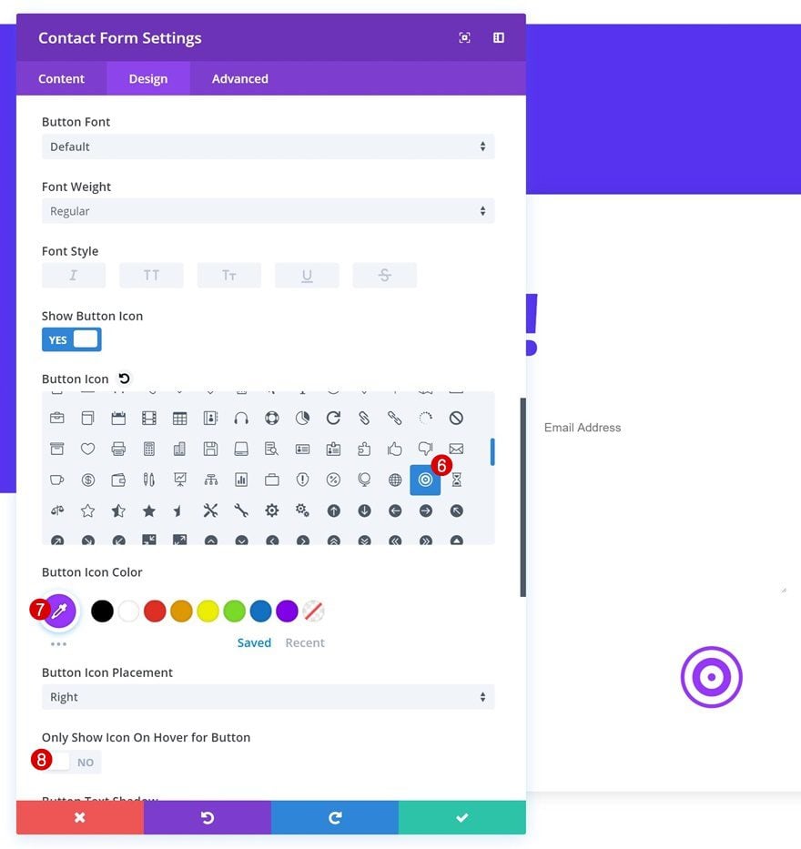
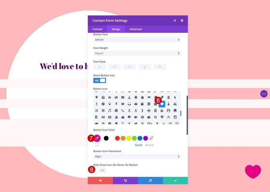
Play around with the button settings as well to create an icon button instead of one containing text.
- Use Custom Styles for Button: Yes
- Button Text Size: 73px
- Botton Text Color: rgba(0,0,0,0)
- Hover Button Background Color: rgba(255,255,255,0)
- Button Border Width: 0px
- Button Icon Color: #9932ff
- Only Show Icon on Hover for Button: No
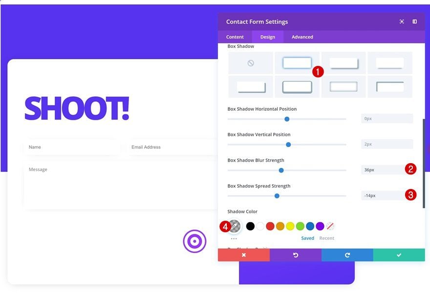
Box Shadow
Lastly, add a subtle box shadow to each one of the fields.
- Box Shadow Blur Strength: 36px
- Box Shadow Blur Strength: -14px
- Shadow Color: rgba(0,0,0,0.3)
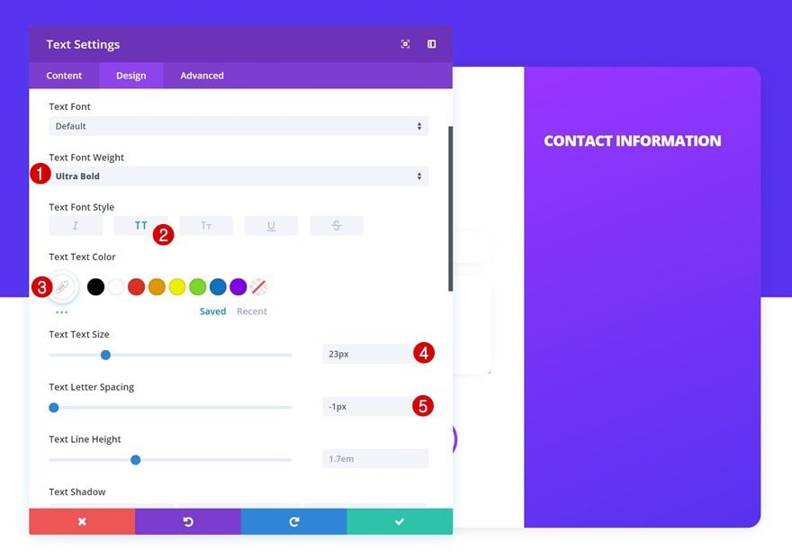
Add Text Module to Column 2
Add Content
The first module we’ll need in the second column is another Text Module.
Text Settings
Once you’ve added the content, change the text settings of this module.
- Text Font Weight: Ultra Bold
- Text Color: #ffffff
- Text Size: 23px
- Text Letter Spacing: -1px
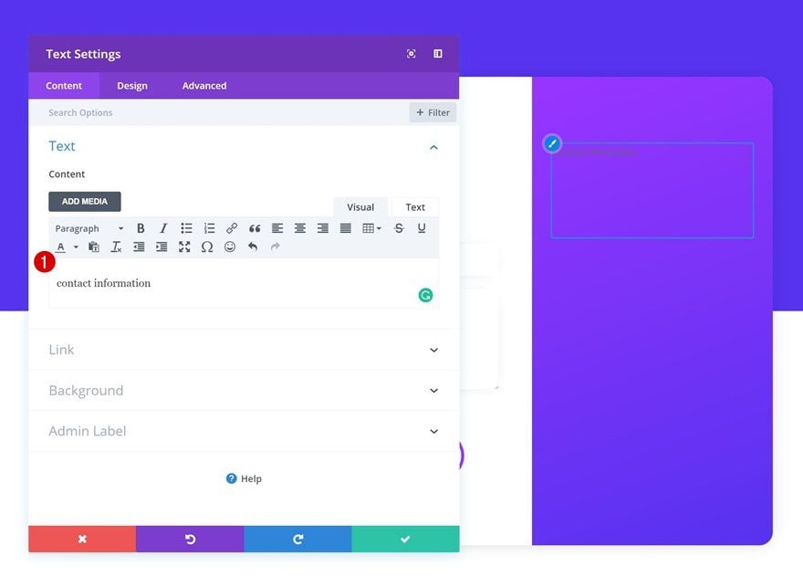
Add Blurb Module #1 to Column 2
Add Content
The second module we’ll need is a Blurb Module. Go ahead and enter some contact information.
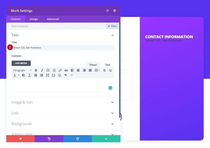
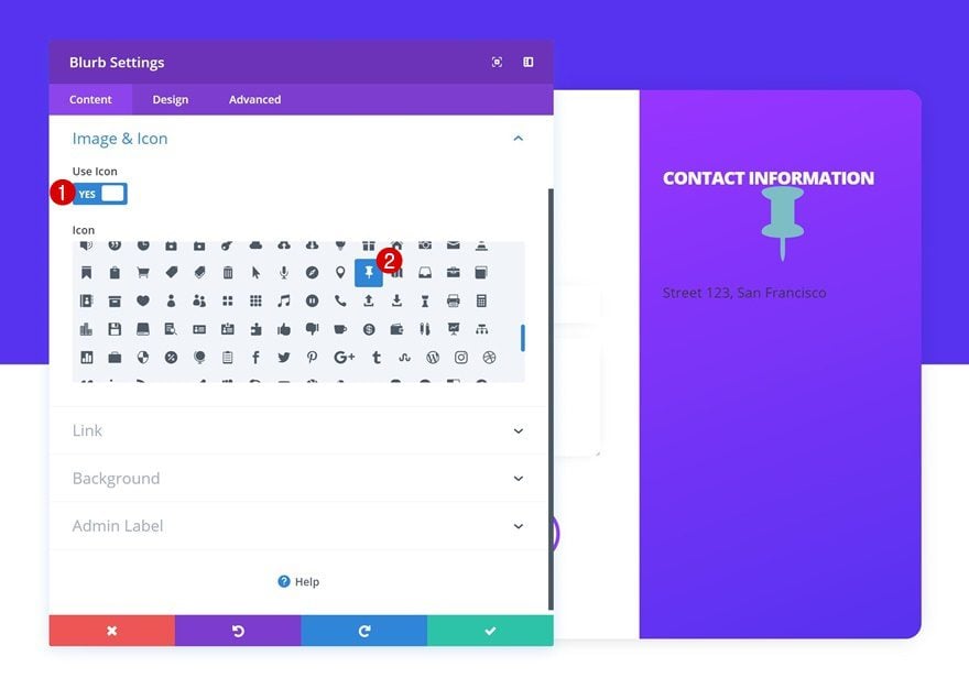
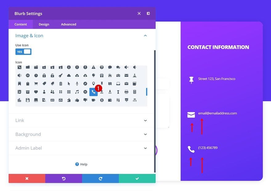
Select Icon
Then, choose a matching icon.
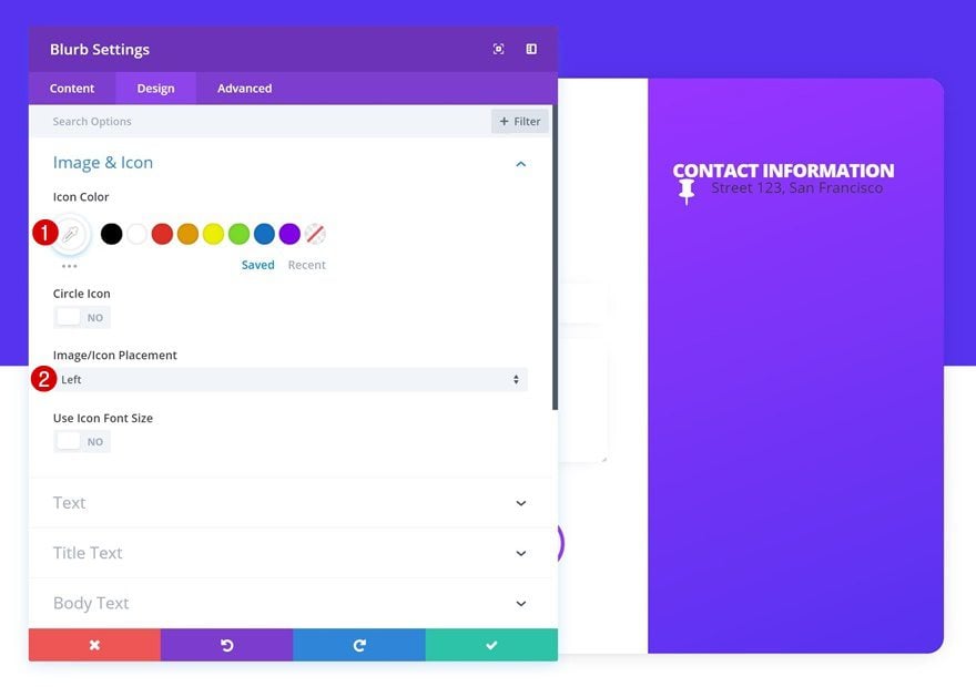
Icon Settings
Change the settings of this icon.
- Icon Color: #ffffff
- Icon Placement: Left
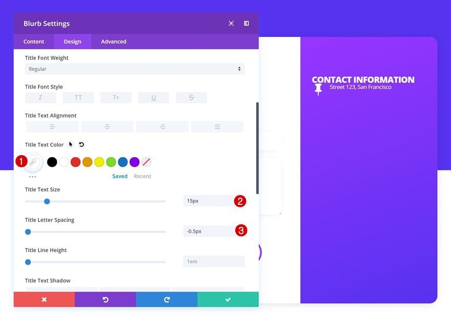
Title Text Settings
Continue by making some changes to the title text settings next.
- Title Text Size: 15px
- Title Letter Spacing: -0.5px
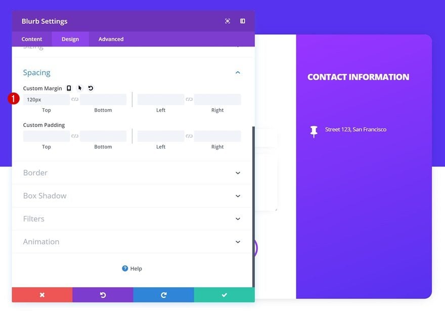
Spacing
And add some top margin.
- Top Margin: 120px
Clone Blurb Module Twice
Once you’re done modifying the first Blurb Module, you can go ahead and clone the module twice.
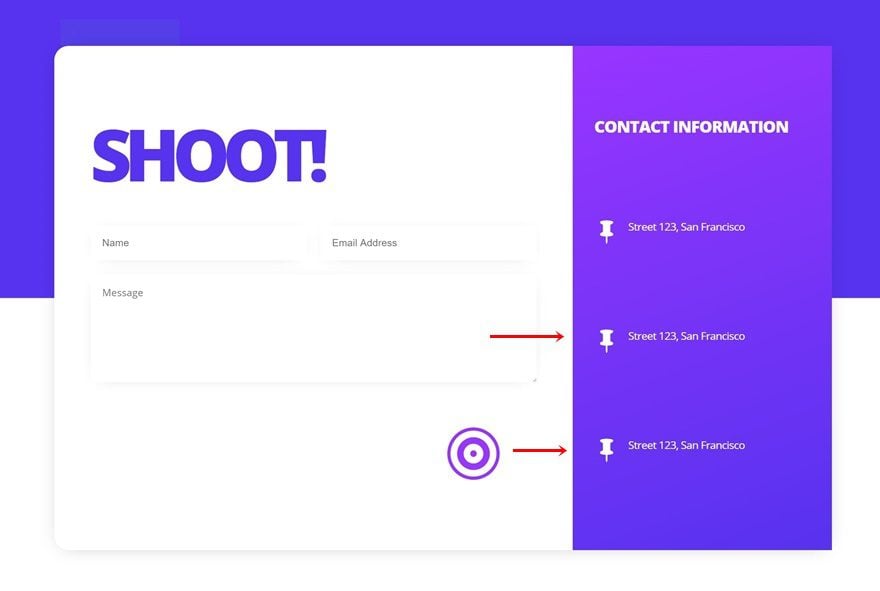
Change Content & Icon of Both Duplicates
Change the content and icons of both duplicates to share different kinds of contact information with visitors.
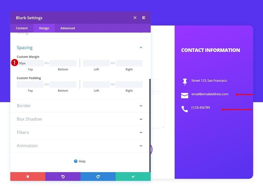
Change Spacing of Both Duplicates
The top margin of both duplicates needs to be altered as well.
- Top Margin: 30px
Creating Contact Form #3
Add New Section
Background Color
On to the third example! Add a new section with the following background color:
- Background Color: #3491CE
Spacing
Continue by adding some custom padding values in the spacing settings.
- Top Padding: 200px
- Bottom Padding: 200px
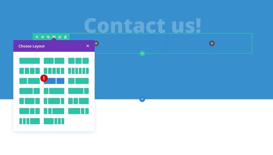
Add Row #1
Column Structure
Then, add a new row using the following column structure:
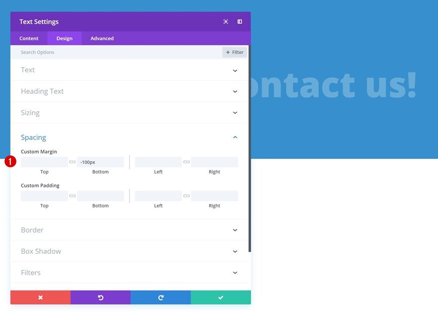
Add Text Module
Add Content
Time to start adding modules! The first module we’ll need to add to the first column is a Text Module. Enter some content of choice.
Text Settings
Then, change the text settings.
- Text Font Weight: Ultra Bold
- Text Color: rgba(255,255,255,0.24)
- Text size: 100px (Desktop), 86px (Tablet), 60px (Phone)
- Text Line Height: 1em
- Text Orientation: Center
Spacing
Add some negative bottom margin as well.
- Bottom Margin: -100px
Add Row #2
Column Structure
The second row we need to complete this example contains the following column structure:
Gradient Background
Without adding any modules yet, open the row settings and add a gradient background.
- Color 1: #11CE84
- Color 2: #10C77F
- Gradient Type: Linear
- Gradient Direction: 160deg
- Start Position: 50%
- End Position: 50%
Sizing
Change the sizing settings as well.
- Use Custom Gutter Width: Yes
- Gutter Width: 1
- Equalize Column Heights: Yes
Spacing
Add some custom padding values next.
- Top Padding: 150px
- Bottom Padding: 100px
- Left Padding: 50px
- Right Padding: 50px
Border
Then, go to the border settings and add ’20px’ to each one of the corners. Use a bottom border as well.
- Bottom Border Width: 10px
- Bottom Border Color: #1ba35a
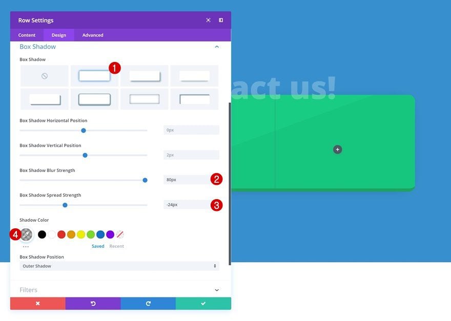
Box Shadow
Complete the row settings by adding a subtle box shadow.
- Box Shadow Blur Strength: 80px
- Box Shadow Spread Strength: -24px
- Shadow Color: rgba(0,0,0,0.3)
Add Contact Form Module to Column 1
Enable ‘Make Fullwidth’ Option on Name & Email Field
The first module we need in the first column of the row is a Contact Form Module. Open the name and email field and change the layout settings.
- Make Fullwidth: Yes
Elements
Disable the captcha next.
- Display Captcha: No
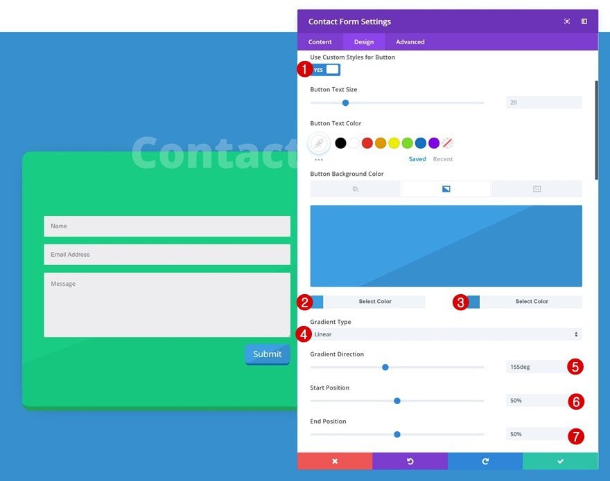
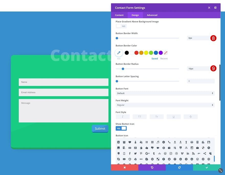
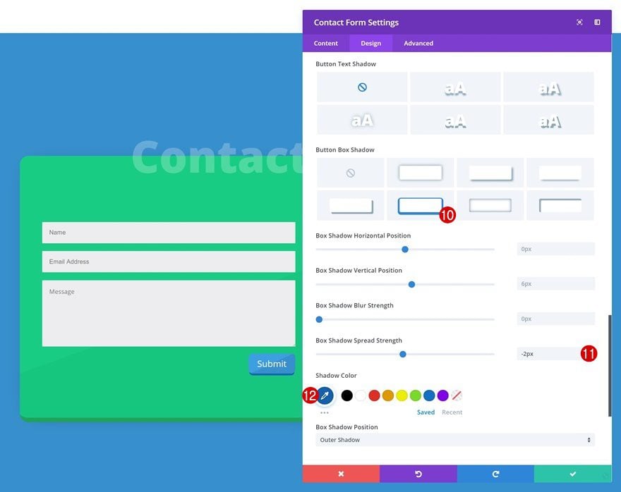
Button Settings
And change the button settings.
- Use Custom Styles for Button: Yes
- Button Text Color: #ffffff
- Color 1: #3AA0E3
- Color 2: #3491CE
- Gradient Type: Linear
- Gradient Direction: 155deg
- Start Position: 50%
- End Position: 50%
- Button Border Width: 0px
- Button Border Radius: 10px
- Box Shadow Spread Strength: -2px
- Shadow Color: #0a60af
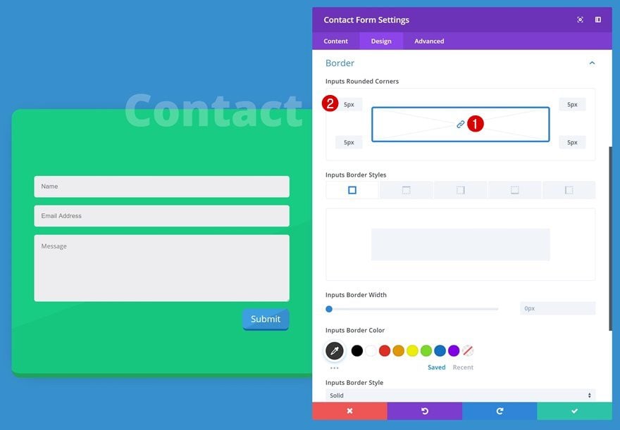
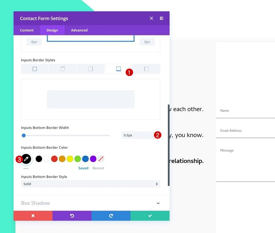
Border
We’re also adding ‘5px’ of rounded corners to each one of the fields.
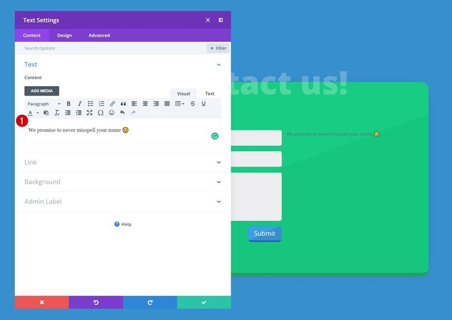
Add Text Module to Column 2
Add Content
In the second column, the first module we’ll need is a Text Module. Go ahead and enter some content.
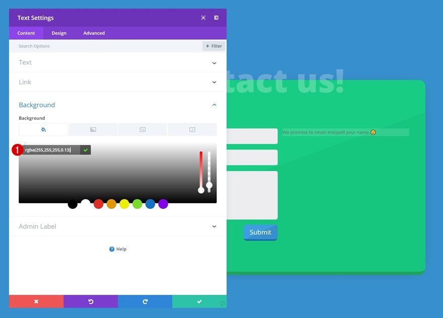
Background Color
Then, change the background color.
- Background Color: rgba(255,255,255,0.13)
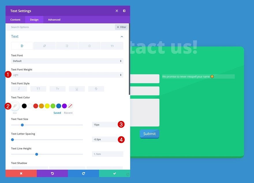
Text Settings
Play around with the text settings as well.
- Text Font Weight: Light
- Text Color: #ffffff
- Text Size: 15px
- Text Letter Spacing: -0.5px
Spacing
And add some custom padding to give the module space to breathe.
- Top Padding: 12px
- Bottom Padding: 12px
- Left Padding: 10px
- Right Padding: 10px

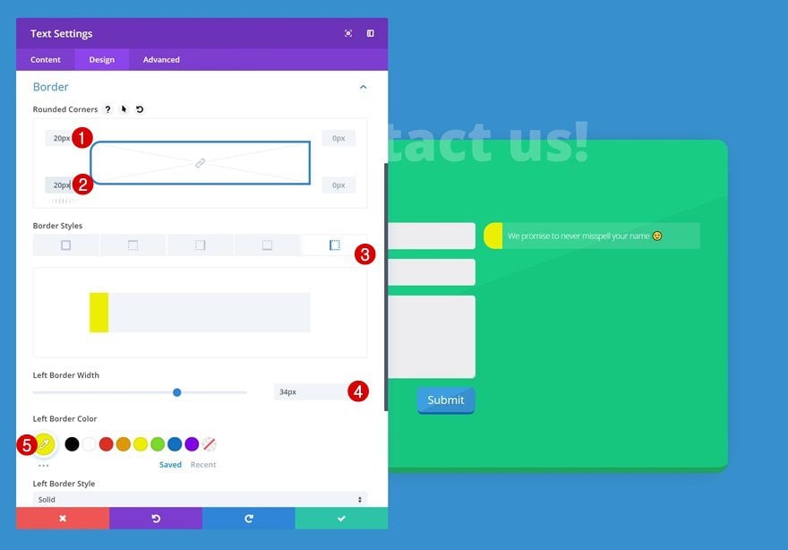
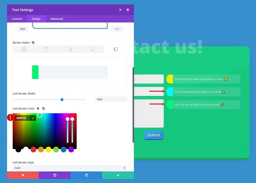
Border
We’re also adding ’20px’ to the top left and bottom left corners. On top of that, we’ll add a left border.
- Left Border Width: 34px
- Left Border Color: #edf000
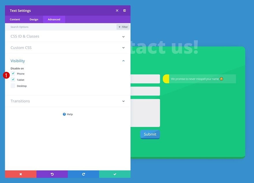
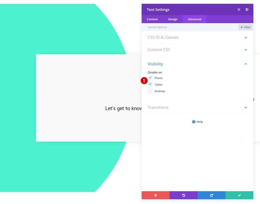
Visibility
To make this design match the different screen sizes, we’re going to disable the Text Module on phone and tablet.
Clone Text Module Twice
Once you’re done modifying the first Text Module, go ahead and clone the module twice.
Change Content of Both Duplicates
Change the content of both duplicates into something else.
Change Spacing of Both Duplicates
And add some top margin to create space between each one of the modules.
- Top Margin: 20px
Change Border of Both Duplicates
Last but not least, change the left border color of each one of the duplicates individually.
- Color 1: #00faff
- Color 2: #00f76f
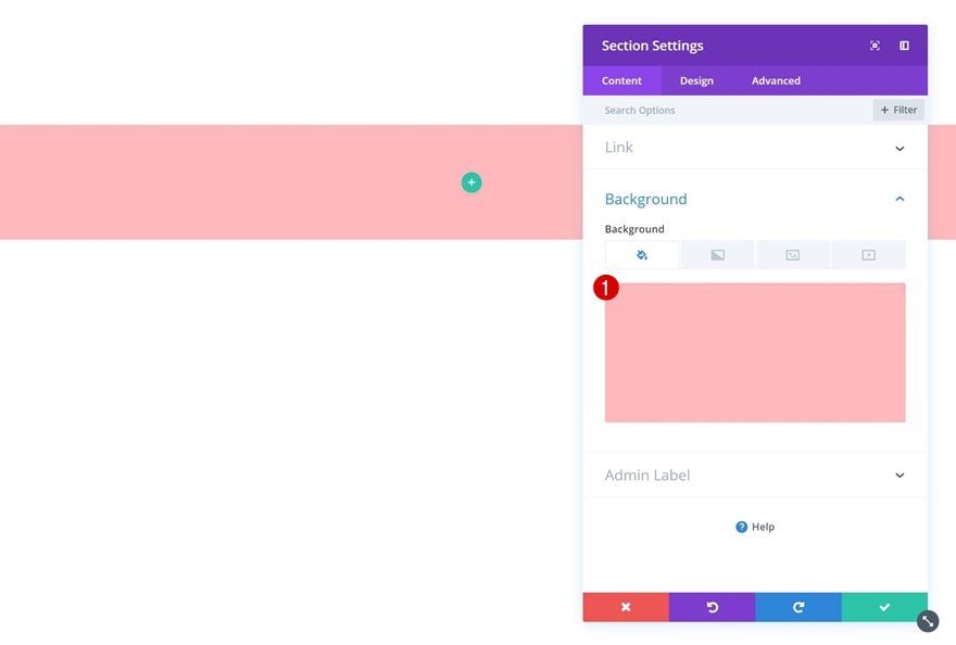
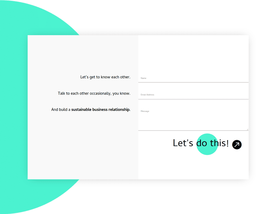
Creating Contact Form #4
Add New Section
Background Color
On to the fourth example! Add a new section using the following background color:
- Background Color: #FFBABD
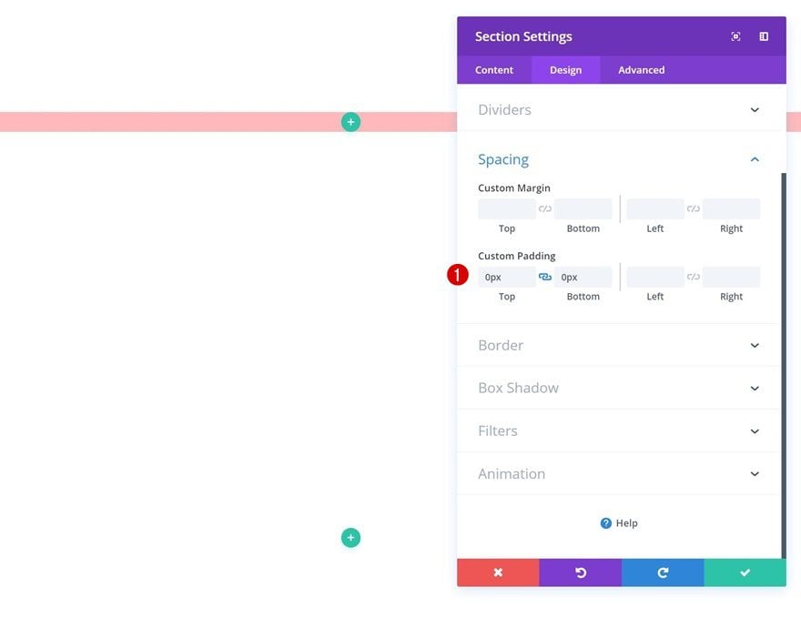
Spacing
Remove the default padding of this section.
- Top Padding: 0px
- Bottom Padding: 0px
Add New Row
Column Structure
Continue by adding a new row using the following column structure:
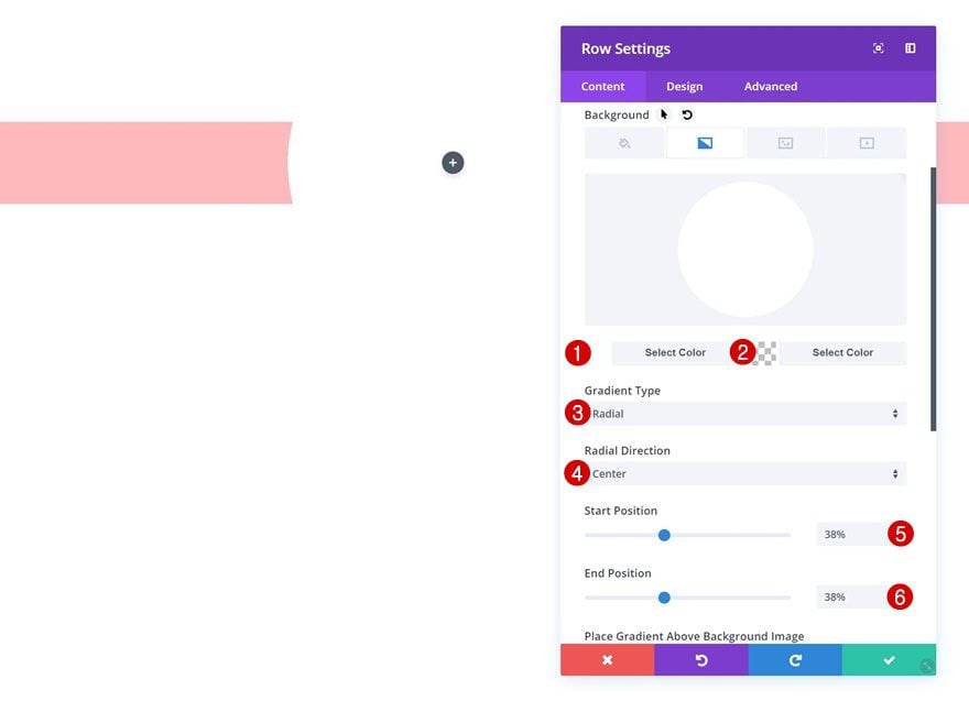
Gradient Background
Without adding any modules yet, open the row settings and add a gradient background.
- Color 1: #ffffff
- Color 2: rgba(41,196,169,0)
- Gradient Type: Radial
- Radial Direction: Center
- Start Position: 38%
- End Position: 38%
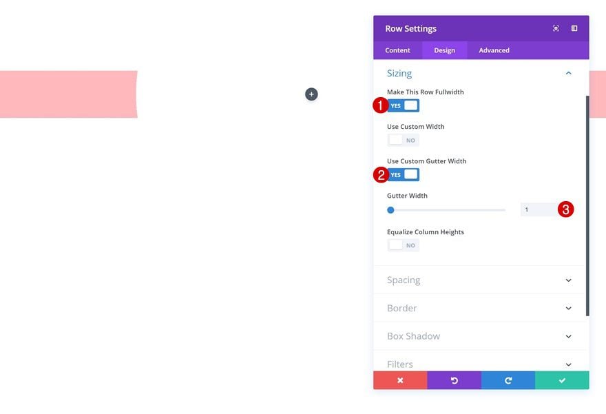
Sizing
Change the sizing settings next.
- Make This Row Fullwidth: Yes
- Use Custom Gutter Width: Yes
- Gutter Width: 1
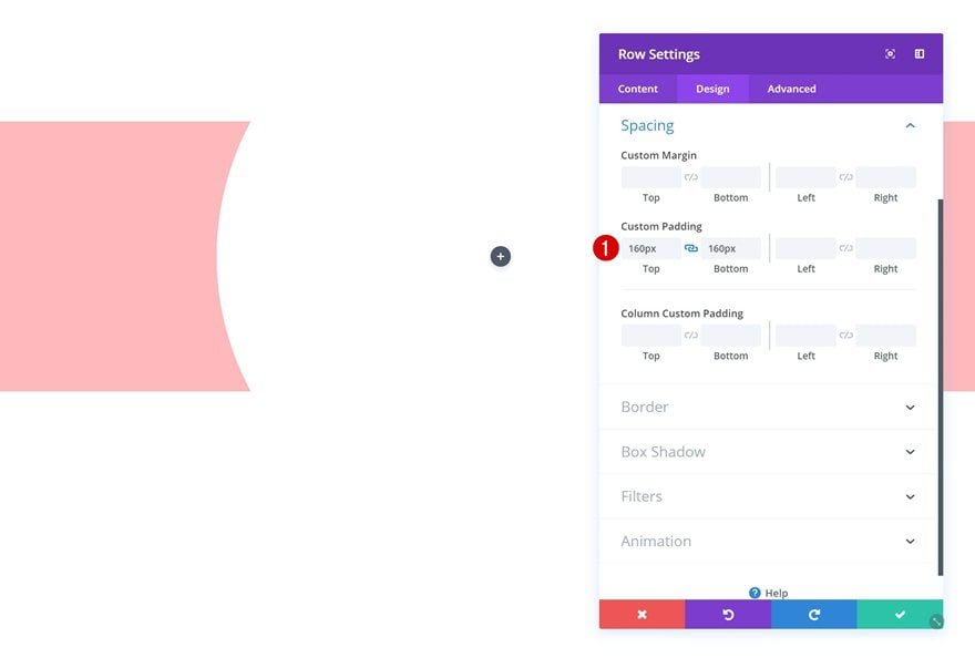
Spacing
And add some custom padding.
- Top Padding: 160px
- Bottom Padding: 160px
Add Text Module
Add Content
The first module we need is a Text Module. Go ahead and enter some content.
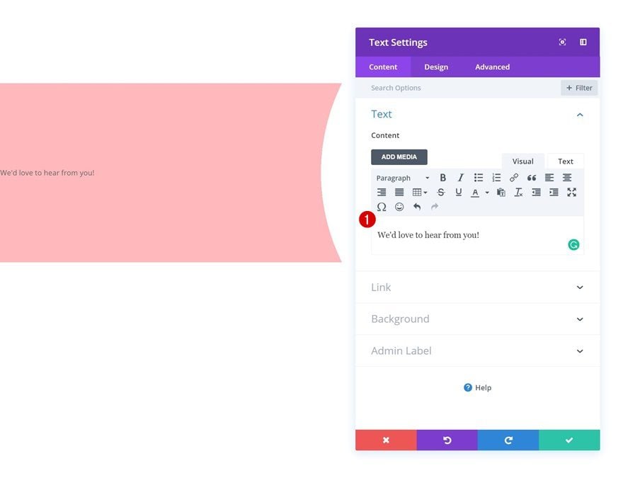
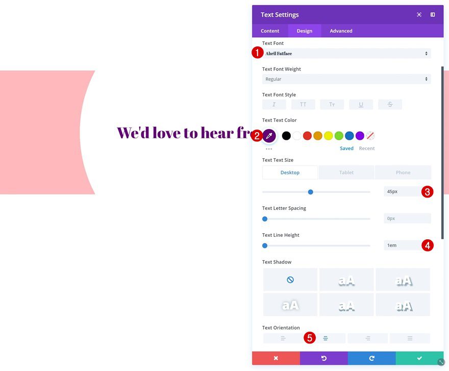
Text Settings
Change the text settings accordingly:
- Text Font: Abril Fatface
- Text Color: #640076
- Text Size: 45px (Desktop), 34px (Tablet), 20px (Phone)
- Text Line Height: 1em
- Text Orientation: Center
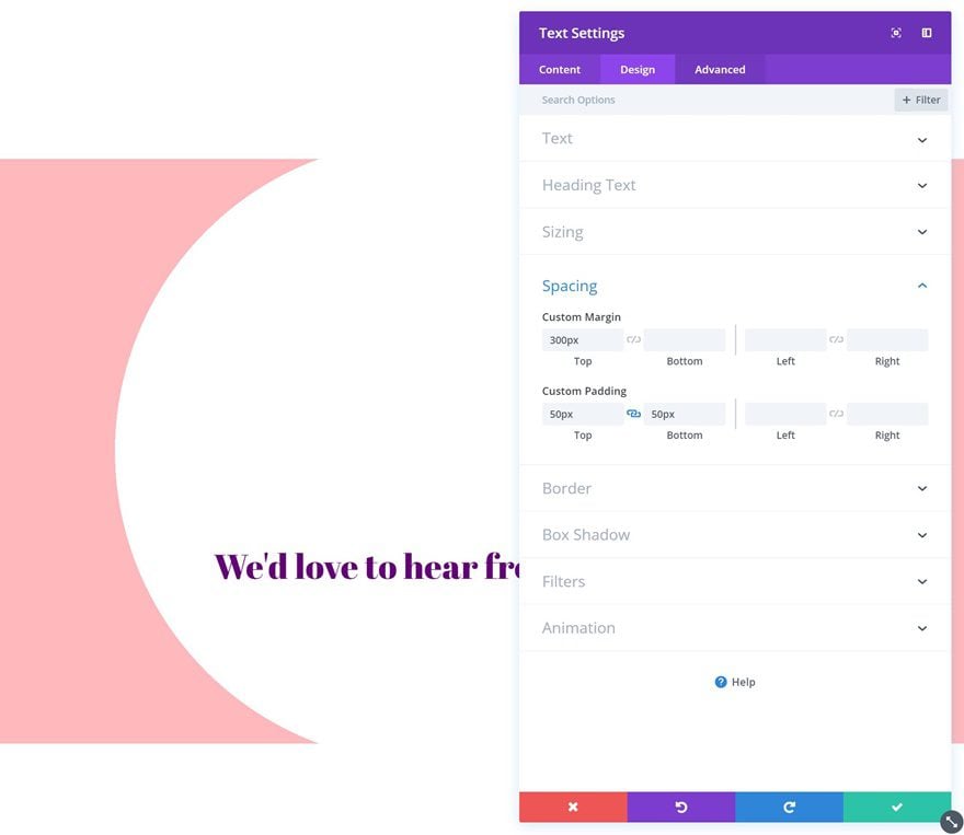
Spacing
Add some custom spacing values next.
- Top Margin: 300px
- Top Padding: 50px
- Bottom Padding: 50px
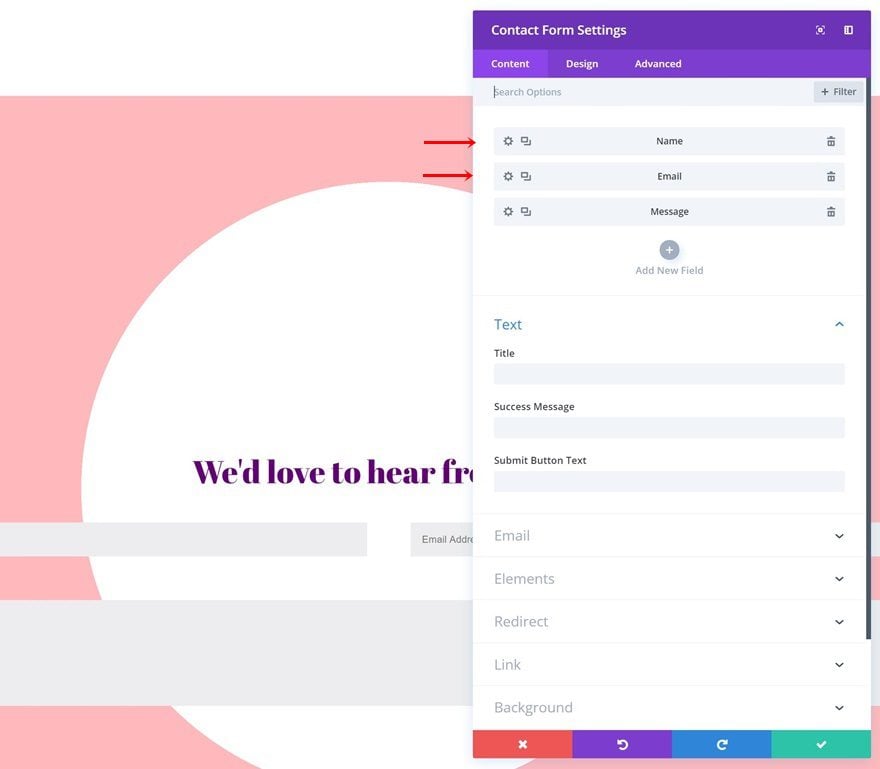
Add Contact Form Module
Enable ‘Make Fullwidth’ Option on Name & Email Field
The second and last module we need is a Contact Form Module. Open both the name and email fields and change the layout settings.
- Make Fullwidth: Yes
Elements
Then, disable the captcha option in the elements settings.
- Display Captcha: No
Form Field Text Settings
Make some changes to the form field text settings as well.
- Form Field Background Color: #fff6f6
- Form Field Text Color: #ff7c7c
Button Settings
Change the button into an icon button using the following settings:
- Use Custom Styles for Button: Yes
- Button Text Size: 88px
- Button Text Color: rgba(255,255,255,0)
- Hover Button Background Color: rgba(255,255,255,0)
- Button Border Width: 0px
- Button Icon Color: #e60085
- Only Show Icon on Hover for Button: Yes
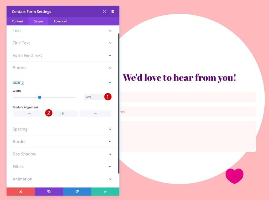
Sizing
And play around with the sizing values to make the design match all screen sizes.
- Width: 42% (Desktop), 50% (Tablet), 77% (Phone)
- Module Alignment: Center
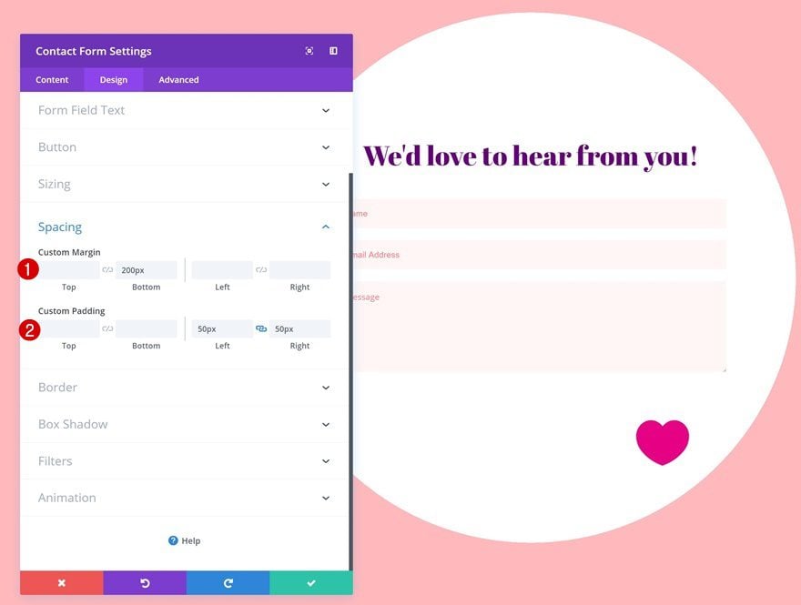
Spacing
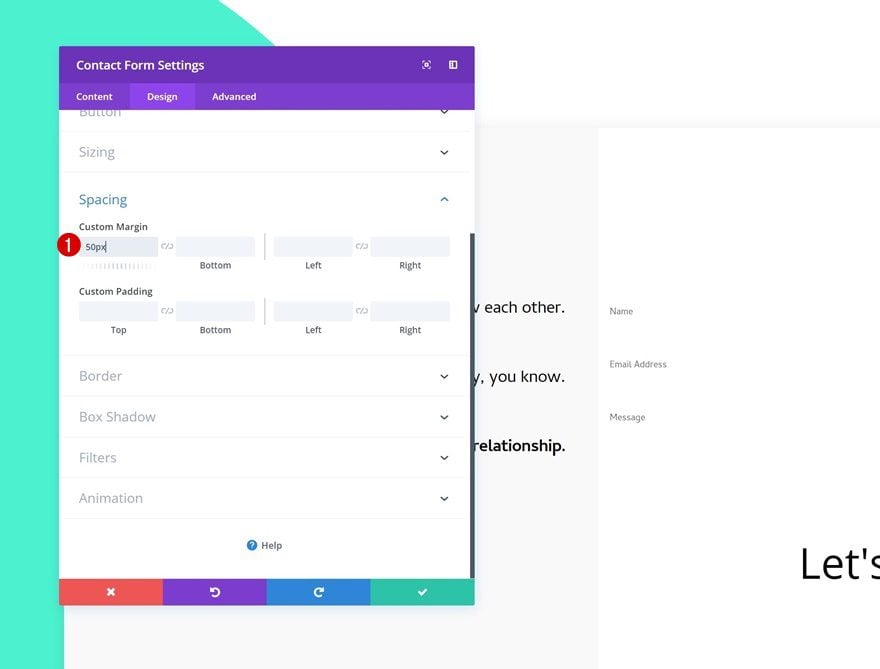
Continue by adding some custom spacing values to the module.
- Bottom Margin: 200px
- Left Padding: 50px
- Right Padding: 50px
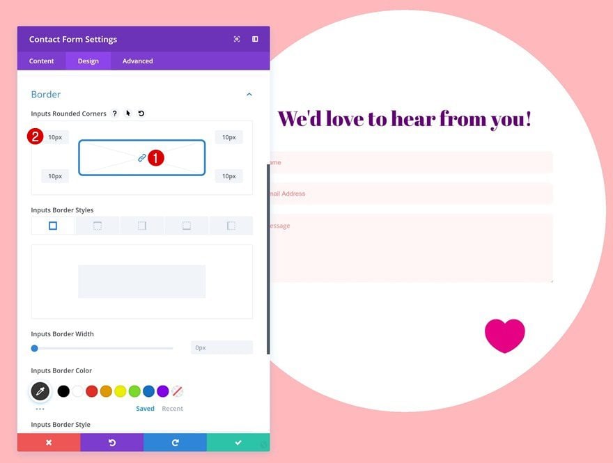
Border
And add ’10px’ to each one of the corners.
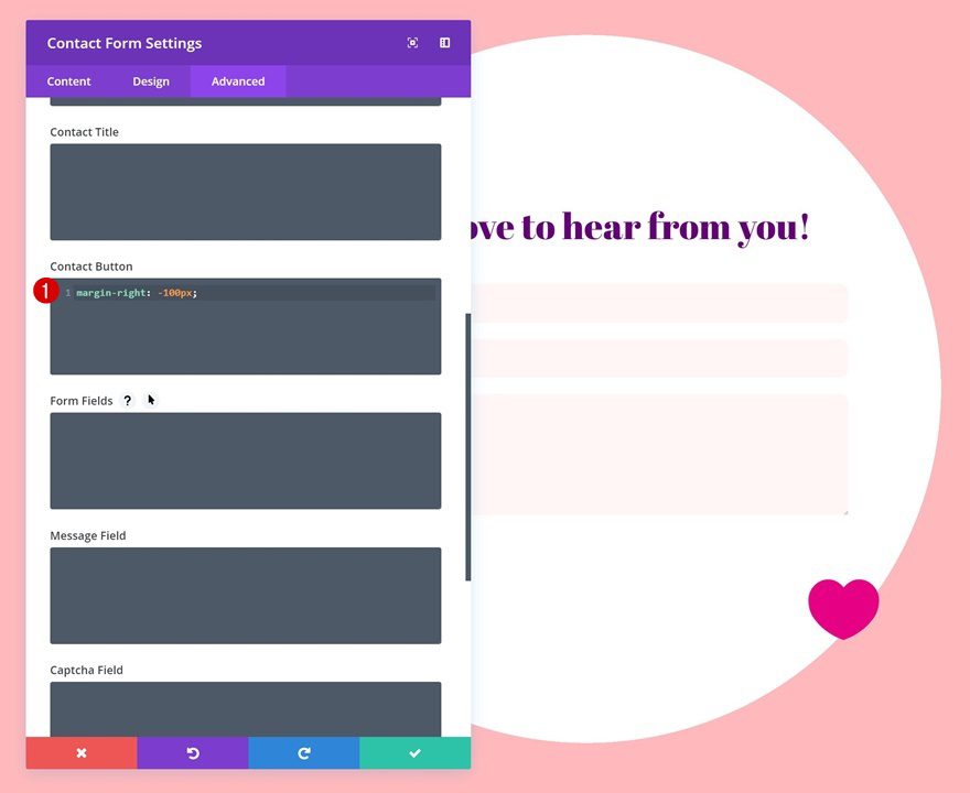
Button Margin
Last but not least, push the icon button to the right by using the following line of CSS code in the advanced tab:
margin-right: -100px;
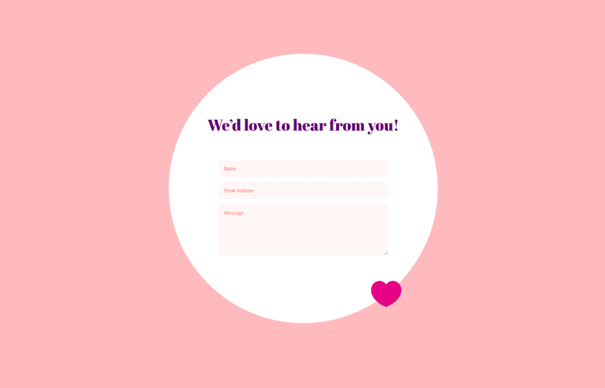
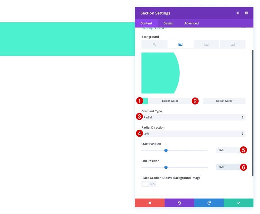
Creating Contact Form #5
Add New Section
Gradient Background
On to the last example! Add a new section with the following gradient background:
- Color 1: #4bf2d0
- Color 2: #ffffff
- Gradient Type: Radial
- Radial Direction: Left
- Start Position: 36%
- End Position: 36%
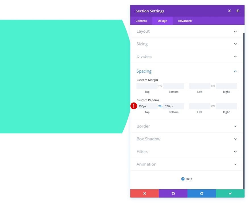
Spacing
Then, go to the spacing settings and add some custom padding.
- Top Padding: 250px
- Bottom Padding: 250px
Add New Row
Column Structure
Once you’re done modifying the section settings, add a new row using the following column structure:
Background Color
Without adding any modules yet, open the row settings and add a background color.
- Background Color: #ffffff
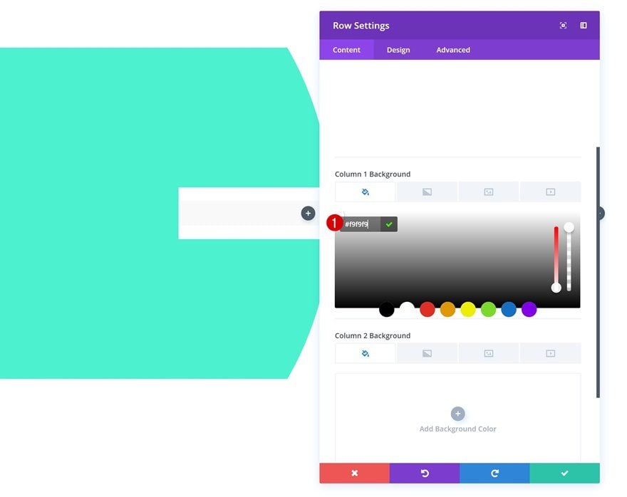
Column 1 Background Color
Add another background color to the first column.
- Column 1 Background Color: #f9f9f9
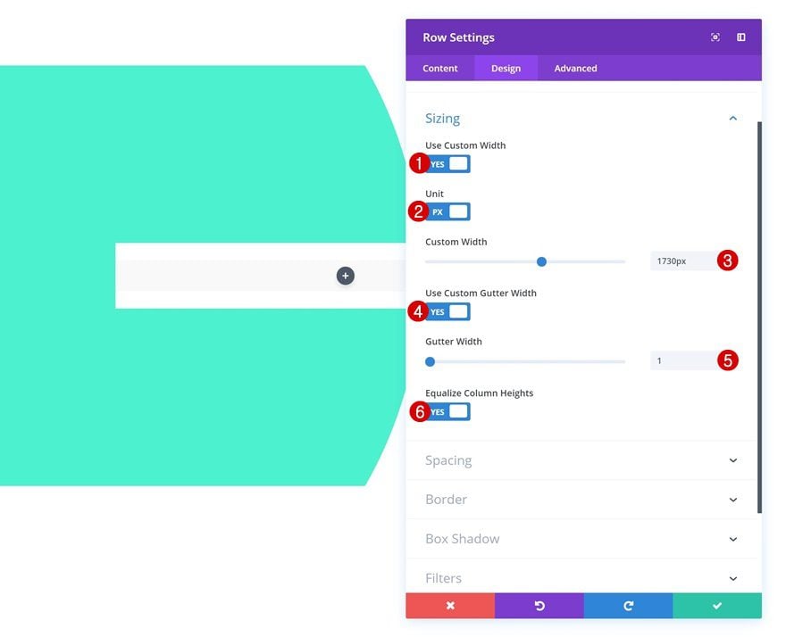
Sizing
Then, change the sizing settings of the row.
- Use Custom Width: Yes
- Unit: PX
- Custom Width: 1730px
- Use Custom Gutter Width: Yes
- Gutter Width: 1
- Equalize Column Heights: Yes
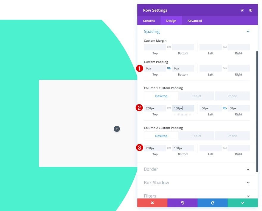
Spacing
And add some custom spacing values to match all screen sizes.
- Top Padding: 0px
- Bottom Padding: 0px
- Column 1 Top Padding: 200px (Desktop), 0px (Tablet & Phone)
- Column 1 Bottom Padding: 150px (Desktop), 0px (Tablet & Phone)
- Column 1 Left Padding: 50px
- Column 1 Right Padding: 50px
- Column 2 Top Padding: 200px (Desktop), 100px (Tablet & Phone)
- Column 2 Bottom Padding: 150px, 100px (Tablet & Phone)
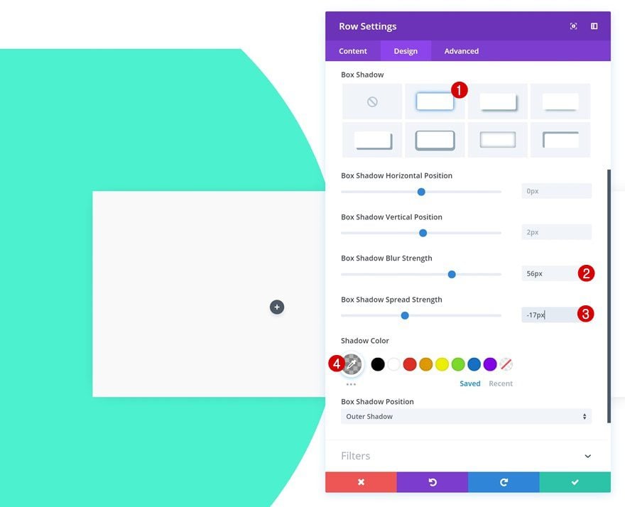
Box Shadow
The last thing you’ll need to do in the row settings is adding a subtle box shadow.
- Box Shadow Blur Strength: 56px
- Box Shadow Spread Strength: -17px
- Shadow Color: rgba(0,0,0,0.3)
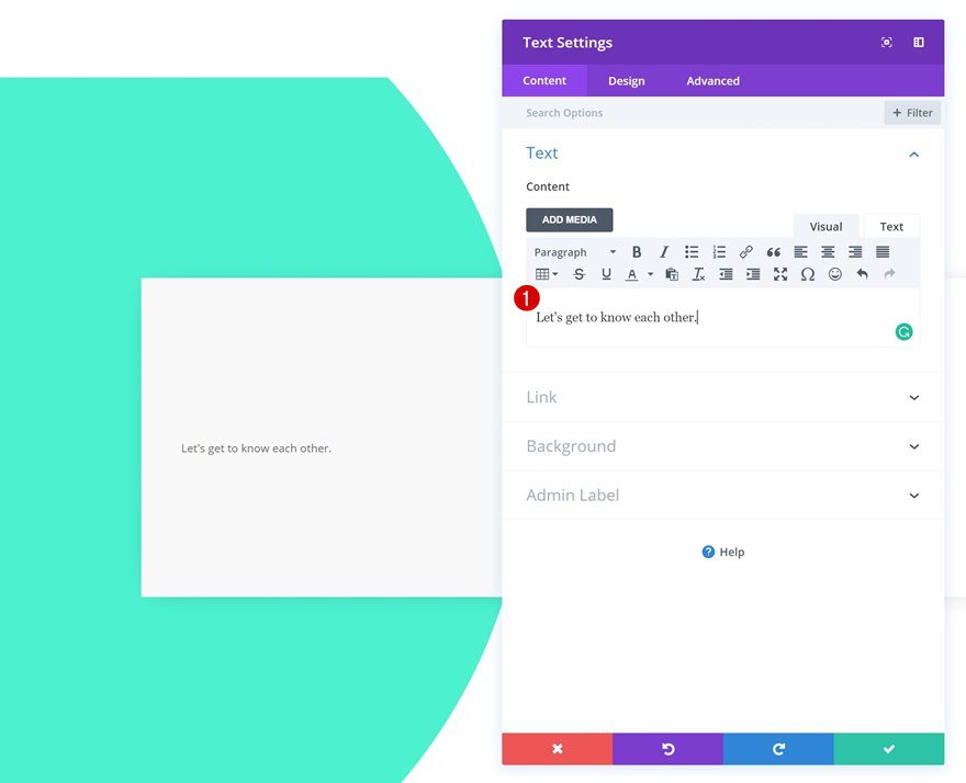
Add Text Module to Column 1
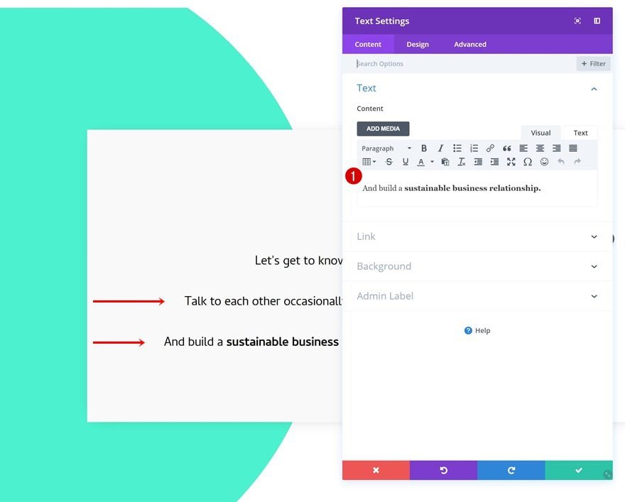
Add Content
Time to start adding modules! Add a Text Module to the first column.
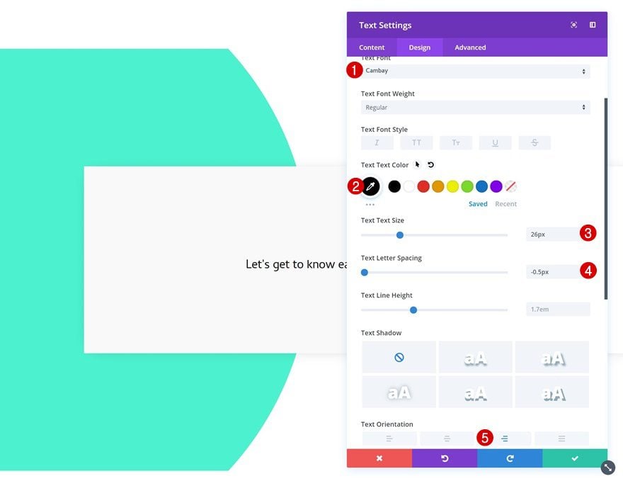
Text Settings
Once you’ve added the content, go to the text settings and make some changes.
- Text Font: Cambay
- Text Color: #000000
- Text Size: 26px
- Text Letter Spacing: -0.5px
- Text Orientation: Right
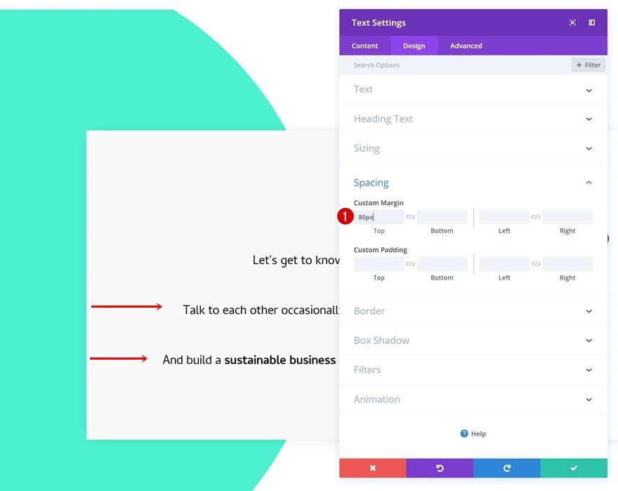
Spacing
Add some top margin as well.
- Top Margin: 60px
Visibility
And hide the module on both phone and tablet.
Clone Text Module Twice
Change Content of Both Duplicates
Once you’re done modifying the first Text Module, go ahead and clone the module twice. Change the content of both duplicates.
Change Spacing of Both Duplicates
Modify the top margin of both duplicates as well.
- Top Margin: 80px
Add Contact Form Module to Column 2
Enable ‘Make Fullwidth’ Option on Name & Email Field
The only module we need in the second column is a Contact Form Module. Open the name and email fields and change the layout settings.
- Make Fullwidth: Yes
Elements
Disable the captcha option next.
- Display Captcha: Yes
Form Field Text Settings
Then, go to the form field text settings and make some modifications.
- Form Field Background Color: rgba(255,255,255,0)
- Form Field Font: Cambay
Button Settings
And create a unique button using the following button settings:
- Use Custom Styles for Button: Yes
- Button Text Size: 64px (Desktop), 50px (Tablet), 40px (Phone)
- Button Text Color: #000000
- Color 1: #4bf2d0
- Color 2: rgba(41,196,169,0)
- Gradient Type: Radial
- Radial Direction: Center
- Start Position: 25%
- End Position: 25%
- Button Border Width: 0px
- Only Show Button on Hover for Button: No
Spacing
Add some top margin to this module as well.
- Top Margin: 50px
Border
And use a subtle bottom border for each one of the fields.
- Bottom Border Width: 0.5px
- Bottom Border Color: #000000
Individual Field Spacing
Last but not least, add the following bottom margin to each one of the fields individually and you’re done!
- Bottom Margin: 50px
Preview
Desktop
Now that we’ve gone through all the steps, let’s take a final look at the Divi contact form module designs on desktop.
Mobile
And this is what you can expect from the Divi contact form module designs on smaller screen sizes:
Final Thoughts
In this post, we’ve shared 5 beautiful Divi contact form module designs that you can easily use and modify for any website you create. Contact forms are a vital part of many websites out there so it’s important to make sure your design convinces your visitors to get in touch. If you have any questions or suggestions, make sure you leave a comment in the comment section below!
The post 5 Unique Ways to Style Divi’s Contact Form Module appeared first on Elegant Themes Blog.