It’s easy to fall into the trap of always following the latest trends when it comes to web design. However, just as with any other art form, there are some myths that you should question before considering if they’re viable for your designs.
The web design myths we’ve chosen for this article have become widespread over the past few years, but that doesn’t make them law. In this piece, we’ll explore seven myths, why they may not always be the right option, and how to go about implementing alternatives.
Let’s dig in!
Myth 1: Minimalism Is Always the Best Option
Over the past few years there’s been a switch towards minimalist design – i.e. sites that use negative space and spread out information to make the pages seem less ‘busy’. While we can’t deny minimalism looks good on occasion, it’s not always the right choice for every project.
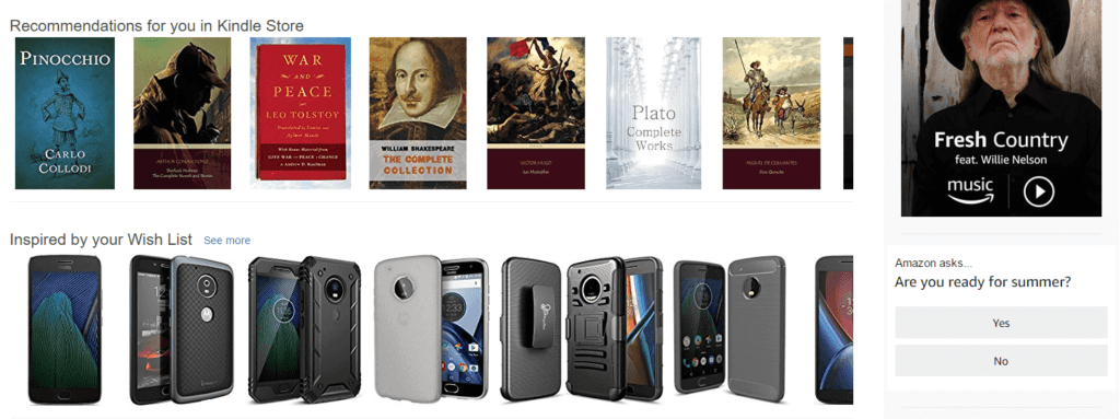
Plenty of websites without minimalist designs are quite successful – Amazon, for example.
If you’re designing a site with multiple elements that need attention, minimalism might not be the right way to go. Take Amazon, for example. Their home page is packed with items, but is no less usable. In fact, if they went minimalist, it would probably impact sales since they wouldn’t be able to display as many product recommendations per page.
As with any trend, the key is to ask yourself whether the website you’re designing is really a good fit for it. Here’s a handy checklist to help you when it comes to minimalism:
- If you were to use a minimalist design, would you be leaving key elements out? In this case, you probably should steer away from it.
- Is all of the information on your pages relevant? If so, you might be able to streamline your design for a more minimalistic look, without impacting its usability.
If you do decide to go the minimalistic route – and you’re sure that it’s a good fit – don’t let your use of negative space get out of hand. In short, it should be all about enhancing key elements of your site and not making them difficult to find.
Myth 2: User Feedback Should Guide Your Every Choice
Let’s clear up something right off the bat – user feedback is crucial to creating a design that both you and your clients can be proud of. However, there are some occasions where listening to your instincts should trump the recommendations of your users.
For example, imagine your client has asked you to make their website entirely animation-based. For those who remember Flash in the early 2000s, that thought alone is probably enough to make you shiver. In this case, you’d likely want to guide the client towards a different design choice – ideally one you’ve gone to bat for.
The question is, how do you know when it’s necessary for you to step in and look beyond your user or client feedback? Here are two situations where it’s definitely warranted:
- If your users are asking you to implement a design element that would impact the usability of the final product.
- Whenever a client suggests you modify your designs in a way that would render them less usable or attractive.
Naturally, dealing with clients is going to be much harder than with end users. However, as a designer, you should always speak up and try to explain why making a particular change might hurt the final product so you and your clients are on the same page.
Myth 3: Usability is Enough to Propel a Site to Success
It goes without saying that you want your designs to be both stylish and usable – individually, neither are enough to propel a site to success. To put it simply, it doesn’t matter if your site works perfectly if it looks terrible.
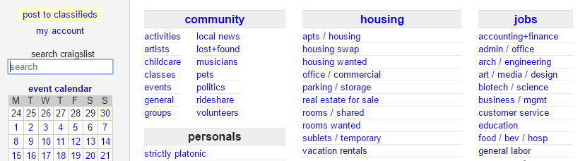
Craigslist offers an excellent example of an unattractive, yet useable design.
If you currently design websites, you’ll likely already ensure they look fantastic. It’s critical because a lot of times users will make snap judgments about a site due to its looks. Your first hurdle is to make sure the design looks great at first glance in order to give visitors the best opportunity to stick around and interact with it.
There isn’t a single universal way to improve a site’s design. However, there are a couple of techniques you should consider employing if you feel that your designs aren’t hitting the mark:
- A/B test key elements on your pages one by one and make gradual improvements.
- Look for inspiration in sites you consider attractive to update your style.
Both of these techniques can involve a lot of work. The good news is that once you have a great design, it’ll have a longer shelf life. In fact, a lot of popular sites go years without major updates to their designs – ours for example (up until recently)!
Myth 4: Menus Need to be Streamlined
In the past, we’ve talked about how simplifying your menus can help improve usability on your site. We still stick by it, there are some sites that need to add a bit of complexity to their menus.
Complex menus aren’t necessarily a poor design choice.
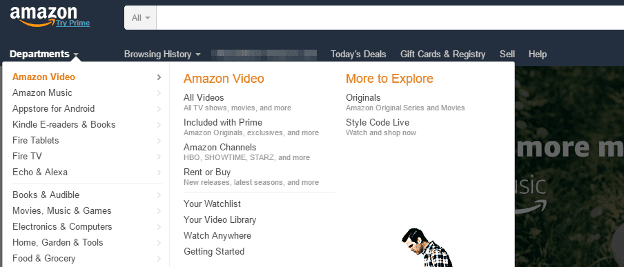
Let’s return to the Amazon example. They employ gigantic mega menus, but they’re not confusing due to their structure. Most importantly, the complex menus are an inherent part of the website – without them, you’d need to rely entirely on the search function.
To put it simply, if your site has many important pages, you should add as many items as necessary to your navigation menu. The key to making this work is to keep things simple. Here’s how we do it:
- Use multi-level menus if you need to include more pages.
- Separate your links according to categories to make them easier to locate.
- Make sure each of your links is still clearly readable, even on sub-menus.
Extensive menus can be intimidating if you’re visiting a site for the first time, but no more so than trying to find content without them.
Myth 5: Your Home Page is the Most Important Element
Home pages are one of the most important parts of any website – there’s no denying that. However, you shouldn’t give it so much importance that you overlook the rest of your site’s design.
Sometimes ‘secondary pages’ are the true heroes on a website.
The good news is that if you already have an excellent home page on your hands, you’re well on your way to a successful site. All it takes now is making sure your other pages don’t look like afterthoughts. If you’re using the Divi theme, you can check out some of our pre-built layouts to give the rest of your site a quick facelift, such as:
- Three Free Beautiful Project Page Layouts.
- The Free Divi Contact Pages Layout Pack.
- The Profile Pages Layout Pack.
Over the years, we’ve built up a rather large library of content for Divi, and you can check out some more of our free layouts here.
Myth 6: Everything Must Be Within a Three-Click Reach
There’s a longstanding ‘rule’ when it comes to website design: every piece of content should be reachable within three clicks. The reasoning behind this is simple – if something is hard to find, your users might get frustrated and bail.
Sometimes, it’ll take more than three clicks to get where you want to go.
However, the truth is there’s no data to back up this rule, despite how prevalent it has become among web designers. In fact, users apparently have no problem clicking around until they find what they’re looking for. Here’s what that means for you:
- Multi-level designs shouldn’t perform any worse than ones with less content.
- You don’t need to optimize your content based on the three-click rule, but it still should follow a logical structure.
The last point is particularly important. Altough users aren’t as quick to give up on their search as we all thought, that doesn’t mean they’ll put up with disorganized websites. If your designs aren’t easy to use, chances are you might scare them off too.
Myth 7: You Should Cater to Distracted Mobile Users
When it comes to mobile design, there’s a major misconception about the way users engage with their devices – the idea that we’re always ‘on the go.’ This school of thought states that since you’re catering to a distracted crowd, you should streamline your mobile designs and keep things simple.
Responsive design doesn’t need to sacrifice complexity to look great.
The truth is, these days most people spend more time using smartphones and other similar devices than desktop computers. Here are the two most important ways this development impacts you as a designer:
- You need to think from a mobile-first perspective. That is to say, optimize your designs for smaller viewports first.
- The myth of the distracted mobile user isn’t wholly accurate, so there’s no need to ‘dumb-down’ your designs. In fact, stripping down your site for mobile devices may hurt your popularity among what could be your biggest demographic.
As far as this myth goes, it might have been more accurate during the dawn of smartphones. However, these days most devices pack enough power for a comparable browsing experience to a full desktop computer. That means you don’t need to hold back on your designs anymore.
Conclusion
Staying on top of the latest web design trends can be useful if you’re looking for inspiration, or if you want to catch up on new developments. However, as every designer knows, no two projects are alike. Questioning prevalent web design myths isn’t about being contrary – it’s about deciphering what’s best for each of your projects.
When it comes to web design, these are the seven myths you should consider leaving in the past to make way for the future:
- Minimalism is always the best option.
- User feedback should guide your every choice.
- Usability is enough to propel your site to success.
- Navigation menus should be streamlined.
- Your homepage is the most important part of your site.
- Everything must be reachable within three clicks.
- You should cater to distracted mobile users.
Which of these web design myths do you think is the most impactful and why? Share your thoughts with us in the comments section below!
Article image thumbnail by Bloomicon / shutterstock.com
The post 7 Web Design Myths You Need to Leave in the Past appeared first on Elegant Themes Blog.