
It’s that time again for our monthly Divi Showcase where we take a look at several awesome Divi websites made by our community members. Every month we showcase the best Divi websites that were submitted from our community and today we want to share with you the top ten websites for the month of November. Throughout the post I’ll point out some of my favorite features from each of the sites.
I hope you like them!
The Best Community Divi Site Submissions for November 2017
1. StartUP
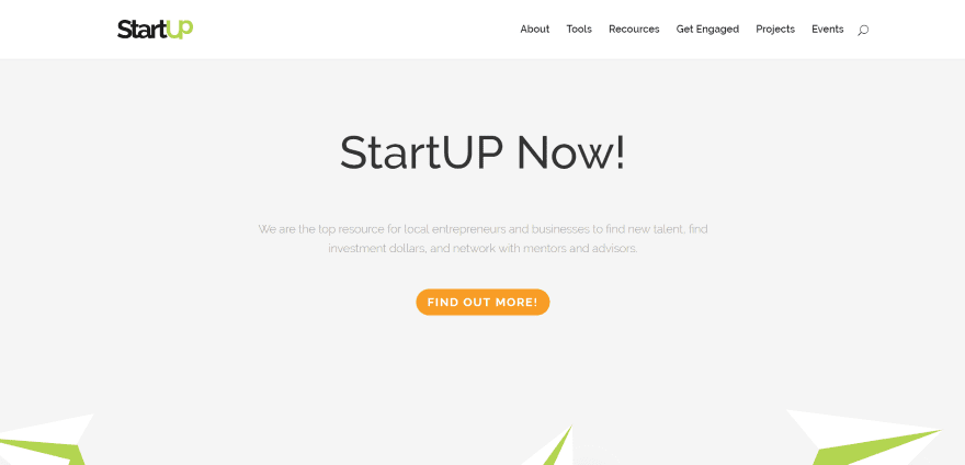
This site was submitted by Georgios Ntouvels. The site uses a clean minimal design with a green and orange color scheme. Green is used for highlights, especially within the flat graphics, and orange is used for all of the buttons including the back-to-top button. The sections display graphics and CTA’s in two alternating columns that draw attention to the CTA.
2. Future 500 ID Camp
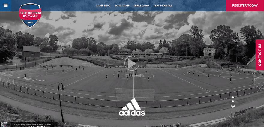
This site was submitted by Greg Dietrich. It includes an impressive video header that loops a hi-res video of the camp with sections in color and others in black and white. Red and blue are used throughout the site as branded colors behind backgrounds, as overlays, as text and buttons, and icons. It includes an overlapping logo, CTA in the menu, and a sticky contact us button.
3. Country is the New City
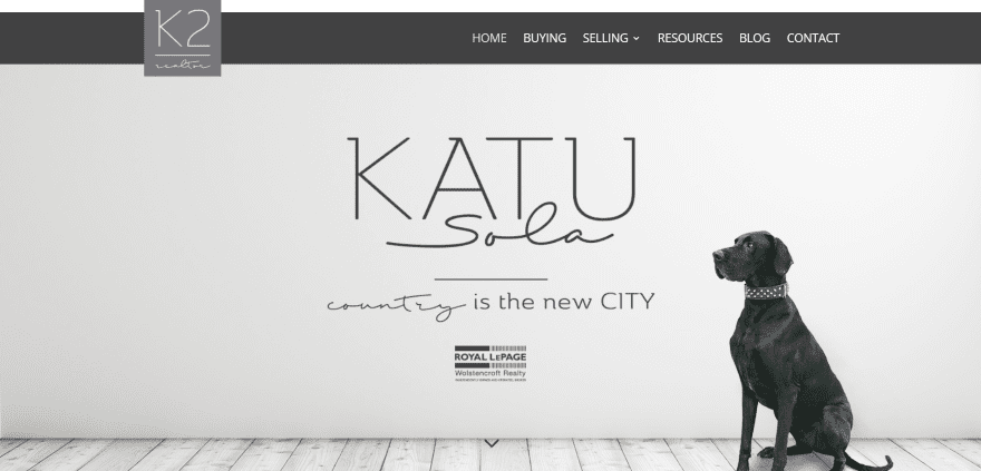
This site was submitted by Kristy Hill. It has an interesting menu that shows through the top on scroll with the logo overlapping both the top and bottom of the menu. The second section is a full-screen image slider without controls to show off the homes. Listings are displayed with IDX. The colors in the section backgrounds look elegant and inviting. The site makes excellent use of color, images, and fonts.
4. Ben Hysa
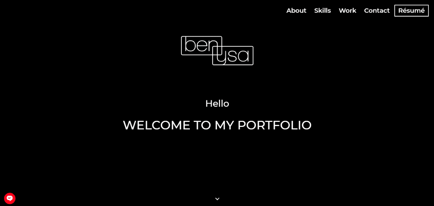
This site was submitted by Arben Husic. It has lots of interesting animations throughout. As the site loads the only thing that displays is the logo, which is revealed through animation. After the animation stops everything else, including the menu, slowly appears. Small animations reveal the various elements of the sections as you scroll including the unique skills section that lists Photoshop, Illustrator, WordPress, etc. The site also includes a cool dot navigation feature.
5. Tom Farina
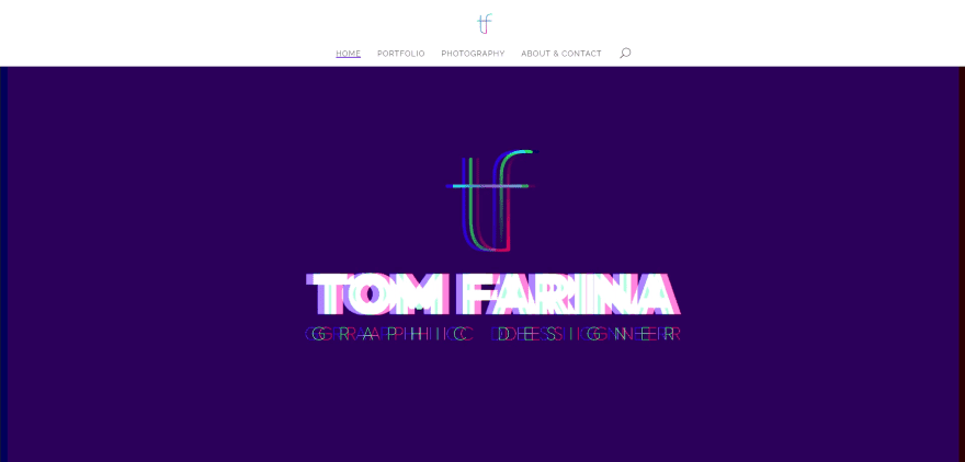
This site was submitted by Tom Farina. It includes an animated logo against a dark blue background full-screen header. The cool ‘static’ and ‘out of sync’ animation sometimes affects the background. The portfolio sections are full-screen. They’re revealed in parallax as you scroll through the site and displays buttons to the various portfolio pages. The contact page includes an overlapping contact form. The menu includes hover animation.
6. Touramisu
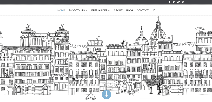
This site was submitted by Laura Goyer. The site uses an interesting animation as the header with the buildings in place and traffic driving by and wind blowing. I especially like the large circled numbers in the numbered blurbs. The blog makes interesting use of CTA’s and Instagram feed in the sidebars. The large typography and dark gray, red, and blue give the site an elegant look and feel.
7. Becky Lord
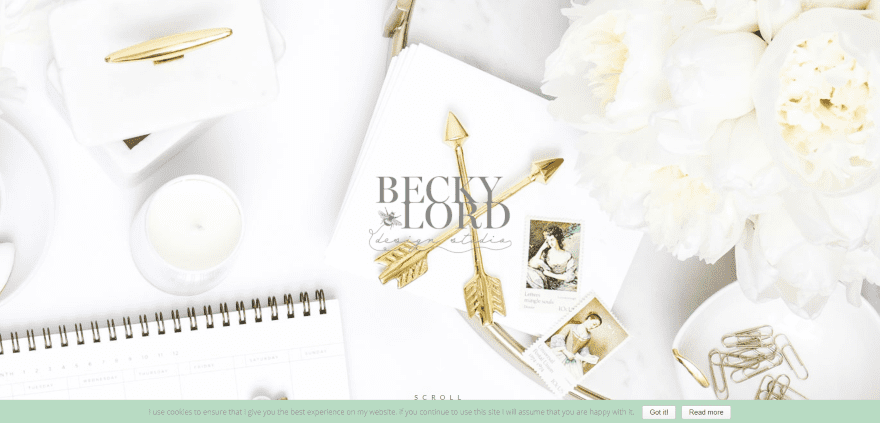
This site was submitted by Madeleine Jones. The site is both soft and elegant in its choice of colors, typography, and imagery. The homepage is simple enough that it doesn’t need a menu for navigation. Links to the various pages and services are provided through blurbs. Other pages do include a menu and retain the elegance of the homepage perfectly.
8. Butler Foods
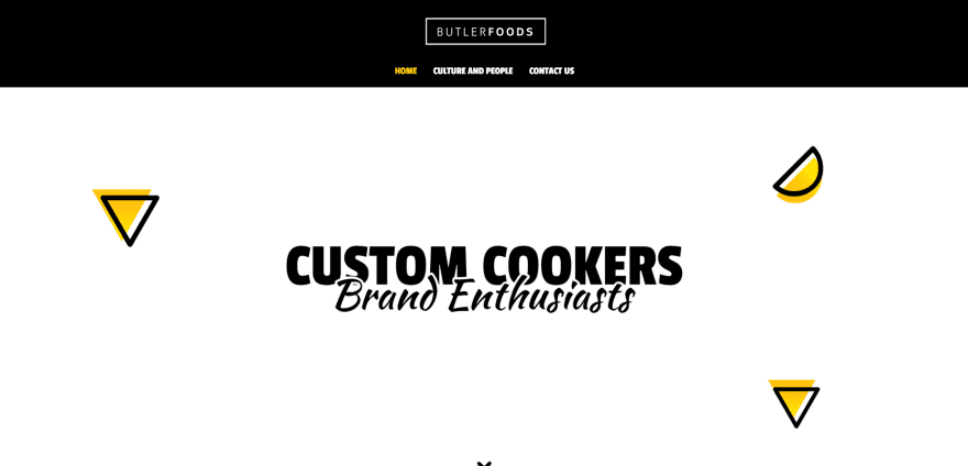
This site was submitted by Monique Brooks. The site blends backgrounds and foregrounds with images and text in true parallax. Large typography is used for headings. Yellow and black are used as branded colors throughout the site. The icons are placed within squares with patterned backgrounds and have touches of yellow. The site is simple but effective.
9. Juliette Surprise
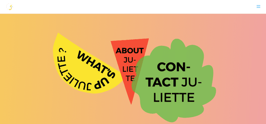
This site was submitted by Juliette Le Moine. The site follows the brutalist design trend that we covered in 10 Brutalist Websites to Inspire Your Next Web Design Project. Both the header and background of the website change colors. Parallax sections include patterns for both the foreground and background that blend and strike across each other. Image sliders sometimes reveal the background patterns. The site is a great example of brutalist design.
10. Madia Bio
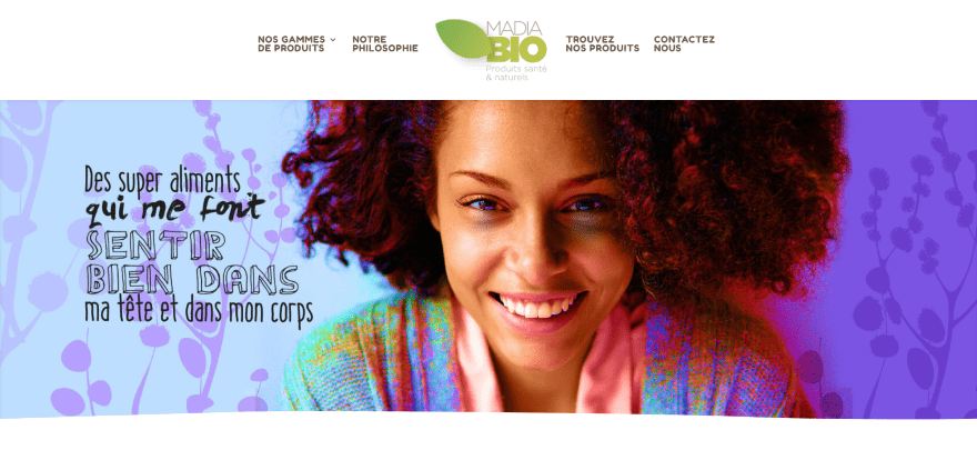
This site was submitted by Yann Boutin. This site makes great use of background patterns including the products that are displayed within backgrounds that feature elements from the product packaging and information boxes that overlap sections, which use rounded section separators. A green overlay displays a CTA over a map. Links to pages use cartoons that stands out in design but matches the site in color. The site makes excellent use of color and fonts.
In Closing
That’s our 10 best community Divi site submissions for November. The sites look amazing and as always we want to thank everyone for your submissions!
If you’d like your own design considered please feel free to email our editor at nathan at elegant themes dot com. Be sure to make the subject of the email “DIVI SITE SUBMISSION”.
We’d also like to hear from you in the comments! Tell us what you like about these websites and if there is anything they’ve done you want us to teach on the blog.
Featured image via Alhovik / shutterstock.com
The post Divi Design Showcase: New Submissions from November 2017 appeared first on Elegant Themes Blog.