
Creating a grid layout for your blog is a great way to organize your posts. Divi makes this extremely easy with the Blog Module. In just a few seconds you can deploy a functioning blog grid layout to your page. And you can even utilize the many design settings to customize the look of your blog grid in many ways. But today, I’m taking things to another level.
In this tutorial, I’m going to show you how you can create multiple background layers to frames your three-column blog grid with a beautiful and symmetrical design. Hopefully, you can use these design techniques to create a blog page guaranteed to impress.
Let’s get started.
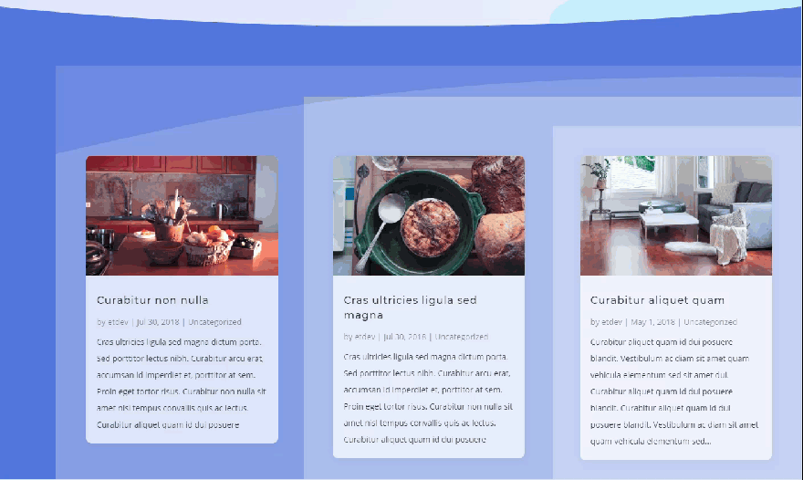
Sneak Peak of the Grid Layout Design
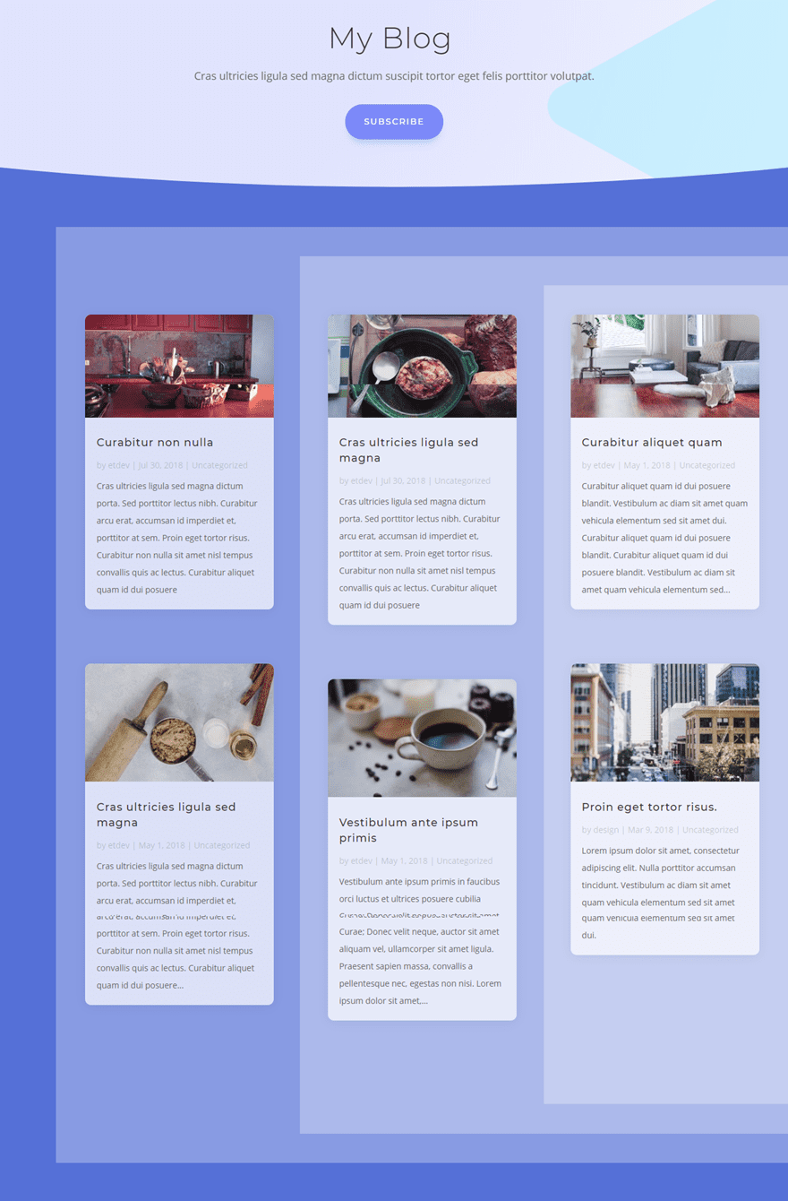
Here is a sneak peek of the design.

Getting Started
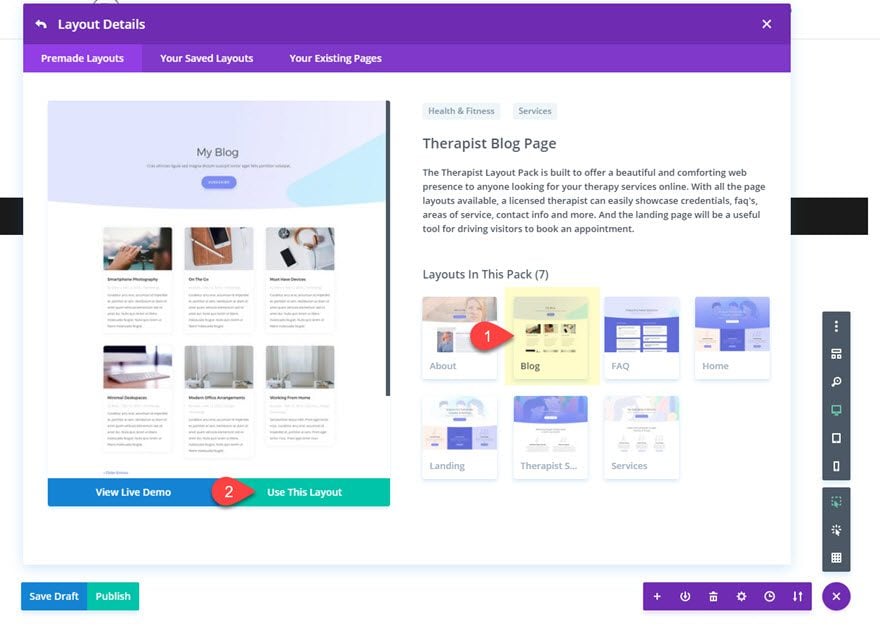
All you need is Divi for this tutorial. Once you have the Divi Theme installed and active, create a new page and give you page a title. Then deploy the Visual Builder. Select “Choose a Premade Layout” and then upload the Therapist Blog Page Layout to your page and publish it.
Make sure you have at least 6 blog posts with content and featured images. If you don’t, the blog posts will not show up on the page.
Now you are ready to start editing.
Add the First Background Layer to the Section
The custom design is going to be added to the second section of the layout holding the blog module. To create our first background layer, we are going to style the section settings as follows:
Background Color: #5873dd
Custom Padding (desktop): 4vw Top, 4vw Bottom, 7vw Left
Custom Padding (tablet): 0vw Left
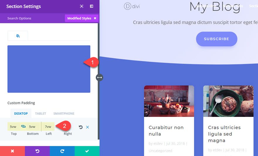
The custom 7vw left padding basically offsets the content of the section (the row) for a unique look. If you want everything nice and centered for you design you can leave that out.
Add the Second and Third Background Layers to the Row
The second and third background layers will be created by adding a background color to the whole row and then a background gradient to the column within the row.
Open the row settings and update the following:
Background Color: rgba(255,255,255,0.3)
Column 1 Background Left Color: rgba(255,255,255,0.0)
Column 1 Background Right Color: rgba(255,255,255,0.3)
Column Gradient Direction: 90deg
Column Start Position: Column Start Position: 33.3%
Column End Position: 0%
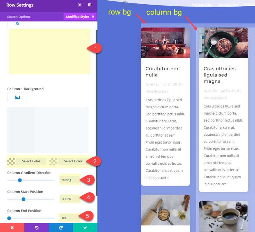
Notice that I’m using a white color with 30% opacity in order to create a consistent degree of white overlay colors that allow the blue section background to show through. As each color overlaps, the user sees a 30% lighter version of the blue section background. This way if you ever want to change the color scheme of the layout, all you will have to do change the section background color.
Setting the column gradient start position to 33.3% ensures that the gradient will divide right between the first and second column of my blog grid. But this won’t look correct initially because we still need to give our row a custom width of 100% among other things.
Custom Width: 100%
Gutter Width: 4
Custom Padding: 4% Top, 4% Bottom
The custom padding exposes the layers vertically to add to the overall design.
Save settings.
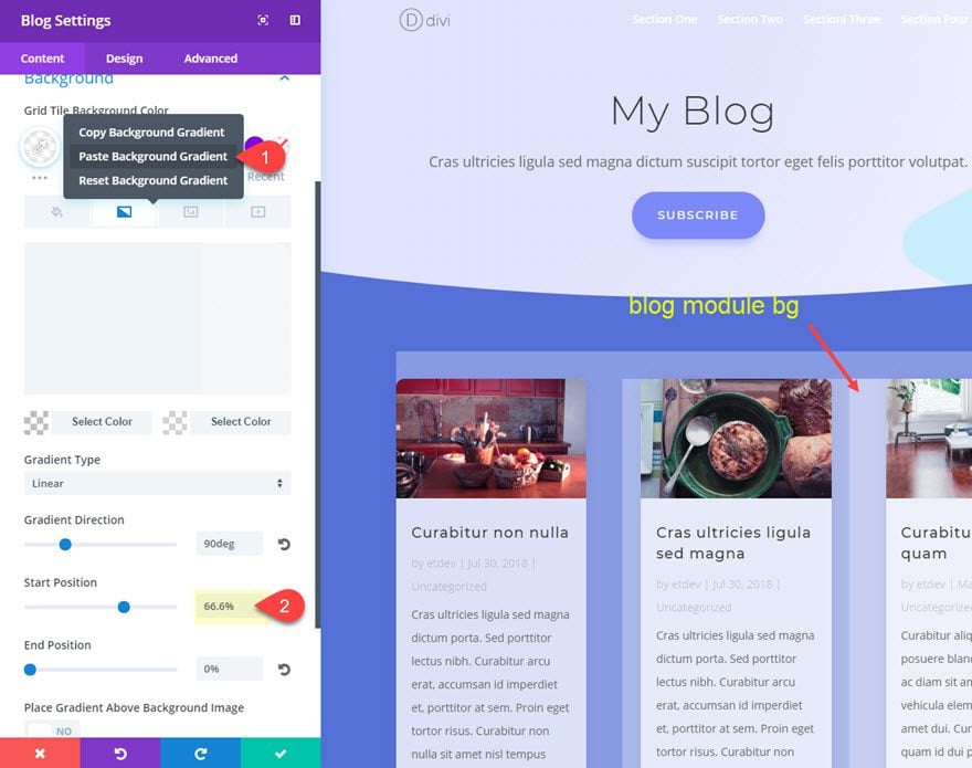
Adding the Fourth Background Layer to Our Blog Module
This is where everything falls into place. The fourth and final layer will be a background gradient added to our blog module. Then with the exact spacing added, the blog module will align perfectly with our background layers. I’ll also be adding a few style tweaks to the blog cards to add some final touches.
Go to the blog module settings and update the following:
Grid Tile Background Color: rgba(255,255,255,0.7)
To add the background gradient, you can go over to the row settings and copy the column 1 background gradient and then come back to the blog settings and paste it in using the right click options.
Then update the following:
Start Position: 66.6%
Custom Margin: 4% Top, 4% Bottom
Custom Padding: 4% Top, 4% Bottom, 4% Left, 4% Right
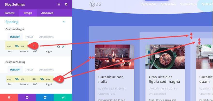
As you can see the 4% length value is used throughout to give equal spacing to our design. And there is more to this 4% value than meets the eye. If you remember, we set our row to have a custom gutter width of 4. In Divi, if you add a blog module with a grid layout to a row with a 4 gutter width, your blog grid columns will be horizontally separated by 8% of margin. So, adding the 4% of left and right padding to the module will create the exact spacing we need.
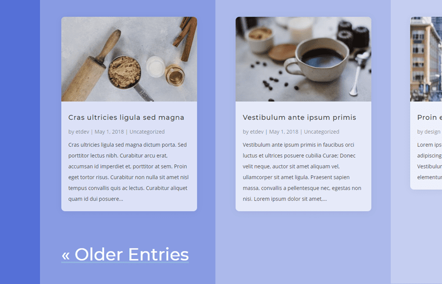
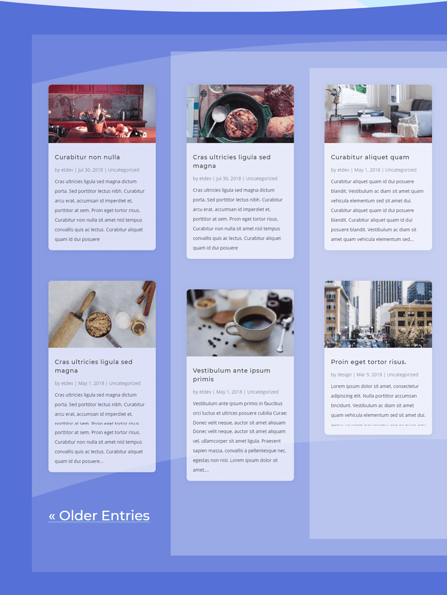
At this point, we are done with the background design. Check out what we have so far.
Now all we need to do is add a few final touches to the blog module.
Final Touches
Under the design tab of the Blog Module Settings, update the following:
Body Text Color: rgba(0,0,0,0.8)
Meta Text Color: rgba(0,0,0,0.5)
Pagination Font Style: Underline
Pagination Underline Color: rgba(166,221,217,0.39)
Pagination Text Color: #ffffff
Pagination Text Size: 3vw(desktop), 40px(tablet), 30px(smartphone)
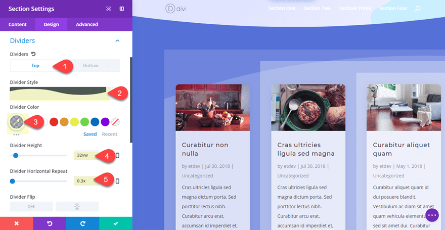
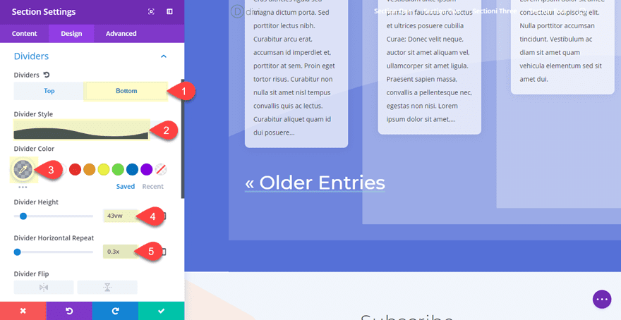
If you want to give your design a bit more texture, you can add divider backgrounds to your section.
Divider Top: See Screenshot
Divider Color: rgba(88,115,221,0.5)
Divider Height: 32vw
Divider Horizontal Repeat: 0.3X
Divider Bottom: See Screenshot
Divider Color: rgba(88,115,221,0.5)
Divider Height: 43vw
Divider Horizontal Repeat: 0.3X
Now Check out the final result…
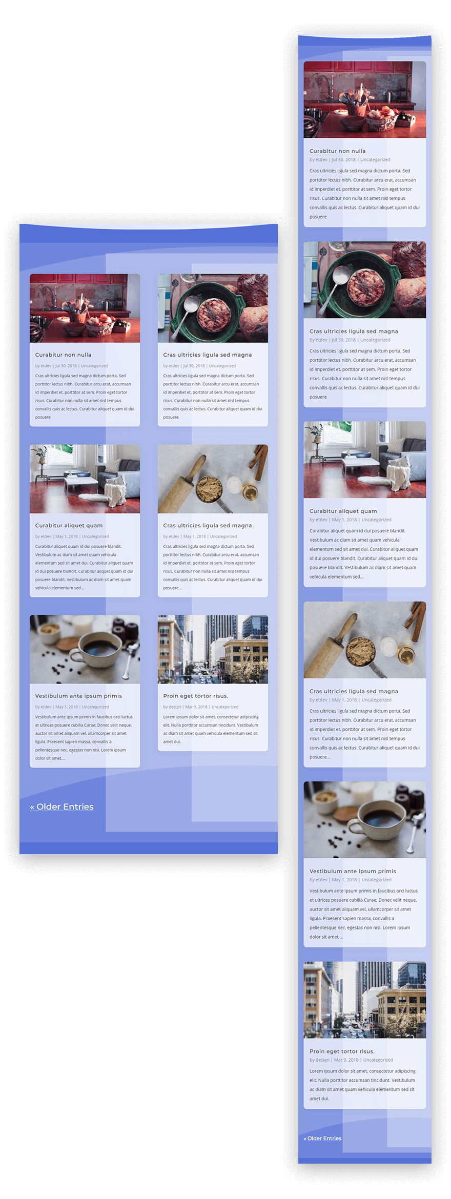
Responsive Design
The layers that frame the columns of the grid scale perfectly on all desktop browser sizes.
Although the background layers will not adjust for two columns on tablet and one column on smartphone, the result is still very symmetrical and provides a subtle broken grid design that works well.
Here is what it will look like on mobile…
Final Thoughts
This layered background technique is really a way to create the impression of having three column backgrounds where there is actually only one column (since the blog module sits in one column). Sure this is possible to do in custom CSS at the blog module level, but I thought it would be more helpful to give a creative solution using on the Divi Builder. And variations of the design can be used as a backdrop of other content as well.
I tried to explain the reasoning behind some of the styling used in this tutorial, but if you have questions, I’m all ears. And, for those of you hoping to spice up your blog grid layout, hopefully this post will at least give you some design tips to do just that.
I look forward to hearing from you in the comments.
Cheers!
The post Upgrade Your Divi Blog Page with a Background Designed for the Grid Layout appeared first on Elegant Themes Blog.