
Section Dividers continue to be a popular Divi design element. There are many divider styles to choose from with helpful options that make it easy to add unique transitions and backgrounds to your page.
In this tutorial, we are going to use section dividers a bit differently. Divi allows you to adjust the height and arrangement of each divider. This allows us to position dividers above certain areas or content within the section. By using the hover option for divider height, we can add unique hover effects that reveal partially hidden content. This works great for drawing attention to a particular call to action or button that you want visitors to click.
Let’s get started.
Sneak Peek
Download the Section Divider Height Hover Effects for FREE
To lay your hands on the letter animation designs from this tutorial, you will first need to download it using the button below. To gain access to the download you will need to subscribe to our Divi Daily email list by using the form below. As a new subscriber, you will receive even more Divi goodness and a free Divi Layout pack every Monday! If you’re already on the list, simply enter your email address below and click download. You will not be “resubscribed” or receive extra emails.
@media only screen and ( max-width: 767px ) {.et_bloom .et_bloom_optin_1 .carrot_edge.et_bloom_form_right .et_bloom_form_content:before, .et_bloom .et_bloom_optin_1 .carrot_edge.et_bloom_form_left .et_bloom_form_content:before { border-top-color: #ffffff !important; border-left-color: transparent !important; }
}.et_bloom .et_bloom_optin_1 .et_bloom_form_content button { background-color: #f92c8b !important; } .et_bloom .et_bloom_optin_1 .et_bloom_form_content .et_bloom_fields i { color: #f92c8b !important; } .et_bloom .et_bloom_optin_1 .et_bloom_form_content .et_bloom_custom_field_radio i:before { background: #f92c8b !important; } .et_bloom .et_bloom_optin_1 .et_bloom_border_solid { border-color: #f7f9fb !important } .et_bloom .et_bloom_optin_1 .et_bloom_form_content button { background-color: #f92c8b !important; } .et_bloom .et_bloom_optin_1 .et_bloom_form_container h2, .et_bloom .et_bloom_optin_1 .et_bloom_form_container h2 span, .et_bloom .et_bloom_optin_1 .et_bloom_form_container h2 strong { font-family: “Open Sans”, Helvetica, Arial, Lucida, sans-serif; }.et_bloom .et_bloom_optin_1 .et_bloom_form_container p, .et_bloom .et_bloom_optin_1 .et_bloom_form_container p span, .et_bloom .et_bloom_optin_1 .et_bloom_form_container p strong, .et_bloom .et_bloom_optin_1 .et_bloom_form_container form input, .et_bloom .et_bloom_optin_1 .et_bloom_form_container form button span { font-family: “Open Sans”, Helvetica, Arial, Lucida, sans-serif; } p.et_bloom_popup_input { padding-bottom: 0 !important;}

Download For Free
Join the Divi Newlsetter and we will email you a copy of the ultimate Divi Landing Page Layout Pack, plus tons of other amazing and free Divi resources, tips and tricks. Follow along and you will be a Divi master in no time. If you are already subscribed simply type in your email address below and click download to access the layout pack.
You have successfully subscribed. Please check your email address to confirm your subscription and get access to free weekly Divi layout packs!
To import the layout to your page, simply extract the zip file and drag the json file into the Divi Builder.
Let’s get to the tutorial shall we?
What You Need to Get Started
To get started, you will need to have the following:
- The Divi Theme installed and active
- A new page created to build from scratch on the front end (visual builder)
- A few mock images to use in the design. I will be using a few images with transparent backgrounds from out Juice Shop Layout Pack.
After that, you are ready to start!
Implementing the Section Divider Height Hover Effect Design in Divi
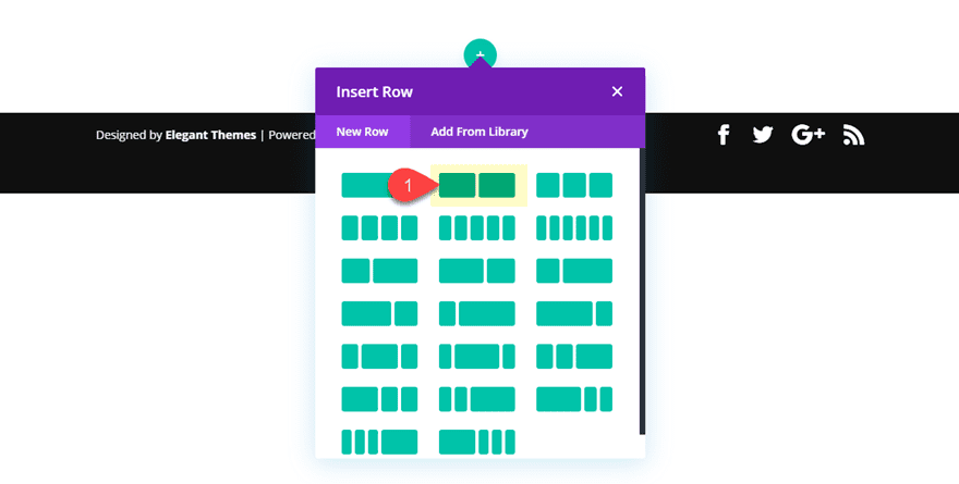
Creating the Section and Row
First, let’s create a regular section with a two column row.
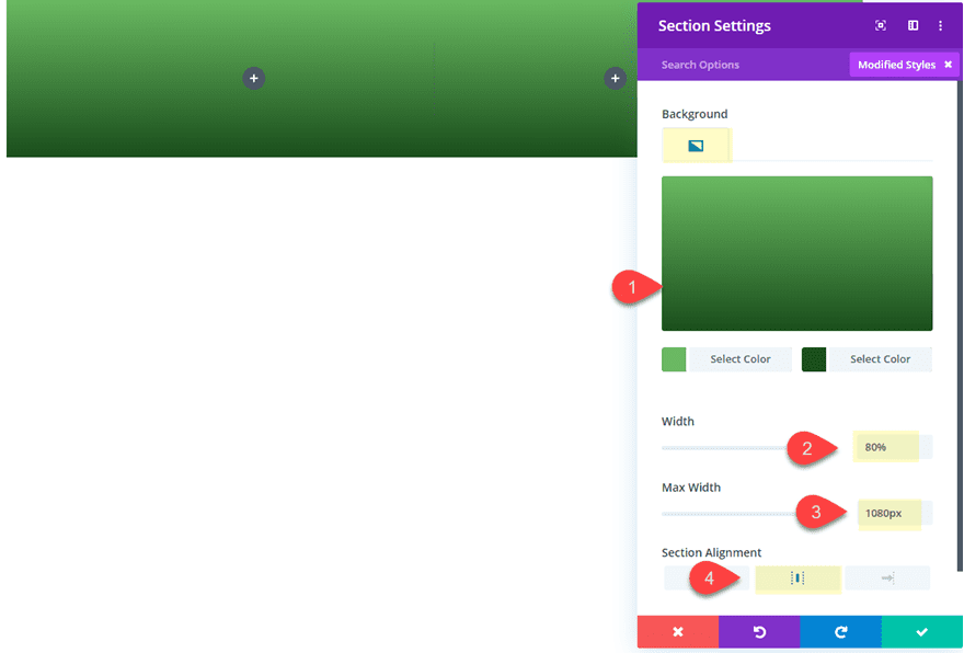
Before adding a module, open the section settings and update the following:
Background Gradient Left Color: #73ba57
Background Gradient Right Color: #2a4c23
Width: 80%
Max Width: 1080px
Section Alignment: Center
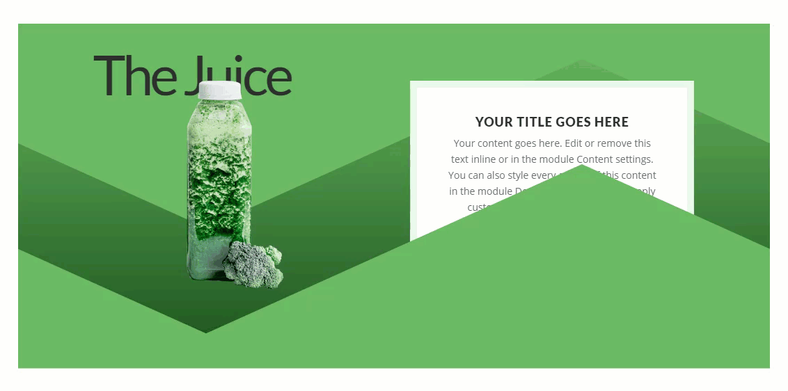
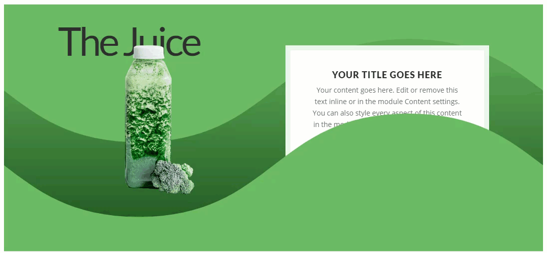
Adding the Section Title
To add the title of the section, create a text module and update the body content with the following h2 header:
The Juice
Then update the design as follows:
Heading 2 Font: Lato
Heading 2 Text Size: 80px
Heading 2 Letter Spacing: -5px
Margin: -50px top, -40px bottom
Z-Index: -1
The custom margin and the z index will allow the text to sit behind the image we will add in the next step.
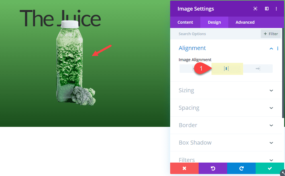
Adding the Image
Under the text module with the title in column 1, add an image module. Then upload an image that has a transparent background. I’m using an image from the Juice Shop Layout Pack that is 240px by 300px.
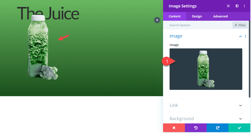
The adjust the image alignment to center.
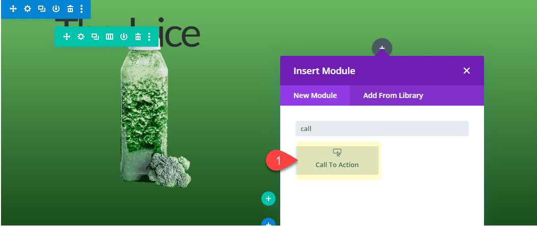
Adding a Call to Action in Column 2
In Column 2, add a call to action module.
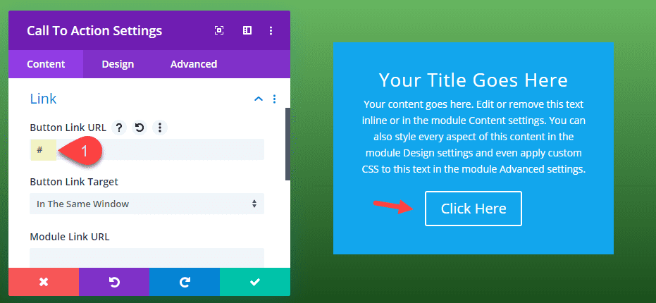
Add a Button Link URL to make sure the button shows.
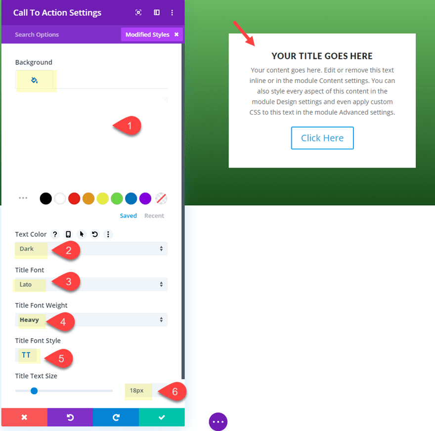
Styling the CTA Background and Title Text
Then update the following design settings:
Background Color: #ffffff
Text Color: dark
Title Font: Lato
Title Font Weight: Heavy
Title Font Style: TT
title Text Size: 18px
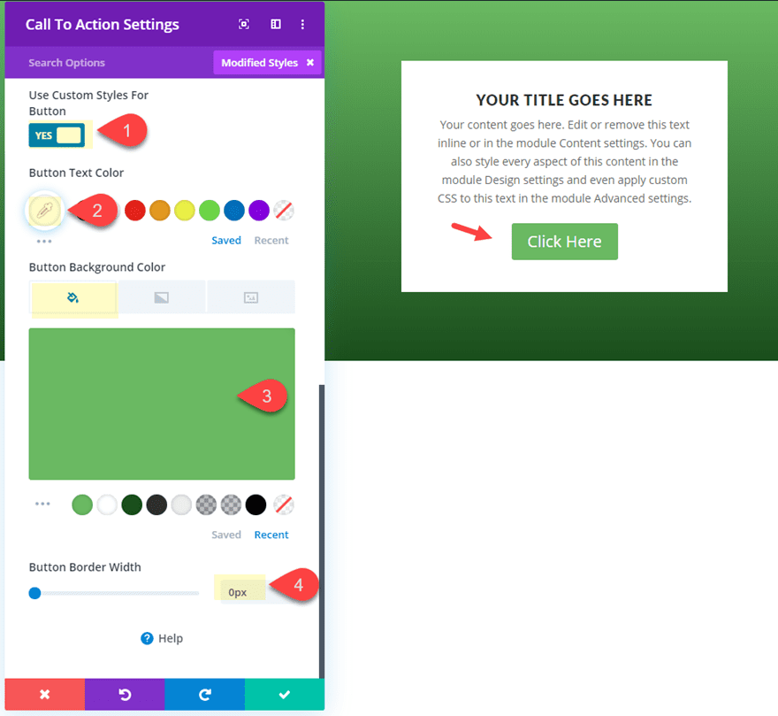
Styling the CTA Button
Update the button design as follows:
Button Text Color: #ffffff
Button Background Color: #73ba57
Button Border Width: 0px
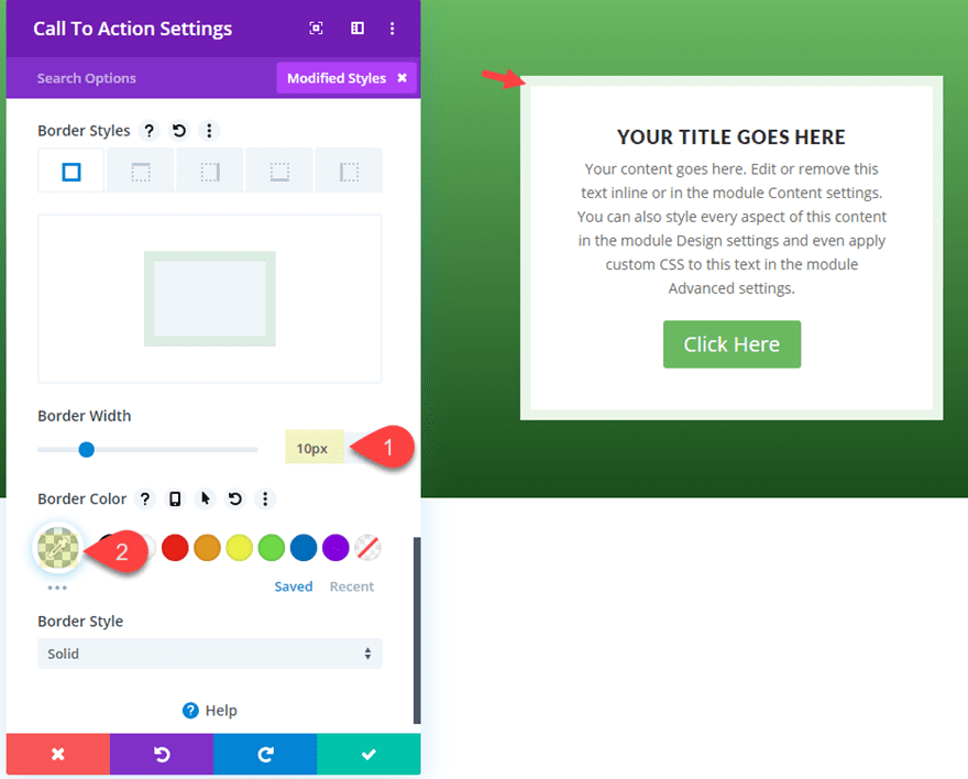
Styling the CTA Border
Then add a border to frame the module as follows:
Border Width: 10px
Border Color: rgba(115,186,87,0.15)
Adding the Divider Height Hover Effect to Reveal the Call to Action
Now it’s time to add the section divider height hover effect to reveal the call to action. To do this, we must first create our section dividers.
Adding the Top Divider
Open the section settings and the top divider with the following settings.
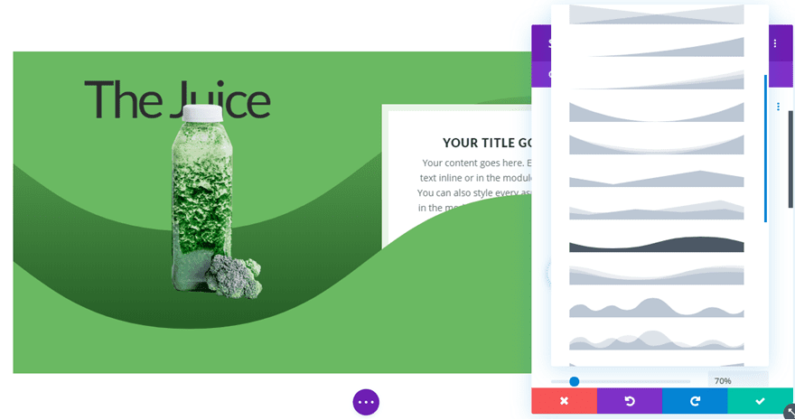
Top Divider Style: see screenshot
Top Divider Color: #73ba57
Top Divider Height: 70% (default), 0% (hover)
Top Divider Flip: horizontal
Notice the Divider Height starts with a default height of 70% and then changes to a height of 0% on hover.
Adding the Bottom Divider
Next add a similar bottom Divider to the section with the following settings.
Top Divider Style: see screenshot
Top Divider Color: #73ba57
Top Divider Height: 70% (default), 0% (hover)
Top Divider Flip: horizontal
Divider Arrangement: On Top of Section Content
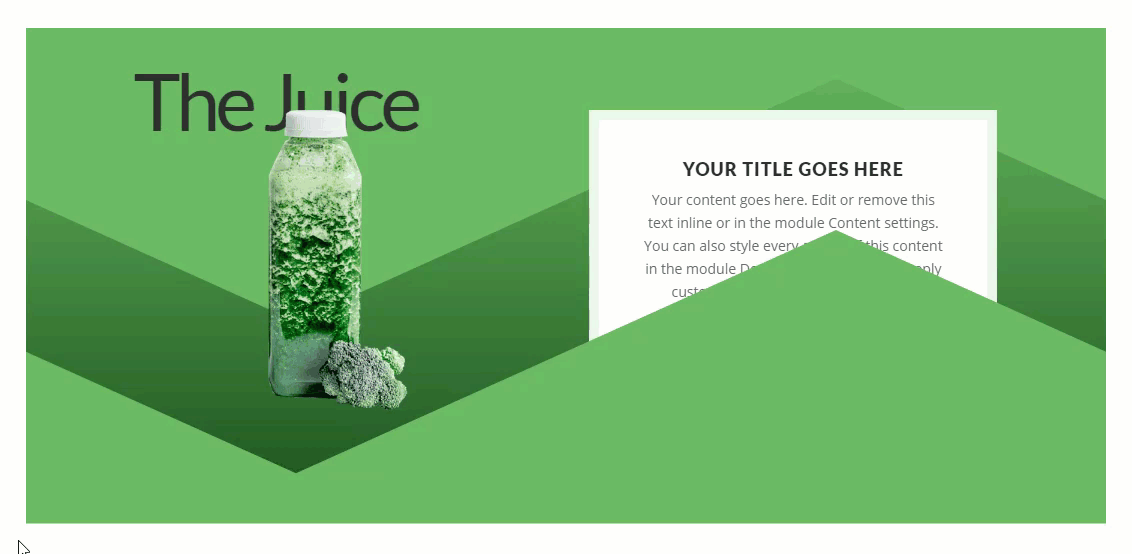
This bottom divider also starts with a 70% height that changes to 0% on hover. However, since the divider arrangement option is set on top of the content, the section divider hides the bottom portion of the call to action in column 1. Then on hover, the rest of the call to action is revealed.
Check out the result so far.
Adding a Box Shadow Hover Effect for a Unique Transition and Design
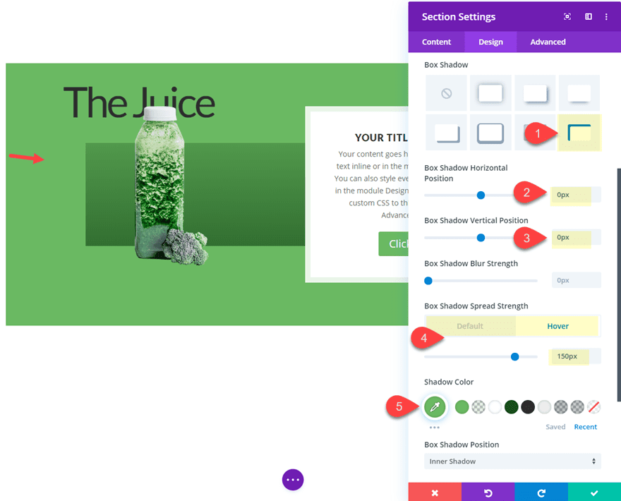
For a unique transition and design on hover, we can add a box shadow hover effect that will take place simultaneously with the divider height hover effect. To do this add the following box shadow to the section.
Box Shadow: see screenshot
Box Shadow Horizontal Position: 0px
Box Shadow Vertical Position: 0px
Box Shadow Spread Strength: 0px (default), 150px (hover)
Box Shadow Color: #73ba57
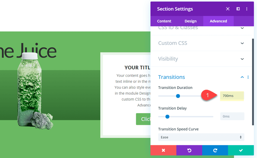
Slowing Down the Transition Duration
For one last step, let’s slow down the transition duration a bit.
Transition Duration: 700ms
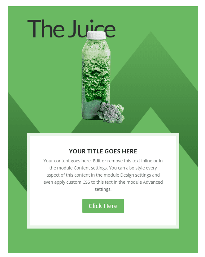
Final Result
Here is the final result on desktop.
If you don’t want the content to be hidden on tablet and phone display, you can easily change the Divider arrangement to “underneath section content” for those devices.
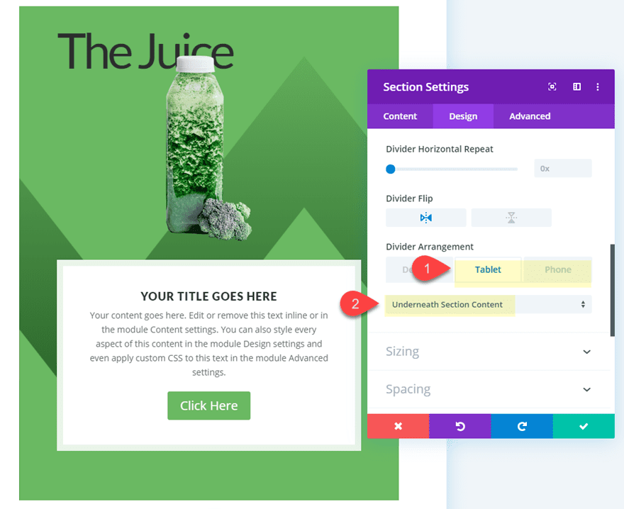
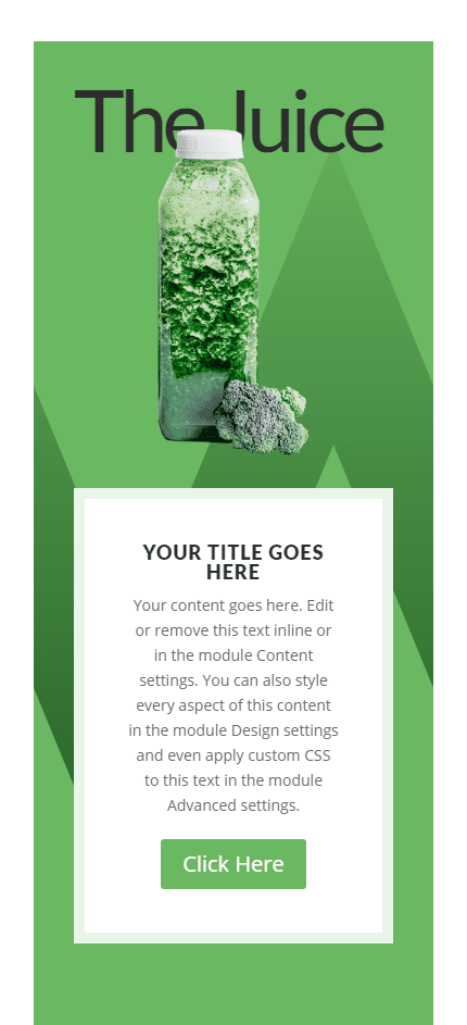
Here is the final design on tablet and phone.
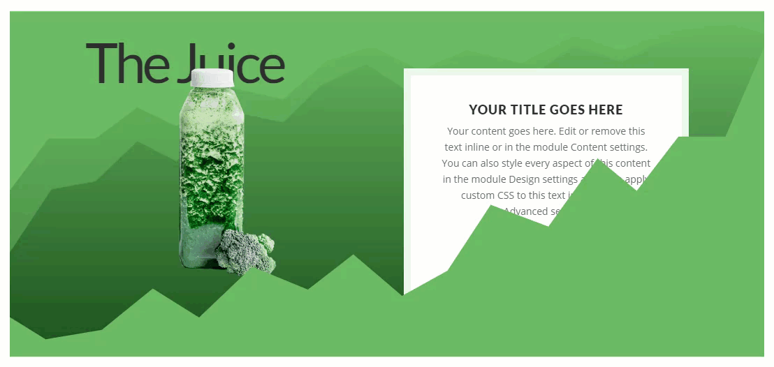
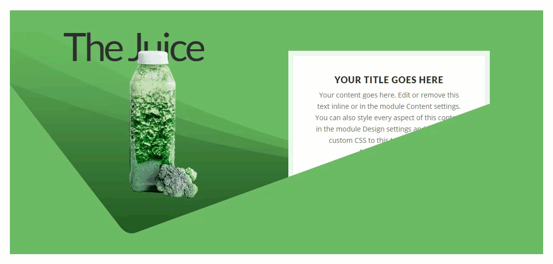
Experimenting with Other Section Divider Styles for Completely Unique Designs in Seconds
With this setup in place, you can easily experiment with different divider styles and combinations!
Here are a few more that I’ve included in the free download.
Final Thoughts
Hopefully, this post has given you a little inspiration for how to create some unique section divider height hover effects to reveal content. In fact, adjusting the divider height on hover can be a great design element by itself. And, the design examples should help you jumpstart your own exploration and designs.
I look forward to hearing from you in the comments.
Cheers!
The post How to Use Section Divider Height Hover Effects to Reveal Content in Divi appeared first on Elegant Themes Blog.